PB Creative – Titsey Brewing Co design
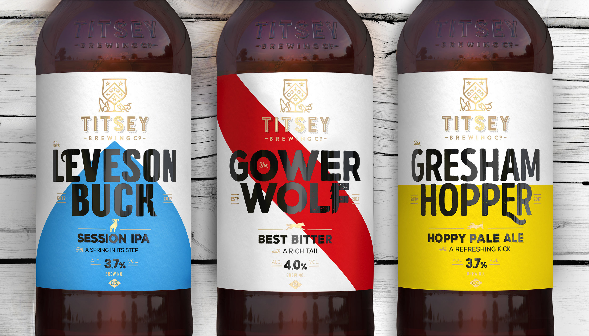
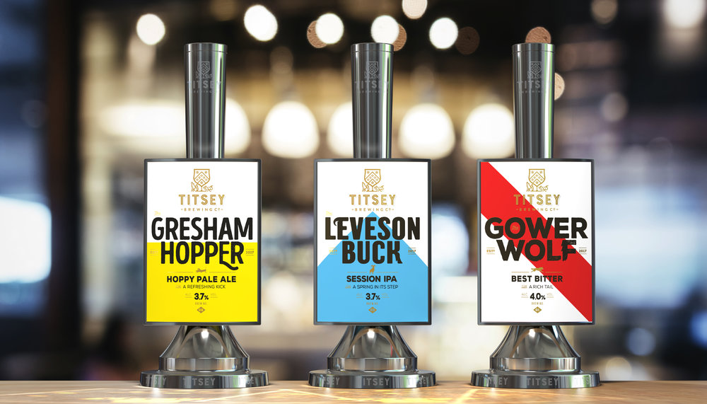
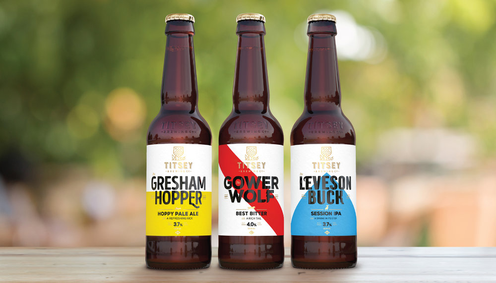
“Titsey Brewing Co, a micro-brewery located on the Titsey Estate in Surrey, has launched with a collection of three unique beers, with brand identity and packaging design by PB Creative.
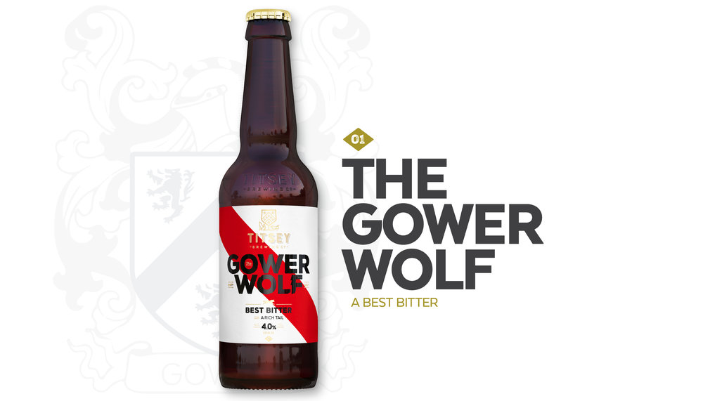
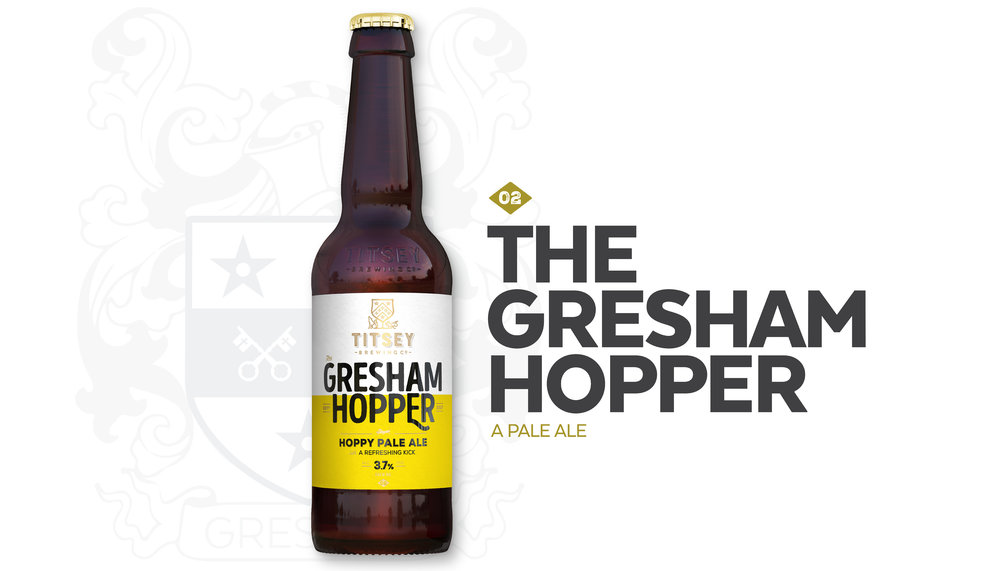
Inspired by the history and heritage of the Titsey Estate, Titsey Brewing Co has produced a light and fresh IPA called Leveson Buck, a Gower Wolf bitter, and a hoppy ale with the name Gresham Hopper.
Leveraging the Titsey heritage
PB Creative was initially approached by Titsey Brewing Co to design a pump clip but responded by creating a completely new brand identity that leverages the heritage of the Titsey Estate with a modern and progressive feel.
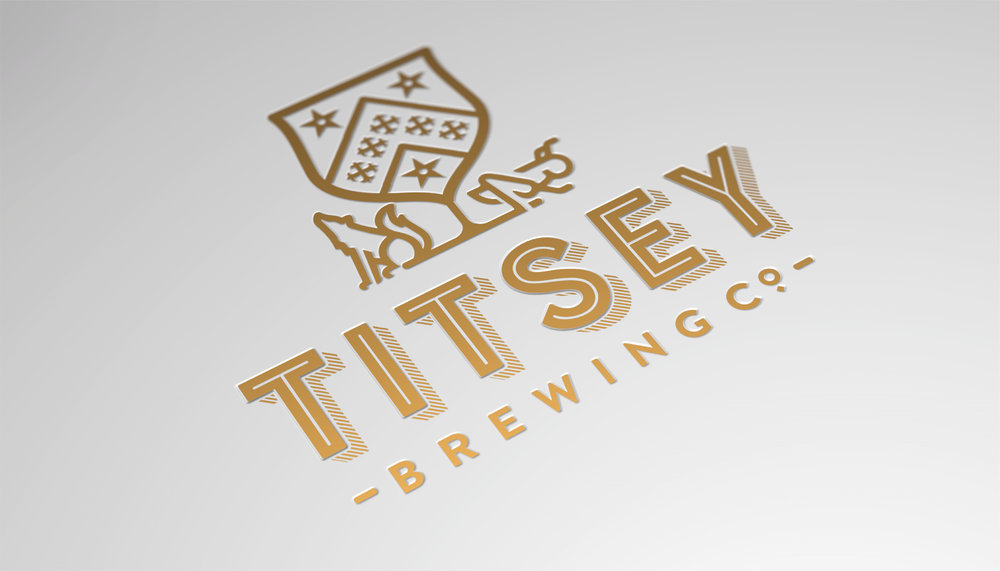
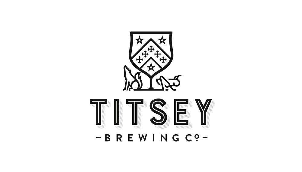
The brandmark crafted by PB Creative takes its inspiration from the crests of two of the most prominent families from the estate, Gower and Gresham, and their family emblems, the wolf and the grasshopper.
By bringing these historical elements together, and adding a chalice to represent brewing, PB Creative crafted a modern take on the heraldic shield. The resulting logo is unique and ownable, presenting a cohesive link between the heritage of the estate, the crests and the brewery.
A fresh take on historical design cues
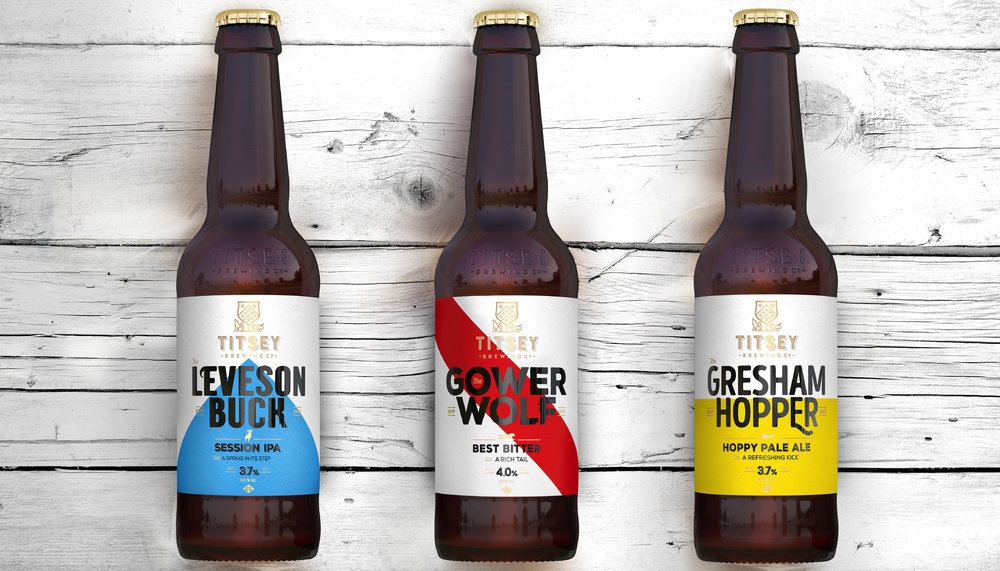
Each beer takes its name from the family tree of Titsey Place – the manor house on the estate. PB Creative took design cues from each of the family crests to create signature geometric lines and colour palettes for the identity of each beer.
Playful language, such as ‘A rich bitter with a dark tale’ for the Gower Wolf bitter and ‘A hoppy ale with a bittersweet kick’ for the Gresham Hopper ale, bring the provenance of the beers to life, while bespoke typography subtly nods to the grasshopper and wolf emblems.”
CREDIT
- Agency/Creative: PB Creative
- Article Title: PB Creative Delivers a Rich and Compelling Brand Story for Titsey Brewing Co
- Organisation/Entity: Agency Commercial / Published
- Project Type: Packaging
- Agency/Creative Country: United Kingdom
- Market Region: Europe
- Format: Bottle
- Substrate: Glass


