


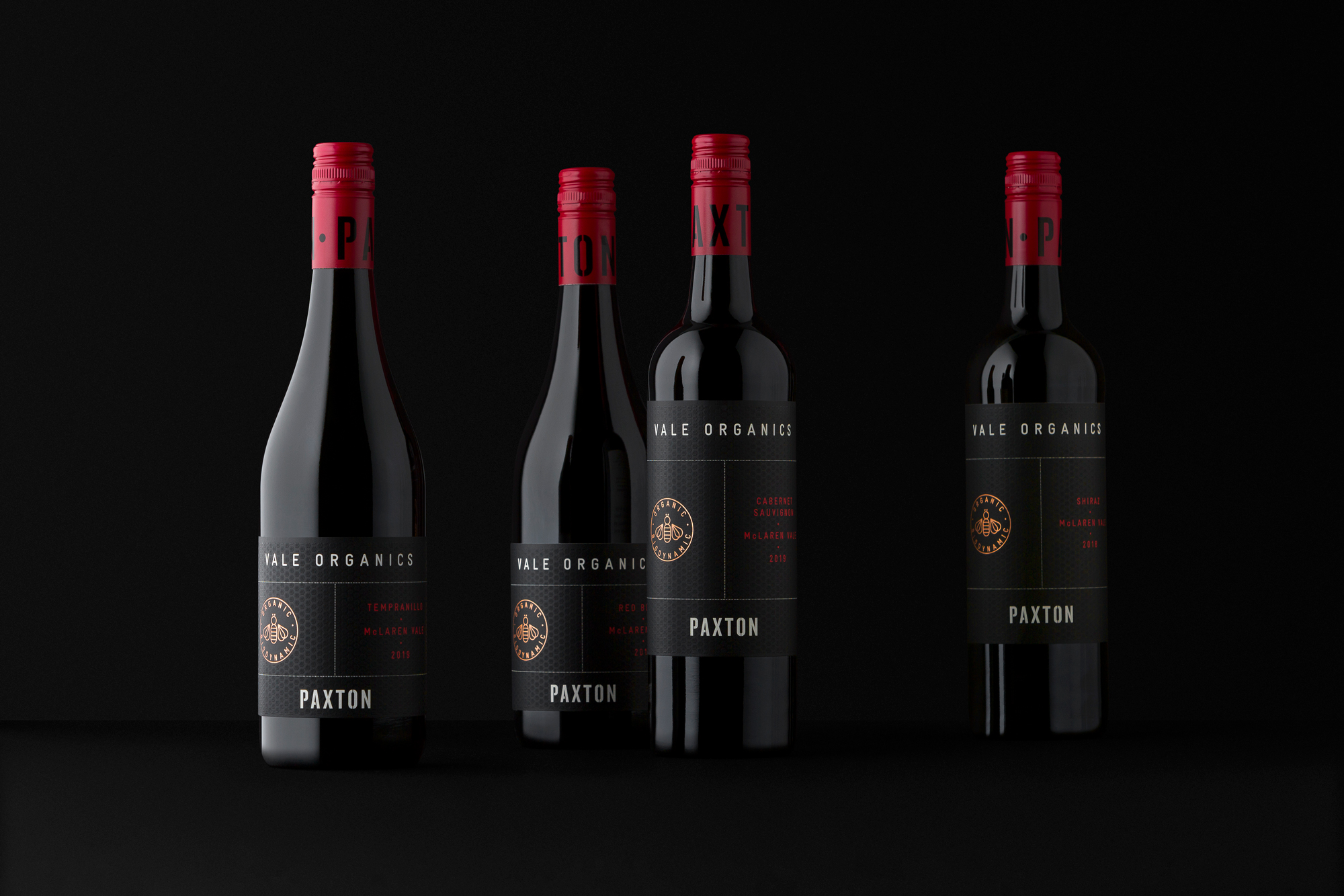
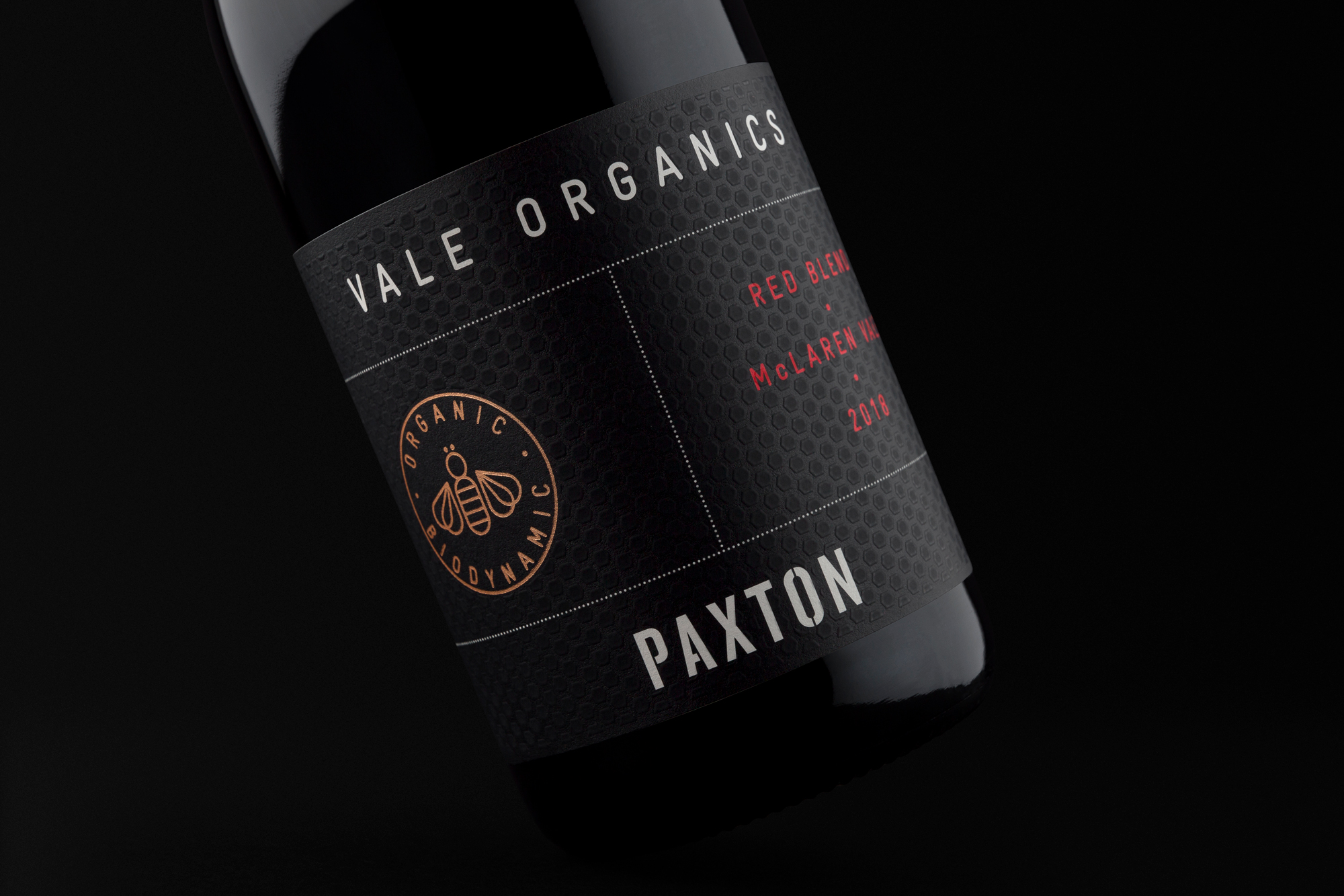
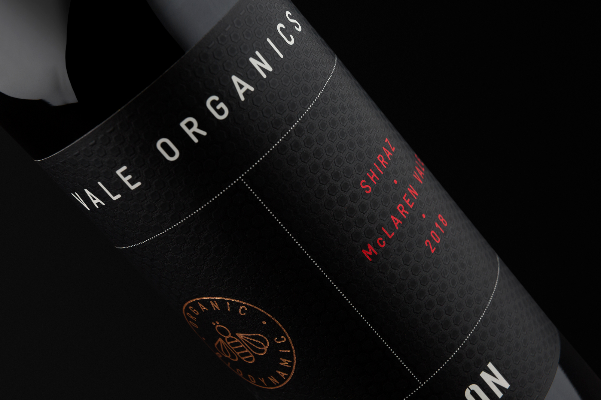
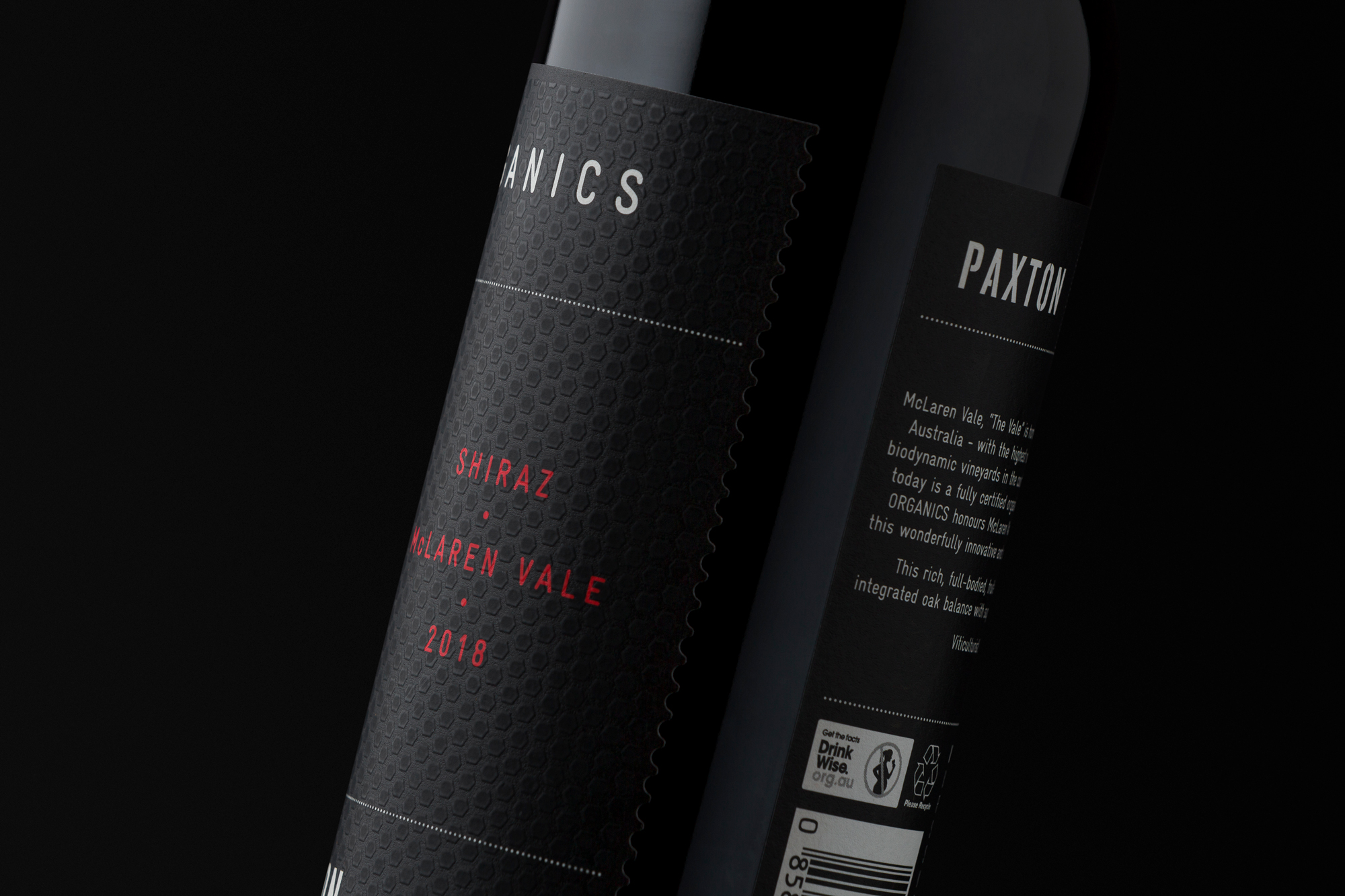
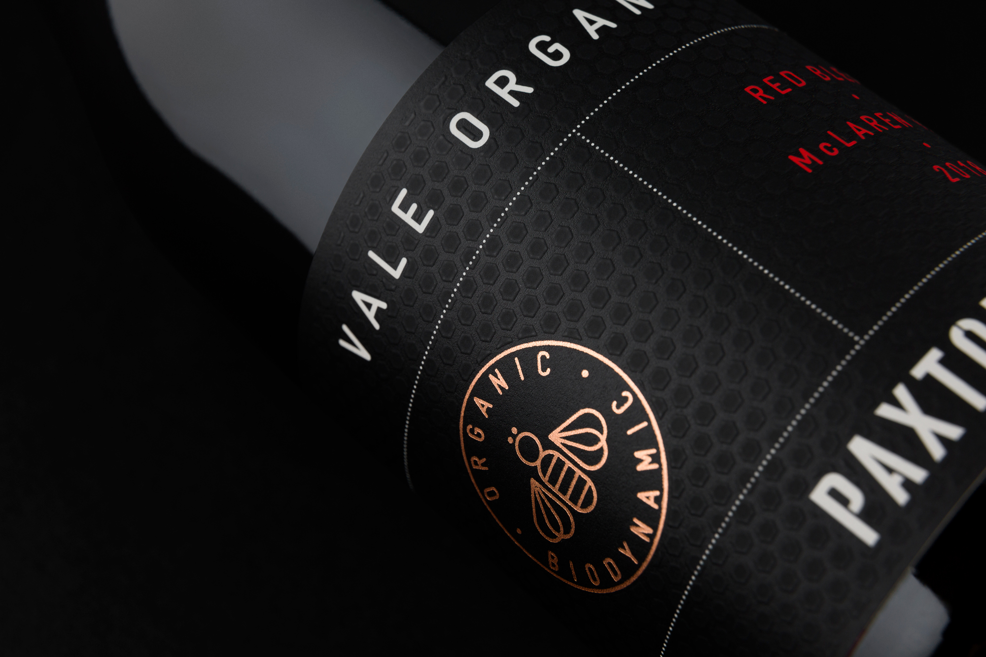
The Paxton ‘Vale Organics’ range has been designed as an accessible organic offering targeting conscientious wine drinkers. Aiming for a clean, confident, and considered package, this range is wrapped in black with foils and a subtle honeycomb texture for premium cues.
The range offers the consumer a high-quality organic product that stands out as a point-of-difference from the typically rustic looking labels in the Australian organic wine market.
CREDIT
- Agency/Creative: David Byerlee Design
- Article Title: Paxton Vale Organics Wine Packaging Designed by David Byerlee Design
- Organisation/Entity: Agency, Published Commercial Design
- Project Type: Packaging
- Agency/Creative Country: Australia
- Market Region: Multiple Regions
- Project Deliverables: Brand Architecture, Branding, Graphic Design, Packaging Design, Research, Retail Brand Design
- Format: Bottle
- Substrate: Pulp Paper
FEEDBACK
Relevance: Solution/idea in relation to brand, product or service
Implementation: Attention, detailing and finishing of final solution
Presentation: Text, visualisation and quality of the presentation


