


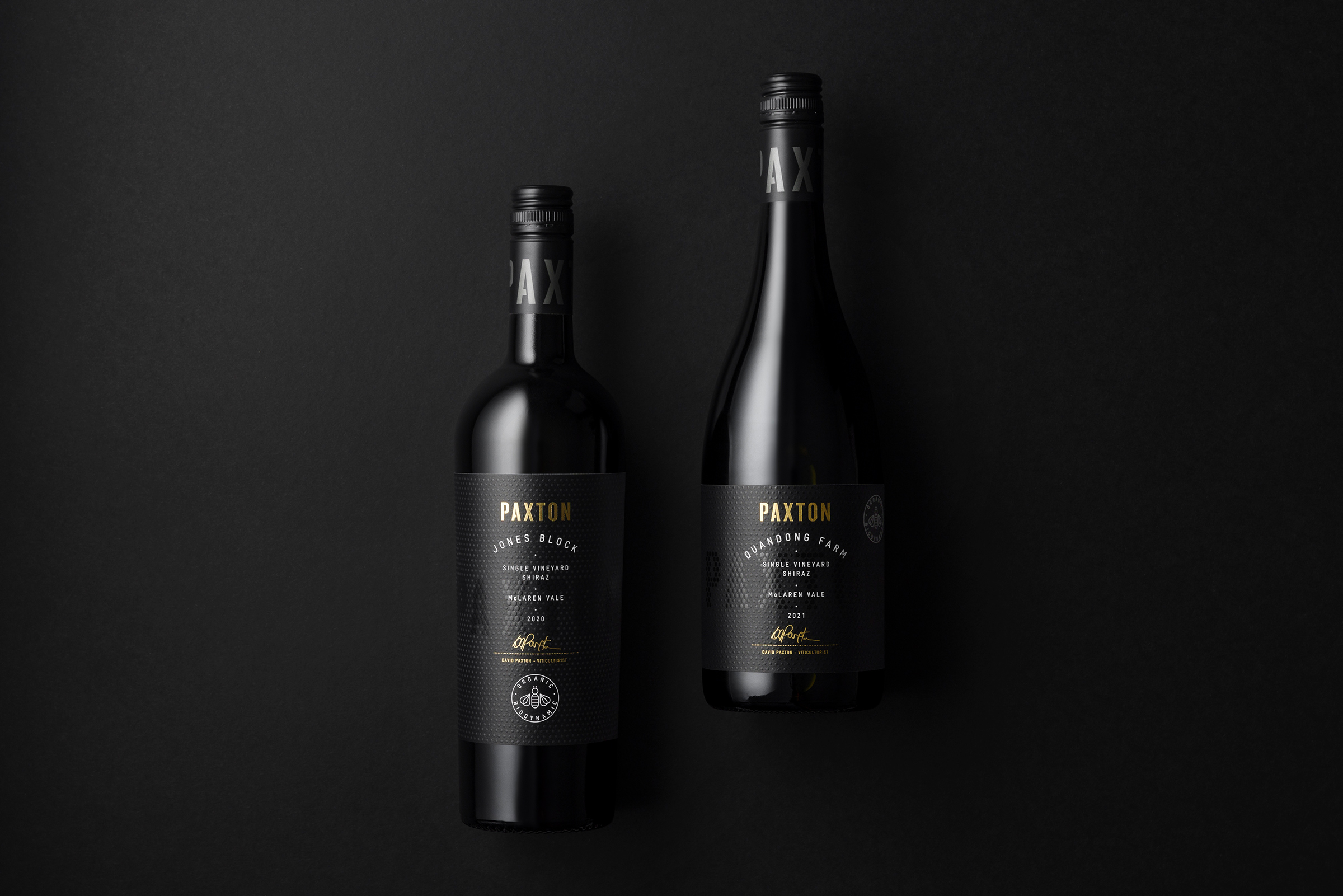
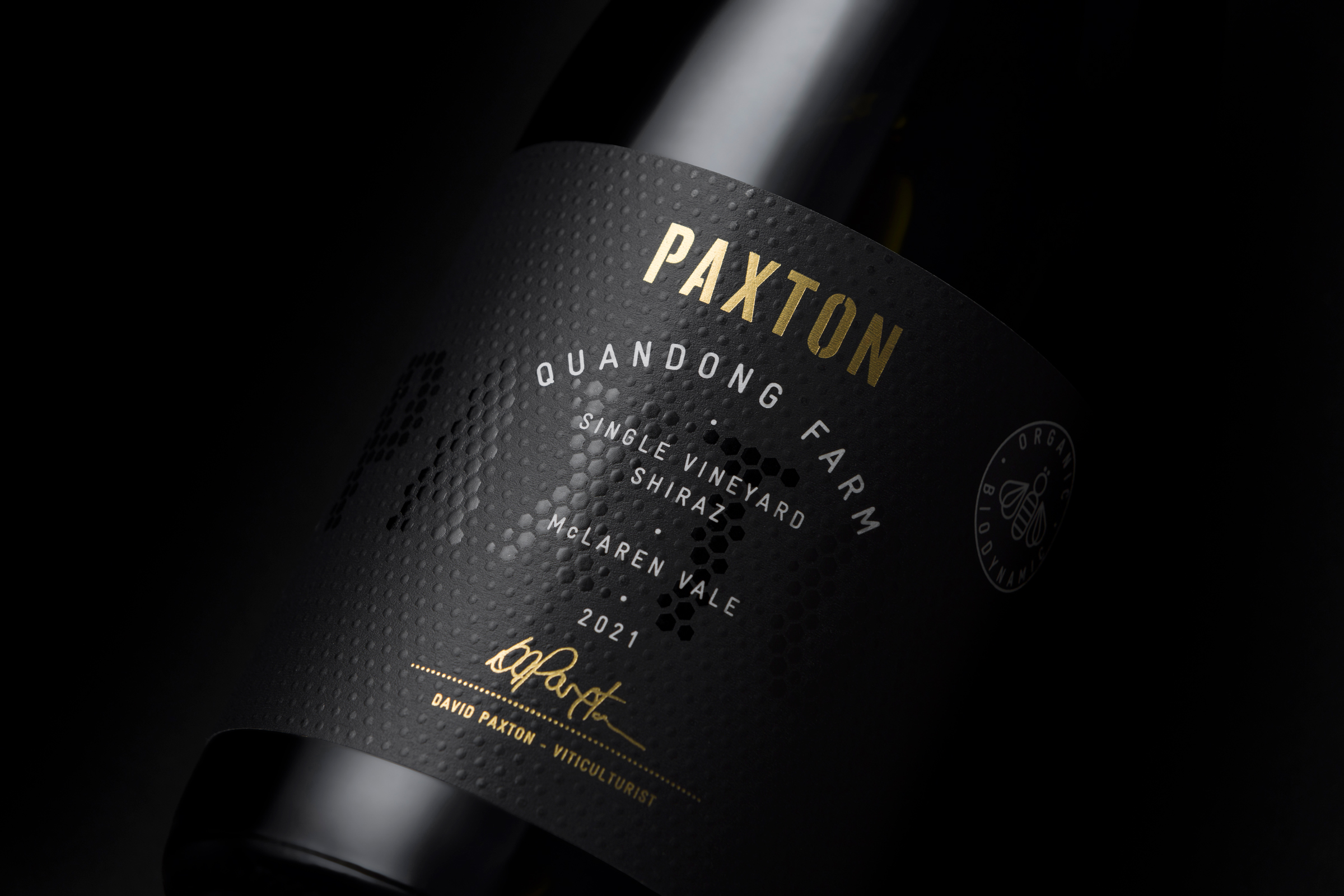
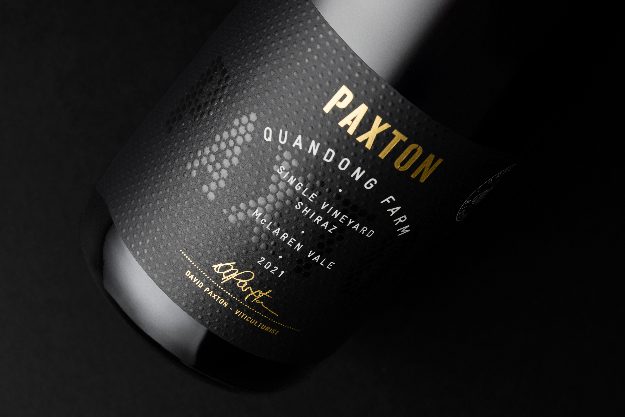
Paxton, a celebrated leader in the realm of biodynamic wine production, embarked on a captivating journey to transform the visual identity of their esteemed single vineyard wine collection. In doing so, we carefully curated labels that effortlessly interwove rich, textured tones of black with the opulent gleam of gold foil highlights, thereby conveying the esteemed and top-tier positioning of their exceptional wines.
These meticulously designed labels, serving as more than just decorative elements, doubled as a representation of the brand’s guiding principles. Additionally, they artfully incorporate a subtle yet deeply symbolic honeycomb pattern — a reverential homage to Paxton’s iconic emblem, the bee. This thoughtful design element paid due respect to the bee’s profound significance within the realm of biodynamic farming practices, thus underscoring Paxton’s commitment to sustainability.
A contrasting blend of gloss and matt varnishes was employed to execute the intricate honeycomb pattern with precision. This intricate process resulted in the delicate yet artful unveiling of the revered ‘PAXTON’ insignia, thereby adding an intriguing depth and a compelling tactile appeal to the finished packaging. The result is packaging that not only captures the essence of Paxton’s wines but also captivates the senses of wine enthusiasts.
As a resounding testament to their unwavering dedication to sustainability and innovation, Paxton seamlessly transitioned their complete wine label portfolio to the eco-friendly UPM Raflatac’s RafWine Bagasse — a label stock thoughtfully created from recycled sugar cane pulp. This eco-conscious choice epitomises their steadfast commitment to environmental responsibility and forward-thinking practices.
CREDIT
- Agency/Creative: Byerlee Design
- Article Title: Paxton – Single Vineyard Collection
- Organisation/Entity: Agency
- Project Type: Packaging
- Project Status: Published
- Agency/Creative Country: Australia
- Agency/Creative City: Adelaide
- Market Region: Global
- Project Deliverables: Art Direction, Brand Architecture, Brand Rejuvenation, Branding, Packaging Design
- Format: Bottle
- Industry: Food/Beverage
- Keywords: wine, shiraz, byerlee, paxton, david byerlee, packaging, McLaren vale, adelaide
-
Credits:
Director: David Byerlee


