


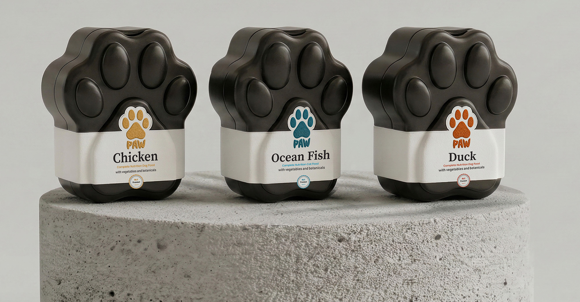
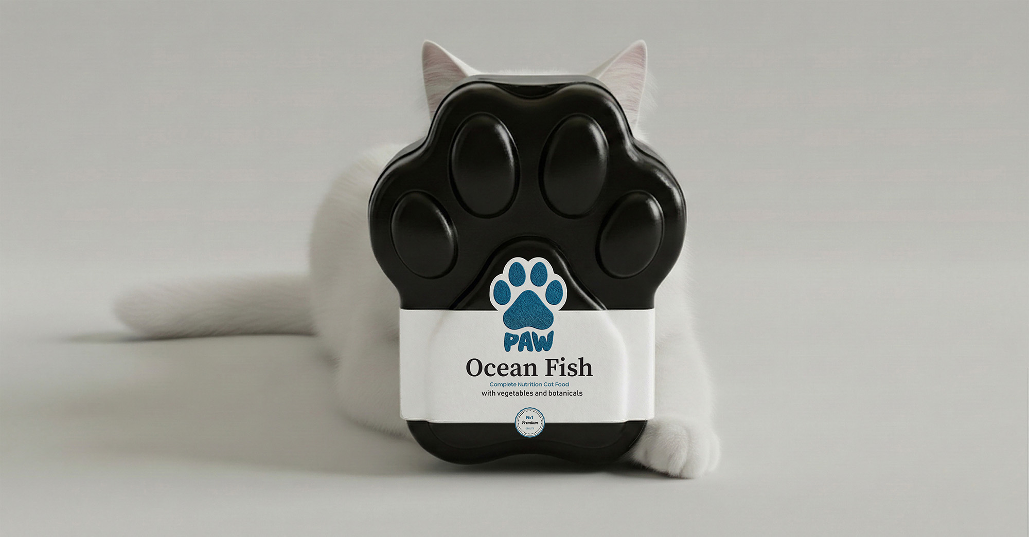
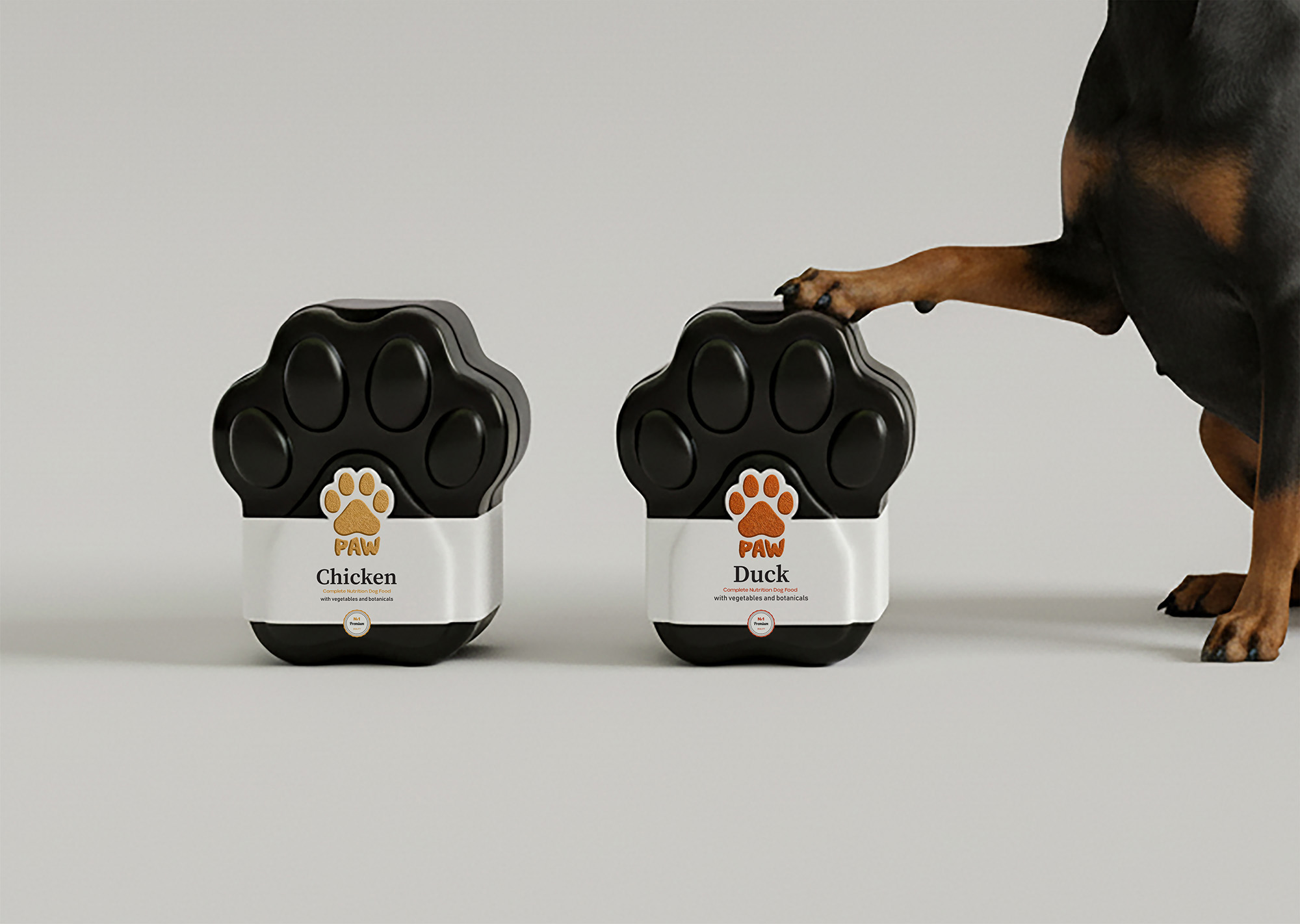
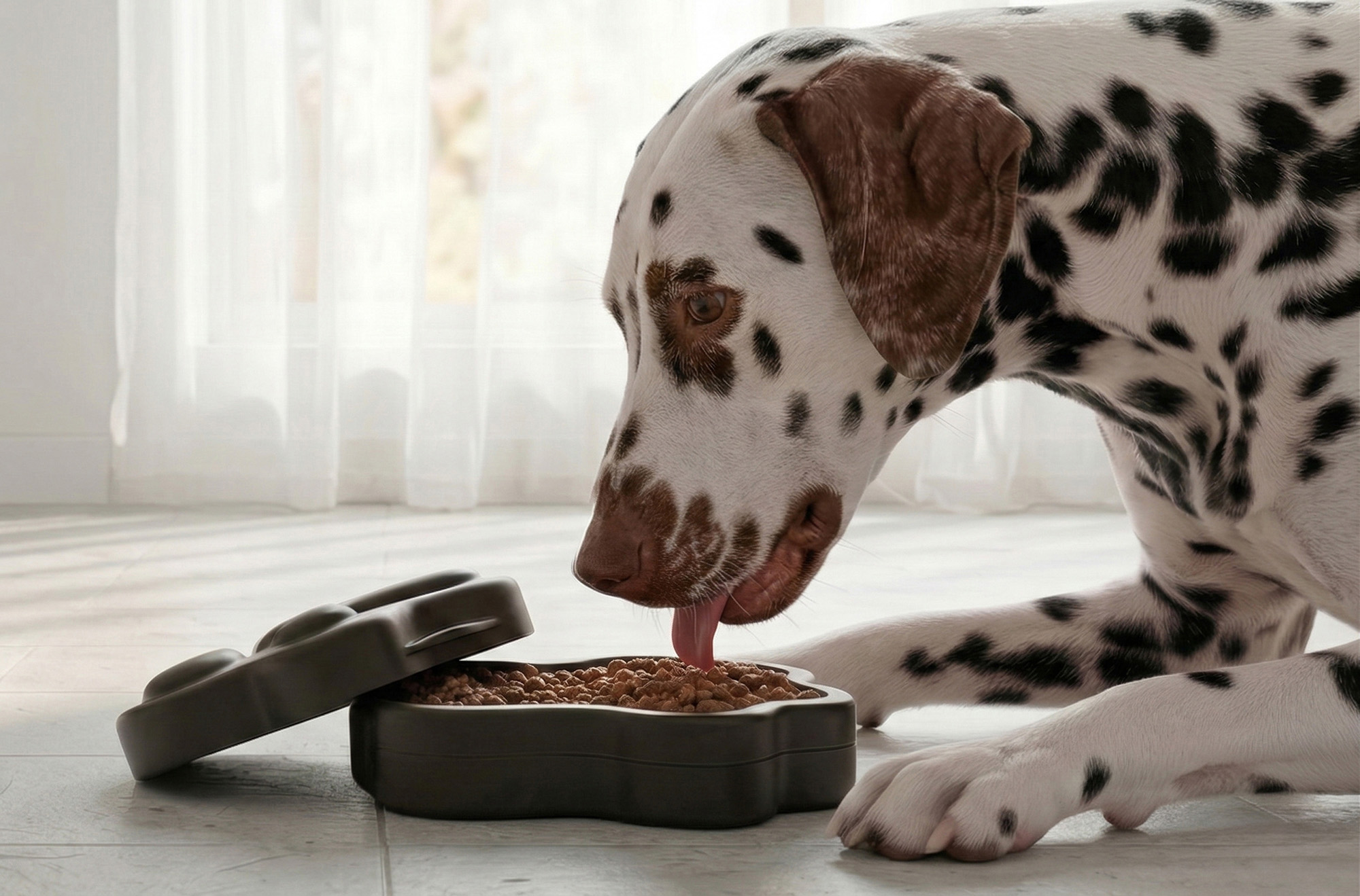
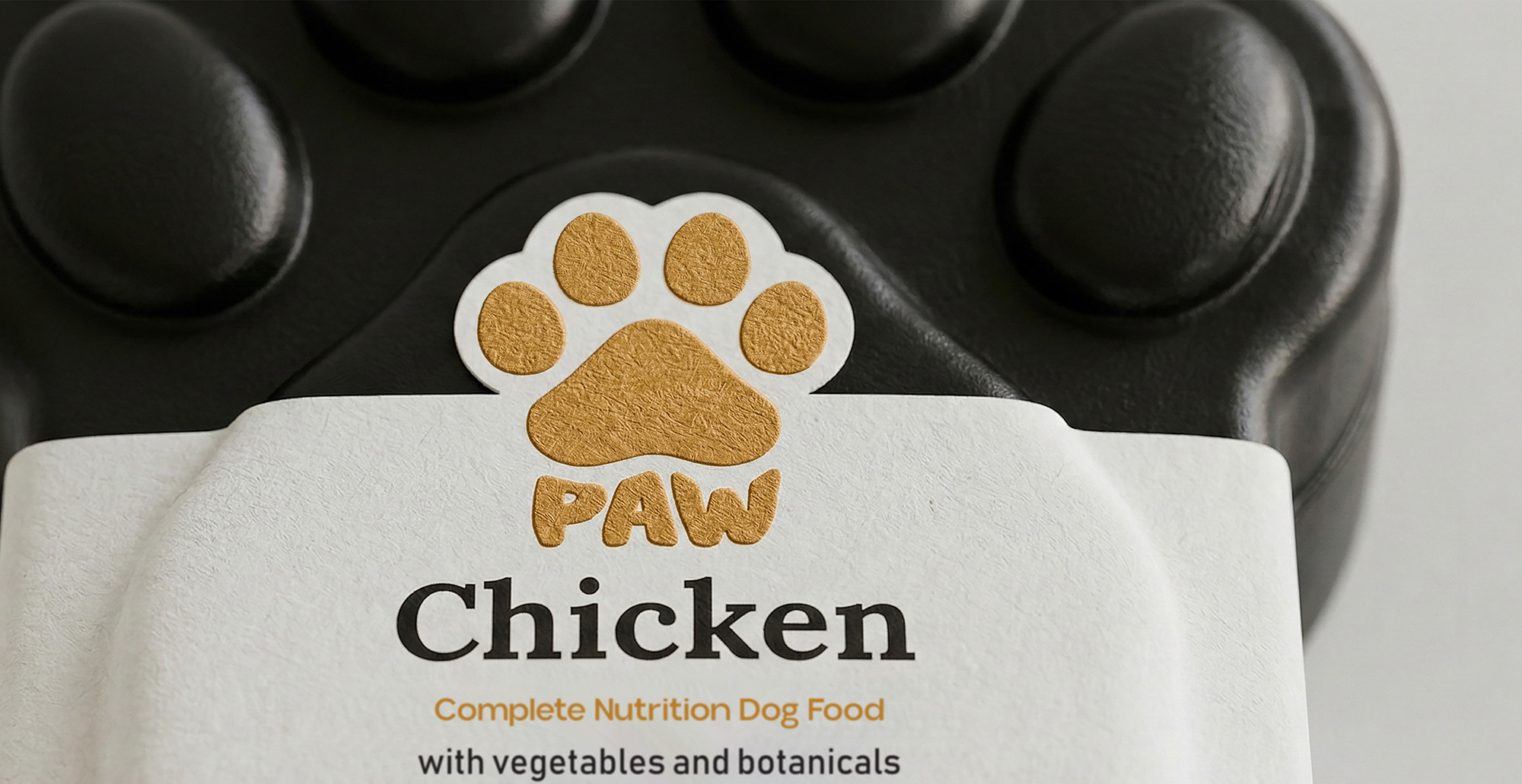
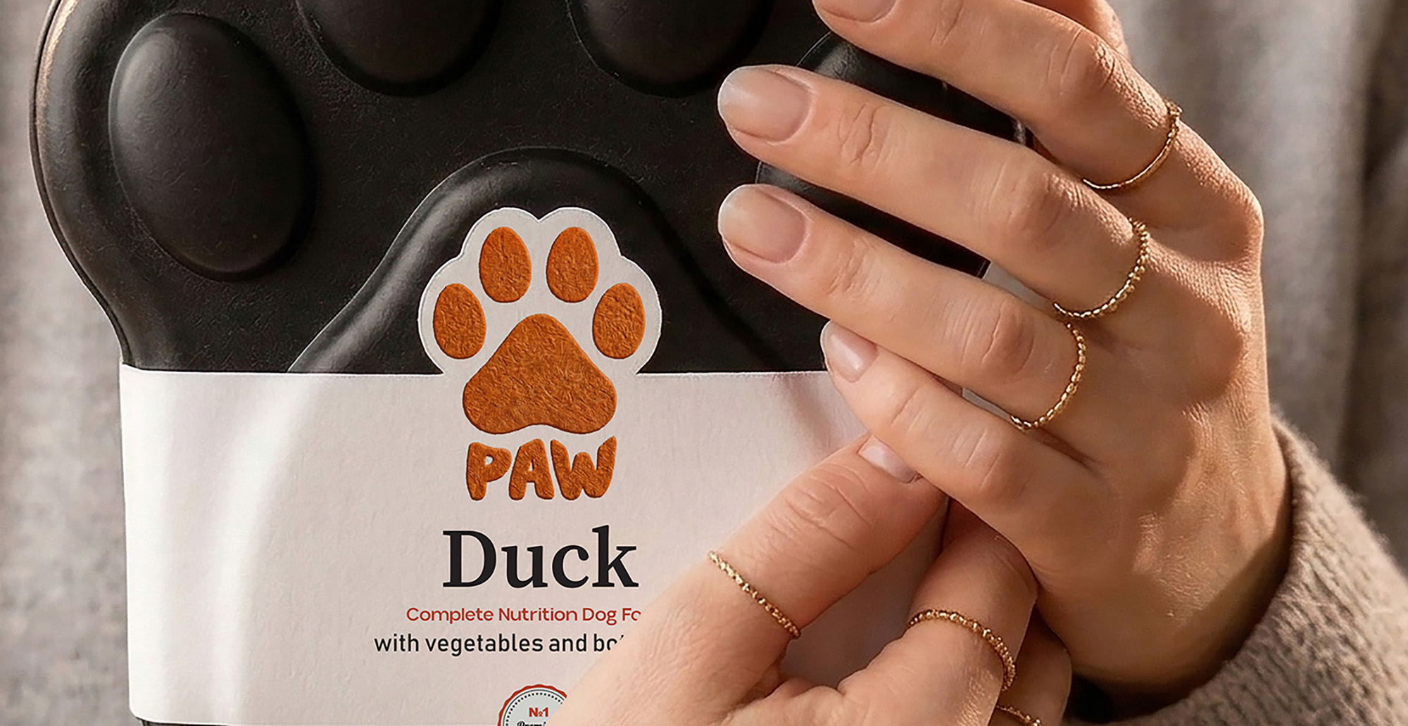
I received an order to create a creative packaging design for a box of dog and cat food. Starting from the choice of the name, everything was on my shoulders. And I started doing research. It all started with the name. I thought for a long time about what name to give the brand, which would fully characterize dogs and cats, and I realized that the name PAW was the ideal option in this case. And I decided that I would characterize the logo with a dog’s paw. I used a dog’s paw icon in the logo, and wrote the text part in a bubble font, which is more typical for animals and would be better typical for this product. After doing all this work, I moved on to thinking about the packaging design. I conducted a market study and realized that no matter how many creative solutions there are, there is no box in the shape of a dog’s or cat’s paw. And in this case, my choice fell on a dog’s paw – what if the box is also a dog’s paw, I thought and started working on the box. The box should be dark black, metallic, so that it can also be used as a food bowl. This way, I got a pretty elegant and premium box. The food would come in three flavors: chicken, duck, and fish. The chicken and duck flavors are intended for dogs, and the fish flavor is for cats. Therefore, it was necessary to make it so that when looking at the box, it would be immediately clear which food was intended for whom. And I decided to divide the types into colors: chicken food would be yellow, duck food would be orange, and fish food would be blue.
CREDIT
- Agency/Creative: Lilit Sivolenko
- Article Title: PAW Packaging Design by Lilit Sivolenko Uses Color Coding to Separate Dog Flavors and Cat Fish at a Glance
- Organisation/Entity: Freelance
- Project Type: Packaging
- Project Status: Non Published
- Agency/Creative Country: Armenia
- Agency/Creative City: Yerevan
- Market Region: Europe
- Project Deliverables: Packaging Design
- Format: Box
- Industry: Food/Beverage
- Keywords: petfood
-
Credits:
graphic designer: Lilit Sivolenko


