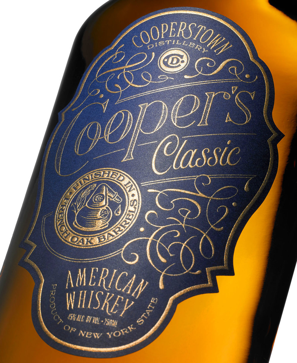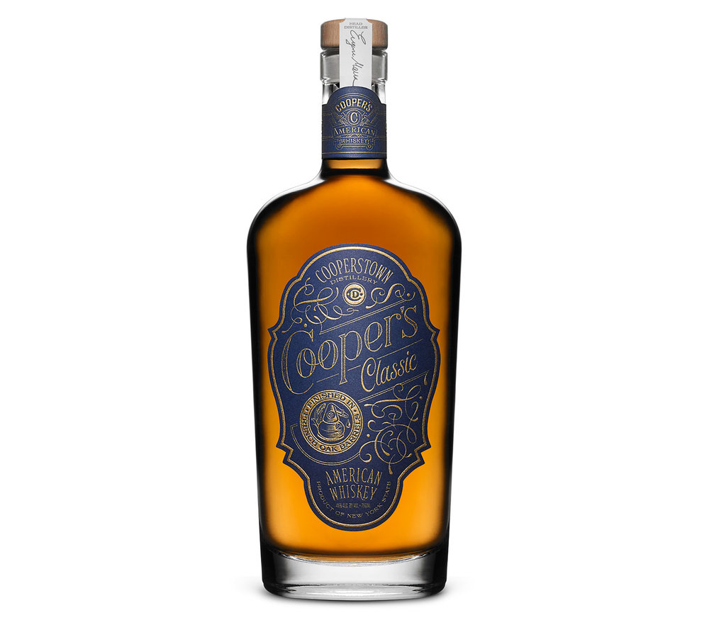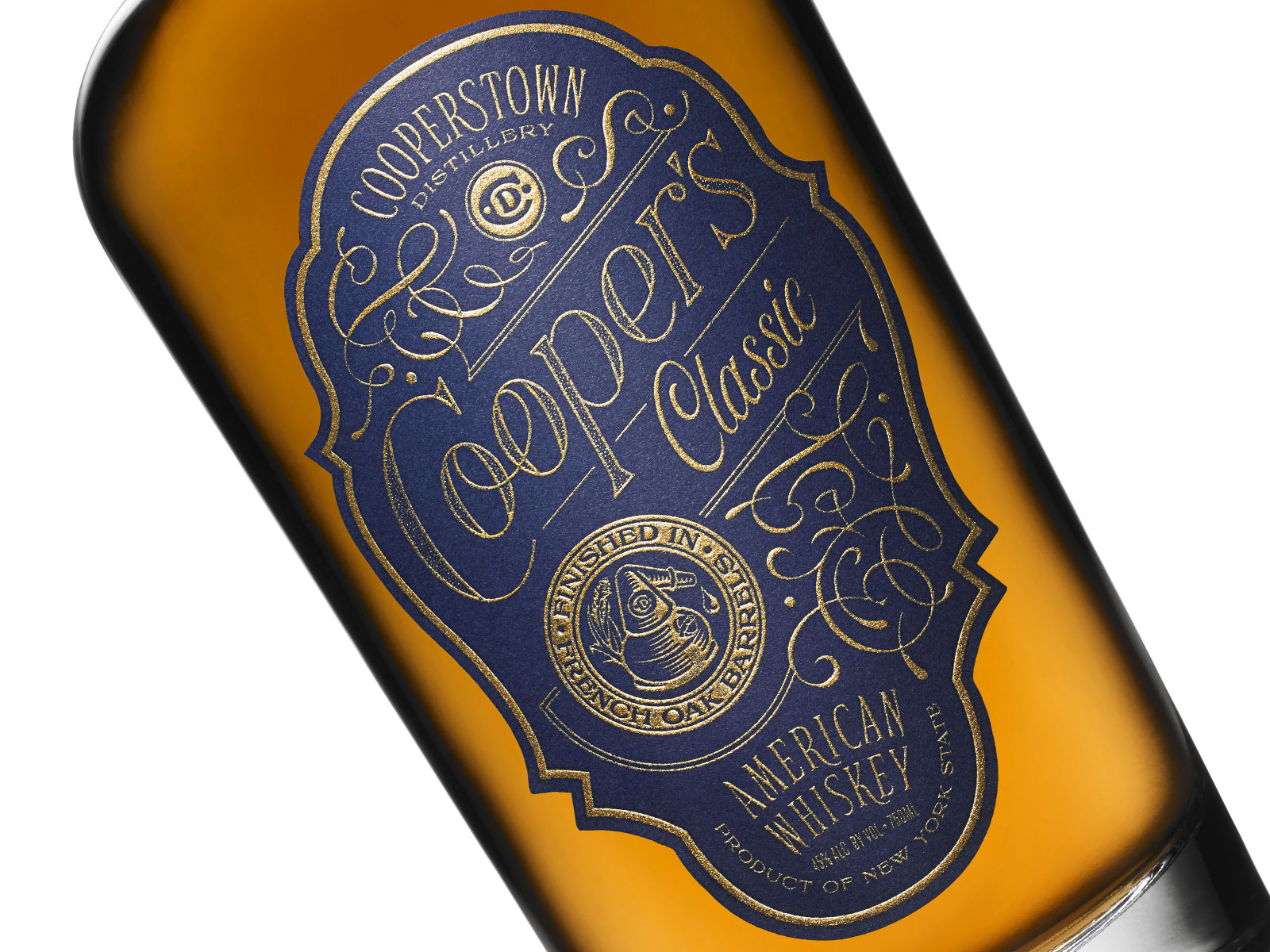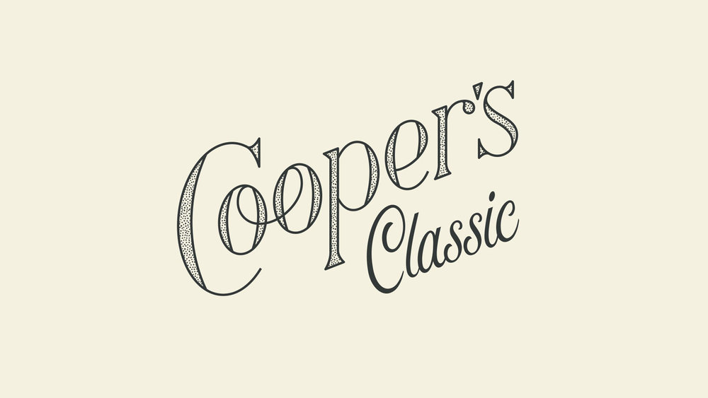
“When Cooperstown Distillery created Cooper’s Classic, it was deemed the finest, smoothest whisky to come from their distinctive line of handcrafted, artisanal spirits. The branding of this whiskey also needed to reflect the company’s deep appreciation for American history and more than a passing admiration for a local boy made good: author James Fenimore Cooper. The name pays homage to the author, while the gold embossed lettering, deep indigo blue background and classic design on each individually numbered bottle speaks to American craftsmanship at its highest levels. This is the debut of a new American classic.”


CREDIT
- Agency/Creative: Pavement Design
- Article Title: Pavement Design – Cooper’s Classic
- Project Type: Packaging
- Format: Bottle
- Substrate: Glass, Pulp Paper
FEEDBACK
Relevance: Solution/idea in relation to brand, product or service
Implementation: Attention, detailing and finishing of final solution
Presentation: Text, visualisation and quality of the presentation


