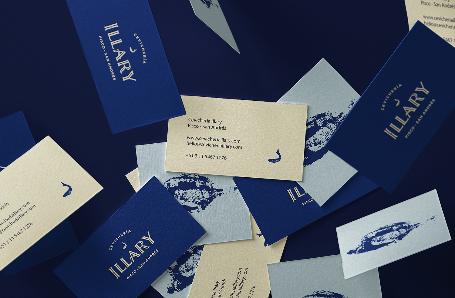
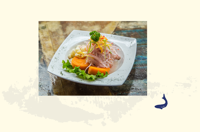
The Brief: a family based in San Andrés coast in Peru wanted to open a ‘cevicheria’, a restaurant specialised in ‘Ceviche’. Ceviche is a South American seafood dish originated in Peru and widely eaten in the local area typically mde from fresh raw fish cured in fresh citrus juices, most commonly lemon or lime, and spiced with ají and chili peppers. In Peru, ceviche has been declared to be part of Peru’s “national heritage” and has had a holiday declared in its honor.
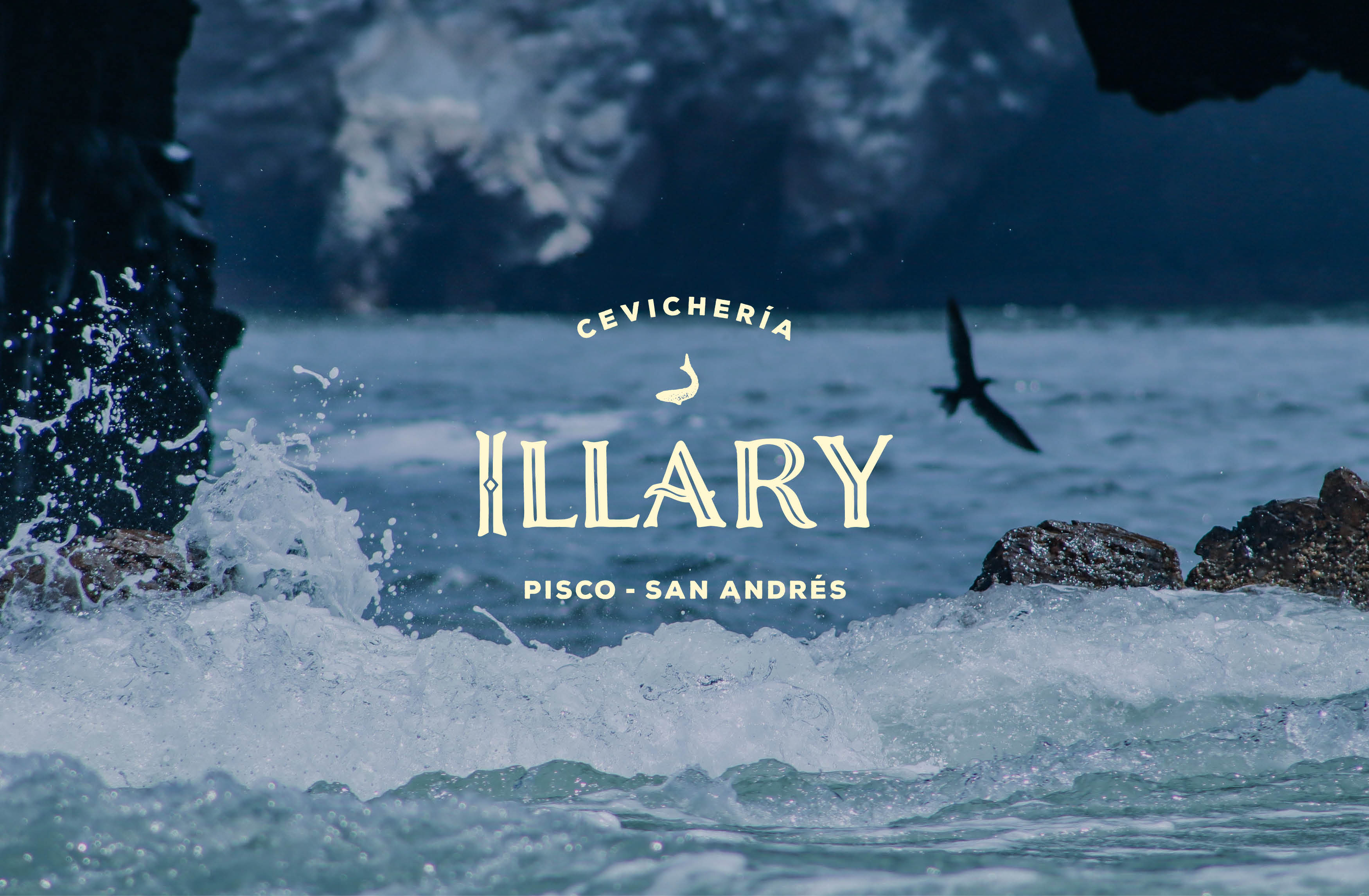
The Objective: to create the logo for the family restautant with a speical focus on the sea without falling into the typical fish representation. The main idea was to create a unique and special connection between the restaurant and the sea, emphathising the handmade and raw aspect of the dish.
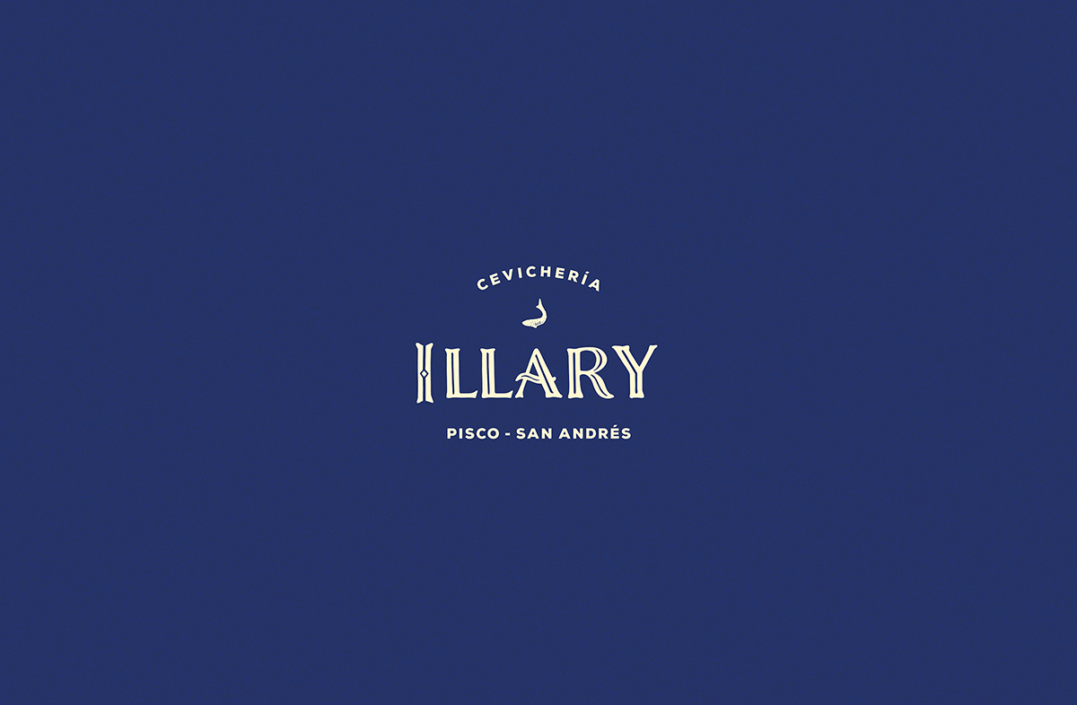
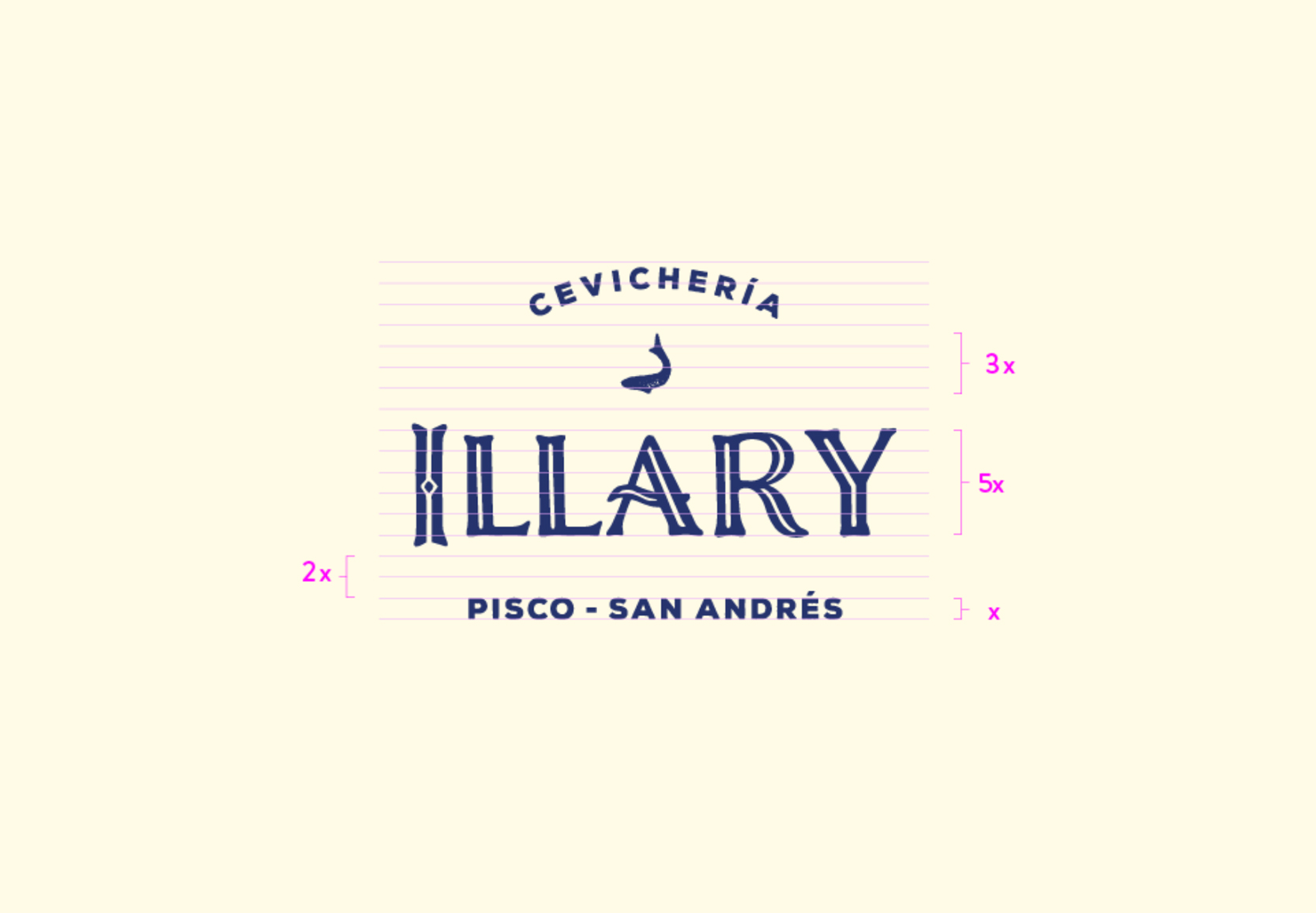
The solution: I approached this project using a typeface called Nelson to design the logo, because to me it has an inmediate connection to the sea due to its waivy shapes – specially the ones from the character ‘A’ – and due to the typeface inlines that remind me of a fish bone.
To make it cleaner I hand-rendered the name ‘ILLARY’ with pen on paper, giving it the uniqueness, handmade and rustic feeling and to remove the original cracked edges of the typeface.
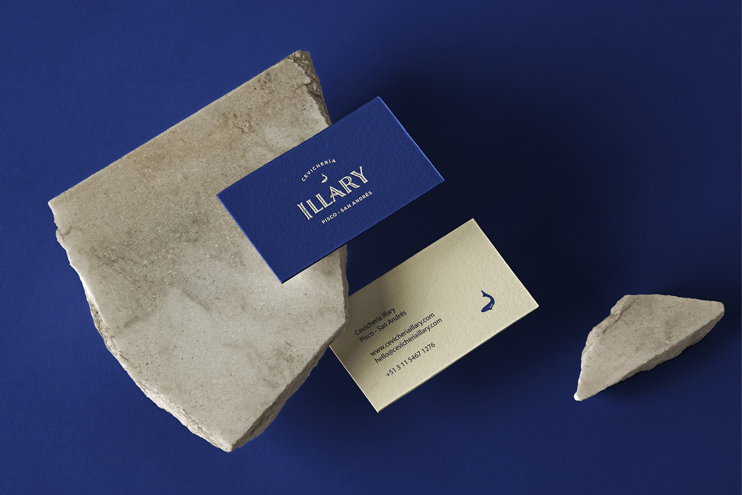
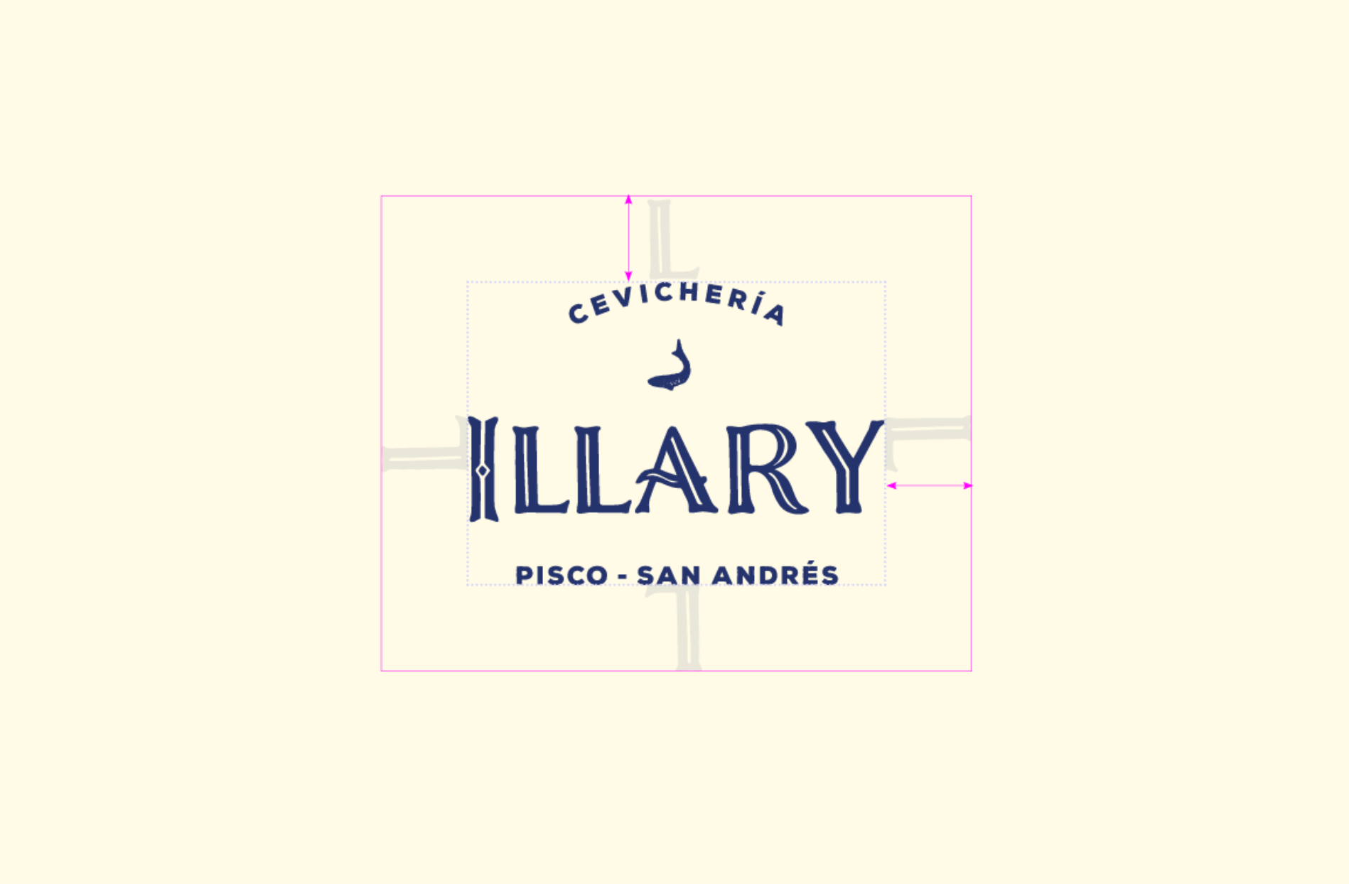
The logo composition is made with the family name as the main element and getting a perfect balance with a the small fish symbol and highlighting the restaurant specialty and location with the tagline.
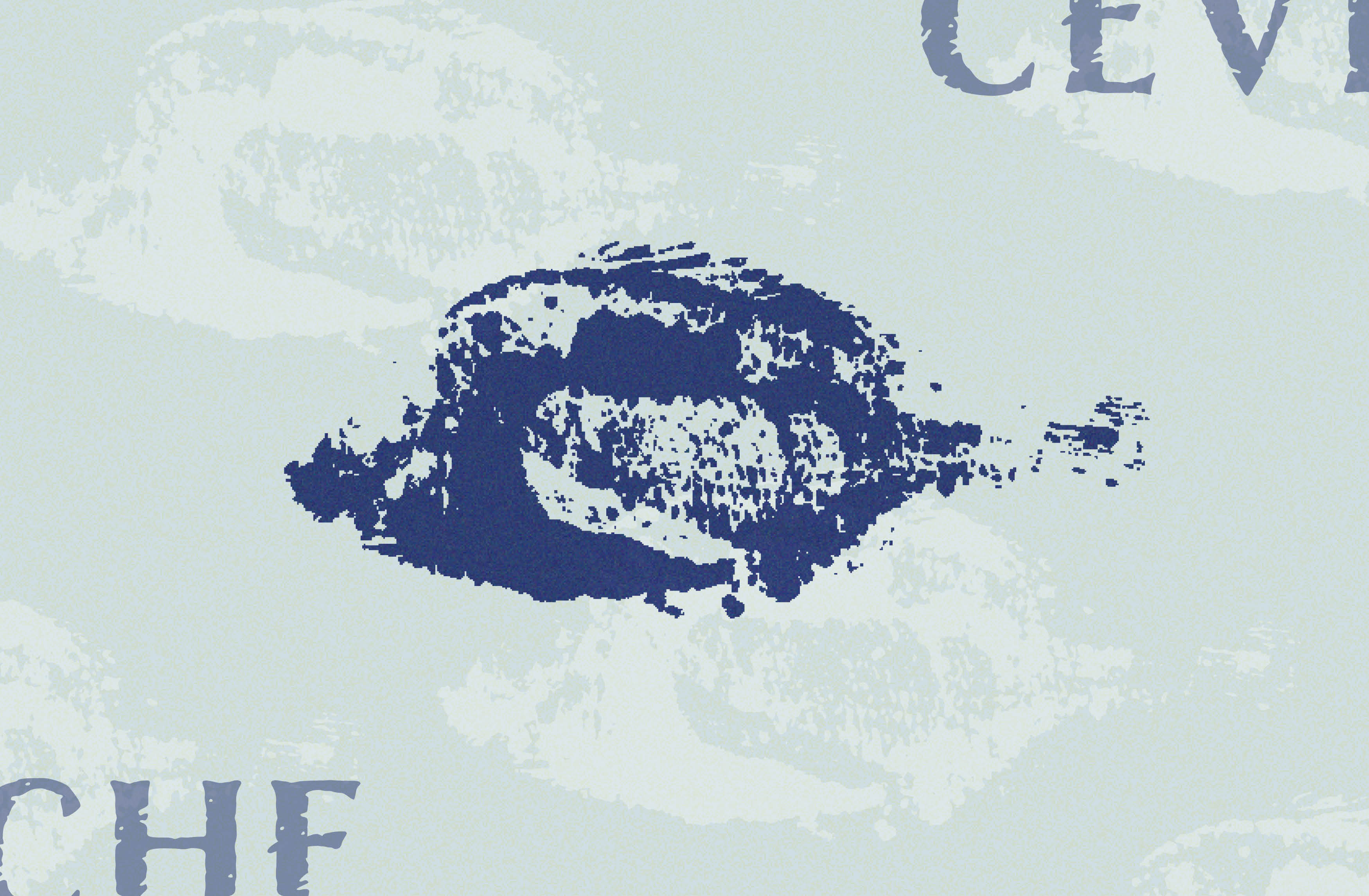
The fish imagery is made with the ‘Gyotaku’ technique: inking a real fish and printing it on washi paper. The shapes created with Gyotaku are in between figurative and abstract, creating a vanishing feeling, like a ‘unique momentum’. Every Gyotaku is unique and different, making the industrial and identical repetition somewhat insignificant compated to the uniqueness of the hand-made things.
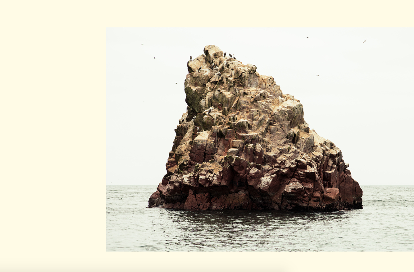
The colours of the brand were chosen from the real Peruvian sea, sky and rocks.The cream colour is one of the main colours of the brand since it brings the contrast and warmth to the palette.
CREDIT
- Agency/Creative: Paula Pons
- Article Title: Paula Pons Designs a New Brand for Peruvian Cevicheria
- Organisation/Entity: Freelance, Published Commercial Design
- Project Type: Identity
- Agency/Creative Country: Germany
- Market Region: South America
- Project Deliverables: Brand Creation, Brand World, Branding, Graphic Design, Research
- Industry: Hospitality
- Keywords: Restaurant, Logo Design, Branding, Cevicheria, Peruvian


