Creative agency Paul Belford Ltd recently worked with Busaba, the Thai restaurant group, to develop a new brand strategy and identity. The rebrand coincides with Busaba’s 20th anniversary and is part of a drive to reenergise the brand while celebrating its past.
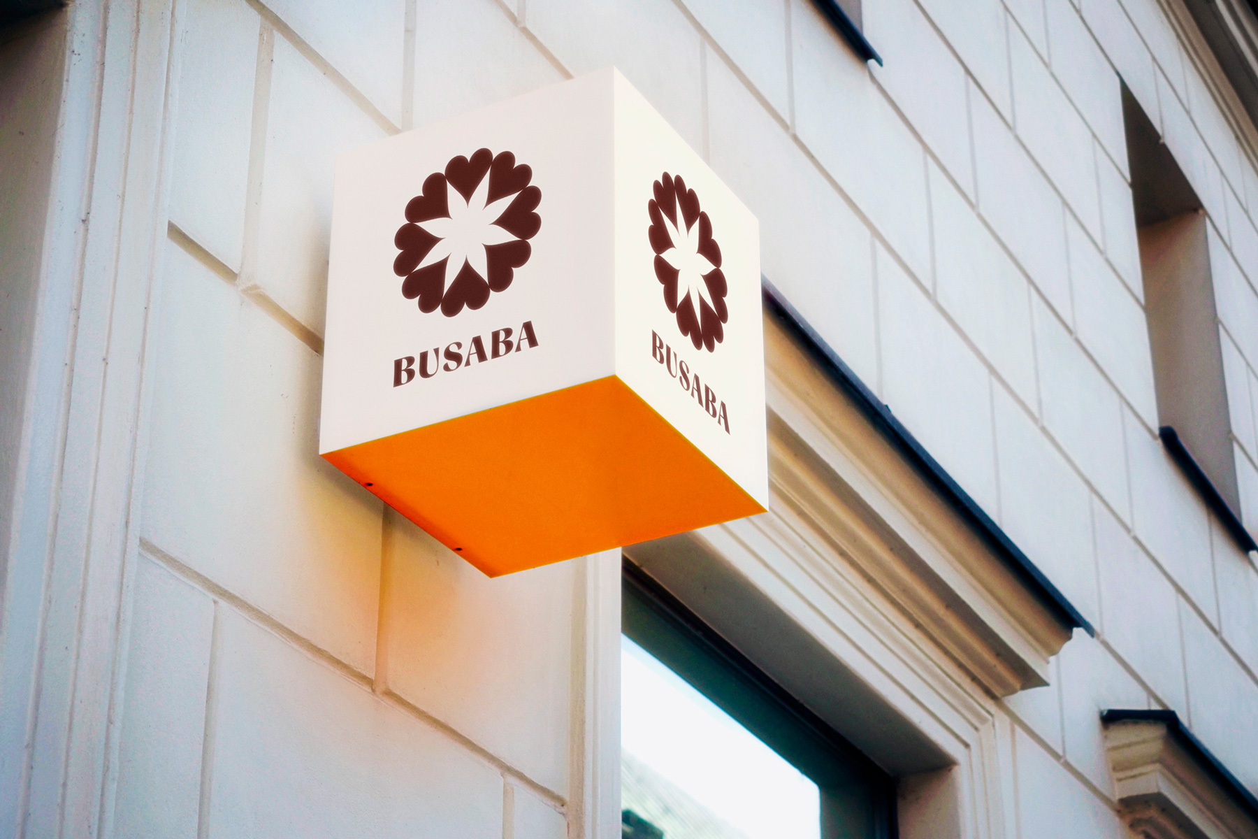
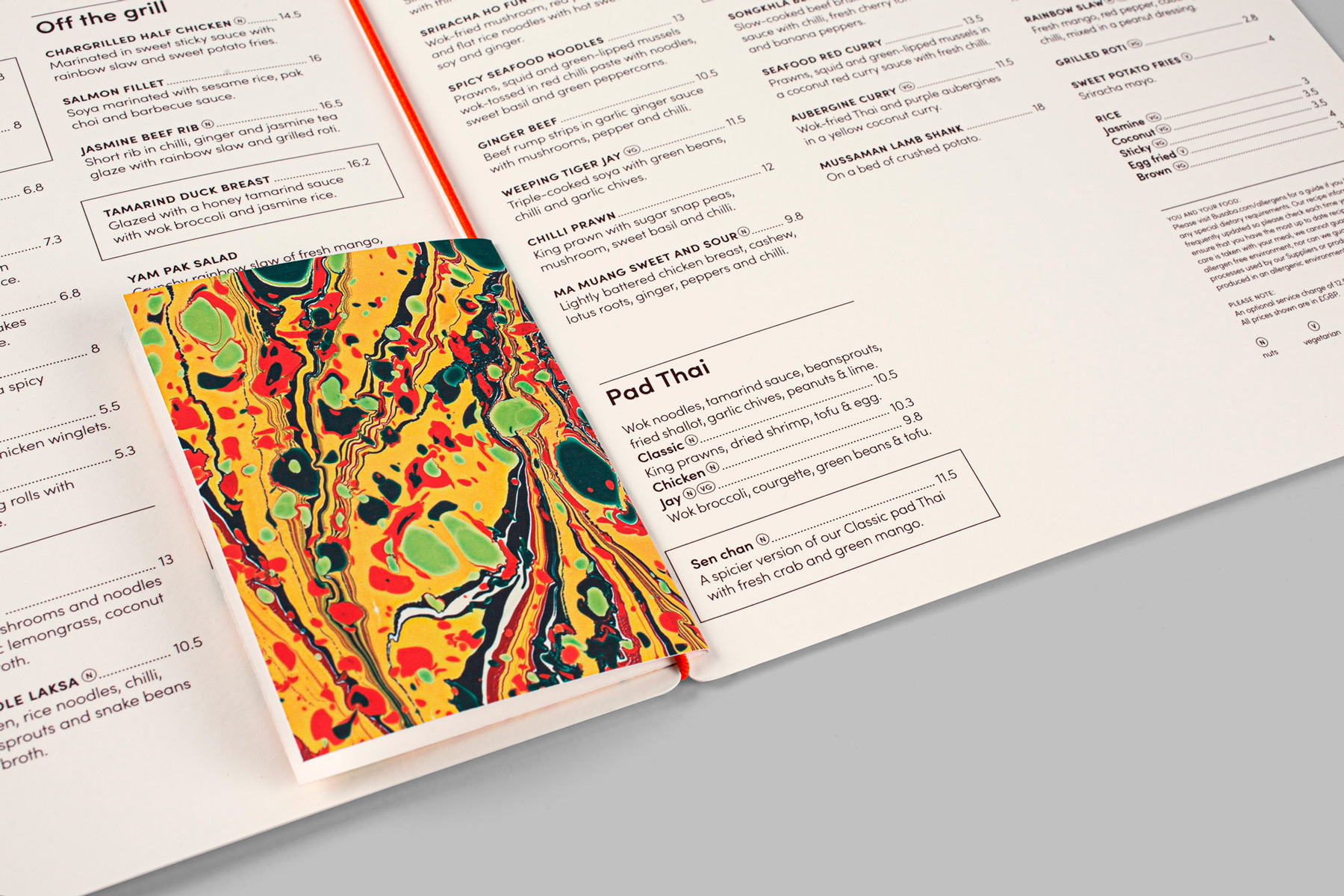
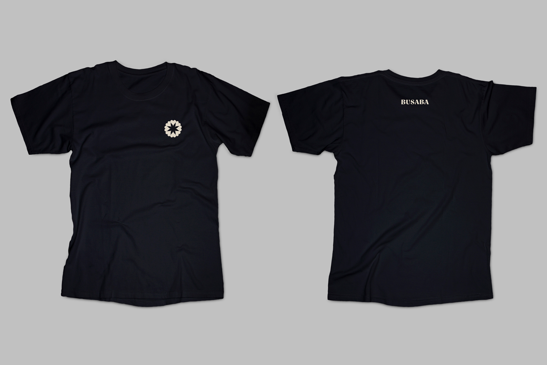
The new identity, launching this week, includes a fresh logo together with extensive brand guidelines, as well as a suite of menus and a team uniform. The full rebrand will be activated over the next year, starting with digital platforms, an advertising campaign and exterior signage at the 13 London restaurants. This comes alongside a full business review that will also see revamps to restaurant interiors and recipes.
When the first Busaba restaurant opened in Soho in 1999, it introduced Londoners to exciting new Thai flavours. Led by renowned restaurateur Alan Yau, it was radical and bold, with inspiring food and modern design. Now, two decades later, while the group has stood the test of time, London’s restaurant scene is more competitive than ever before, with new challenges for the mid-market sector.
The design brief, established earlier this year, was to create an identity rich in meaning, reflecting Busaba’s founding Buddhist philosophy. The aim of the rebrand was to reignite the rituals and symbols in every restaurant, helping to differentiate Busaba from other casual dining operators. This needed to be executed in a way that would communicate confidence, taking pride in Busaba’s 20-year legacy while highlighting brand relevance for modern audiences.
The first phase of the rebrand was the creation of a new brand strategy, encapsulating Busaba’s brand purpose in the phrase ‘happiness and harmony’. This idea was further articulated through a new set of brand values, which informed a 200-word manifesto, directed brand positioning and influenced the creative development.
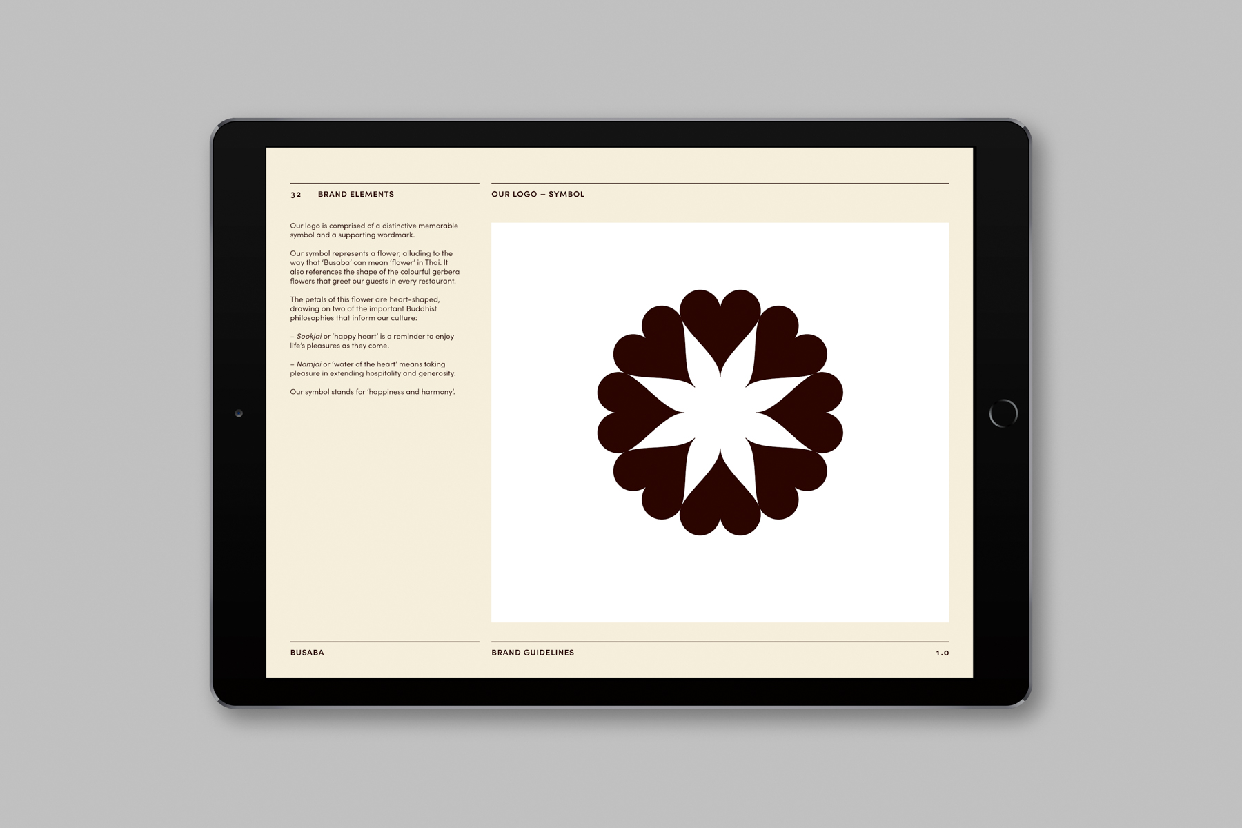
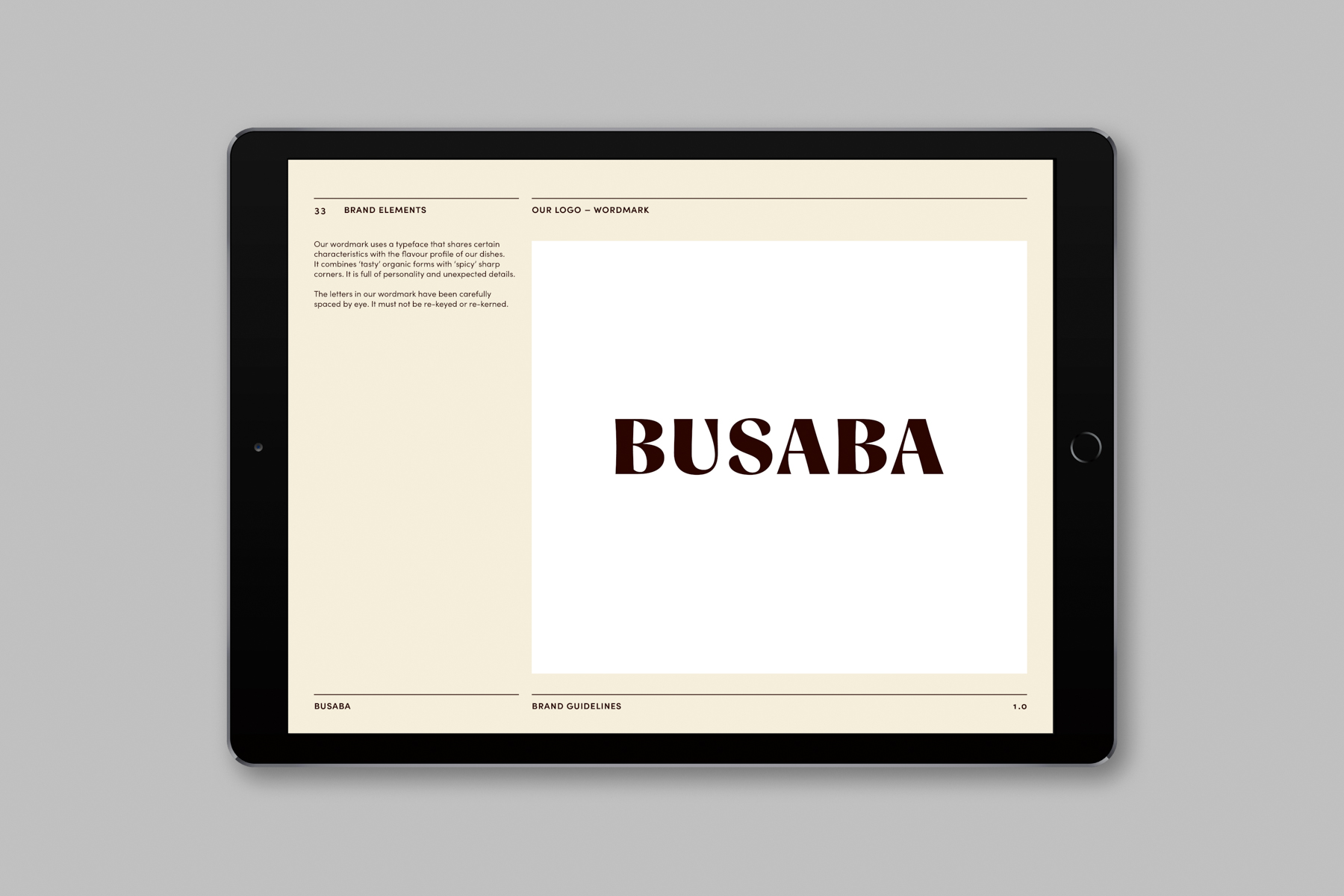
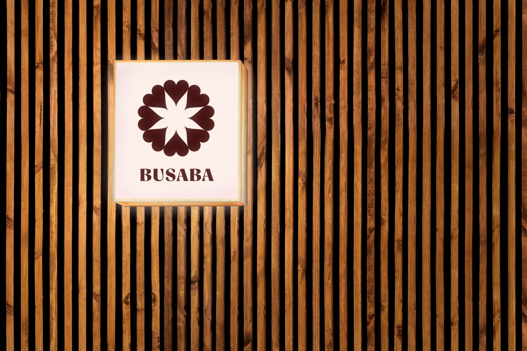
The logo, developed by Paul Belford Ltd, represents a flower, alluding to the fact that ‘Busaba’ can mean ‘flower’ in Thai. It also references the shape of the gerbera flowers that greet guests in every restaurant. In Buddhist teaching, these symbolise impermanence and serve as reminder to live in the present moment.
The petals of the flower logo are heart-shaped, drawing on two of the important Buddhist philosophies that inform Busaba’s culture: ‘sookjai’ and ‘namjai’. ‘Sookjai’, meaning ‘happy heart’, has similarities to the Western idea of mindfulness and involves enjoying life as it comes. Meanwhile the principle of ‘namjai’, or ‘water of the heart’, encourages taking pleasure in acts of hospitality, generosity and kindness.
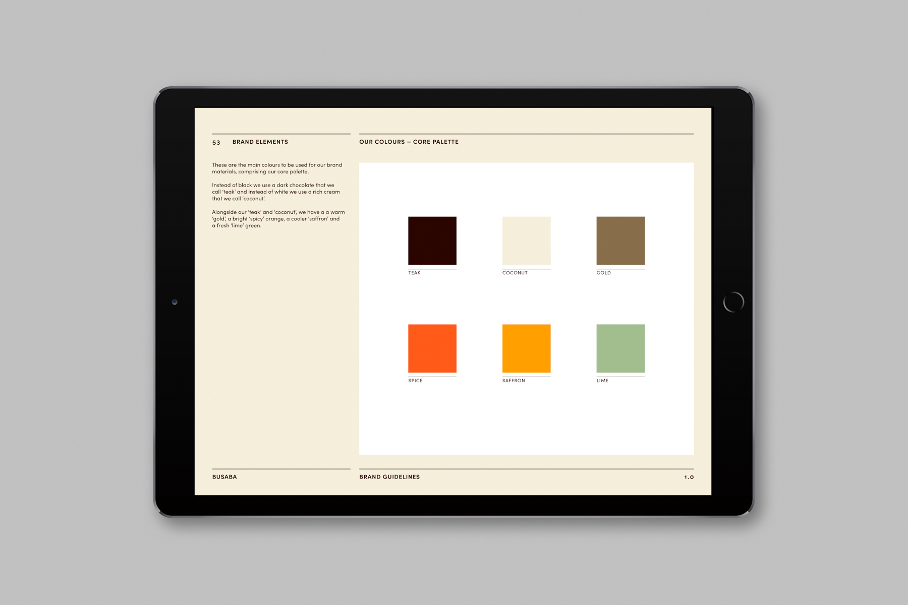
The new brand colours are equally meaningful, referencing the native palette of the restaurants. A deep chocolate called ‘teak’ draws on Busaba’s distinctive dark wood interiors while a warm ‘gold’ foil echoes the atmospheric lighting and brass details. These are complemented by a rich cream called ‘coconut’ and accented by a bright ‘spicy’ orange, a cooler ‘saffron’ and a fresh ‘lime’ green, all inspired by the restaurant’s fragrant dishes.
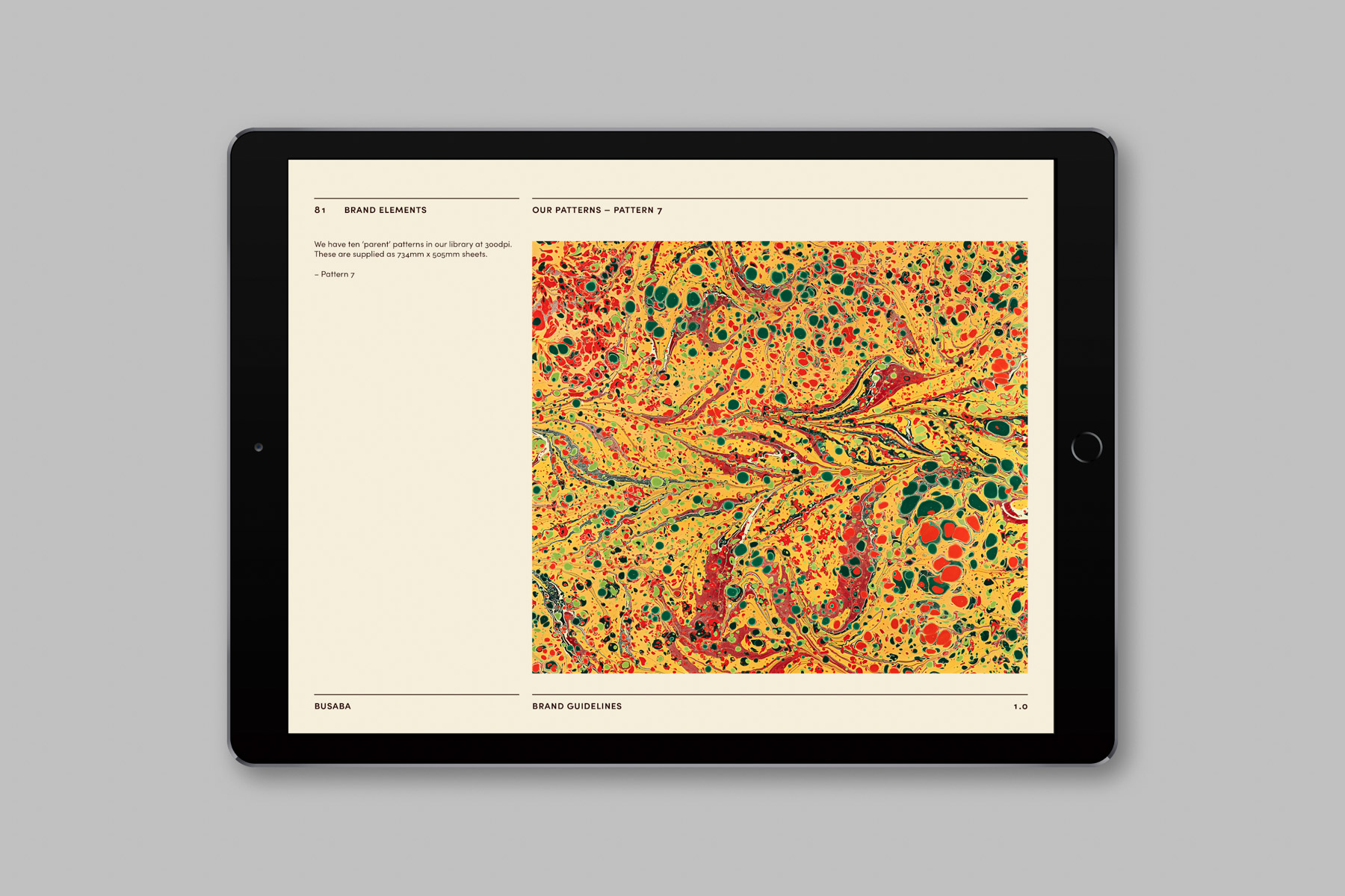
Alongside this colour palette, Paul Belford Ltd has introduced a library of patterns that draw similar inspiration from Busaba’s vibrant sauces, visualising the harmonious mix of flavours in Thai cuisine. These feature excerpts from bespoke marbled papers, produced by artist Rachel Maiden. While the new guidelines encourage a restrained use of colour, these patterns make a bold graphic impact, helping to create a rich and textured brand language.
The typeface chosen for the project is Sofia Pro from French foundry Mostardesign, a clean, modern geometric sans serif with a warm and human feel. Sofia’s rounded curves and open terminals make the font family elegant, friendly and contemporary, and help add personality to brand.
In addition to this, the brand guidelines cover everything from social media and stationery to takeaway packaging and till screens. They also include guidance on icons as well as tone of voice, and are accompanied by a new archive of food imagery with art direction by Paul Belford Ltd and photography by Laurence Haskell.
‘Every Busaba is designed to delight the senses’, creative director Paul Belford explains, ‘The floating flowers, the burning incense, calming music, the Buddhist gong sounded at the beginning and end of every day and – of course – the taste, smell and appearance of delicious Thai dishes. Our aim was to develop a system of brand elements that would help evoke these senses while drawing upon Busaba’s deep-rooted Buddhist spirituality.’
‘Working with Paul Belford on this rebrand has required Busaba to push boundaries, both internally and externally,’ comments Neve Rabbou, the brand’s marketing director. ‘As a 20-year-old brand with plenty of history, we needed an evolution rather than a revolution. Paul and his team led this with creative precision and a deep understanding of our background, ethos and philosophy, injecting relevance back into Busaba while maintaining our roots. The creative process has rejuvenated the brand, making it fresh and beautiful with a clear personality that is true to what we have always stood for.’
The launch of the rebrand will be celebrated in November with a special menu reviving a selection of Busaba’s most popular dishes from the past 20 years, including chilli prawn rice (1999), char kwetio (2002), jungle curry (2006) and crab claw po (2010).
Paul Belford Ltd has developed branding for clients in the food and drink sector including Yo! Sushi, Beanworks, Waddesdon Wine and Belu Water.


CREDIT
- Agency/Creative: Paul Belford Ltd
- Article Title: Paul Belford Ltd Creates New Logo for Busaba in Thai Restaurant Rebrand
- Organisation/Entity: Agency, Published Commercial Design
- Project Type: Packaging
- Agency/Creative Country: United Kingdom
- Market Region: Europe
- Project Deliverables: Brand Advertising, Brand Guidelines, Brand Identity, Brand Redesign, Brand Rejuvenation, Brand Strategy, Branding, Graphic Design, Identity System, Photography, Rebranding, Research, Tone of Voice
- Format: Bag
- Substrate: Pulp Paper


