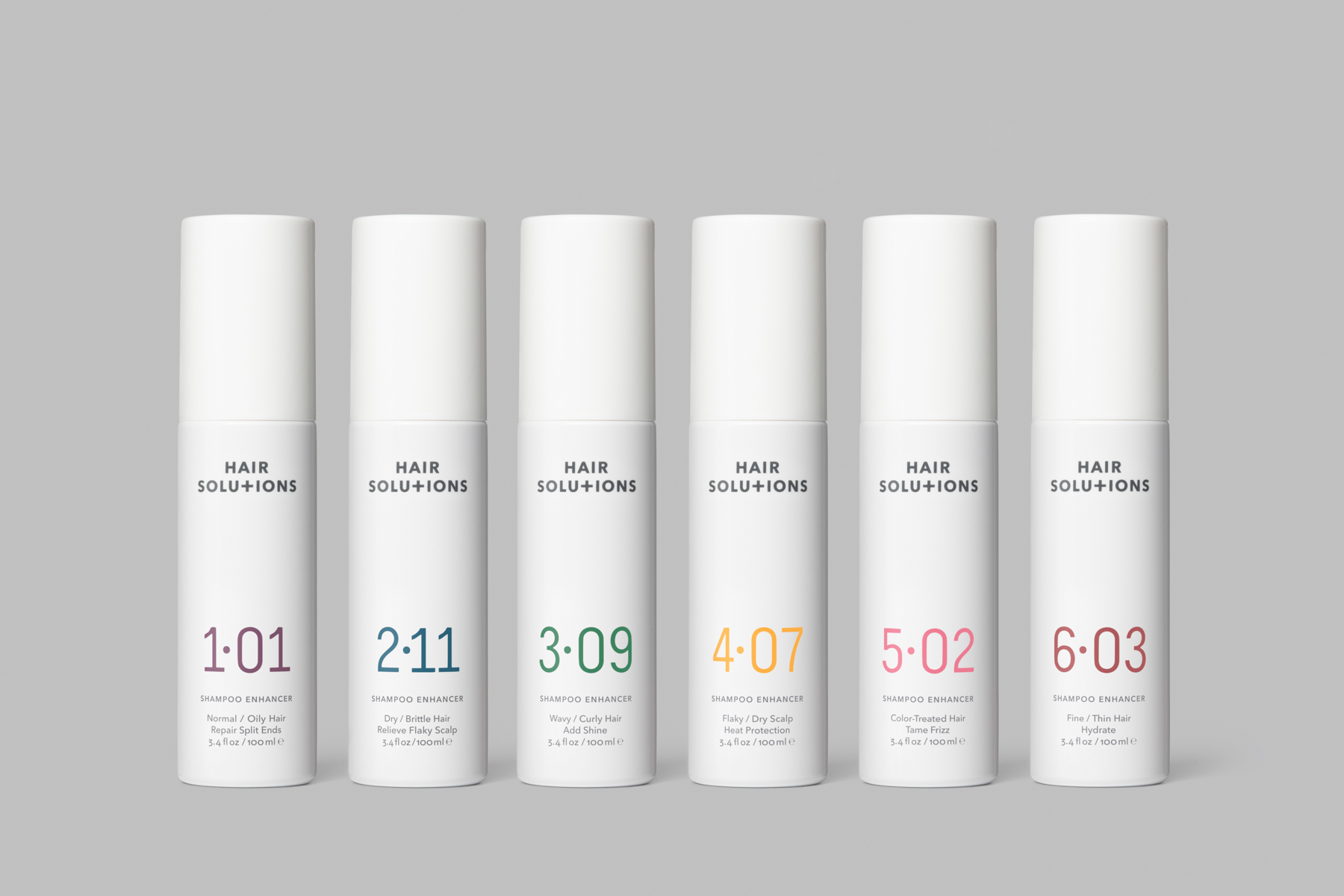
London-based creative agency Paul Belford Ltd recently worked with Hair Solutions, a beauty brand headquartered in Miami, to create branding and packaging for a new range of shampoo enhancers designed to meet the increasing demand for personalisation and customisation in the world of beauty.
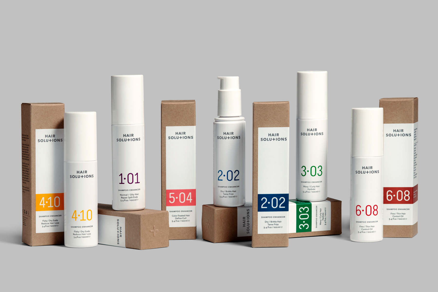
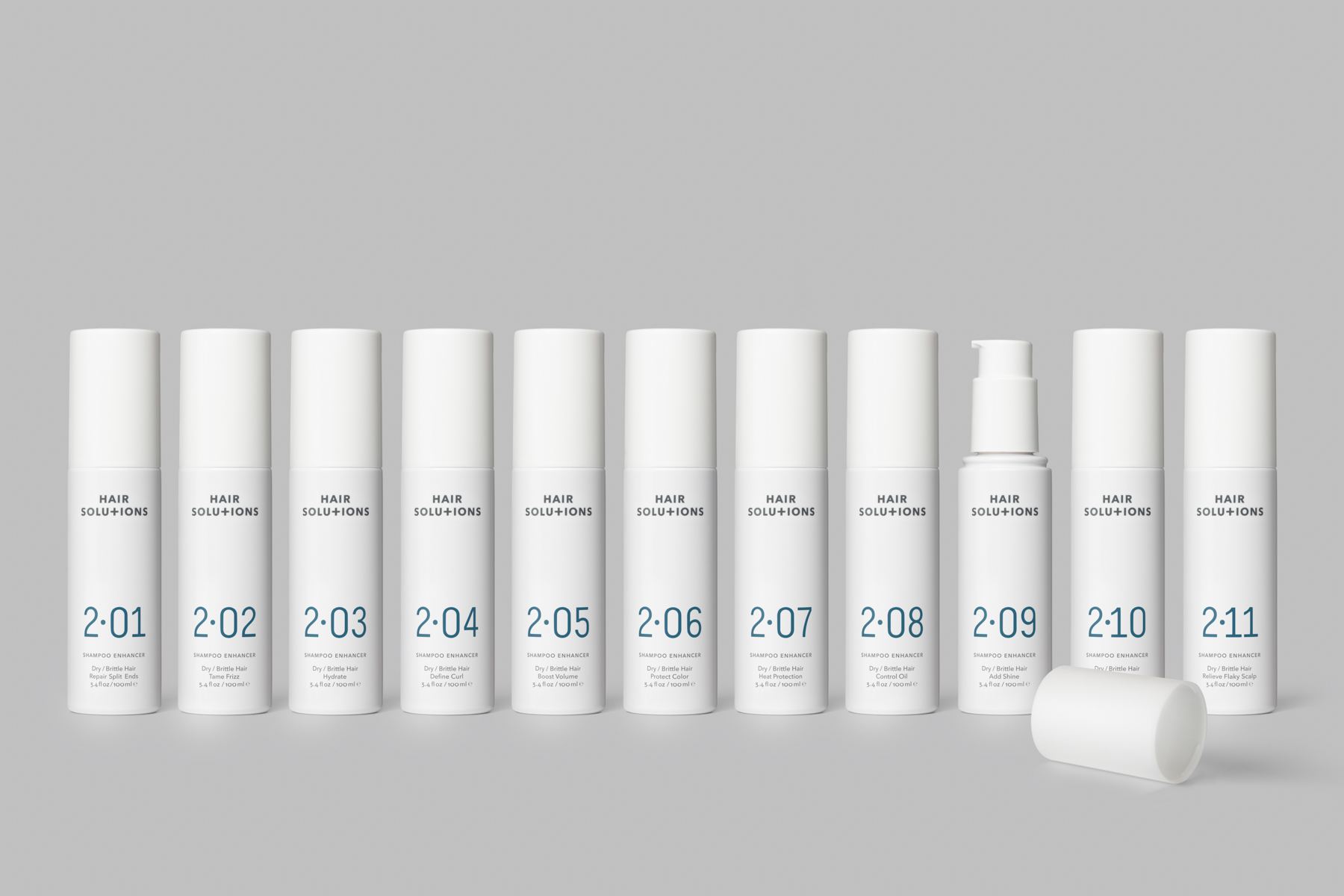
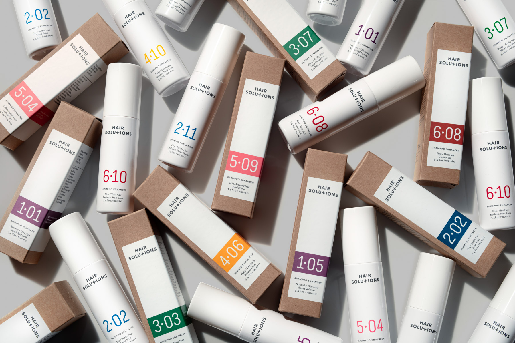
The brand is set to launch with a range of 66 products, each formulated with a unique blend of botanical extracts, suitable for six hair types and targeting eleven hair goals. The products complement the user’s existing haircare routine by improving their everyday shampoo.
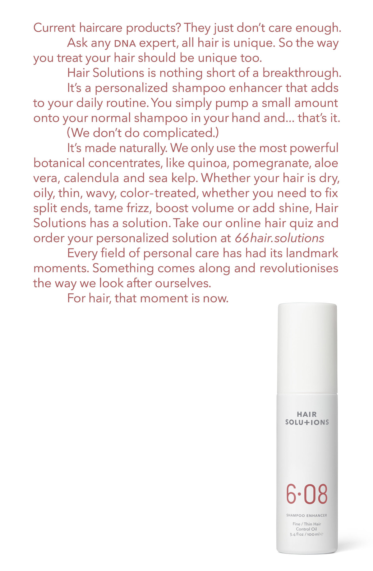
The brand will initially be launched online, before looking to expand retail opportunities in stores and salons. There are also plans to explore other personalised product ranges, such as conditioners, leave-in hair masks, serums and mousses. An online quiz will help users identify the perfect product.
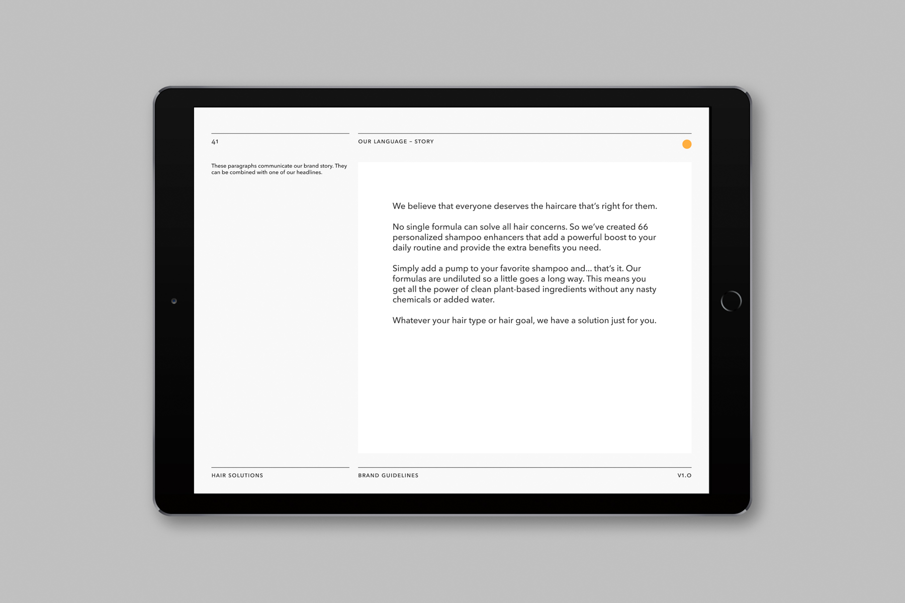
The brief was to create a brand identity that would clearly explain the innovative concept of shampoo enhancement, the variety of products available and the extent of personalisation. This needed to be brought to life through a practical packaging system that would bring order to the complex and extensive SKU line.
A year in development, the project encompasses a logo, typeface and colour palette together with guidelines demonstrating print and digital applications, as well as packaging and photography.
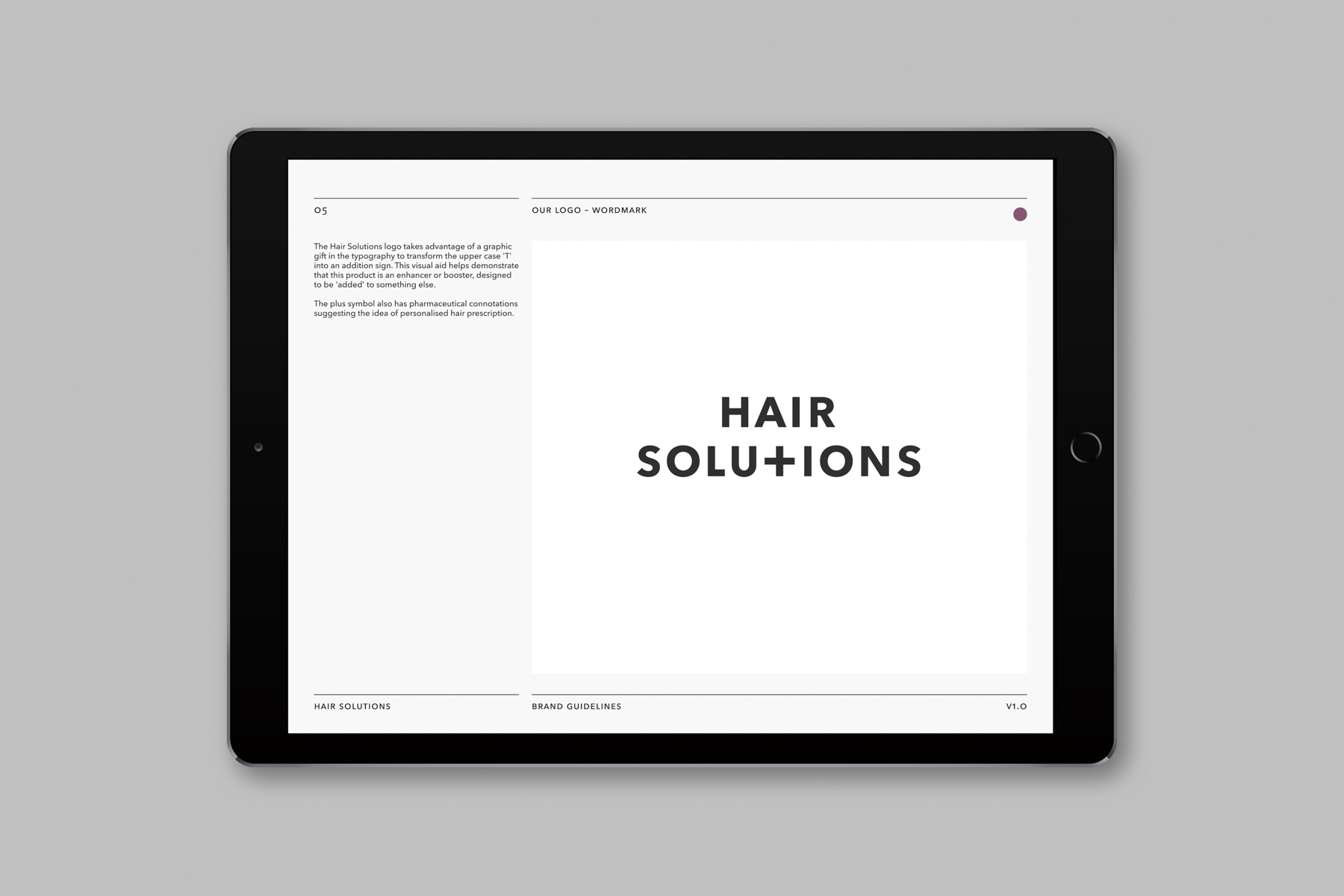
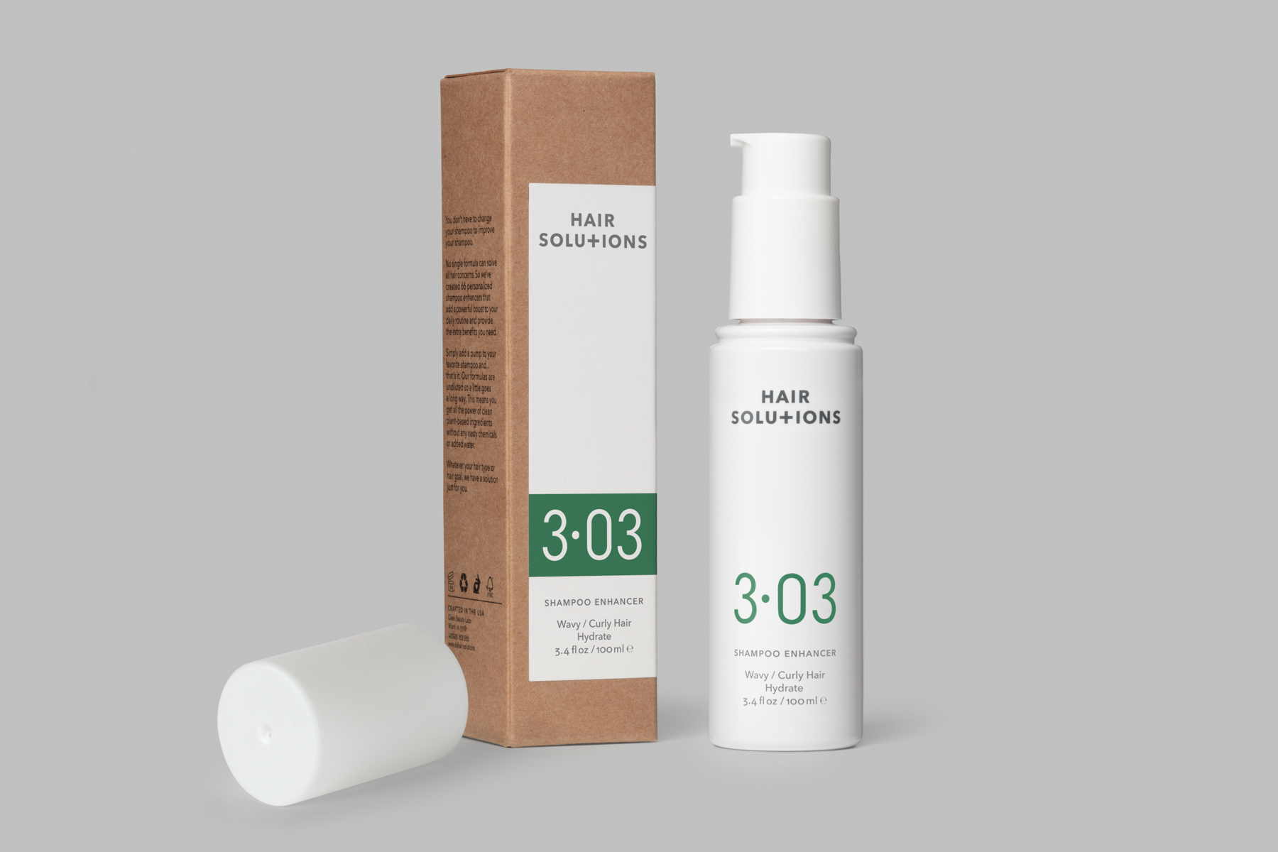
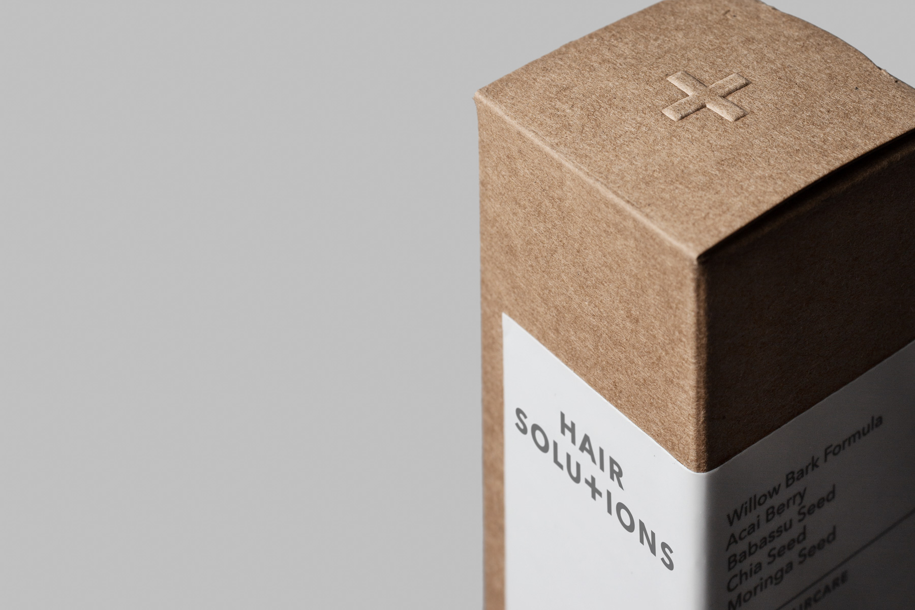
The logo, developed by Paul Belford Ltd, uses typography to transform the upper case ‘T’ into an addition sign. This visual aid demonstrates that the product is an enhancer or booster, designed to be ‘added’ to something else. The plus symbol also has pharmaceutical connotations suggesting the idea of personalised hair prescription with associations of repair, good health and clinical effectiveness.
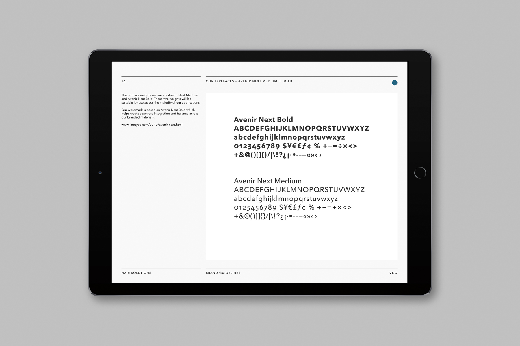
The font family chosen for the project is Avenir Next, a clean, modern geometric sans serif with an organic and crafted human feel. It was selected for its friendliness compared to some other sans serifs, helping to convey the brand values of modernity, innovation, warmth and authenticity.
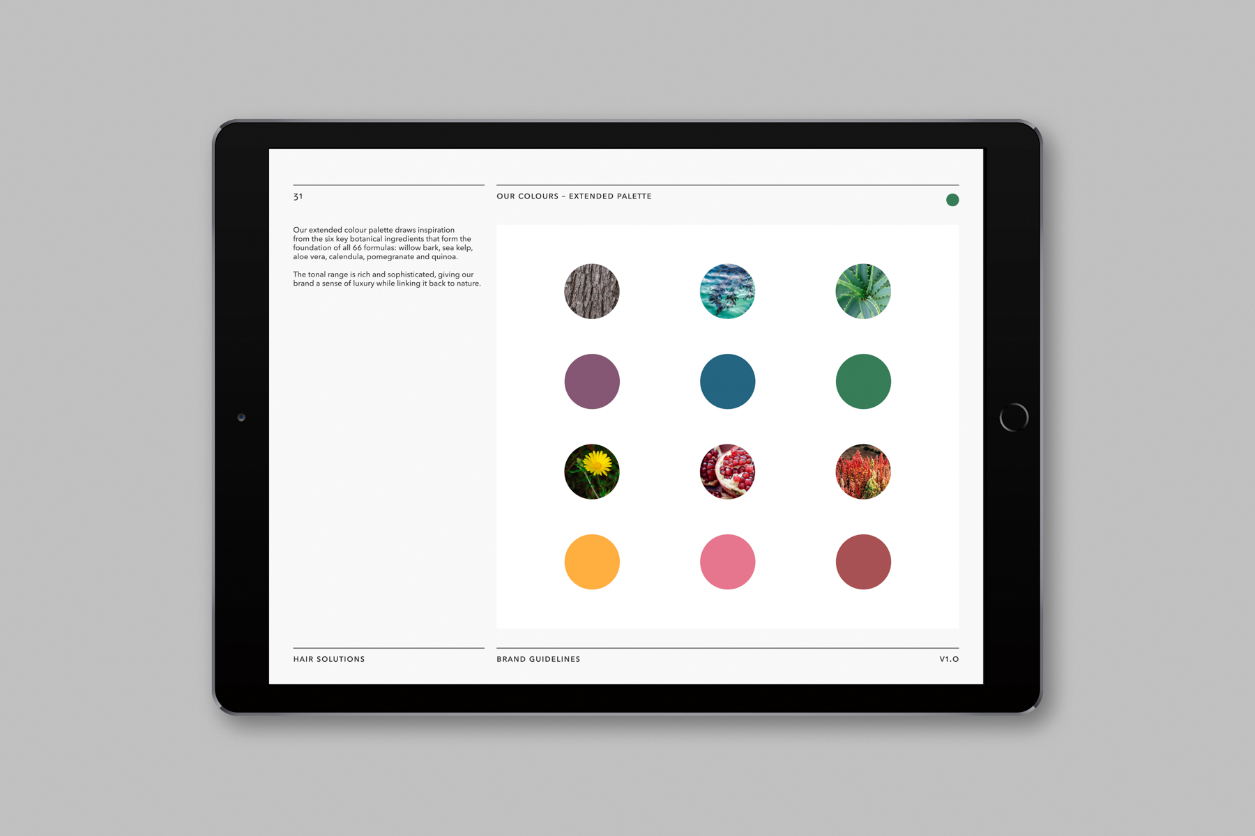
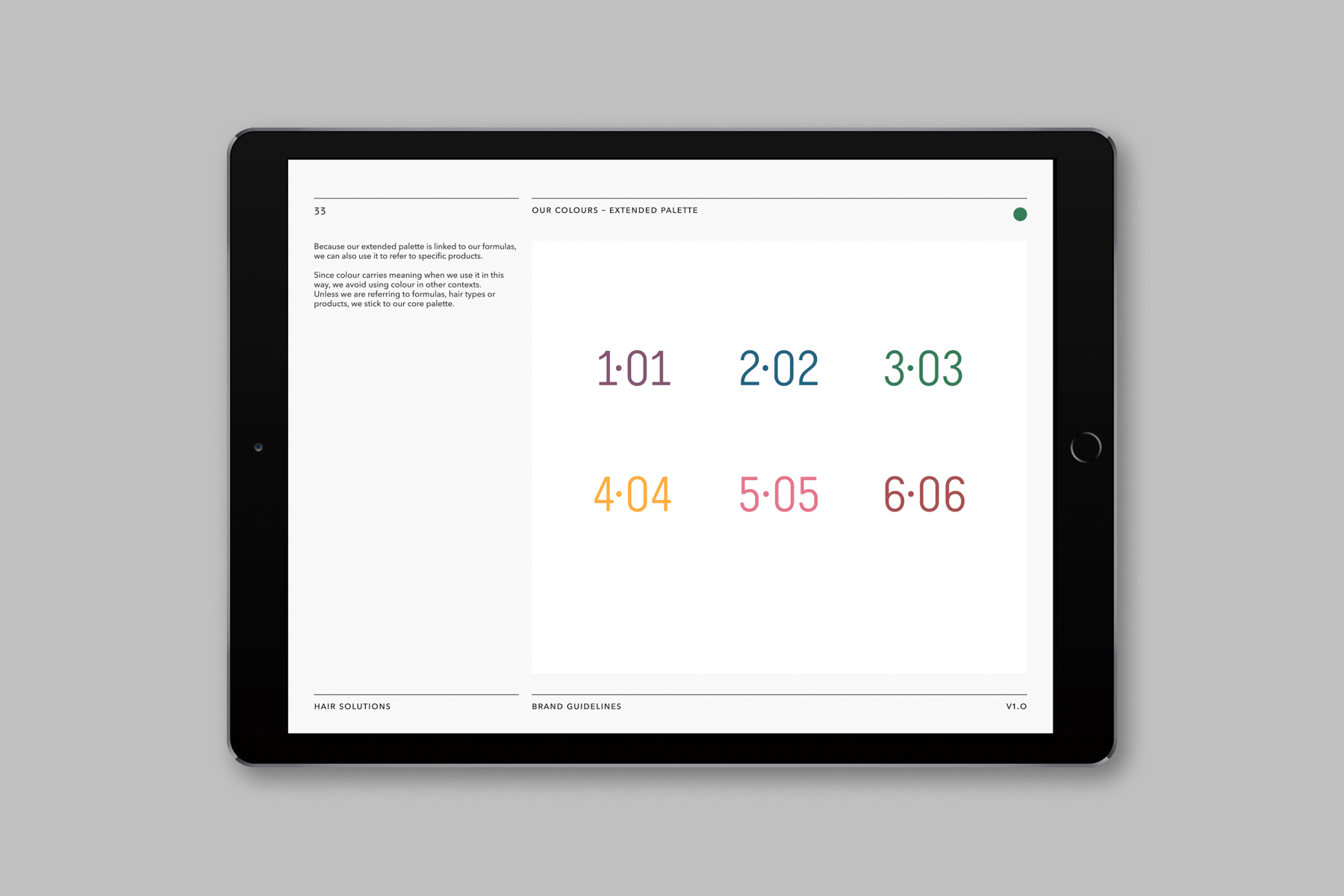
Meanwhile, the extended colour palette draws inspiration from the six key botanical ingredients that form the foundation of all 66 formulas: willow bark, sea kelp, aloe vera, calendula, pomegranate and quinoa. The tonal range is rich and sophisticated, creating a sense of luxury while linking the brand back to nature. Since each of the botanical formulas is intended for a specific hair type, the six colours also represent different user groups.
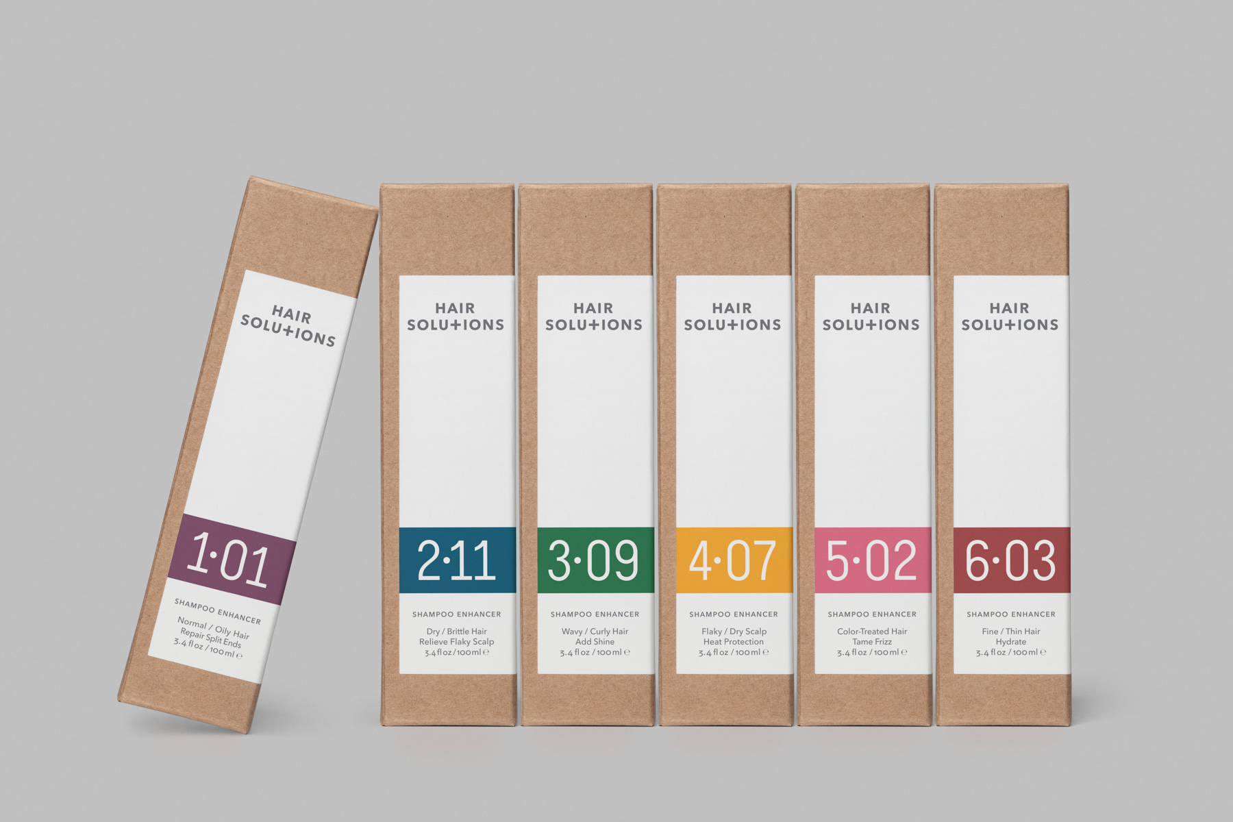
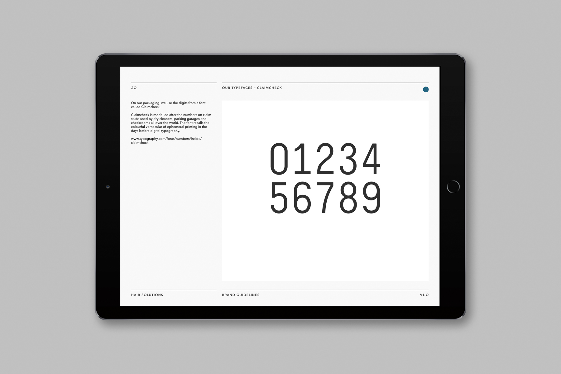
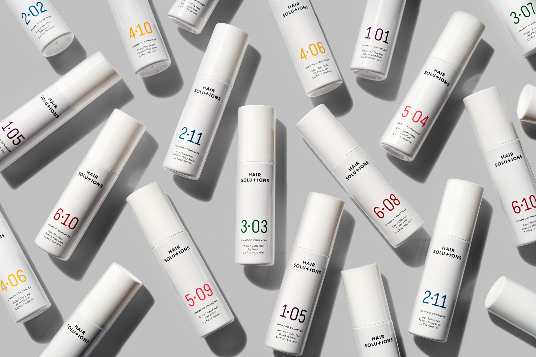
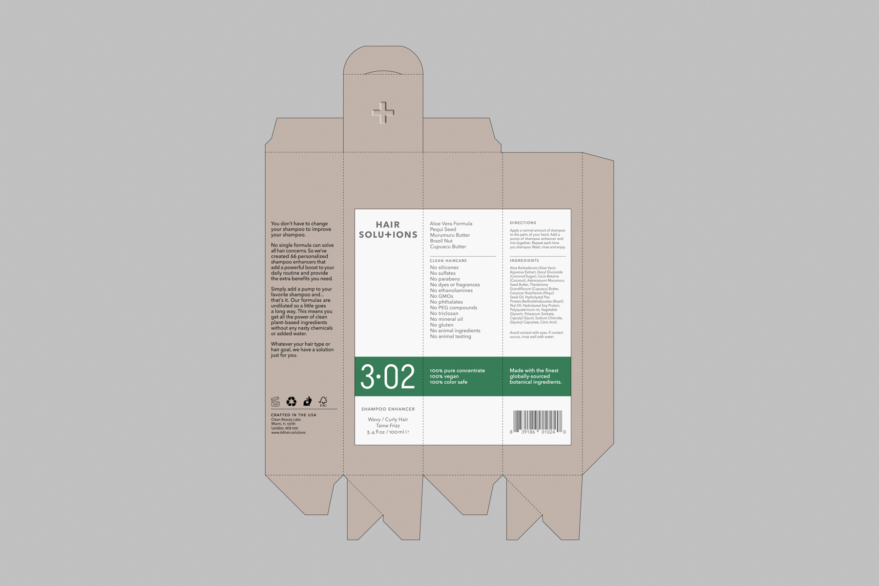
Each colour is clearly differentiated to separate the hair types from one another, acting as a visual guide. This makes the palette central to Paul Belford Ltd’s packaging solution where a graphic language of colour and numbers groups products while conveying both variety and specificity.
This system is supported by the natural cues of kraft paper and blind embossing, reflecting the brand’s commitment to responsible manufacture, and its emphasis on ethical sourcing and transparent chains of production. All packaging is FSC (Forest Stewardship Council) certified, while the product ingredients are vegan, cruelty-free and eco-conscious.
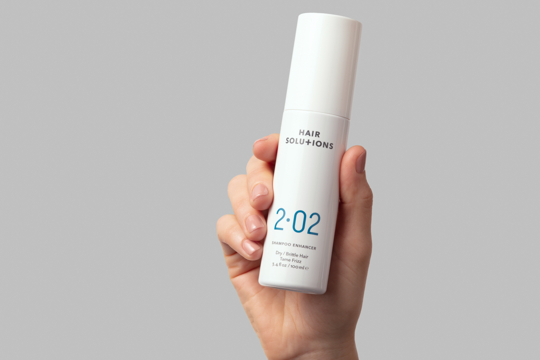
Photography is also central to the new identify, helping to showcase the scale of the product range and the extent of personalisation offered by the brand, with art direction by Paul Belford Ltd and photography by Laurence Haskell. The photography style is clean, minimal and considered with a grey background to give the white packaging impact.
Creative director Paul Belford says: ‘One of the big design challenges with Hair Solutions was creating a system that could clearly differentiate, yet consistently brand 66 different products (and also future-proof for possible expansion of the product line). The colour coding/numbering system achieves that, together with a simple, clean minimal design and the graphic gift of changing the cap ‘T’ to a plus symbol in the logo.’
Paul Belford Ltd has developed branding and packaging for clients including Osofor, Soap Co., Me + My, Beanworks, Waddesdon Wine and Belu Water.
###
CREDIT
- Agency/Creative: Paul Belford Ltd
- Article Title: Paul Belford Ltd Creates Branding and Packaging for Hair Solutions New Personalised Haircare Range
- Organisation/Entity: Agency, Published Commercial Design
- Project Type: Packaging
- Agency/Creative Country: United Kingdom
- Market Region: Multiple Regions
- Project Deliverables: Brand Advertising, Brand Creation, Brand Identity, Brand Naming, Brand Strategy, Branding, Graphic Design, Identity System, Packaging Design, Photography, Product Naming, Research, Tone of Voice
- Format: Bottle
- Substrate: Plastic


