Nestled in the heartlands of Mexico, where the sun’s golden embrace blankets in the rugged terrain, a remarkable group of women known as Las Patronas radiates boundless compassion. They stand as a beacon of hope for weary souls traversing their land in search of a brighter tomorrow. These migrants, escaping the clutches of poverty, violence, and oppression, embark on a perilous journey aboard “La Bestia” or “The Beast” the infamous freight train, in pursuit of the promised sanctuary of the United States and Canada.
For decades, Las Patronas have stationed themselves on the platform of La Patrona, a humble town in Veracruz, extending sustenance, hydration, and aid to the migrants clinging to the sides of the thundering train. Their tireless endeavors have rescued countless lives and kindled hope in the bleakest of hours. Yet, their narrative remained largely untold, confined to the pages of news outlets and the pixels of computer screens.
Within this gap between their noble deeds and the wider world’s awareness, a seed of an idea began to germinate—a concept that would burgeon into a movement of empathy and solidarity. Thus, Patronas was born—a subsidiary of the nonprofit Las Patronas—dedicated to amplifying awareness of their mission and supporting migrants through gastronomic means.
The vision was clear: to bring the rich flavors of Mexico to the Canadian market through authentic pre-made meal kits, each mouthful a tribute to the resilience and fortitude of the migrants aboard La Bestia. However, Patronas transcended mere culinary enterprise; it aims to emerge as a conduit for social transformation, a platform for storytelling, and a beacon of hope for those yearning for a brighter tomorrow.
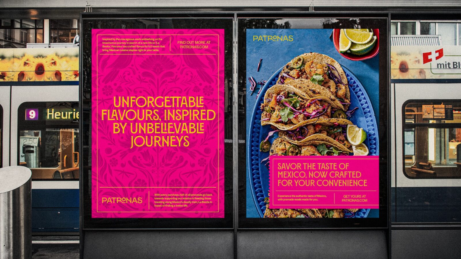
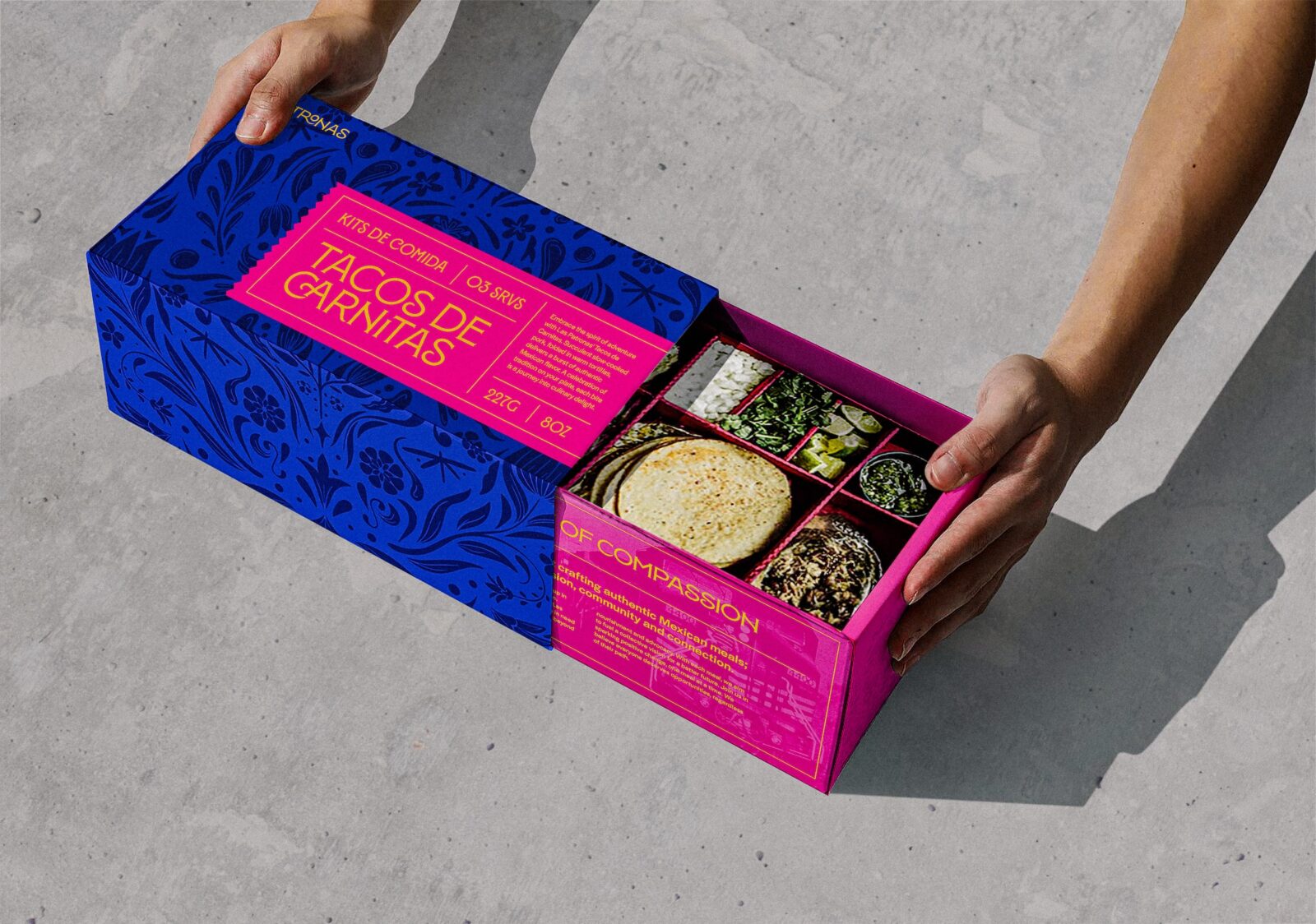
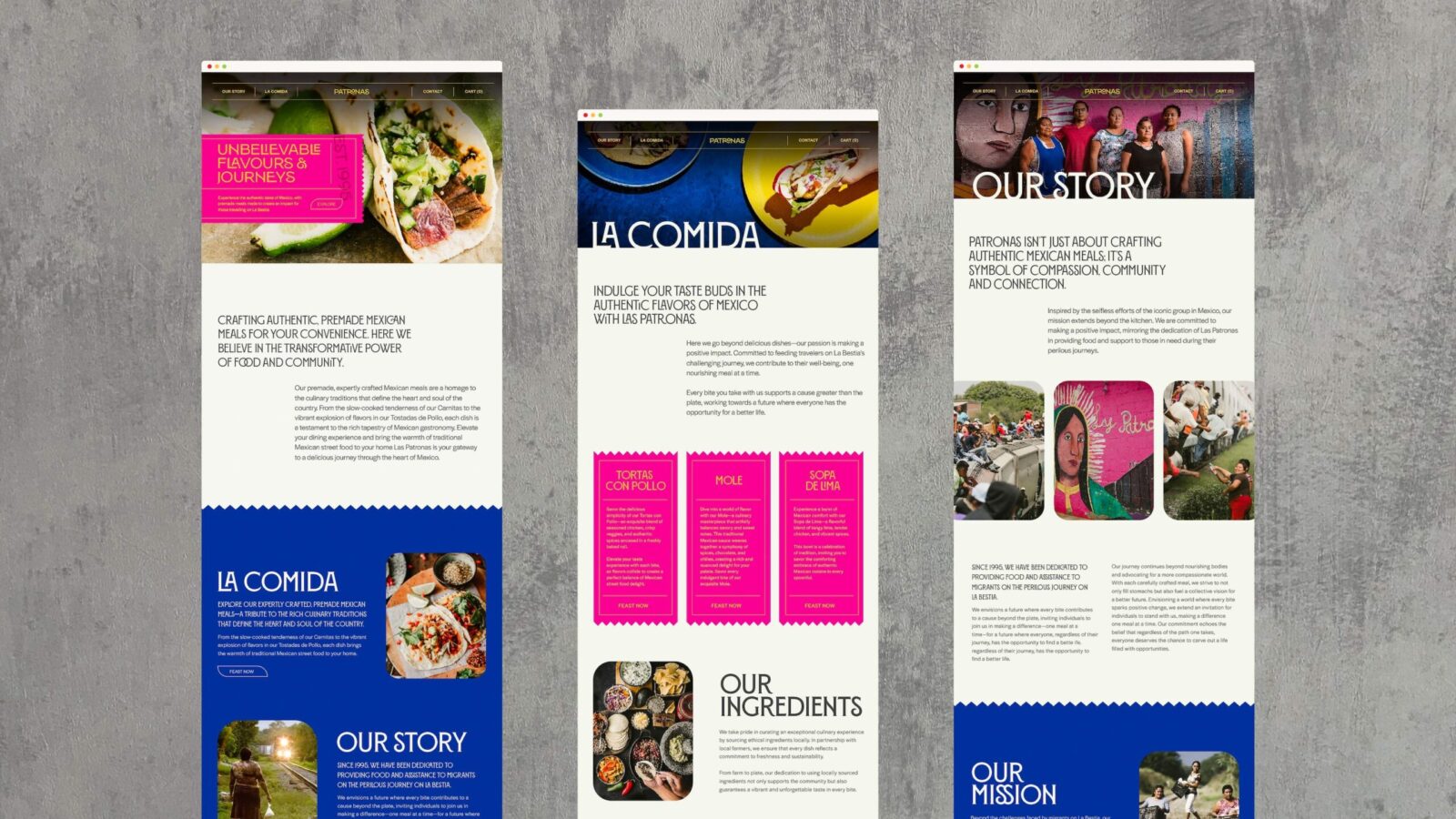
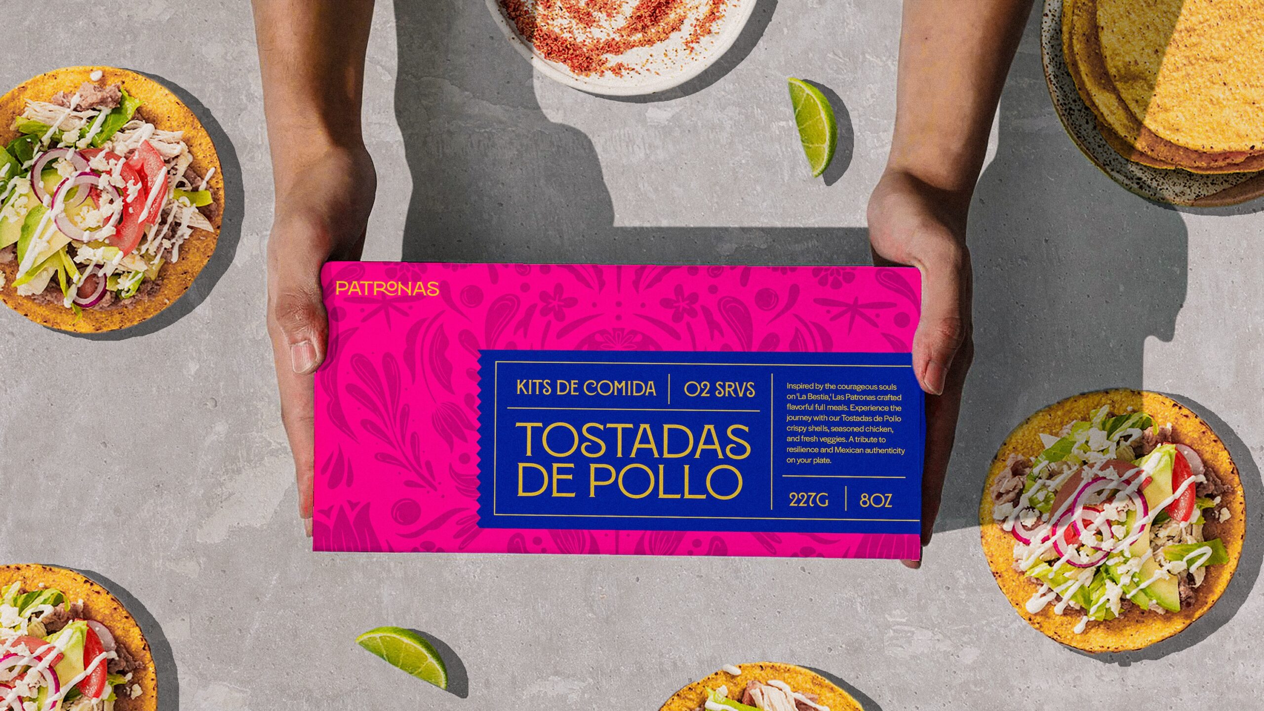
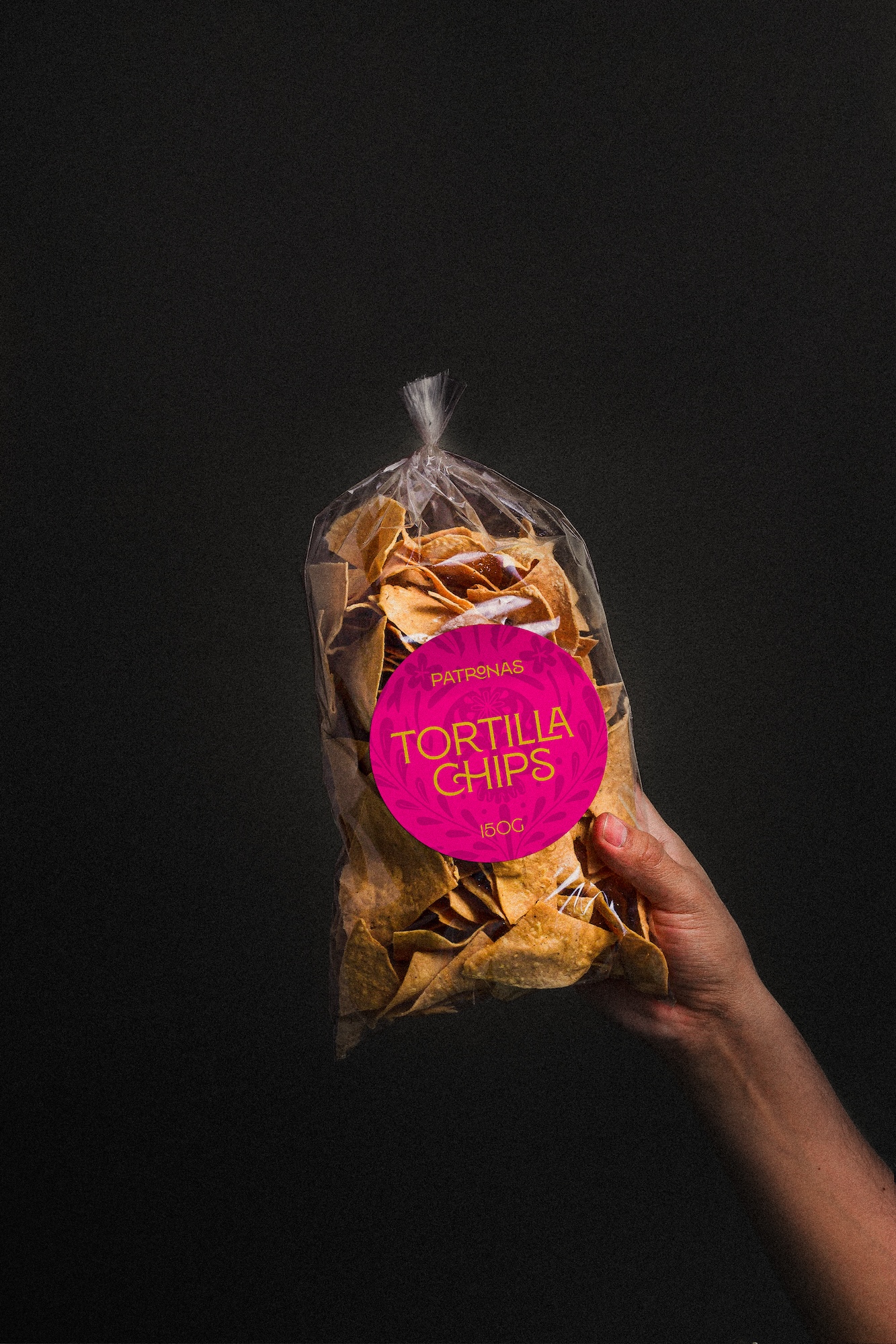
To encapsulate the essence of Las Patronas and the migrant experience, Patronas’ visual identity was infused with layers of symbolism and significance. Drawing inspiration from vintage train tickets of the 1950s, the brand’s logo and packaging paid homage to the historic roots of migration and the enduring quest for liberty and opportunity. Vibrant hues and a subtle vintage aesthetic mirrored the vivacious tapestry of Mexican culture, all while the dynamic color palette reflected the diversity and intricacy of Mexican cuisine.
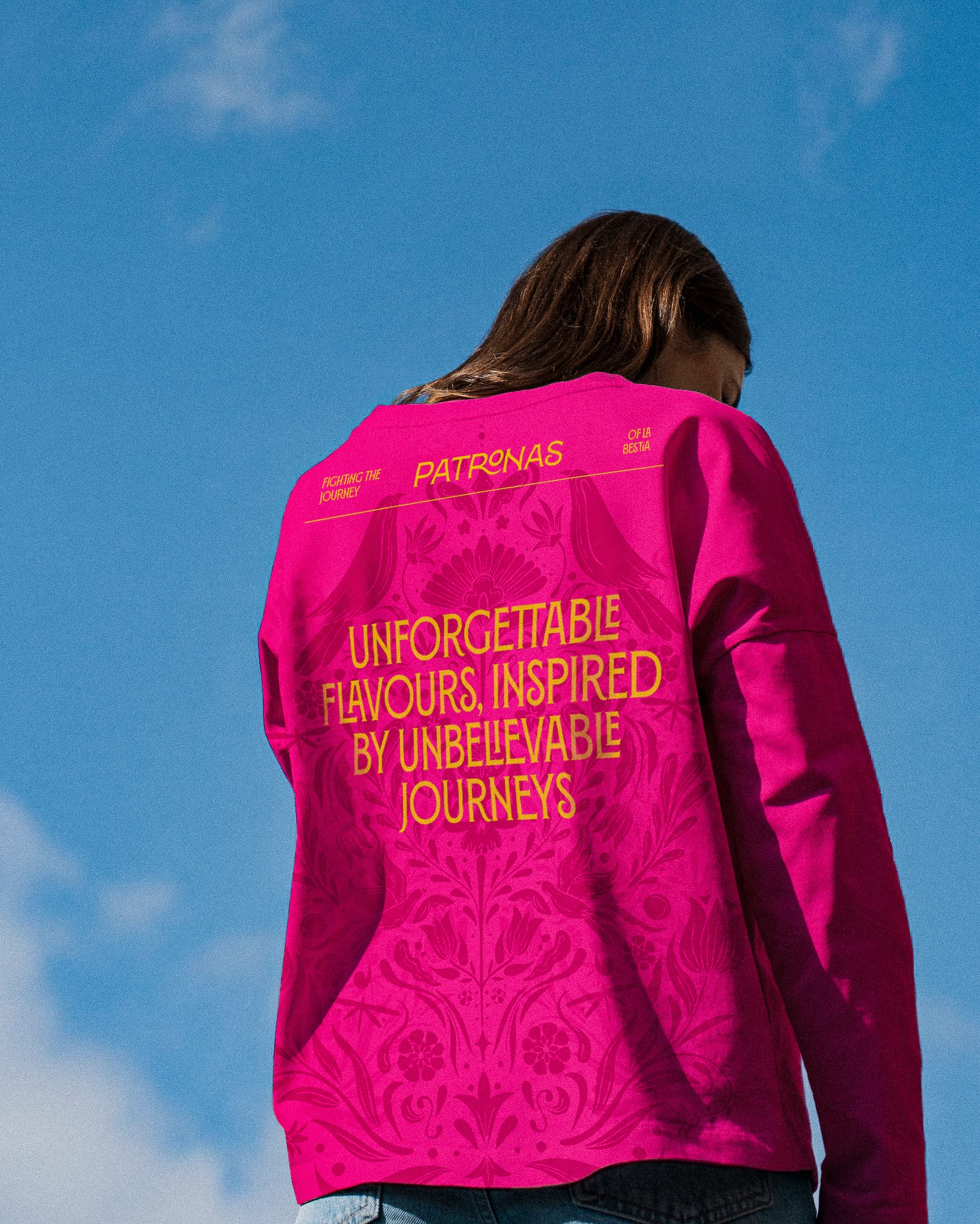
Yet, it was in the minutiae that Patronas truly flourished. The typography, reminiscent of 1950s calligraphy and the spirited graphics adorning Mexico’s bustling streets, evoked a sense of nostalgia and resilience. Illustrative patterns, inspired by Mexican street art and the indomitable spirit of migrants on La Bestia, narrated a tale of freedom, adversity, peril, and beauty—a narrative interwoven into every fiber of Patronas’ essence. Amidst these patterns, birds soared gracefully, their wings stretched in flight, echoing the aspirations of migrants seeking a brighter horizon. These avian symbols evoked a sense of exploration and possibility, beckoning customers to embark on a voyage of discovery through the flavors and narratives encapsulated within each Patronas meal kit. At the heart of the pattern lay a skull, a potent symbol of mortality and the dangers faced by those braving the journey on La Bestia. Its presence served as a stark reminder of the hazards inherent in migration, yet also attested to the resilience and courage of those who dared to dream of a better life. Amidst the swirling motifs, delicate flowers bloomed, their petals a testament to resilience and hope amidst adversity. The floral elements then celebrated the beauty discovered in unexpected places, reminding us that even in the depths of struggle, there exists space for growth and renewal.
Together, these elements composed a symphony of colors and shapes, a visual testament to the strength and beauty discovered amidst adversity. Through its pattern illustration, Patronas captured the essence of the migrant experience, inviting customers to embrace the journey and stand in solidarity with those who dared to dream.
To harmonize the visual identity, the pattern’s overlapping layers crafted a richer narrative imbued with a humanistic essence, echoing the notion of embracing imperfection, akin to the resilient women of Las Patronas who might hypothetically hand-print the design themselves.
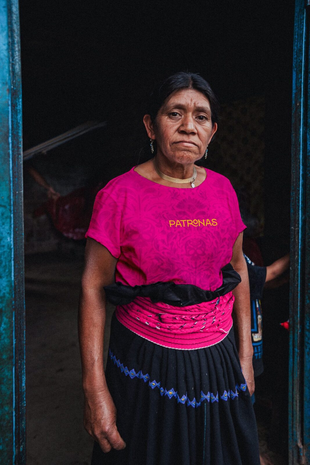
At the core of Patronas lies the art of storytelling. Through captivating photography, the brand goal is to breathe life into the profound narratives of those journeying on the train. These visuals serve not merely as snapshots but as windows connecting the Canadian audience to the poignant stories behind the brand.
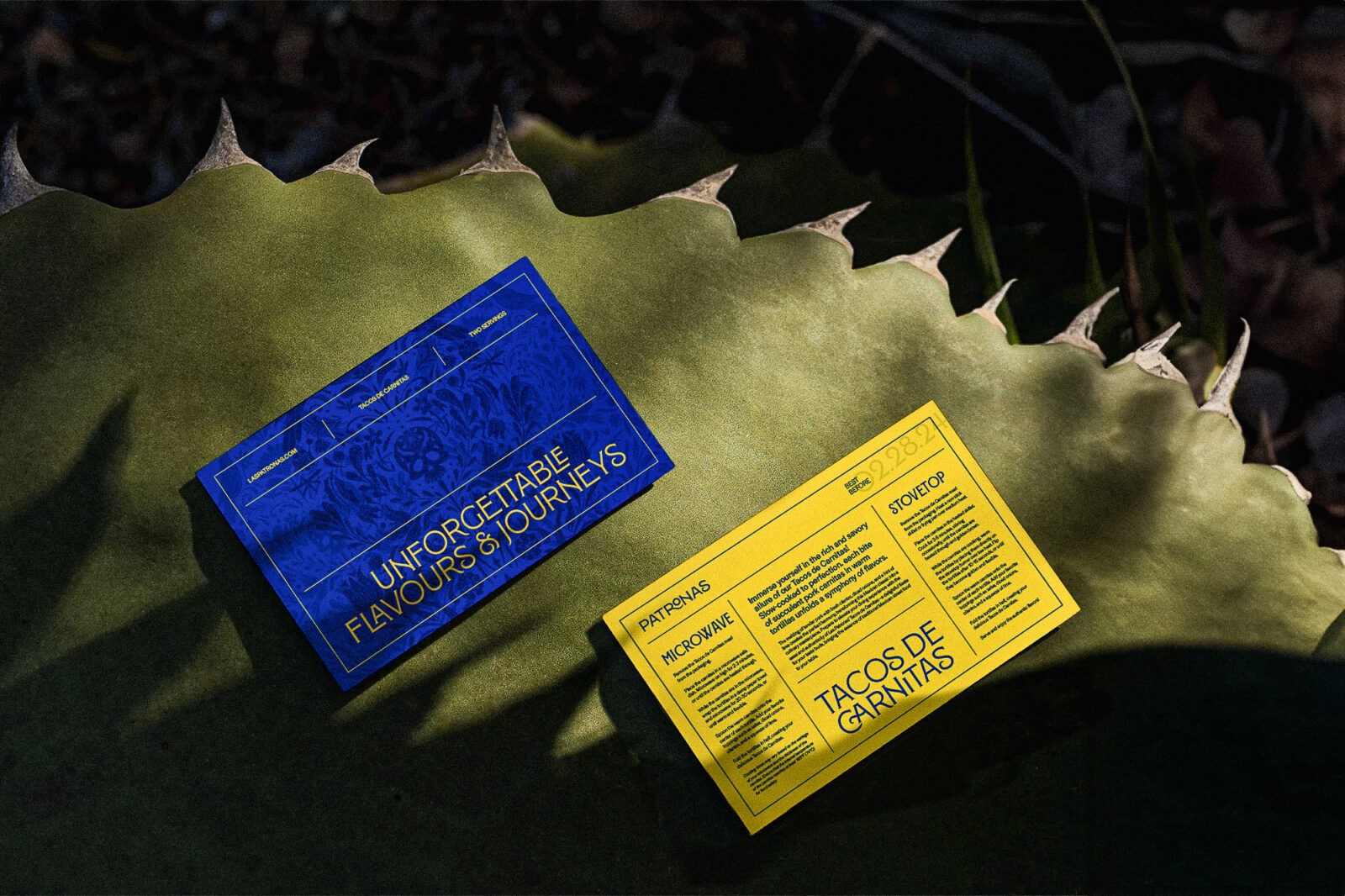
When customers open a Patronas box, it’s not merely about unveiling delicious food; it’s about unraveling narratives. The packaging design transcends mere sustenance; its an immersive experience and casts a spotlight on the experiences and adversities encountered by migrants on the perilous journey of La Bestia. Each box includes additional details about Patrona’s story and the individuals traveling on La Bestia within the edges of the inside of the box, fostering a deeper connection between the brand and its customers. Accompanied by a postcard guiding people on how to fully savor the meal, the packaging ultimately promotes empathy and engagement, encouraging customers to cherish each bite.
In essence, Patronas symbolizes not just a culinary endeavor, but a testament to resilience, empathy, and the power of storytelling. Through every meal kit and packaging detail, it strives to honor the courage of migrants, amplify awareness, and foster a deeper connection between communities, all while celebrating the beauty found amidst adversity.

CREDIT
- Agency/Creative: Bella Sanchez
- Article Title: Patronas’ Visual Identity Weaves a Story of Migration, Resilience, and Mexican Heritage by Student Bella Sanchez
- Organisation/Entity: Student
- Project Status: Non Published
- Agency/Creative Country: Canada
- Agency/Creative City: Surrey
- Project Deliverables: Brand Creation, Brand Design, Brand Identity
- Industry: Food/Beverage
- Keywords: WBDS Student Design Awards 2024/25
- Keywords: WBDS Student Design Awards 2024/25
-
Credits:
Educational Institution: Wilson School of Design - Graphic Design for Marketing
Educator's Name: John Belisle


