Percept – Patou
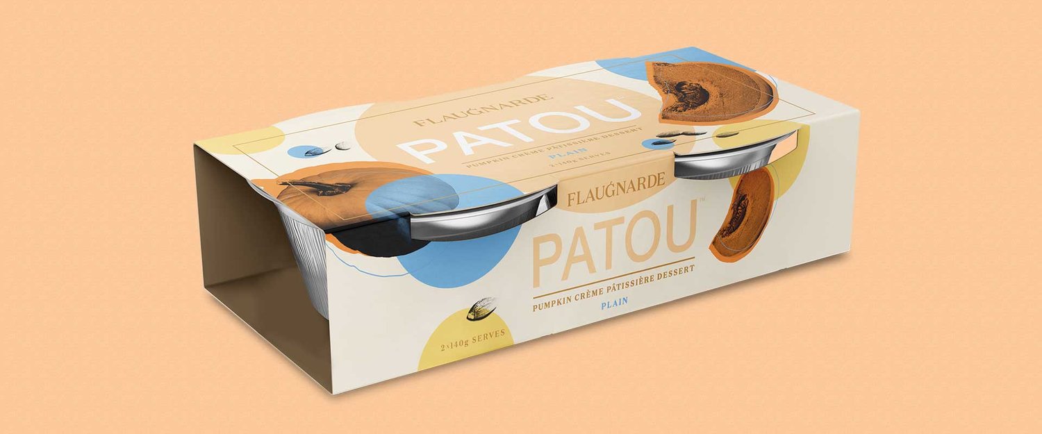
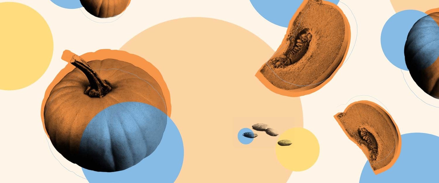
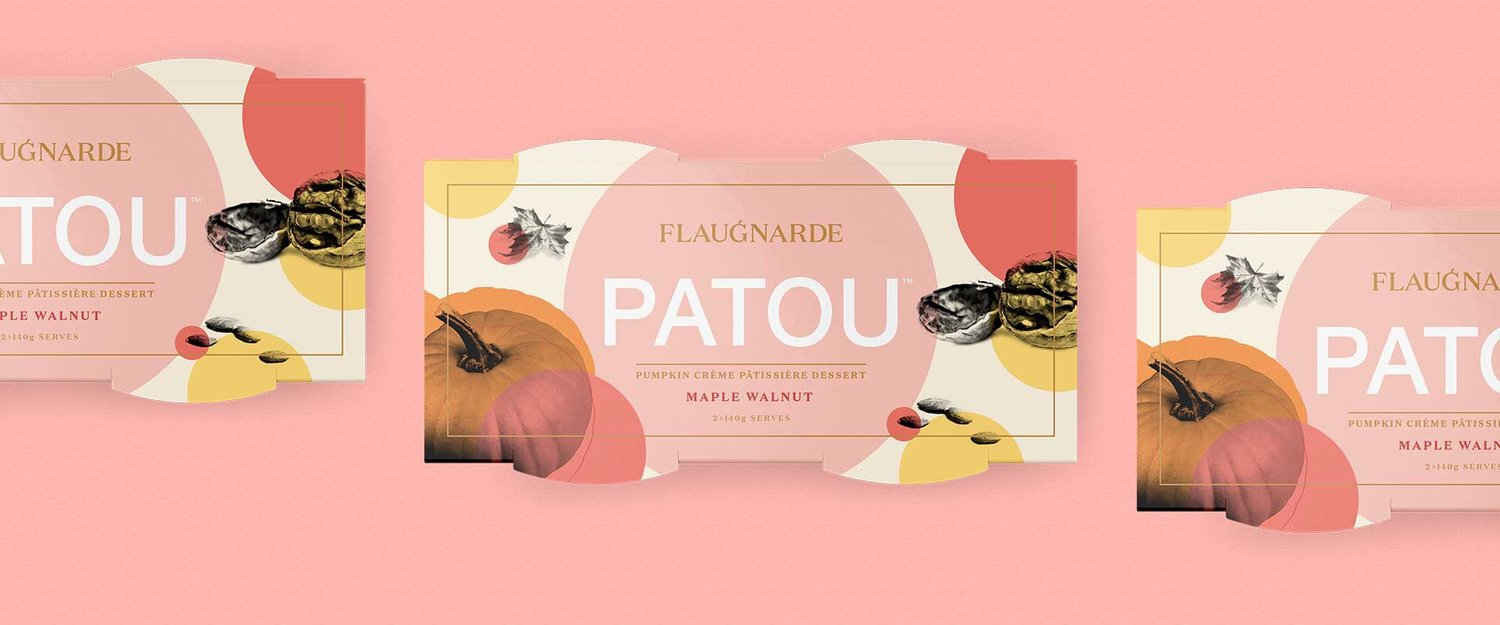
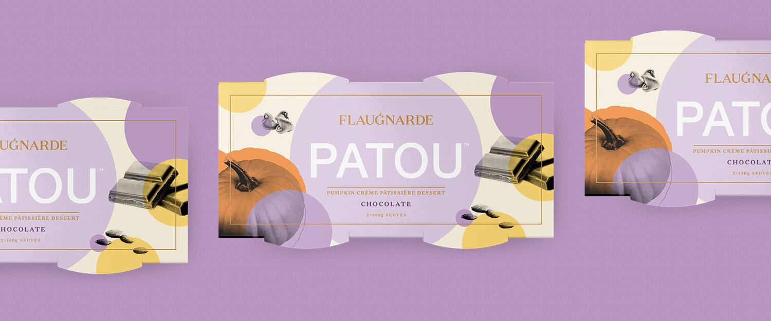
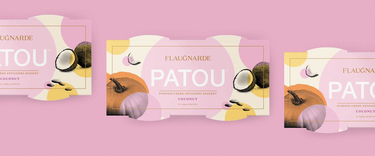
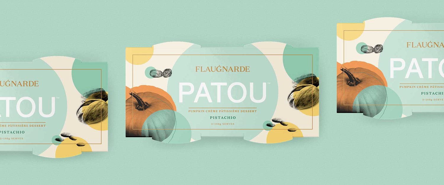
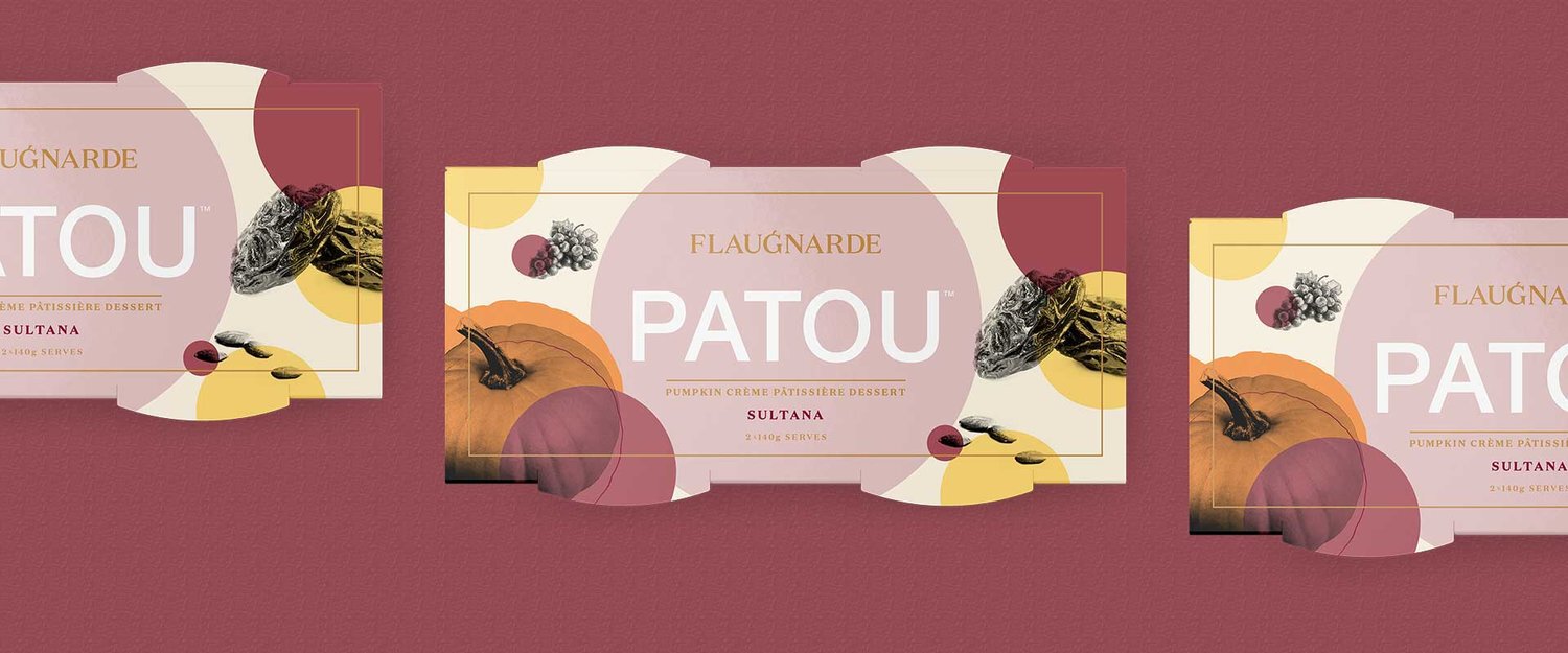
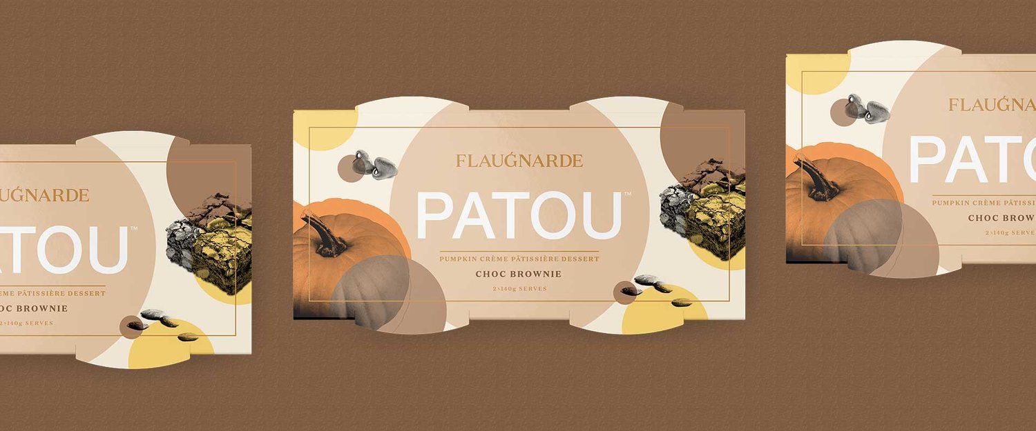
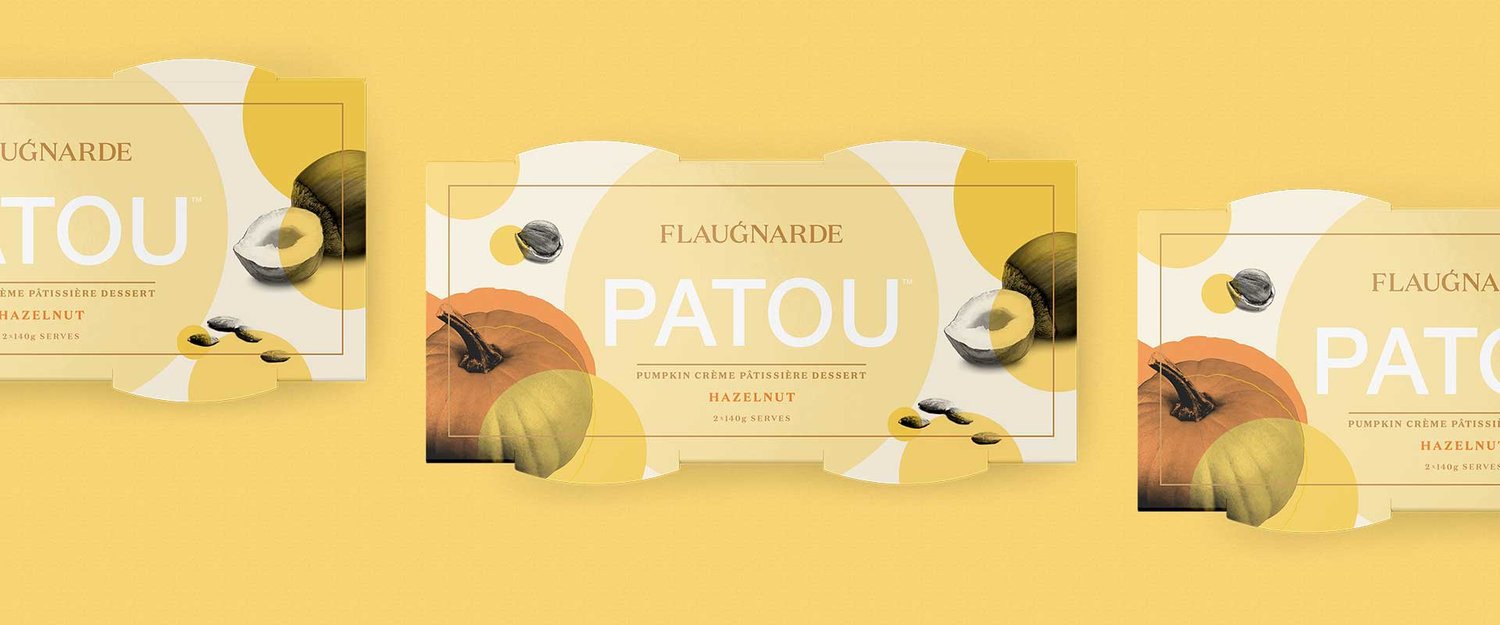
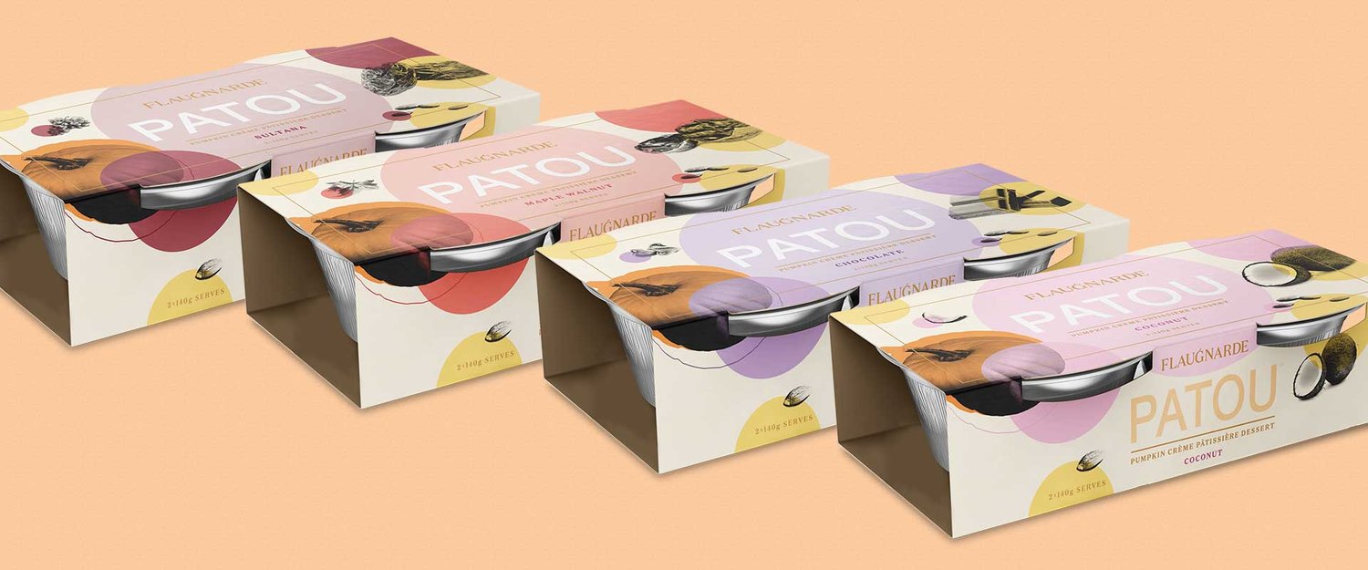
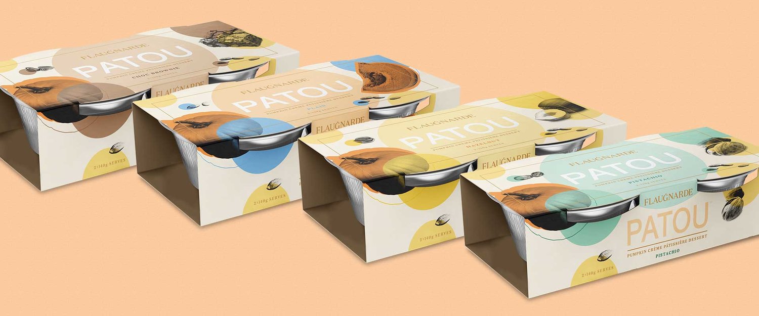
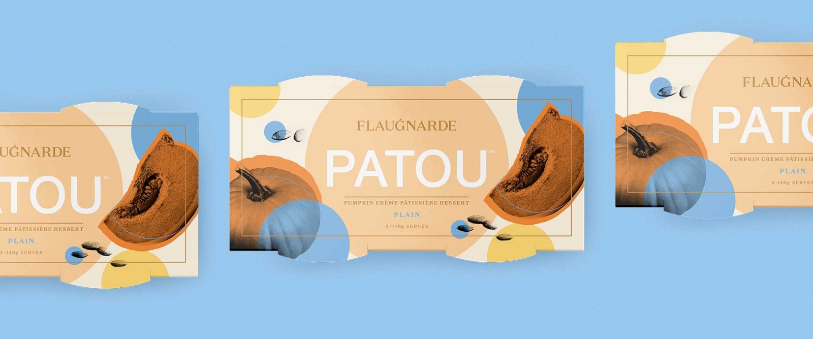
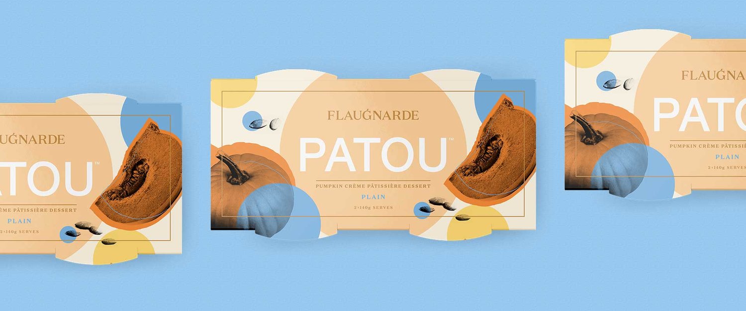
Flaugnarde is a family-run company born from traditional family recipes. It brings exciting new premium dessert products to the Australian market.The client needed a master brand identity and packaging design for their flagship dessert ‘Patou’, a savoury-sweet combination of pumpkin and creme patisserie.The master brand logotype design is an elegant wordmark with European influences. The typography is given personality by adding a pumpkin stem to the letter ‘G’ — a subtle celebration of the brand’s flagship product. On pack, the logo is treated with gold foil stamping, a delicate and luxurious touch.Combining sophisticated typography with pop-art-inspired illustration, Patou is a dessert that shines in the premium dessert category. The communication hierarchy was also considered during the packaging design process to ensure a consistent look and feel for all future product line extensions.The balance of bright colour splashes and brave illustrative style creates a packaging solution that challenges category conventions, standing out for the right reasons.After the successful launch of the flagship product, Percept were again appointed to create the packaging design for the full range of flavours as the brand becomes more and more popular in stores throughout Australia.