Path – Oppo Ice Cream Sticks
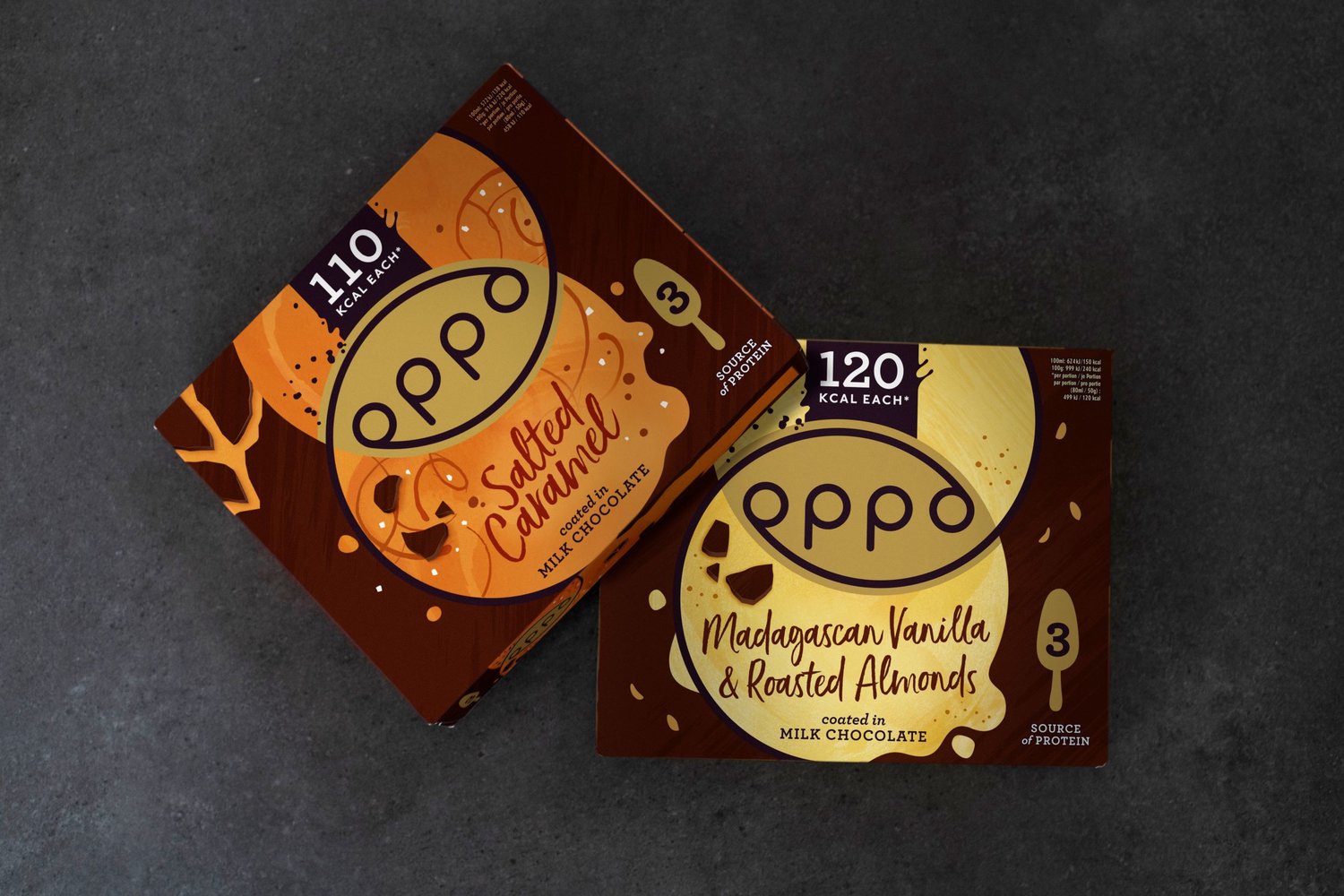
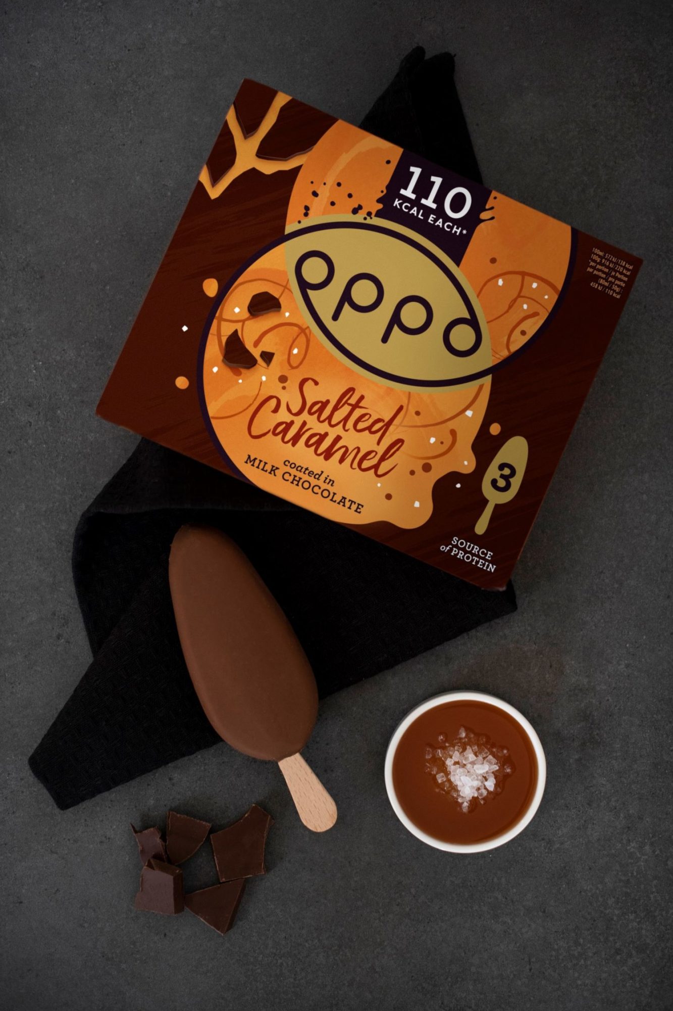
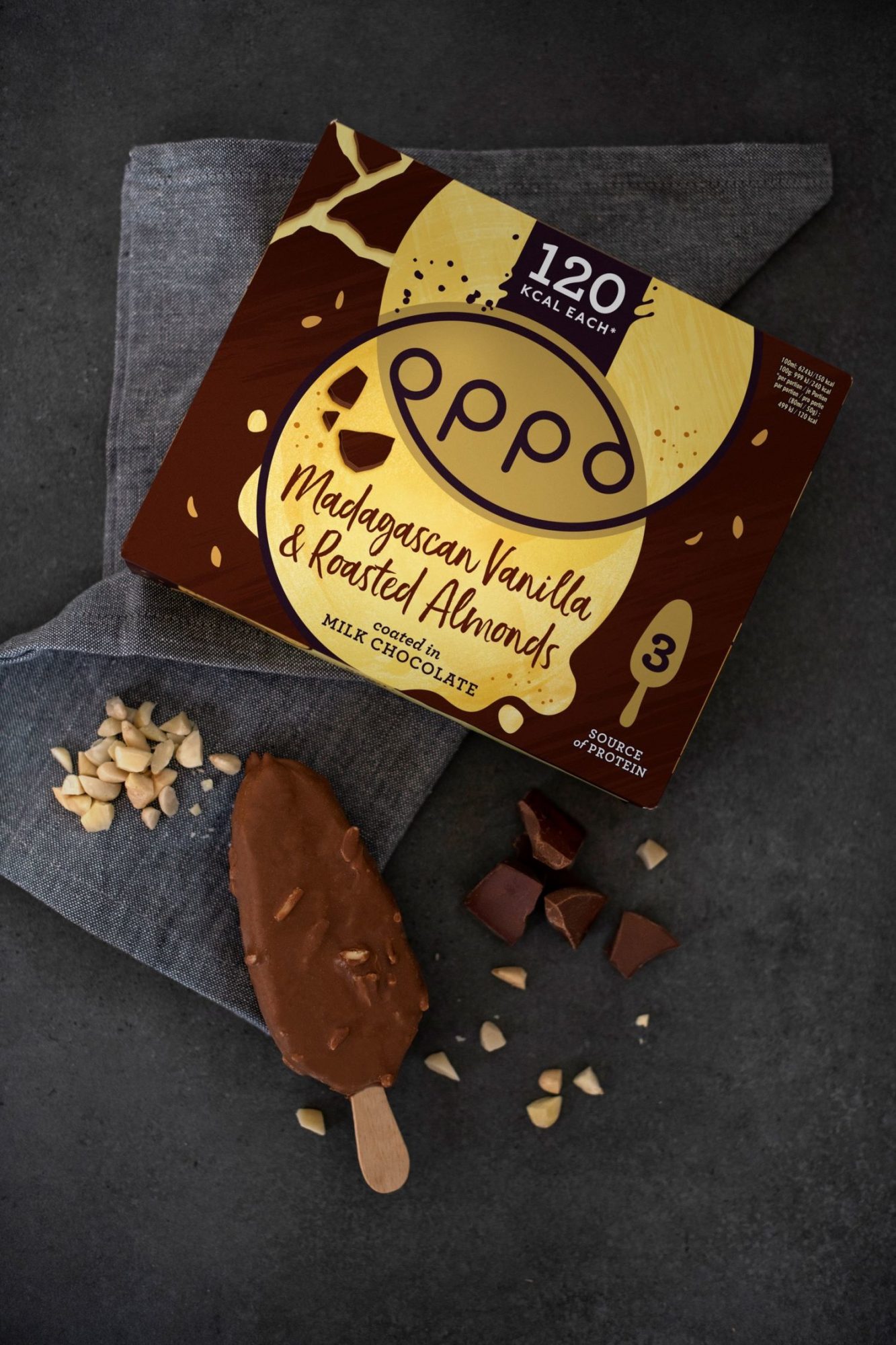
The Oppo Brothers have recently extended their portfolio of premium healthy ice creams and puds with a new range of naturally decadent hand-held treats. With packaging designed by their creative partners at strategic design consultancy Path, Oppo’s new Ice Cream Sticks supports the brand’s ambition to grow their presence in the frozen fixture with a sweet indulgence you never need to resist. The initial launch includes two variants – Madagascan Vanilla coated in Milk Chocolate with Roasted Almonds and Salted Caramel coated in Milk Chocolate. Path’s task was to develop a new expression that disrupted the freezer, converting category indulgers and attracting ice cream avoiders with powerful communication of Oppo’s significant health-conscious proposition – 60% less calories than the competition without a compromise to taste. The design uses untreated textures and handcrafted qualities to communicate the taste sensation of Oppo’s new Ice Cream Sticks. The smooth chocolate background is cracked to convey the no-need-to-resist first bite of the product experience. Scattered almonds and drizzles of salted caramel elevate taste appeal, whilst clear communication of calories is stated above Oppo’s ‘sweet spot’ logo. “We’ve had the pleasure of being The Oppo Brothers’ creative partners for almost 5 years, supporting them in expanding and strengthening their appeal with seductive sophistication,” comments Amy Rees, Design Director at Path. “At every turn, we’ve tried to strike the right balance between premium decadence and everyday temptation, luxurious taste and natural goodness, sweet indulgence and making a healthy choice. The design for this new exciting offering continues to bring Oppo’s promise of #GoodTemptation to life, as it offers consumers the best of both worlds.”Oppo founder, Harry Thuillier comments: “Releasing our new range of Oppo Ice Cream Sticks is an exciting moment for the brand. It’s a popular and extremely competitive sub-category, but we believe that Oppo offers something completely different – that sophisticated taste, texture and natural goodness you’re looking for when craving something sweet without the calories and guilt. As our creative partners, Path understand our brand, strategically and aesthetically, and always hit the sweet spot with their effective creative solutions.”


