


Few kitchen tools gracefully balance form and function – not only providing better results but enhancing people’s daily lives. Enter Holcomb – a new product design studio reimagining homeware with an eye toward better, long-lasting design that also embraces the natural beauty of imperfection. Looking to fully embody its “well-lived” ethos, Holcomb partnered with design studio Parker to build a warm, welcoming brand world that rethinks this “heirloom technology” for the modern age.
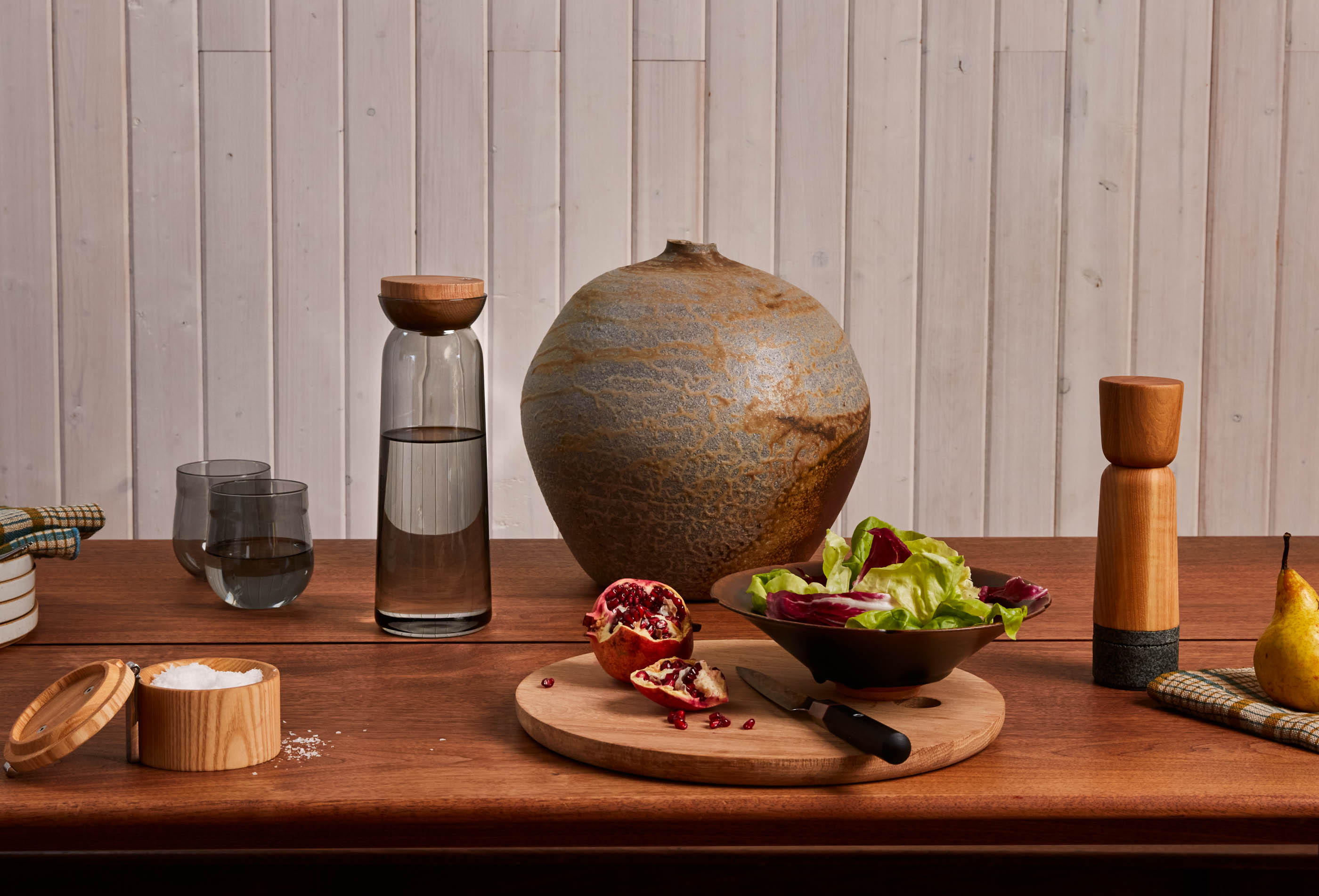
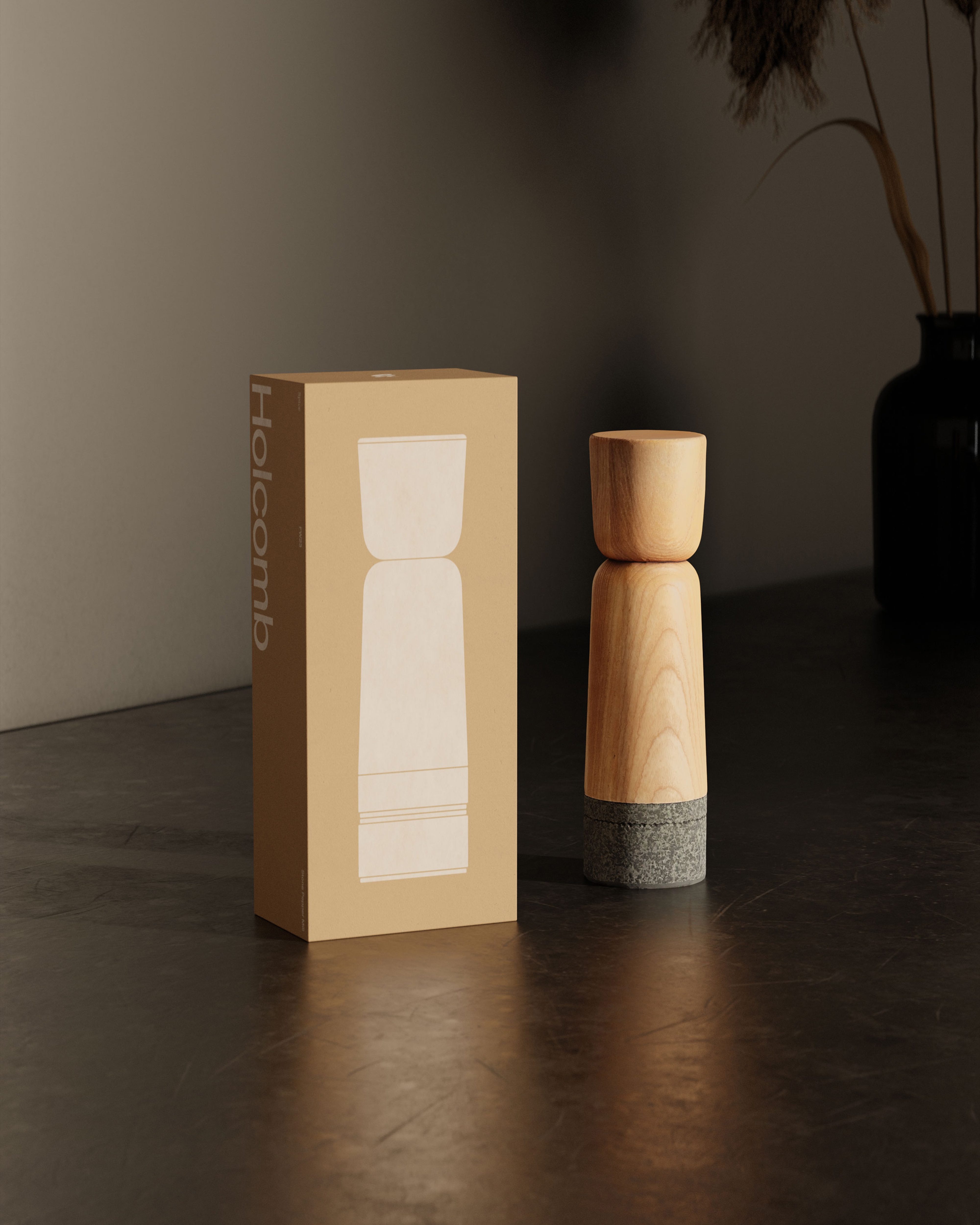
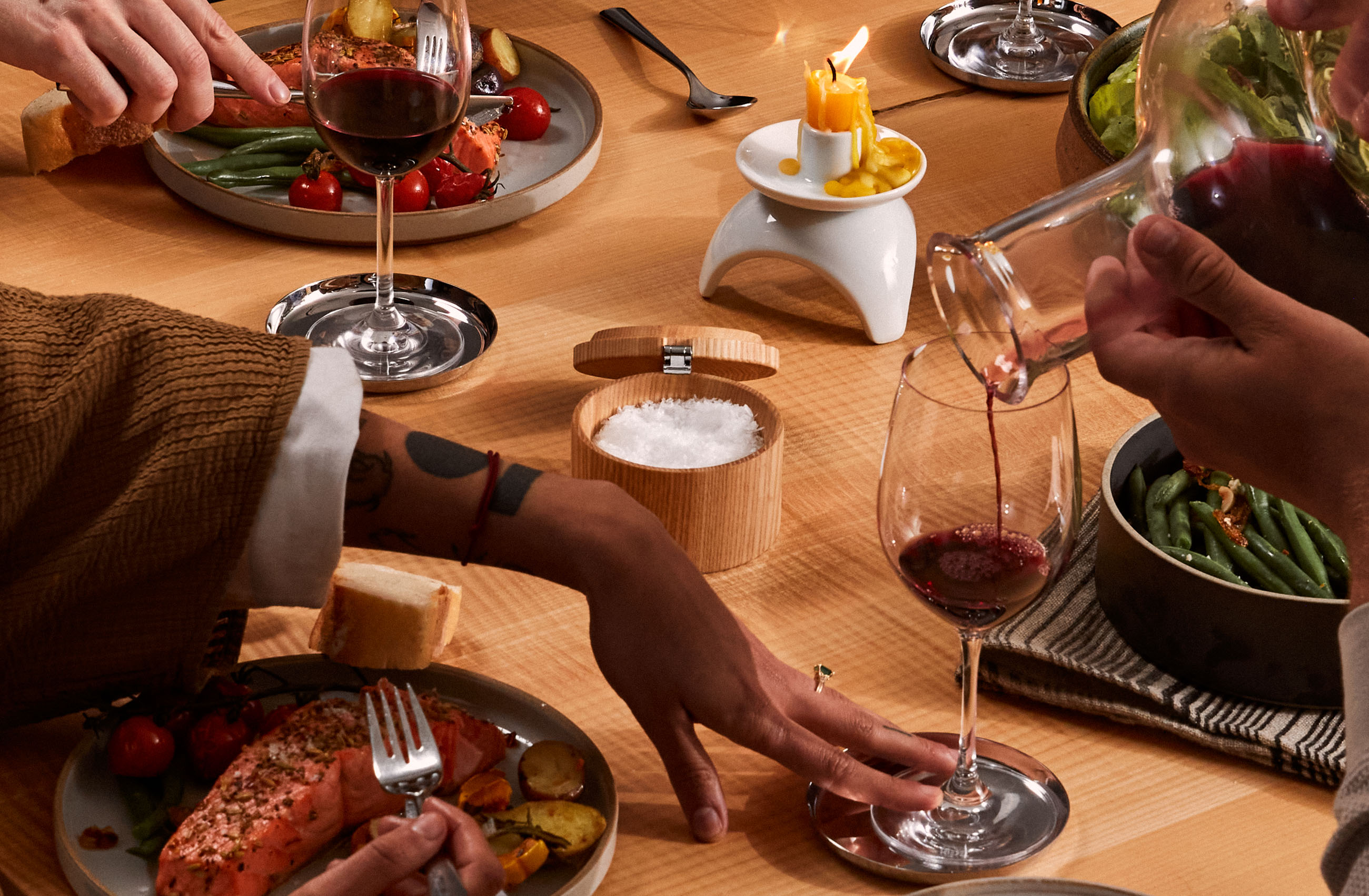
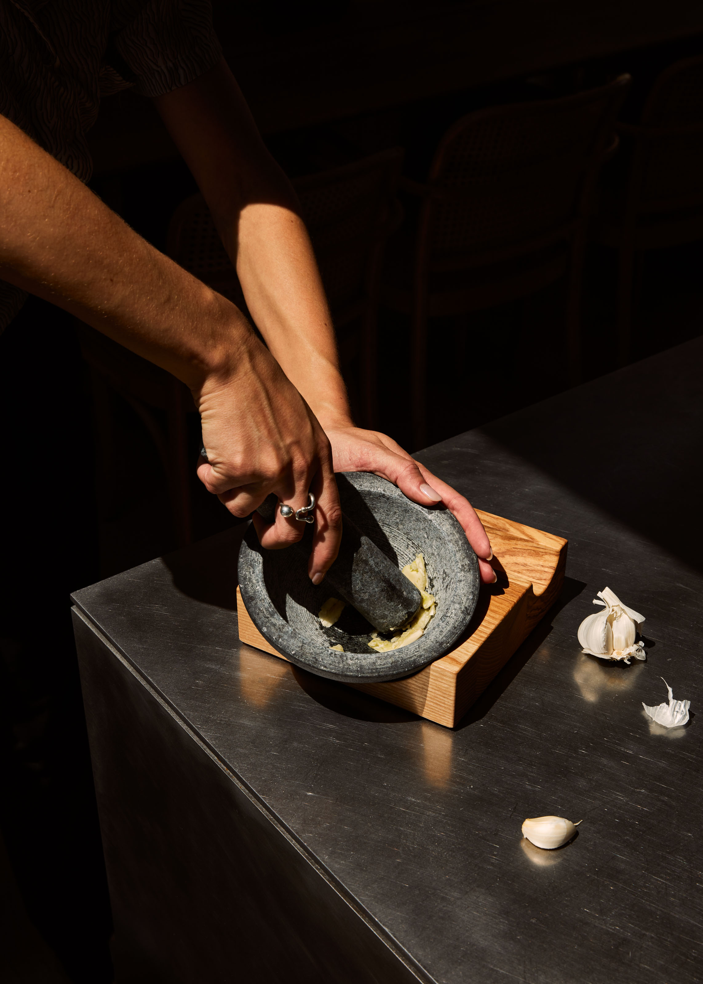
Holcomb is a family-founded studio that specializes in crafting products for the contemporary kitchen – objects like a pepper mill, decanter, mortar and pestle, carafe and more. Each product is rooted in the use of natural materials that patina and improve with age. Teaming with Parker, the company worked to not only highlight their expertise in product design but to propel the brand’s expansion.
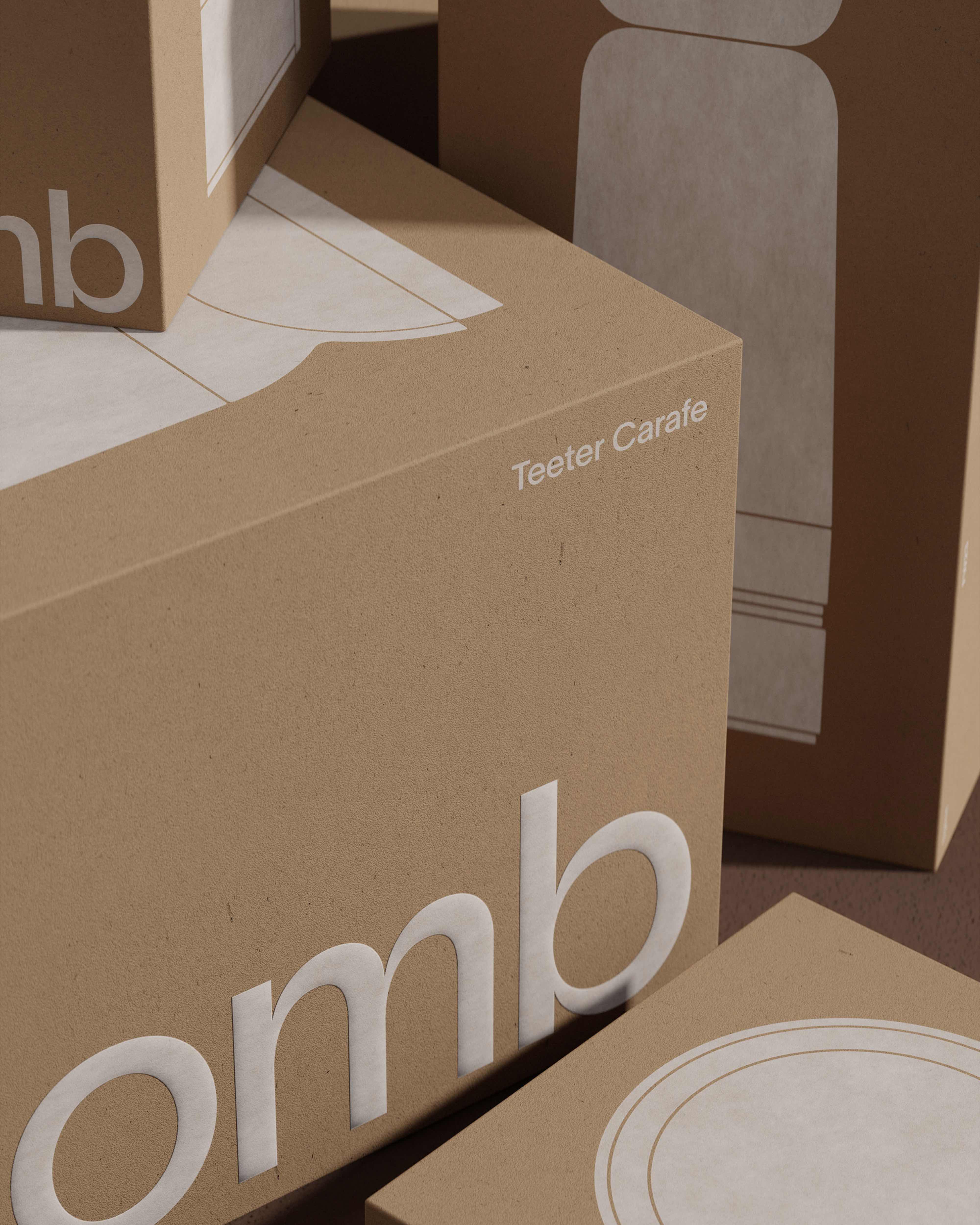
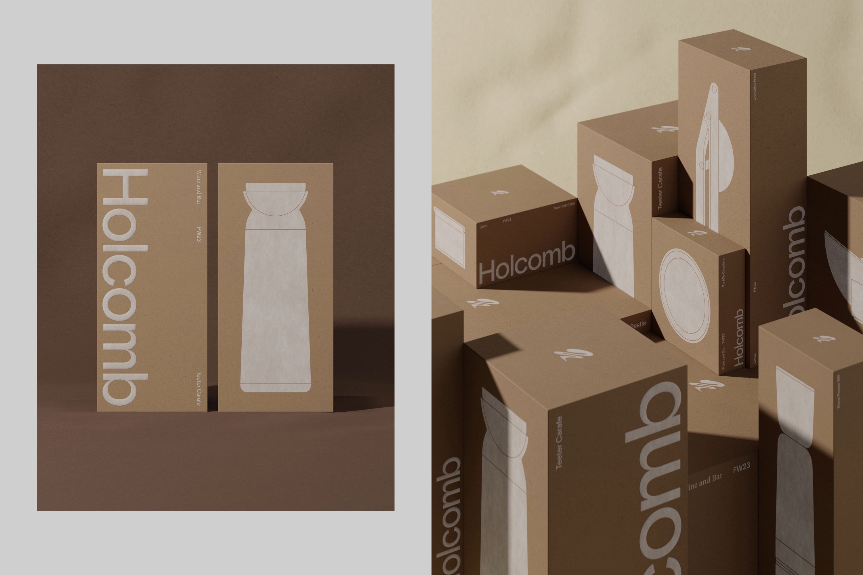
“We knew that the new identity needed to assert Holcomb’s status as a ‘design’ company first, and a kitchen company second. This was central to their story – they had an entire industrial design operation that was the catalyst for the concept,” explains Parker Founder and Creative Director Tyler Eide. “But we also needed to be accessible. Products for the kitchen are expected to be more than tools, but kitchen decor that reflects the owners’ point of view. So, Holcomb needed to create an inviting brand atmosphere that felt approachable to a wide variety of personal tastes.” Understanding this, Parker’s team worked to build Holcomb’s brand world across various touch points – packaging design, photography, and a comprehensive e-commerce digital experience.
The Holcomb wordmark and typographic system blends simplicity with warm type and color pairings to infuse the system with life. Drawn in a natural and organic style, the ‘h’ symbol leans into the dynamic (and occasionally chaotic) essence of cooking.
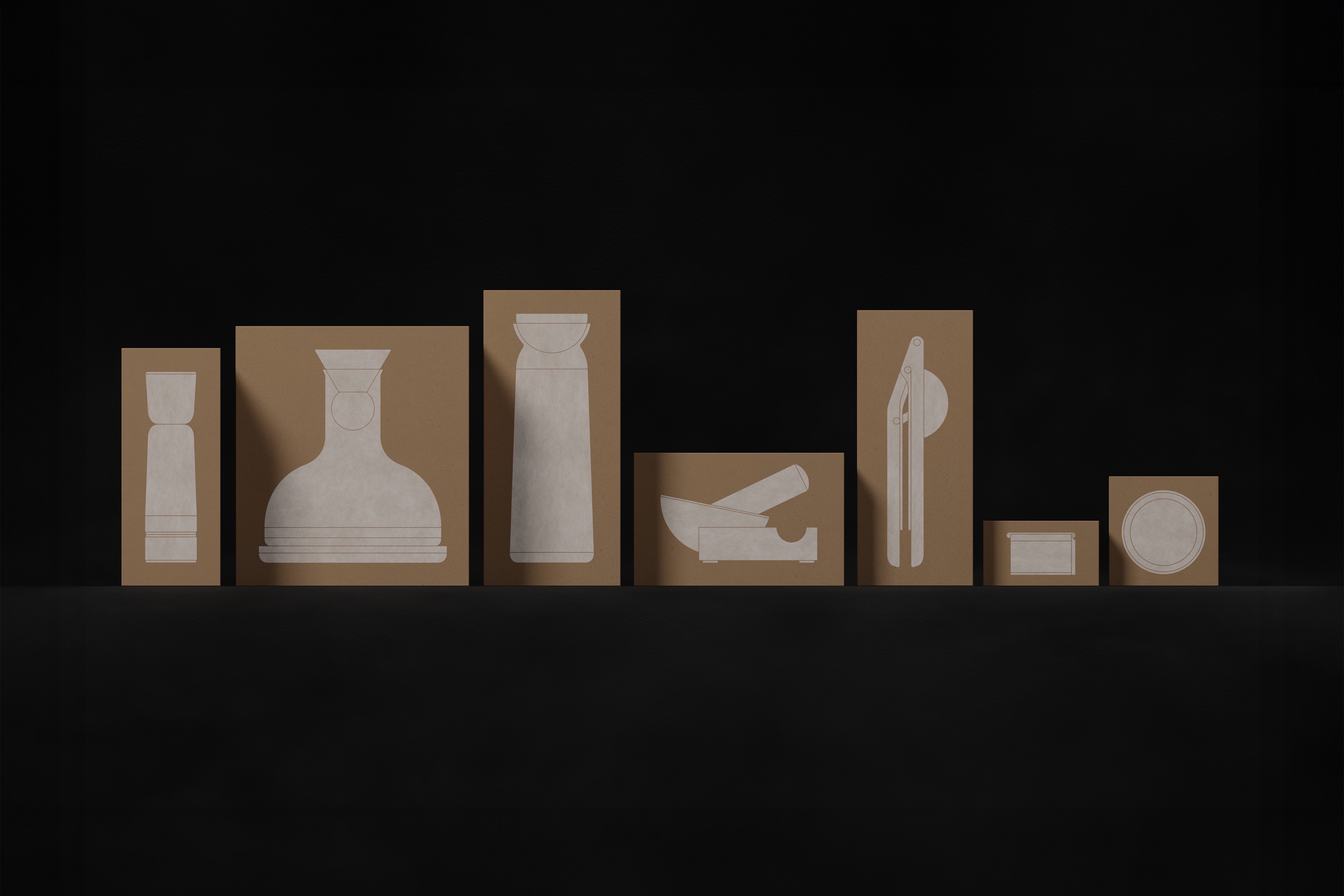
The color palette — inspired by and named after raw materials — allows the brand to be both subdued and confident. The natural tones complement the products while the neutral tones support. Meanwhile, photography by Katherine Fox makes dramatic use of light and shadow to build a textured brand world filled with warmth and beauty. Additional product illustrations used heavily by legendary industrial designer Dieter Rams, highlight the simplicity of the form as well as the function.
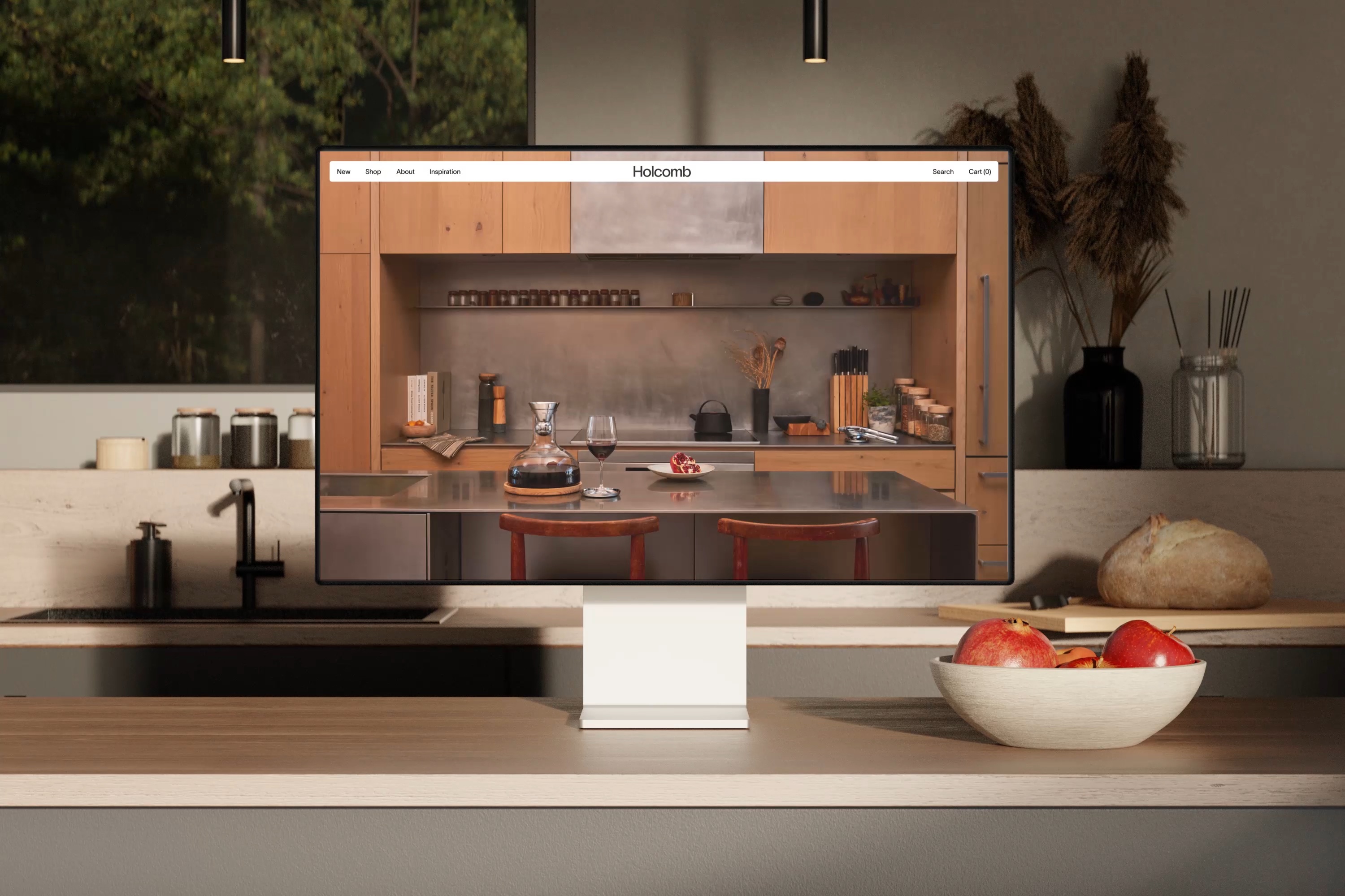
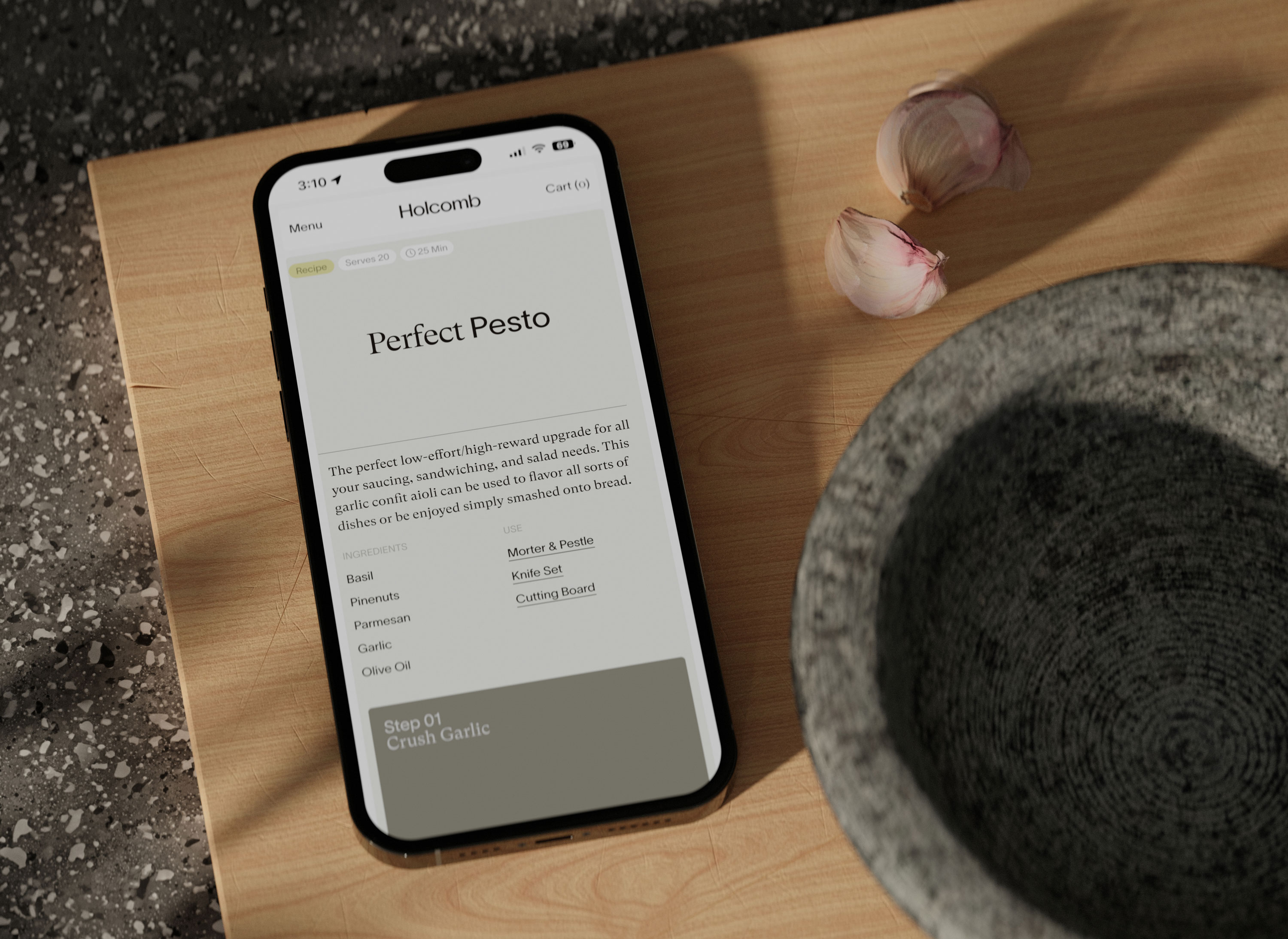
In partnership with the development team at Baggy, Parker also created a website that similarly embodies the brand’s duality. Inspired directly by the precision and line work found in the products themselves, the e-commerce experience features rounded corners, soft animations, and radiant colors – all helping to bring the products’ personalities to life within the digital space.
Parker’s Principal Brand Director, Sarah Sweeney, adds,“This project has everything we look for – a holistic approach to brand building as well as a partner producing products in a way that is responsible and beautiful. Working together, we were able to build an identity that reflects a commitment to designing with purpose, and not for unnecessary flourish. It’s minimalistic in its approach and expressive where it needs to be. But it’s also an important reminder that value and beauty can be found in the smallest of details.”

CREDIT
- Agency/Creative: Parker
- Article Title: Parker’s Harmonious Brand Identity for New Homeware Line Holcomb Offers Relief from Everyday Chaos
- Organisation/Entity: Agency
- Project Type: Identity
- Project Status: Published
- Agency/Creative Country: United States
- Agency/Creative City: Seattle
- Market Region: North America
- Project Deliverables: Brand Design, Brand Identity, Packaging Design, Web Design
- Industry: Retail
- Keywords: Holcomb, Parker, kitchen, Dieter Rams
-
Credits:
Founder and Creative Director: Tyler Eide


