


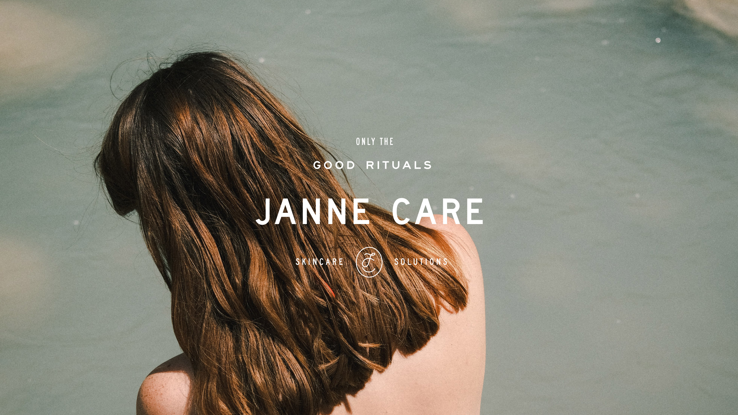
Janne Care is a groundbreaking haircare and skincare brand that is committed to providing individuals with exceptional, high-quality products designed for those who aim to preserve their youthful spirit and vitality. At the heart of Janne Care’s philosophy is the belief that beauty solutions don’t have to be overly complicated or difficult to understand. The brand’s innovative approach focuses on creating effective, results-driven products that cater to the modern individual, offering simple yet sophisticated solutions to daily beauty needs.
With an ever-growing focus on self-care, Janne Care recognizes the importance of maintaining both the mind and body in a state of youthful energy. Their products, carefully curated with this in mind, prioritize clean, active ingredients that work to rejuvenate the skin and hair, helping users maintain their natural beauty with ease. One of their core tenets is to combine simplicity with efficacy, making it easier for individuals to invest in products that truly work, without feeling overwhelmed by complex routines or hard-to-understand ingredients. Janne Care aims to inspire its customers to embrace a fresh, vibrant approach to beauty.
Their first groundbreaking innovation, which focuses on hair care, has garnered attention for its thoughtful formulation and approach. The brand’s focus on this particular area is a natural extension of the company’s broader mission to offer beauty solutions that support the inherent needs of the modern consumer. With the growing number of beauty brands available today, Janne Care stands out for its commitment to blending advanced science with a fresh, youthful perspective. Their products feature clinically tested active ingredients, each one carefully selected to create a meaningful impact on the skin and hair. The emphasis on clinically tested, impact-measured ingredients is central to the brand’s promise to deliver real results and transparent beauty solutions.
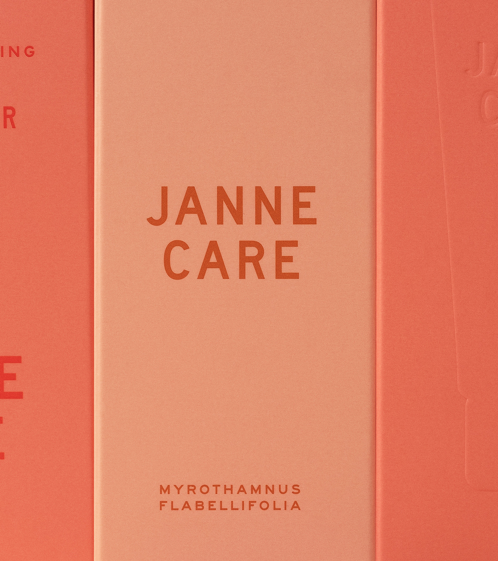
As a fresh, vibrant, and youthful brand, Janne Care wanted to ensure that their visual identity mirrored their values and reflected their unique position in the beauty industry. The goal was to create a brand identity that exudes simplicity without sacrificing elegance. The brand’s visual design avoids unnecessary complexity, using minimalist aesthetics that communicate the essence of the products without overwhelming the customer. The design process was rooted in the concept of clarity, aiming to make every aspect of the brand—from the products themselves to the packaging and marketing materials—easy to understand and accessible to all.
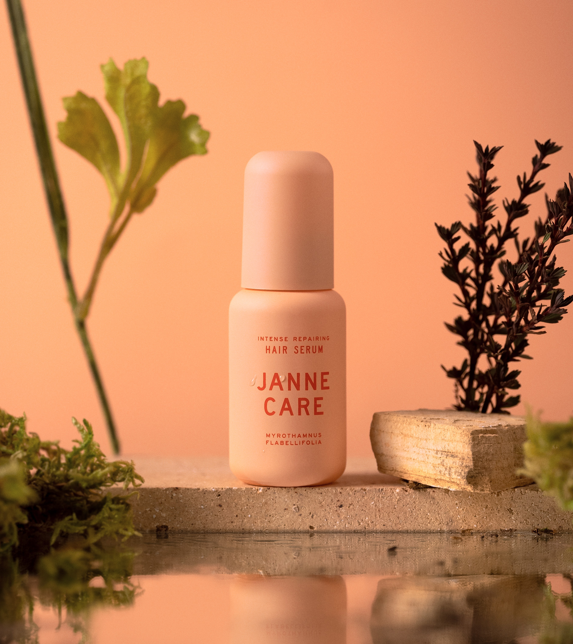
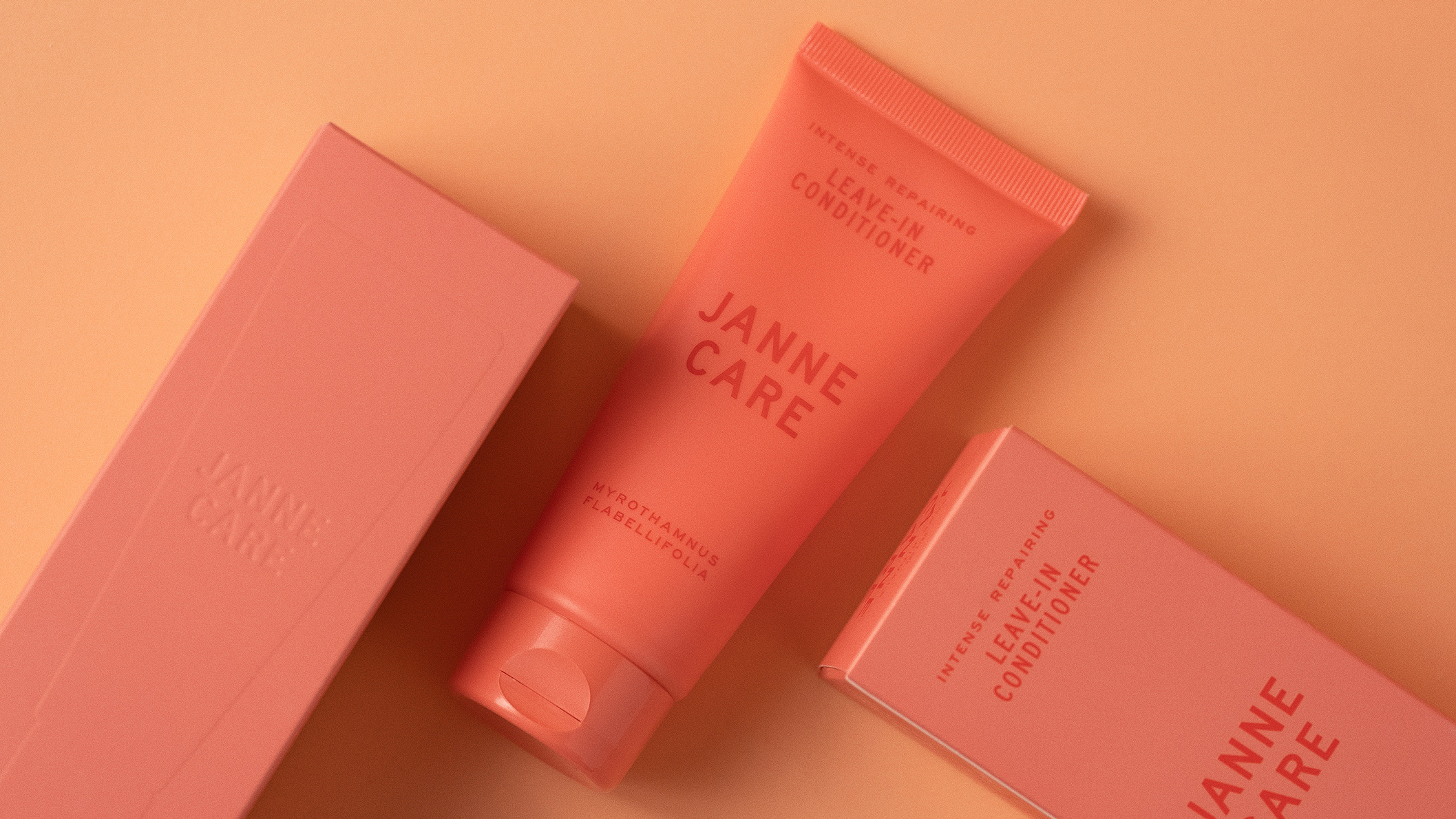
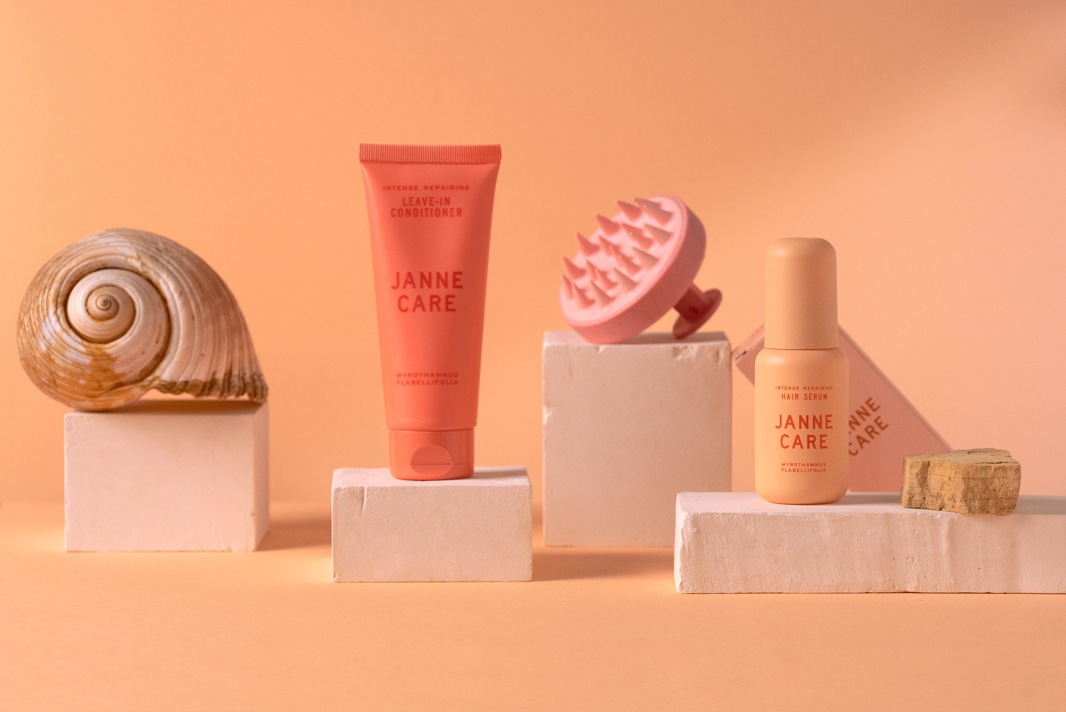
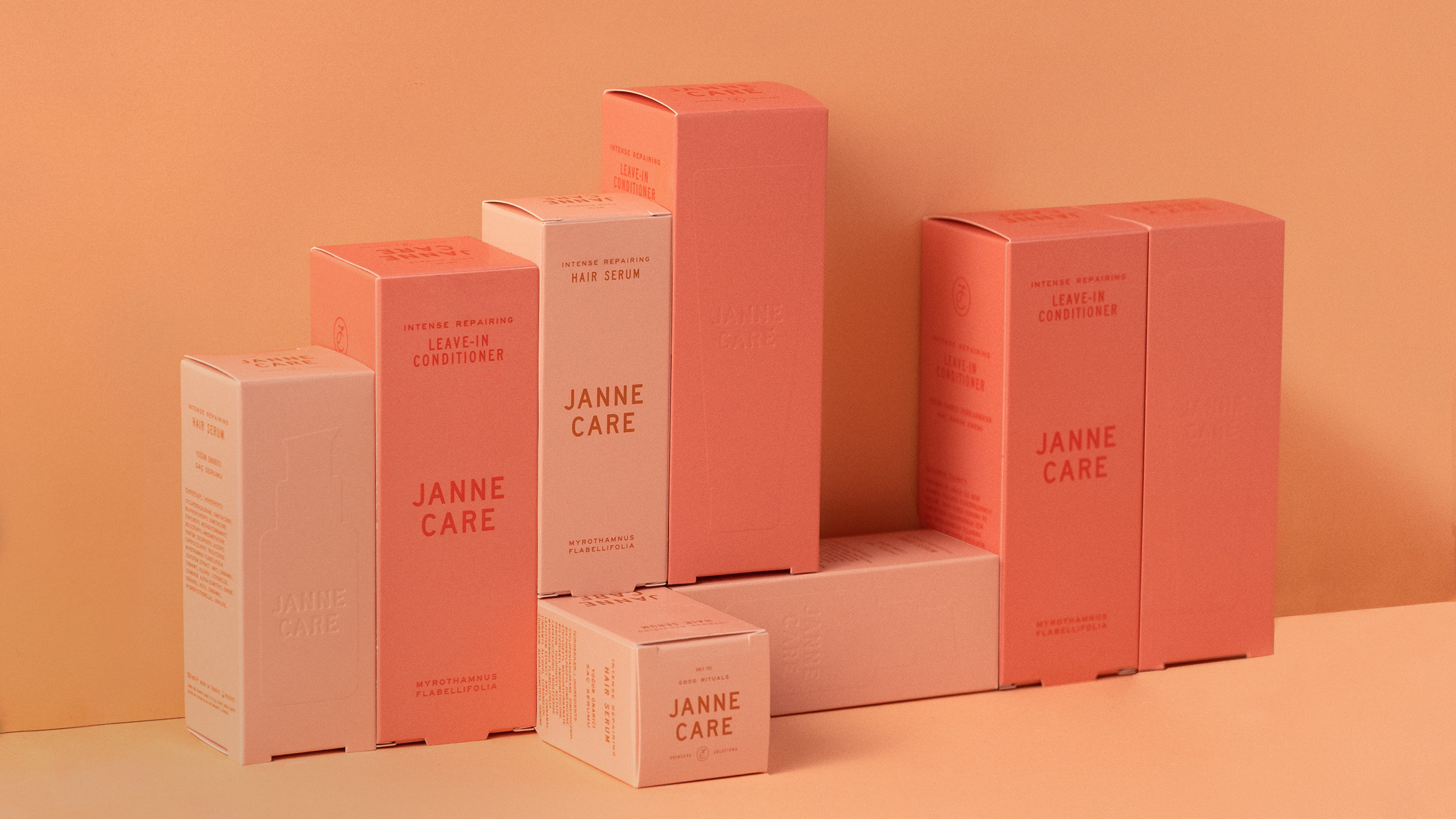
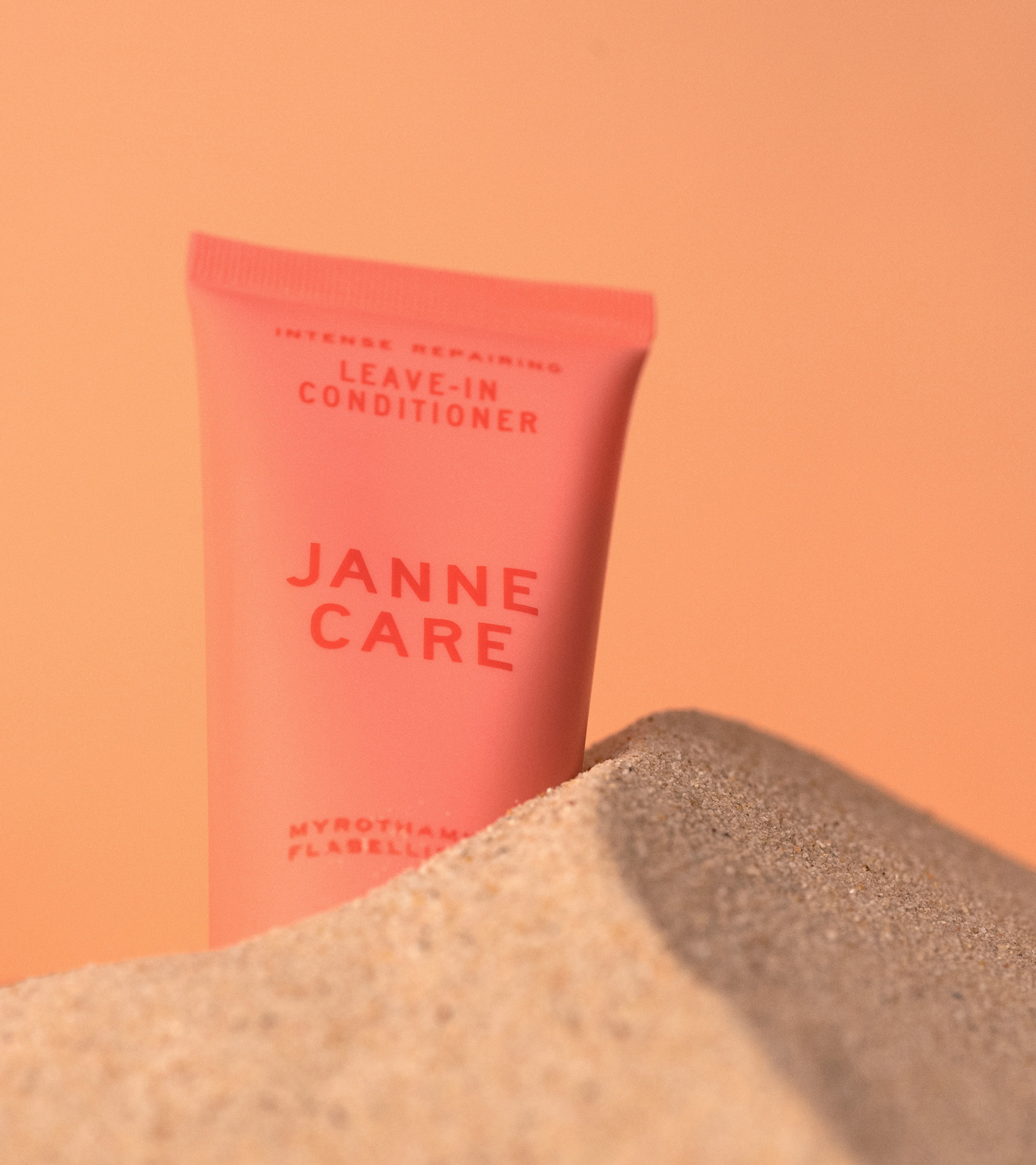
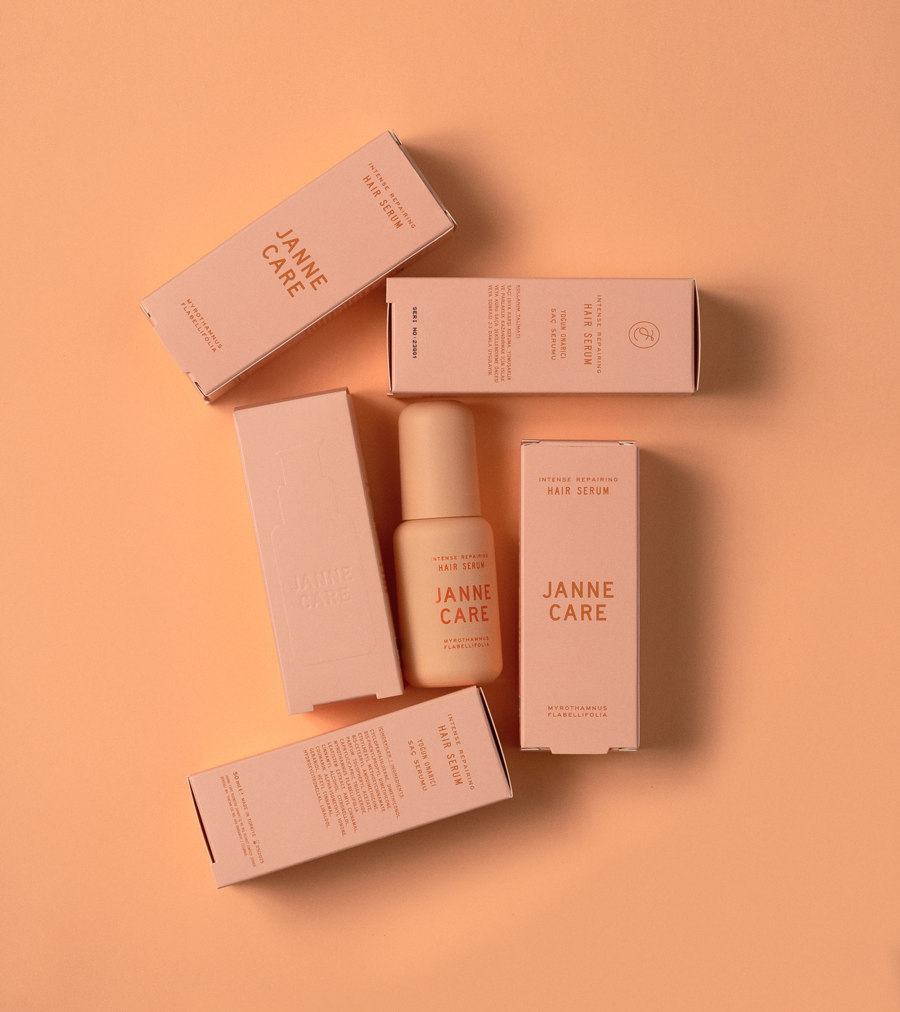
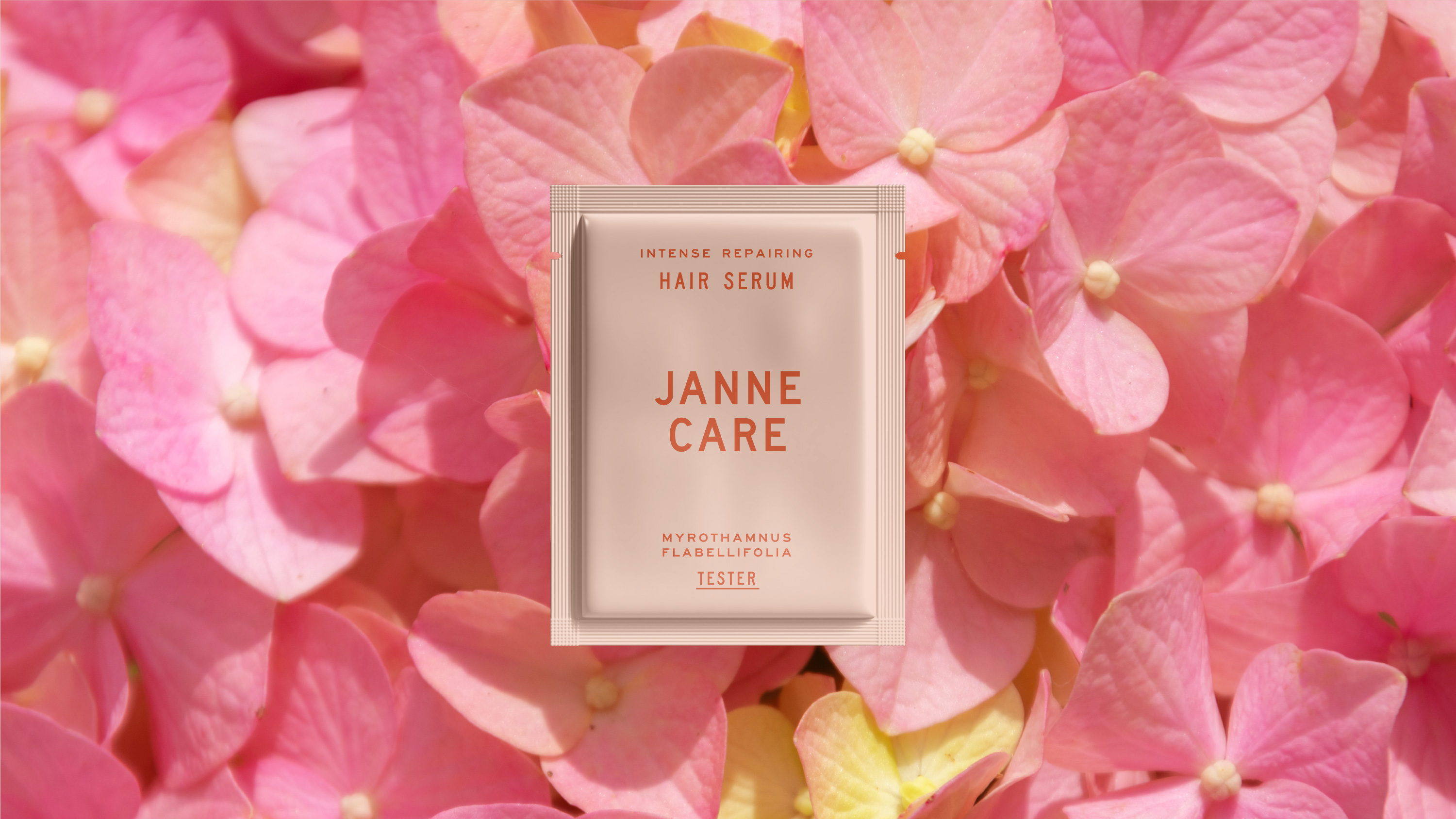
The color palette for Janne Care is rooted in soft, inviting pink tones, chosen to create a sense of warmth and optimism. Pink is a color often associated with beauty, vitality, and youth, which aligns perfectly with Janne Care’s brand identity. The gentle shades of pink evoke feelings of comfort, freshness, and femininity, offering an approachable, friendly aesthetic. This choice of color plays a significant role in communicating the brand’s commitment to creating beauty products that are as approachable as they are effective. By using a unified pink palette across their packaging, Janne Care ensures that the brand’s visual identity is instantly recognizable and distinct from other brands in the market.
To ensure the visual language is cohesive and aligned with their brand ethos, Janne Care opted for a minimalistic design approach. The packaging is simple yet elegant, avoiding unnecessary ornamentation while still maintaining a sense of sophistication. This design philosophy allows the products to speak for themselves, highlighting the quality and efficacy of the ingredients rather than relying on flashy packaging or extraneous design elements. The result is a clean, streamlined aesthetic that reflects the brand’s promise to offer effective beauty solutions that are straightforward and accessible to everyone.
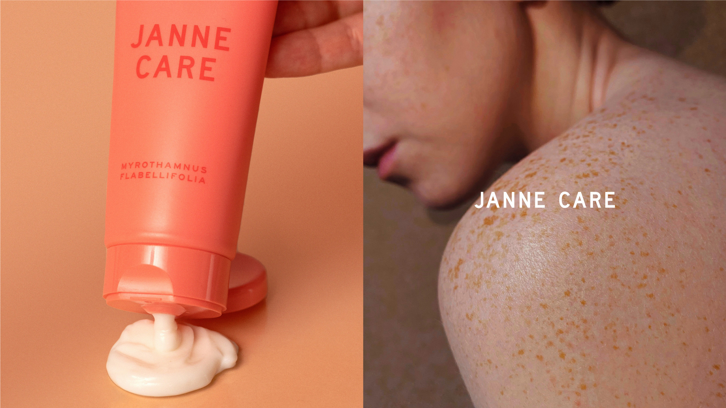
Janne Care’s commitment to creating a seamless brand experience extends to their product photography as well. Every photograph was carefully curated, with the intention of capturing the essence of the brand in a way that feels authentic and relatable. By overseeing the entire process—from the set design to the final image—Janne Care ensured that every photograph accurately represents the brand’s core values. The set designs were kept simple, highlighting the products themselves in a clean, natural environment. The focus was placed on showcasing the textures, colors, and quality of the products, giving consumers a true sense of what they can expect from the brand.
The photography was also designed to be versatile, ensuring that the images could be used across various platforms, from social media to print materials. The use of soft lighting and neutral backdrops allows the products to stand out and take center stage, while the subtle details of the set design help to create an inviting atmosphere that feels both fresh and timeless. The overall aesthetic is one of sophistication and simplicity, reflecting Janne Care’s mission to offer high-quality, effective products that prioritize the needs of the modern consumer.
At the heart of Janne Care’s offering is the promise of simplicity and elegance. The brand aims to prove that beauty solutions can be both uncomplicated and effective, without sacrificing quality or performance. In a world that is often cluttered with complicated beauty routines and overwhelming product choices, Janne Care stands as a beacon of clarity, offering products that are as easy to incorporate into daily life as they are impactful.
As a fresh, vibrant, and youthful brand, Janne Care wanted to ensure that their visual identity mirrored their values and reflected their unique position in the beauty industry. The goal was to create a brand identity that exudes simplicity without sacrificing elegance. The brand’s visual design avoids unnecessary complexity, using minimalist aesthetics that communicate the essence of the products without overwhelming the customer. The design process was rooted in the concept of clarity, aiming to make every aspect of the brand—from the products themselves to the packaging and marketing materials—easy to understand and accessible to all.
The color palette for Janne Care is rooted in soft, inviting pink tones, chosen to create a sense of warmth and optimism. Pink is a color often associated with beauty, vitality, and youth, which aligns perfectly with Janne Care’s brand identity. The gentle shades of pink evoke feelings of comfort, freshness, and femininity, offering an approachable, friendly aesthetic. This choice of color plays a significant role in communicating the brand’s commitment to creating beauty products that are as approachable as they are effective. By using a unified pink palette across their packaging, Janne Care ensures that the brand’s visual identity is instantly recognizable and distinct from other brands in the market.
To ensure the visual language is cohesive and aligned with their brand ethos, Janne Care opted for a minimalistic design approach. The packaging is simple yet elegant, avoiding unnecessary ornamentation while still maintaining a sense of sophistication. This design philosophy allows the products to speak for themselves, highlighting the quality and efficacy of the ingredients rather than relying on flashy packaging or extraneous design elements. The result is a clean, streamlined aesthetic that reflects the brand’s promise to offer effective beauty solutions that are straightforward and accessible to everyone.
We meticulously crafted every aspect of the product imagery, from the conceptualization to the final shots, ensuring each detail aligns with our brand’s ethos. Our team took full control of the product photography process, overseeing every element from lighting to set design to capture the true essence of Janne Care. Every photograph was carefully curated by us, with attention to the smallest details, including custom set designs that reflect the simplicity and sophistication of the brand. Our creative team worked hands-on to develop and execute the complete product photography, including thoughtfully designed sets that enhance the beauty of each product. We designed the entire visual experience, handling everything from product photography to set creation, to ensure that every image speaks the brand’s story of elegance and simplicity.
CREDIT
- Agency/Creative: Parcour Studio
- Article Title: Parcour Studio Shapes Janne Care’s Identity with a Fresh Approach to Beauty Branding
- Organisation/Entity: Agency
- Project Type: Packaging
- Project Status: Published
- Agency/Creative Country: Turkey
- Agency/Creative City: Istanbul
- Market Region: Europe, Middle East
- Project Deliverables: Art Direction, Beauty Photography, Brand Creation, Brand Design, Brand Identity, Brand Tone of Voice, Branding, Creative Direction, Graphic Design, Label Design, Logo Design, Packaging Design, Photography, Product Photography, Set Design
- Format: Bottle, Box, Tube
- Industry: Beauty/Cosmetics
- Keywords: hair, care, pink, beauty, product,
-
Credits:
Creative Direction: Burak Tigli
Art Direction: Deniz Damar


