


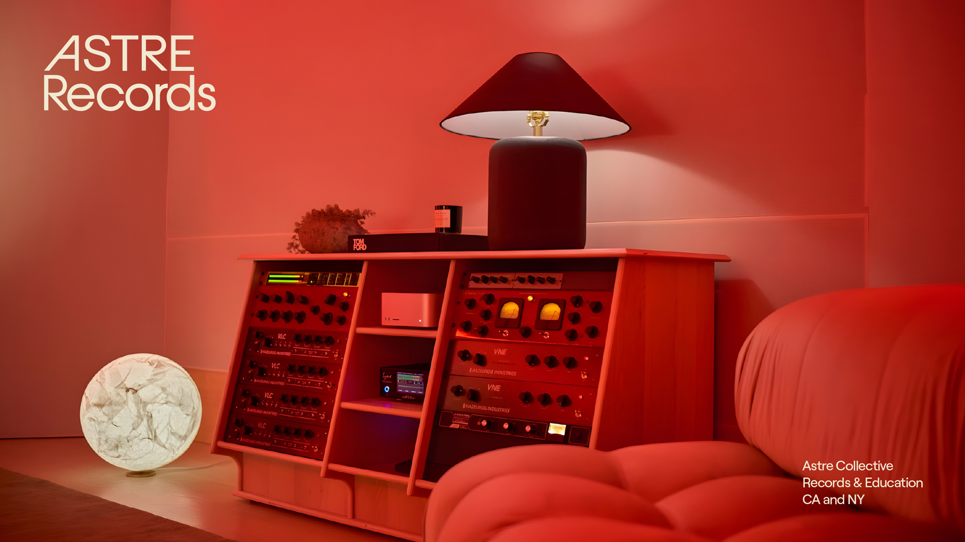
Astre Collective represents an immersive record label dedicated to pushing the boundaries of sound. They produce, record, and mix for Dolby Atmos / Spatial Audio, delivering an unparalleled listening experience. As the only record label utilizing a two-channel Atmos mix, they achieve groundbreaking fidelity on stereo platforms.
Astre Collective is inspired by the vision of music industry legend Mike Miller and his “Atmosphere Studios.” Mike Miller’s work has pioneered the use of innovative sound technologies, offering artists a unique audio experience. With an extensive portfolio in Spatial Audio and Dolby Atmos mixing, Atmosphere Studios (having worked with artists such as Harry Styles, Lil Nas X, Tyler, The Creator, SZA, and Labrinth) has left a significant legacy in the world of mixing. Astre Collective aims to carry this legacy forward by developing innovative projects for the music industry and supporting artists.
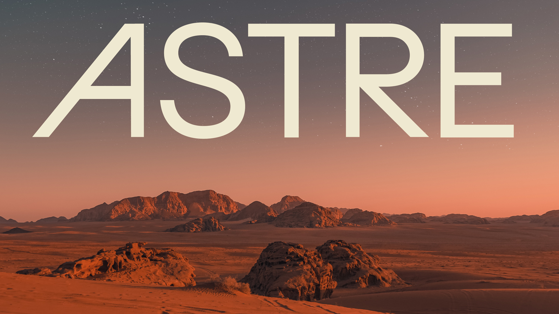
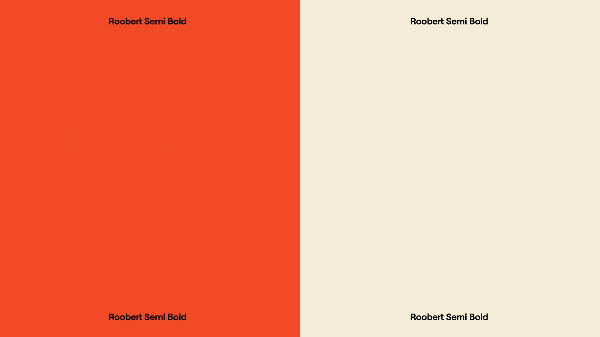
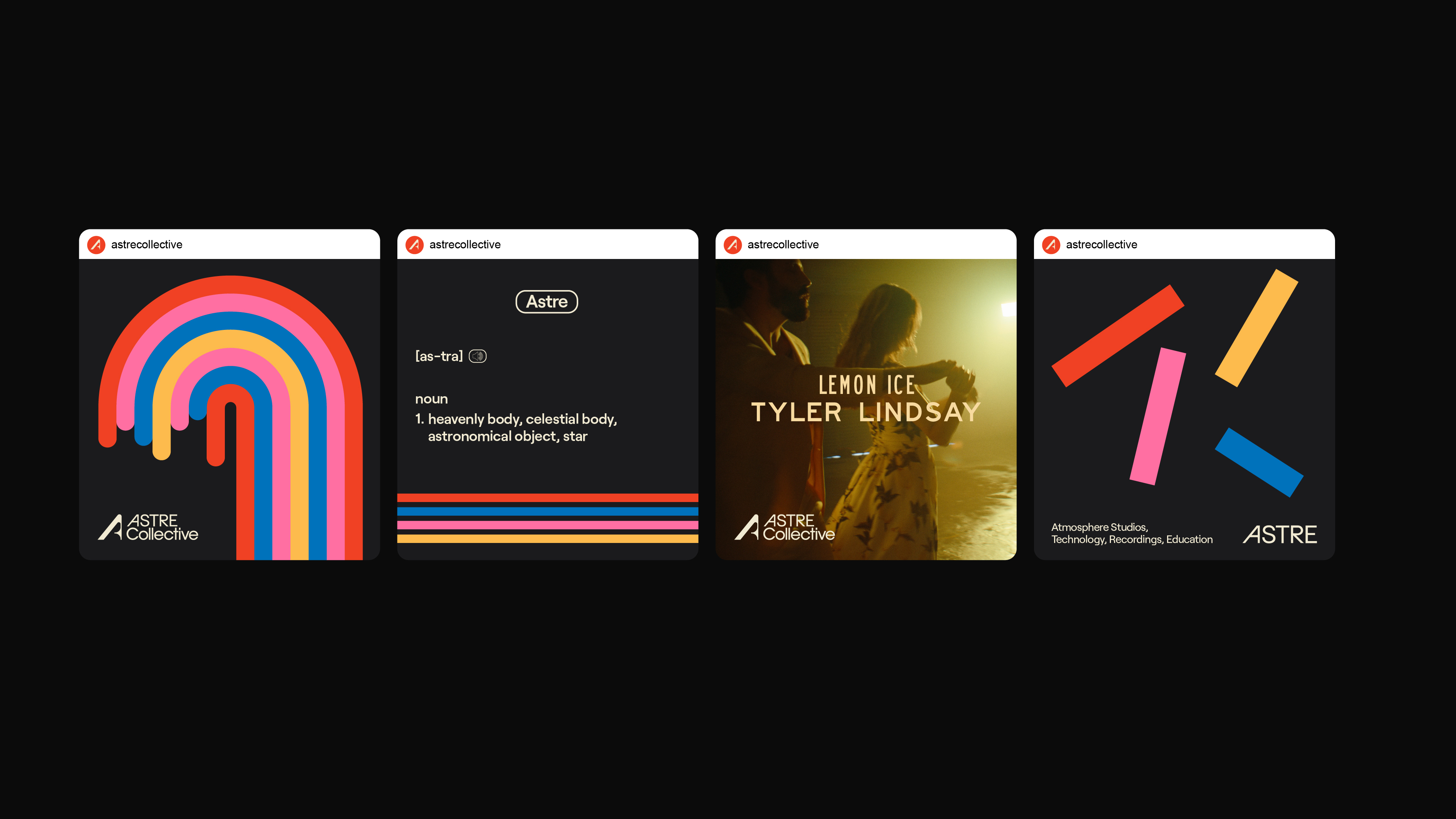
While crafting Astre’s visual language, we drew inspiration from the golden age of the music industry. The clean yet bold aesthetic that defined the 60s and 70s was not only present in countless iconic album covers and posters but also used by tech companies of the time to promote state-of-the-art music equipment. In contrast to the minimalist approaches that followed in later decades, the use of large, confident typography and fonts with strong decorative qualities served as key references for us.
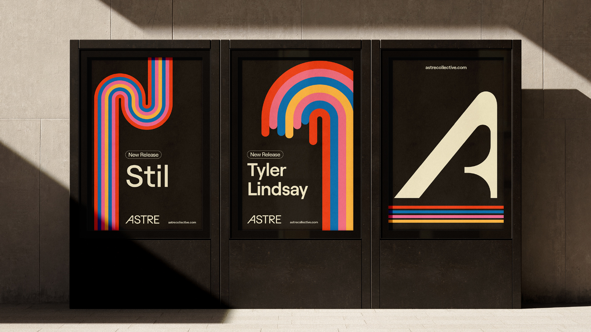
In our typographic approach, rather than altering text elements with common stylistic treatments like bold or italic, we opted for a visual solution: highlighting key words by enclosing them in balloon-like shapes and slightly lifting them within the text flow. This not only created a strong and easily recognizable typographic mark, but also subtly referenced Astre’s associations with space and celestial themes.
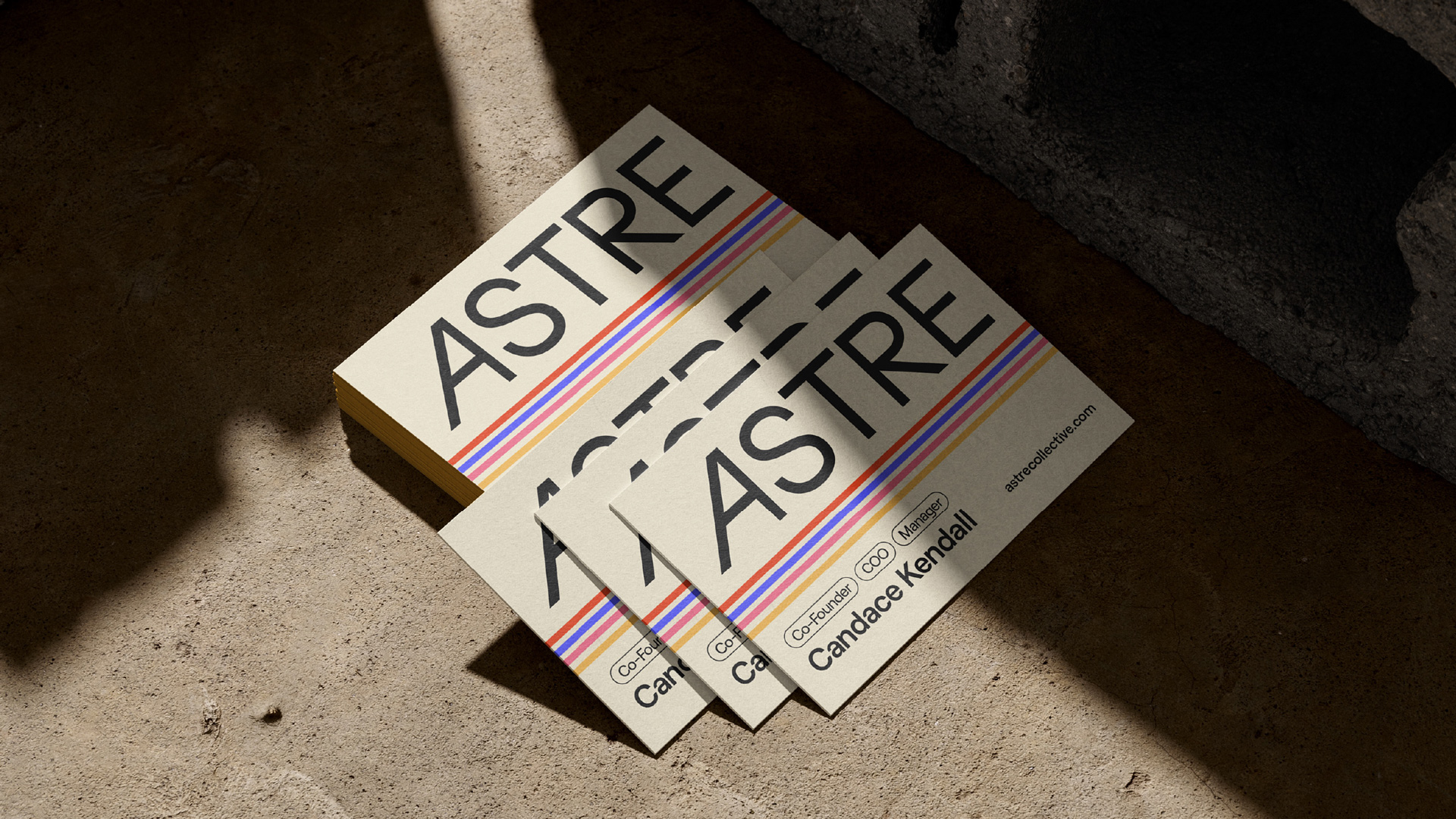
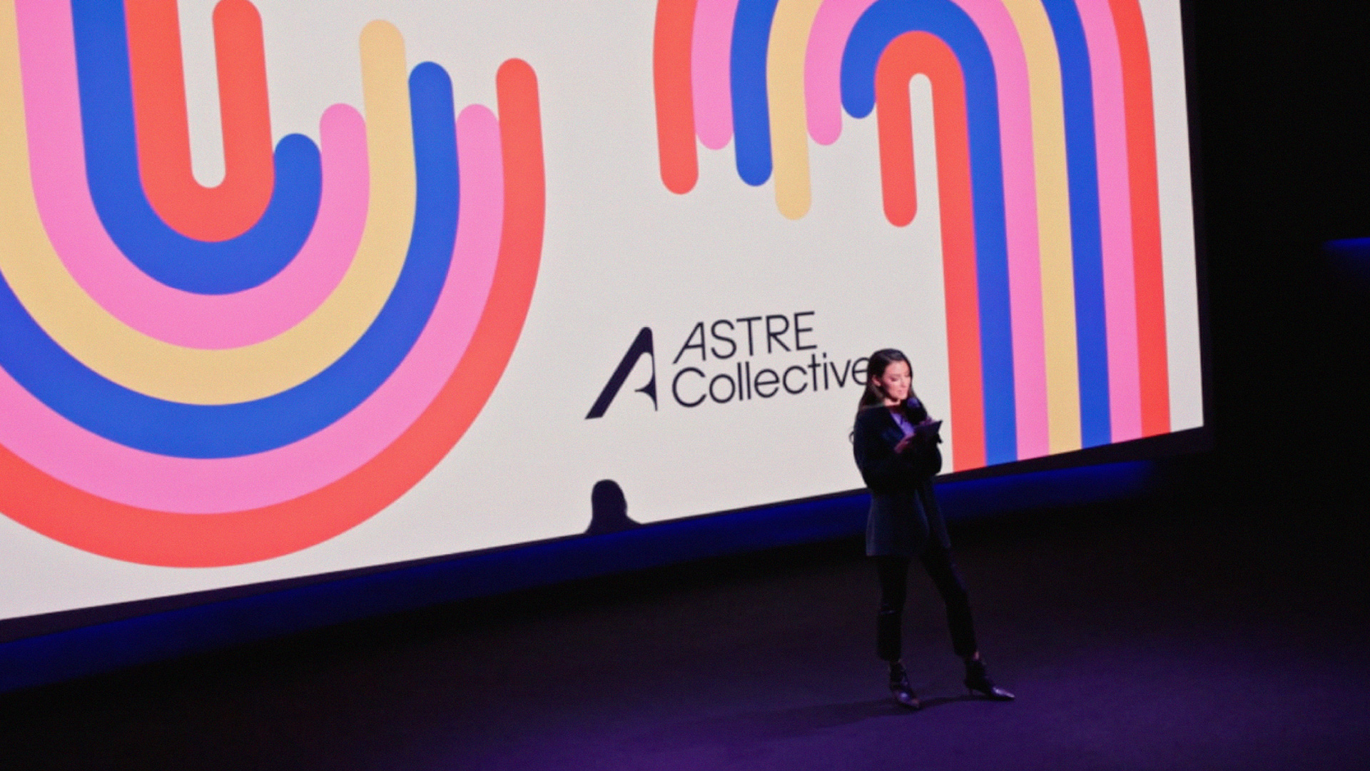
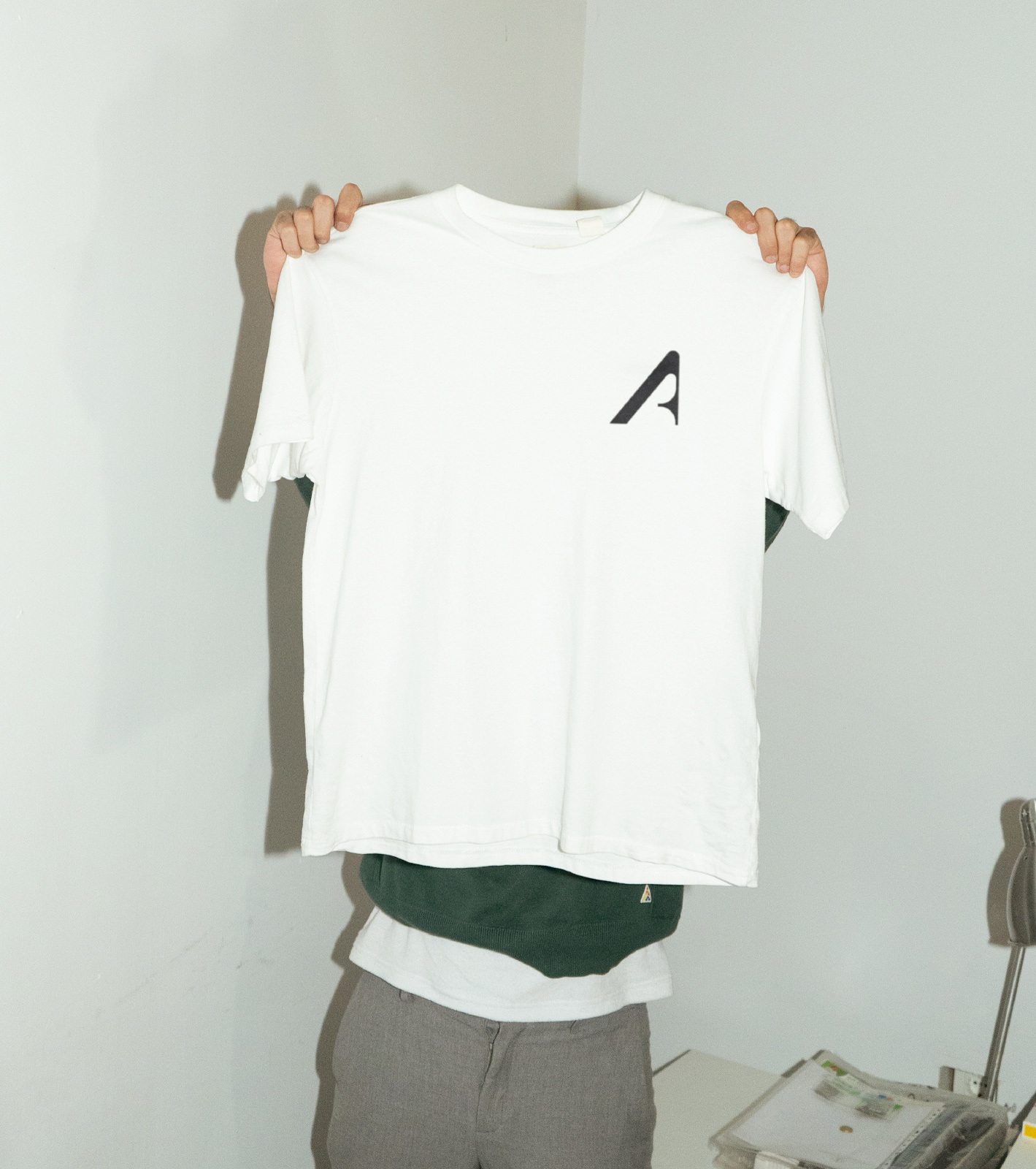
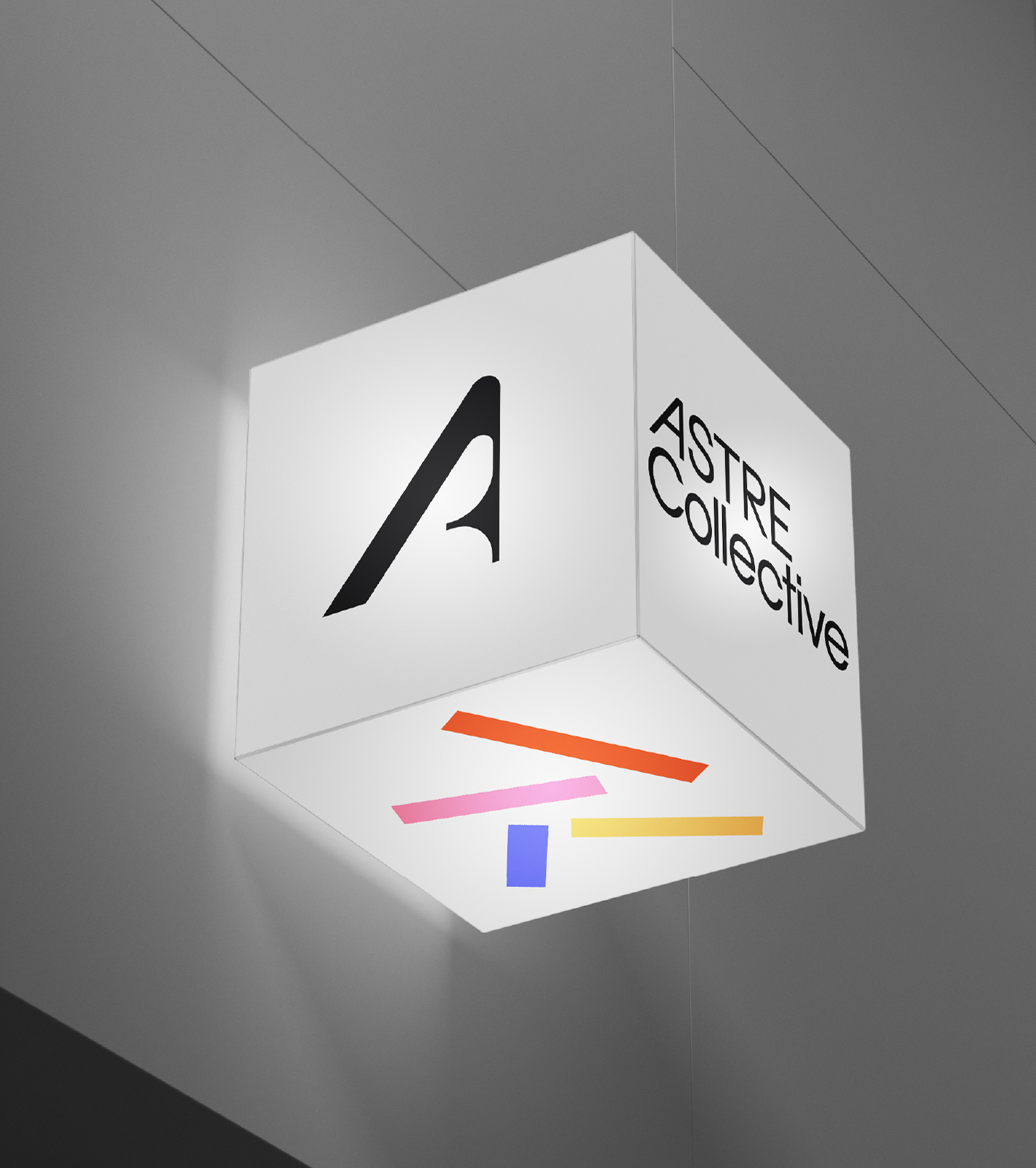
As a brand that speaks to multiple fields within the music ecosystem, Astre needed to present all its projects under one unified voice, with a coherent and consistent visual solution. In response to this need, we designed a central symbol and a main logotype to ensure brand integrity across all areas of activity, along with sub-logos to be used in various projects. To carry this multi-layered structure into the core identity, we defined Astre’s four foundational components — Atmosphere Studios, Technology, Recording, and Education — using a unique color code. The lines we created using these colors enabled us to generate visual forms adaptable to different scenarios.
As for color usage, we adopted a palette that brings together bold and vivid tones. Rather than assigning purely decorative value to the colors, we treated them as elements that carry specific meaning within the brand’s visual and corporate identity.

CREDIT
- Agency/Creative: Parcour Studio
- Article Title: Parcour Studio Reimagines Audio Identity for Astre Collective with a Retro-Futurist Lens
- Organisation/Entity: Agency
- Project Type: Identity
- Project Status: Published
- Agency/Creative Country: Turkey
- Agency/Creative City: Istanbul
- Market Region: North America
- Project Deliverables: Brand Design, Brand Experience, Brand Identity, Brand Mark, Brand Tone of Voice, Branding, Design, Graphic Design, Icon Design, Identity System, Logo Design
- Industry: Entertainment
- Keywords: music, mix engineering, mixing, audio, dolby, music branding
-
Credits:
Graphic Designer: Deniz Damar
Graphic Designer: Burak Tigli


