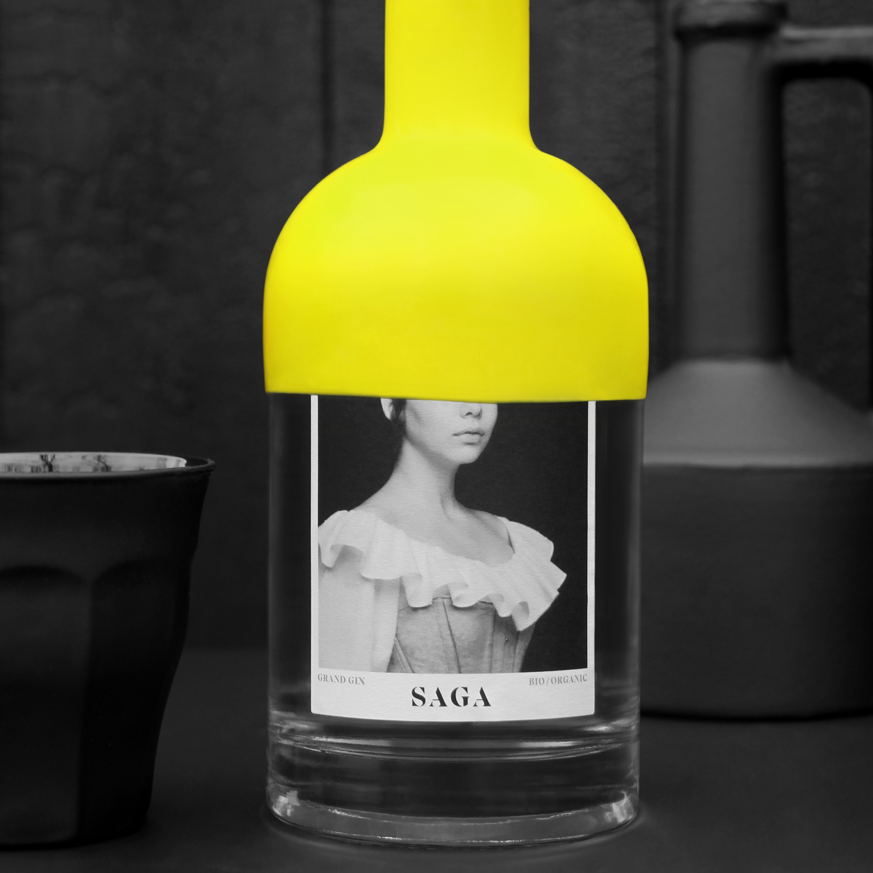
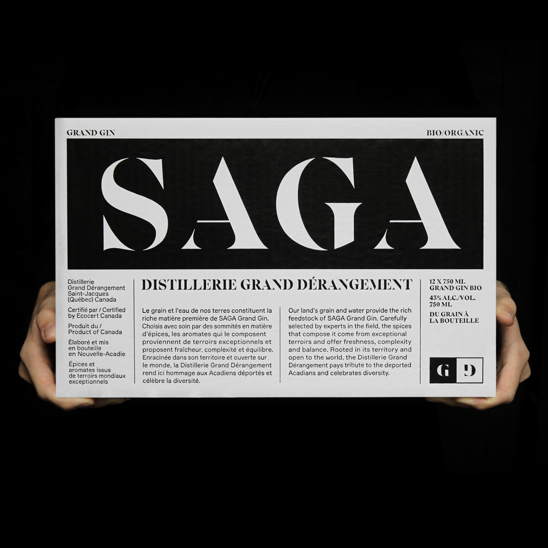
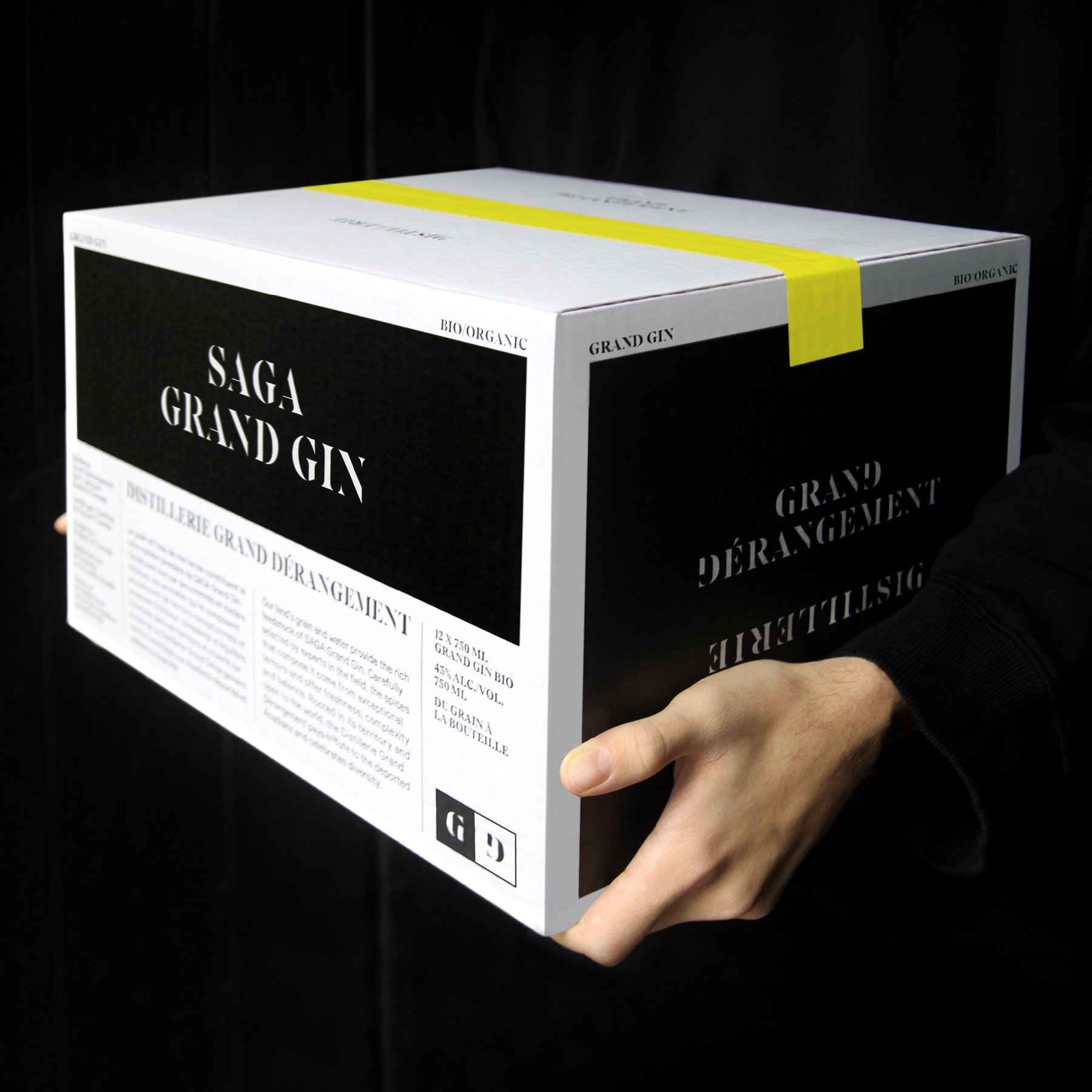
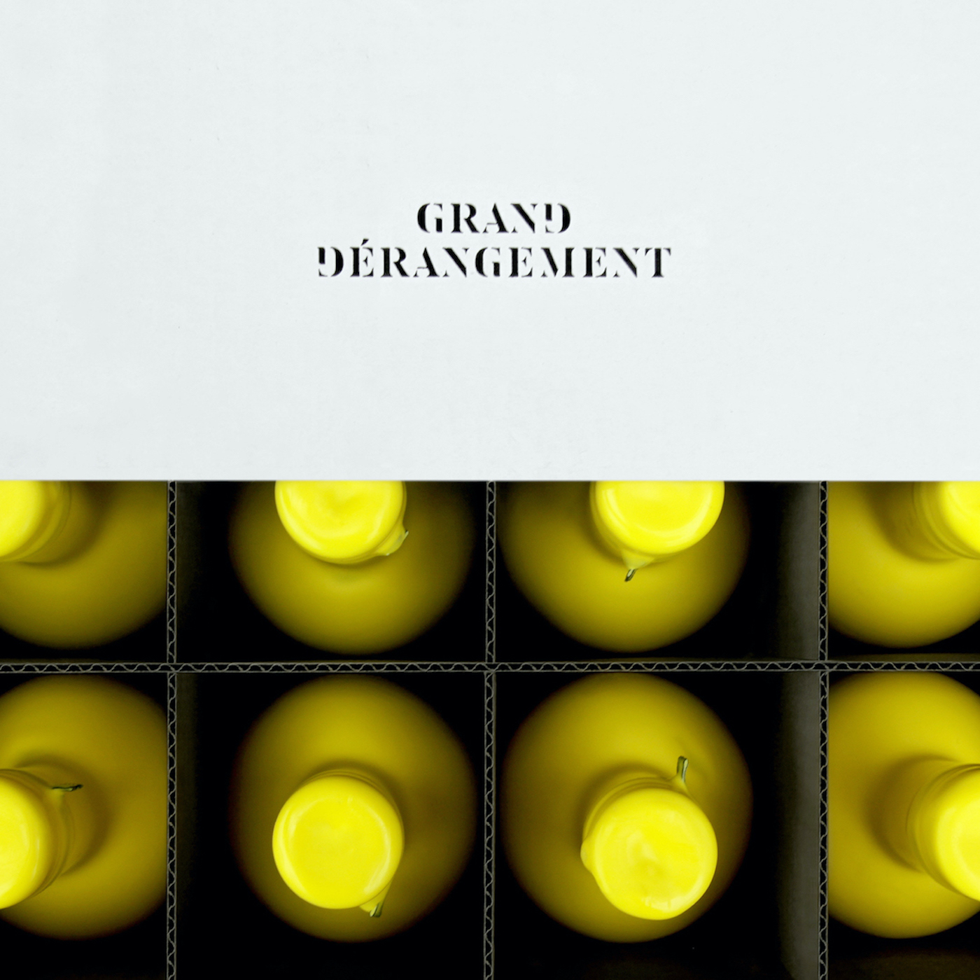
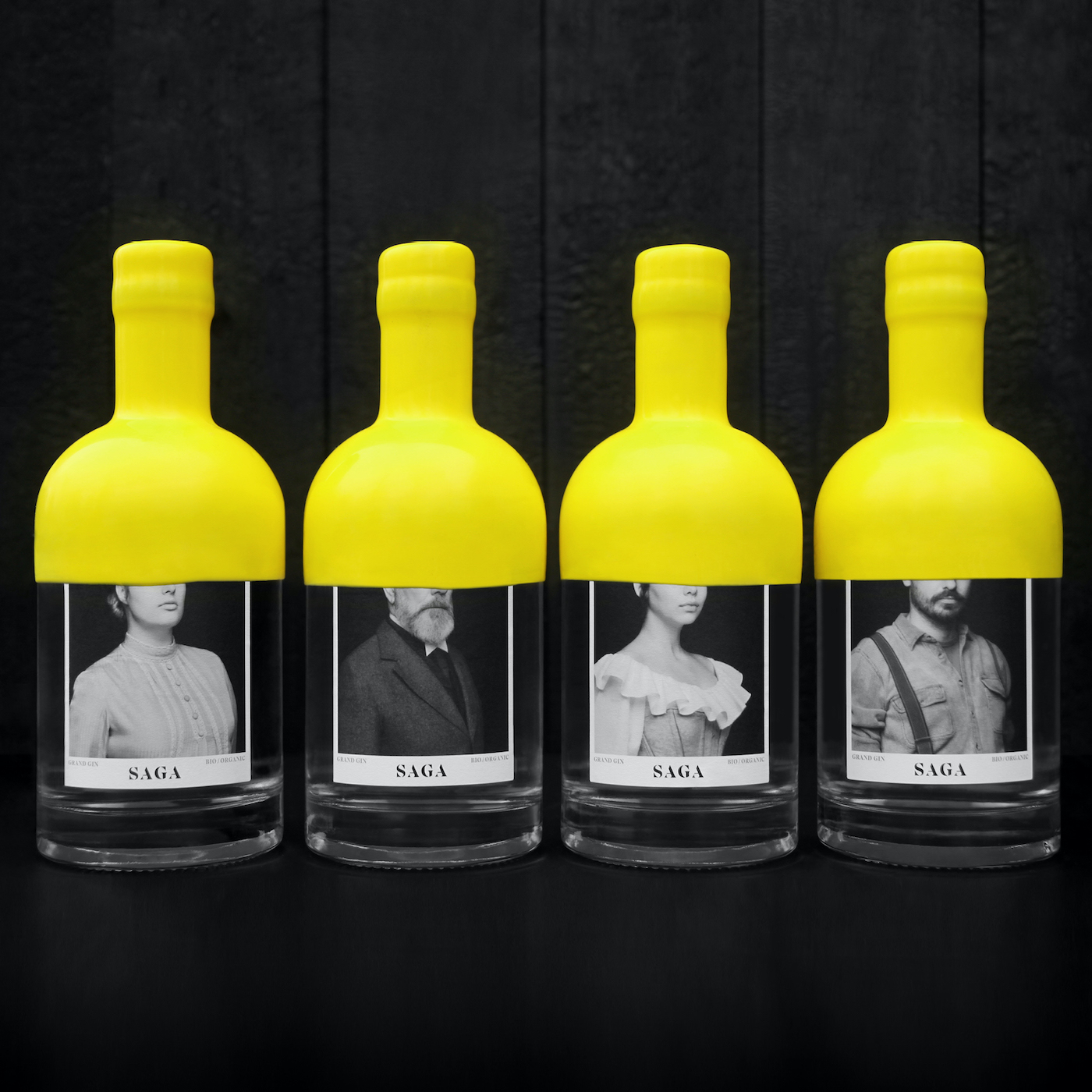
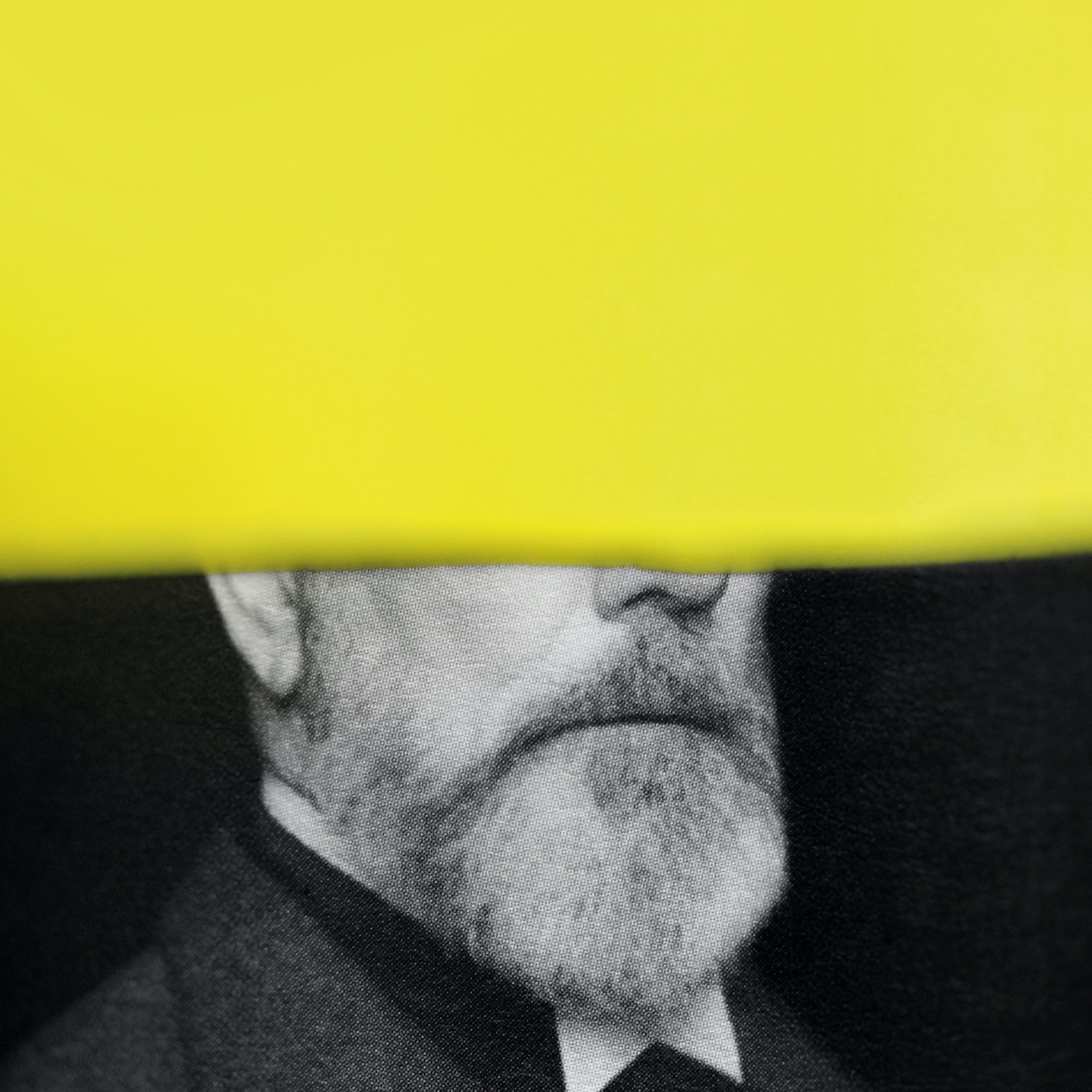
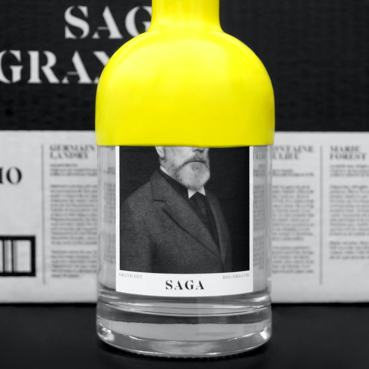
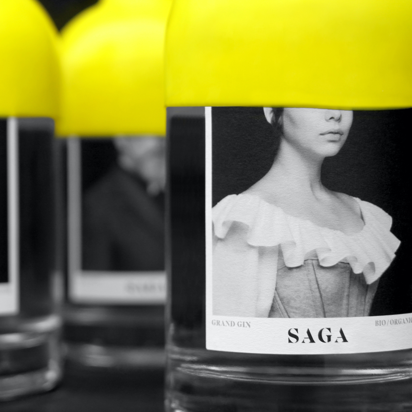
The Distillerie Grand Dérangement is a new distillery from Lanaudière in Quebec that wanted to produce and sell the first certified organic gin in the province as their first product. Many distilleries were created in the last years in Quebec, which explain the high competition and the need for this project to be unique and have a strong graphic impact. Their idea was for Paprika to create a name and a graphic identity for this gin that relates to the history behind the name of the distillery. The Grand Dérangement refers to the deportation of the Acadian people of Canada by the British Government that started in 1755. The town where the distillery is established was founded by Acadians hence the hommage. The creative process started with historical research on the matter in order to better understand the main characteristics of the Acadian people and its history. Based on our research, we found four Acadian individuals that truly existed and filled the missing pieces of their stories as accurately as possible with the idea that the boxes would bare their stories, and contain twelve bottles, three for each characters. We decided on the name SAGA as it is a short and easily remembered name that links all these stories together. The name is directly linked to the deportation of the Acadians as this event defined their story and strengthened the pride that all Acadians have for the courage and determination of their ancestors. The wax seal on the bottle keeps the simplicity of the product while still creating a distinctive element. Wax has been used for sealing alcohol for centuries, which is why we chose to use it, as it adds to the historical reference of the brand. The yellow wax covers almost half of the bottle in order to hide the eyes of the person on the label, enhancing the mystery around these individuals and their story. The consumer can then choose the character that he prefers or finds more relatable when picking his bottle or try to collect them all. The box is mainly black and white and covered with the stories of each characters, the brand and the deportation, resembling a newspaper and contrasting with the colourful bottle. The two are still linked by the yellow seal on the box.


CREDIT
- Agency/Creative: Paprika
- Article Title: Paprika Creates the Graphic Identity of the SAGA Grand Gin
- Organisation/Entity: Agency, Published Commercial Design
- Project Type: Packaging
- Agency/Creative Country: Canada
- Market Region: North America
- Project Deliverables: Brand Creation, Brand Identity, Brand World, Branding, Graphic Design, Packaging Design, Photography, Product Naming, Research, Retail Brand Design
- Format: Bottle, Box
- Substrate: Glass Bottle, Pulp Carton


