


Paper is closely related to our everyday life, but do we know its qualities, abilities and history of this material? This is what the concept of exhibition named Paper Story about.
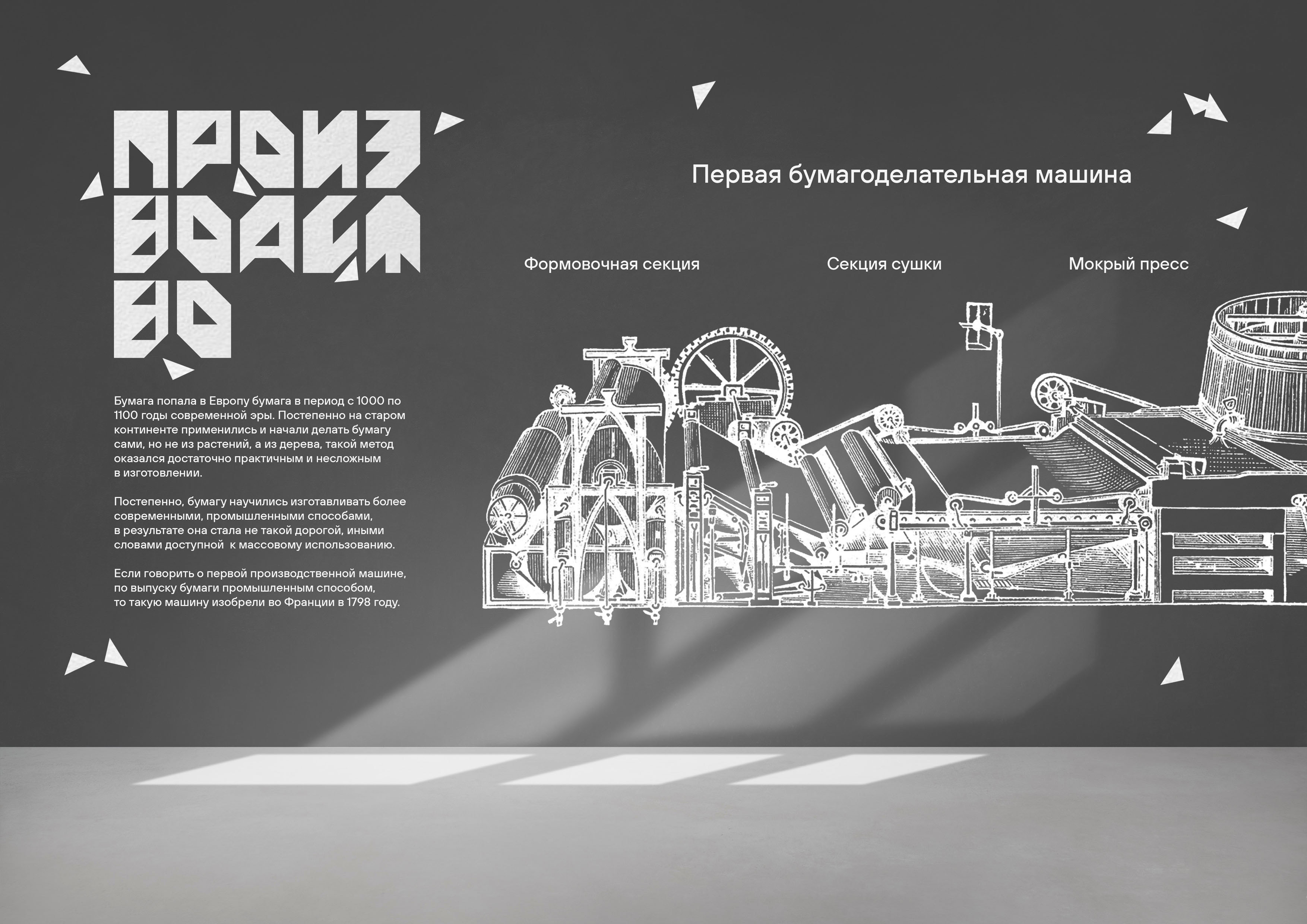
The exhibition space is (conceptually) separated to 3 halls: Paper in the Past, Paper Production and Paper Now. The first one includes some ancient types of paper. The second one includes pictures and different scaled paper production models. And, finally, the third one includes installations about creative and unusual ways of using different types of paper nowadays. It is probably the biggest hall of all because now there’s a lot of ways to produce paper, a lot of ways to use it and everyone has access to it.
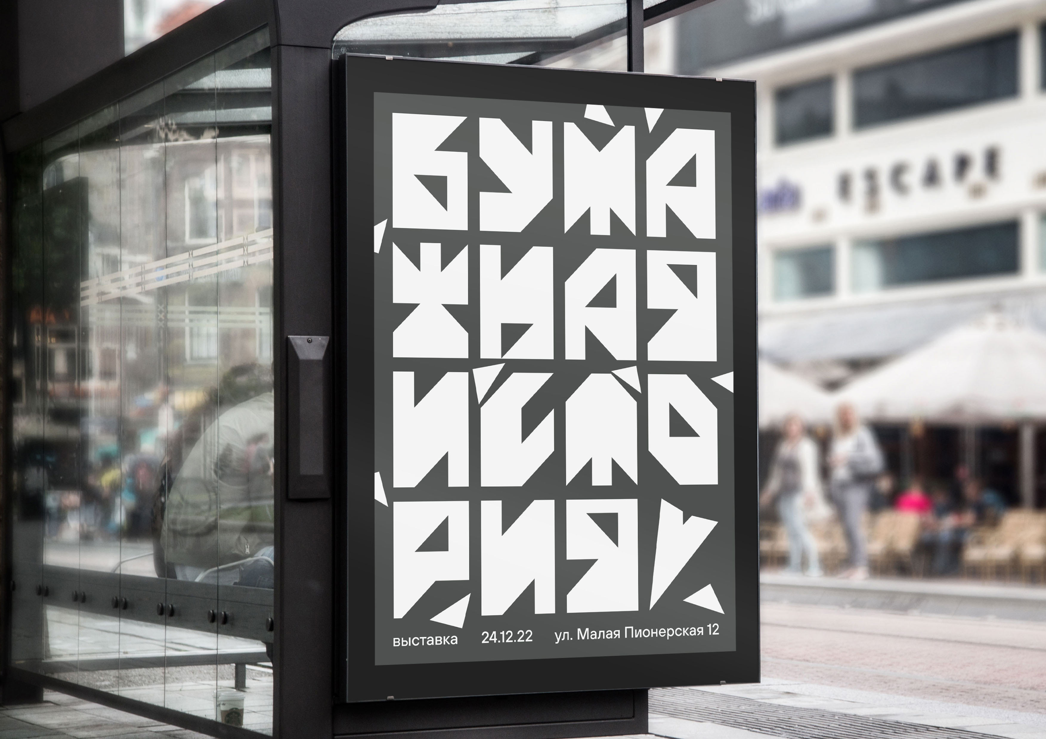
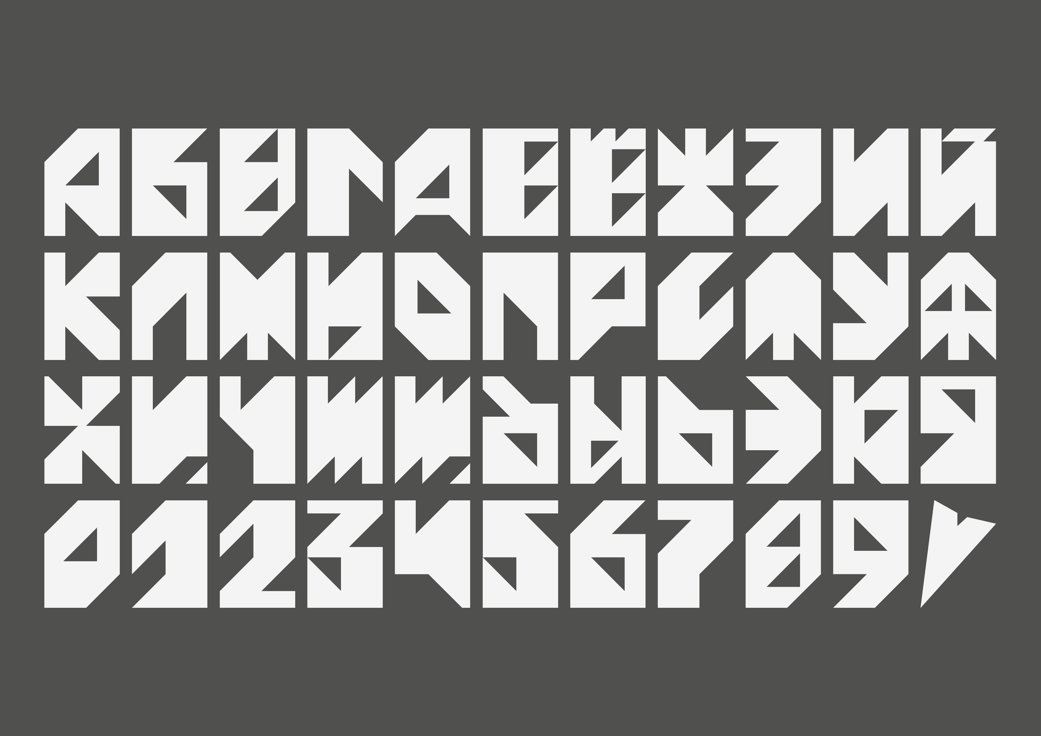
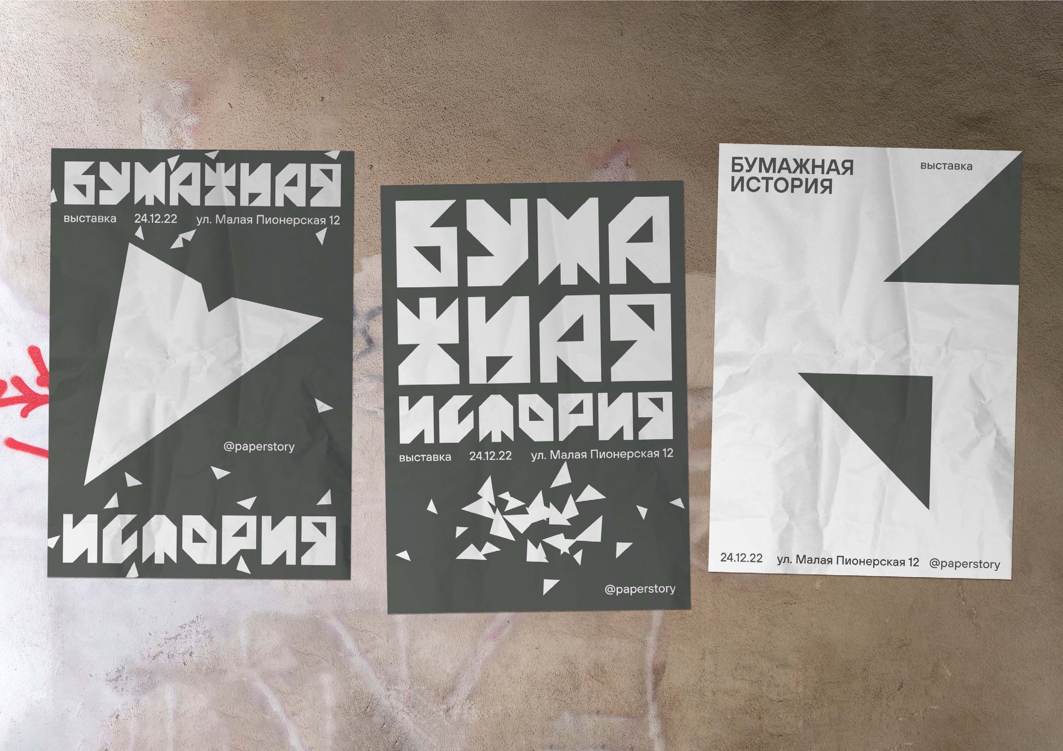
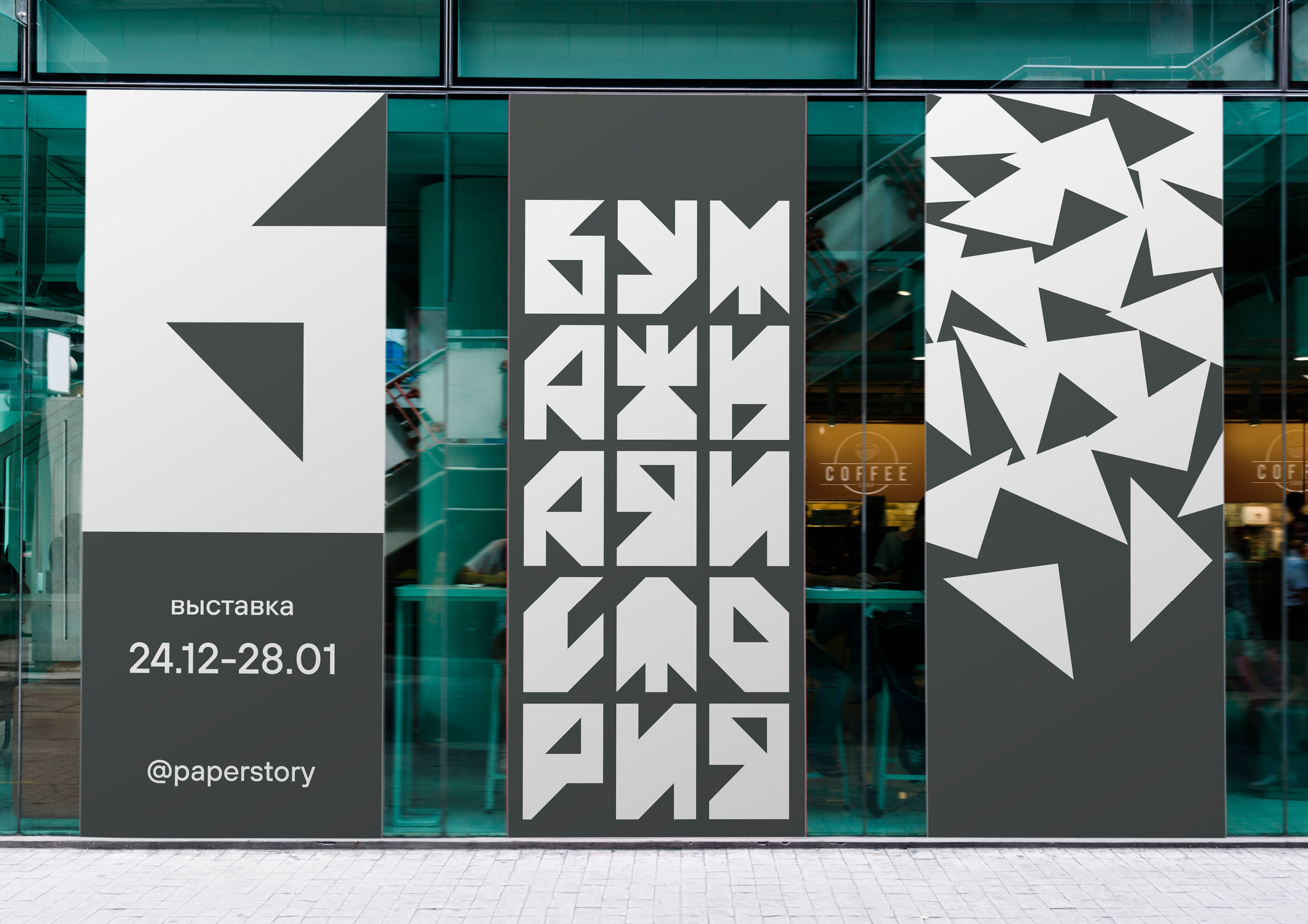
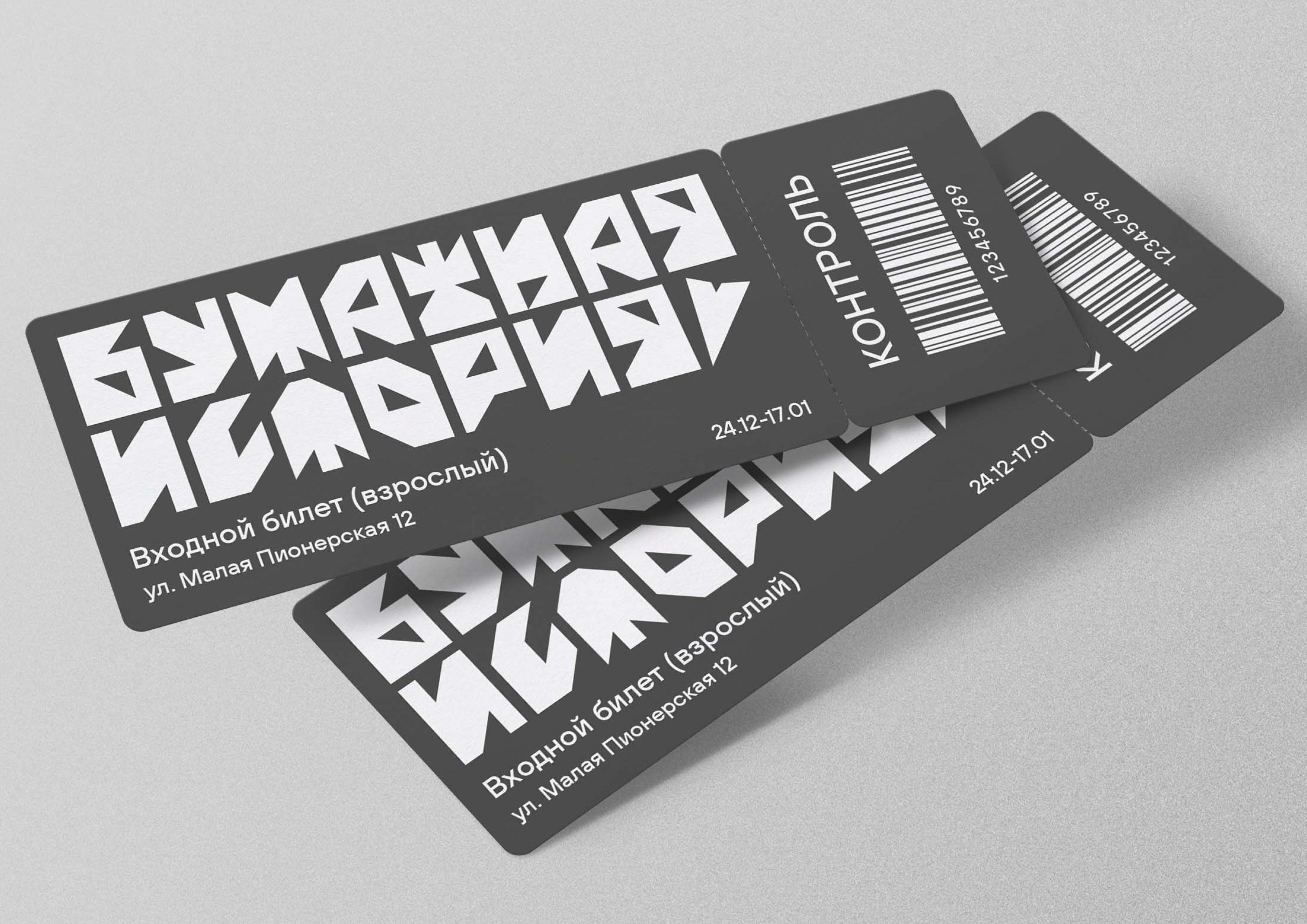
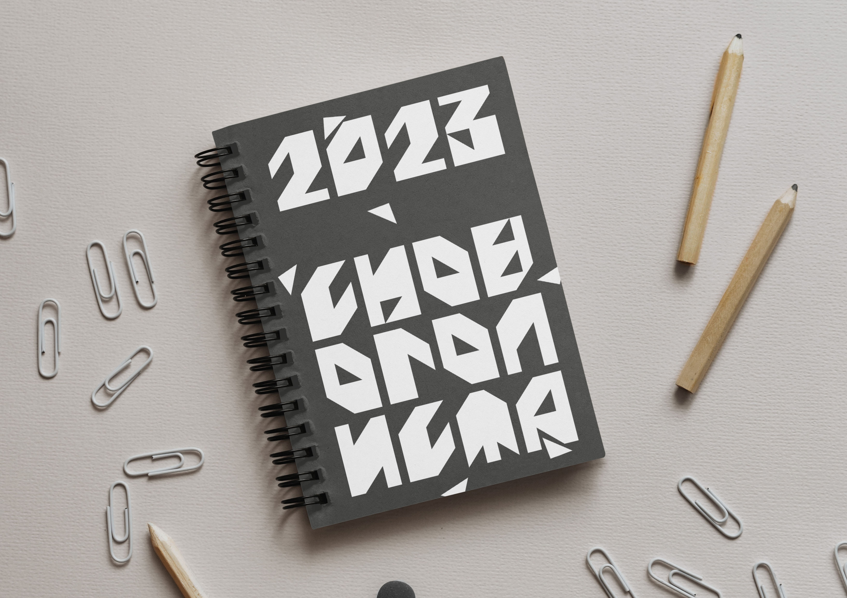
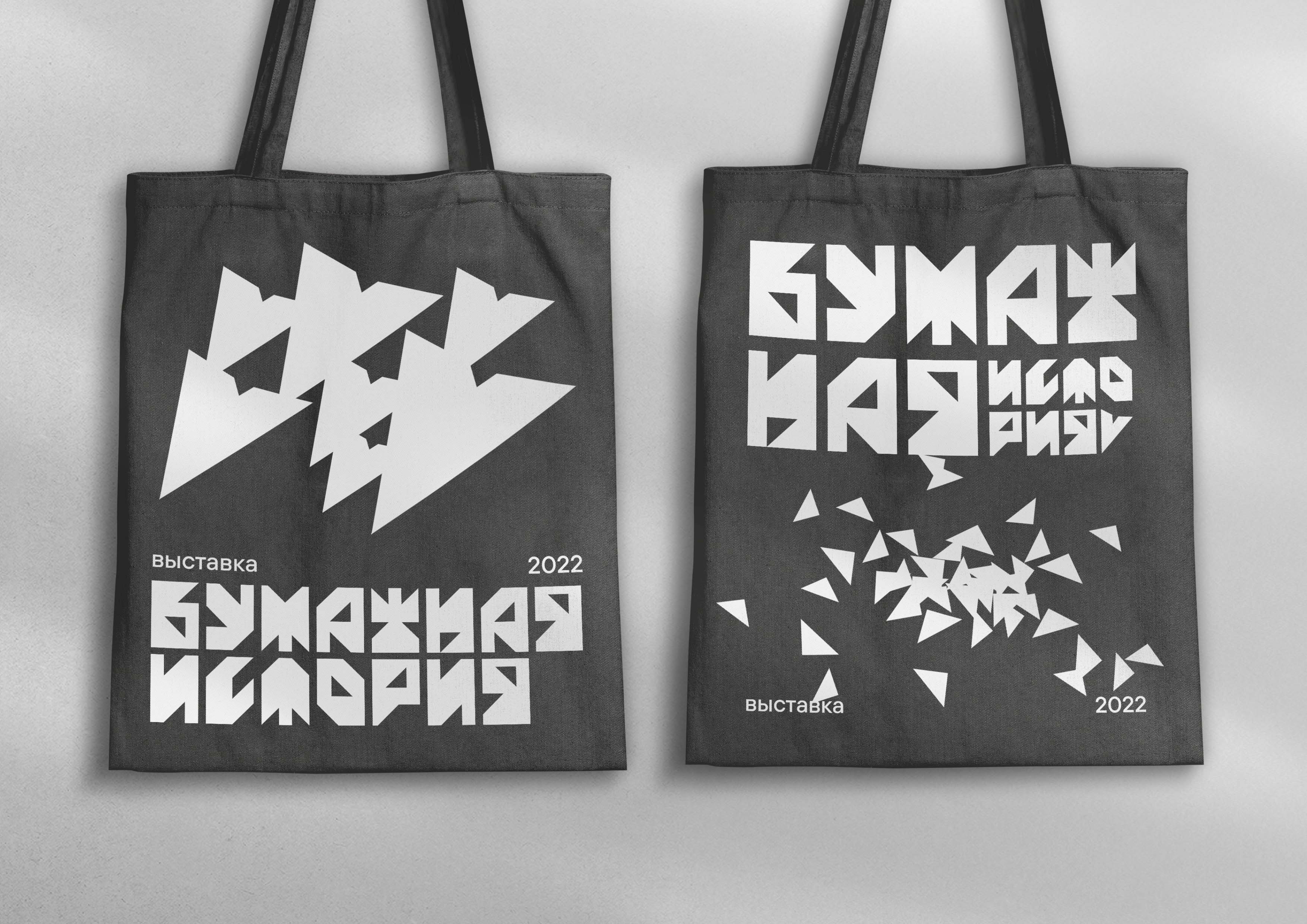
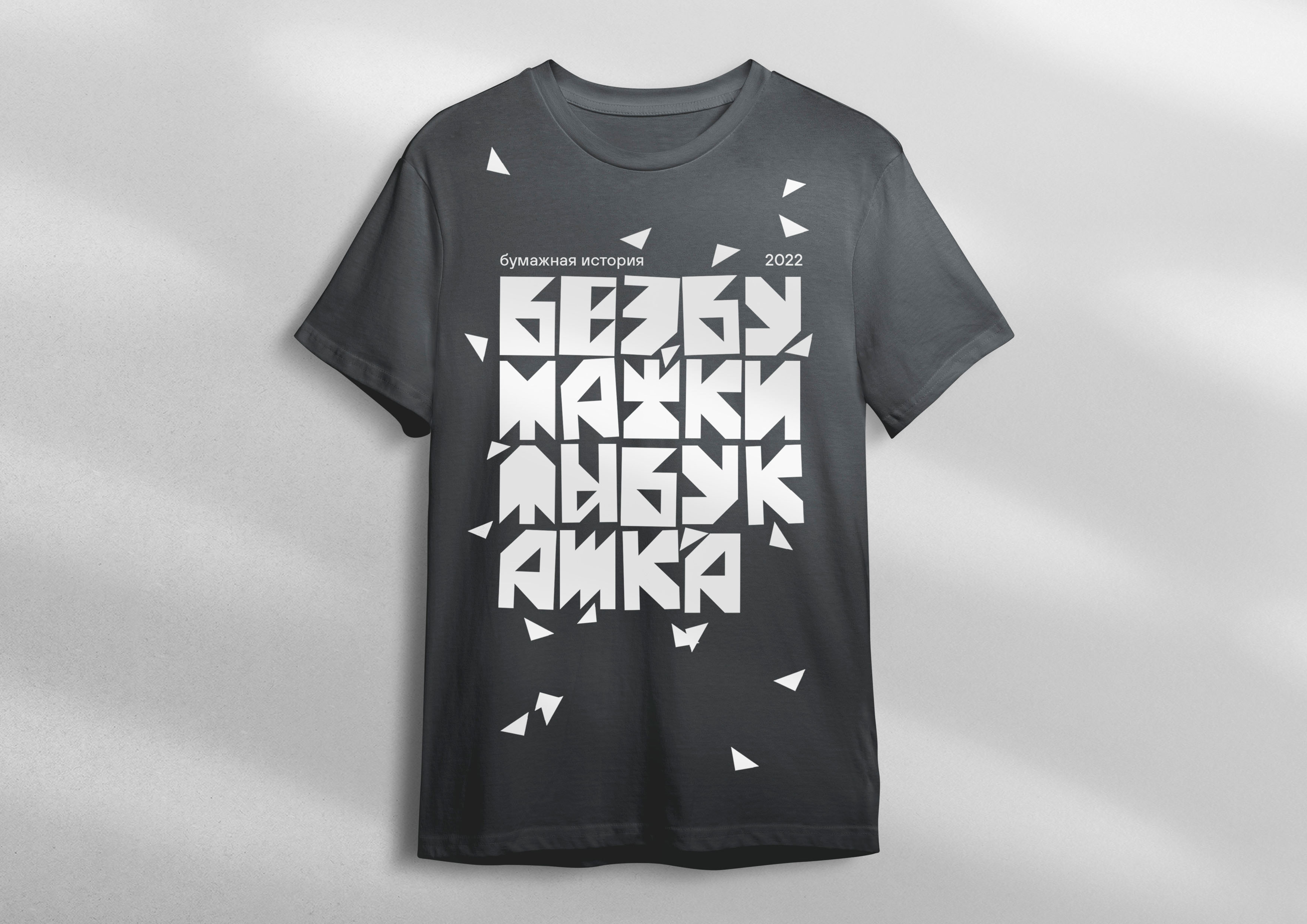
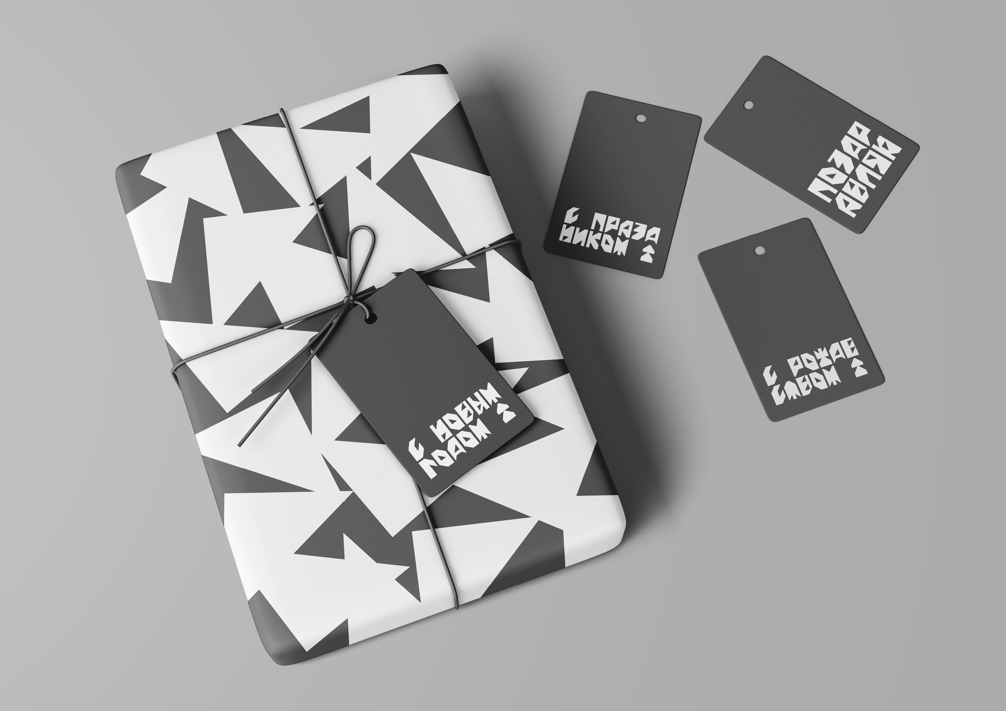
For this exhibition I created custom cyrillic font inspired by paper sheet resolution, paper folds and triangular cuts. The identity is based around the font and the things we usually do with paper except for writing and printing: cut and fold. The words are usually hypernated (if needed) and with no spaces to create the big letter rectangle. The cut triangles are everywhere, as they were just cut and left on the table. Paper triangles can easily shape into a pattern. There’s also a paper plane, simple origami toy everyone knows how to make. It kind of plays the role of the mascot which is also an additional font glyph. Chosen colors are simple: white letters as paper sheets and non-distracting grey background for contrast. The combination of these elements creates diversity for exhibition identity.
CREDIT
- Agency/Creative: Anna Galsanova
- Article Title: Paper Story Exhibition Branding
- Organisation/Entity: Student
- Project Type: Identity
- Project Status: Non Published
- Agency/Creative Country: Russia
- Agency/Creative City: Moscow
- Market Region: Europe
- Project Deliverables: Exhibition Design, Type Design, Typography
- Industry: Entertainment
- Keywords: Exhibition, Font
-
Credits:
Curator: Leonid Slavin
Designer: Anna Galsanova


