Who is Papat?
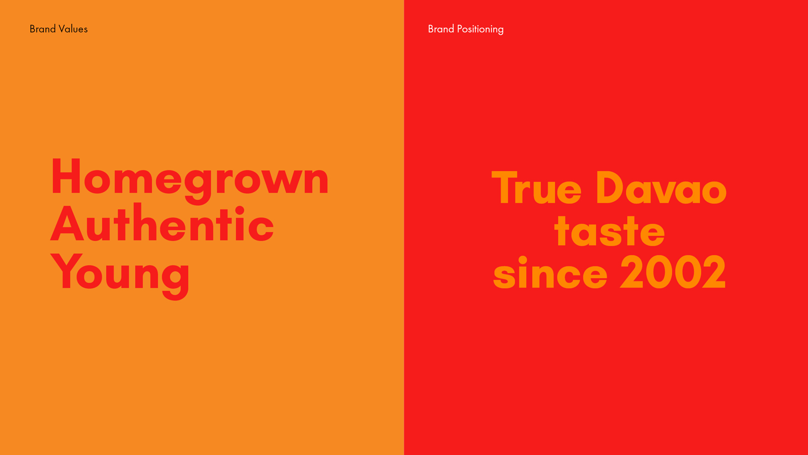
Papat’s Foods, affectionately known as Papats, stands as a renowned meat processing company hailing from Davao City, Philippines. What began as a modest catering business in 2002 has blossomed into the thriving enterprise we see today.
Amidst their remarkable growth, Papat’s Foods remains unwavering in its commitment to provide the people of Davao, and eventually the entire Philippines, with an authentic homegrown taste they can cherish.
The goal
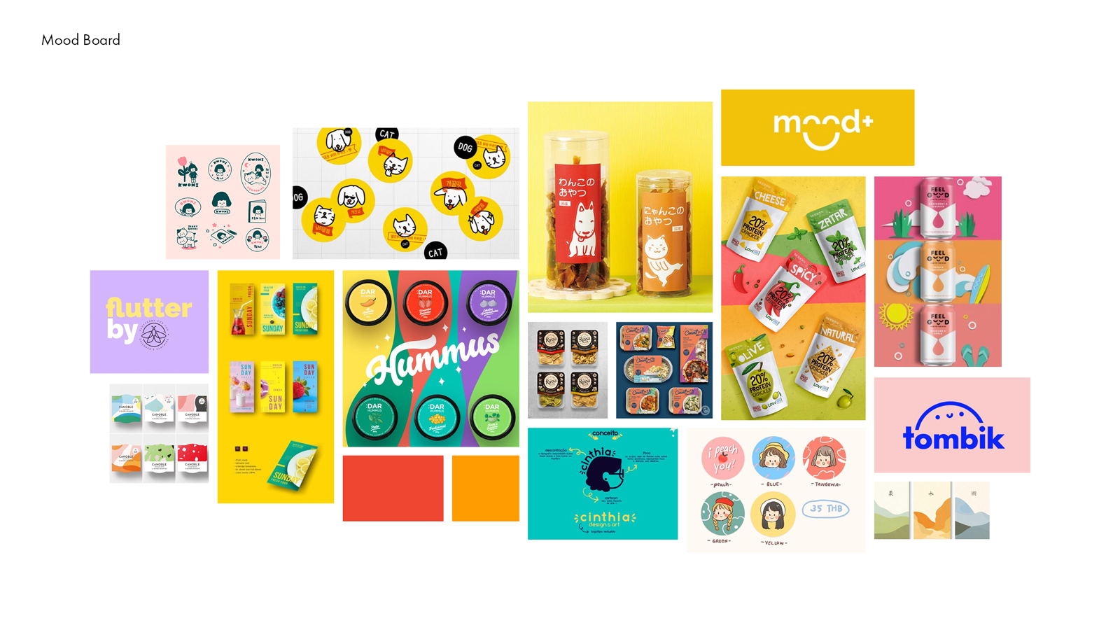
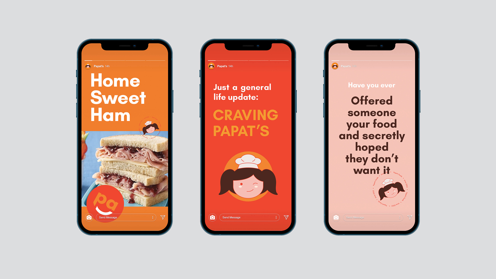
To adapt to the ever-changing landscape and connect with today’s generation, the company decided to go through a rebranding effort. This project seeks to breathe new life into their visual identity, infusing it with youthful energy and relevance for the present day. By doing so, Papats aims to continue captivating the hearts and palates of their cherished customers, while also captivating the hearts and palates of a new era of consumers.
The Concept
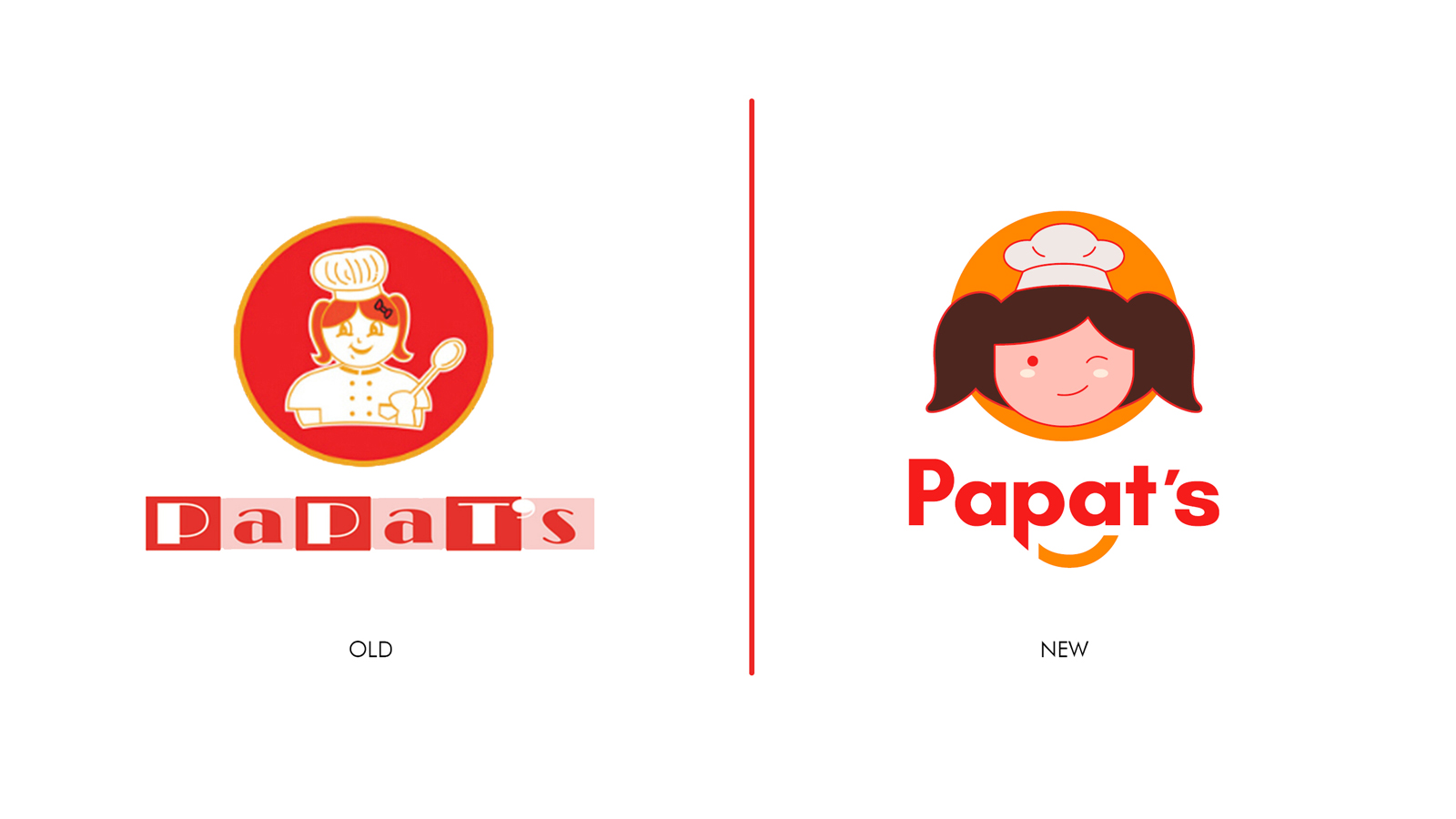
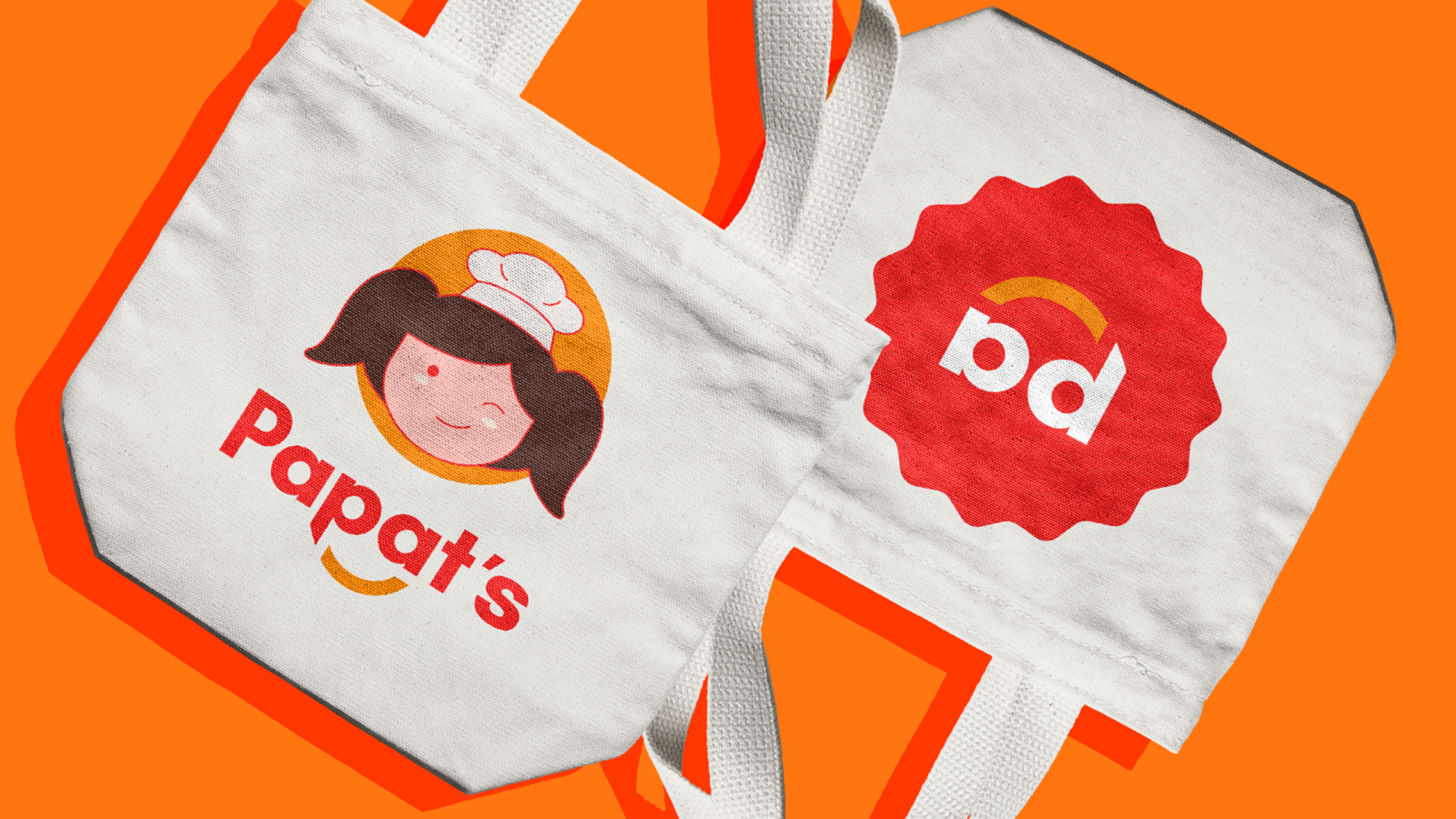
The old logo’s young girl underwent a redesign to give her a more modern look. We removed her body and arms, so the focus is now on her face, creating a better “human” connection with the audience. However, the full-body version still exists as a supporting graphic for the brand.
Additionally, we made a subtle yet significant change by bringing the letters P and A together with an arch below them, resembling a smiling face. This change supports the brand’s friendly and youthful personality, making it even more approachable to customers.
A Home-y Feeling
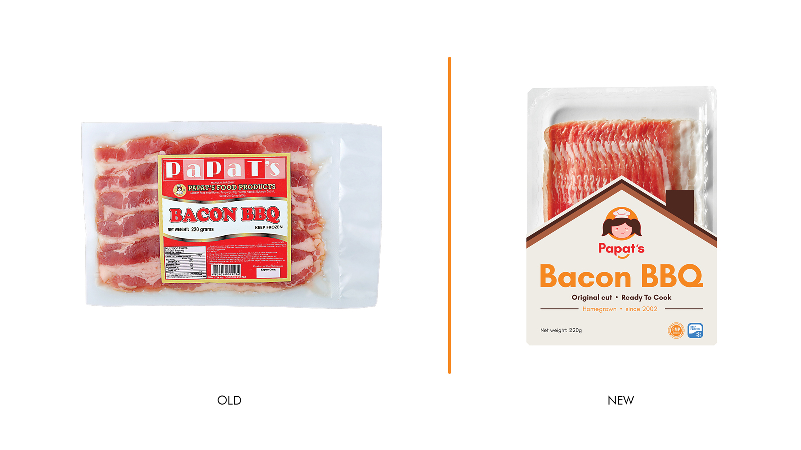
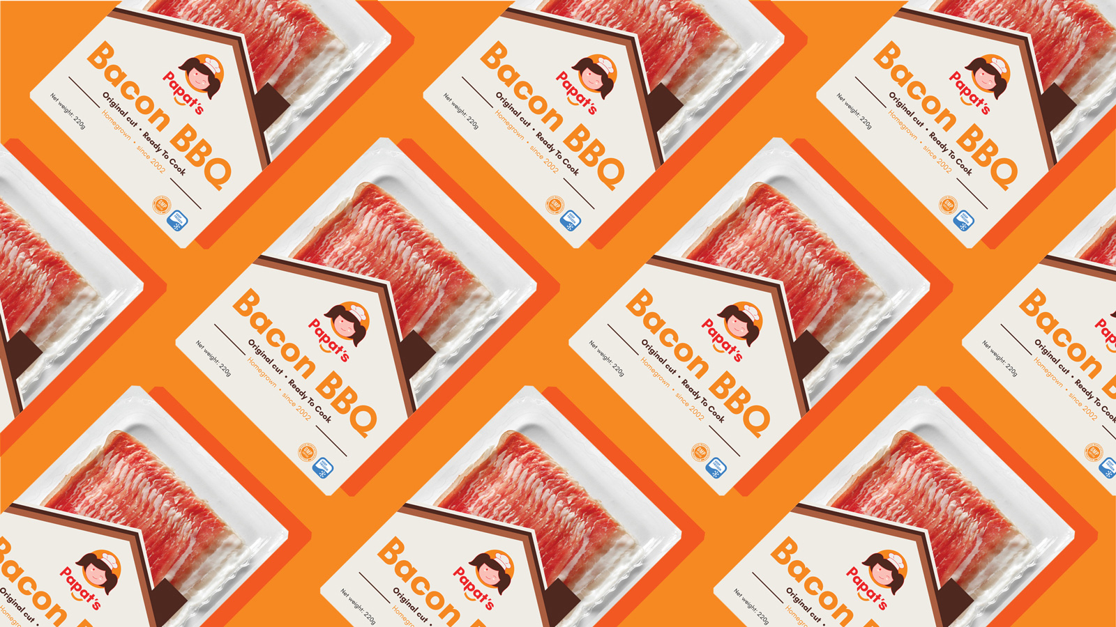
The brand takes immense pride in its home-grown roots, and they wanted to reflect this in their packaging. The perfect way to do so? By using a house-shaped packaging design.
The label on the packaging cleverly takes the form of a house, depicted in a simple and vibrant flat-colored style that harmonizes with the brand’s overall visual identity. This delightful packaging gives the product a fresh and youthful appearance, creating a striking contrast to their 20-year legacy. It’s a brilliant way to showcase their origins while embracing a modern and inviting look.



CREDIT
- Agency/Creative: Super Graphic
- Article Title: Papat’s Foods Visual Identity Refresh
- Organisation/Entity: Freelance
- Project Type: Identity
- Project Status: Published
- Agency/Creative Country: Philippines
- Agency/Creative City: Santa Rosa, Laguna
- Market Region: Asia
- Project Deliverables: Brand Design, Brand Identity, Packaging Design
- Industry: Food/Beverage
- Keywords: Processed meat, visual identity, food and beverage
-
Credits:
Brand Designer: Arnold De Guzman


