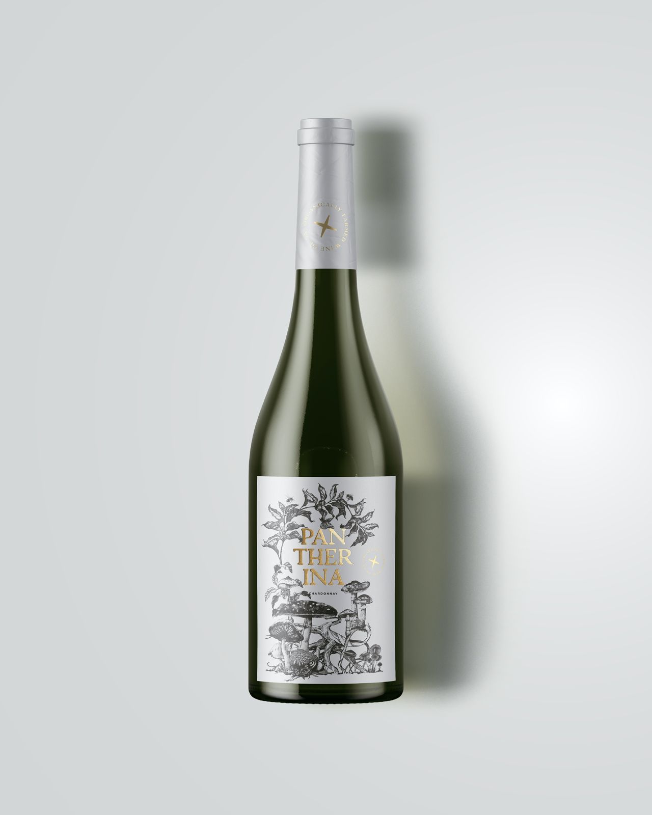
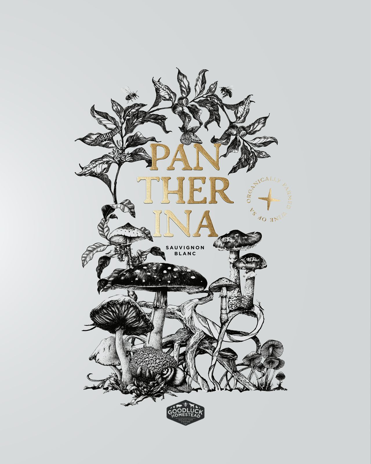
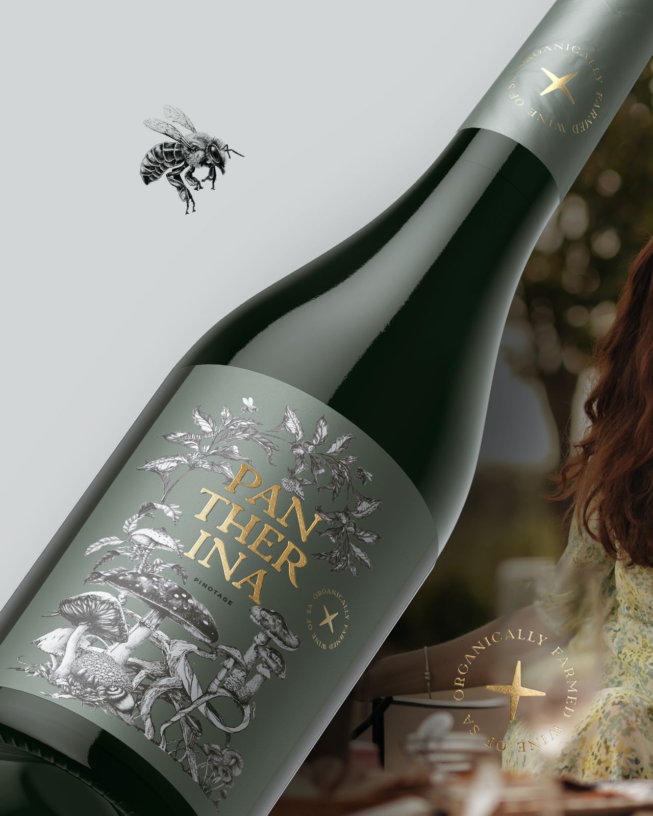
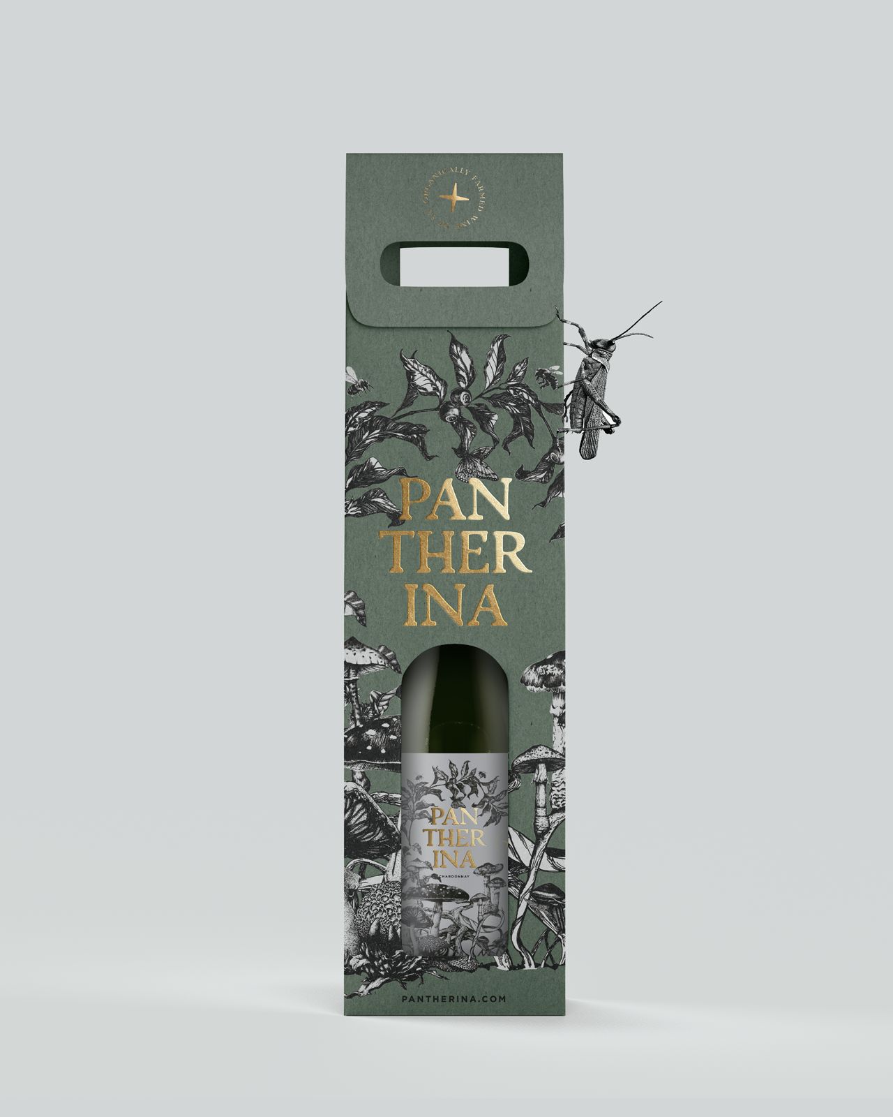
Nestled in a lush tapestry of whimsical mushrooms and enchanting woodland creatures, our label design for Pantherina is a gateway to the extraordinary. At the heart, a golden emblem radiates the essence of organically farmed South African wine, a testament to the purity and magic of nature. Let the starlit path guide your senses beyond the celestial, savoring a blend where the universe itself seems to pour into your glass.
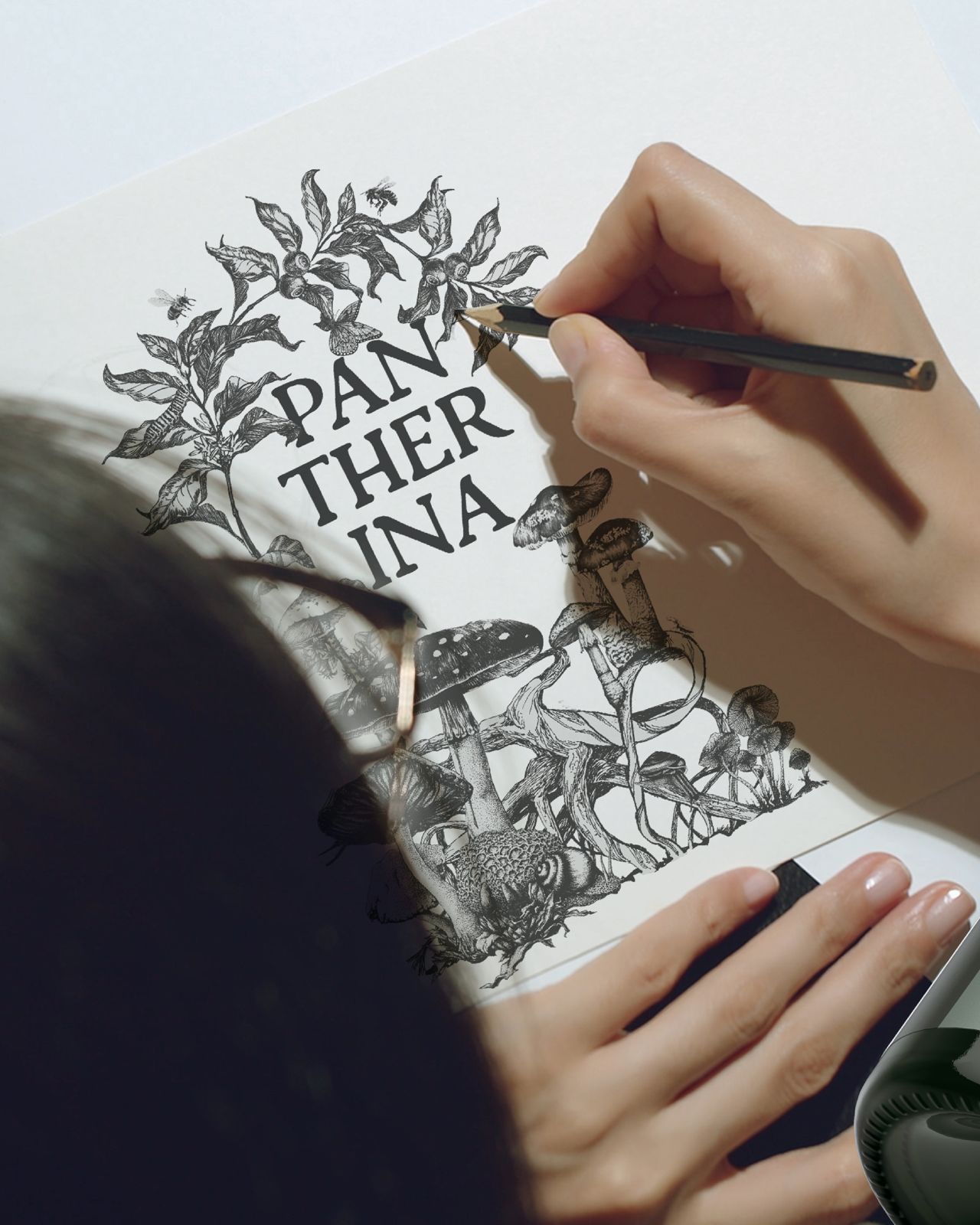
Crafted with meticulous attention to detail, Pantherina’s label design not only captivates the eye but also serves as a testament to the craftsmanship involved in the winemaking process. The intricate details of whimsical mushrooms and enchanting woodland creatures are not merely artistic elements; they are a reflection of Pantherina’s commitment to organic farming in the Stanford region of South Africa. This commitment is pivotal in preserving the biodiversity and ensuring the sustainability of winemaking in this picturesque locale.
The design is a visual celebration of the interconnectedness between Pantherina’s vineyards and the surrounding ecosystem. The whimsical mushrooms, with their vibrant colors and fantastical shapes, mirror the diversity of flora that thrives in the organic vineyards. Each mushroom becomes a tiny guardian of biodiversity, representing a delicate balance that Pantherina strives to maintain.
Similarly, the woodland creatures depicted on the label play a crucial role in the narrative of sustainability. From playful squirrels to wise owls, these creatures are not mere embellishments; they symbolize Pantherina’s commitment to coexisting harmoniously with the natural environment. By embracing organic farming practices, Pantherina ensures that the vineyards provide a habitat for a myriad of species, contributing to the overall health of the ecosystem.
The golden emblem at the heart of the design serves as a beacon, radiating the essence of organically farmed South African wine. This emblem is more than just a symbol; it embodies the dedication to sustainable viticulture practices. Organic farming, with its avoidance of synthetic pesticides and fertilizers, becomes a crucial element in Pantherina’s ethos, fostering soil health and preserving the delicate balance of the Stanford terroir.
In the Stanford region of South Africa, where Pantherina’s vineyards thrive, the commitment to organic farming goes beyond mere adherence to a set of principles. It becomes a way of life—a conscious decision to nurture the land and cultivate grapes in harmony with nature. The label design, with its vivid depiction of woodland flora and fauna, is a visual representation of this commitment, inviting consumers to appreciate not only the wine but also the holistic approach to winemaking.
The craftmanship embodied in Pantherina’s label design becomes a narrative of stewardship and responsibility. As one gazes upon the label, the intricate details reveal a story of hands-on cultivation, where each vine is tended to with care and respect for the ecosystem. The commitment to organic farming becomes a thread in the rich tapestry of Pantherina’s winemaking, ensuring that every bottle carries not just the flavors of the terroir but also the spirit of sustainable viticulture.
The starlit path depicted on the label, which guides the senses beyond the celestial, takes on an added significance in the context of Pantherina’s commitment to organic farming. It becomes a metaphorical journey through the vineyards, where the light of sustainability illuminates the way. As consumers savor the blend in their glasses, they become part of a larger narrative—a narrative of supporting environmentally conscious practices and promoting a sustainable future for winemaking in South Africa.
Pantherina’s label design is a masterful fusion of artistry and commitment to the environment. The whimsical mushrooms, enchanting woodland creatures, and the golden emblem collectively tell a story of organic farming, biodiversity, and sustainability in Stanford, South Africa. As consumers engage with the label, they embark on a visual journey that extends beyond aesthetics, delving into the ethos of Pantherina—a winery dedicated not only to crafting exceptional wines but also to preserving the magic of nature for generations to come.
CREDIT
- Agency/Creative: Supernova Co.
- Article Title: Pantherina Wine Label Design
- Organisation/Entity: Agency
- Project Type: Packaging
- Project Status: Published
- Agency/Creative Country: South Africa
- Agency/Creative City: Supernova Co
- Market Region: Africa
- Project Deliverables: Brand Design, Illustration, Packaging Design
- Format: Bottle
- Industry: Food/Beverage
- Keywords: Packaging Design, packaging, brand design, creative design
-
Credits:
Creative Director: Jo Sagrestano
Creative Director: Riekus Raaths


