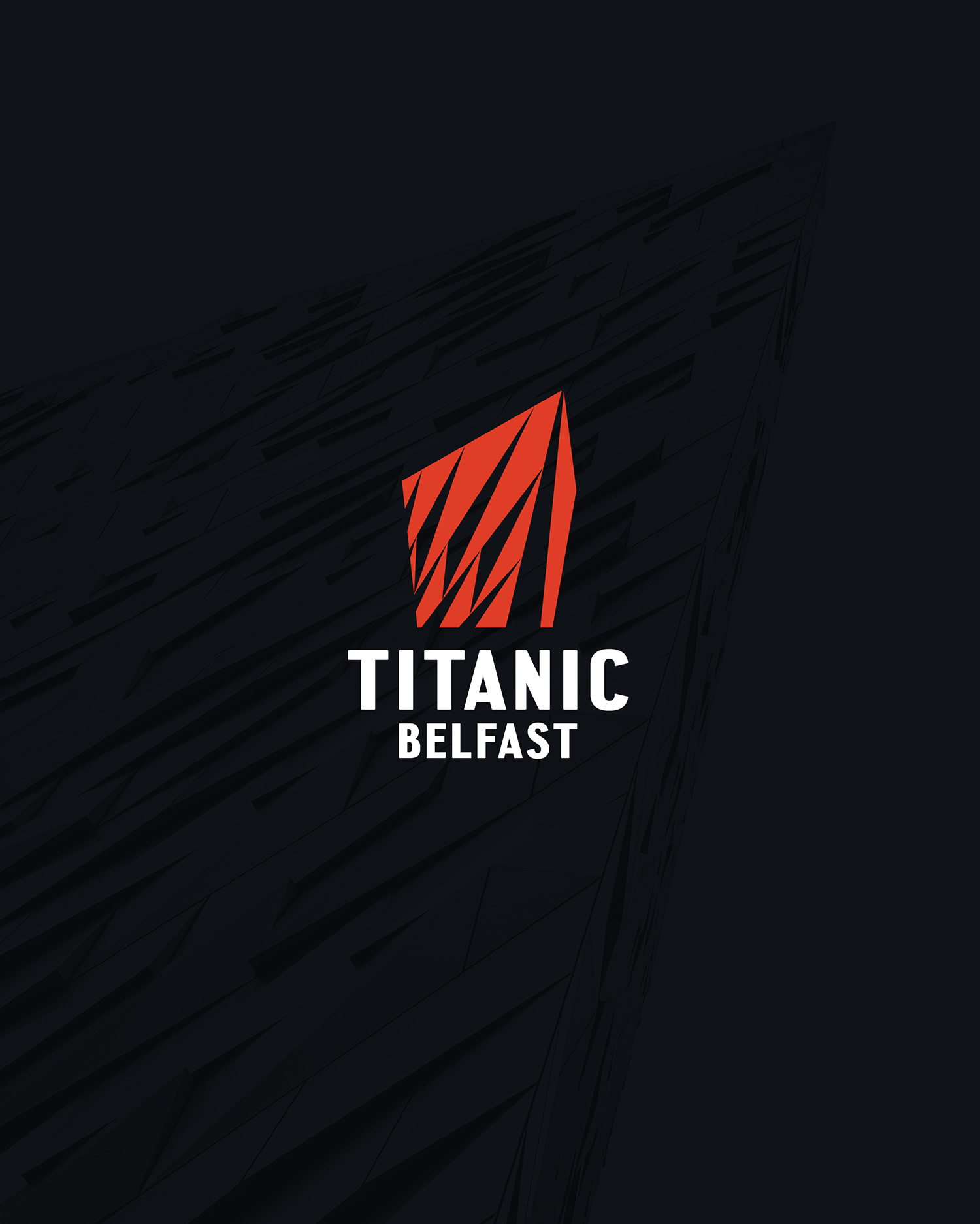
Titanic Belfast is a world leading visitor attraction located in Belfast, Northern Ireland. Located on the exact spot where RMS Titanic was designed, built and launched, Titanic Belfast offers an authentic visitor experience steeped in heritage and history.
Having attracted almost 6 million visitors from all over the world since opening in 2012, Titanic Belfast has been a catalyst for change, spearheading a transformation for tourism in Northern Ireland.
Titanic Belfast is an iconic six-floor building featuring nine interpretive and interactive galleries that explore the sights, sounds, smells and stories of Titanic, as well as the City and people which made her. It is the World’s largest Titanic visitor experience.
In addition to the core attraction, the iconic building also houses a temporary exhibition space, banqueting suites, education and community facilities, catering outlets, a destination bar and retail store. It attracts tourists from all over the world who come to visit the birthplace of Titanic. The building originally opened in 2012 and now, eight years on and with several planned updates to the core product, they needed to revisit the brand to ensure its suitability and sustainability for the years ahead.
The existing brand had become fragmented, trying to cater for a wide range of product offerings. Too many logos, too many colours. No real consistency. The brief was to create a new brand positioning and tone of voice, look at a new brand architecture, refresh the logo and wider visual assets and create a new brand guidance document for their in-house design and marketing teams. In order to fully understand the requirements, we spent time visiting the centre, went on guided tours, took photos as part of an existing brand audit and ran two separate brand workshops with senior management and key staff to gain more insight into the product offering.
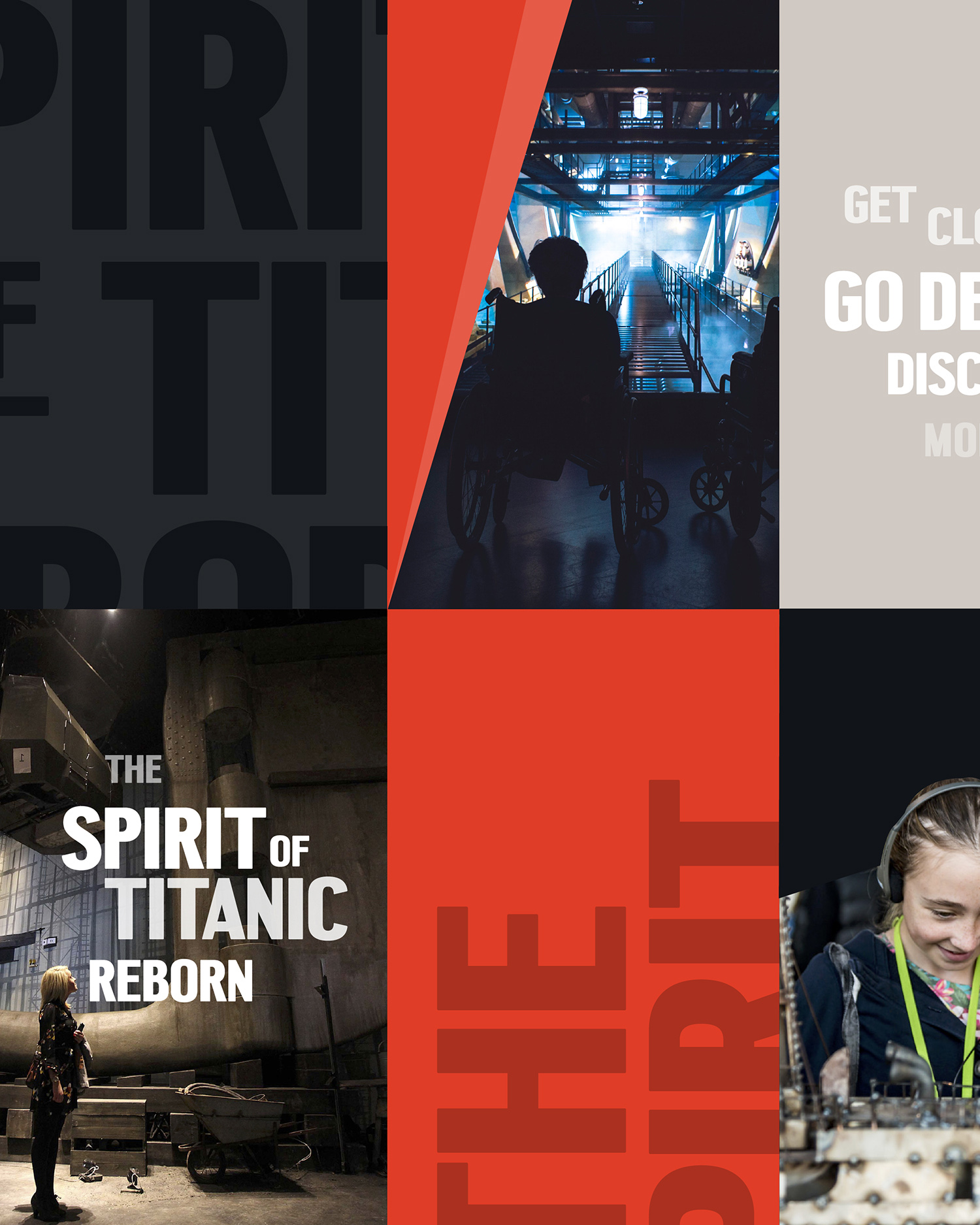
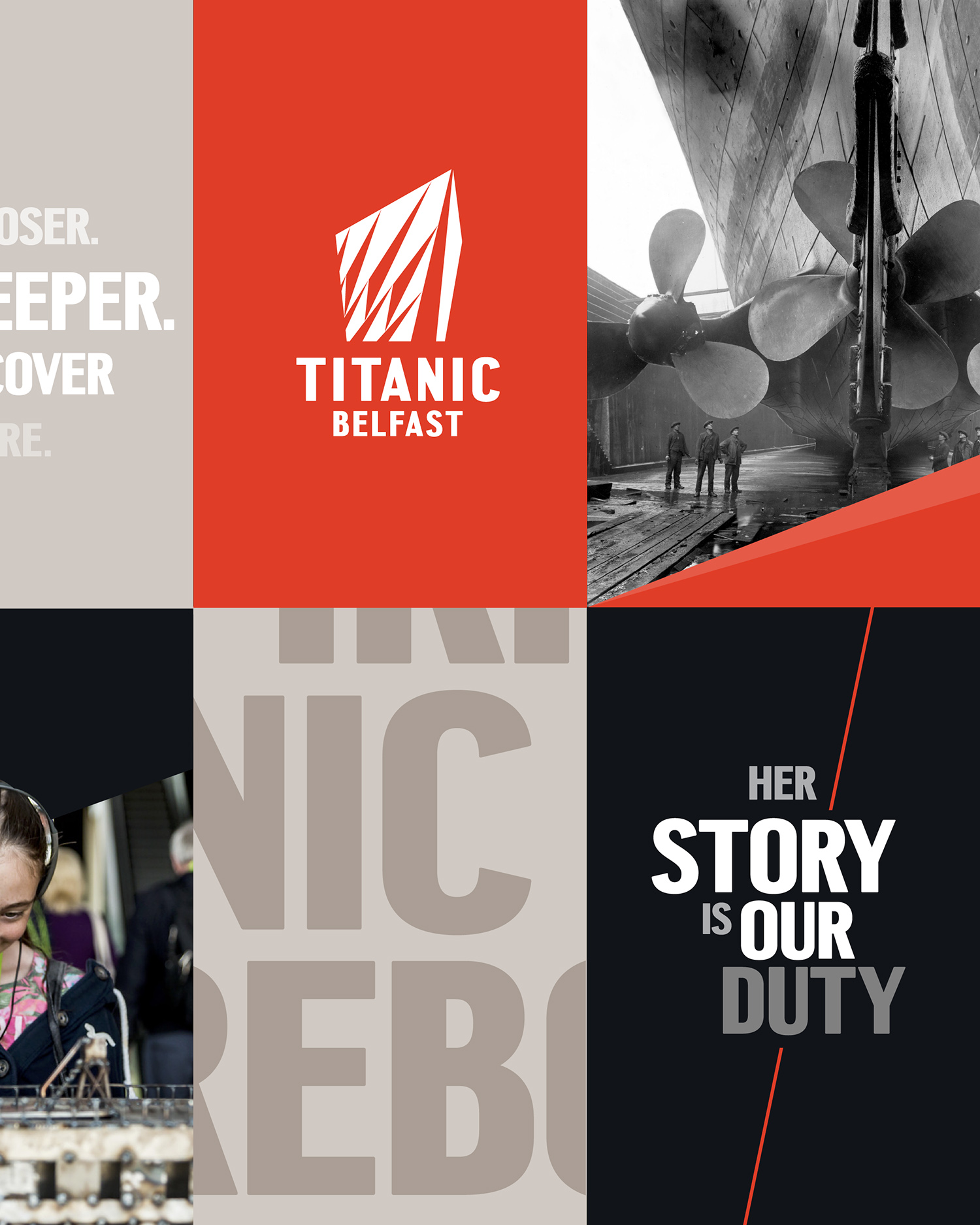
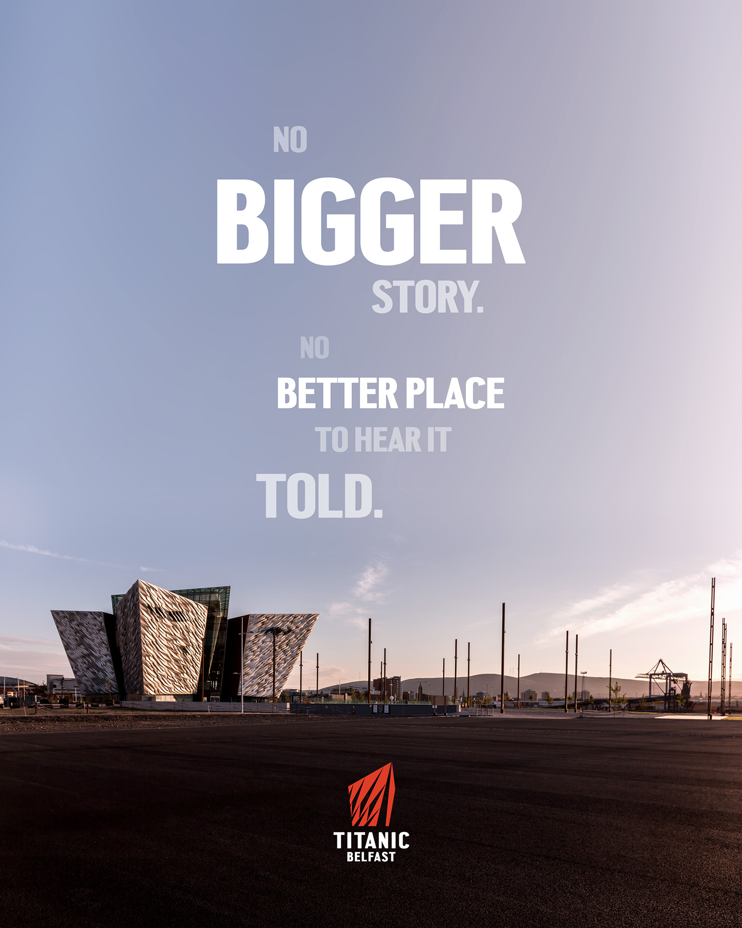
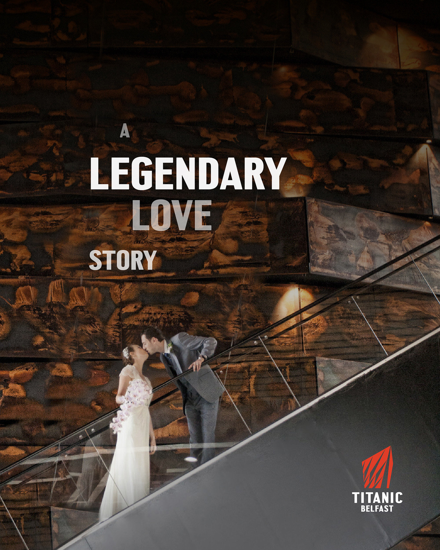
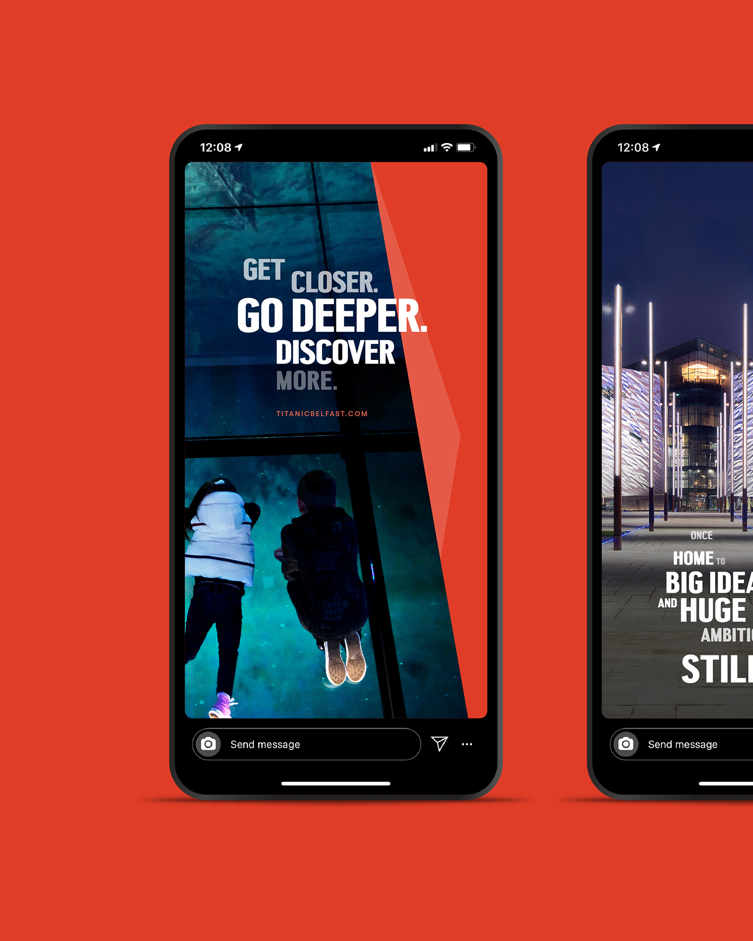
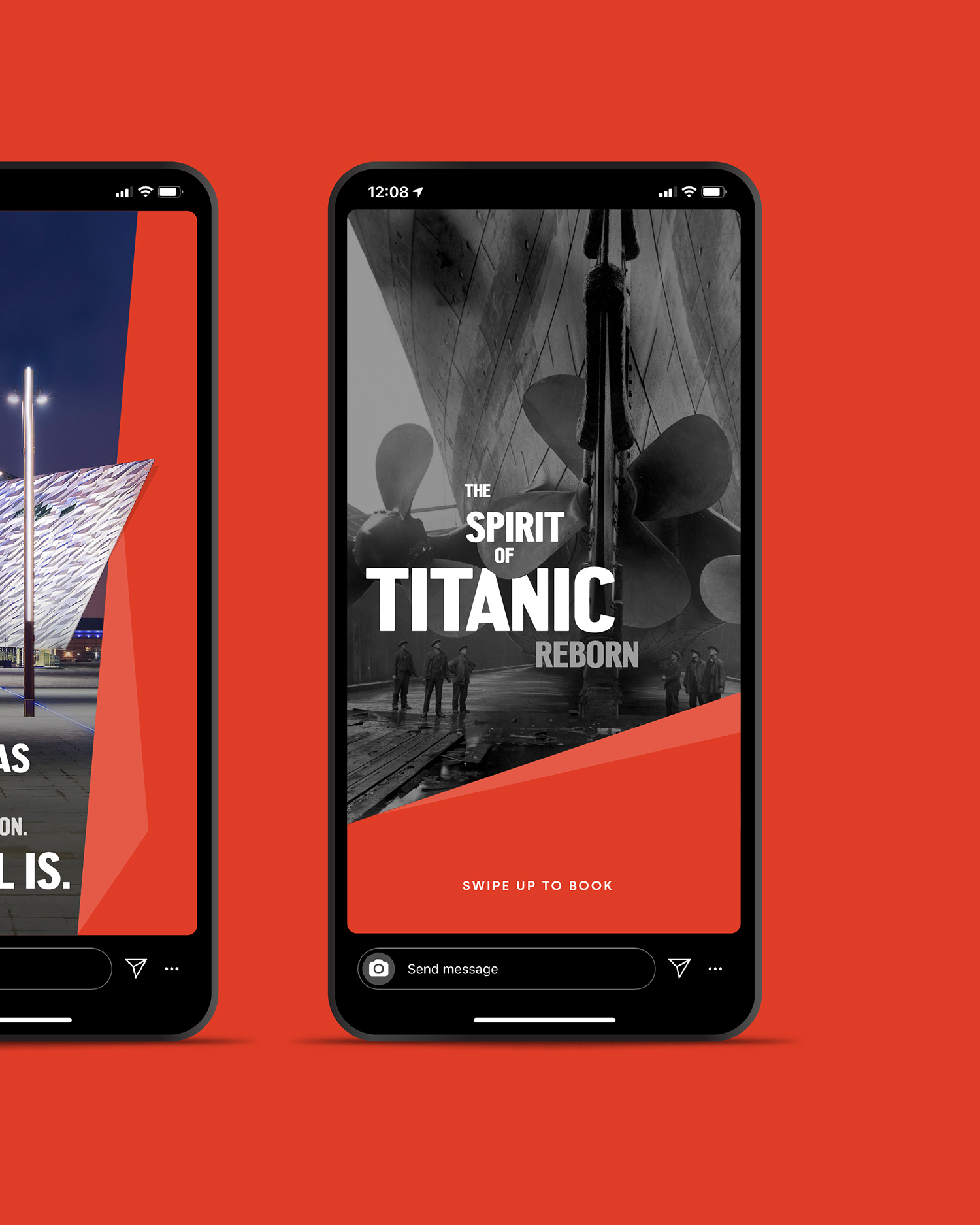
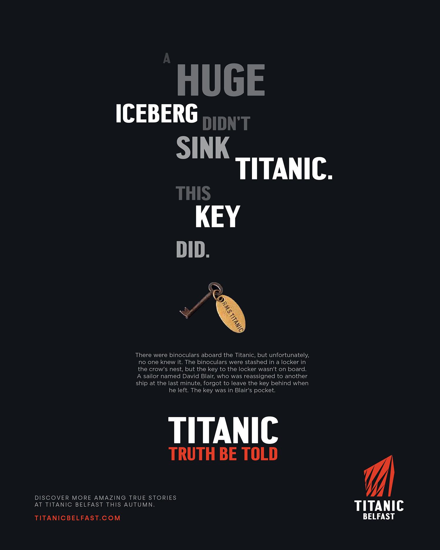
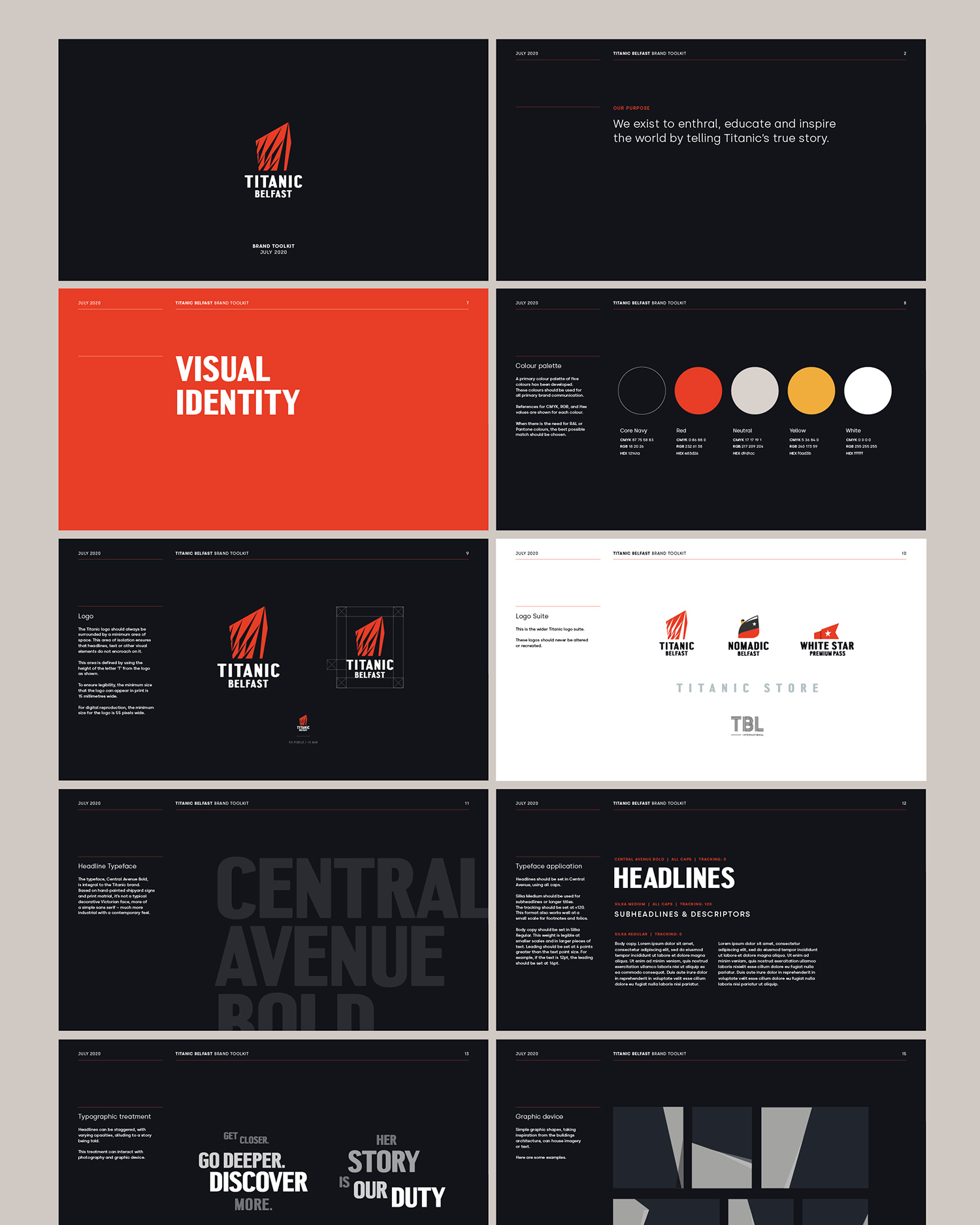
Form this discovery phase we developed a new brand positioning, focused around storytelling and the people involved in the original ship. Enthralling, educating and inspiring the world by telling Titanic’s true story. From the locals who worked in the shipyard to passengers and crew onboard the ship. We tightened up the architecture, bringing a unified style to all logos within the product offering and created a consistent colour palette across all aspects of the brand. The colour palette was influenced by the colours of the Titanic ship. A bold, condensed typeface was chosen, reflecting the signage and graphics from the old shipyard. Brand headlines were set in a staggered style to create a flowing narrative feel.
The logo was refreshed with the new typeface, creating a more balanced marque and giving it more confidence and standout.A secondary angled graphic system was developed, taking the lead from the exterior cladding on the building, and overlaying it with imagery to create an own able visual style for Titanic. The new brand was then applied to a range of touch points including signage, uniforms, way-finding, leaflets, social media, promotional videos and store merchandise. Finally, we created an easy to use brand guidelines document, underlining the new brand positioning, tone of voice, and showing how to apply the visual brand elements across a range of application examples. The project took 6 weeks in total and has been instrumental in helping titanic promote and market themselves to a global audience.
CREDIT
- Agency/Creative: Pale Blue Dot
- Article Title: Pale Blue Dot Creates New Brand Identity for Titanic Belfast
- Organisation/Entity: Agency, Published Commercial Design
- Project Type: Identity
- Agency/Creative Country: United Kingdom
- Market Region: Europe
- Project Deliverables: Brand Advertising, Brand Architecture, Brand Creation, Brand Experience, Brand Guidelines, Brand Identity, Brand Redesign, Brand Rejuvenation, Brand Strategy, Branding, Graphic Design, Identity System, Photography, Product Architecture, Rebranding, Research, Tone of Voice
- Industry: Hospitality
- Keywords: Titanic, Belfast, Visitor Centre, Exhibition Centre, Muesum, Branding, Brand Identity, Brand Strategy, Brand Architecture, Tone of Voice, Copywriting, Brand Guidelines, Graphic Design,


