Path – Anadin
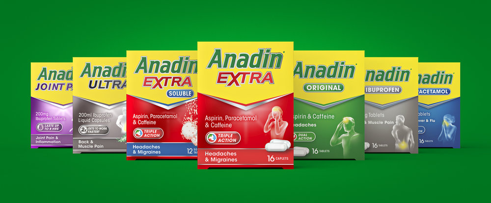
“Path, creative partners for brands, has supported Pfizer in a packaging design refresh of the Anadin portfolio. In uniting the ranges with a clearer and more intuitive design, the leading OTC brand aims to empower its consumers with the information to find the right product for their pain relief needs. The updated range will launch nationwide throughout the remainder of the year.
Path was tasked with identifying a design strategy that enhanced differentiation between the premium and core ranges whilst also establishing consistency across the entire Anadin portfolio. Improved clarity and communication were essential in strengthening navigation as well as conveying the key benefits of each product.
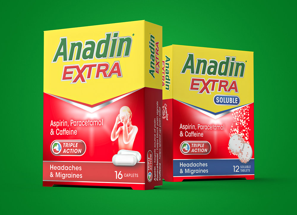
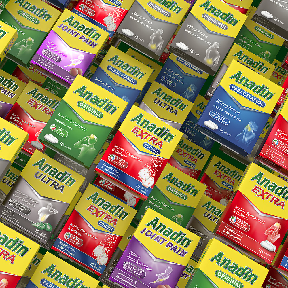
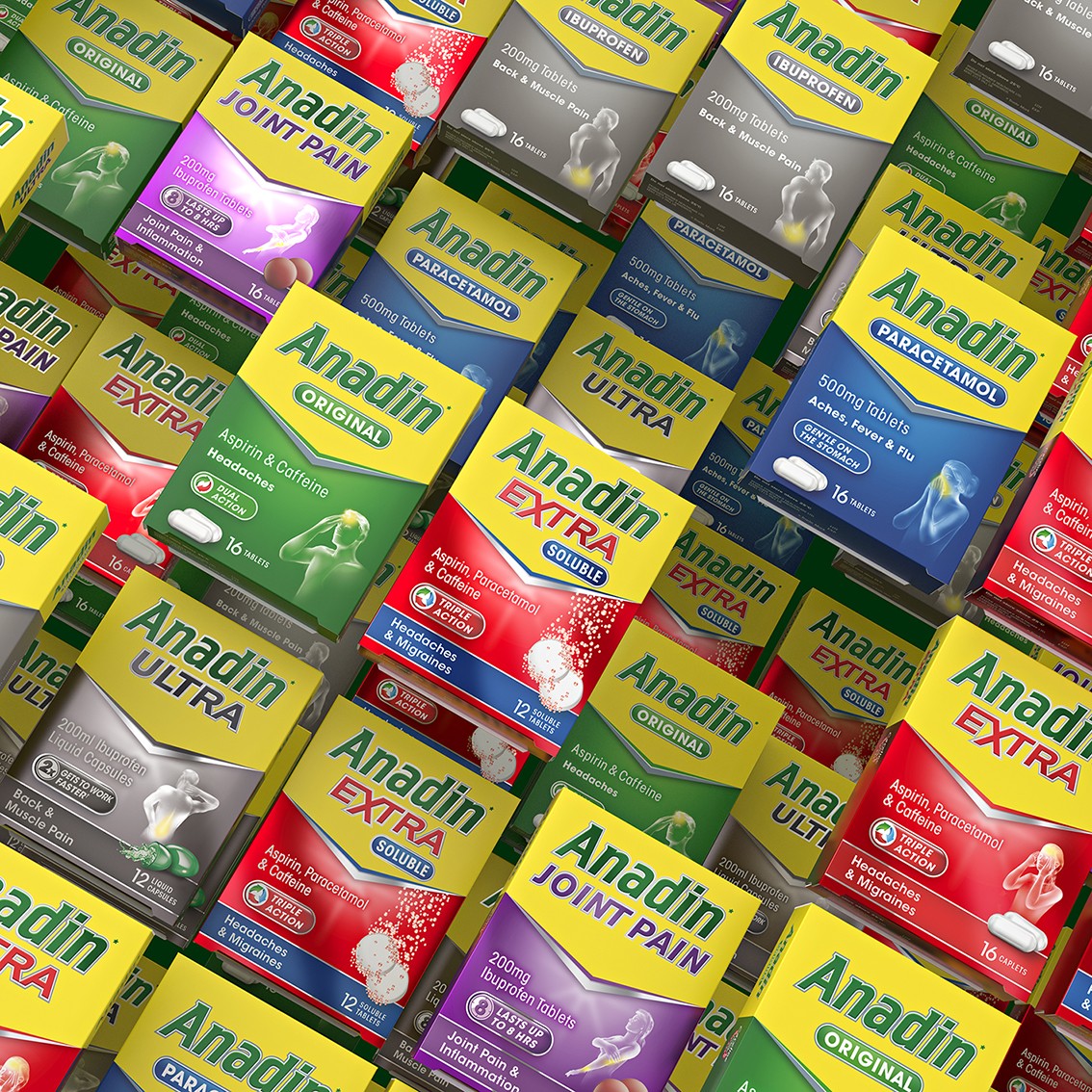
After a strategic assessment of the portfolio, Path developed a solution that simplified the overall design to achieve impact and consistency whilst also highlighting the key differences of each product. Easy to navigate and easy to understand, the Anadin portfolio now reflects the brand’s values of trust, expertise and confident action.
The key to distinguishing the ranges from one another was found in the printing. Whilst core ranges are printed on white board, the premium and specialised ranges are printed on metallic board to elevate the design and justify price points. Overall typography of the sub-ranges was crafted for stronger stand-out, whilst communication hierarchy on pack was simplified for increased clarity. Working together in harmony, these design cues with consumers make the right choice for their pain relief needs.
“Communication is always a challenge in the pharma category,” comments Gökçe Şahbaz, Creative Director at Path. “With this update, Anadin is putting their consumers first by placing the focus on facilitating the decision making process with a design that is simple and intuitive.”
“Anadin is a trusted brand providing effective pain relief across multiple pain states,” comments Mark Eori, Senior Brand Manager at Anadin. “Path’s design solution reflects the expertise of each offering within our portfolio with clear communication and impact. As creative partners, they worked strategically and collaboratively, creating a dynamic design system that supports Anadin’s objective of empowering consumers to live active, positive lives unencumbered by pain.””


CREDIT
- Agency/Creative: Path
- Article Title: Pain-Free Packaging Refresh for Anadin
- Organisation/Entity: Agency Commercial, Published
- Project Type: Packaging
- Agency/Creative Country: United Kingdom
- Market Region: Europe
- Format: Box
- Substrate: Pulp Carton
- Industry: Pharmaceutical


