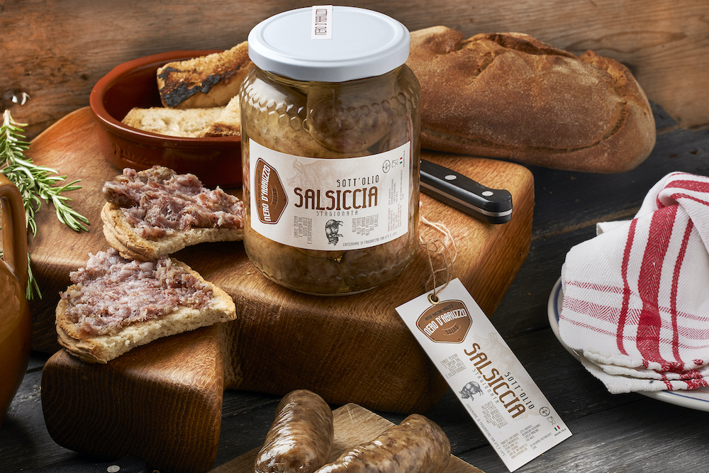
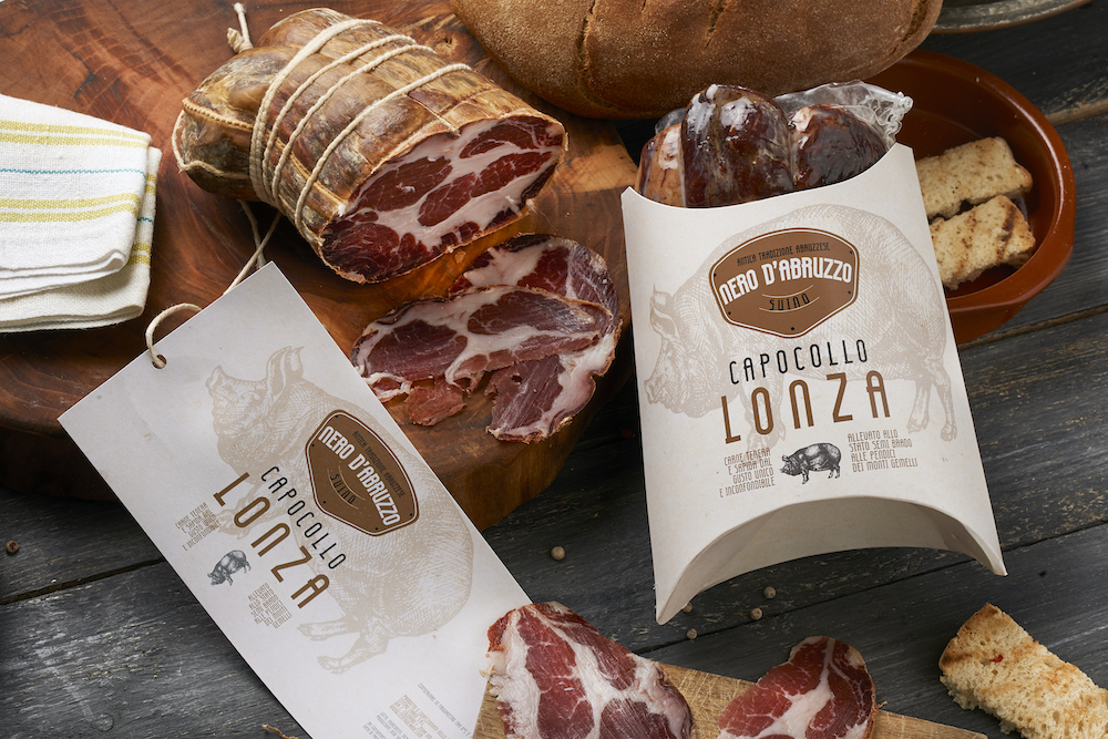
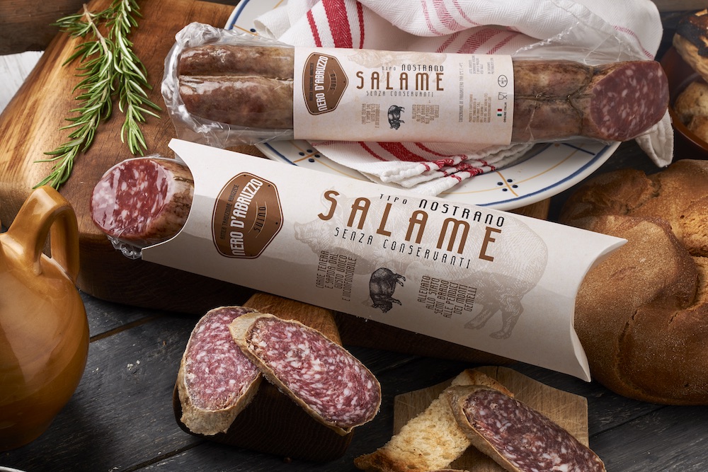
Nero d’Abruzzo Centro Carne an original packaging that combines innovation with the Abruzzo tradition. The packaging was conceived after an in-depth study on the Abruzzo culinary tradition and its strong link between the black pig and the territory. It consists of two types of packaging. the product containing band using 350 g coated paper and a box conceived and designed in collaboration with Fastedit, also in 350 g matte coated paper. The creative idea combines a background pattern that recalls the naturalness of the product, the logo which is a mixture of innovation (plaque) and naturalness, and the various graphic insertions that make the whole product highly saleble to the consumer.


CREDIT
- Agency/Creative: yuma comunicazione
- Article Title: Packaging that Combines Innovation with the Abruzzo Tradition
- Organisation/Entity: Agency, Published Commercial Design
- Project Type: Identity
- Agency/Creative Country: Italy
- Market Region: Europe
- Project Deliverables: Brand Naming, Brand Strategy, Packaging Design, Product Naming
- Industry: Food/Beverage
- Keywords: packaging
FEEDBACK
Relevance: Solution/idea in relation to brand, product or service
Implementation: Attention, detailing and finishing of final solution
Presentation: Text, visualisation and quality of the presentation


