


Australian winemakers Accolade Wines owns the Italian wine brand of Mezzomondo, an everyday wine popular in Canada. They were looking for a revamp and refresh that encapsulated the meaning of its brand name (center of the earth) while at the same time being visually captivating and striking to its target market. They came to DAf as we have worked together previously, and trust in our graphic design skills and we couple them with deep knowledge of export markets.
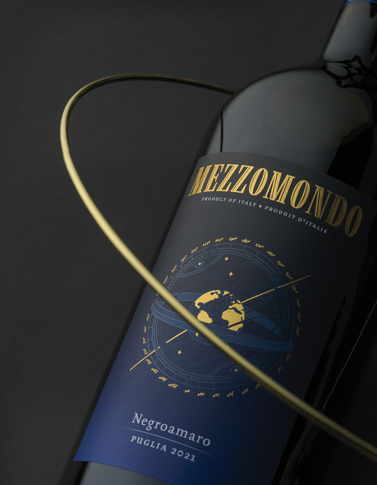
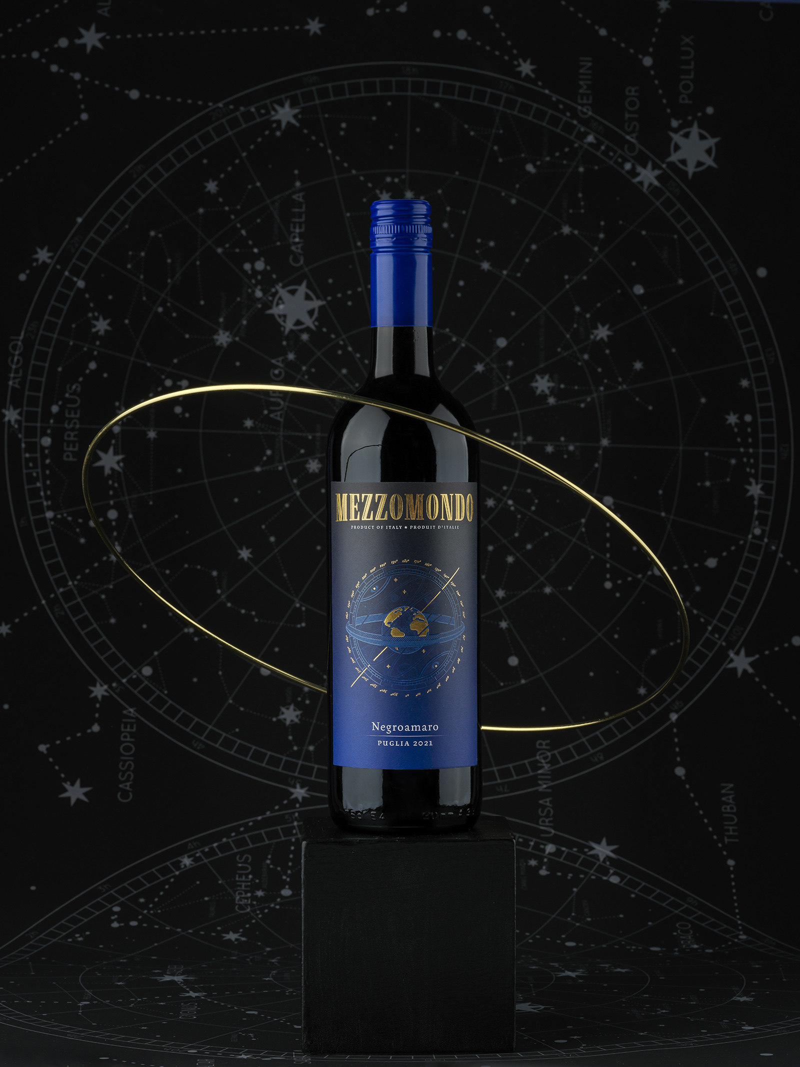
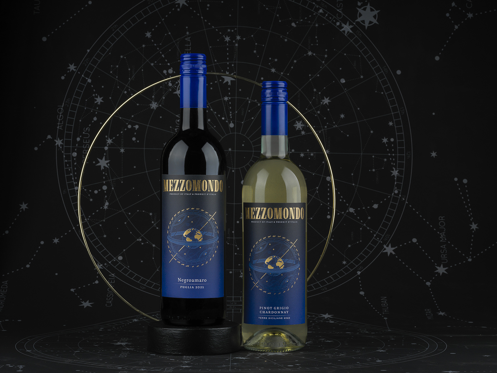
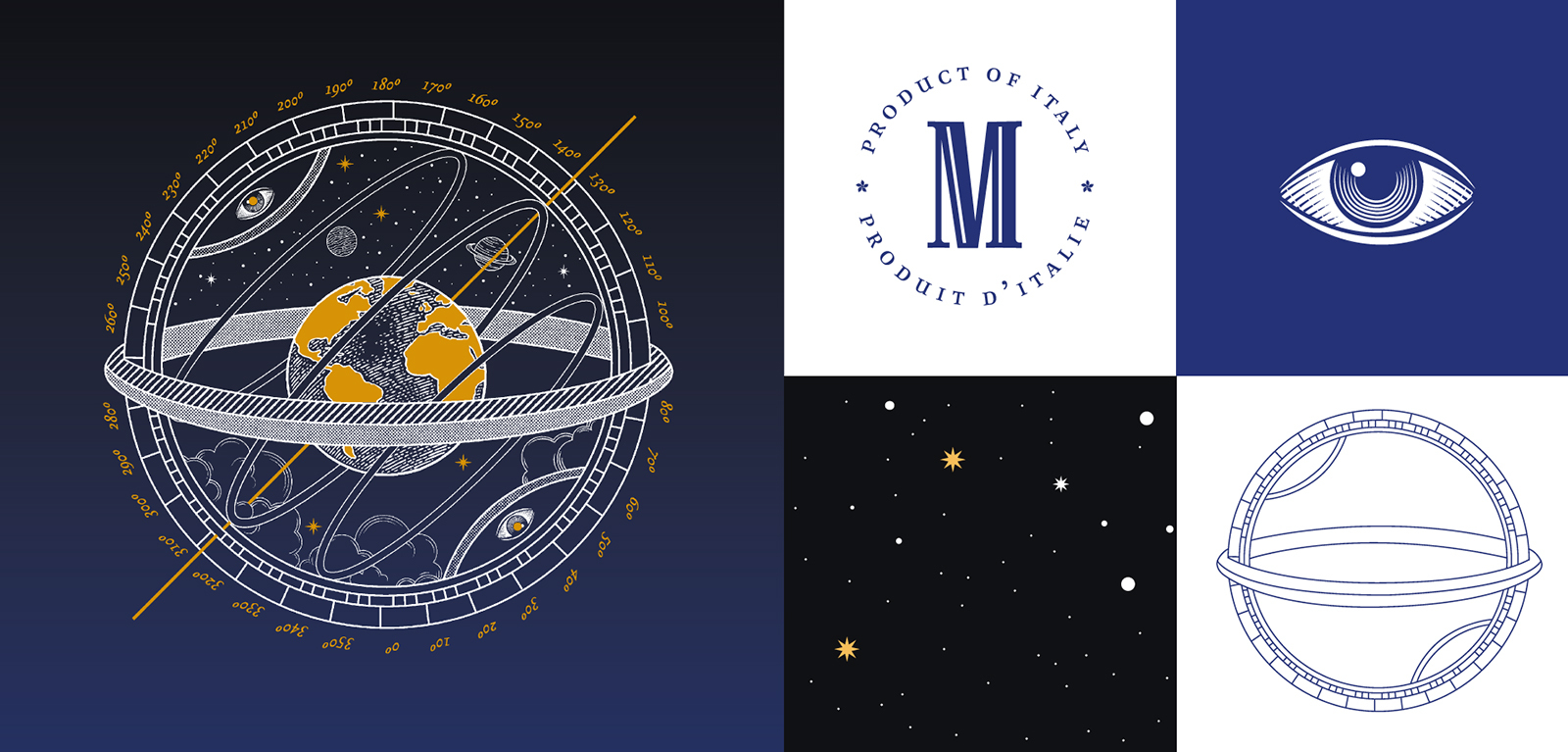
In considering how to communicate the message and give global appeal that encompassed the brand, wine origin and export market, which encompass three different countries, we looked at the old label and determined that it needed a new central symbol to better communicate the meaning of the brand’s name. DAf took inspiration from the armillary sphere, an ancient nautical device consisting of a central sphere and several satellite rings around it. This is an allusion to navigation, as is our further development of the concept achieved by setting the illustration against dark colors. A blue-to-black gradient suggestive of the night sky creates the background for the sphere, which is rendered in embossed gold foil and lighter blue tones, showing the blue and gold planet earth at the center of the instrument. Overall, the look is sleek and celestial, reminiscent of the ocean, and reminds us of the storied tradition of Italian world explorers.
Our design team also rearranged the label somewhat, putting the wine’s origin (in English and French, as required by the Canadian government) up top, and using an easier-to-read font for additional label text such as the wine variety.
On the label, the resulting symbol we created comes to life in a golden foil, shining against the background in a balanced, eye-catching image.
CREDIT
- Agency/Creative: DAf Agency
- Article Title: Packaging Revamp for Mezzomondo
- Organisation/Entity: Agency
- Project Type: Packaging
- Project Status: Published
- Agency/Creative Country: Chile
- Agency/Creative City: Santiago
- Market Region: North America
- Project Deliverables: Design
- Format: Bottle
- Substrate: Glass
- Industry: Food/Beverage
- Keywords: Wine
-
Credits:
Senior Copywriter: Eileen Smith


