Brand story
Close your eyes. Do you hear it? The buzzing of bees, the croaking of frogs, sizzling flies, rustling and buzzing meadows full of wildflowers, herbs, insects, birds. Open your eyes. Do you see it too? The flourishing nature? That vibrancy? The health of blossoming cows, sheep and goats? We love to see cows grazing in a lush meadow of grass, clovers, flowers and herbs. Between the grass, a variety of ground insects and above them the buzzing sound of bees, bumblebees and dragonflies. Above the meadow, plenty of birds come to rest, forage and nest. Surrounding the meadow are healthy ditches with waving reeds and blooming water lilies. Where no water flows, we see varied field edges in the form of flower strips, hedges, wooded banks and unmown fences, in which a wealth of animal species live and find safe passage and shelter.
Idea
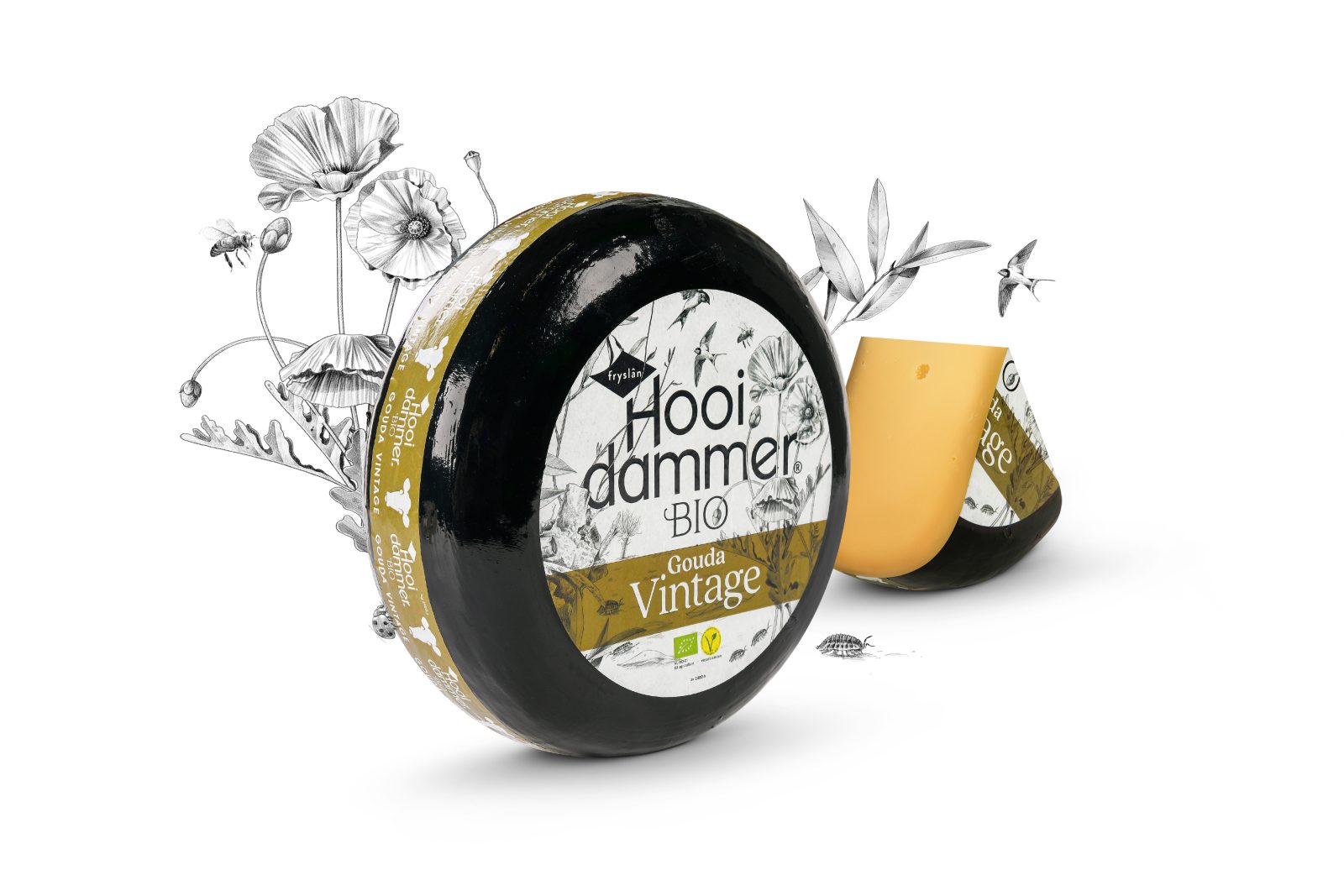
The beauty of less is more. An eye for detail and being focussed to the smallest of nature. It is precisely this beauty and refinement that we convey to the visual world by ‘zooming’ in on a piece of living nature.
Positioning: Full of life, full of flavour.
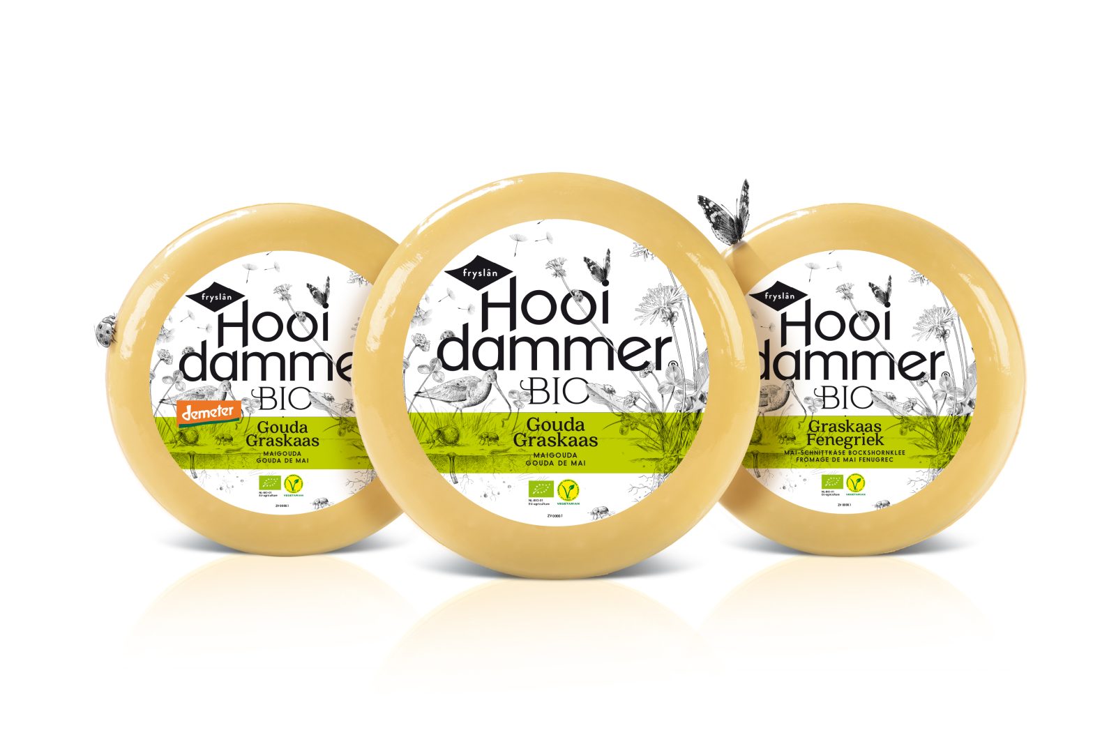
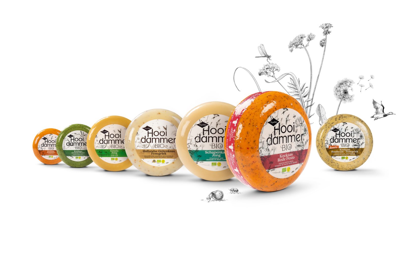
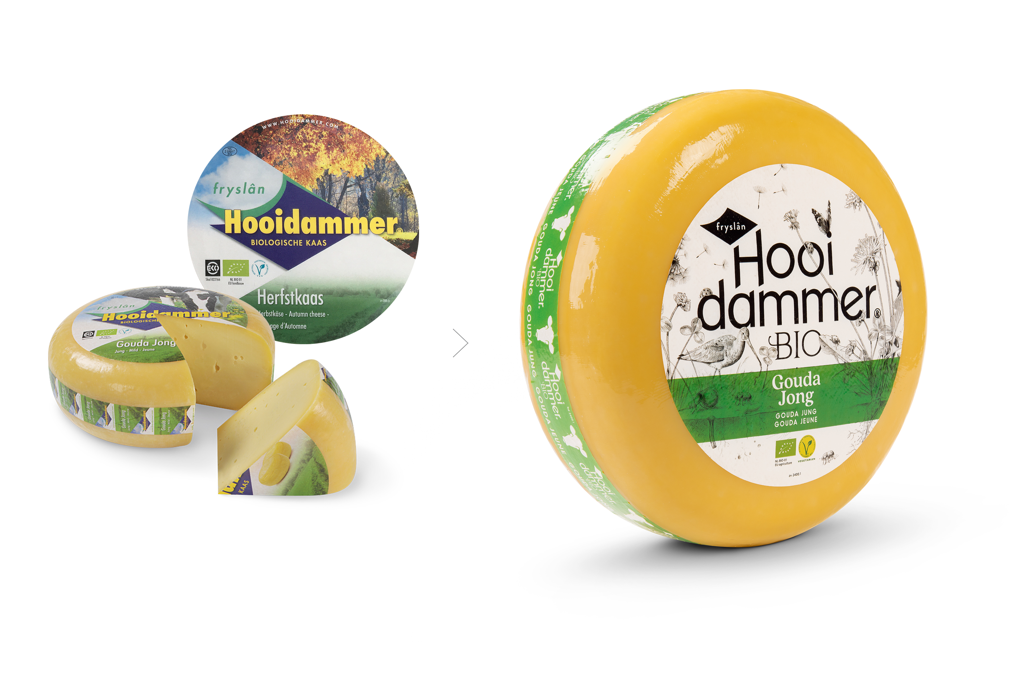
That is the new positioning of Henri Willig’s cheese brand Hooidammer. It goes far beyond organic and is a tribute to biodiversity.
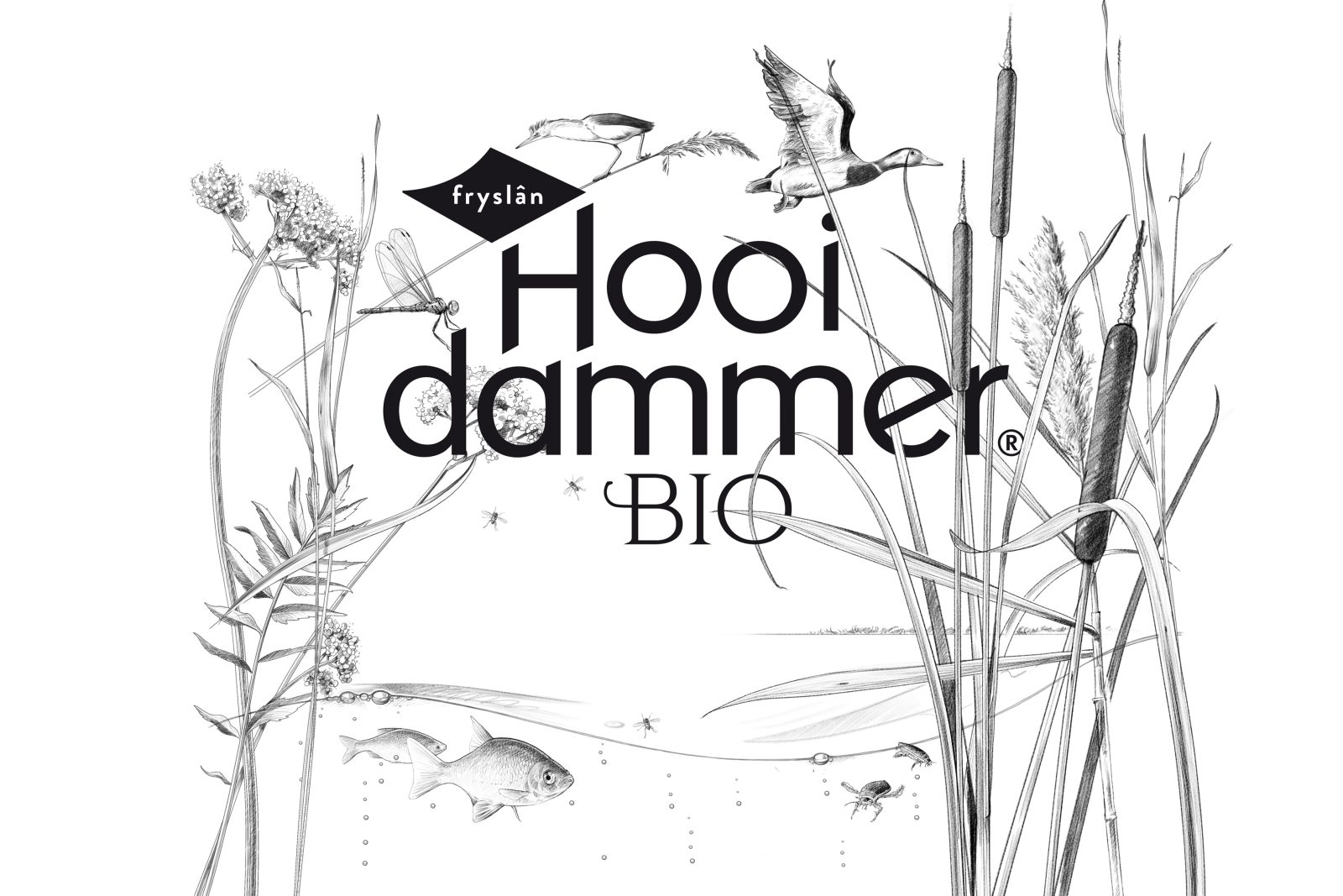
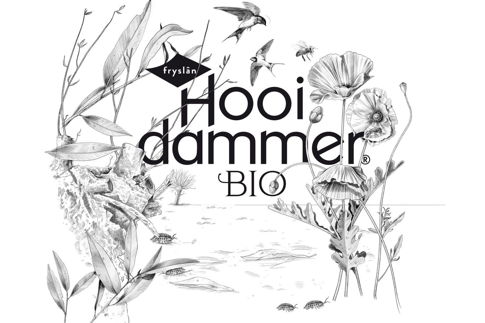
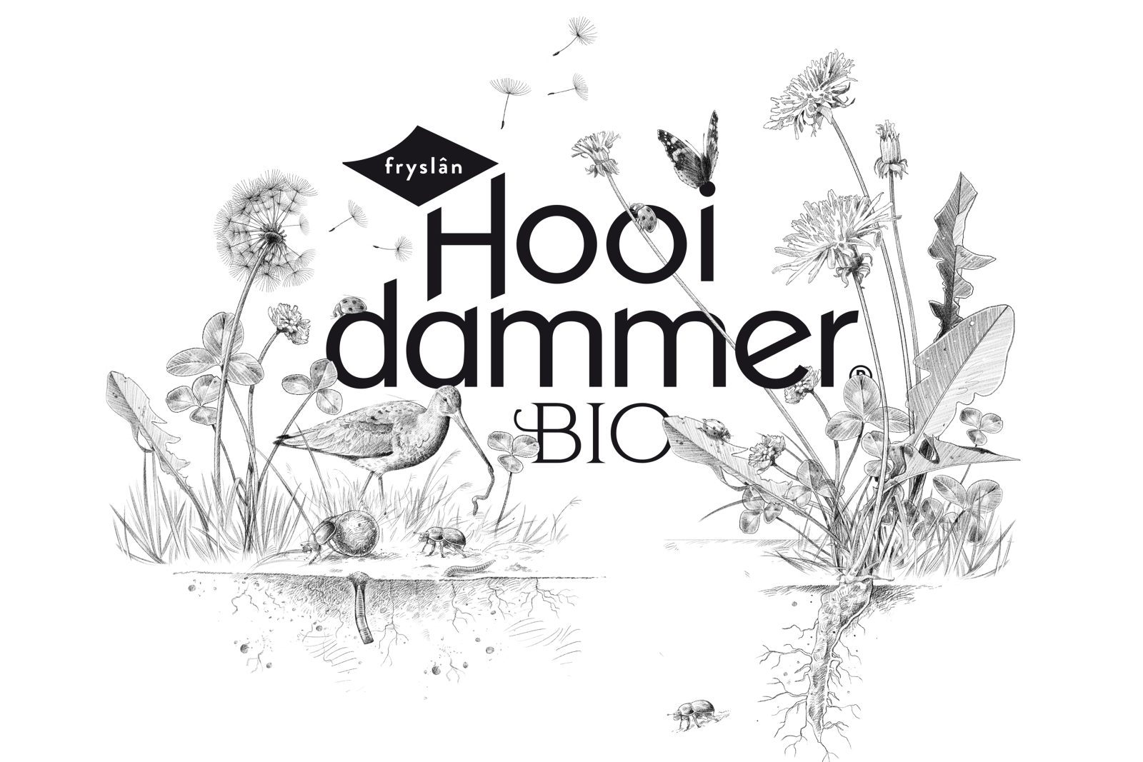
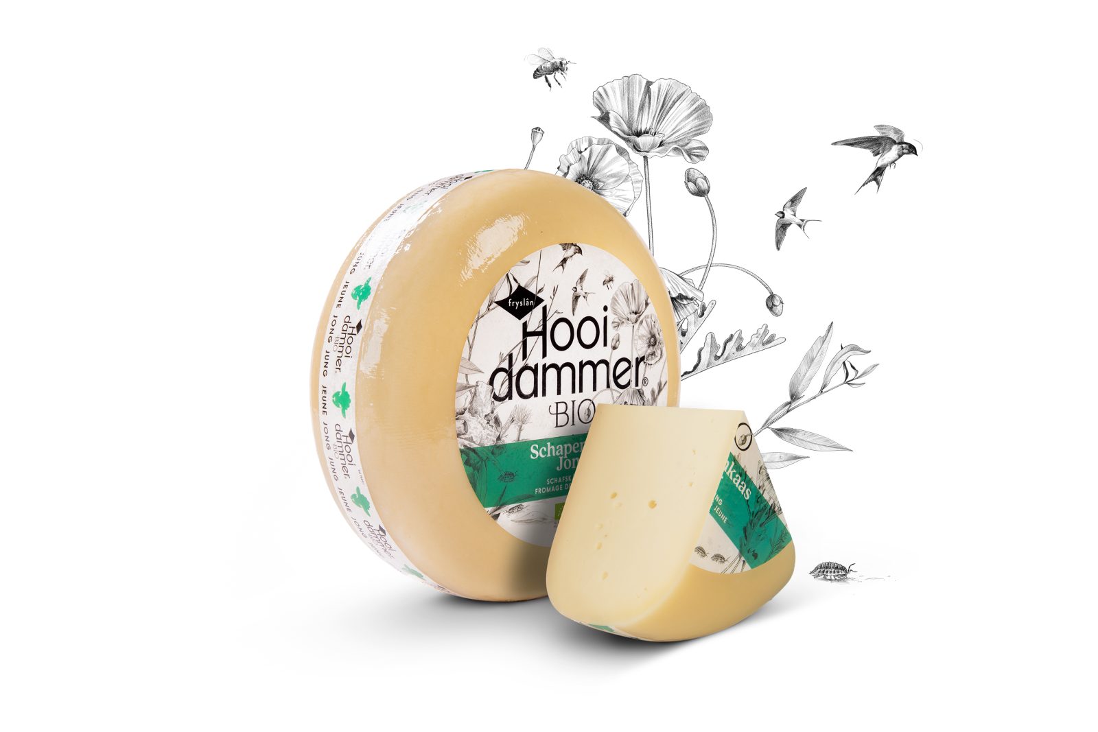
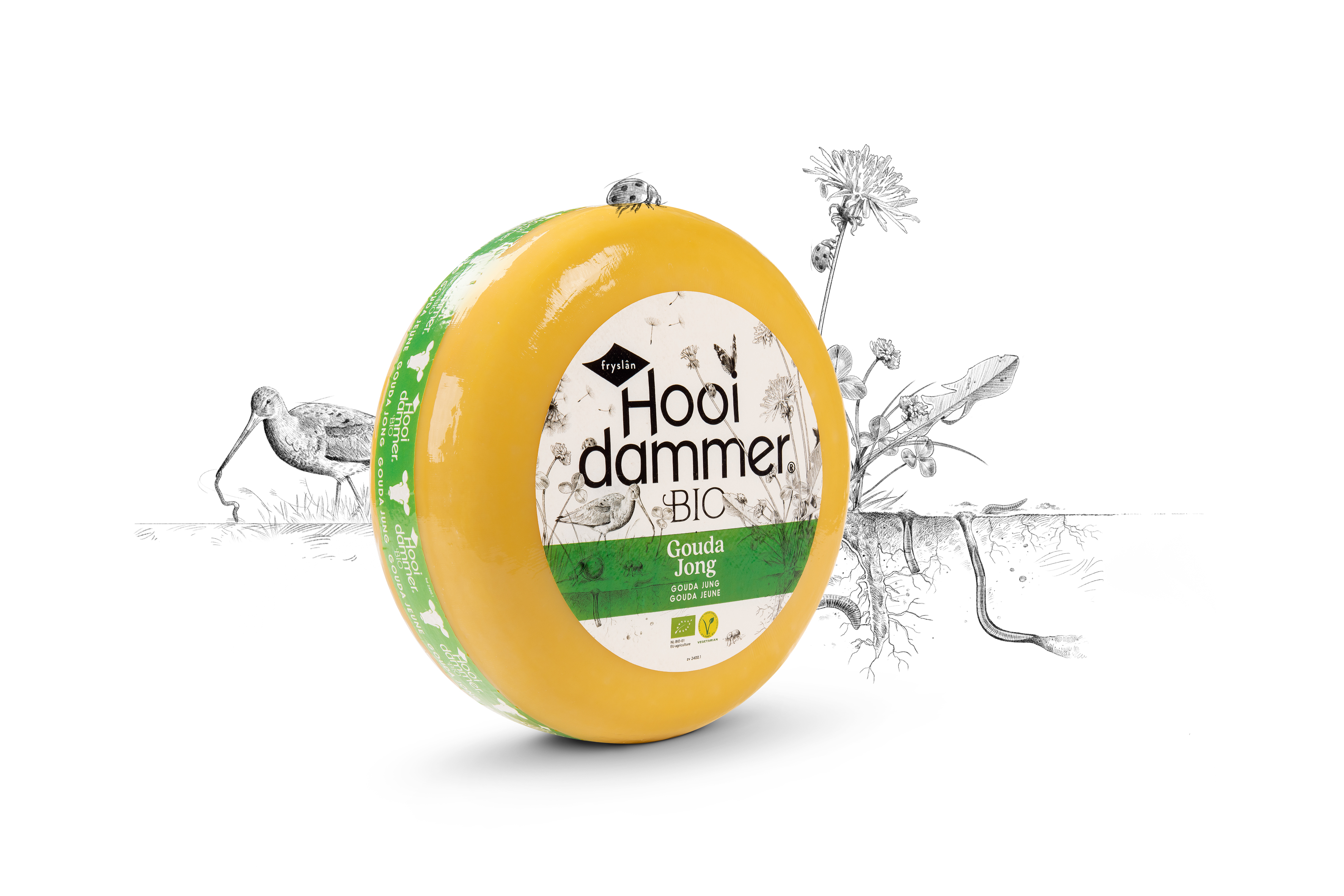
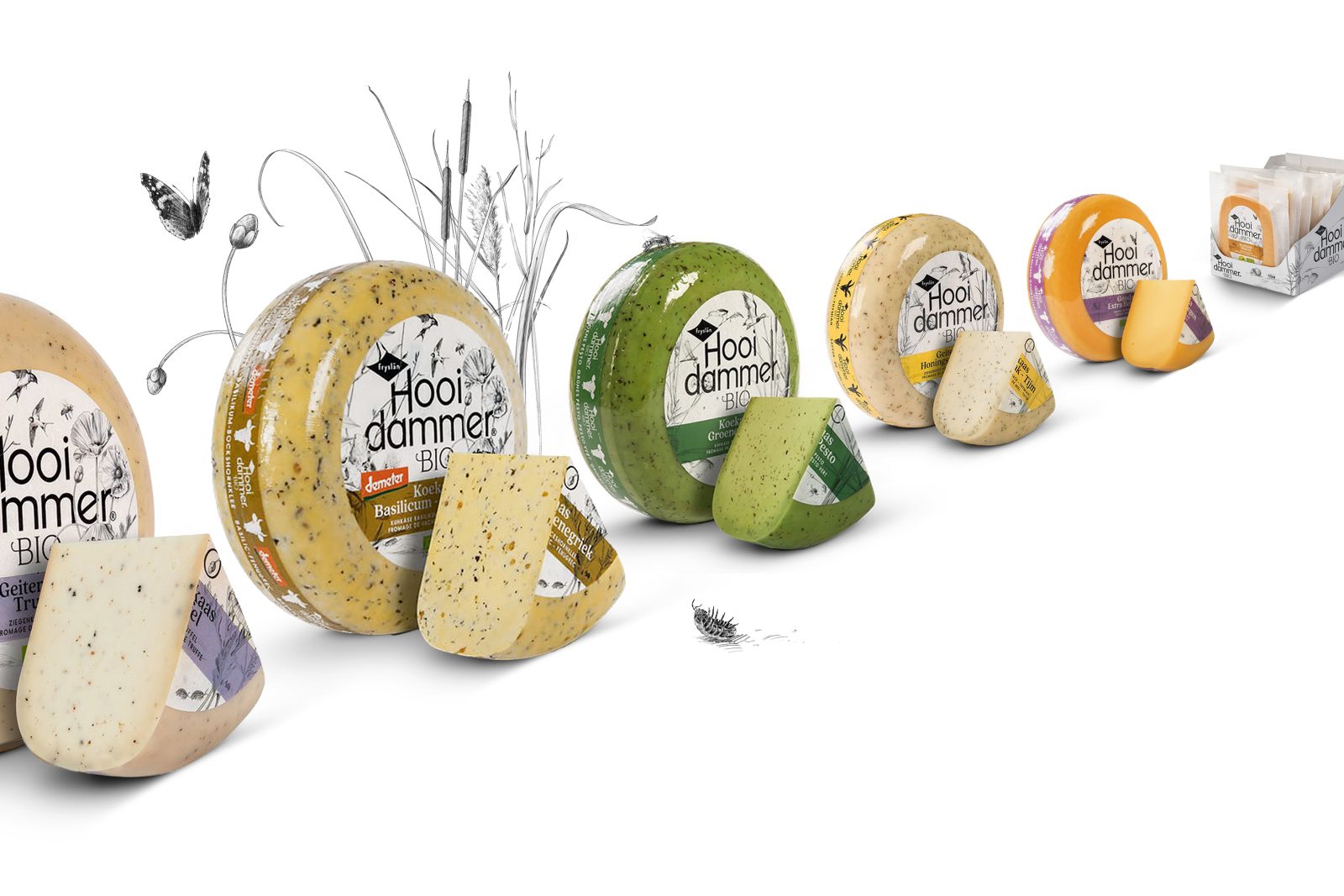
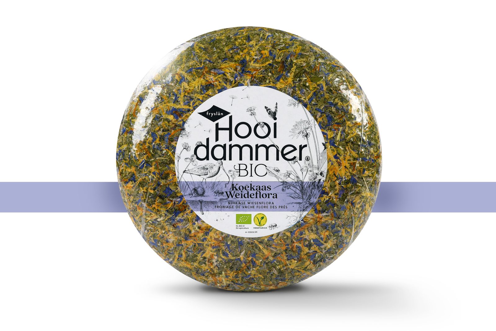
This idea is brought to life creatively by illustrating 3 mini eco-systems; the meadow, the surrounding waters, and the soil. The black and white illustrations in botanical drawing style depict the diverse life with an unprecedented eye for detail. In cooperation with a biologist, illustrations were created revealing the visible and the invisible of both flora (eg clover, valerian, buttercup, dandelion to bulrush) and fauna (eg dung beetle, earth worms, stickleback, Little bittern, swallows to the grutto). After all, a flourishing nature is the main ingredient for these flavorful cheeses. Colour is only used for indicating flavours and recognizability.
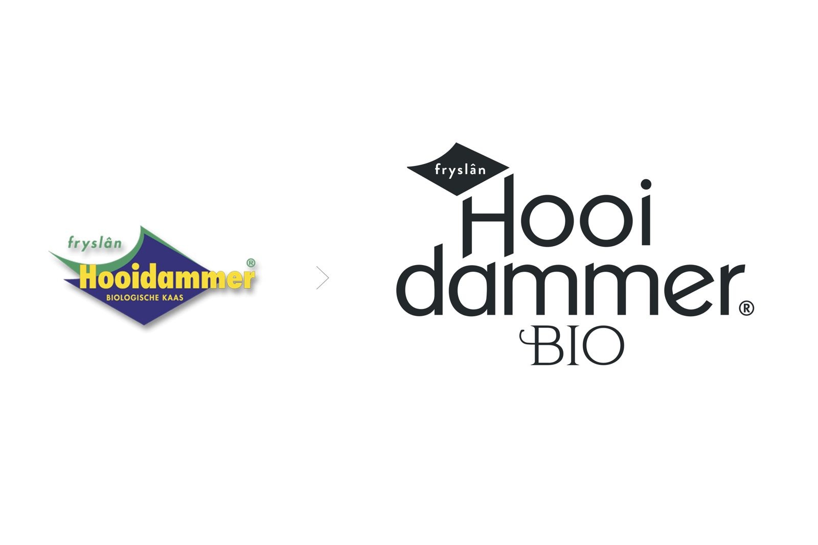
The restyled logo and the remarkable ‘flag’ form was transformed into a subtle communicator of the origin ‘Friesland’. This results in an innovative and refreshing visual language within the category of BIO cheese.
CREDIT
- Agency/Creative: Joost Identities , Food By Design - Marielle Bordewijk & Marleen Zaalberg
- Article Title: Packaging Redesign for Hooidammer – The Beauty of Biodiversity
- Organisation/Entity: Creative, Freelance
- Project Type: Packaging
- Project Status: Published
- Agency/Creative Country: Netherlands
- Agency/Creative City: Haarlem , Den Haag
- Industry: Food/Beverage
- Keywords: WBDS Creative Design Awards 2022/23
-
Credits:
Illustrator: Studio Nick van Oosten
Photography: Saskia van Lelieveld


