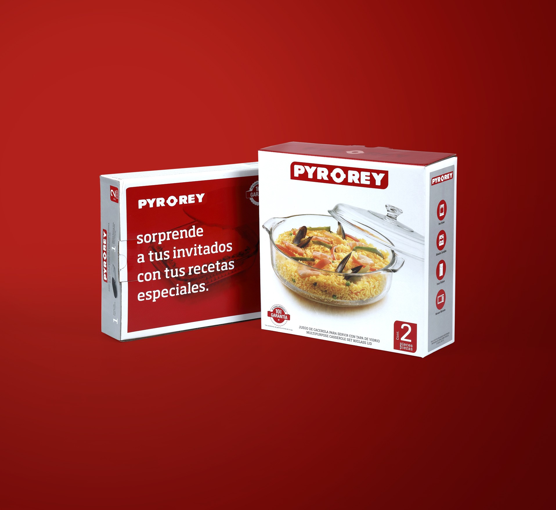
Mutar – Pyr-o-rey
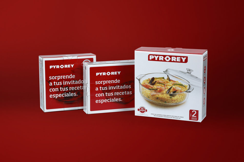
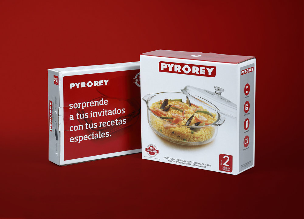
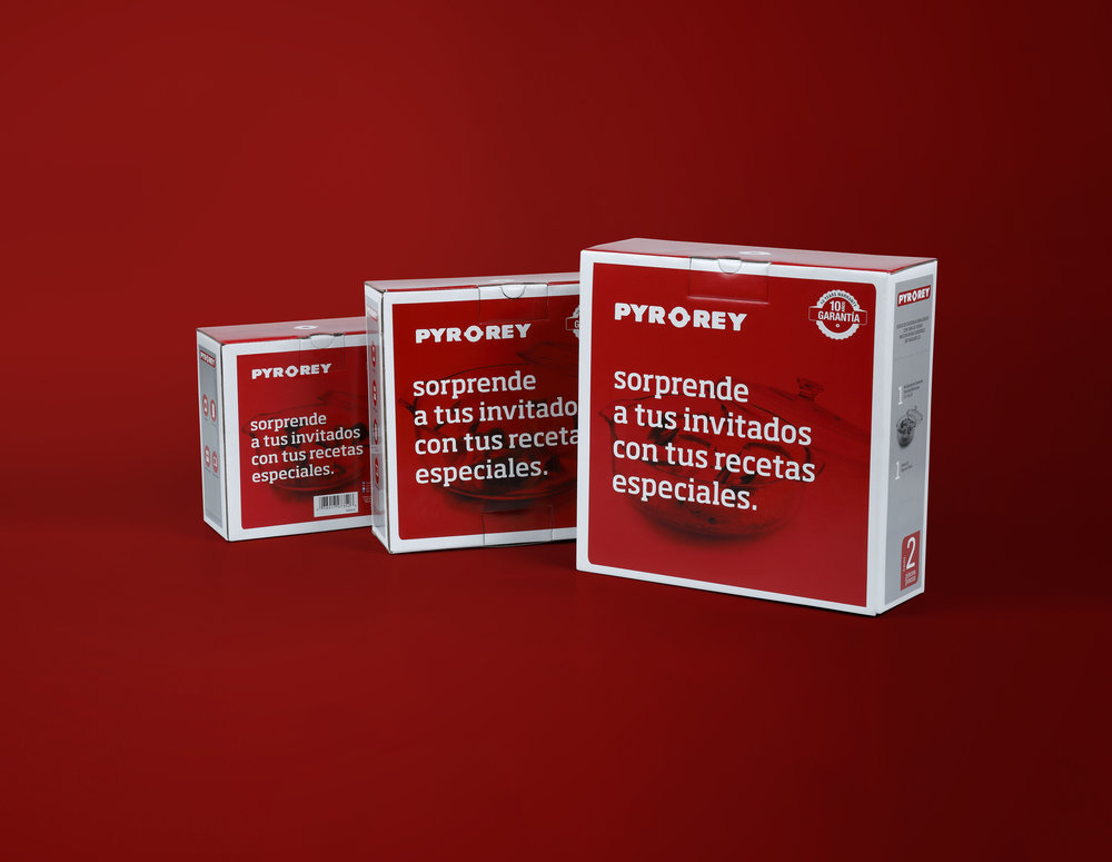
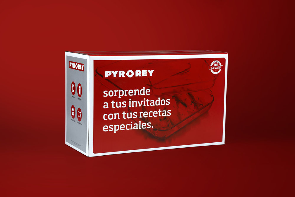
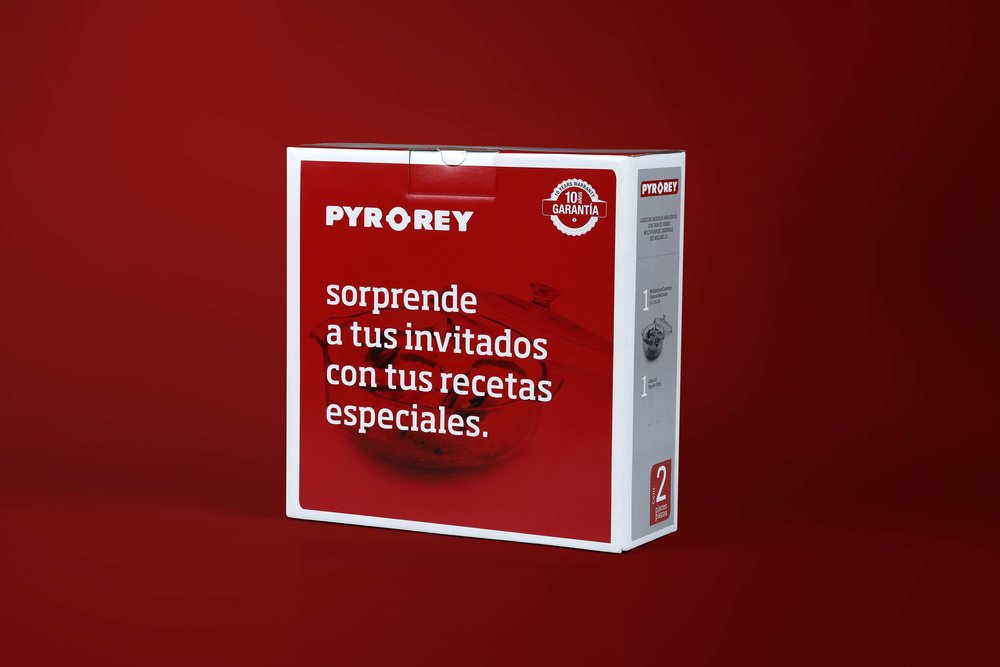
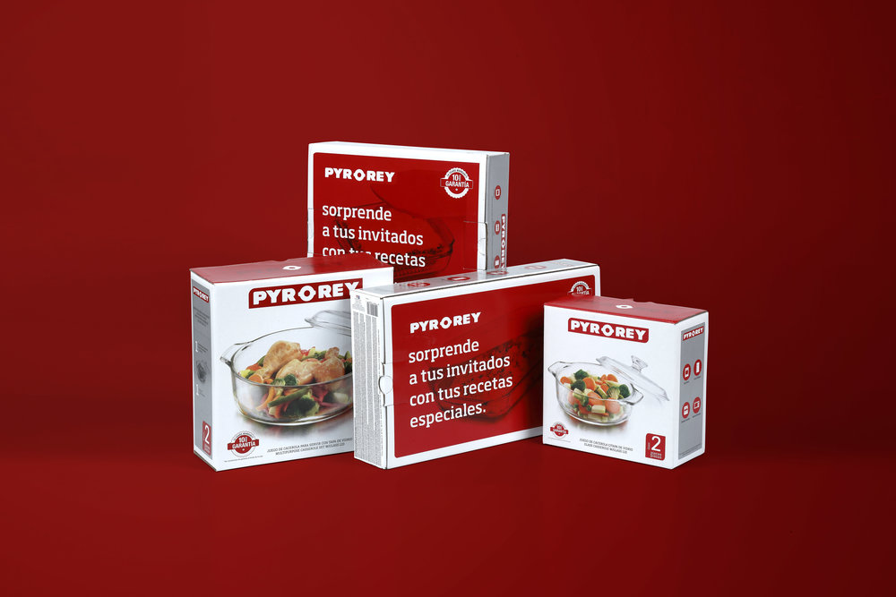
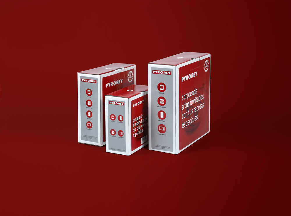
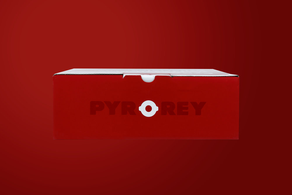
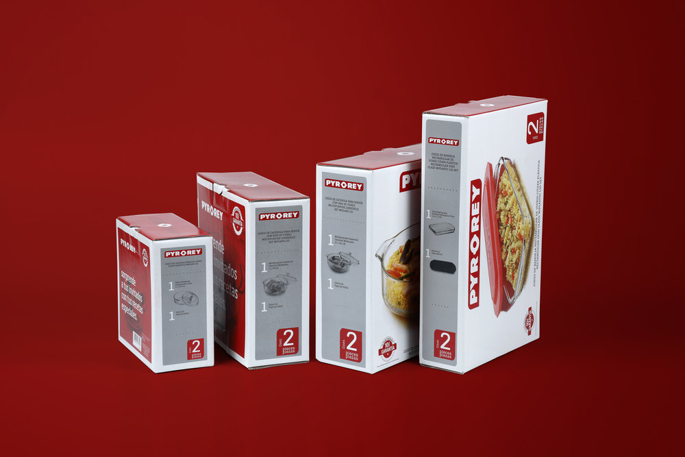
“The Pyr-o-rey packaging redesign concept was based on the curved shapes of the Pyr-o-rey logo, these endings were applied to each of the faces and elements to be highlighted as content / sides while in the front it was decided to maintain the brand logo in a large size, as in the previous packaging to respect the tradition of it, as well as the colors red and gray. A white background was also proposed to have better control of the transparency of the glass in the products; and finally, the reverse was used as a means of advertising attention to convey a more emotional message that makes people feel special with which you share the food “Surprise your guests with your special recipes.””
CREDIT
FEEDBACK
Relevance: Solution/idea in relation to brand, product or service
Implementation: Attention, detailing and finishing of final solution
Presentation: Text, visualisation and quality of the presentation


