


Bear Design Co. – Beekman 1802
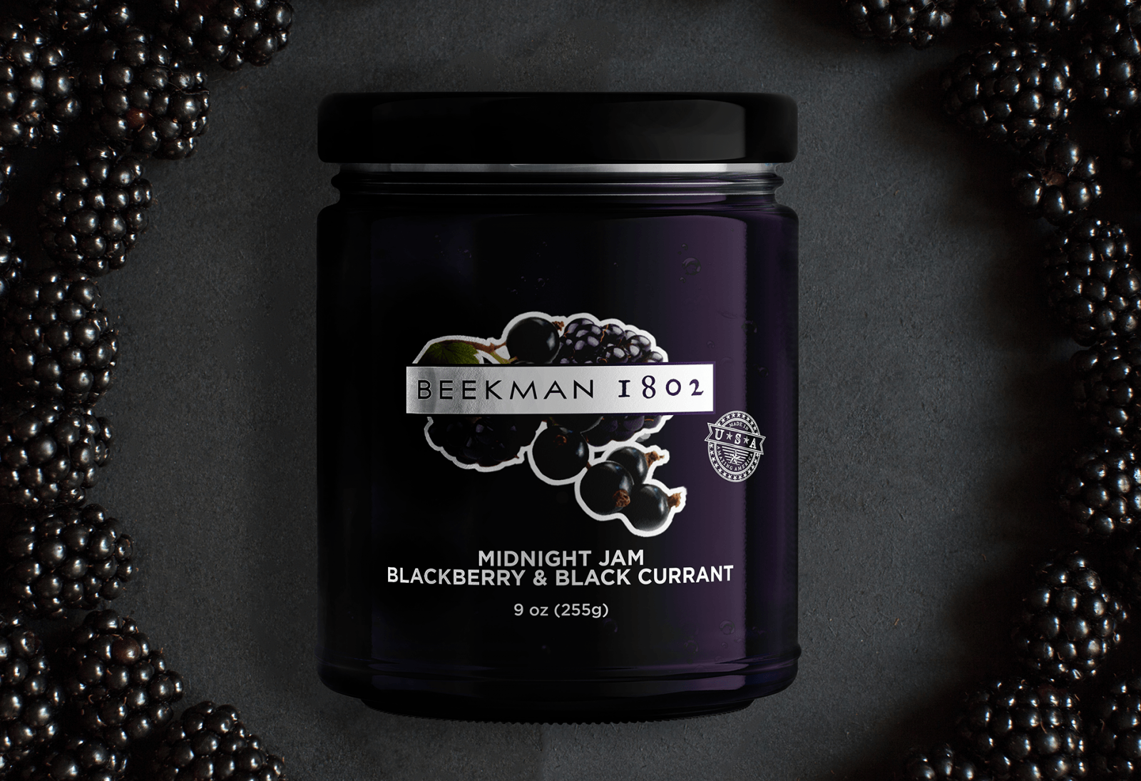
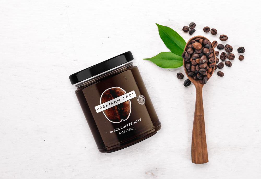
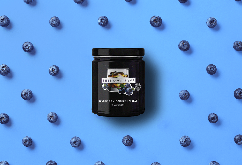
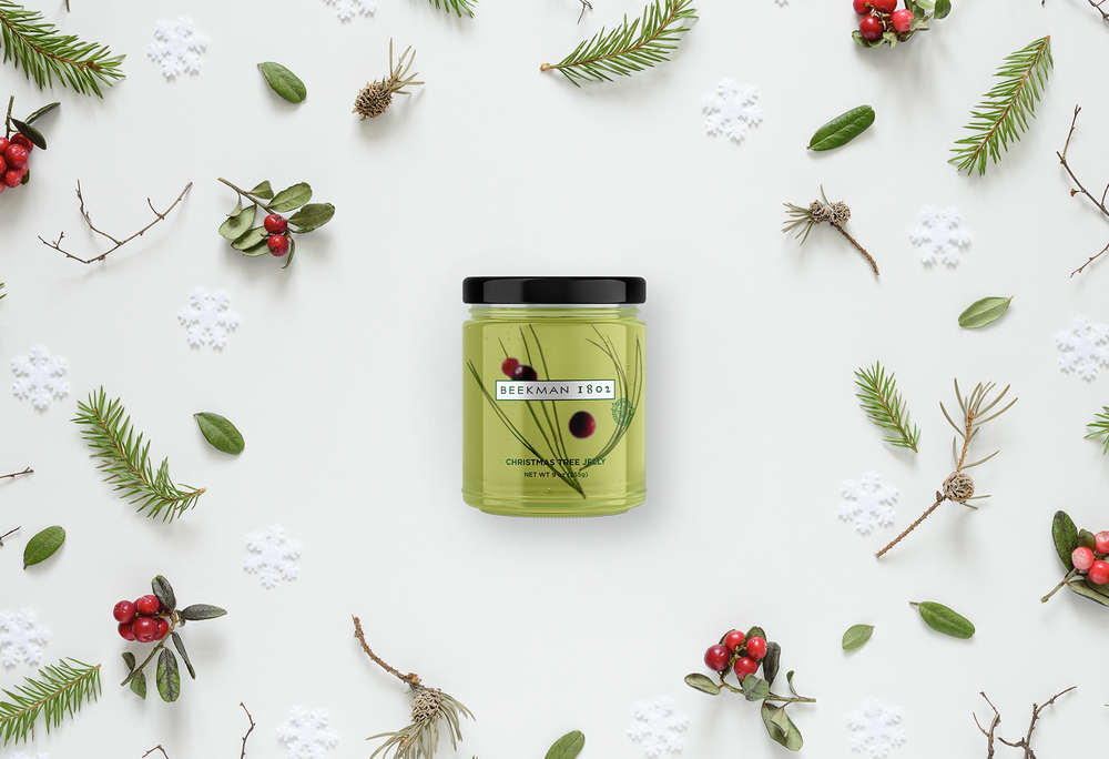
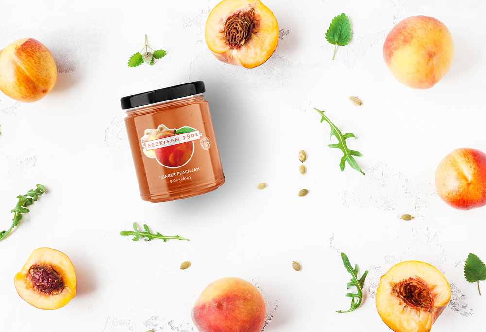
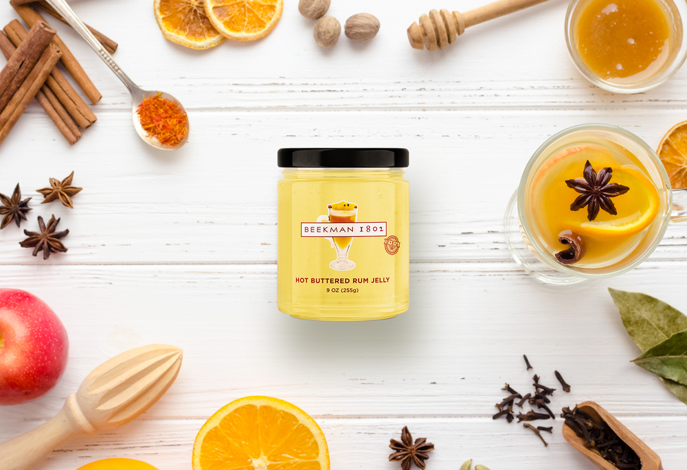
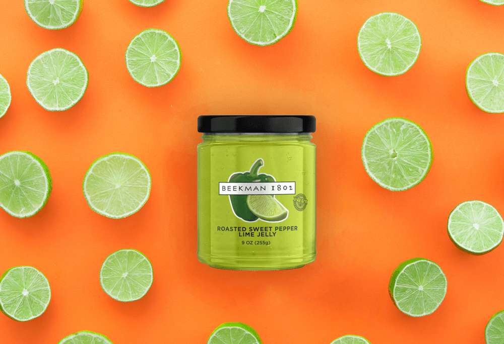
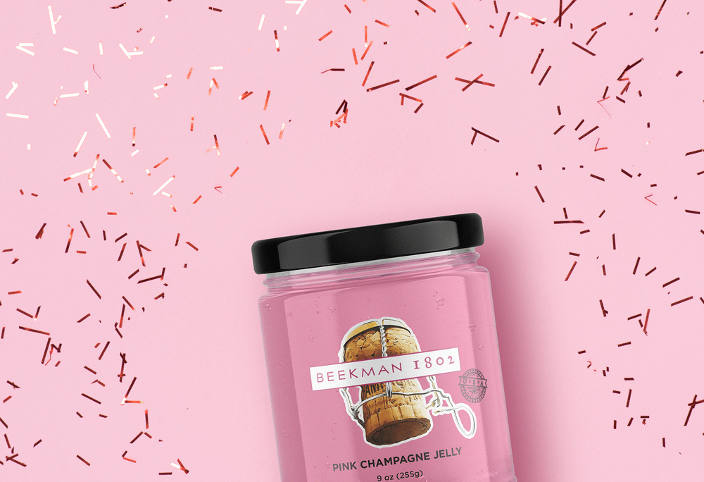
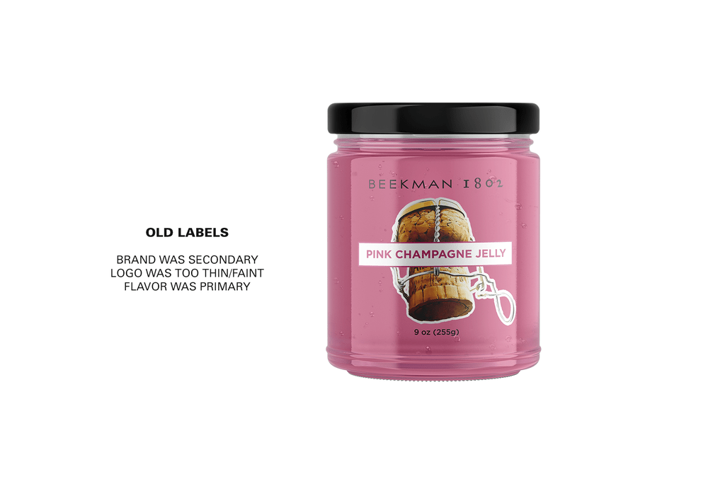
With over 20 SKUs in their line of artisanal jams, Beekman 1802 had various style of label incarnations throughout the years that needed to be redesigned. The more recent designs they liked were transparent labels to see more of the jams and jellies, which stood out from the competition. We worked with them on streamlining all of the jars in the same fashion but quickly realized that like their other packaging, the brand itself wasn’t center stage. For the last iteration which they have today, the logotype was moved to the center frame and made slightly bolder. The flavor now had a new home with a similar hierarchy to the ounces and grams. These new layouts we designed have been rolled out slowly in the last year, so we decided there is enough to share the project we started some time ago.
CREDIT
- Agency/Creative: Bear Design Co.
- Article Title: Packaging Re-Design for Beekman 1802 Artisanal Jams
- Organisation/Entity: Agency Commercial, Published
- Project Type: Packaging
- Agency/Creative Country: United States America
- Market Region: North America
- Format: Jar
- Substrate: Plastic


