


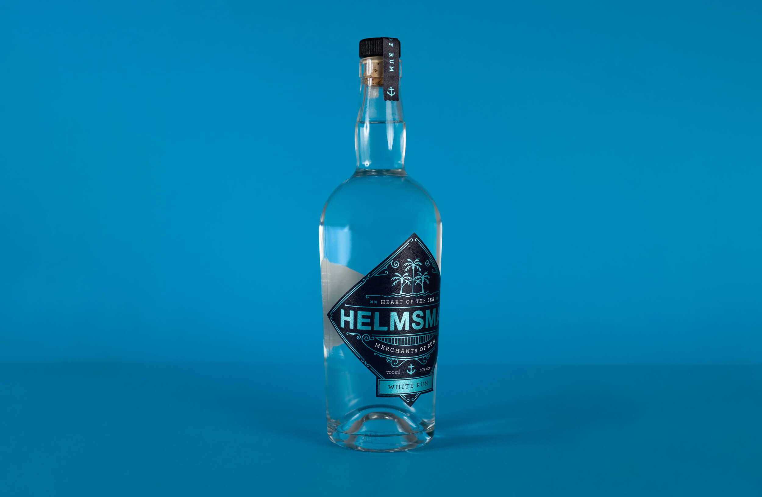
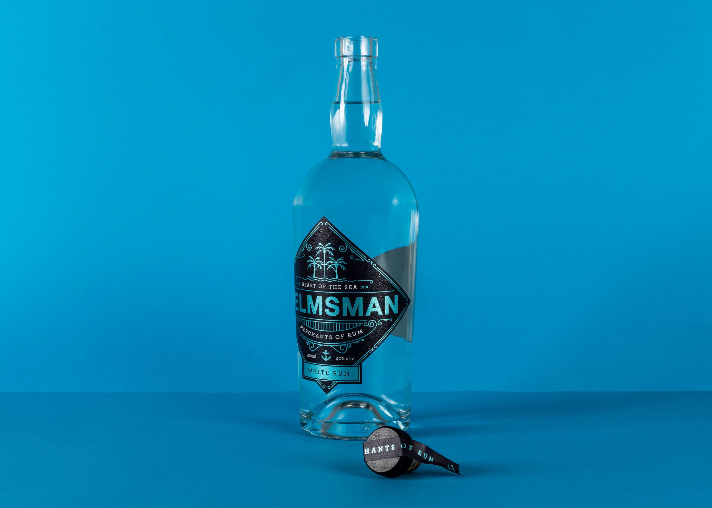
Background: Helmsman Rum is a boutique rum brand created by two rum runners from New Zealand. After successfully launching their spiced rum almost a decade ago, they have now started to create a new flavour range which fits into the rum category at a more affordable price point.
Brief: The white rum is the first flavour off the ship, but as the new flavours will be released at different times, Helmsman needed a solution which will work across new blends as they are created. They also needed consistency through the range with an organising idea which gives the rum a purpose and clear positioning. The labels needed to be eye-catching, not only in the bottle store but on the shelf in bars where the light is minimal and often moving.
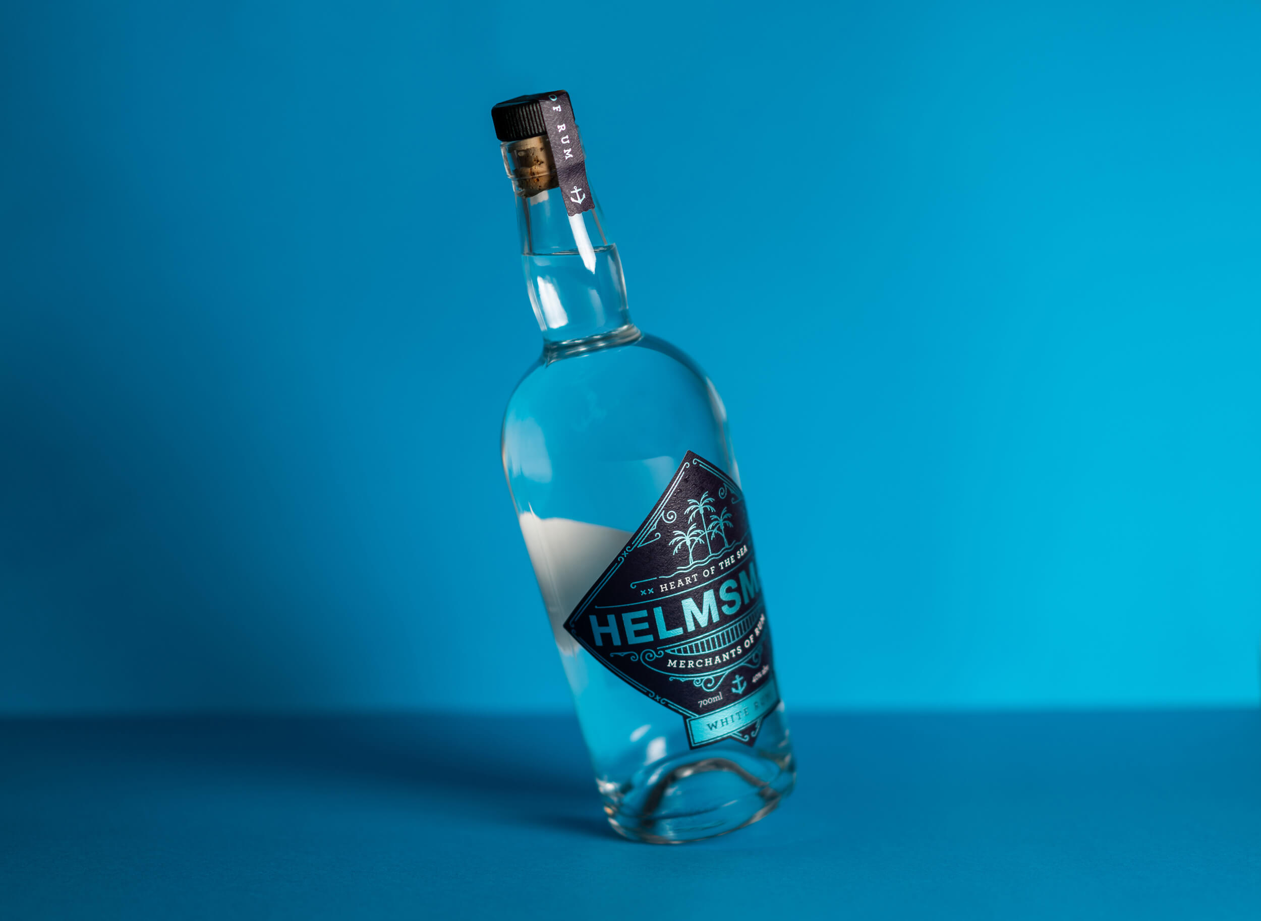
Execution: Our inspiration was to create an idea and design system which connected with the modern seafarer and vagabond. The creators of Helmsman have strong ties to the ocean so it was important for us to express this aspect while at the same time linking to the origins of rum.
For the idea we created ‘Heart of the sea’, this is connected to a wider story of individuals and their relationship with the ocean. Throughout the next few years Helmsman will be bringing to life documented adventures through a project called ‘The rum diaries’, the web series will explore what it means to share the heart of the sea for our local coastal dwellers around New Zealand.
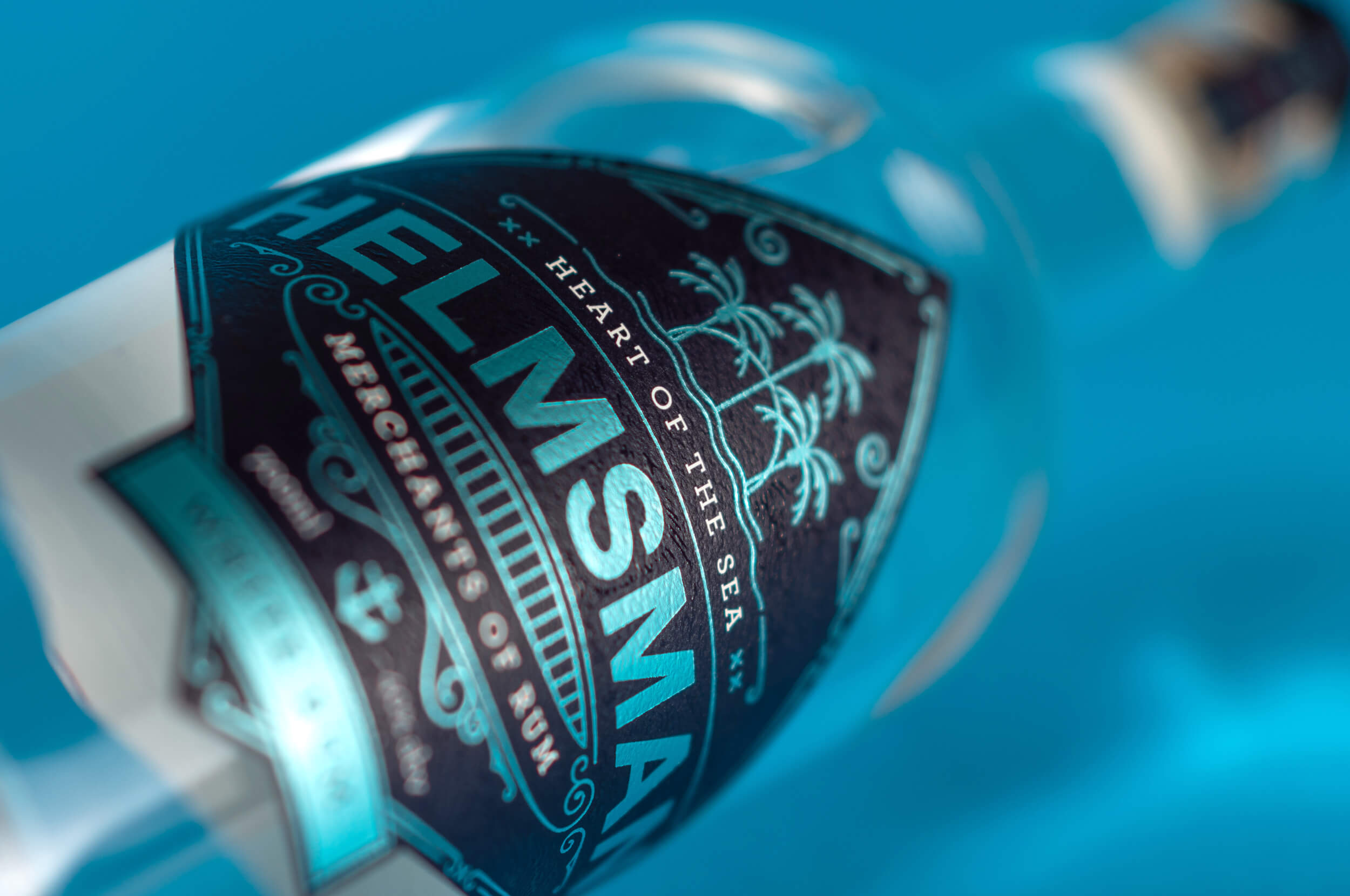
Our design system was inspired by a mix of 17th century motifs and modern typography. Visually we set out to create a way to communicate the movement of water and light through our print finishes and colours.
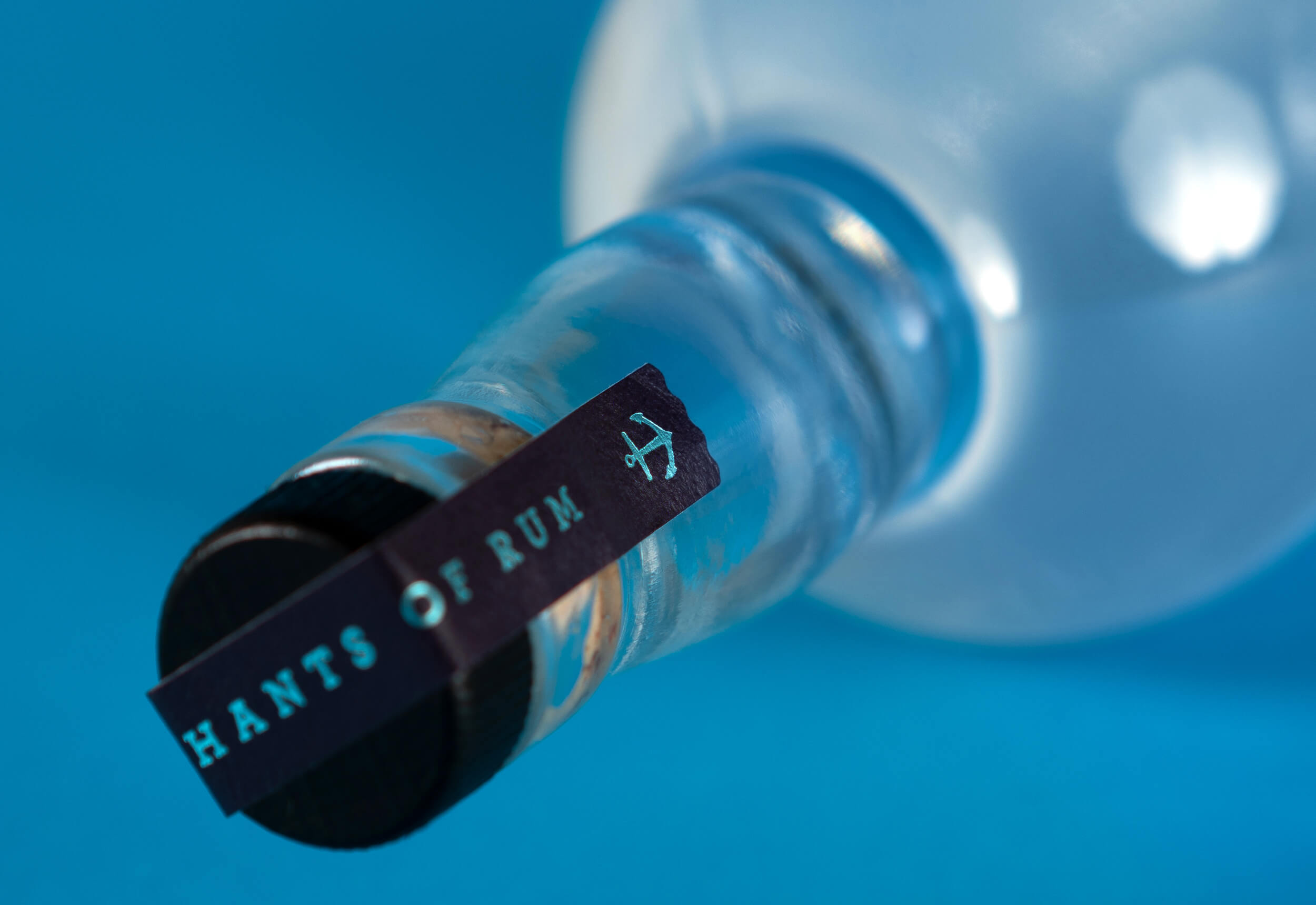
Details: We used a range of printing techniques, all telling their own part of the story. The bright foiling against the dark stock emulates the moonlight catching moving water which also shimmers in the light when sitting behind the bar in an inner city pub. We also used a clear varnish to subtly print a water pattern on the label to give it a texture of seawater and a tactile quality in the hand. The simple colour palette paired with the subtle techniques and textures creates a label which dances like water in the low light.
CREDIT
- Agency/Creative: Society
- Article Title: Packaging Label Design for Helmsman White Rum by Society
- Organisation/Entity: Agency
- Project Type: Packaging
- Project Status: Published
- Agency/Creative Country: New Zealand
- Agency/Creative City: Mount Maunganui
- Market Region: Global
- Project Deliverables: Packaging Design
- Format: Bottle
- Substrate: Glass, Glass Bottle
- Industry: Food/Beverage
- Keywords: Rum, White Rum, Packaging
-
Credits:
Creative Director: Tom Lear


