


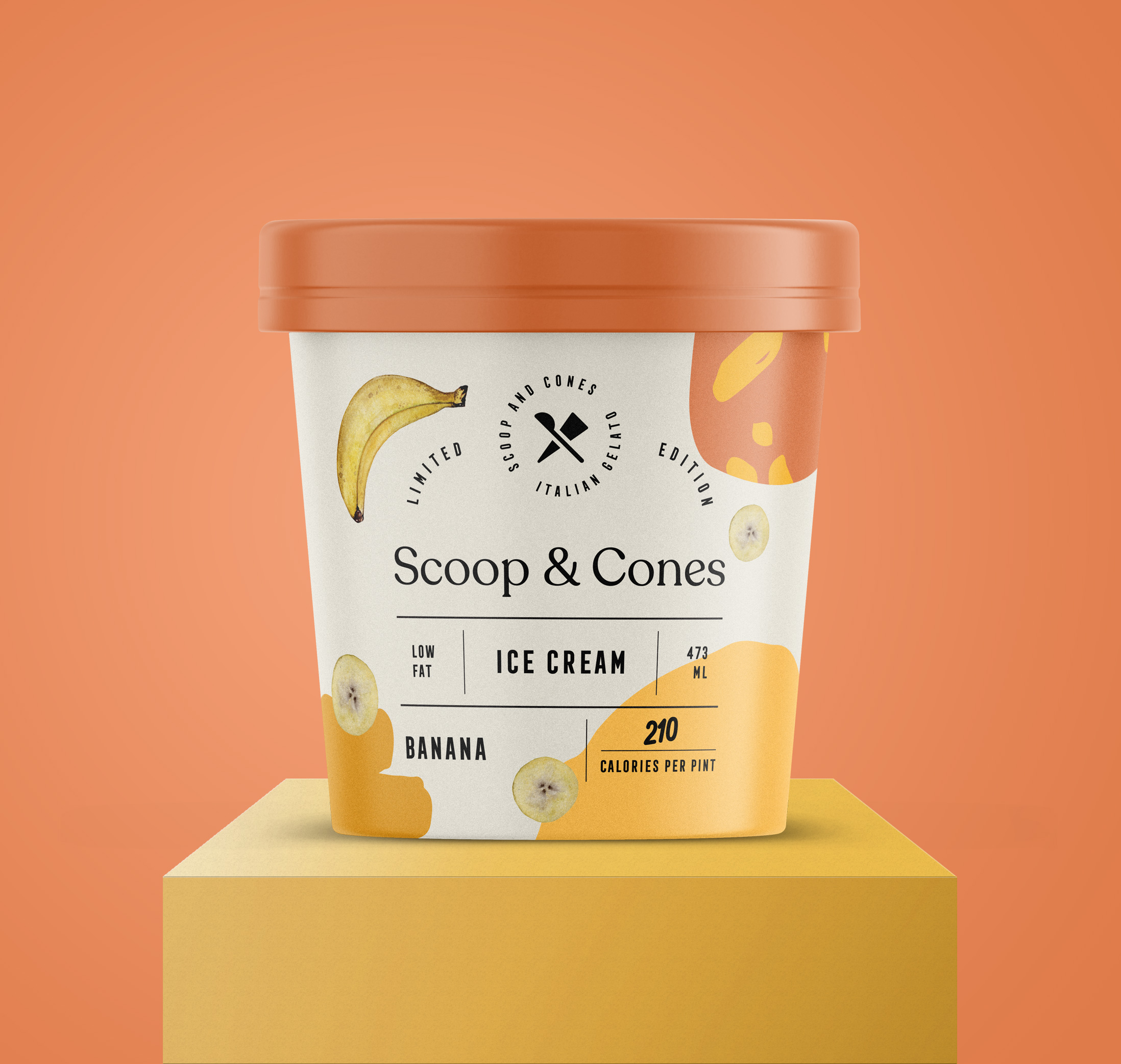
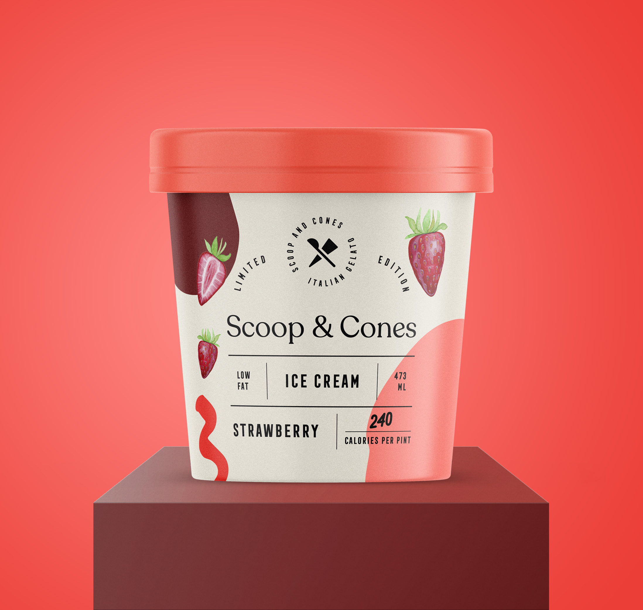
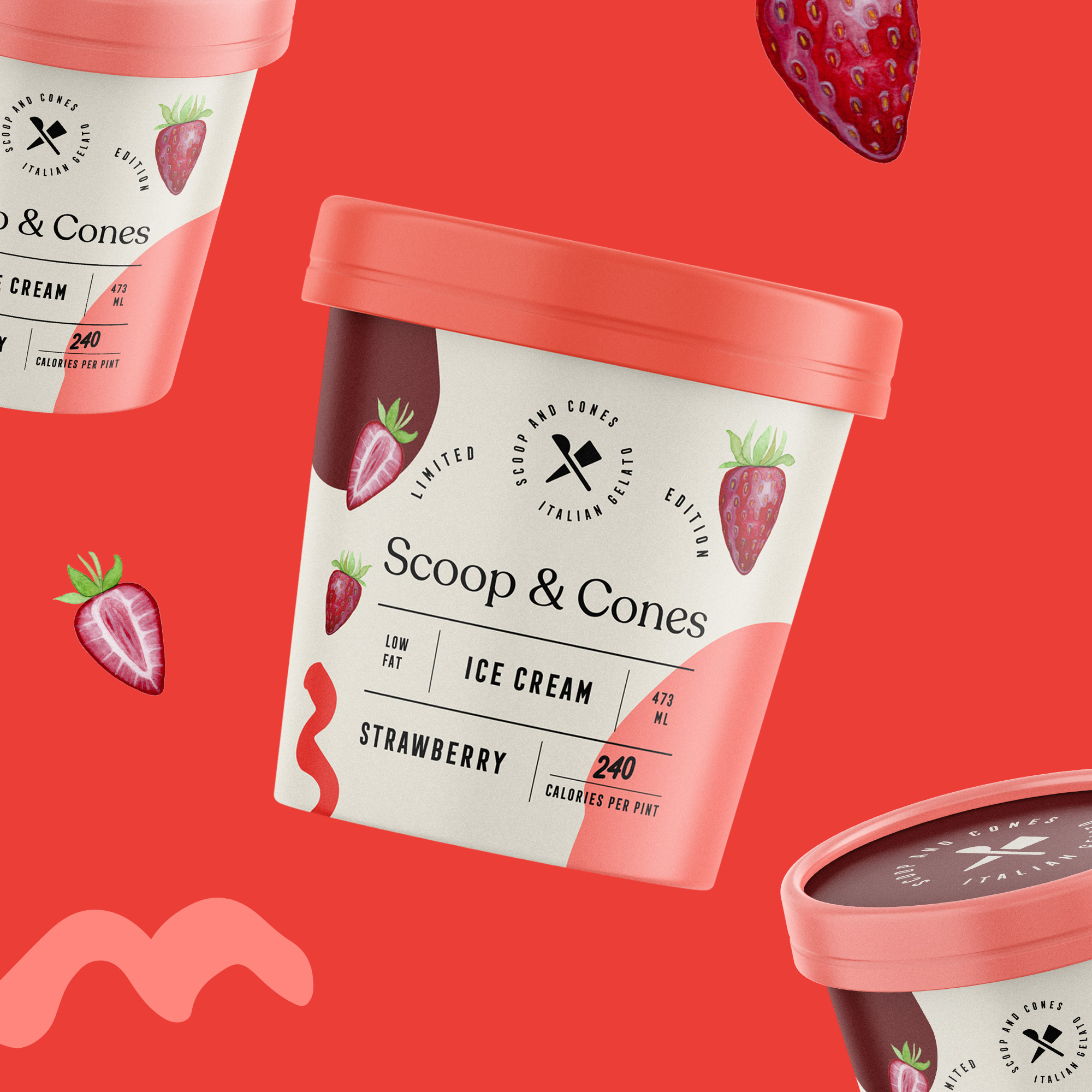
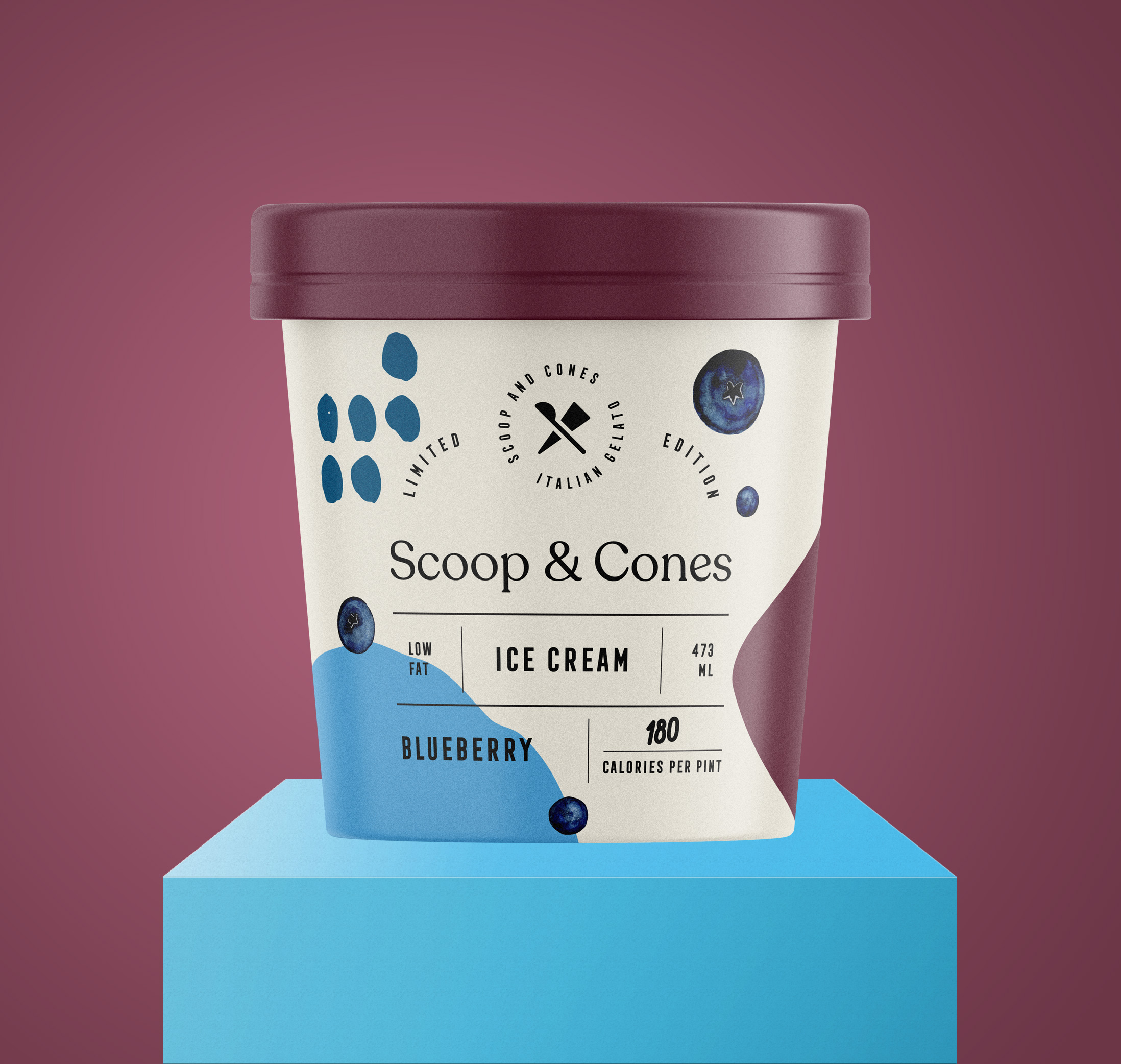
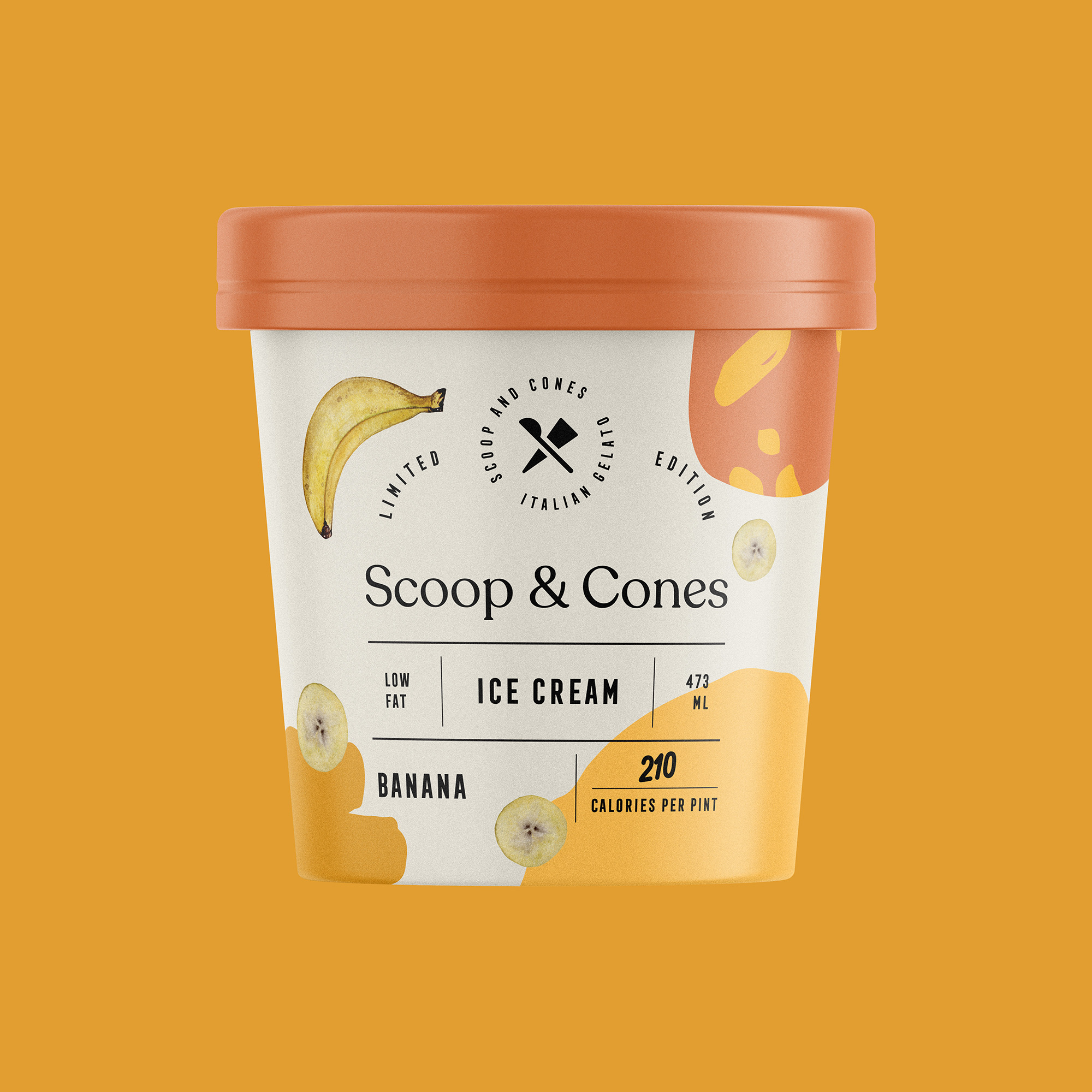
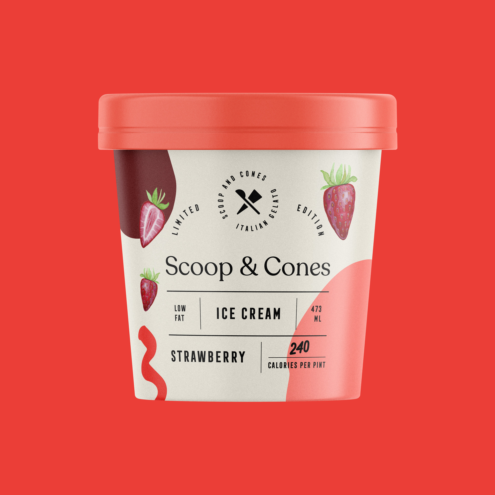
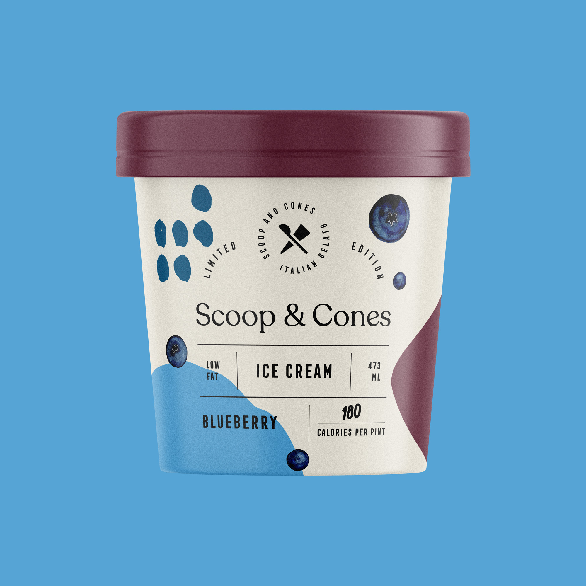
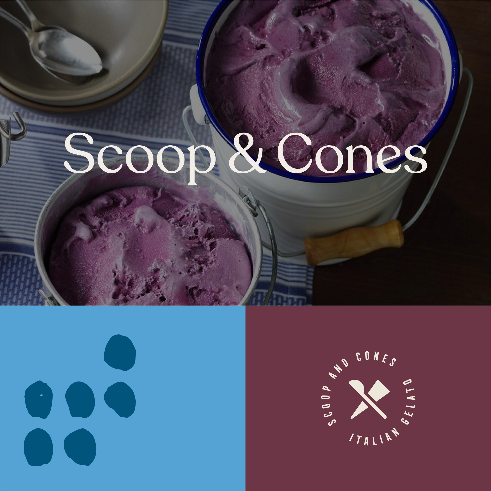
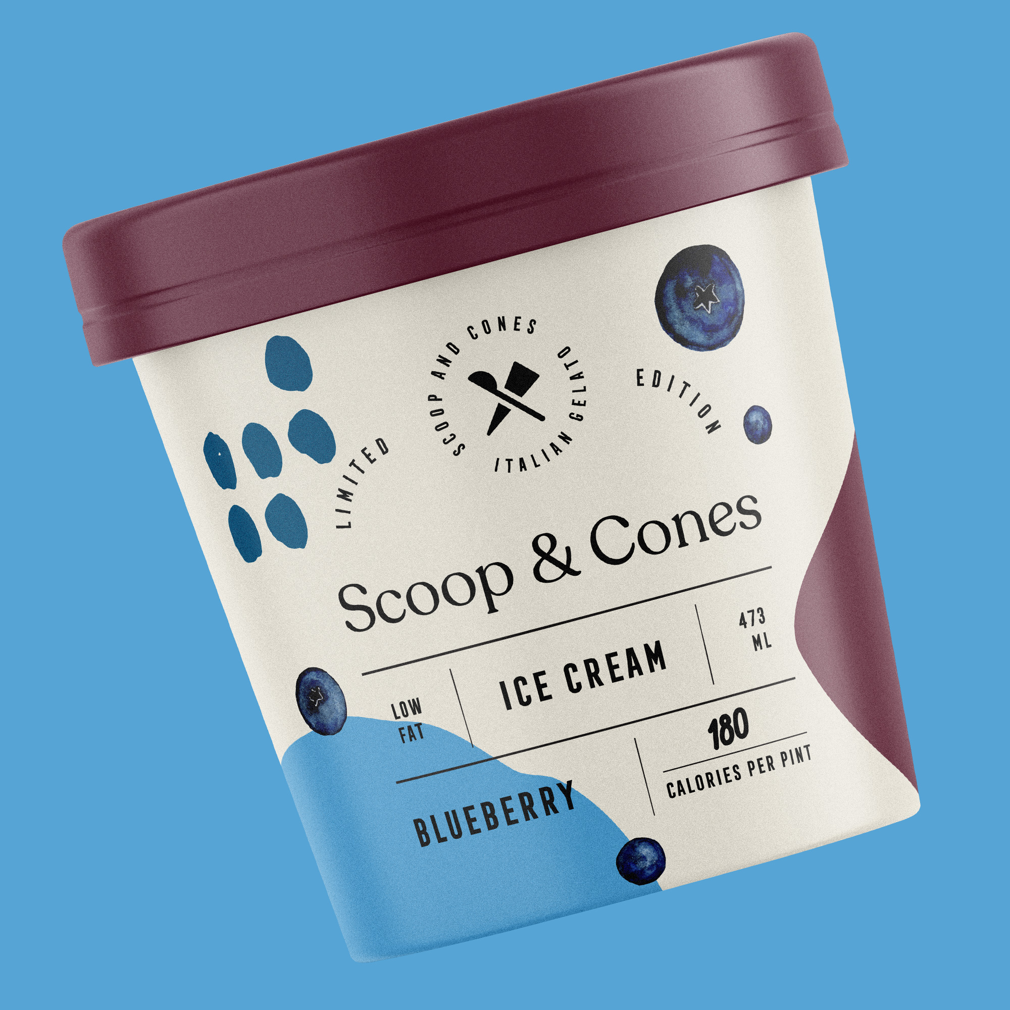
We used scoop and a cone on the logo as the brand name. We also chose to use modern typography.
We categorized the products with colors and used organic shaped patterns on the packaging. And we have created a modern, fun and attractive product.


CREDIT
- Agency/Creative: Marka Network Branding Agency
- Article Title: Packaging for Scoop & Cones
- Organisation/Entity: Agency, Non Published Concept Design
- Project Type: Packaging
- Agency/Creative Country: Turkey
- Market Region: North America
- Project Deliverables: Brand Guidelines, Brand Naming, Branding, Illustration, Packaging Design, Tone of Voice
- Format: Box
- Substrate: Plastic
FEEDBACK
Relevance: Solution/idea in relation to brand, product or service
Implementation: Attention, detailing and finishing of final solution
Presentation: Text, visualisation and quality of the presentation


