


This project demonstrates how agricultural products can be transformed into a clearly positioned brand identity.
For Schafflerhof, I developed the visual identity for the farm’s own store, “Schafflers Hofladen.” The starting point was an existing logo and handmade labels without a consistent brand system. The goal was a professional, scalable brand presence for direct marketing.
The challenge.
Target a young, urban audience. People with a strong design sensibility and clear expectations regarding organic quality, regionality, and regenerative farming.
The strategic idea.
Deliberate distancing from the traditional rustic farm code. Development of a modern, graphically clear visual identity with illustrations as a brand-defining element.
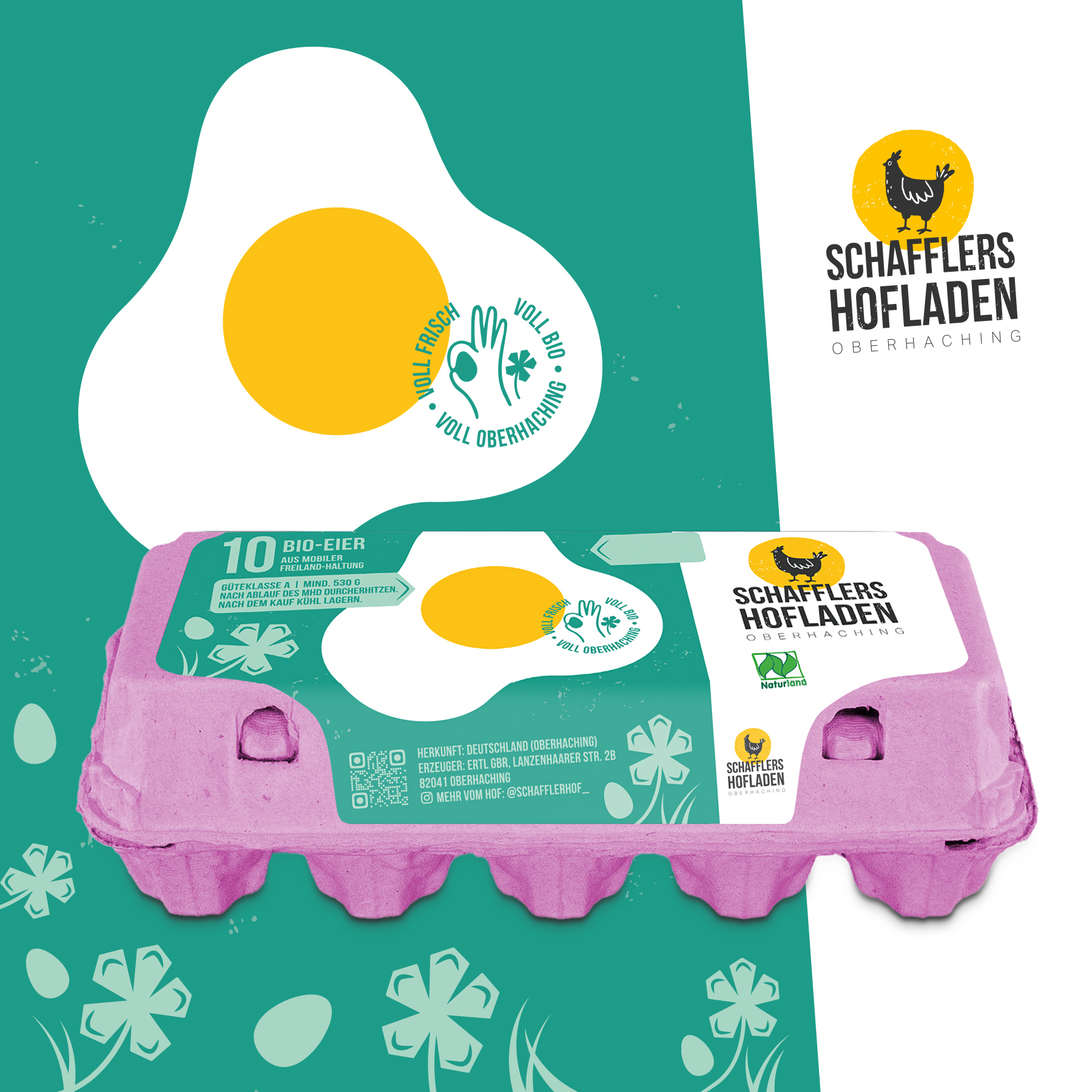
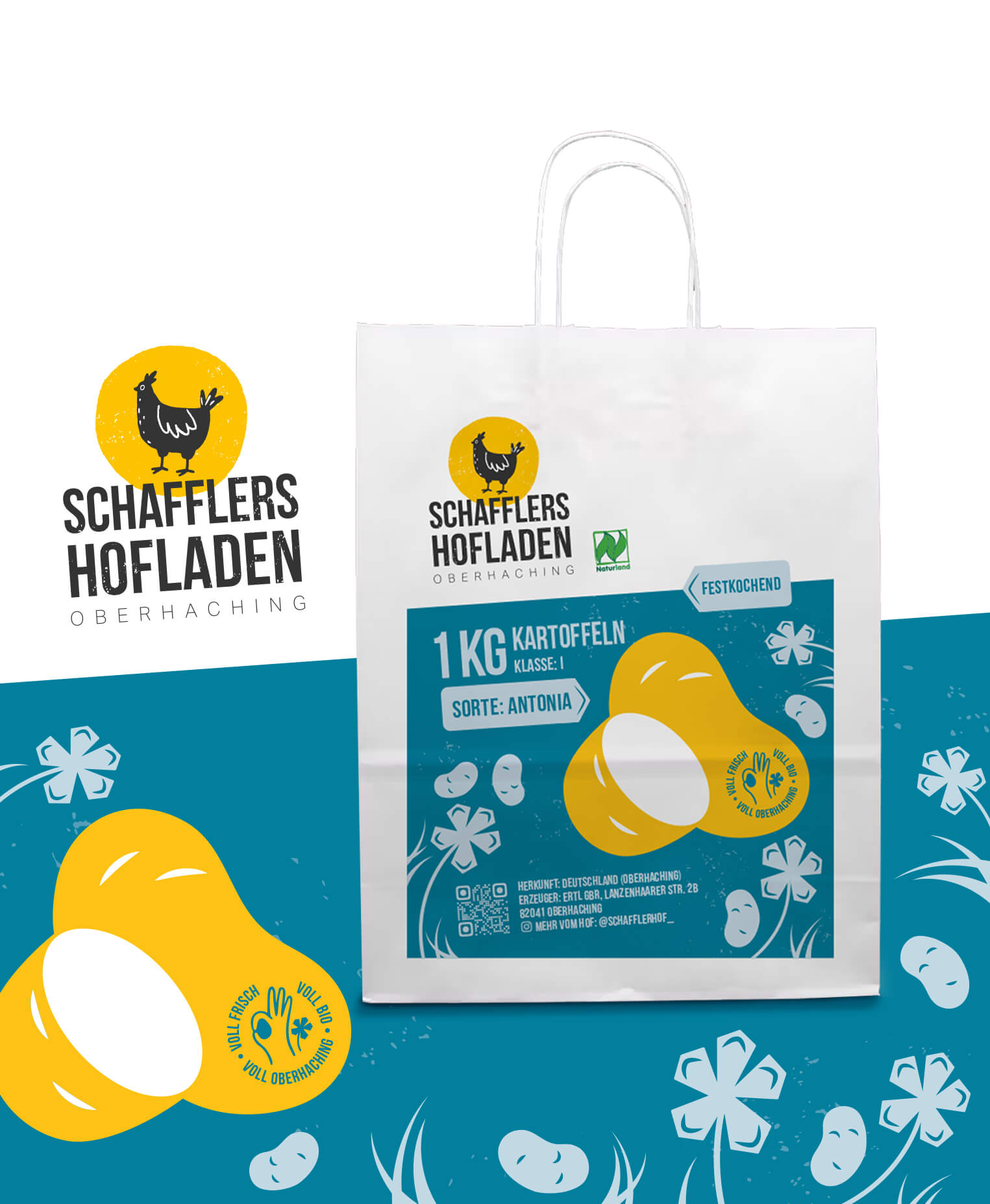
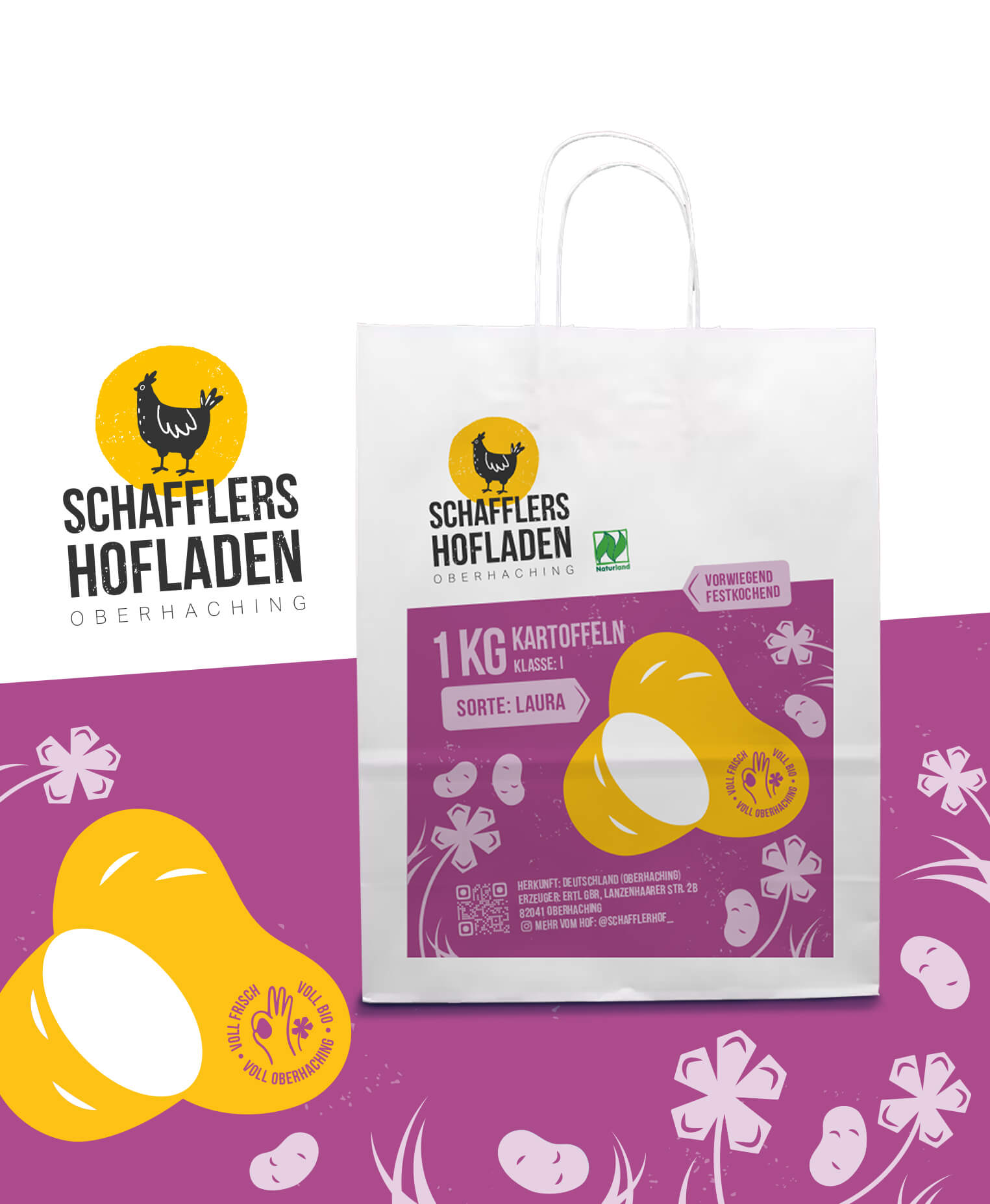
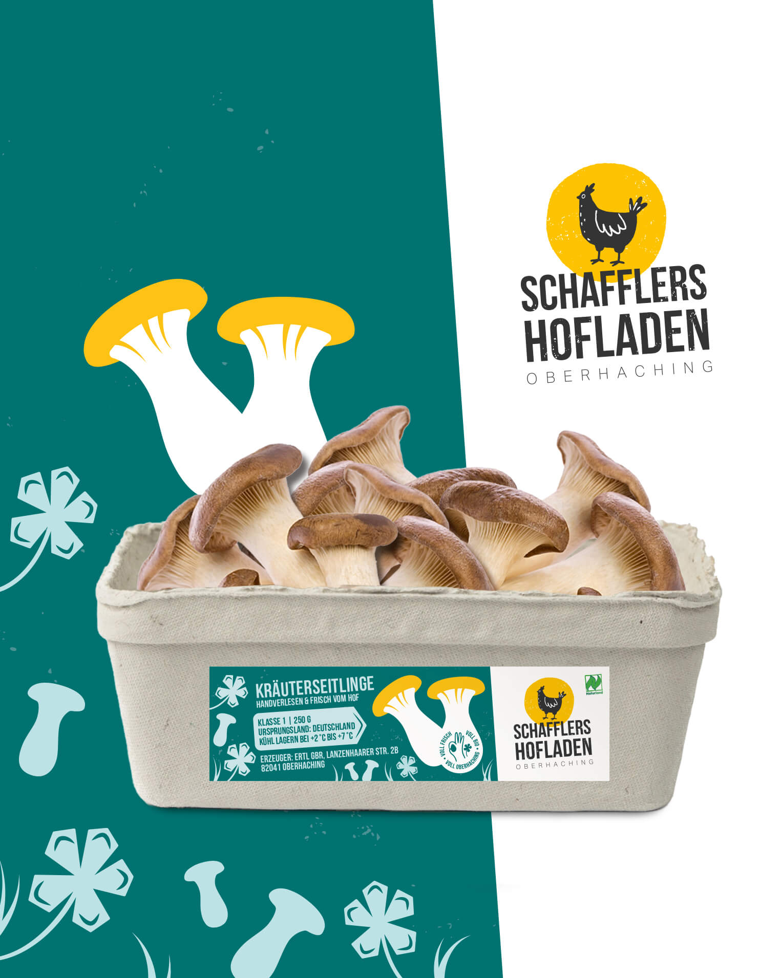
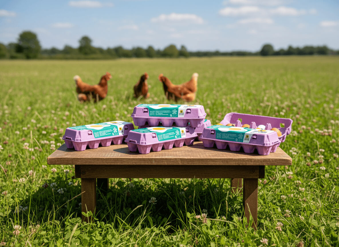
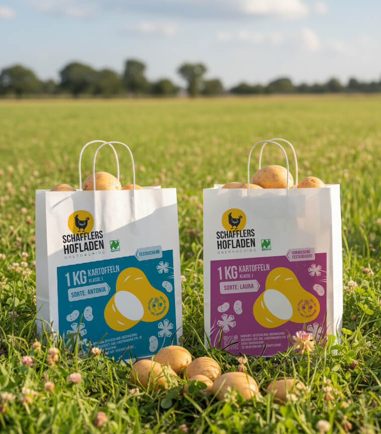
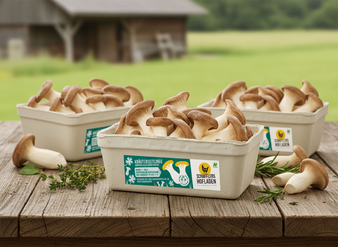
Based on the logo, a coherent packaging system was created with a clear visual hierarchy. White branding areas ensure maximum logo visibility. Colored product surfaces differentiate the product range.
All angles, typography, and design elements consistently derive from the logo’s slant. The system is modular, expandable, and suitable for a growing product range.
The initial product line includes potatoes, free-range eggs from mobile housing, and king oyster mushrooms. Each product has its own distinct color palette, a reduced and bold illustration, and specific icons. The imagery is deliberately simplified and instantly readable.
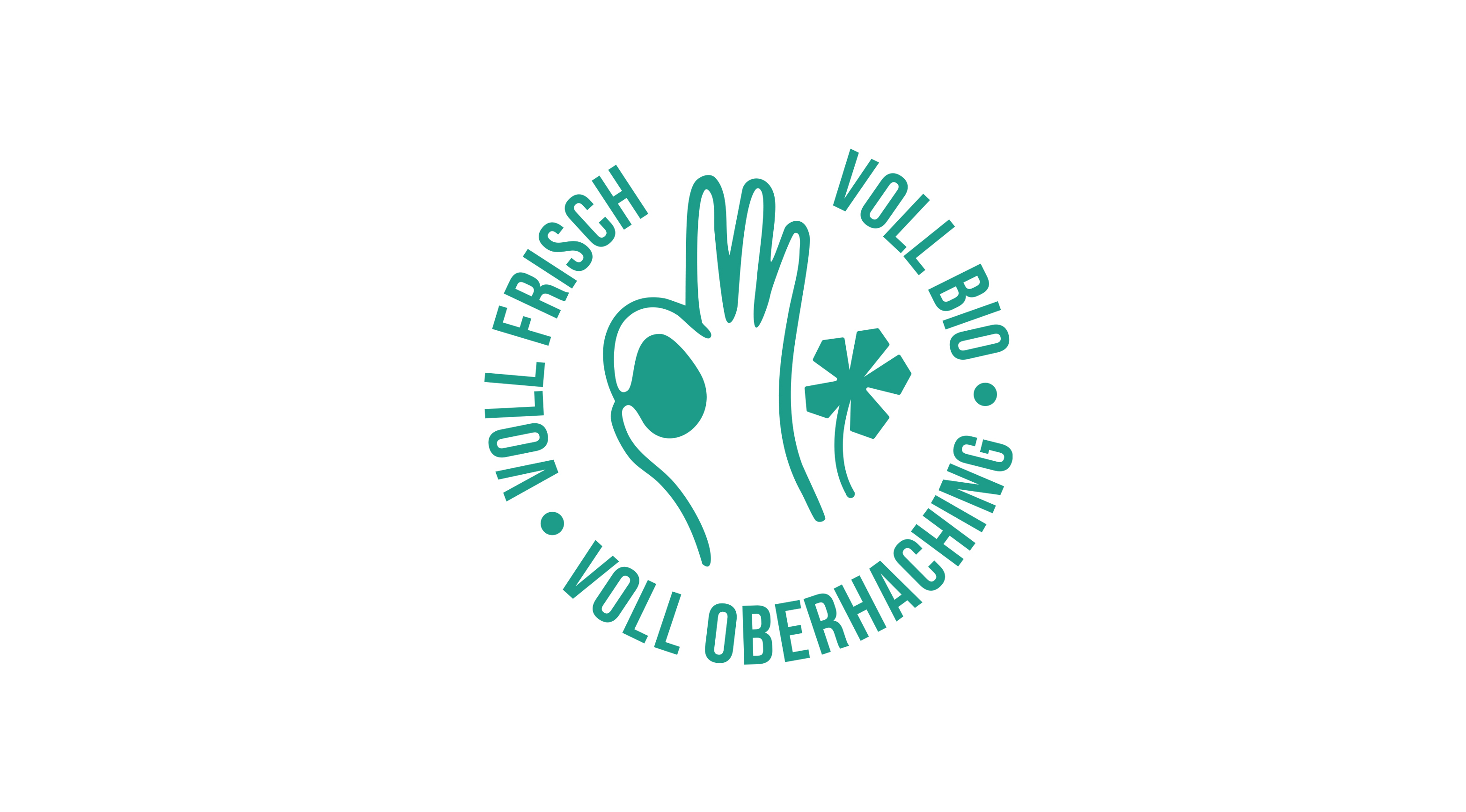
Another key element of the branding is the branding label I developed. Modern in tone, the claim communicates positioning and origin precisely: Fully Organic. Fully Oberhaching. Fully Fresh.
The wording is clear, contemporary, and audience-appropriate. The label combines symbolism and meaning. The “all-good” gesture forms the shape of an egg in the negative space, directly referencing mobile hen housing and animal welfare. The clover icon has a double meaning: a symbol of luck for free-range hens and a reference to clover cultivation and the associated regenerative farming practices.
Clover illustrations run consistently across all products, conveying ecological responsibility and agricultural expertise.
The result is a striking FMCG presence with high recognizability. Clearly positioned. Visually differentiated. Systematically structured. The design works on the shelf, in the farm shop, online, and across brand communications. QR codes, origin labeling, and social media extensions are integral parts of the system.
CREDIT
- Agency/Creative: Stefanie Twellmann
- Article Title: Packaging Designs for the Product Range of the Schafflerhof Farm by Stefanie Twellmann
- Organisation/Entity: Freelance
- Project Type: Packaging
- Project Status: Published
- Agency/Creative Country: Germany
- Agency/Creative City: Hamburg
- Market Region: Europe
- Project Deliverables: Brand Design, Brand Mark, Illustration, Packaging Design
- Format: Bag, Basket, Tag, Wrap
- Industry: Agriculture
- Keywords: branding, packaging design, illustrative design, brand identity, agricultural products, FMCG
-
Credits:
Art direction, illustration, concept and design, final artwork: Stefanie Twellmann


