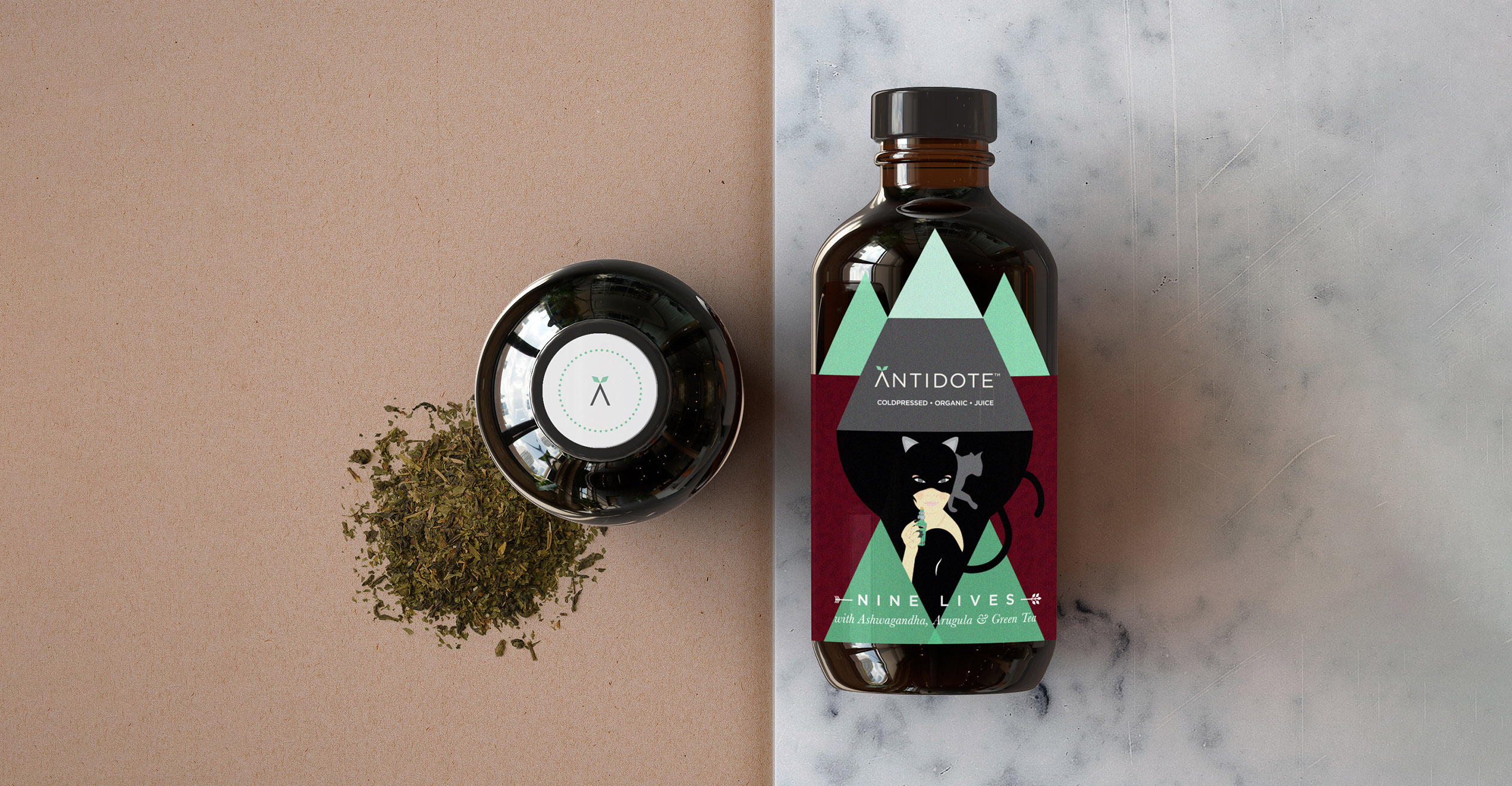
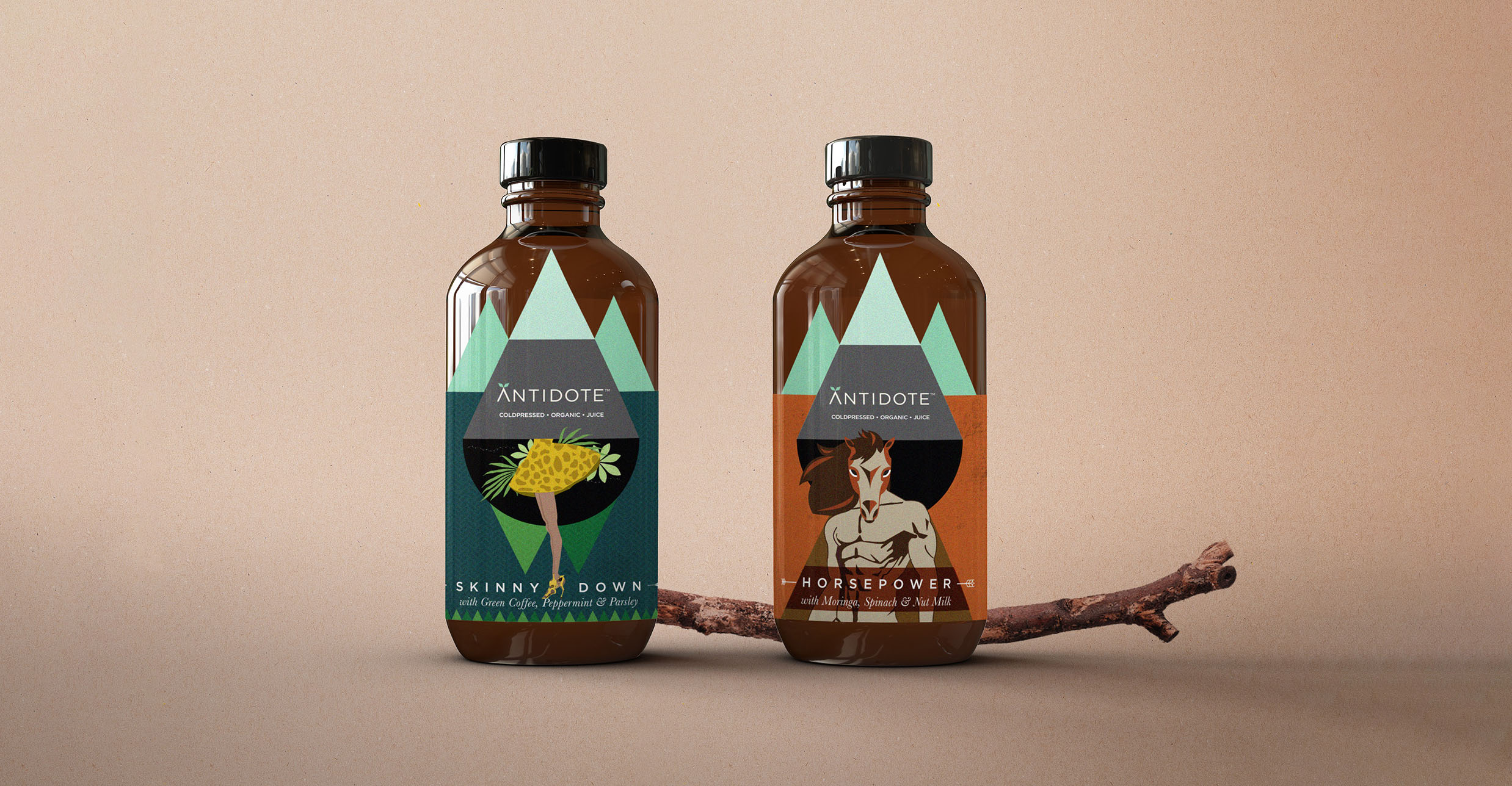
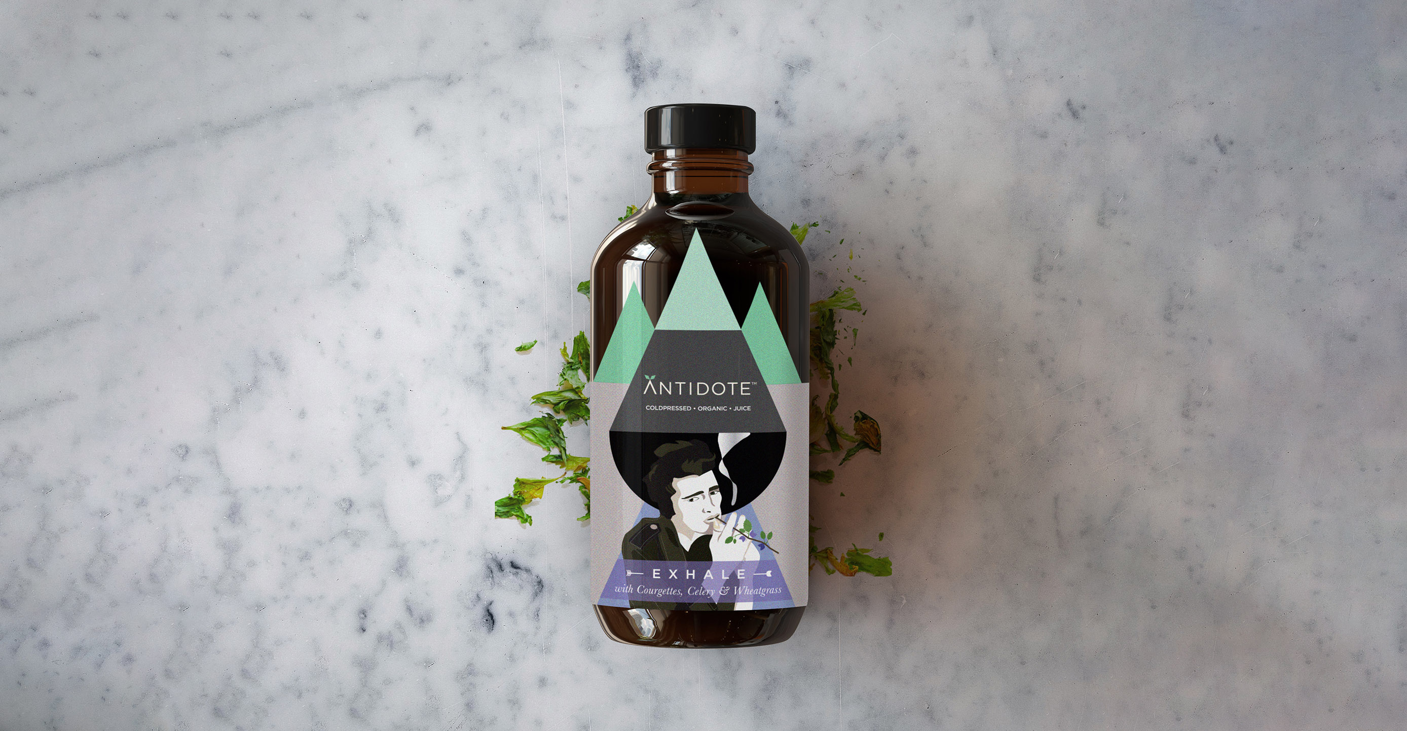
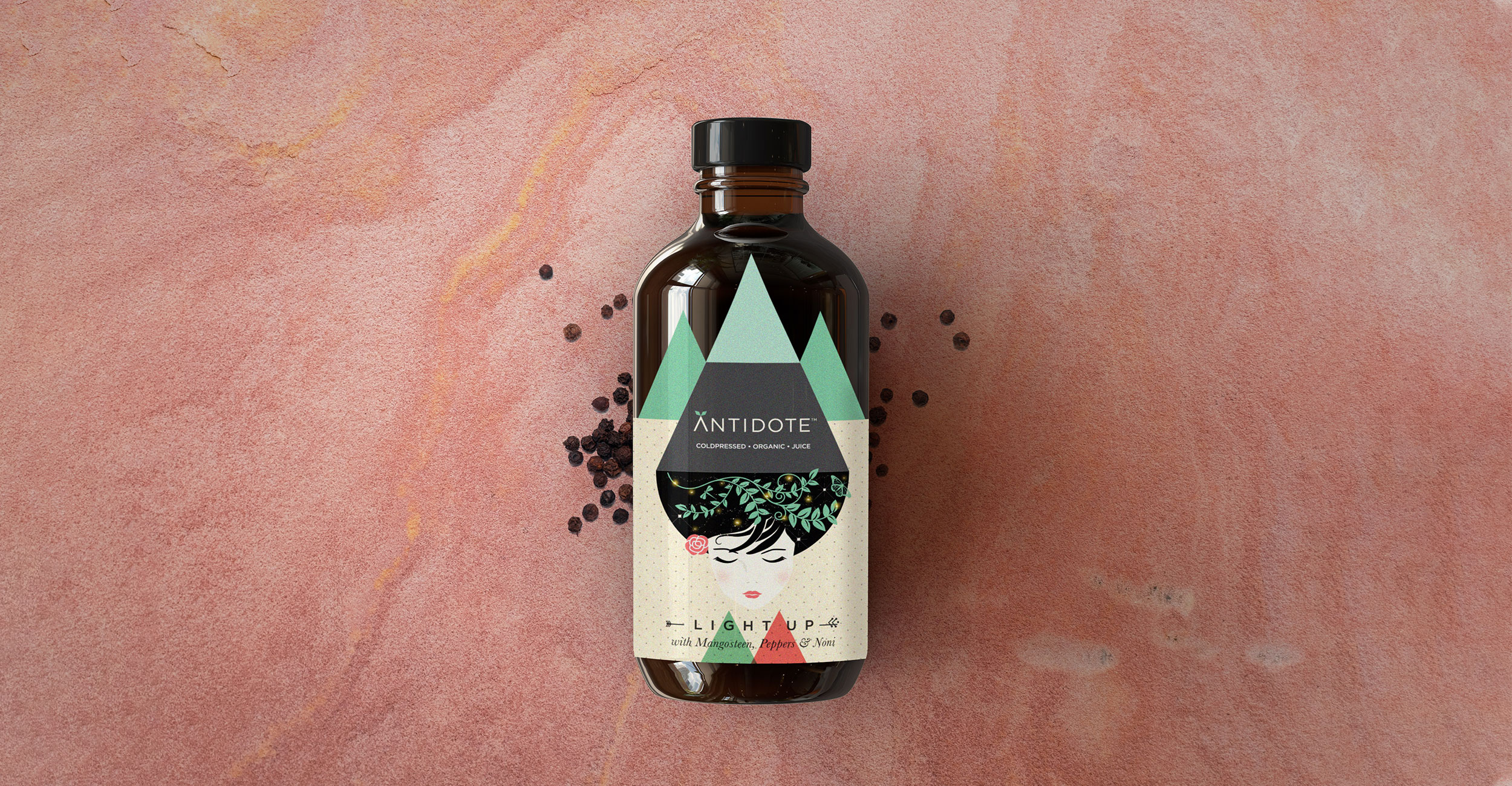
Antidote is a cold-pressed organic juice range that aims to provide rare nutrients in the form of 5 juice cleanses. Each cleanse is named after its core function: Skinny Down for weight loss, Nine Lives for anti-ageing, Exhale for detox, Light Up for skin & Horsepower for strength.
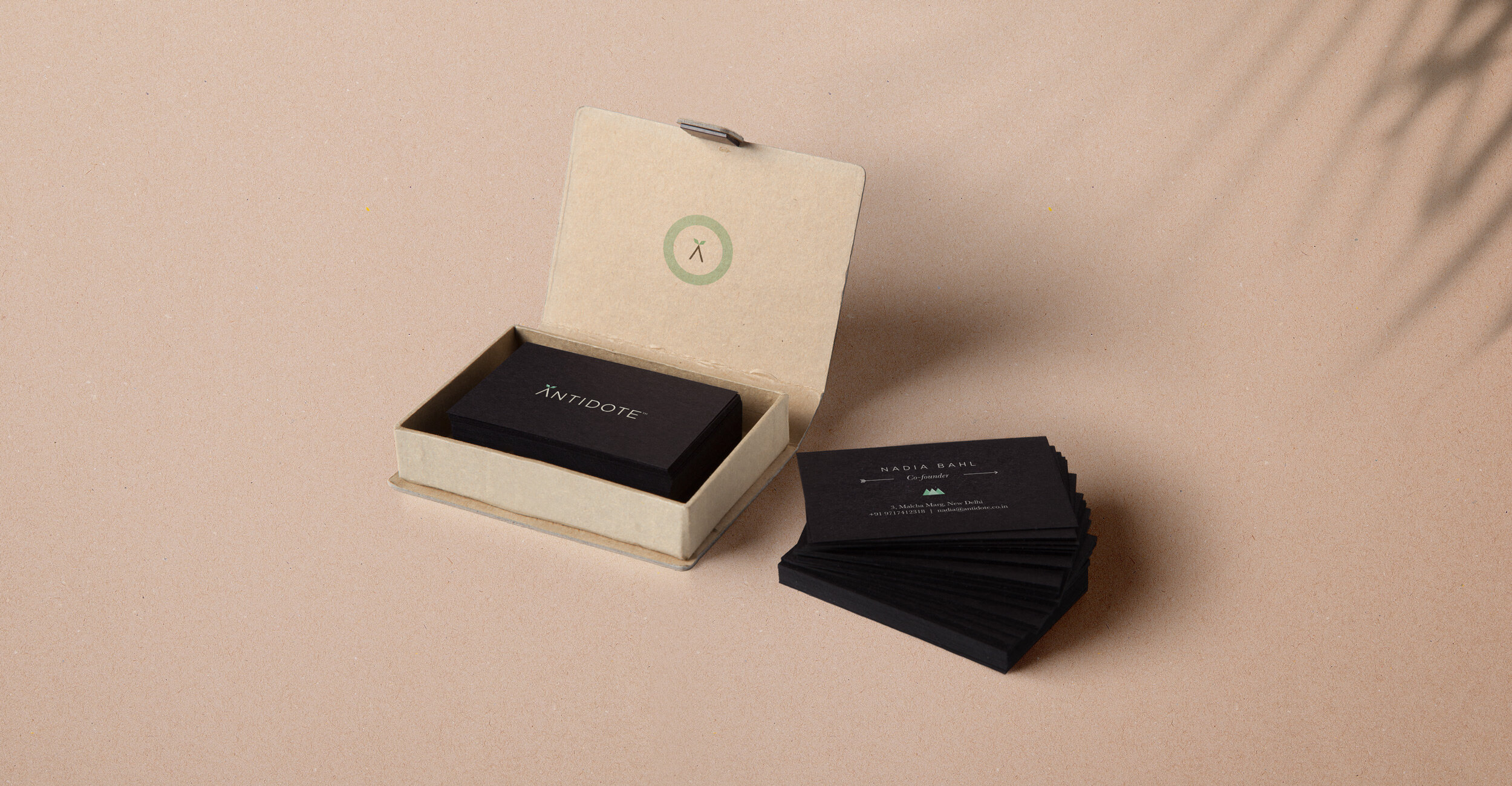
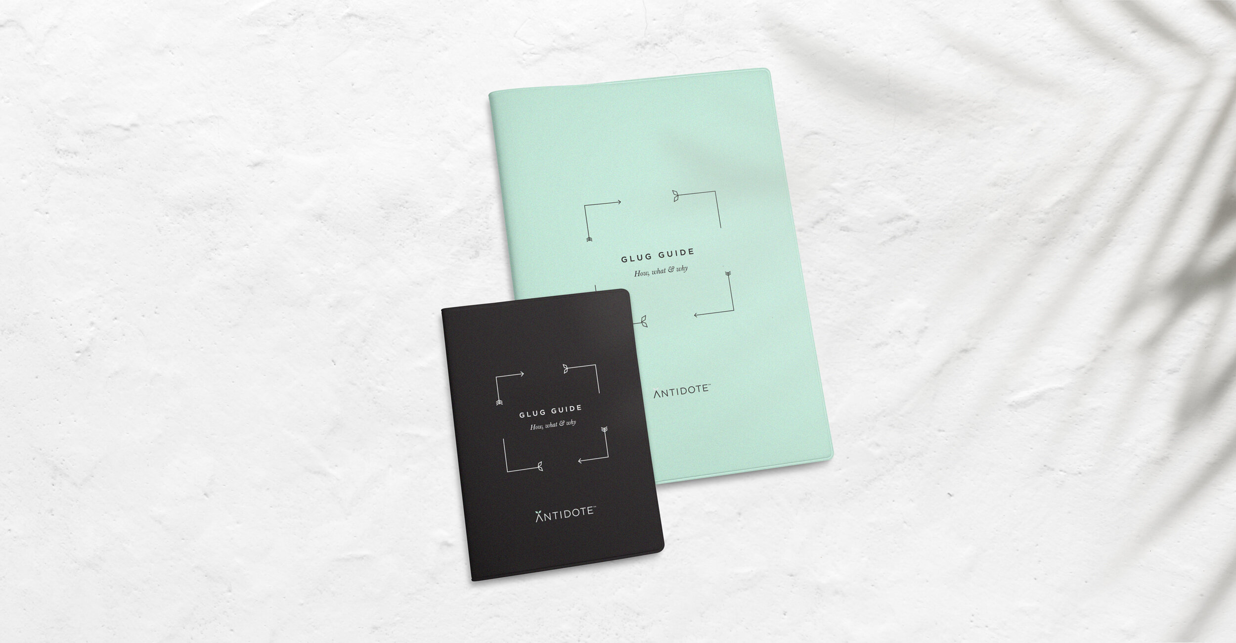
A ‘cure’ for unhealthy lifestyle, Antidote’s ingredients have been picked with the level of care that warrants a precise, geometric approach for its visual identity. The geometric drop has been broken down to create an iconic framework where intricate illustrations and information are nestled to bring its packaging together in a unique and memorable way.
The juice comes in an amber medicine bottle as Antidote is essentially a “cure” for our relatively unhealthy lifestyle.
CREDIT
- Agency/Creative: Sargam Gupta
- Article Title: Packaging Design That Is Carefully Calculated Just Like Its Nutrients
- Organisation/Entity: Freelance, Published Commercial Design
- Project Type: Packaging
- Agency/Creative Country: India
- Market Region: Asia
- Project Deliverables: Brand Guidelines, Brand Identity, Branding, Graphic Design, Identity System, Illustration, Packaging Design, Product Architecture
- Format: Bottle
- Substrate: Glass Bottle


