


Agama is the market leader in frozen seafood with its own retail chain and production facilities. The brand with 22 years of history has won the trust of customers and continues to improve its product. The company supplies products to the best restaurants in the country, controls quality in eight stages – from selecting suppliers to monitoring delivery to retail outlets.
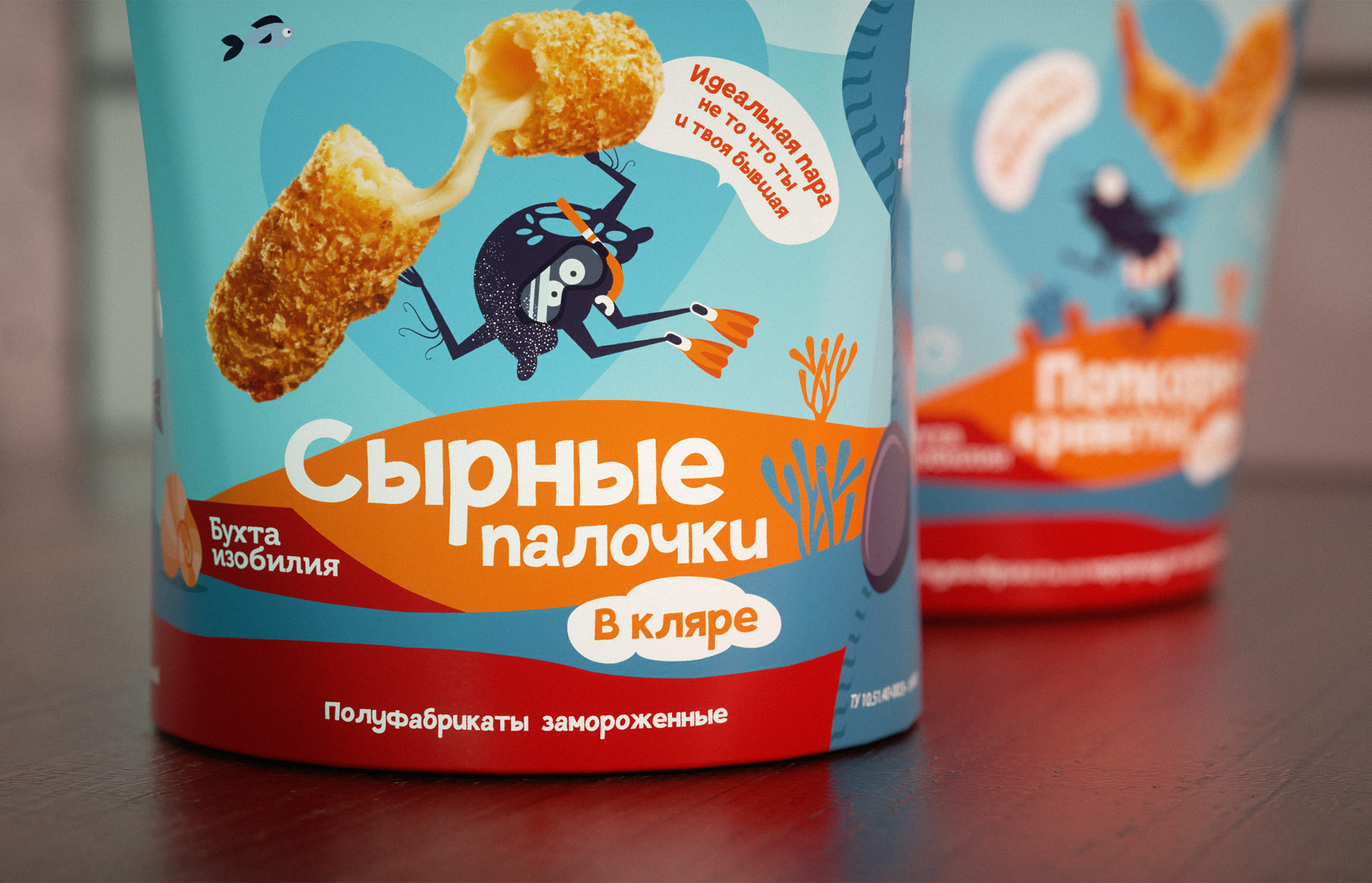
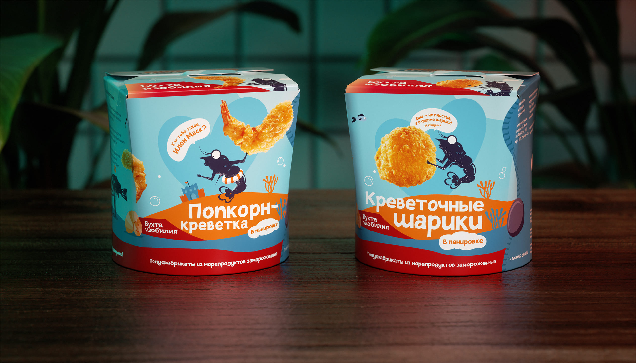
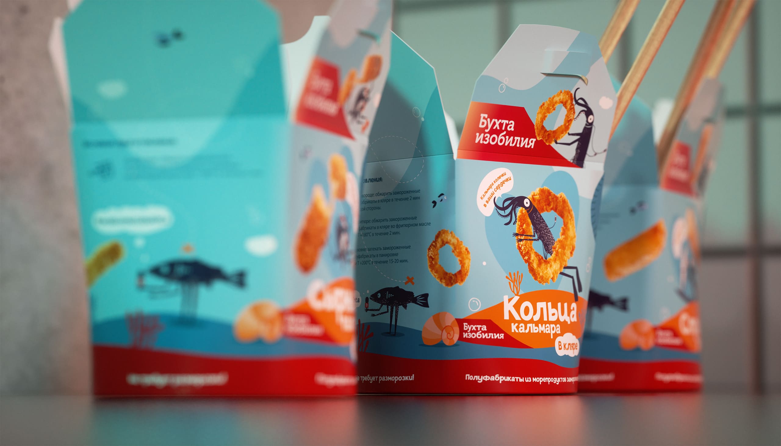
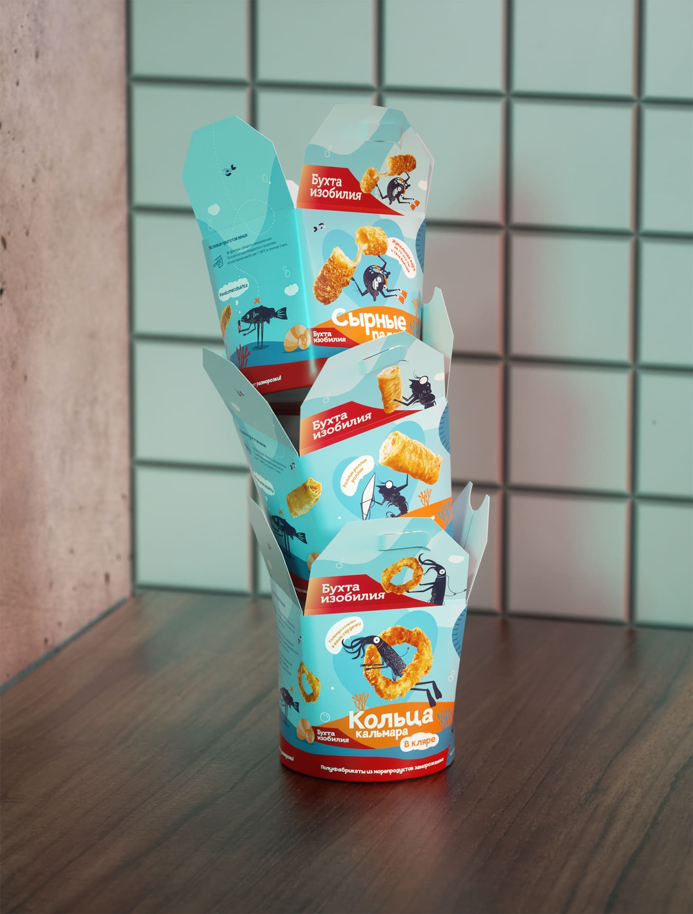
We have created a whole world inhabited by the characters loved by our subscribers: Omar Khayyam, reading out his fish, stand-up Halibut, Karaoke-Crab with songs of his own composition and poet Kalmar Chukovsky, reading life lines with a grain of irony. These and other characters speak the language of their audience, playing up modern memes and the latest news stories.
This format became the starting point for the success of the “Bay of Plenty” in social networks – to be closer to people through humor and endless positive. By the way, not only subscribers appreciated the work of our creators, designers and SMM specialists – Sostav.ru called our networks the most original in the article “Gods of SMM”.
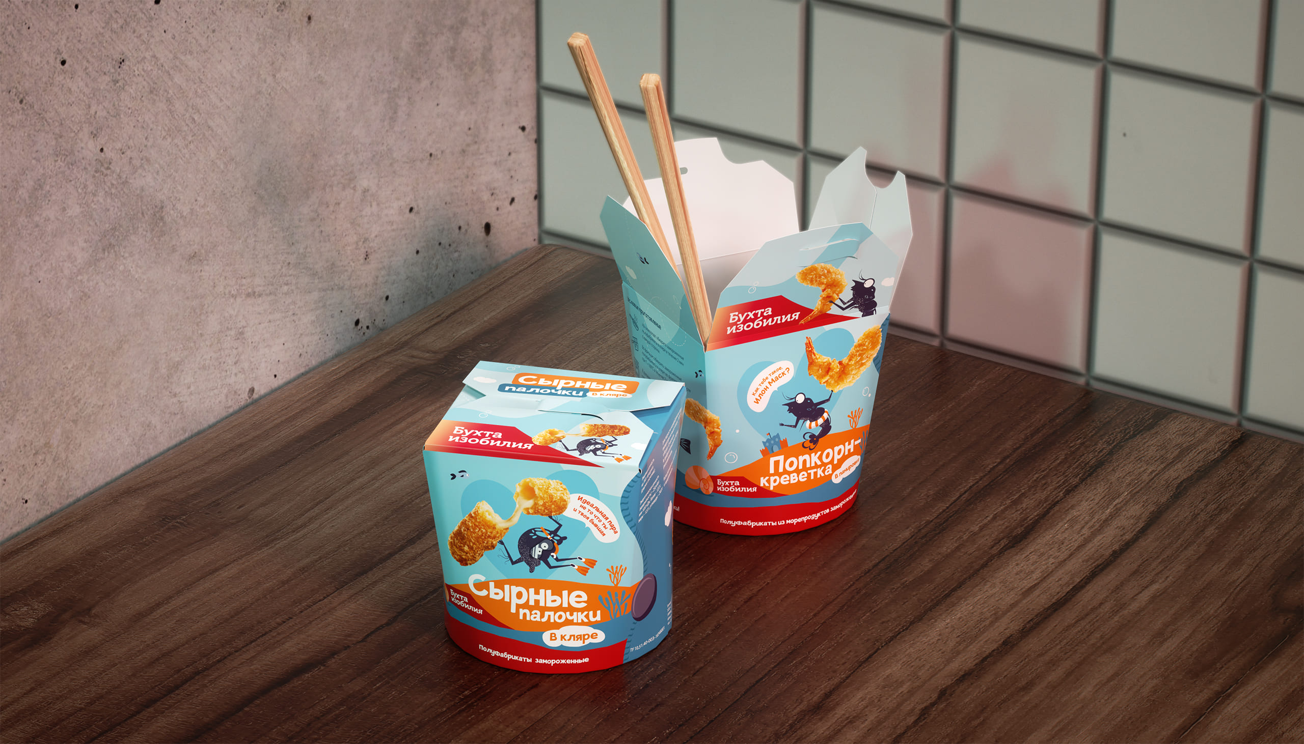
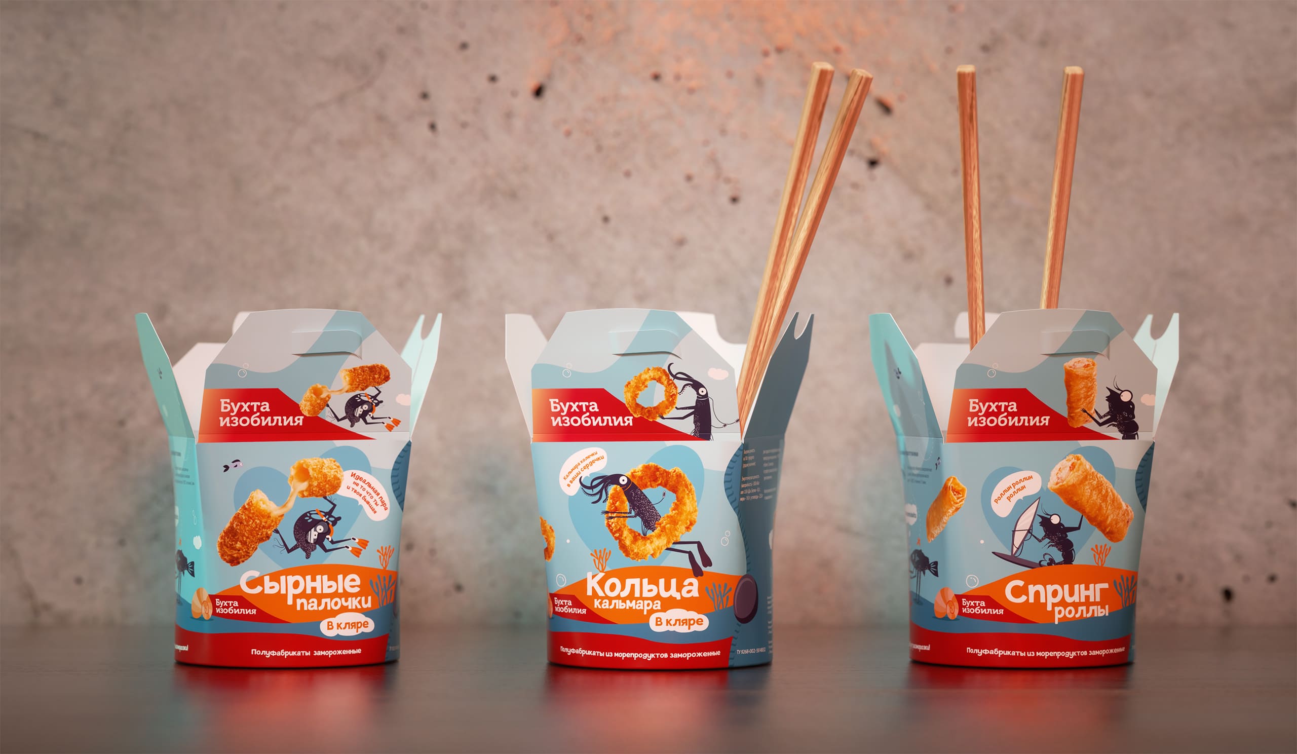
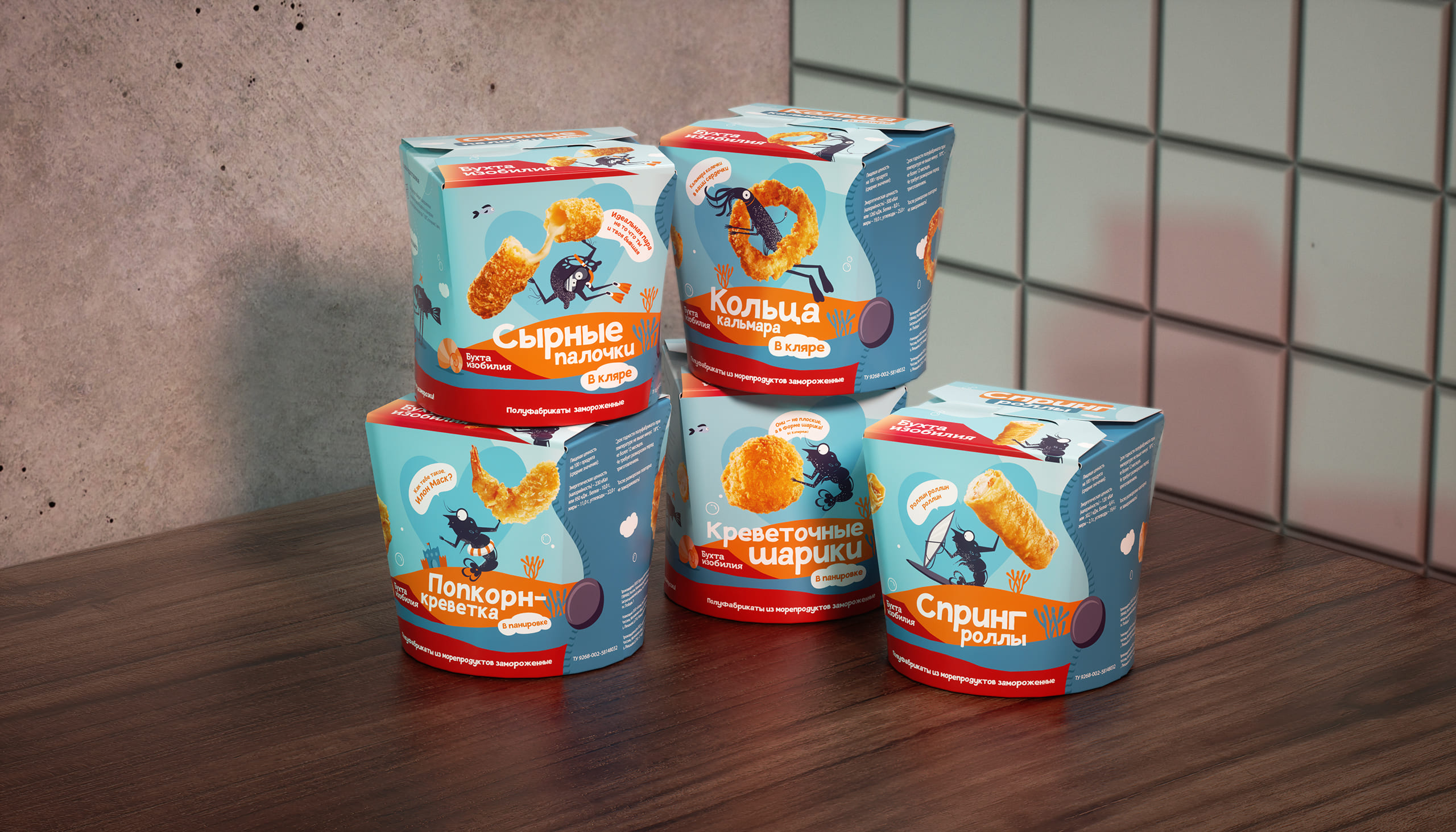
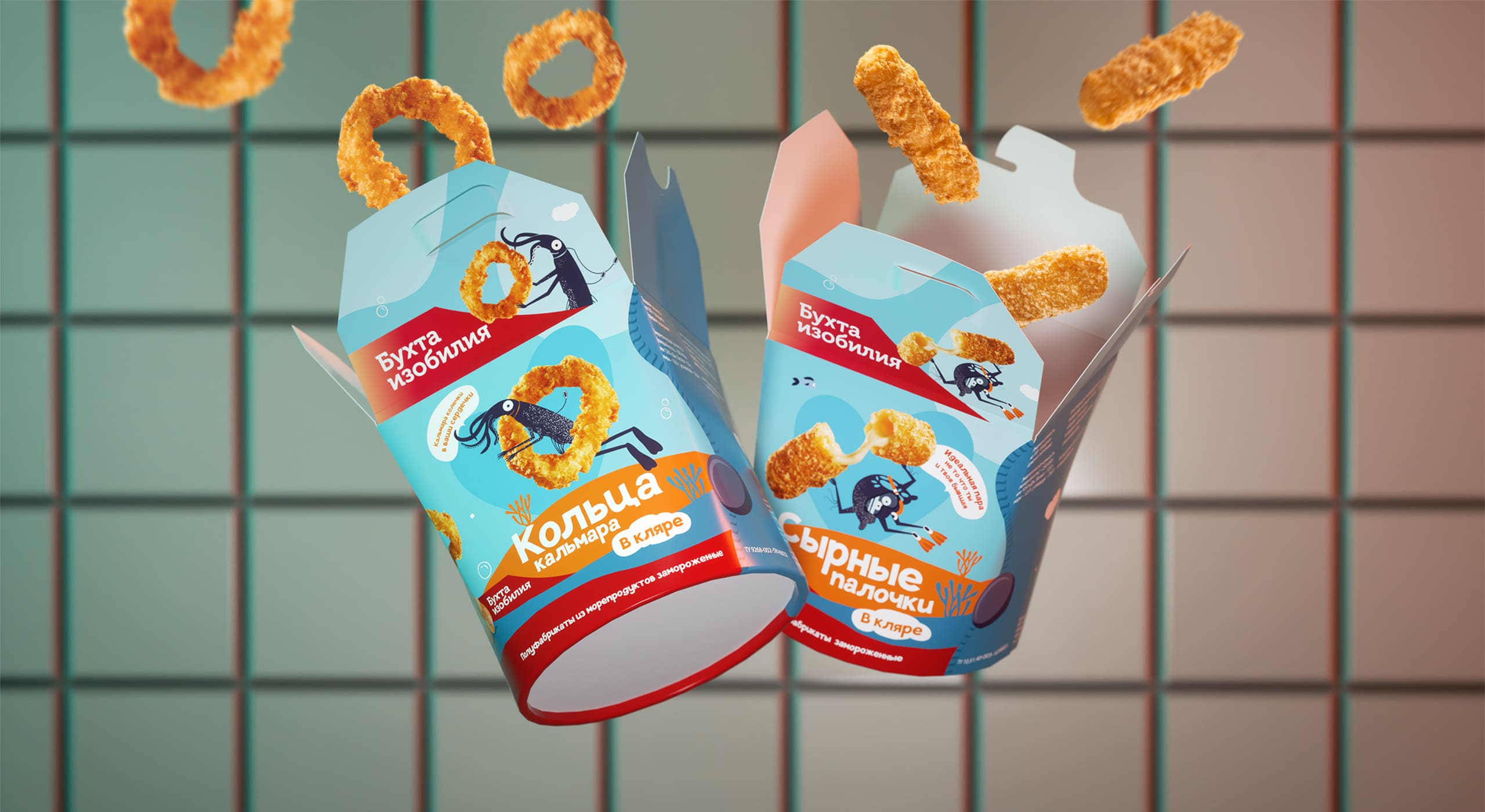
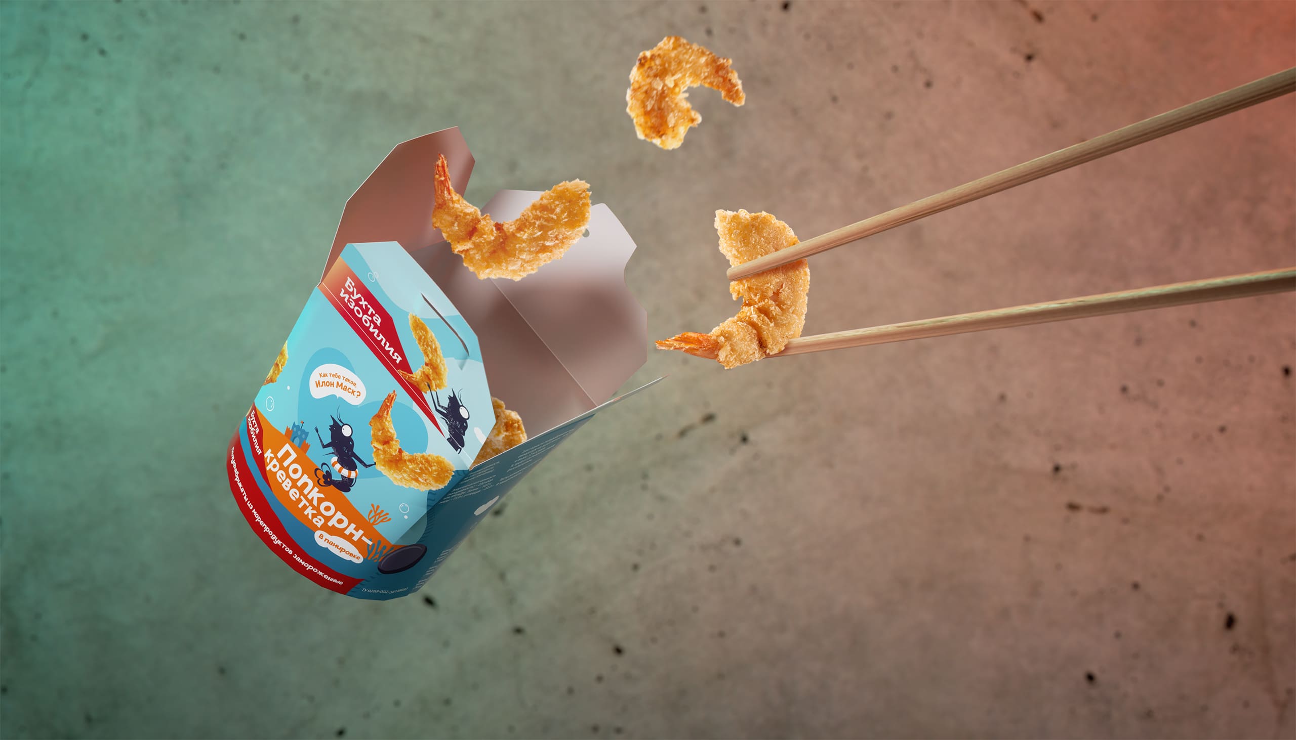
The fantastic return of posts and the popularity of individual characters pushed the Cove of Plenty team and us to move them from digital to reality. Packing frivolous snacks is the best place to use your favorite looks. Now marine bloggers will be nearby not only in the Instagram feed, but also at hand in the form of mouth-watering snacks.
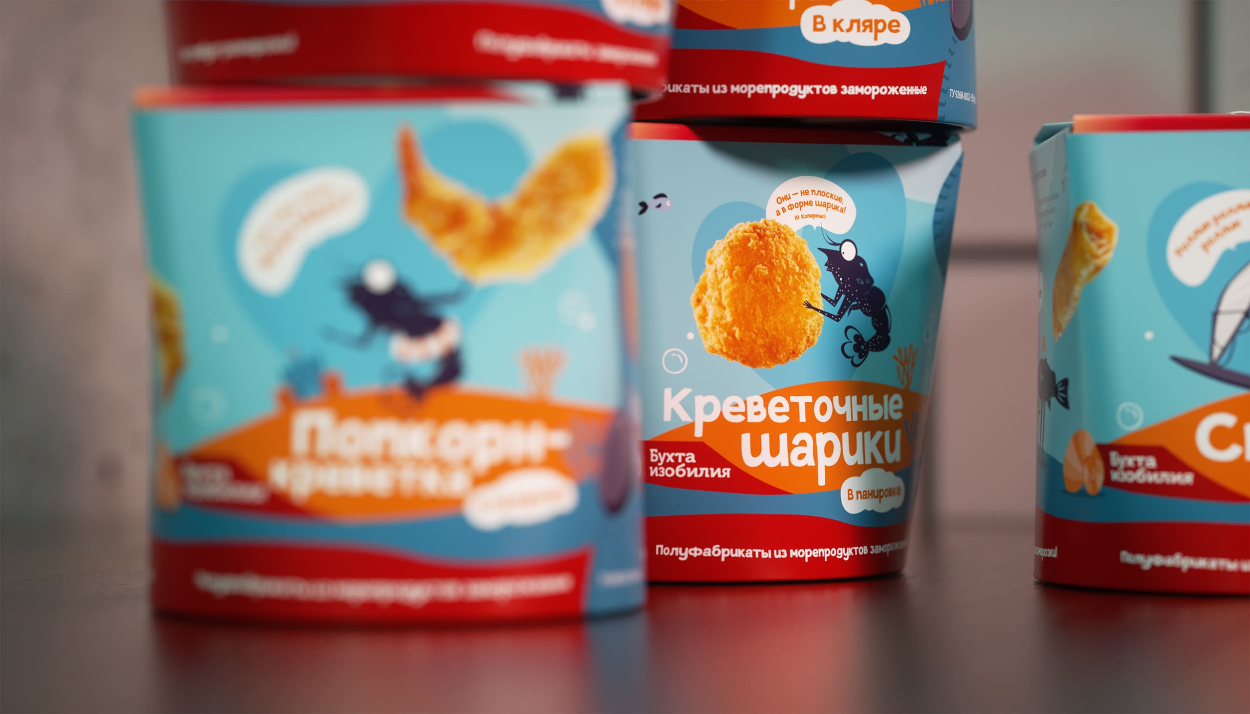
In the packaging, we continue the brand’s friendly and youthful communication style. Bright, expressive colors have been chosen that distinguish the packaging on the sales shelf and distinguish it favorably from competitors. It is based on a delicate blue color, on which red and orange elements are placed in bright accents, highlighting the name and description of the product.
Funny memes and caustic jokes of the heroes on a box with cheese sticks or shrimps continue to delight their fans, and many of these expressions will definitely become the main attribute of an evening in a friendly company. We chose a font that reflects the mood of the brand as much as possible – light, with a touch of fun and enthusiasm, informal and understandable to everyone.
The packaging itself in the form of WOK-boxes emphasizes belonging to the modern audience – it is convenient to use and looks stylish, unlike the usual bags with snacks. Such packaging gives the dish a “restaurant” feeling, despite the fact that it is a quick snack.
To create accents and highlight the quality properties of the content, we carried out product photography.
CREDIT
- Agency/Creative: Radar
- Article Title: Packaging Design, Product Photoshoot and Slogans for a New Snacks Line
- Organisation/Entity: Agency, Published Commercial Design
- Project Type: Packaging
- Agency/Creative Country: Russia
- Market Region: Multiple Regions
- Project Deliverables: Packaging Design, Product Naming
- Format: Box
- Substrate: Pulp Carton


