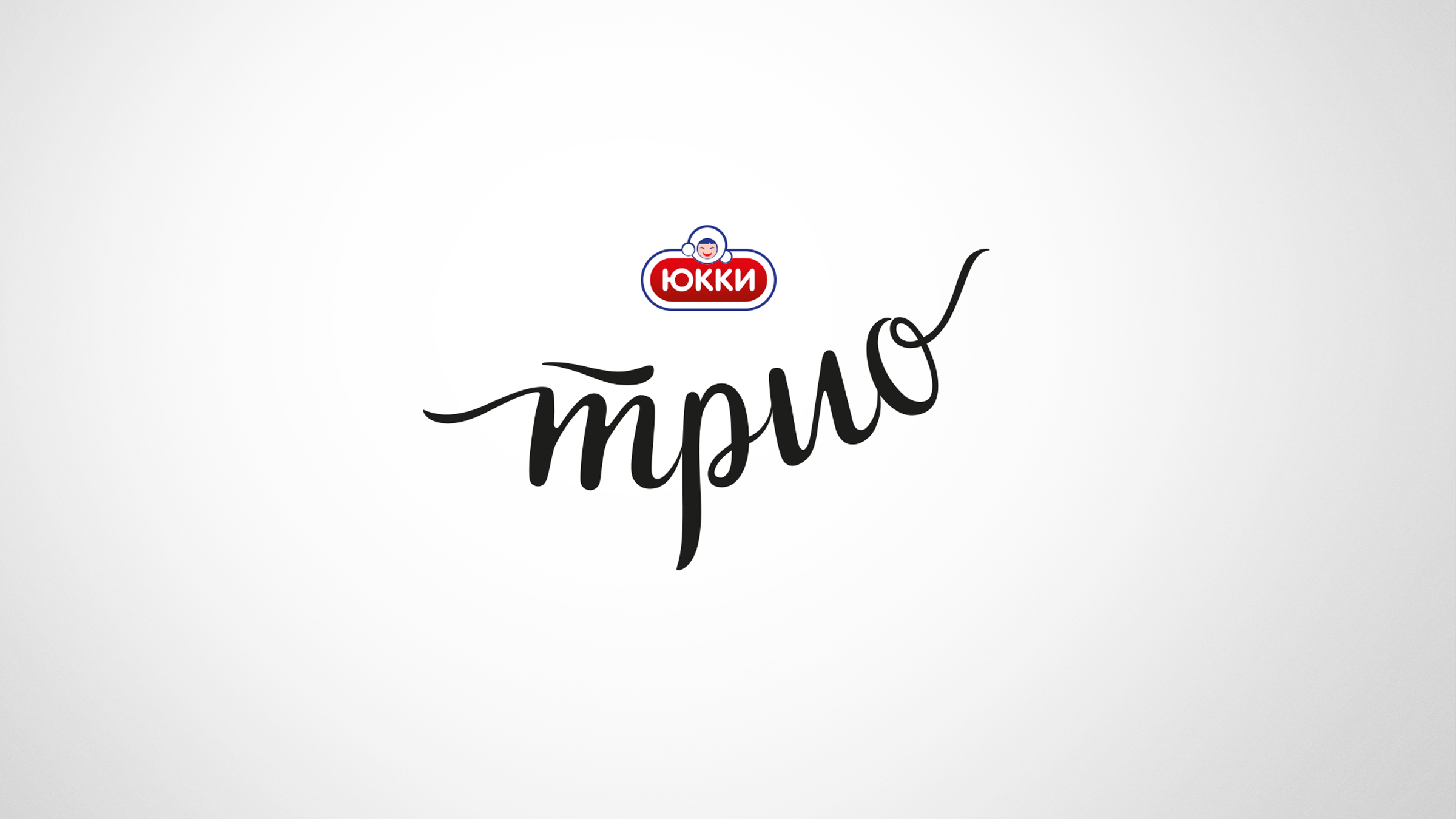
Context and Objective: Ice cream “Trio” is a sub-brand of the umbrella brand “Yucca” from the “Santa Bremor” company. The uniqueness of the products is that there are three types of ice cream in one package. You can enjoy the different flavors individually or mix them together to create interesting combinations.
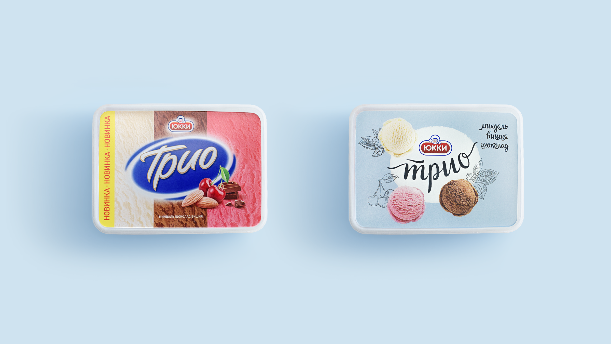
In contrast to the content, the packaging design of the “Trio” ice cream line began to lose its relevance – it looked morally outdated and did not correspond to the modern graphic trends. It was a no brainer that it was time for a redesign.
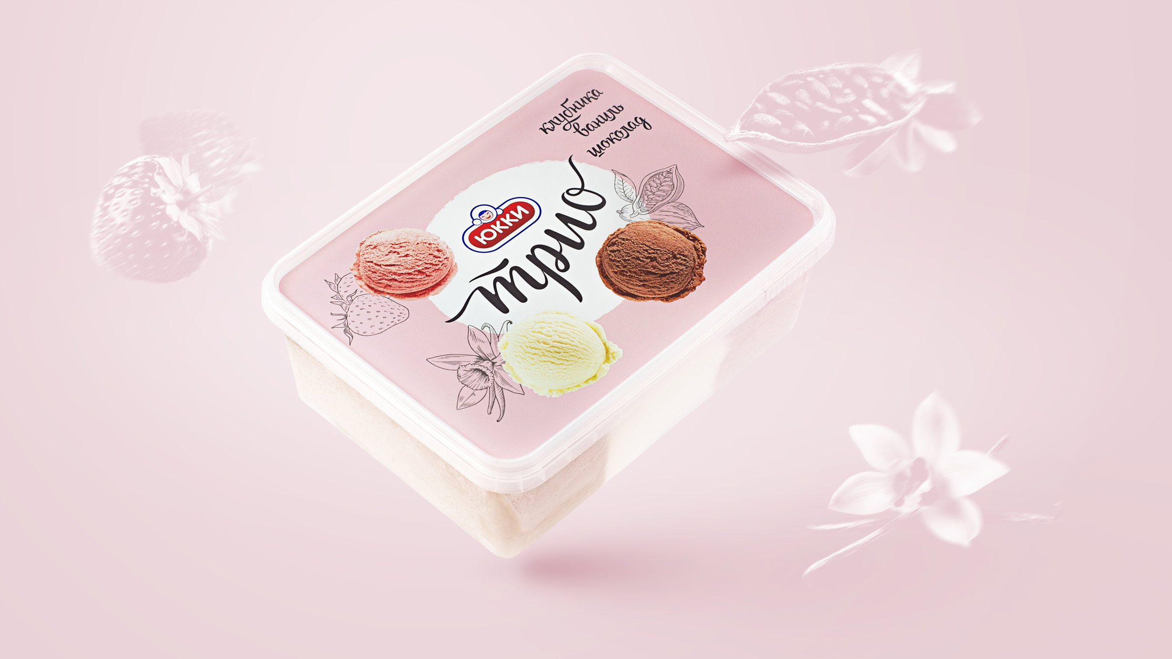
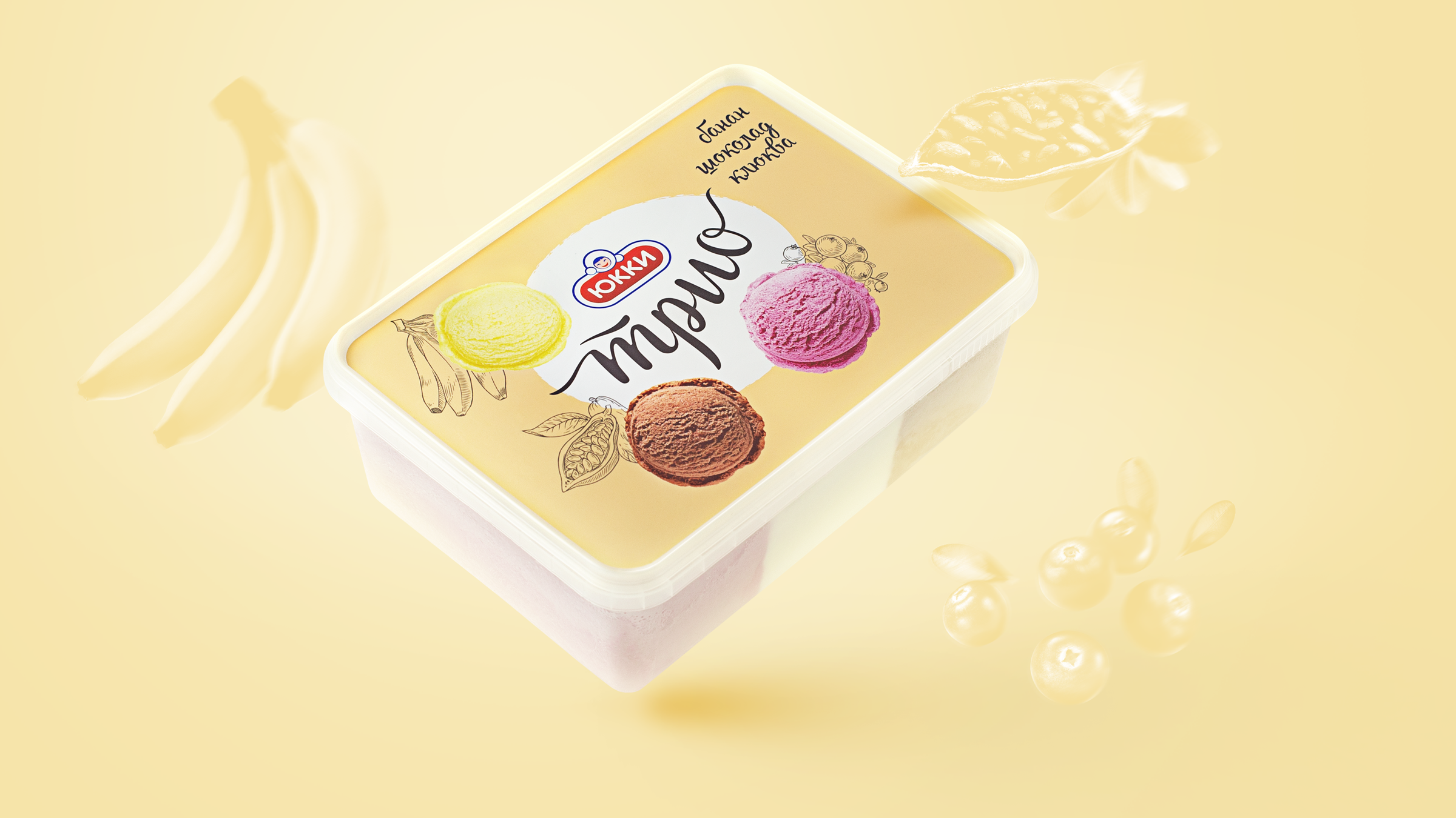
Solution: The results of the analysis carried out by the agency have determined the emotional-visual territory for the development of the “Trio” ice cream line. The focus on the combination and delight of the flavors has helped to find the necessary changes in packaging design.
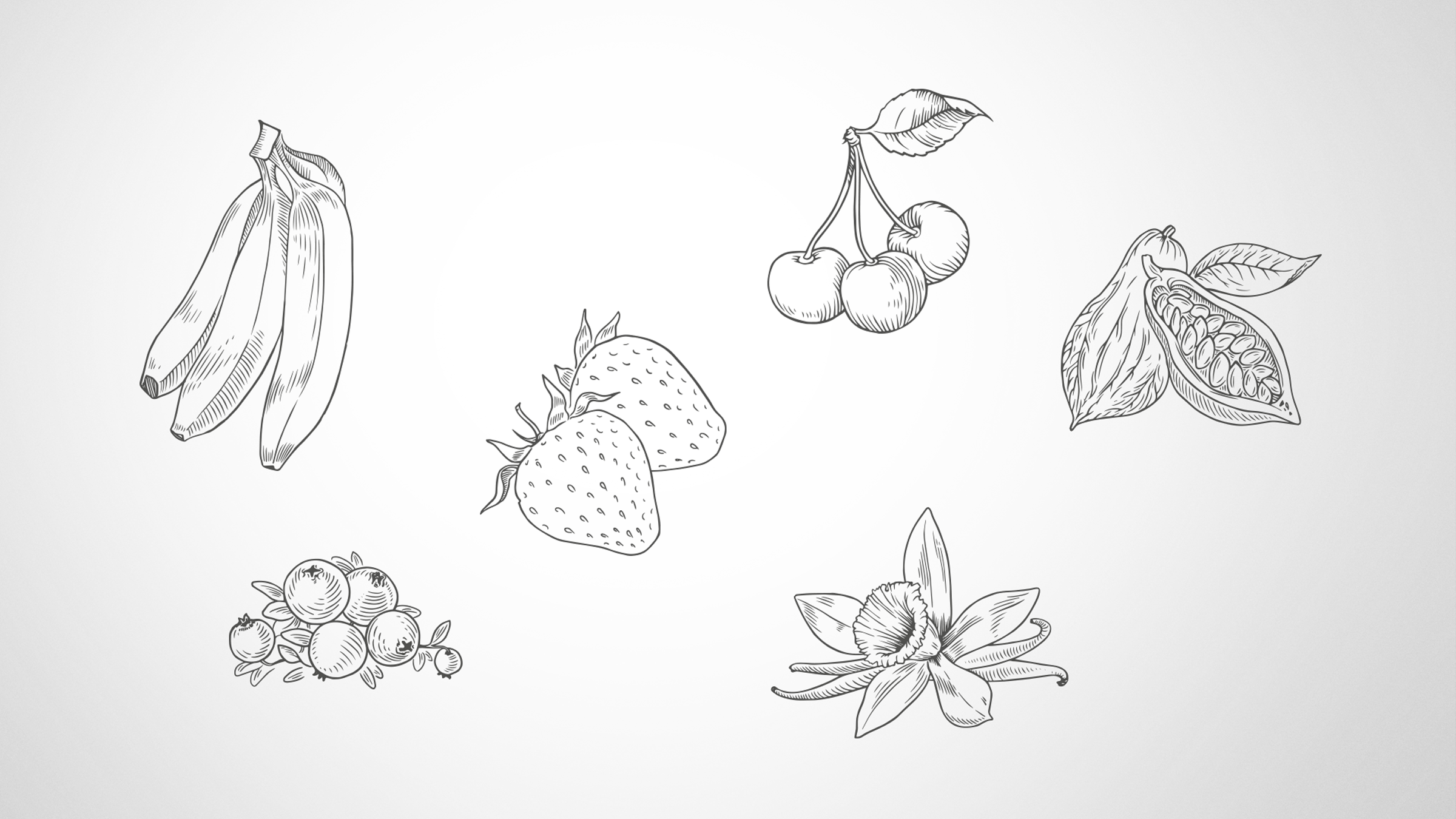
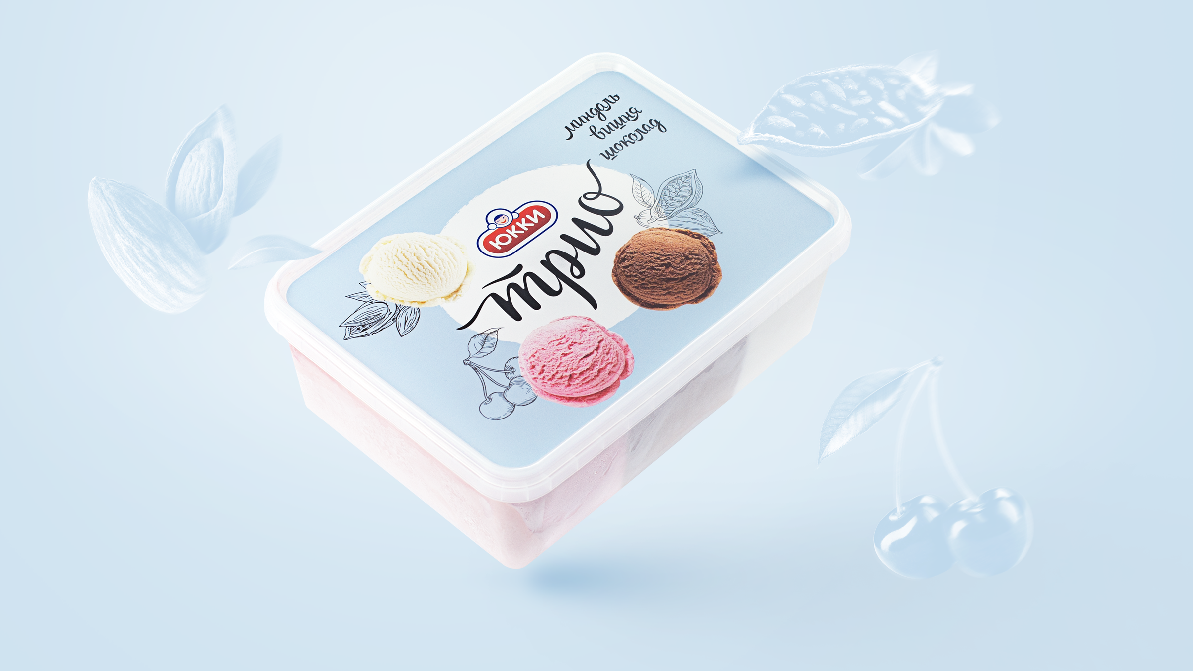
The three-part food zone, reflecting the “3 in 1” essence of the product, supports the “taste unites” idea. Pencil-style illustrations have been created for taste triggers. The pastel background colors enhance the flavor profile of the product. The handwritten logo emphasizes the delicate and light character of the product and adds the necessary contemporary and sophisticated feel to the brand.
CREDIT
- Agency/Creative: AVC
- Article Title: Packaging Design for Three-Layer Ice Cream Brand Trio Created by AVC
- Organisation/Entity: Agency, Published Commercial Design
- Project Type: Packaging
- Agency/Creative Country: Belarus
- Market Region: Europe
- Project Deliverables: Packaging Design, Tone of Voice
- Format: Box
- Substrate: Plastic


