Quick’n’Yummy is a small, family-owned business in Canada. They produce healthy keto-foods like granola, low-carb cookies, muffins and more. Quick’n’Yummy brand was focused on single key product – keto-cupcakes (those quick cakes that are baked directly in the cup). But now they decided to expand the range of the products and add some other product positions from their another trademark.
Task: to redesign the Quick’n’Yummy trademark and develop a design for new SKUs.
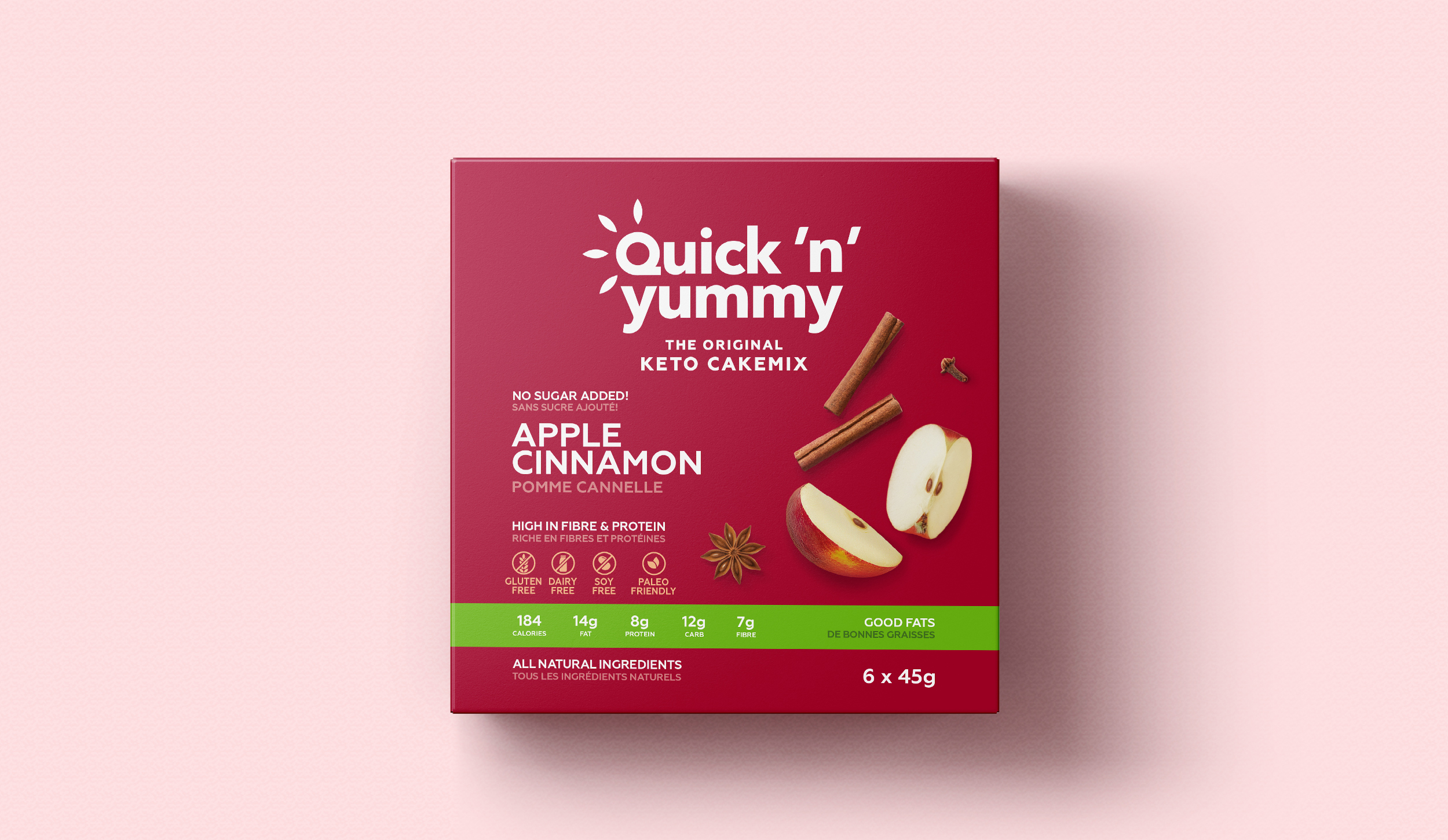
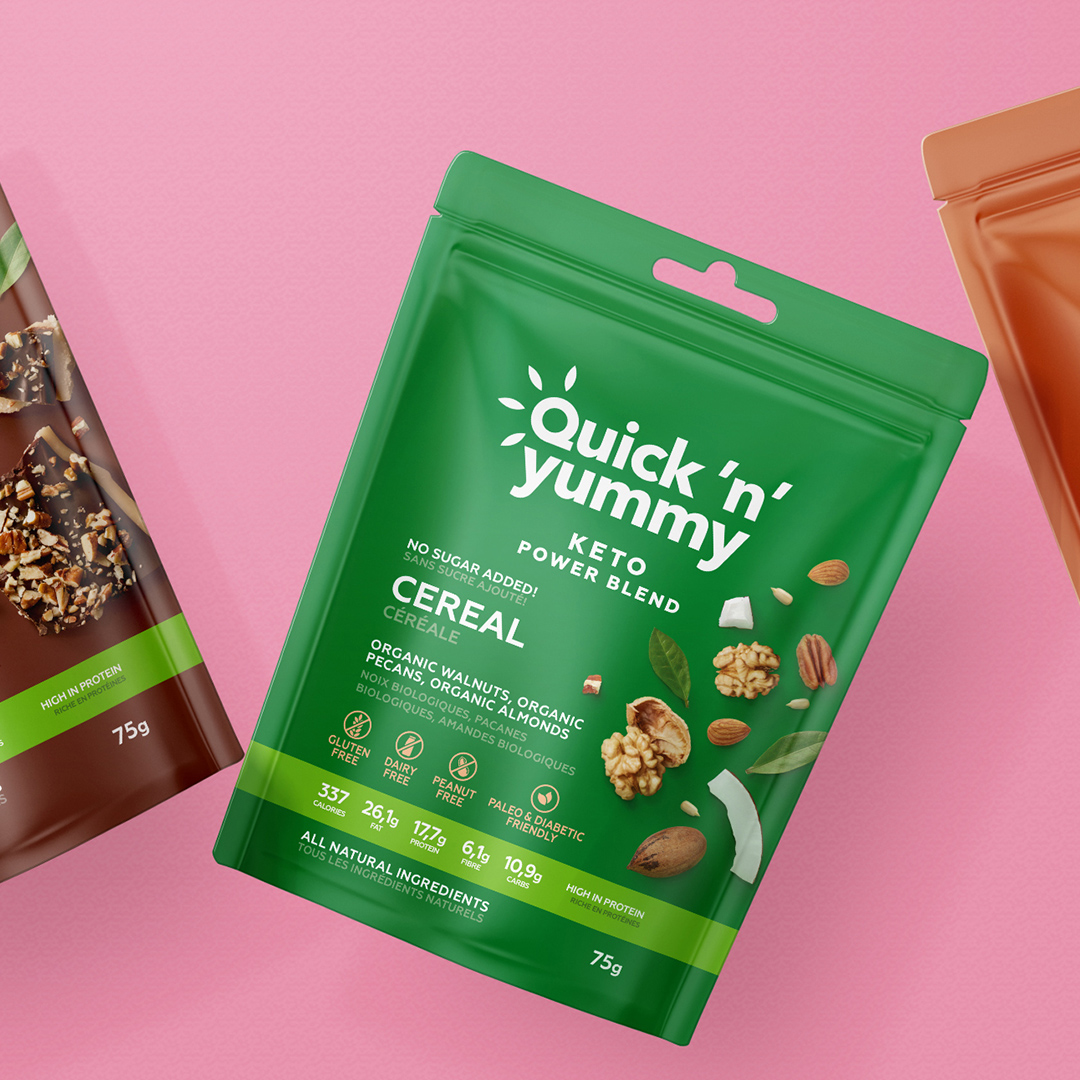
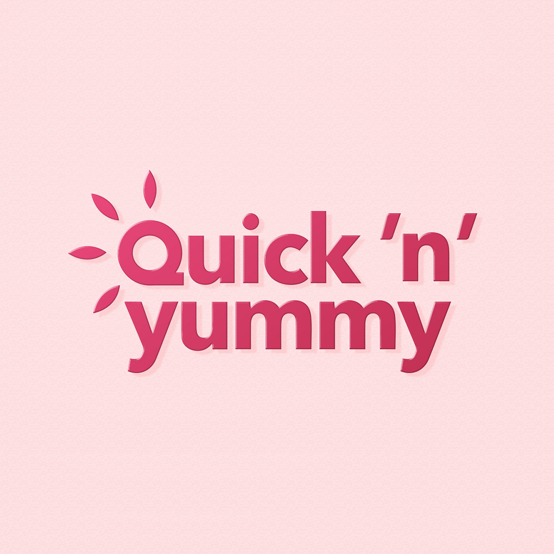
The PG team redesigned the entire logo to make it more suitable for a wider product line. In the logo we use a modern font, which is complemented by the “grains-rays” from the letter “Q”, which reflects the specificity of these products – wholesome, natural, healthy.
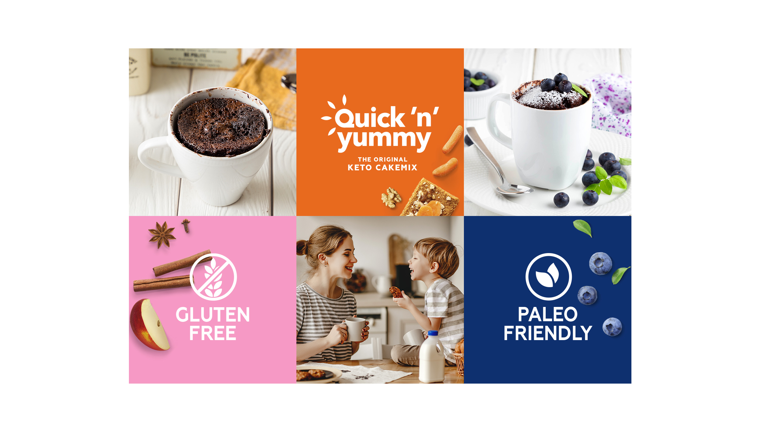
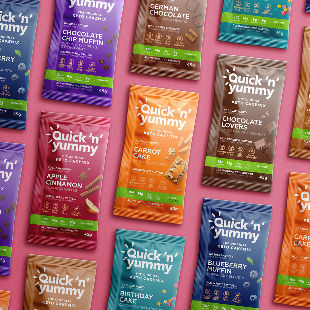
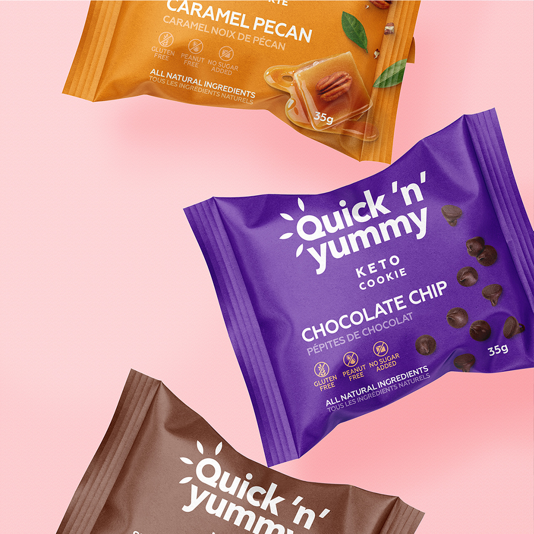
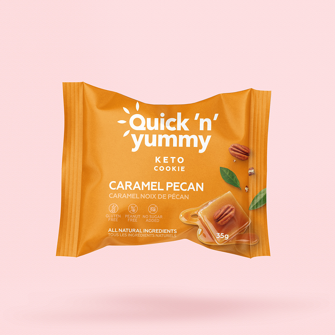
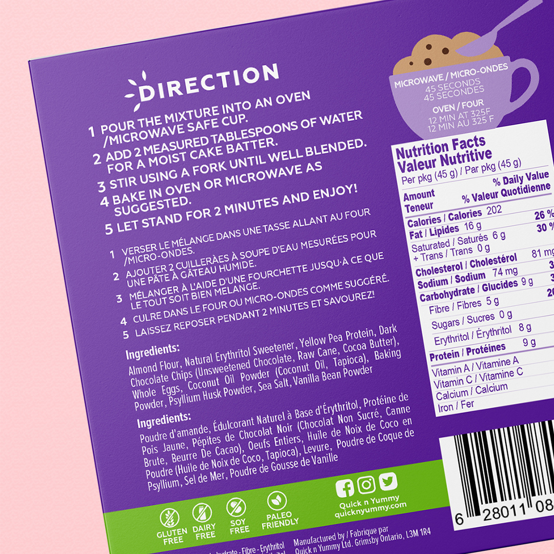
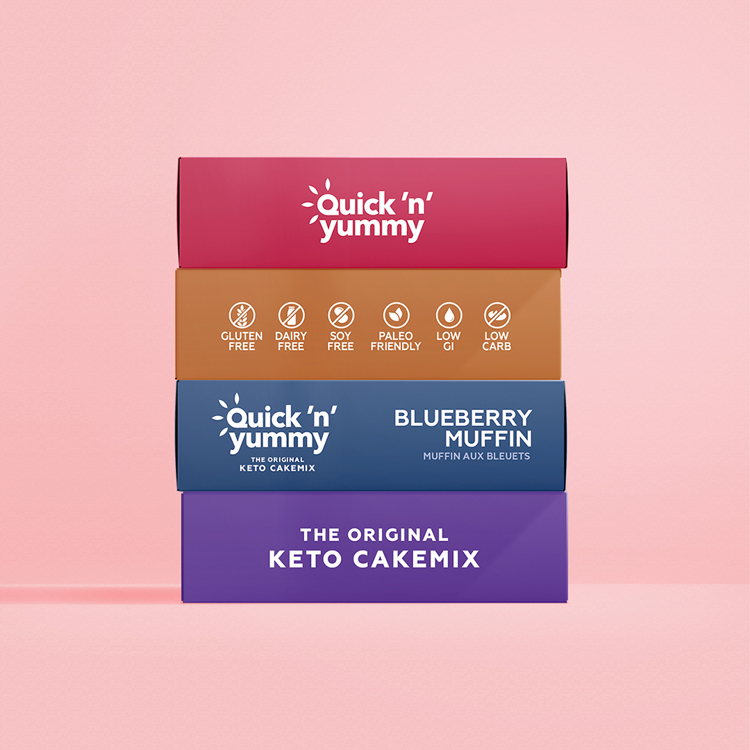
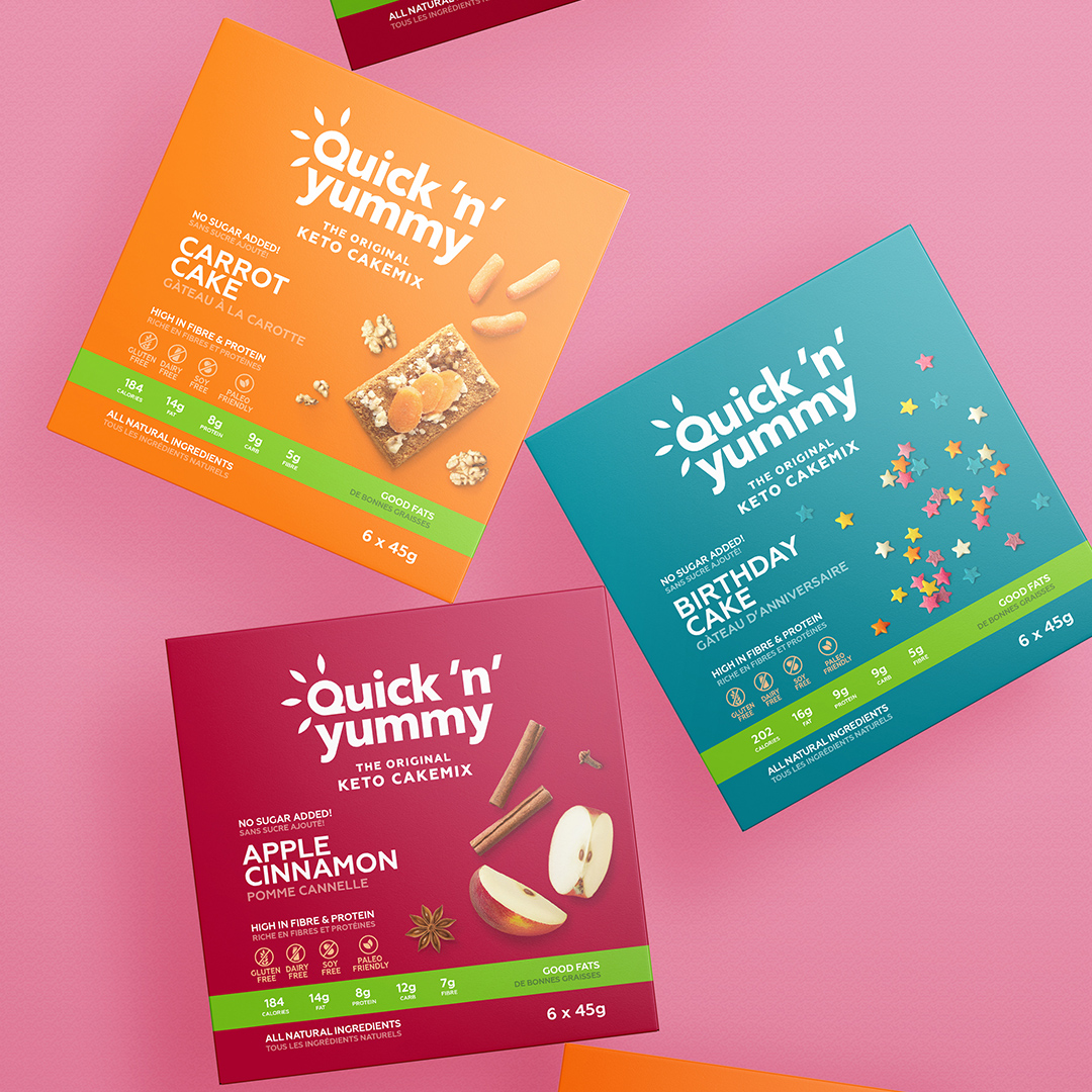
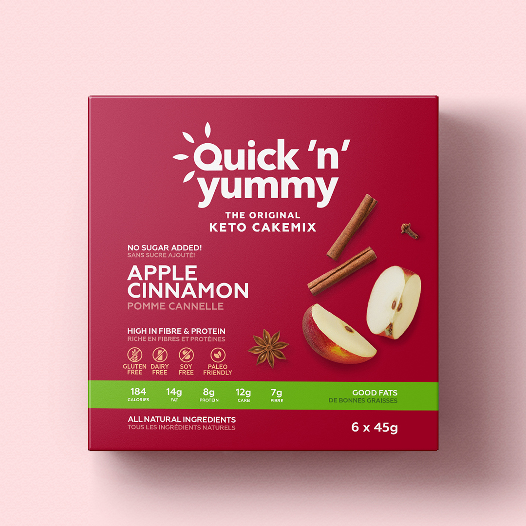
The products of this brand are keto products: low-carb products without added gluten, sugar, milk, soy. Therefore, it was important to place all these advantages on the packaging so that the consumer would clearly pay attention to it.
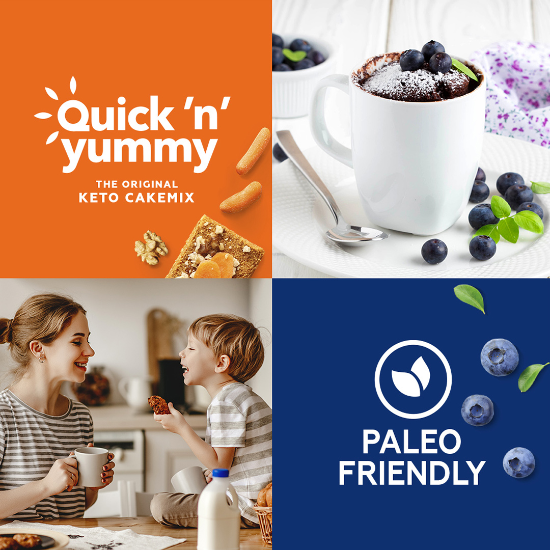
The design is based on vibrant colors and typography that emphasizes the product’s benefits. This design is supported with elements of a juicy food zone so that the consumer understands that our product is delicious as well. As the result, we developed a modern and tasty design.

CREDIT
- Agency/Creative: PG Brand Reforming Company
- Article Title: Packaging Design for the Canadian Quick’n’Yummy Keto Products Created by PG Brand Reforming
- Organisation/Entity: Agency, Published Commercial Design
- Project Type: Packaging
- Agency/Creative Country: Poland
- Market Region: North America
- Project Deliverables: Brand Redesign, Brand Refinement, Brand World, Branding, Graphic Design, Packaging Design, Rebranding
- Format: Box, Flow-Pack
- Substrate: Pulp Carton, Pulp Paper


