


Adequate People – Arctic Salmon Package
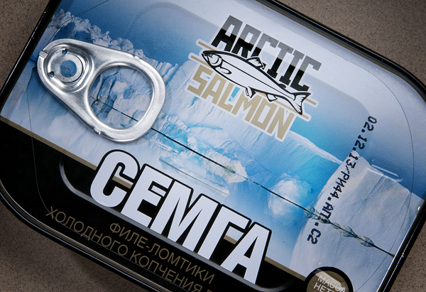
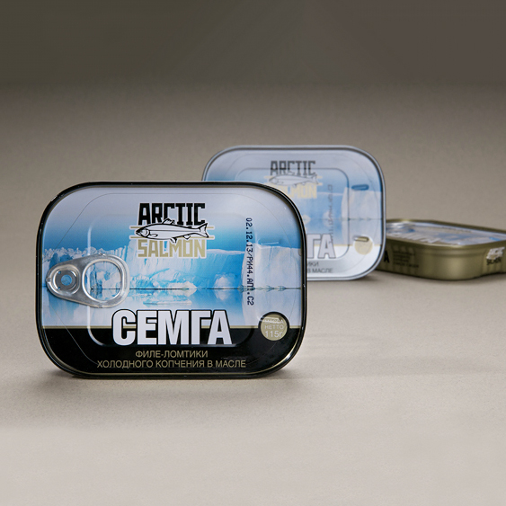
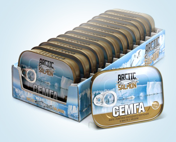
“Arctic Salmon is a salmon from the Barents Sea, offered by the Baltic Sea Company. Within the project, a logo and brand identity was developed.
Black, gold, steel and white-blue colors and shades symbolize from an emotional point of view the icy water of the sea, the silver scales of fish, the golden glare of a rare but bright northern sun.”
CREDIT
- Agency/Creative: Adequate People
- Article Title: Packaging Design for The Baltic Сoast Company
- Organisation/Entity: Agency Commercial / Published
- Project Type: Packaging
- Agency/Creative Country: Russia
- Market Region: Europe
- Format: Tin
- Substrate: Metal
FEEDBACK
Relevance: Solution/idea in relation to brand, product or service
Implementation: Attention, detailing and finishing of final solution
Presentation: Text, visualisation and quality of the presentation


