Have you ever had one of those scam emails from a Nigerian prince offering you £1m in exchange for your help? Well, this project started in a similar way. In this instance, however, it happened to be a Dutch lord who makes his own hot sauce and wasn’t a scam at all…
To catch you up, back in April 2023, we received an email from Nick van Spengler who needed help creating a brand for his range of home-made naturally fermented hot sauce products. He explained that his plan was to name the brand “Spengler’s”, after his family name, while subtly dropping in the phrase “I’m technically a Dutch lord” and clarifying that knighthoods in Holland apply to the whole family, not just the individual. With our interest piqued, we accepted the quest and dove straight into coming up with concepts of how the brand could look, ping-ponging ideas back and forth over email that related back to his noble heritage.
After some initial discussions, we put together a mood board to gauge a sense of what Nick personally responded to. After all, everyone’s interpretation of how concepts materialise visually can be completely different. We needed to check we were on the same page from the start. Nick picked out some of the more timeless and iconic elements on the board, further cementing his inkling that the brand should feel rooted in history and instantly recognisable, like Heinz (an example he mentioned in one of our earlier emails). He also happened to supply us with the van Spengler family crest; an impressive design full of filigree, patterns and iconography specific to their family history.
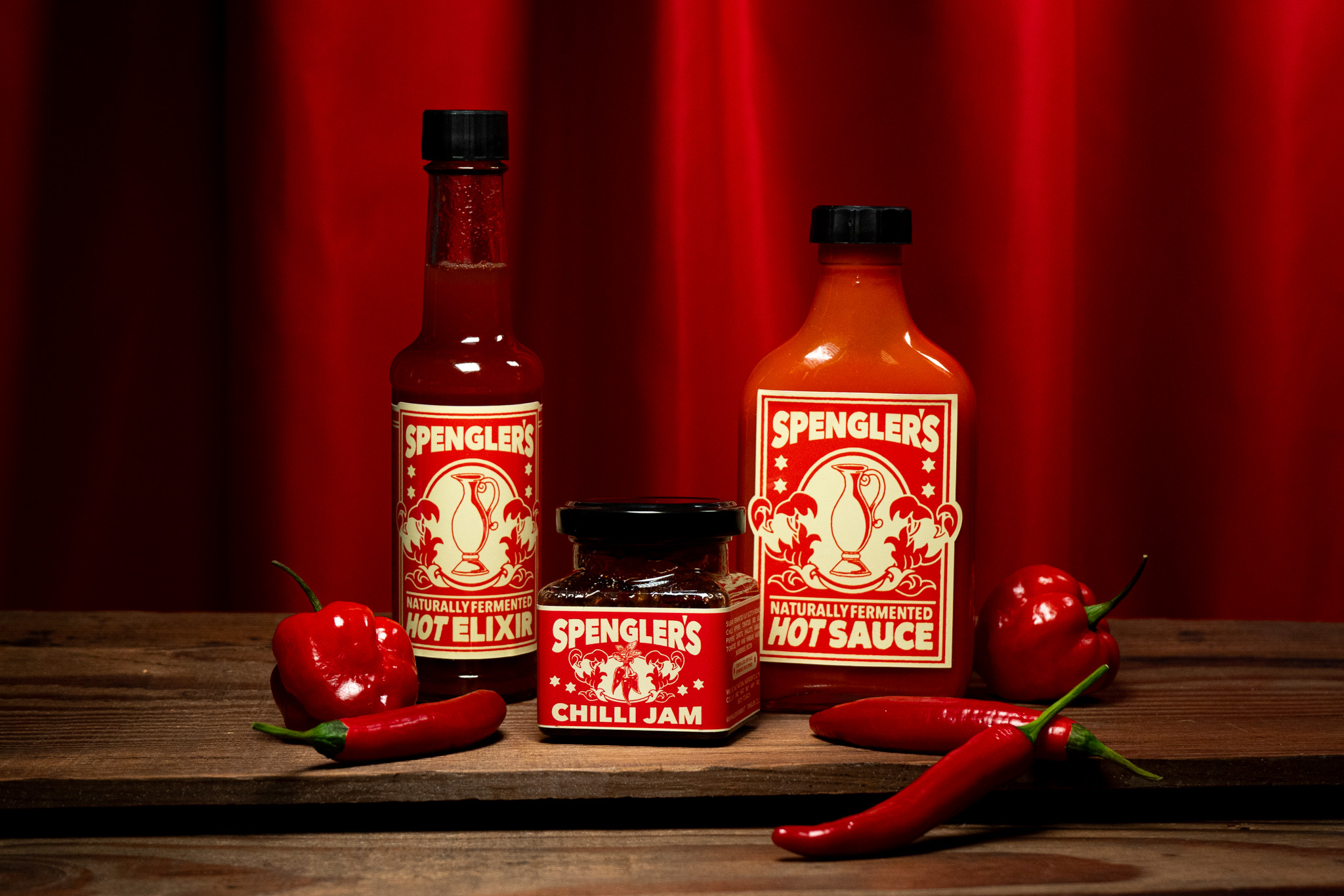
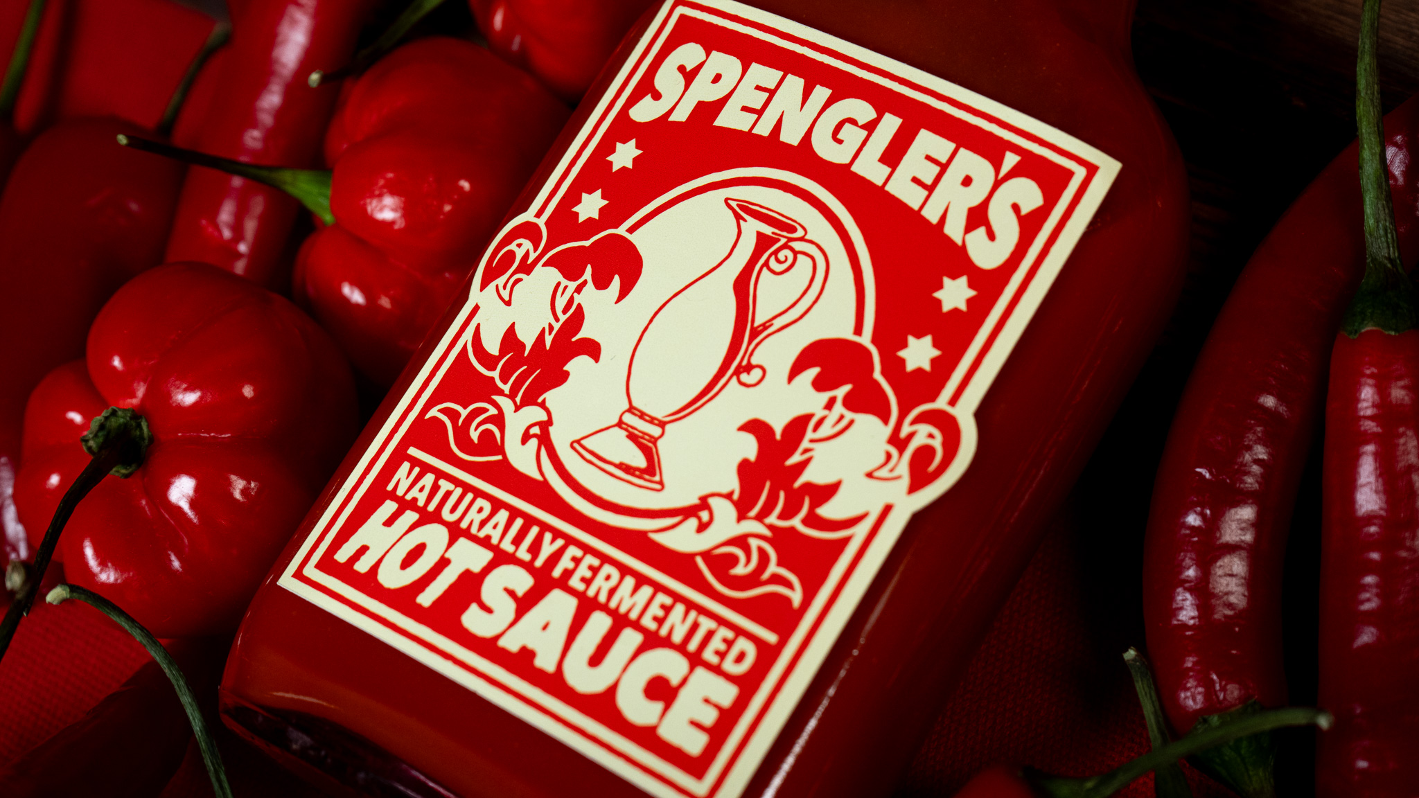
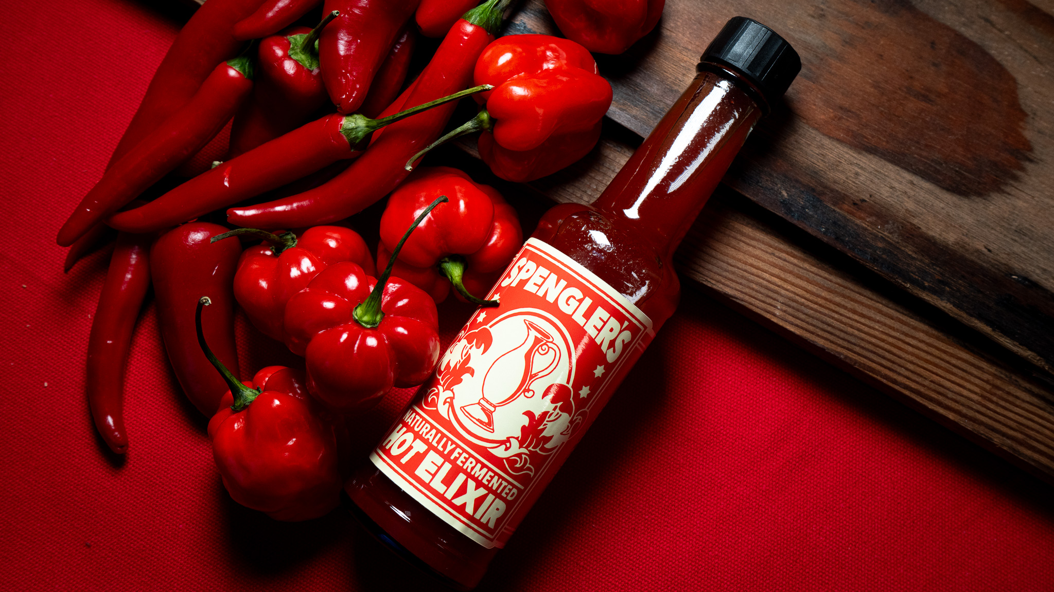
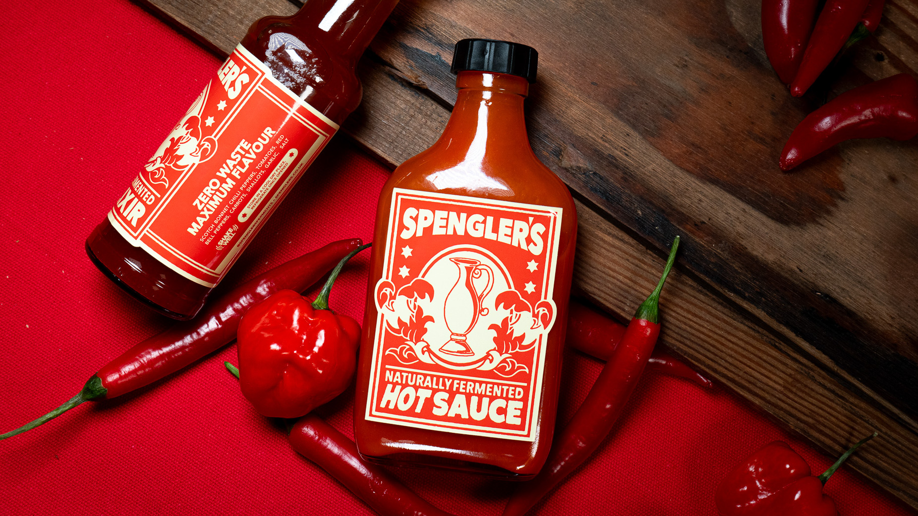
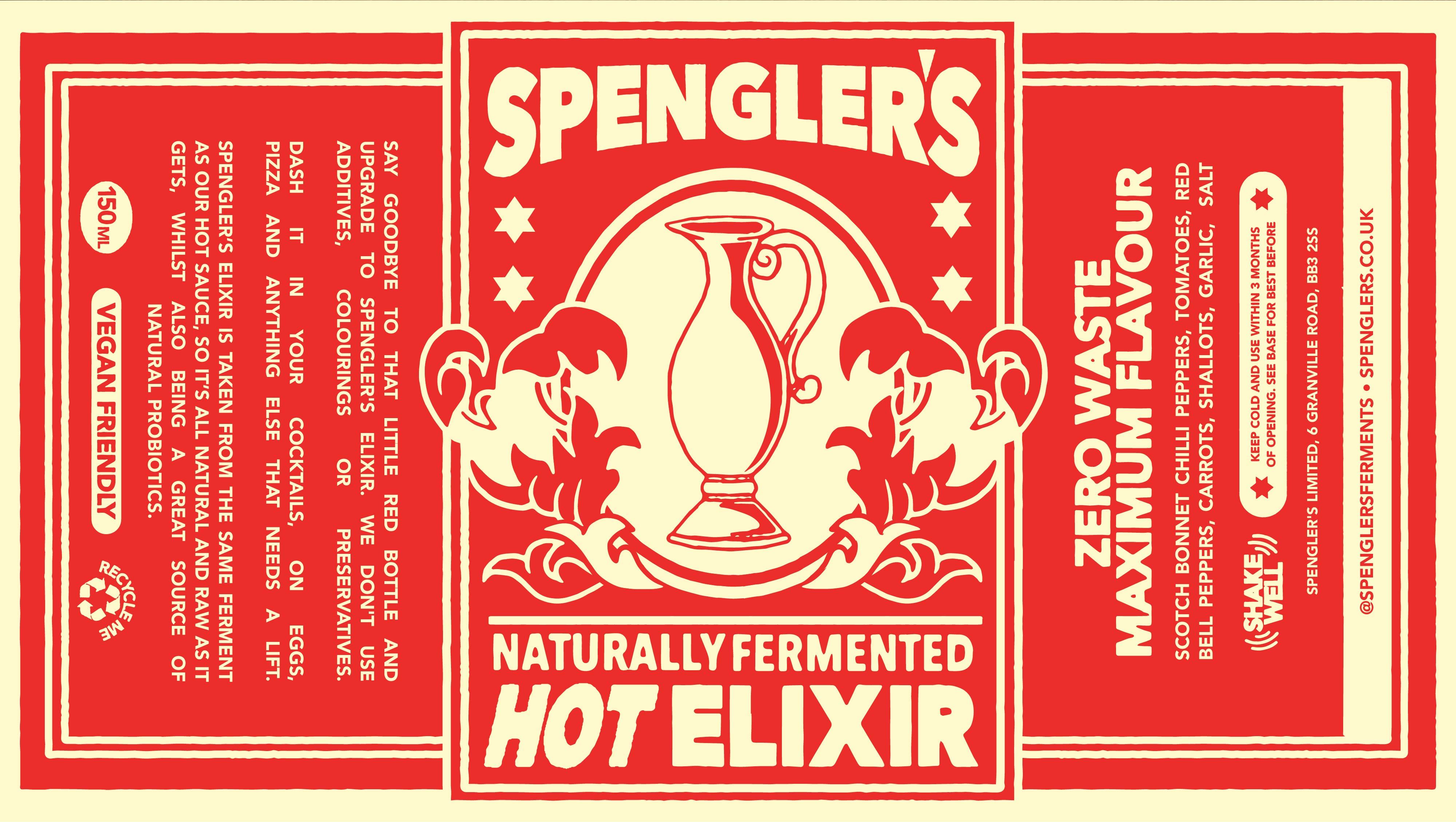
It was this family crest, along with Nick’s favourite references from the mood board, that kickstarted our design process. It was a no-brainer to incorporate elements of the crest in the label designs for the hot sauce bottles. We dissected the design, played around with some initial sketches, but kept coming back to the illustration of the wine jug which lay at the bottom of the crest, surrounded by four stars. It was a neat, timeless icon that would give the design a sense of heritage while still feeling relevant to the product. We re-drew the wine jug, modernising the design slightly and giving it a sense of dimension that would print nicely onto labels. Throughout this process, we also decided on our final colour palette. We picked out the red from the family crest and initially paired it with a bright yellow to give it that classic “hot sauce” look. However, we found this was too harsh and perhaps didn’t fit the heritage look we were going for. So we switched it out for an off-white that felt softer and more “aged”.
After we had decided on the wine jug and the colours, the rest of the design began to fall into place. We picked out filigree from the family crest to surround the jug and gave it it’s own framed backdrop to help set it apart from the background of the label. We also brought the stars back in, creating a nice sense of symmetry to the design. The dimensions of the labels gave us some clear confinements to play within and, therefore, provided us with some guidelines as to where to lay out the text. We also had the fun challenge of laying out all of the legal stuff, paying close attention to the ingredients list and flexing our copywriting muscles to provide some light-reading for all hot-sauce consumers who happen upon a bottle of the good stuff.
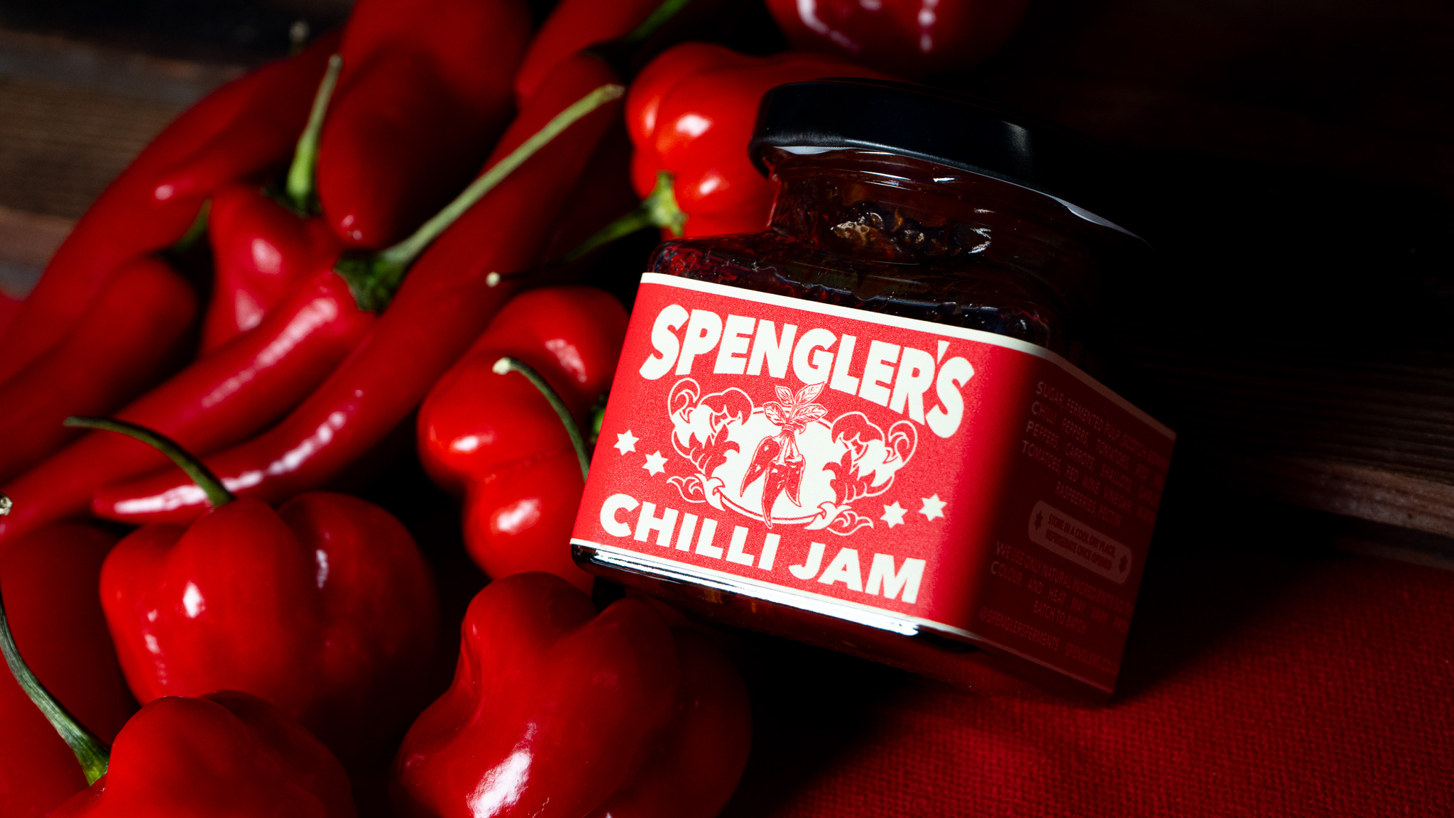
With the foundations of the design locked in, it was time to turn our attention to the secondary products that Nick had been cooking up. The full Spengler’s range includes: their dynamic, rich and addictive hot sauce, a sweet and savoury chilli jam (born out of the waste of their hot sauce) and their very own magic elixir (the run off from their other two products; perfect for Bloody Mary’s). All of these required their own bottles with their own individual label sizes and unique copywriting. The chilli jam was also the perfect product to switch up the illustration on. In lieu of the wine jug, we added in an illustration of a bunch of chillis, which add some variety to the products’ designs while still feeling in-keeping with the overall Spengler’s brand. Our trusty friends at Scanstick also provided us with some print samples which, as always, gave us a good sense of space, print colours and sizing.
We presented the designs to Nick as a jam-packed, one-sheet PDF to really show off the full impact of the brand. This included some logo variations, a brand pattern and some additional illustrations and label ideas. Safe to say, he was thrilled, as shortly after, Spengler’s officially launched with their whole new look.
CREDIT
- Agency/Creative: Happy Go Lucky
- Article Title: Packaging Design for Spengler’s Natural Ferments by Happy Go Lucky
- Organisation/Entity: Agency
- Project Type: Packaging
- Project Status: Published
- Agency/Creative Country: United Kingdom
- Agency/Creative City: Manchester
- Market Region: Europe
- Project Deliverables: Brand Identity, Packaging Design, Product Photography
- Format: Bottle, Jar
- Industry: Food/Beverage
- Keywords: Hot Sauce
-
Credits:
Designer: Harrison Edwards
Art Direction: Harrison Edwards
Photography: Evie Friar
Art Direction: Evie Friar


