EPICA Branding & Packaging – Chispas Apasionante
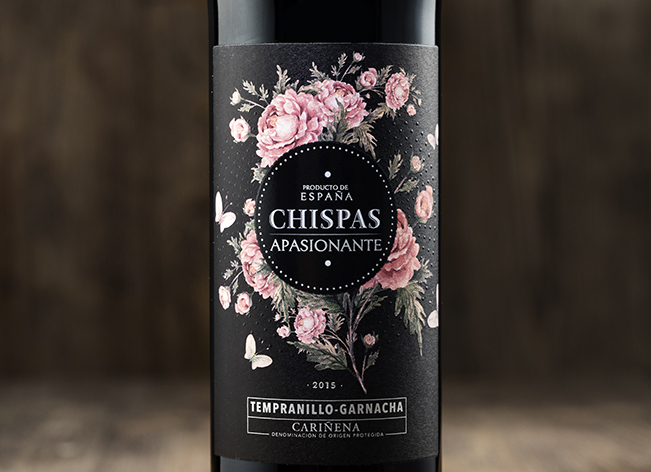
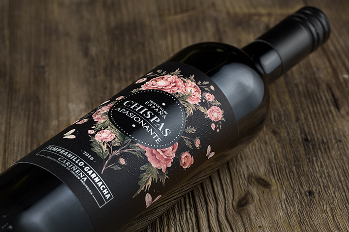
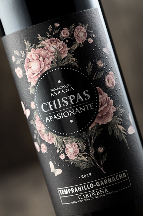
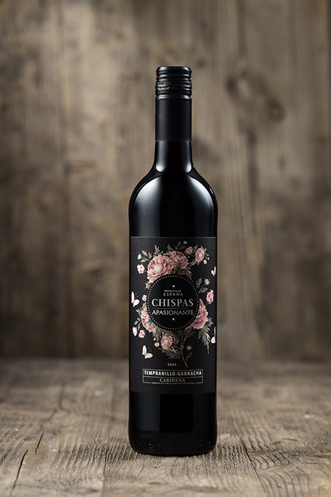
Inspired by traditional Italian winemaking techniques, this rich, fruity style of red wine has grown in popularity in recent years. With this romantic design we want to communicate all the passion and sweetness of this wine. The name CHISPAS means sparks in English, we created them in the label with 3D varnish dots, so the label is nice to your eyes but also to your fingers with this texture. We combine classicism and romanticism with the geometry of the finishes to achieve an evocative and contemporary design at the same time.


CREDIT
- Agency/Creative: EPICA Branding & Packaging
- Article Title: Packaging Design for Spanish Red Wine
- Organisation/Entity: Agency, Published Commercial Design
- Project Type: Packaging
- Agency/Creative Country: Spain
- Market Region: Multiple Regions
- Format: Bottle
- Substrate: Glass
FEEDBACK
Relevance: Solution/idea in relation to brand, product or service
Implementation: Attention, detailing and finishing of final solution
Presentation: Text, visualisation and quality of the presentation


