


In addressing the challenge at hand, the understanding of the Finns’ deep-seated affinity for robust coffee emerged as a pivotal factor in elevating the Italian coffee expertise, while simultaneously capitalizing on the established framework of Segafredo Italian Style.
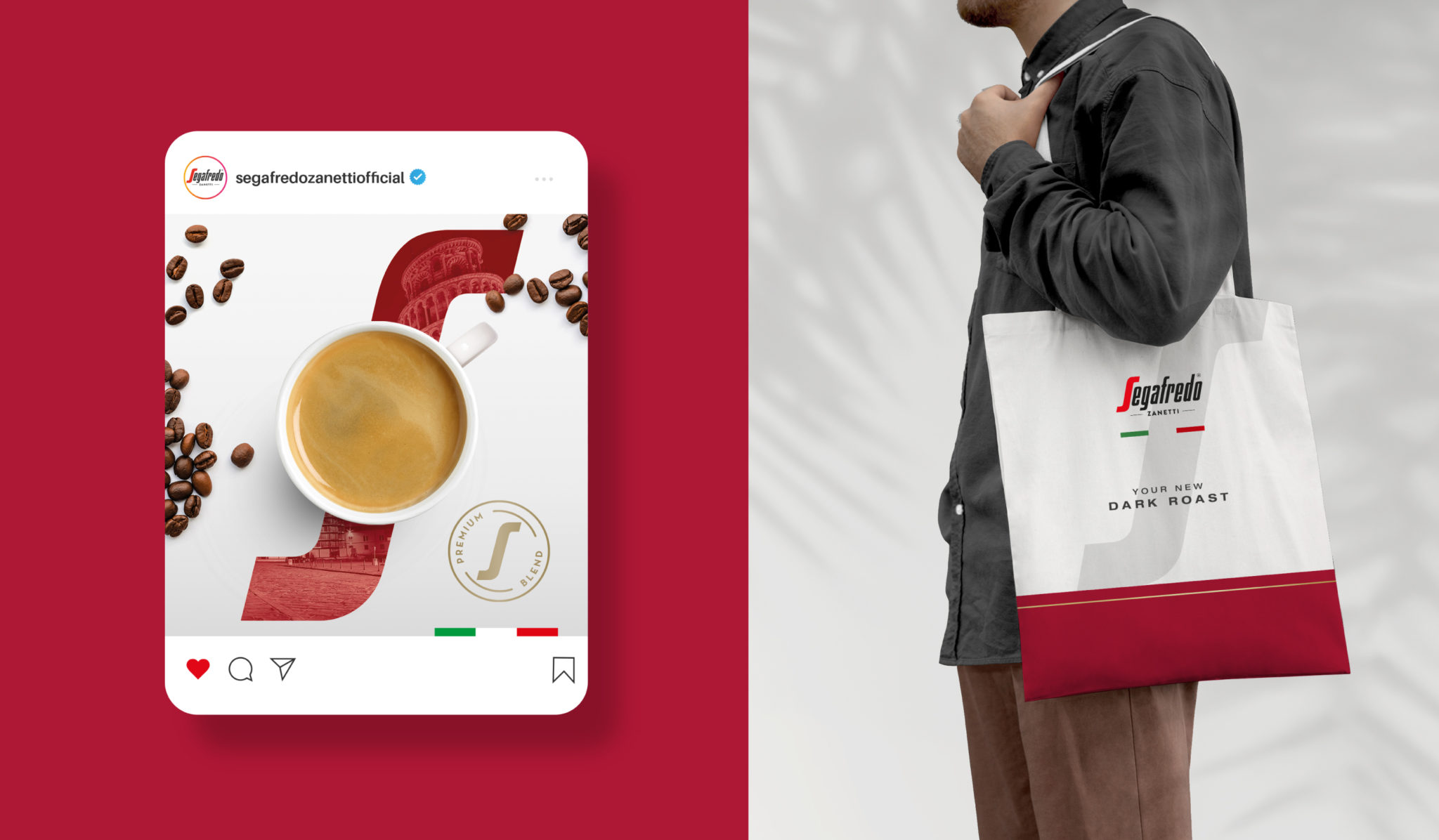
The ultimate solution lay in the realization that Italian coffee embodies not just a beverage choice, but an embodiment of a lifestyle, an everlasting encounter immersed in simplicity and grace – something you can not only taste and feel but visually perceive as well. It was within this context that a comprehensive redesign of the packaging was undertaken.
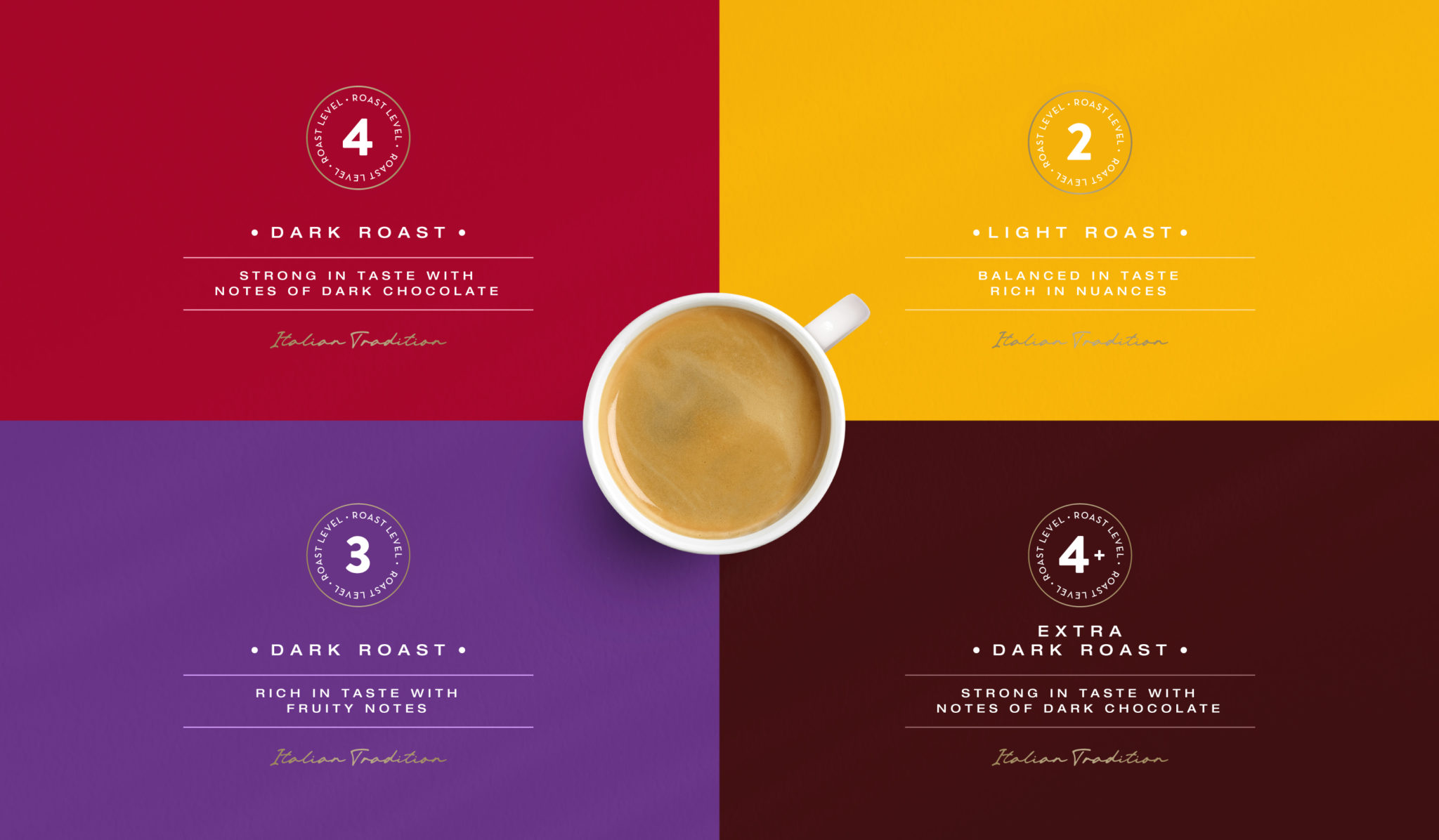
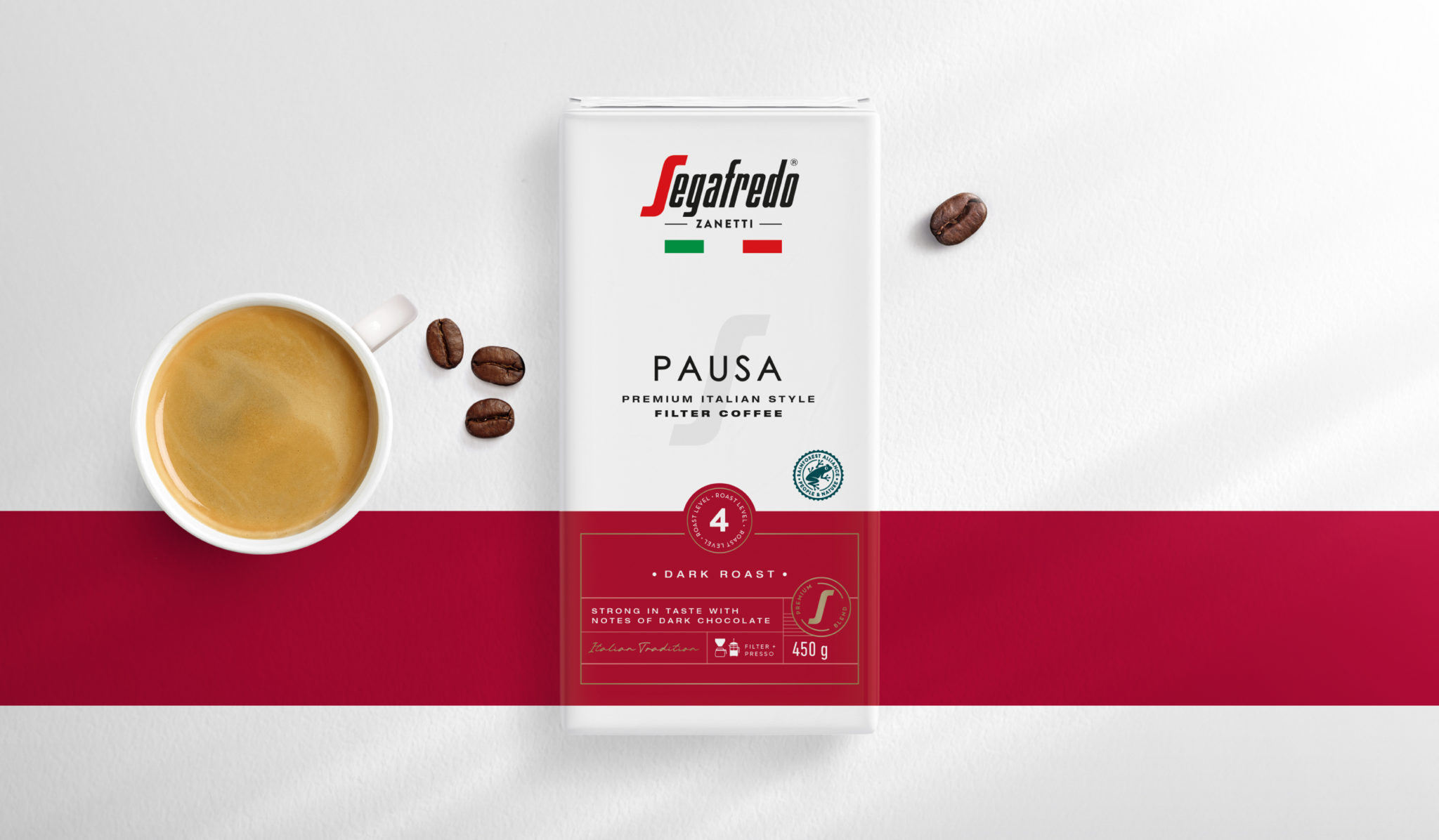
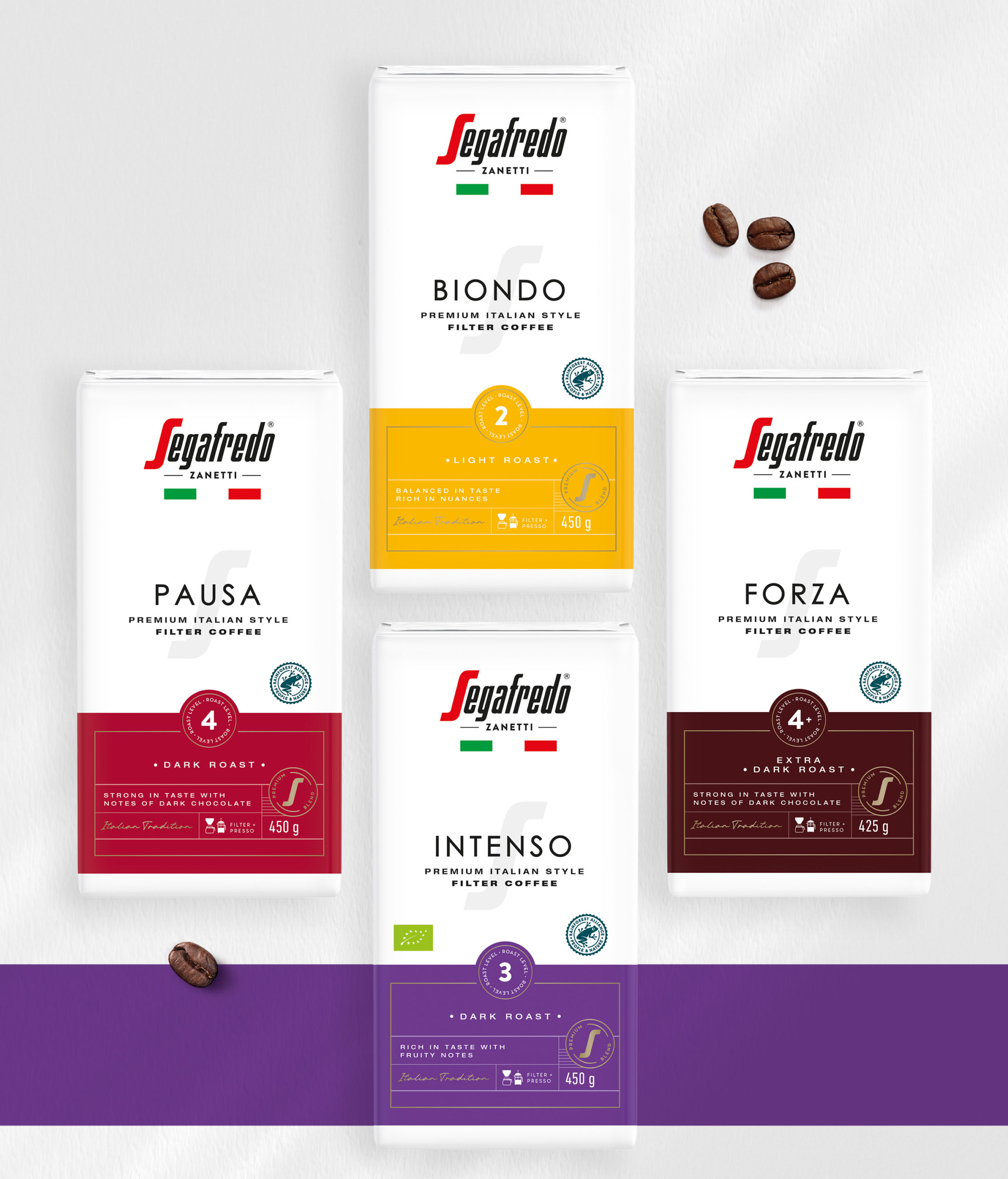
Preserving the inherent charisma of the pack’s white backdrop, a dynamic twist was introduced through the incorporation of a vibrant and eye-catching ribbon. This strategic touch served the dual purpose of segregating various coffee segments while amplifying the perception of the coffee itself as a hallmark of unparalleled quality and consummate mastery. This intricate interplay between color and contrast formed the crux of the new packaging design.
Building further upon this foundation, a homage to Italian finesse was paid through the amalgamation of understated typefaces and refined icons. The deliberate minimalism echoed the core of Italian elegance, creating a visual language that resonated with the cultural essence.
In ushering in this novel White Line design, Segafredo masterfully extends an invitation to Finnish aficionados of coffee – an invitation to partake in an authentic odyssey of la Dolce Vita, the sweet life that Italy is renowned for. The culmination of this endeavor is an immersive encounter that transcends mere coffee consumption, encapsulating the very essence of Italian tradition and flair.
In conclusion, the journey to meet the challenge intertwined with a deep appreciation for Finnish coffee preferences has led to the metamorphosis of Segafredo’s design paradigm. The transformation, a symphony of white canvas and vibrant accents, is not just a packaging revamp but an embodiment of a transcendent coffee experience that pays homage to Italy’s timeless elegance.

CREDIT
- Agency/Creative: Pointbleu Design
- Article Title: Packaging Design for Segafredo Italia
- Organisation/Entity: Agency
- Project Type: Packaging
- Project Status: Published
- Agency/Creative Country: Spain
- Agency/Creative City: Barcelona
- Market Region: Europe
- Project Deliverables: Packaging Design
- Format: Flow-Pack
- Industry: Food/Beverage
- Keywords: minimal, design, coffee
-
Credits:
Pointbleu Design: Pointbleu Design


