Salento is a one-of-a-kind town, located in Quindío, Colombia, a region famous for its vast valleys, rare bird species, and high quality coffee. Those lucky enough to experience the town for themselves, would immediately notice the houses, a multi chromatic feast to the eye, shining brightly in the Andean sun. Although there’s not much to do in town, it sure doesn’t seem like there needs to be; a peaceful stroll through the colored streets is enough to feel at peace. Exit town, head eastward, and you’ll find yourself in Cocora Valley, home of enormous palm trees popping up from the ground, as far as the eye can see. These places are truly a natural wonder and two must-visits for the Colombian experience. They’re also the starting point for the Salento Organics brand, makers of Fair Trade, healthy fruit based snacks.
The owners of Salento Organics (SO from now on) got to us in search of a voice and a face. Initially, the brand was a rather simple one, with a logo and a purely functional label to its name (the logo, product name, barcode and nutritional info piled on a sticker). They told us about their origins, their love for natural ingredients and processes, their mission to help local farmers have dignified lives and jobs; and we couldn’t help feeling especially responsible for this project’s success. It’s always nice to start a new project, it’s especially nice when the project we work on has a real, positive effect on people who don’t have as much as we do.
We started by examining what SO already had: an institutional-looking logo on a sticker. On one side, the logo felt way too serious for a brand that wanted to talk about natural ingredients and fair trade products from exotic lands. It was also full of elements, making it noisy and convoluted, without any reduction power. On the other hand, the packaging was practically non-existent: logo and legal texts were piled on an adhesive label placed on the doypack. The brand was in dire need of intervention.
In honor of the town where it all began, we wanted to be explosive with SO’s colors, and a glance at the competition confirmed us that a colorful brand was the way to go. Also, the numerous amount of fruits used to make the chocolate clusters and bites were a clear invitation to use vivid and exotic color combinations. It would make both the brand, packaging, and other graphic pieces talk about both the product category and place of origin at the same time.
Having talked with the client and throughout the initial workshops and sessions we had with and without them, we understood just how important it was for them and for the brand to talk directly about the fruit and its origins. The brand had to make a stand in terms of what’s important and its beliefs: creating healthy fruit-based snacks, while helping local Colombian farmers at the same time. The brand was meant to transmit the happiness that helping other people brings, and so, the concept and subsequent brand elements had to communicate that much. “Fruit Made Joy” and “Locally Grown, Globally Enjoyed” were some close concepts for SO, but they didn’t feel good enough. Another brainstorming session brought ideas from funnier sides, seeing happiness as word play would make the concept playful enough. Finally, two ideas remained, both a play on known sayings, but transforming them so they would talk about SO’s purpose and values. “For the Love of Fruit” was the close second, an almost definitive idea that came close to the winner: “In Fruit We Trust”. These last 2 were what we wanted SO to take as a flag and as a motto; thus we parted the abstract realm with this statement.
Moving onto the brand itself, part of our creative process entertained an idea that was later revised. Salento Organics’ initials SO were an obvious and almost cute wink to the “so organic” “so healthy” word play, and had some beginner potential. It had to be discarded because it clearly generated conflict with the dairy free brand So Delicious. But it was for the best. Another resounding example of the age old lesson “the first idea is never the best idea”.
Looking back to our first logo drafts, we can see so many ideas and executions, going from the more serious looking ones to the playful and innocent ones, always with the idea behind to show some kind of link with the natural, fruity and exotic world of fruit. Sure enough, some ideas would be stronger than others, and with the help both from the inside team as well as the client, we were able to center the proposals to the end result. For this logo, we thought back on the Valley and the Town we had seen at the beginning. The towering palm trees so important to the region, people and country. The tropical look&feel we had in our visual culture. It all added up in order to make a typographic logo with a clear and simple abstraction of the palm trees we’ve grown so fond of. A jumpy, quirky, and unique, modified font would be a direct call to a happy, joyful brand.
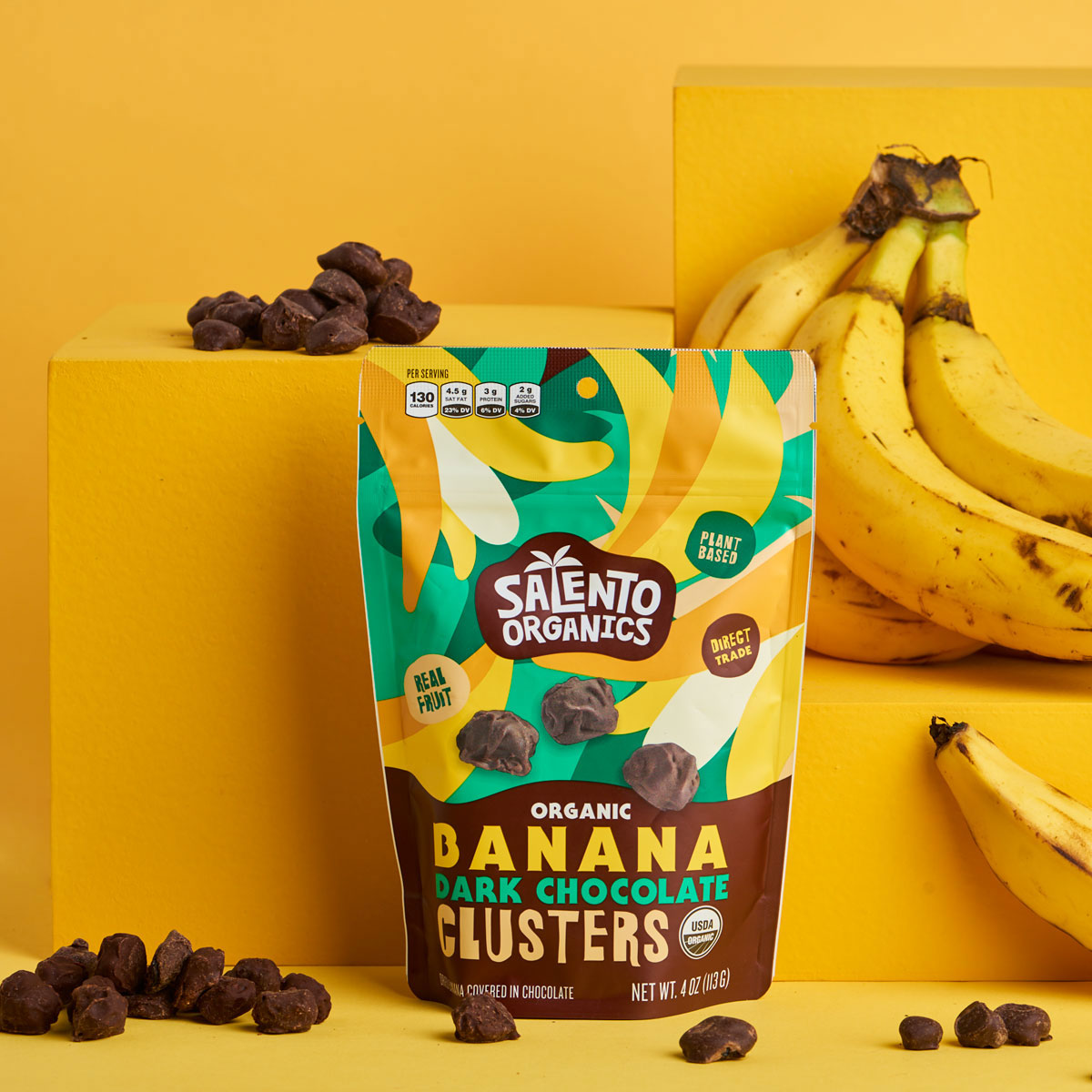
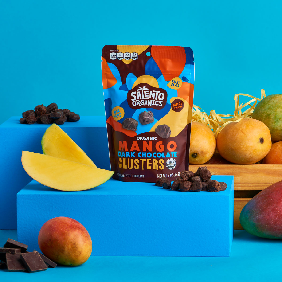
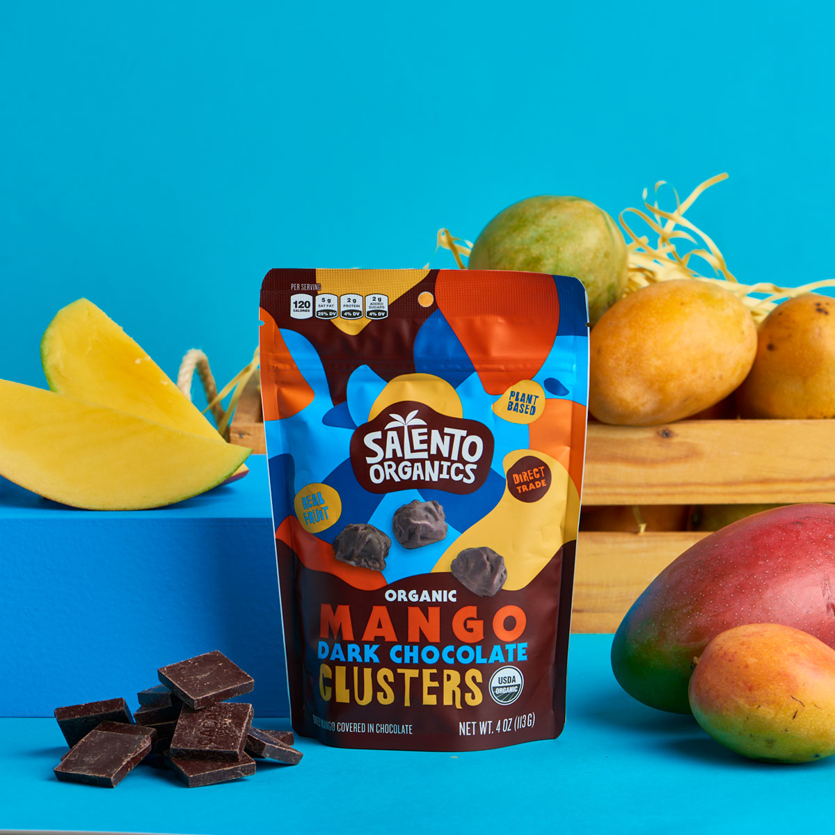
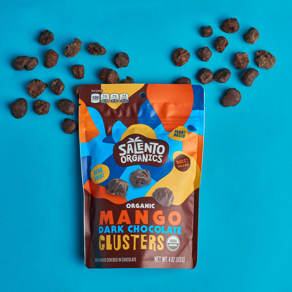
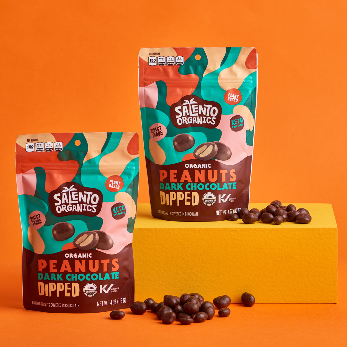
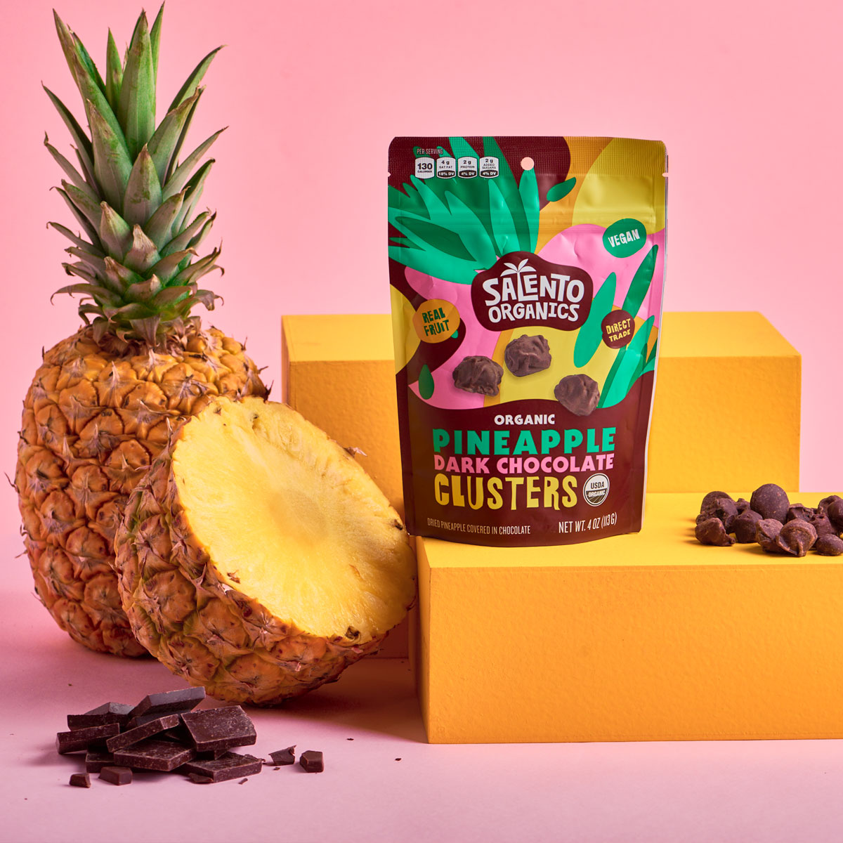
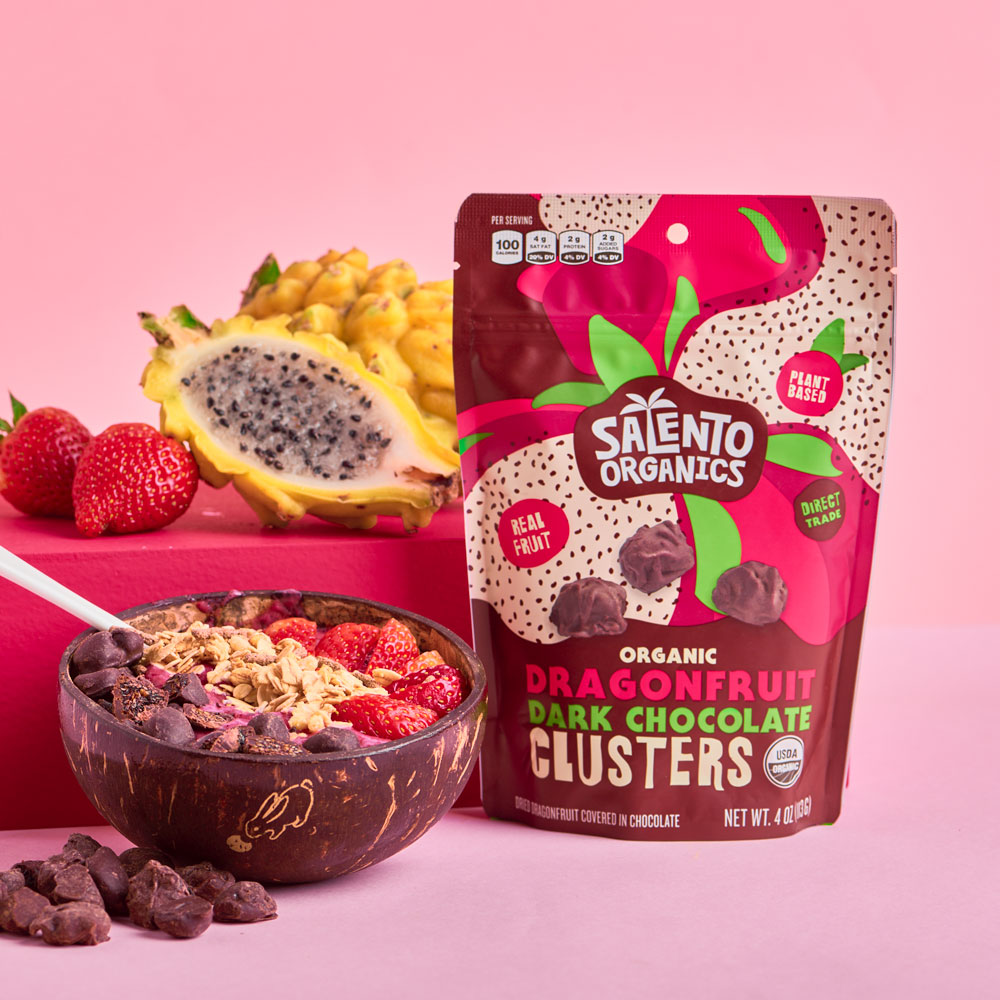
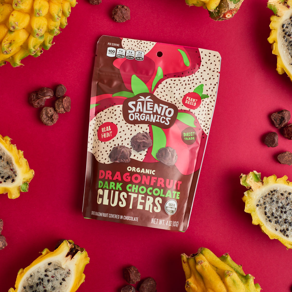
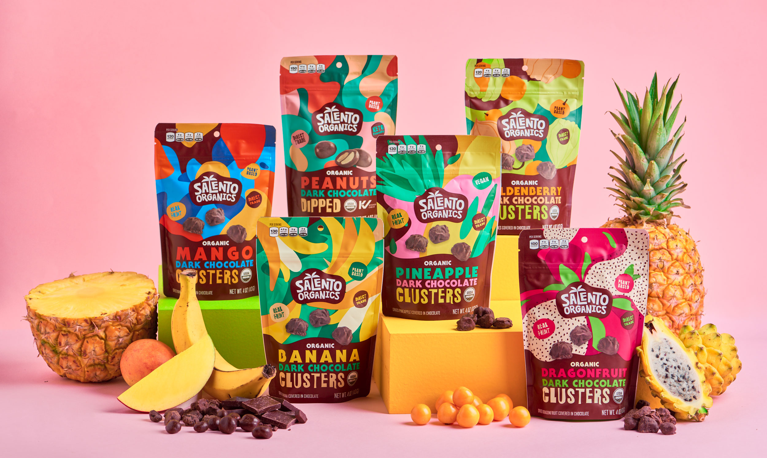
For the packaging, SO had 6 products that would be released with the rebrand. 5 of them are chocolate covered fruit clusters: Dragonfruit, Mango, Pineapple, Banana and Goldenberry. The sixth one is Peanuts dipped in chocolate. All of them made from only 3 ingredients each; an organic, Fair-Trade, non GMO snack. It was with these first 6 products that the brand would go out for sale on social media and on health stores for the first time. The six of them were to function as a family, mainly to differentiate themselves from future lines like pure dried fruit. For this one, we kept in mind the conceptual and categorical importance of vivid, explosive colors and quirky, fun fonts. We designed the package structure to show the process and making of the final product; a combination of exotic, natural fruits with the sweet, simple, tasty dark chocolate. All 6 of these designs would have their front face divided into 2 parts. The lower part would serve as the descriptive half of the packaging; product description in the three main colors, over a dark, chocolate brown background that would undulate to represent liquid cocoa, the unifying ingredient of all 6 members. The upper part would be the main differentiator, and would be an explosive, colorful feast that contrasts with the bottom half. The Logo is located in the middle of this part, and serves as the starting point for abstract, organic shapes, representing the fruit. The logocentric composition of the illustrations would mix with the chocolate wave that is the bottom part, to create a simple and concrete structure, easily replicable to other products if needed.
For the back panel, the initial idea was to tell an origin story. Presented with an illustration of a wonderful view of the Cocora Valley, the idea was to show a fraction of the beauty of the place that inspired this brand. In the end, though, we had to simplify this panel in order to not oversaturate the packaging. We would have loved to tell this story, which is now present on SO’s webpage.
After many ins & outs, tweaks and adjustments, we were happy to make the call, and print the final artworks. Be sure to grab some if you get the chance, they’re pretty damn good.
CREDIT
- Agency/Creative: scd
- Article Title: Packaging Design for Salento Organics Chocolate Covered Fruit Clusters
- Organisation/Entity: Agency
- Project Type: Packaging
- Project Status: Published
- Agency/Creative Country: Colombia
- Agency/Creative City: Bogota, D.C.
- Market Region: North America
- Project Deliverables: Packaging Design
- Format: Bag
- Substrate: Plastic
- Industry: Food/Beverage
- Keywords: Packaging Design, Graphic Design, Branding
-
Credits:
Creative Director: Ana María Mesa
Brand Lead: Mateo Anzola
Brand Lead: Isabel Arango
Brand Designer: Santiago Castaño


