


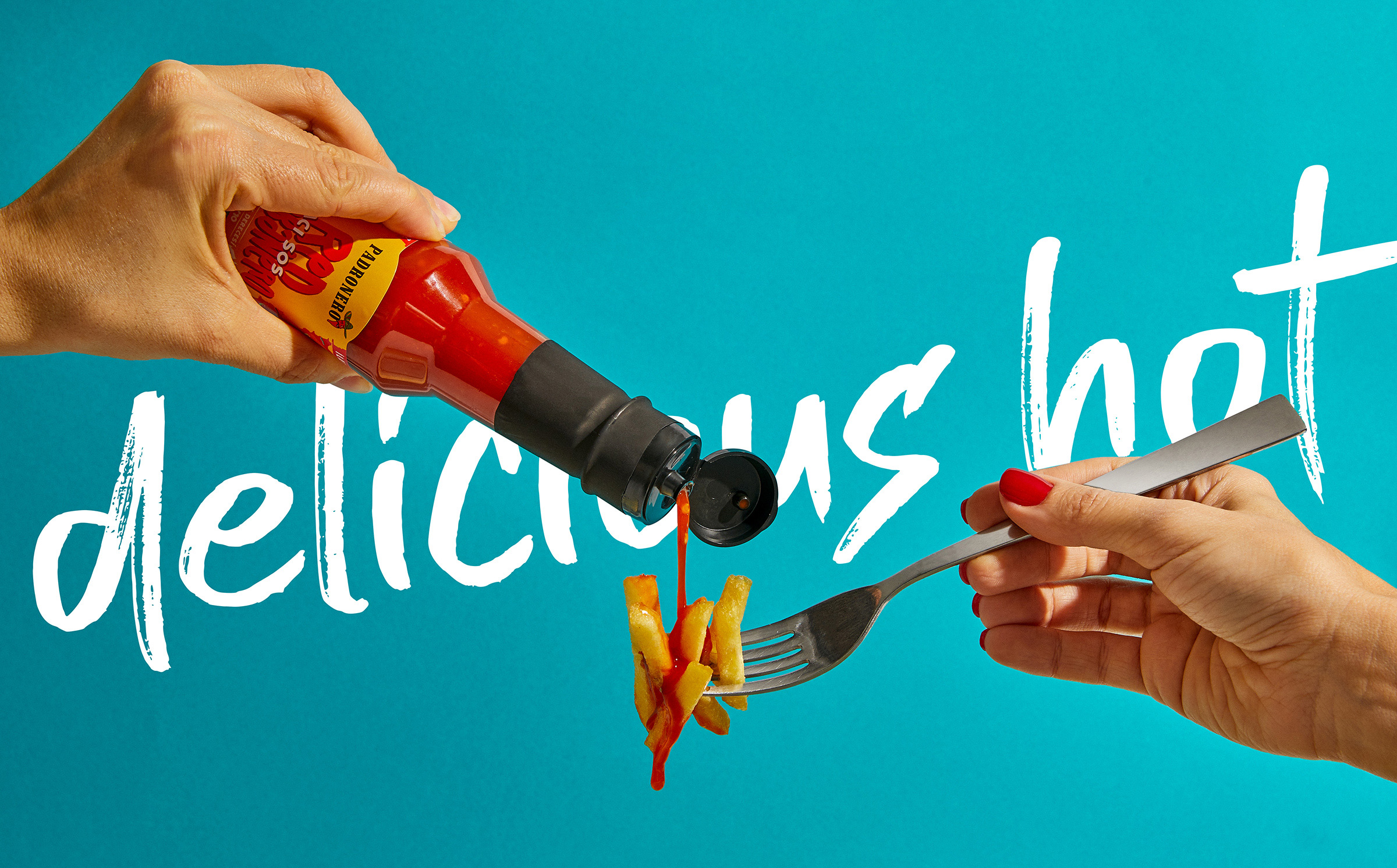
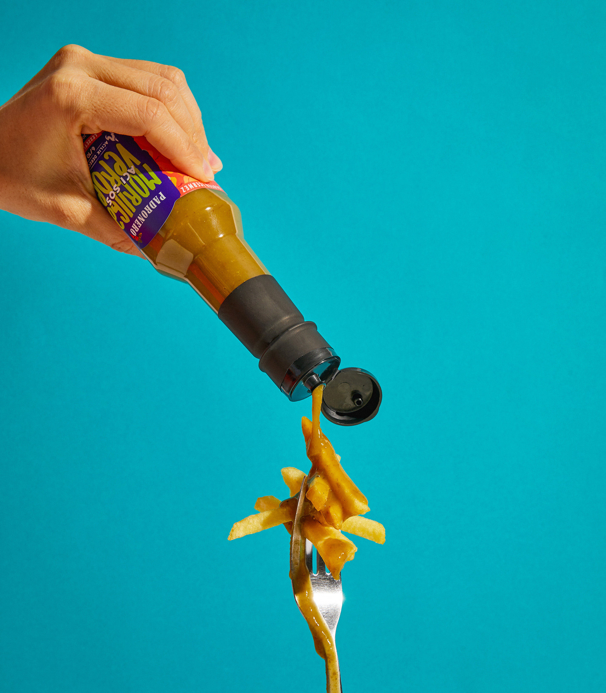
Appetizing Packaging for Delicious Hot Sauce!
We are adding more color to this flavor journey with our new packaging designs for the Padronero brand, which brings a fresh breath to the world of hot sauce. Appetizing, spicy and delicious packaging met with consumers on the shelves.
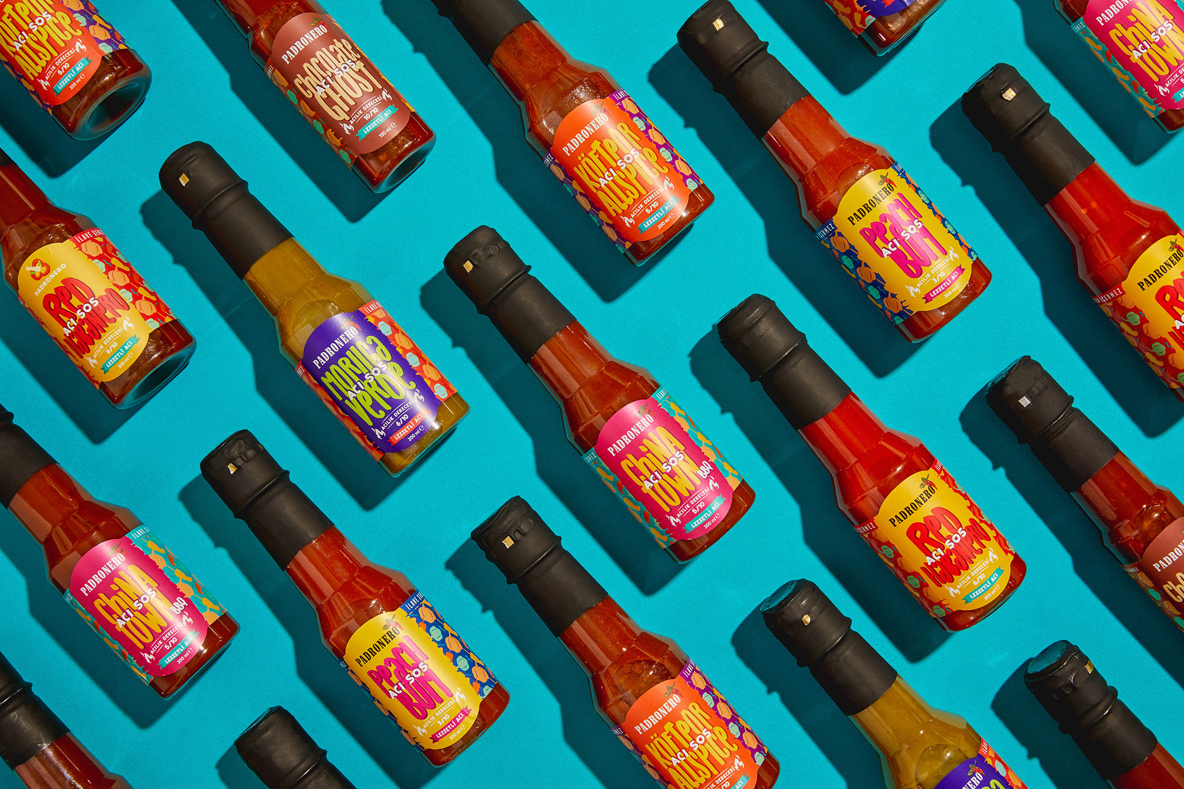
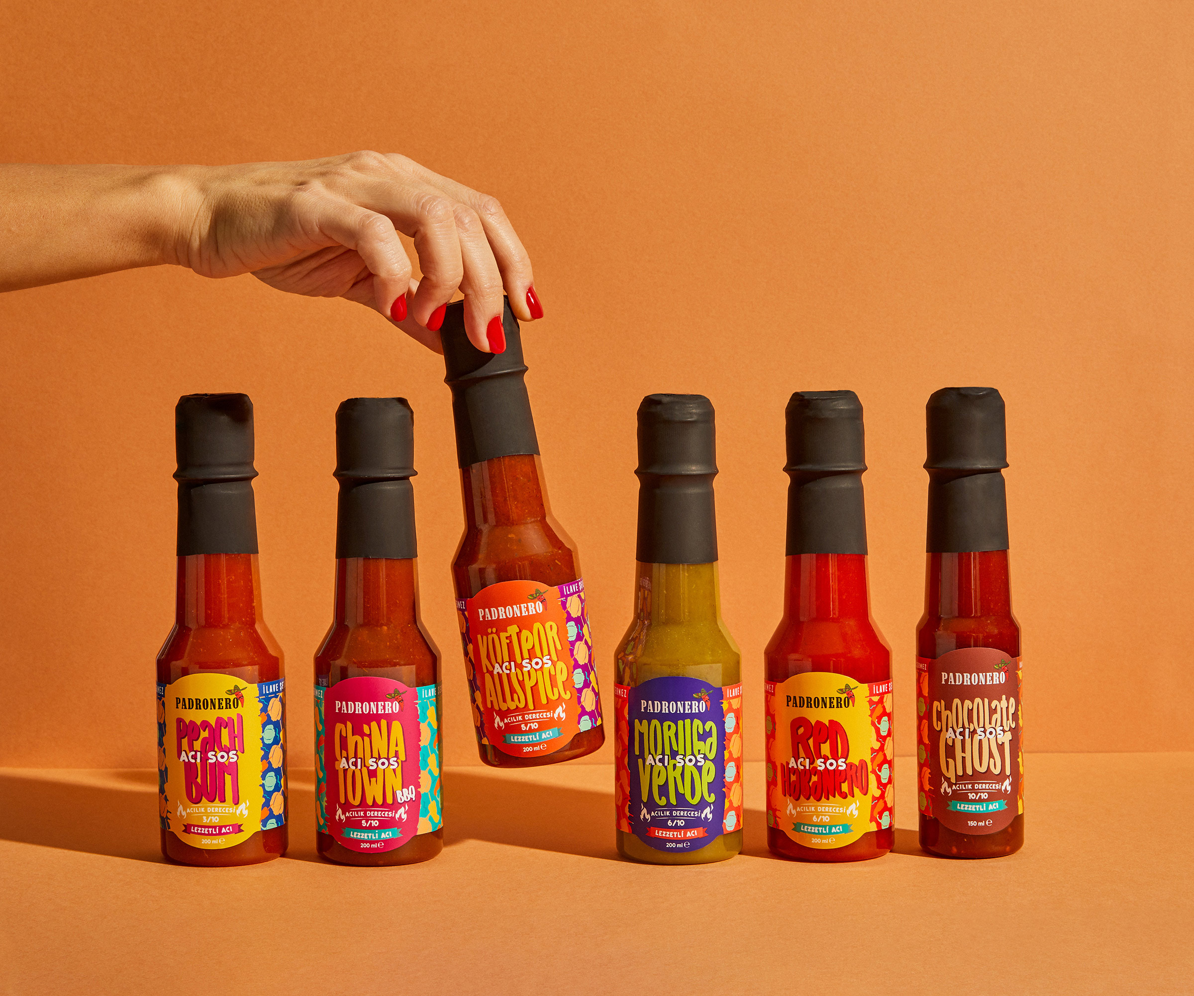
With vibrant colors, eye-catching patterns and original graphics, our products offer a unique style and character. Whether you use it in the kitchen to develop your creative recipes or to offer your friends an unforgettable taste experience.
We use the power of colors in our packaging design. The packaging of each Padronero product is dominated by vibrant colors that reflect the beauty of hot and the richness of taste. Color coding and special patterns emphasize the character of each product and make it easier for you to make your choice.
In our design concept, we prioritize clarity and simplicity. We use carefully designed typography and printing techniques to bring our products to more audiences and provide our customers with an unforgettable experience. We revitalize our packaging with Pantone colors and make it a part of the Padronero experience.
We are excited to present our new packaging designs to you. Join this colorful and delicious adventure. Step into the magical world of hot sauce, flavor and colors with Padronero!
Appetizing Packaging for Delicious Hot Sauce!
We are adding more color to this flavor journey with our new packaging designs for the Padronero brand, which brings a fresh breath to the world of hot sauce. Appetizing, spicy and delicious packaging met with consumers on the shelves.
With vibrant colors, eye-catching patterns and original graphics, our products offer a unique style and character. Whether you use it in the kitchen to develop your creative recipes or to offer your friends an unforgettable taste experience.
We use the power of colors in our packaging design. The packaging of each Padronero product is dominated by vibrant colors that reflect the beauty of hot and the richness of taste. Color coding and special patterns emphasize the character of each product and make it easier for you to make your choice.
In our design concept, we prioritize clarity and simplicity. We use carefully designed typography and printing techniques to bring our products to more audiences and provide our customers with an unforgettable experience. We revitalize our packaging with Pantone colors and make it a part of the Padronero experience.
We are excited to present our new packaging designs to you. Join this colorful and delicious adventure. Step into the magical world of hot sauce, flavor and colors with Padronero!

CREDIT
- Agency/Creative: Talking Packs
- Article Title: Packaging Design for Padronero by Talking Packs
- Organisation/Entity: Agency
- Project Type: Product
- Project Status: Published
- Agency/Creative Country: Turkey
- Agency/Creative City: İzmir
- Market Region: Europe
- Project Deliverables: Advertising, Packaging Design
- Industry: Agriculture
- Keywords: Hot Sauce, Packaging, Padron, Habanero, Padronero
-
Credits:
Creative Director:: Cüneyt Uğurlu
Art Director:: Ece Yılmaz
Creative Group Head:: Kurtulus Fenercioğlu


