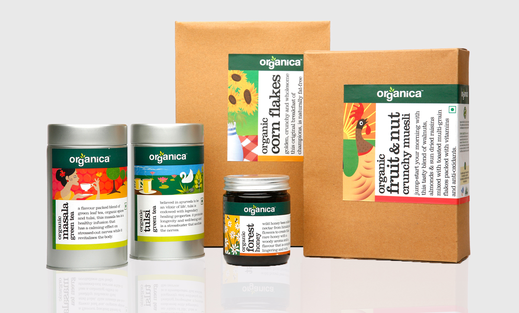
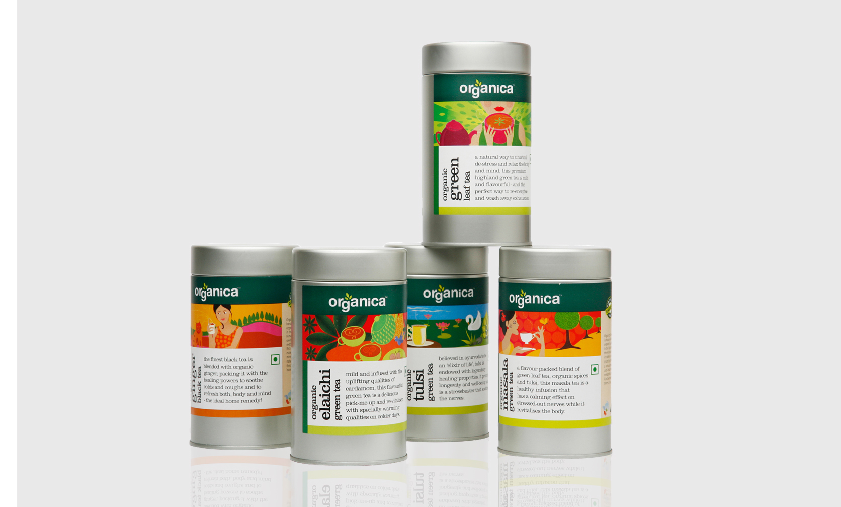
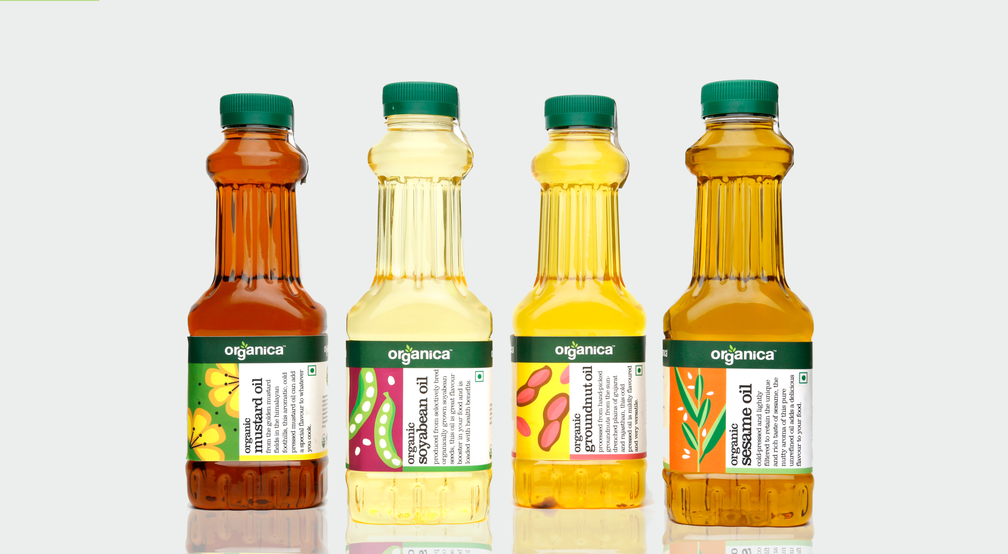
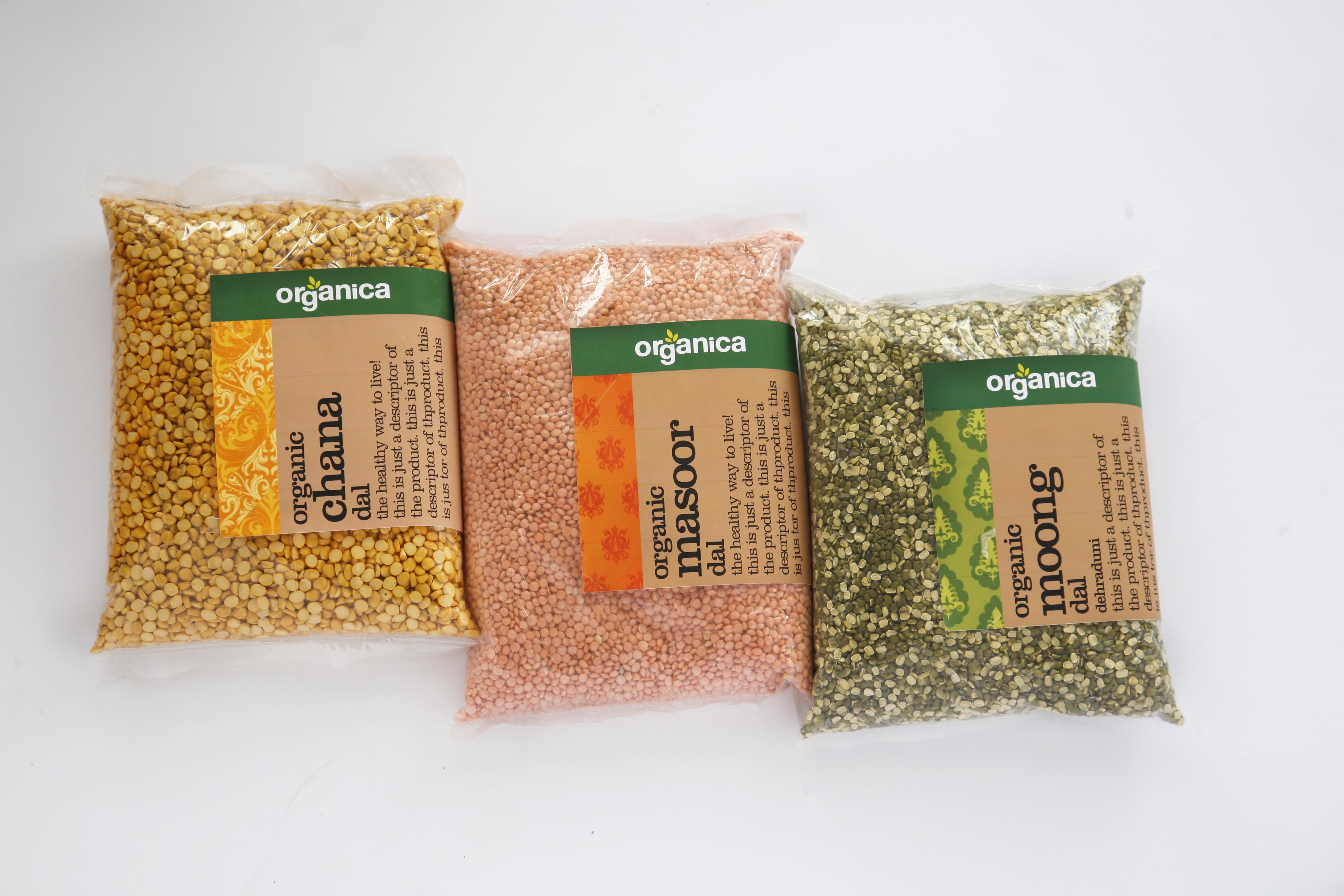
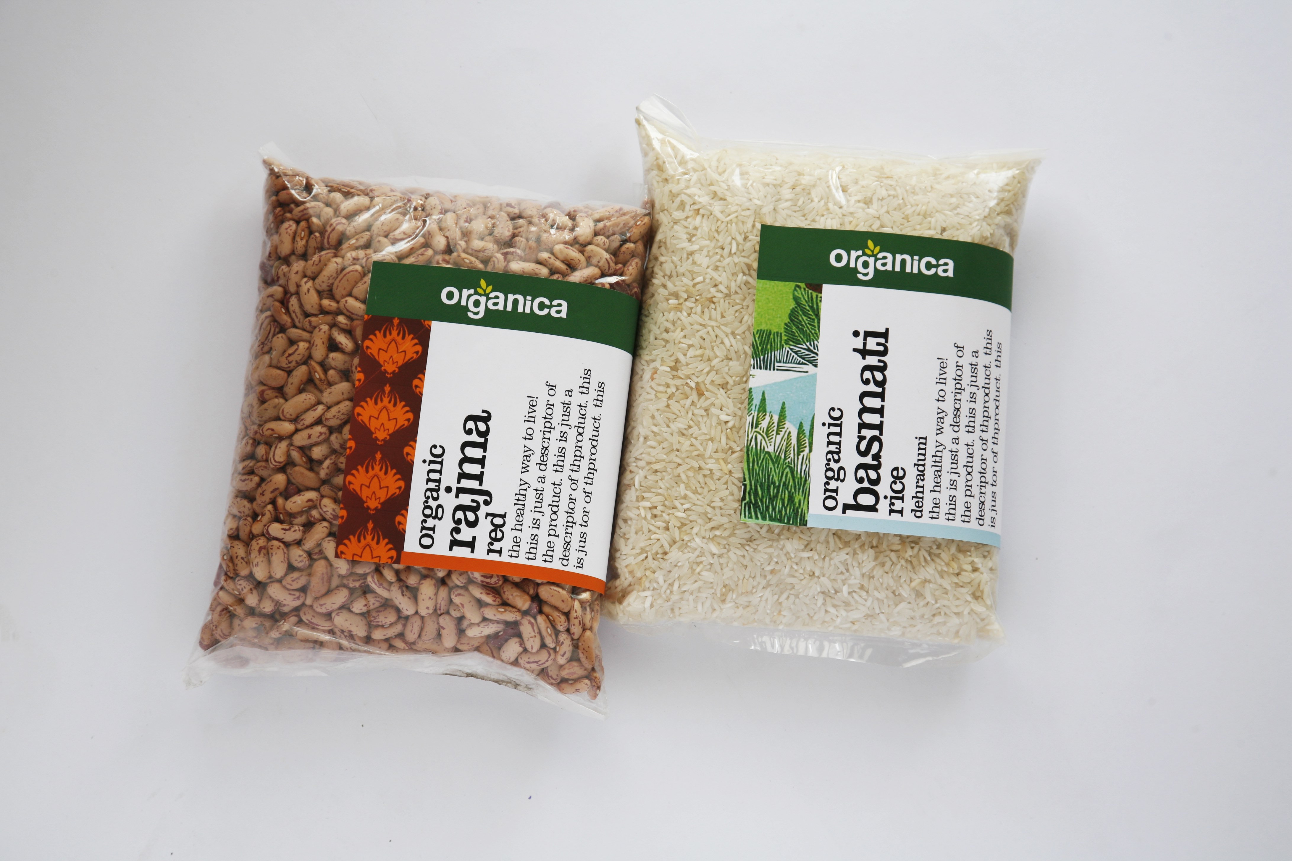
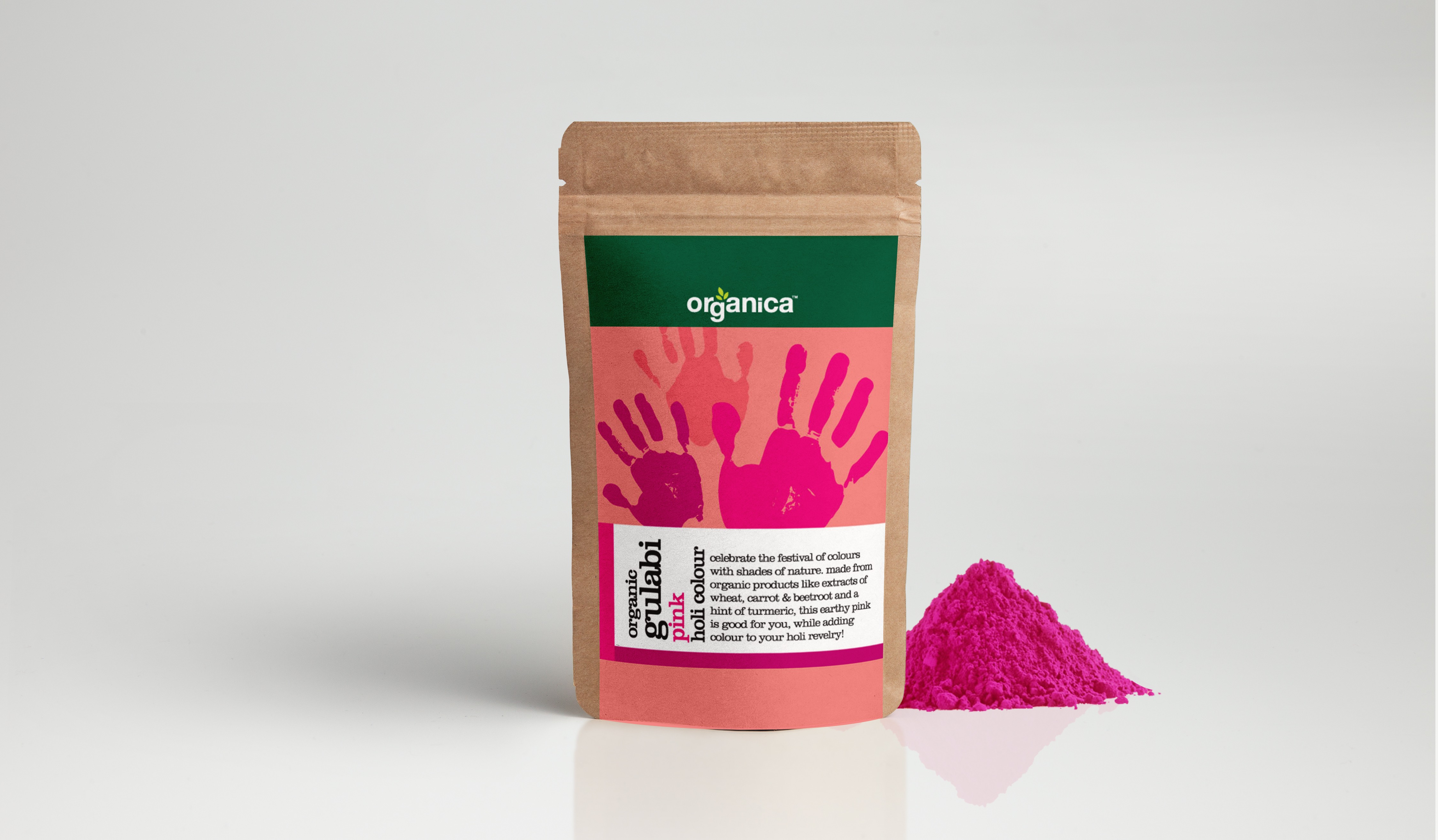
Organica is a brand started up to market high quality organic foods through select outlets. The range was extensive and needed a unifying theme and concept to hold the broad range together. We created the brand identity and visual language to synergise the look of the range and allow extension of the range into other products in future. Our design is inspired from the premise that every product has a story of it’s origin and authenticity and we are putting ours up front for the consumer to read. The idea was to be honest and believable. The organic quality comes through the use of kraft board, tin, and other recycled paper. The presentation is credible and the pedantic quality is offset by jewel like story-book illustrations.The design was kept simple, relatable and relevant to the product. For example, the cereal had graphics that depicted morning, the tea illustrations were done with the flavour in mind, pulses had Indian motifs on them. Illustrations in different styles were created for each category from crayon, watercolours, pencil drawings. Some were given the handmade look some digital, but the binding factor was the story and simplicity of style.
CREDIT
- Agency/Creative: GCD Studio
- Article Title: Packaging Design for Organica Foods Designed by GCD Studio
- Organisation/Entity: Agency, Published Commercial Design
- Project Type: Packaging
- Agency/Creative Country: India
- Market Region: Asia
- Project Deliverables: Brand Creation, Brand Experience, Brand Identity, Brand Naming, Brand Refinement, Brand World, Graphic Design, Identity System, Illustration, Packaging Design, Product Naming, Research, Tone of Voice
- Format: Bottle, Box, Pouch, Tin
- Substrate: Pulp Carton, Pulp Paper


