Branding Studio Deza – Zatecky Gus
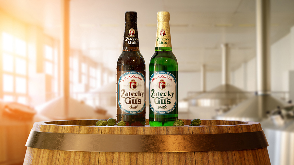
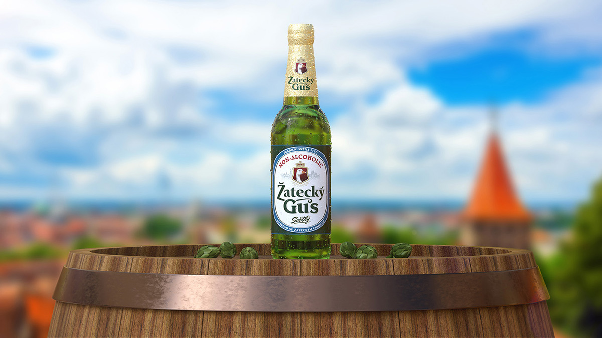
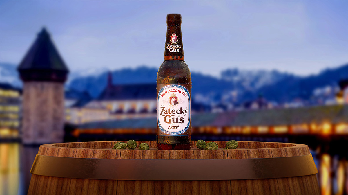
The company «Baltika» launched on the market non-alcoholic beer «Zatecky Gus», dark and light. We have developed a label design. The starting point was the design of alcoholic “Gus”. The non-alcoholic version is a consistent continuation of the alcoholic, but at the same time fundamentally different.Zatecky Gus in detailsIn design of non-alcoholic beer, we saved based visual codes of alcoholic but made significant changes. The main color of central element of label was white, the color of its contour frame — light blue: light “non-alcoholic” colors. We also got rid of unnecessary, weighting graphic elements on the inner label field. On the label we placed the inscription-identifier «non-alcoholic». Large, red, it is immediately noticeable and is read.Similar but differentThe difference between light and dark beer labels is minimal. Therefore, the bottles are perceived as a pair of one — non-alcoholic — order. At the same time, they cannot be confused: the pronounced difference gives the color of the foil on the necks and, of course, the color of the drinks.The same can be said about the entire alcoholic and non-alcohol line of «Zatecky Gus». It looks holistic and obviously owned by the same brand. However, each kind of beer has its own special signs.


CREDIT
- Agency/Creative: Branding Studio Deza
- Article Title: Packaging Design for Non-alcoholic Beer “Zatecky Gus”
- Organisation/Entity: Agency, Published Commercial Design
- Project Type: Packaging
- Agency/Creative Country: Russia
- Market Region: Europe
- Format: Bottle
- Substrate: Glass


