KOP Studio – Mānuka Honey Wine
Mānuka Honey Wine/ Liqueur, a fermented delight all the way from New Zealand.
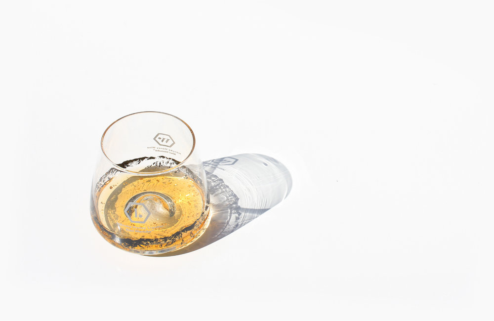
Known for its distinctive character and texture from the honey, the wine broadens out on the palate with the initial impressions dominated by concentrated honey flavours. The finish note on this wine is refreshingly clean, with natural acidity balancing the smooth honey aftertaste. It creates a rich and fulfilling drinking experience.
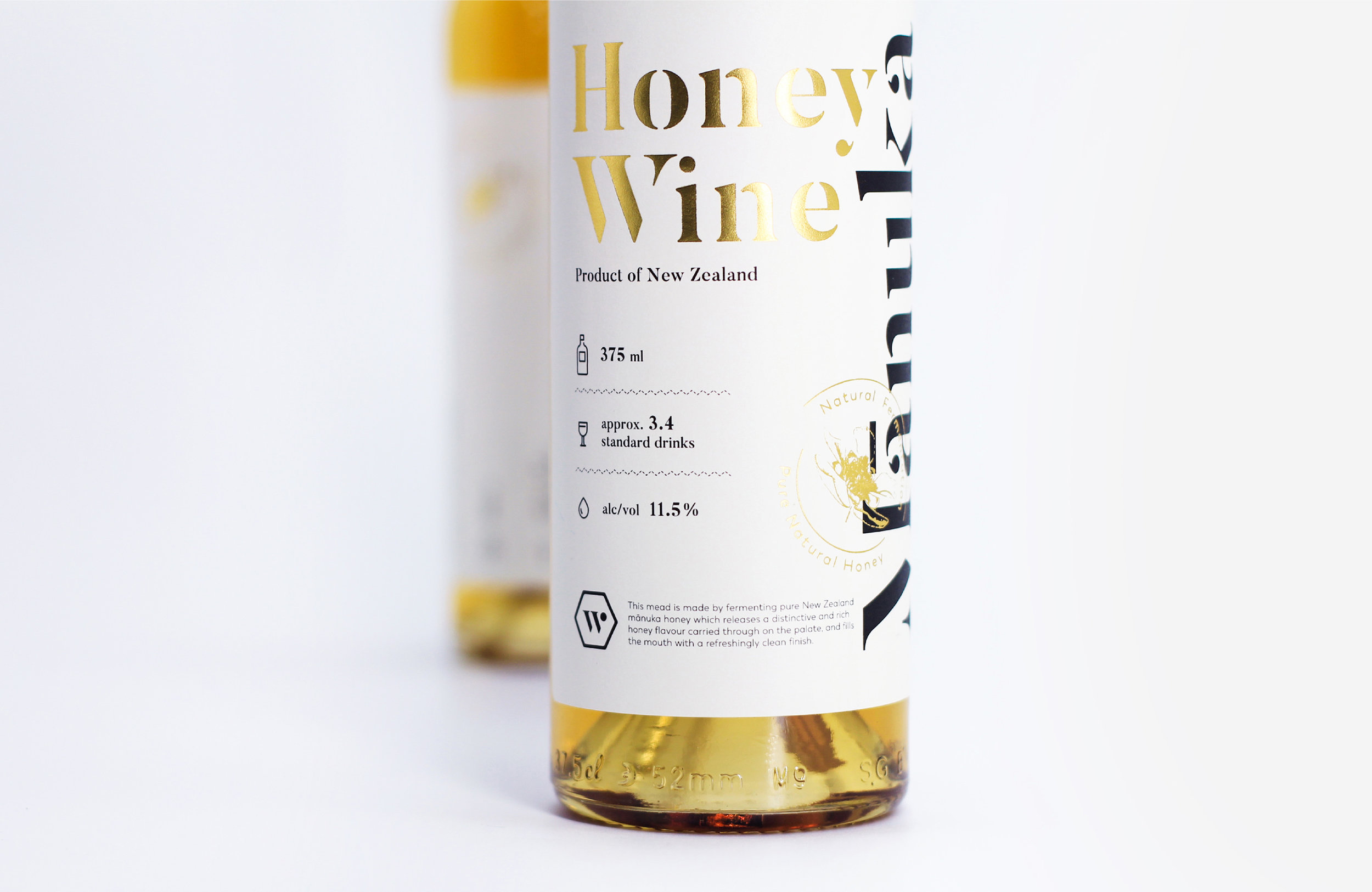
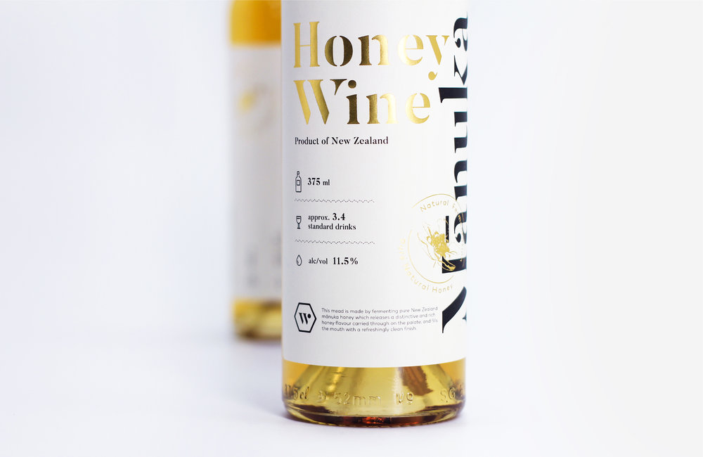
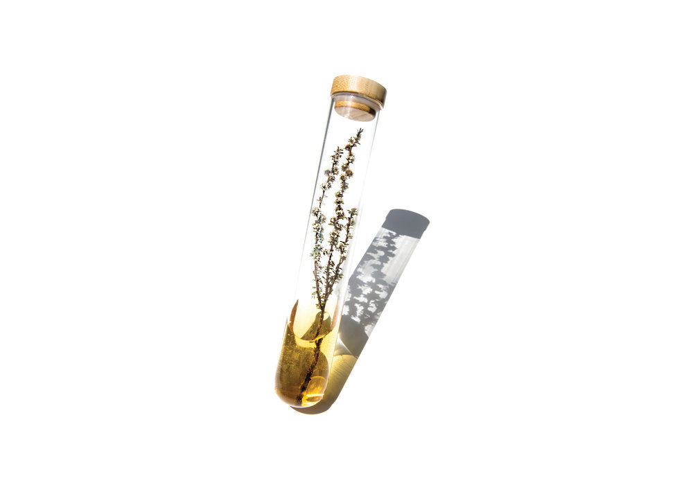
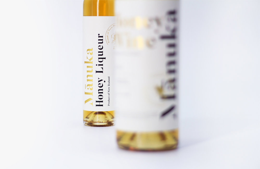
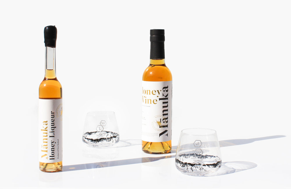
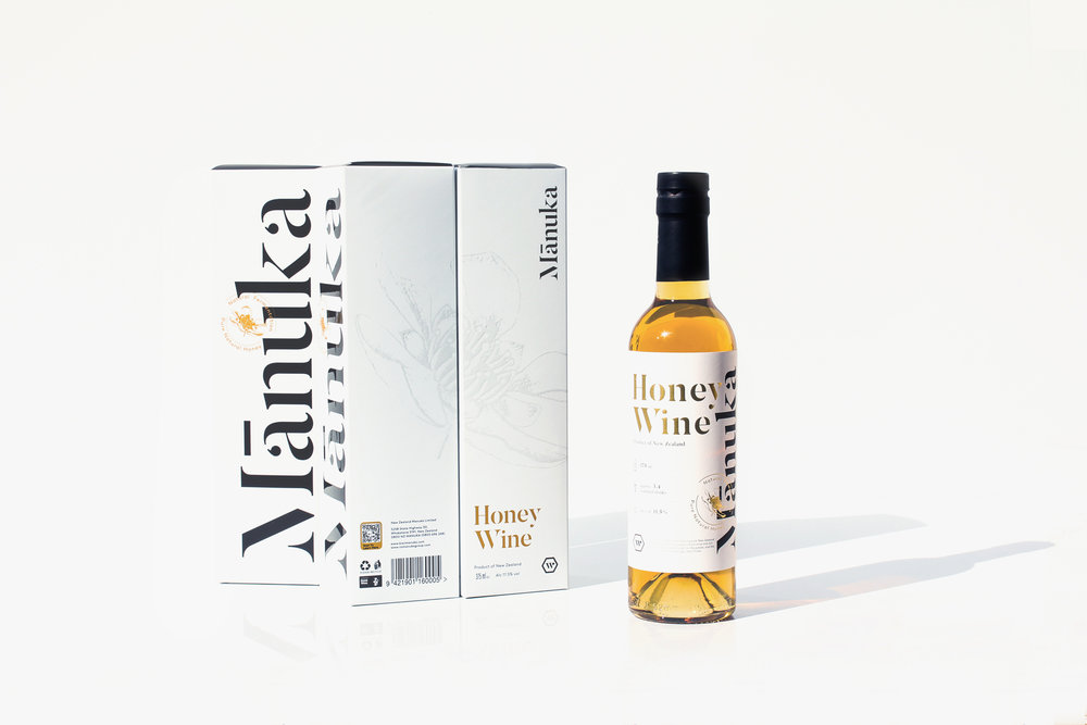
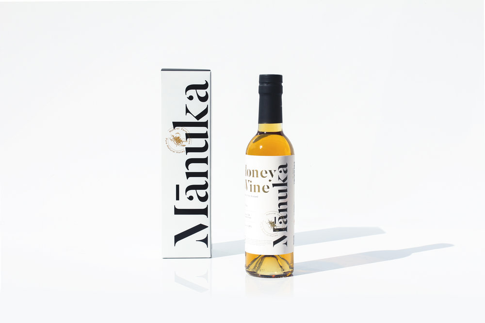
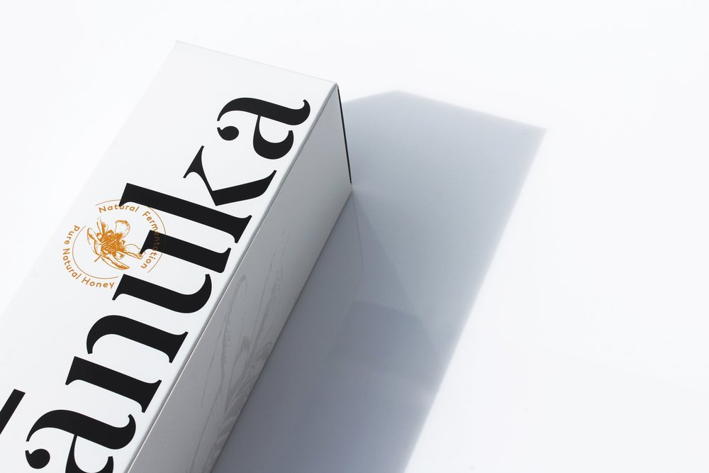
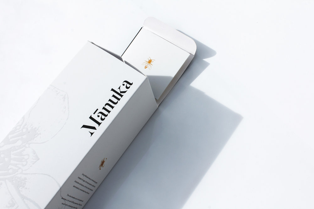
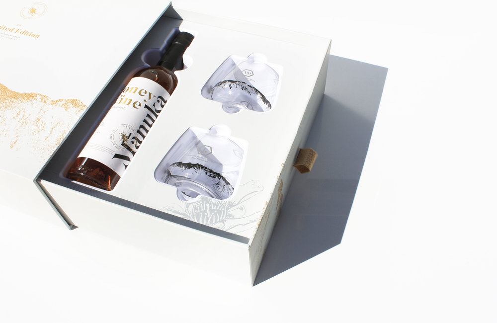
Knowing its origin from New Zealand, the design solution is to not just emphasis on its origin but also on the main ingredient that makes this wine special – Mānuka Honey. Using a clean and simple visual language with a serif type, it allows the main ingredient of this product to stand out. The chosen font gives the brand a classic approach, preparing for a global release whenever it is ready.
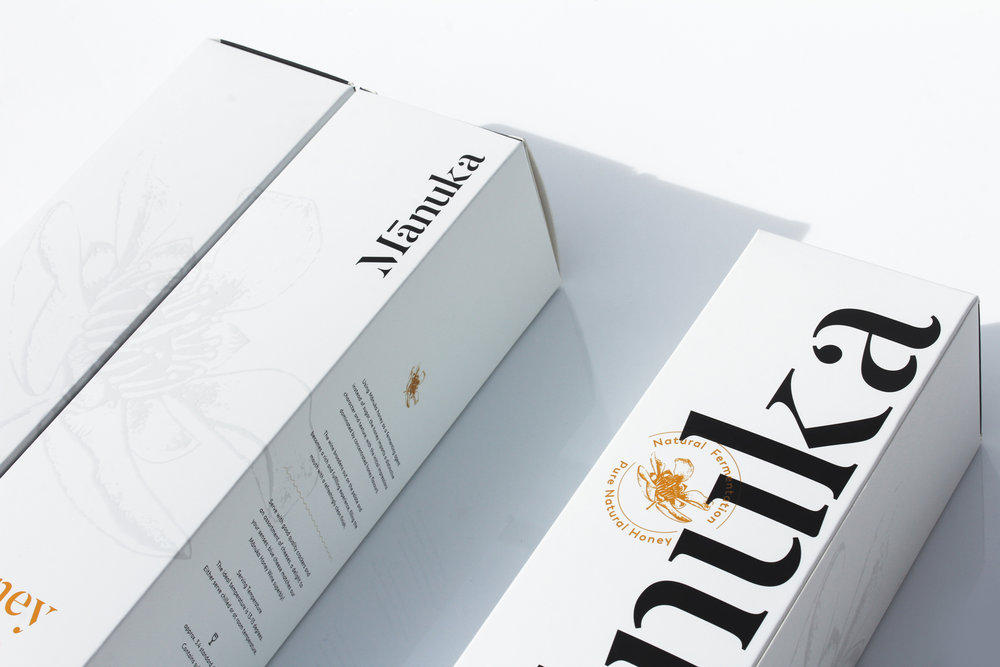
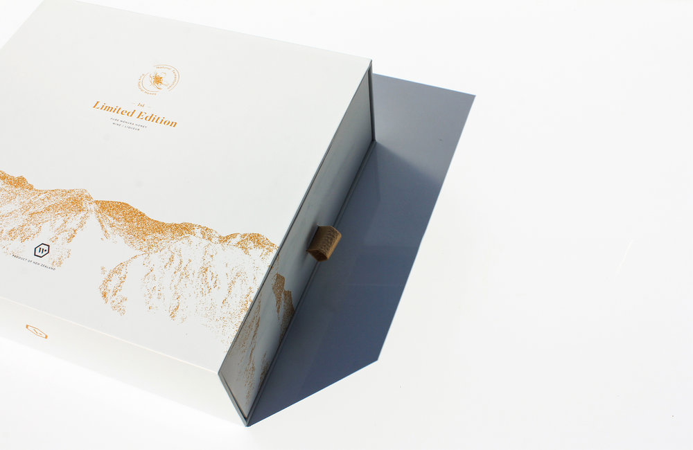
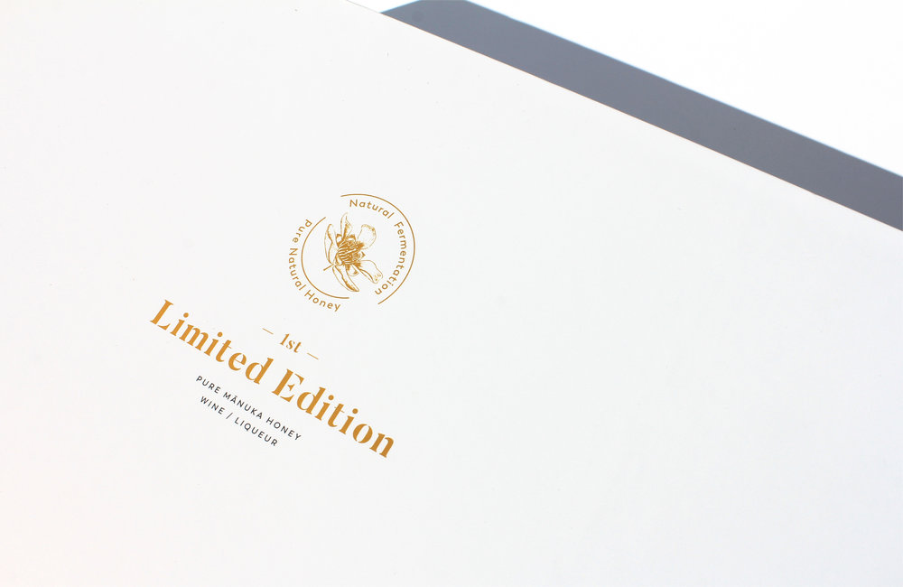
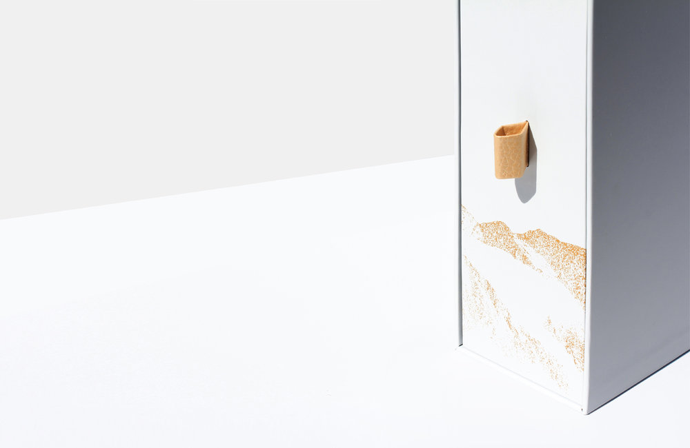
The design decision of using white space with gold foil was drawn from the experience of the tasting the products. Describing the finish note of this wine/liqueur as refreshing and crisp, both label is finished in a tone of simplicity yet exclusive to conclude the design.
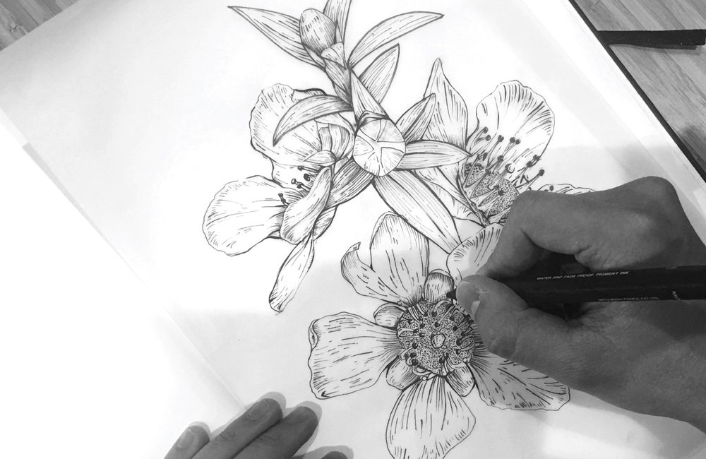
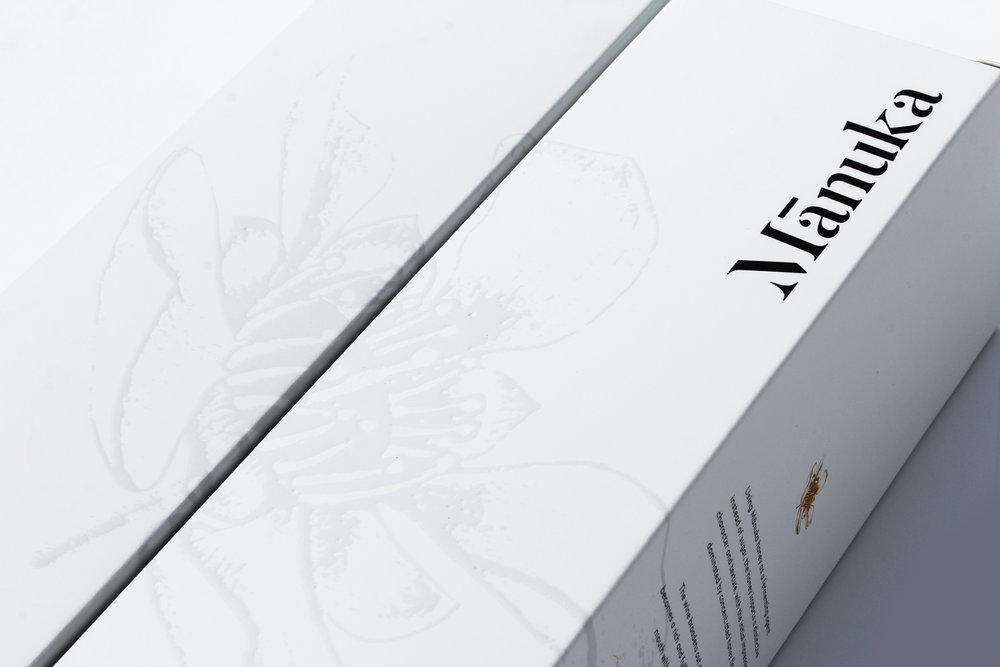
To differentiate the products from others, a Mānuka flower emblem has been created to mark this creation. Hand drawn Manuka flower was developed from scratch to convey the exquisite of these wine/liqueur.
CREDIT
- Agency/Creative: KOP Studio
- Article Title: Packaging Design for New Zealand Mānuka Honey Wine
- Organisation/Entity: Agency Commercial, Published
- Project Type: Packaging
- Agency/Creative Country: Australia
- Market Region: Multiple Regions
- Format: Bottle, Box
- Substrate: Glass, Pulp Board, Pulp Carton


