Packaging design for new flavors of liquid & liquid sports supplements.
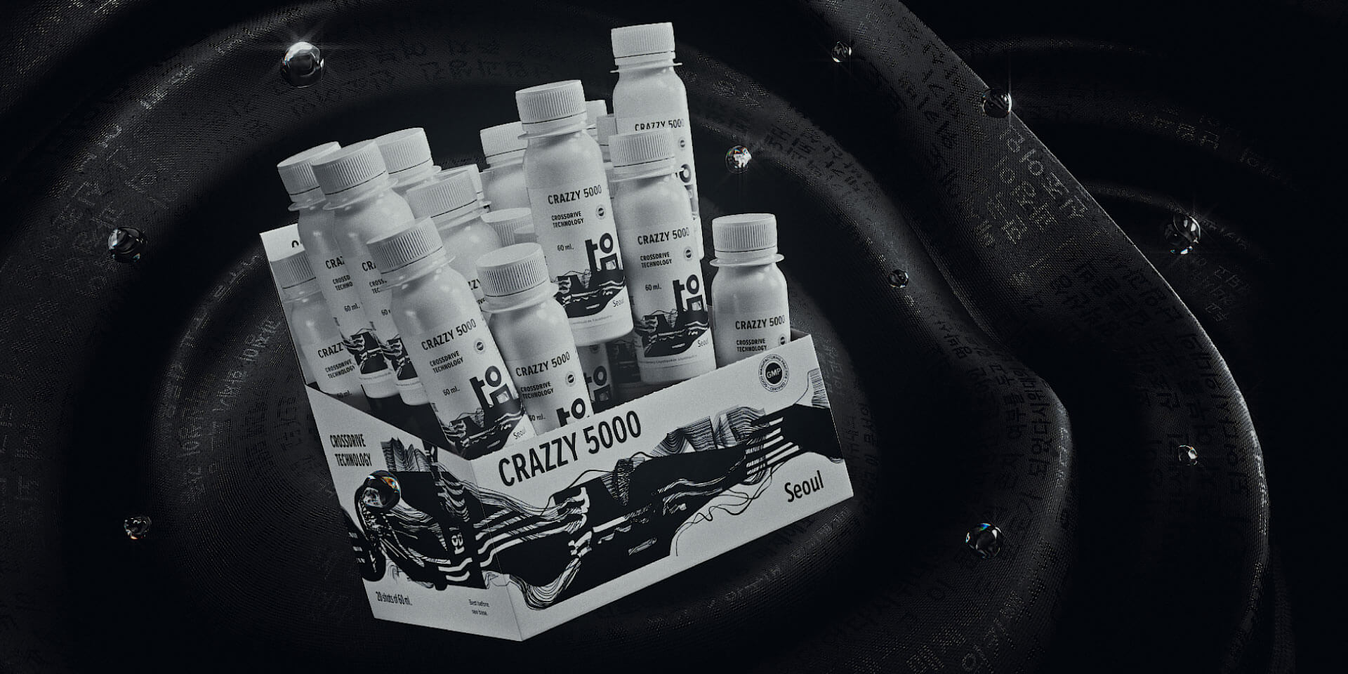
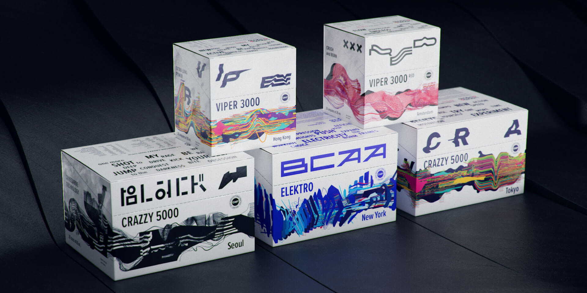
Liquid&liquid is a german manufacturer of liquid sports supplements. We have been working with this brand for a long time: in 2014, we created a logo and a corporate style for the brand; in 2019, we conducted restyling and developed packaging design for l&l crazzy 5000. Now, the brand has decided to release a limited edition: crazzy 5000 black, bcaa elektro and viper red, with the maximum allowed dosages of active ingredients. We needed to develop design based on the one for crazzy 5000, but at the same time, it had to be even more eye-catching.
Every flavor in the core product line of crazzy 5000 is named after some city. The same approach is used for new products.
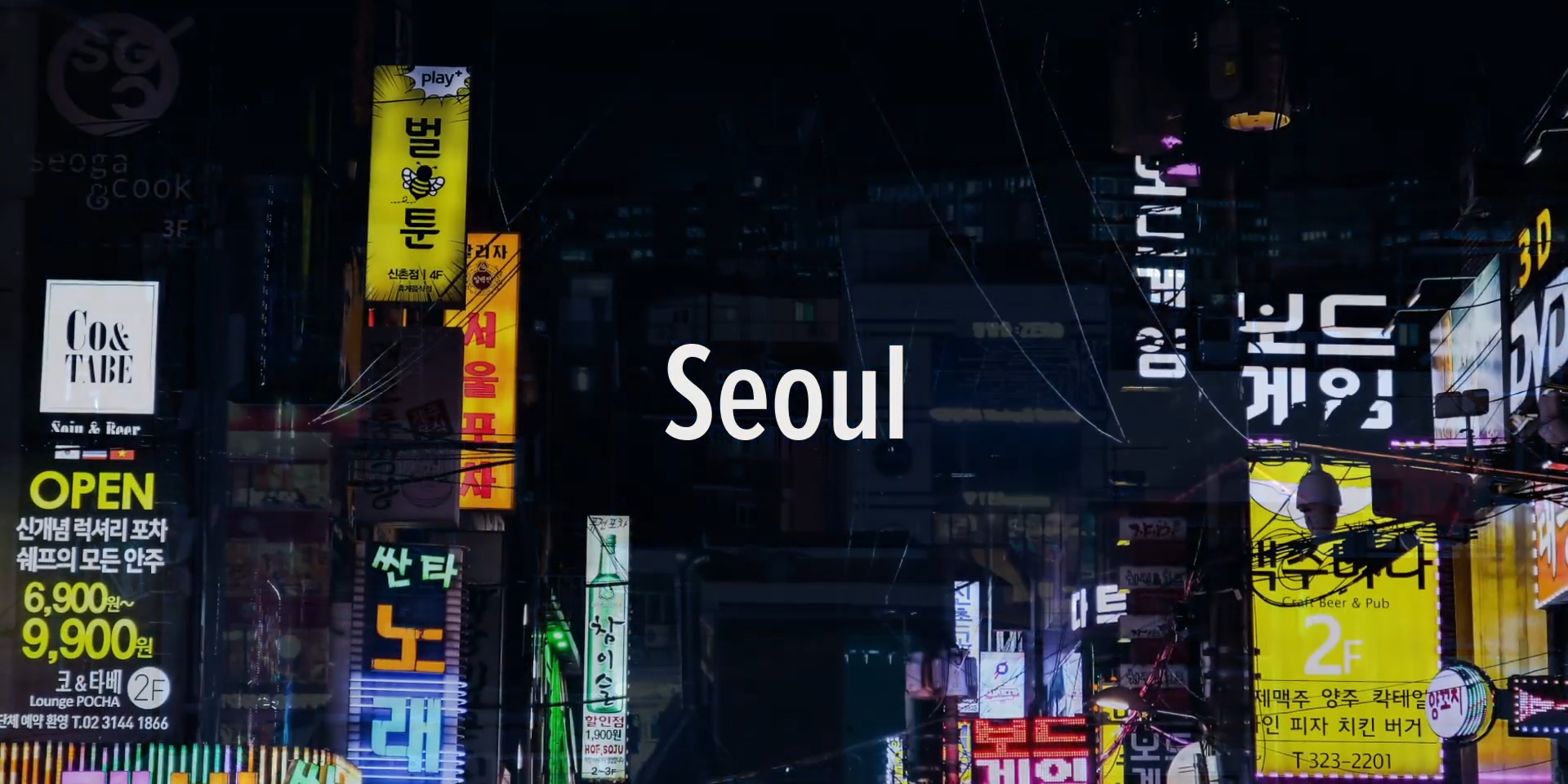
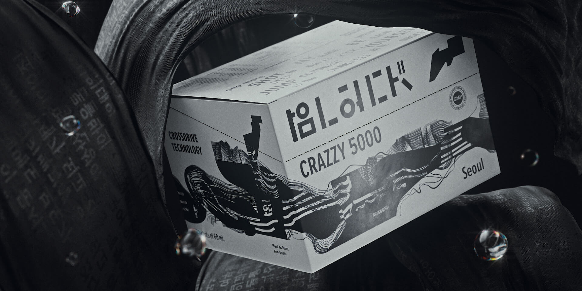
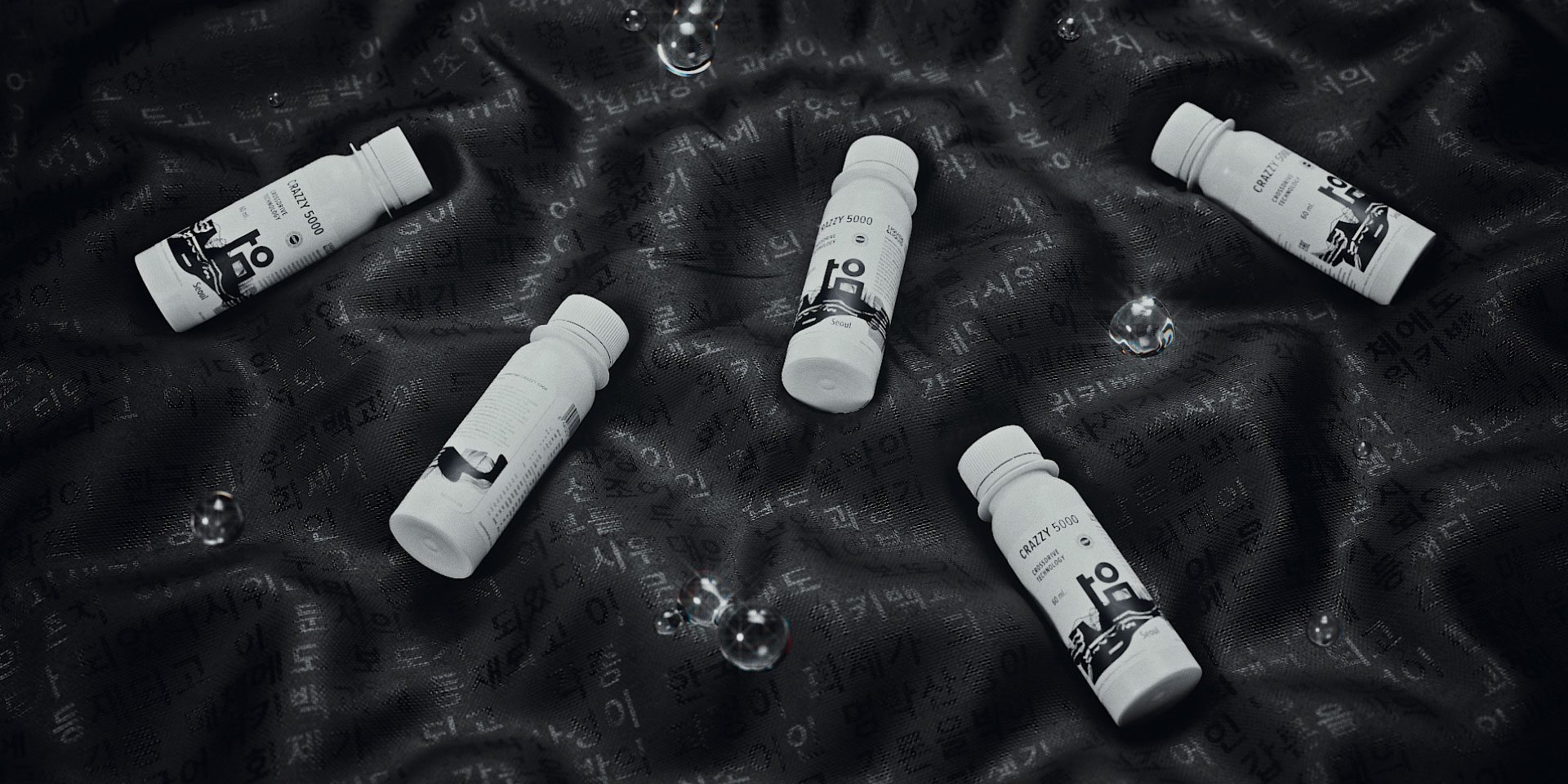
Black is seoul. The capital of south korea, a huge metropolis. Its temperament and exoticism ideally complement tokyo and hong kong from the previous products. The concept is based on the plasticity of the korean hangul script. Hangul graphemes are extremely simple, most of them consist of primitive circles, corners and lines. Their drawing becomes the starting point for the key inscription on the packaging – black.
The signature graphics remain consistent with crazzy 5000 adding new, even stronger sensations: tension, movement, energy explosion. More black appears, the overall shape and color flows are more distorted.
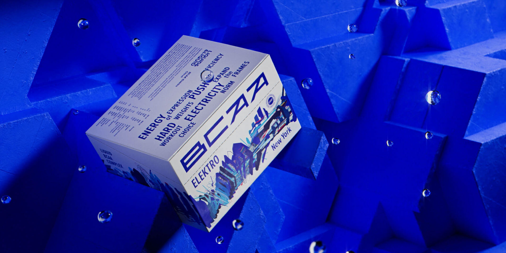
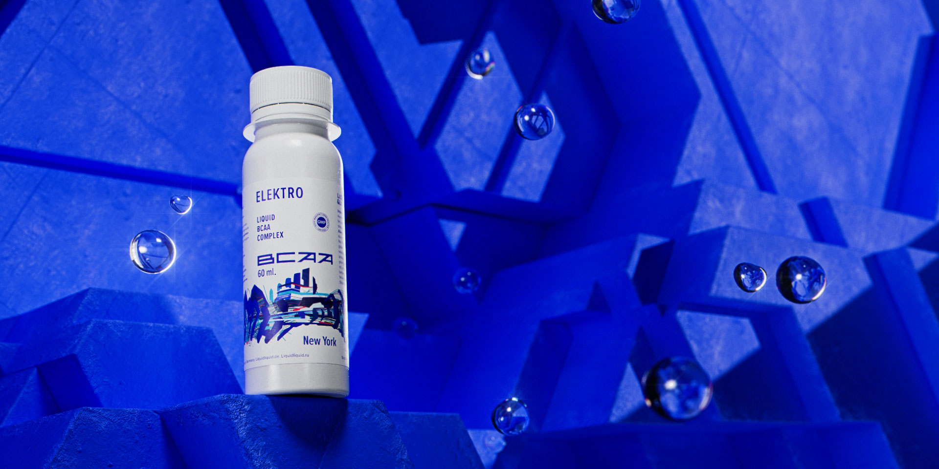
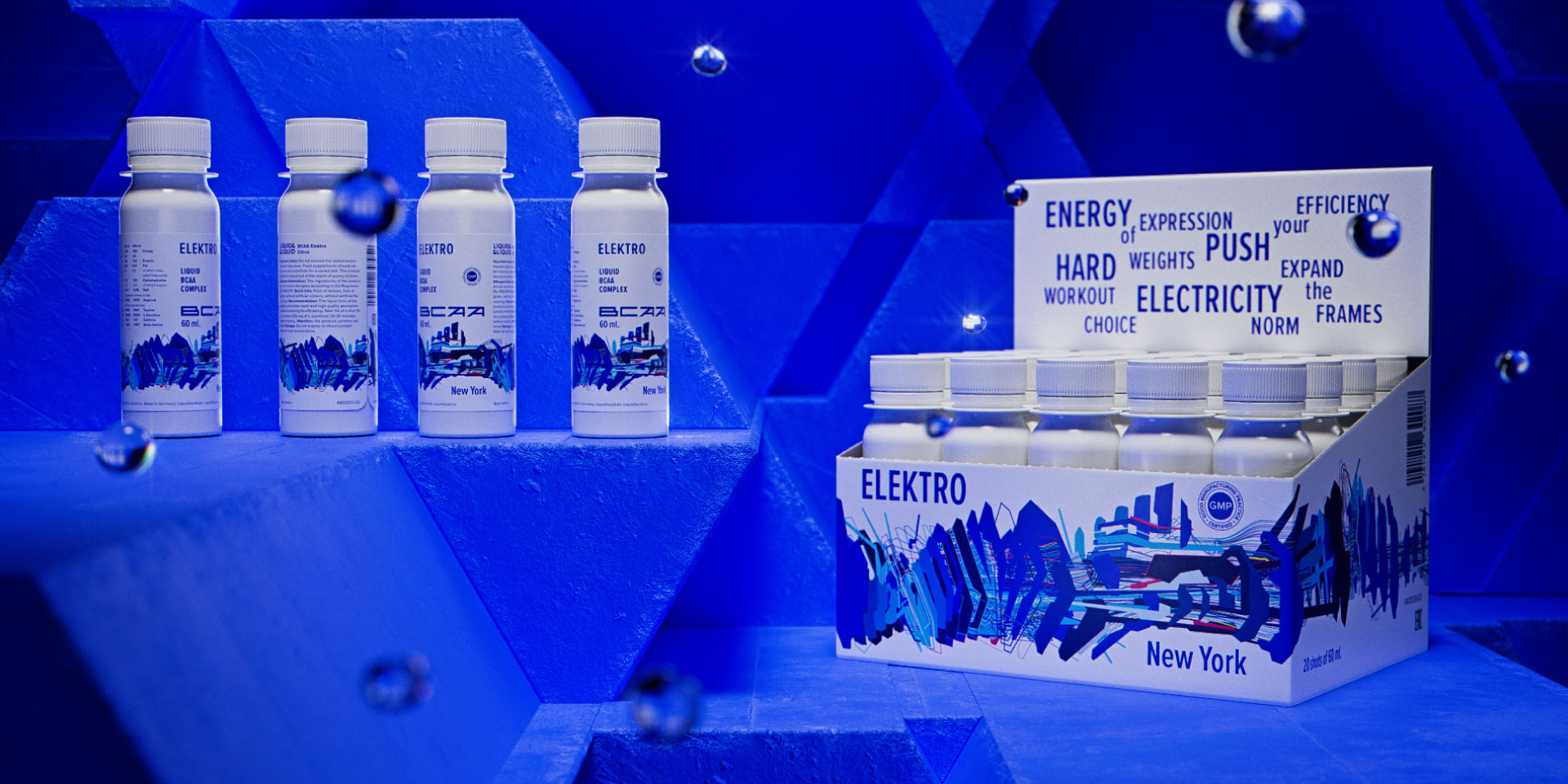
Bcaa elektro is new york. Skyscrapers, steel, glass and concrete, industrial forms, an ocean of electric light. Power. Voltage. Brutal dynamics.
The basic principle is the architecture of the city, of thinking, of your own body. The rigid contours of the city, the smooth outlines of supercars – it all determines the plasticity of the graphics.
Harsh writing also inherits rigid architectural forms, complex multilevel silhouettes of high-rise buildings, and the ragged outline of the city.
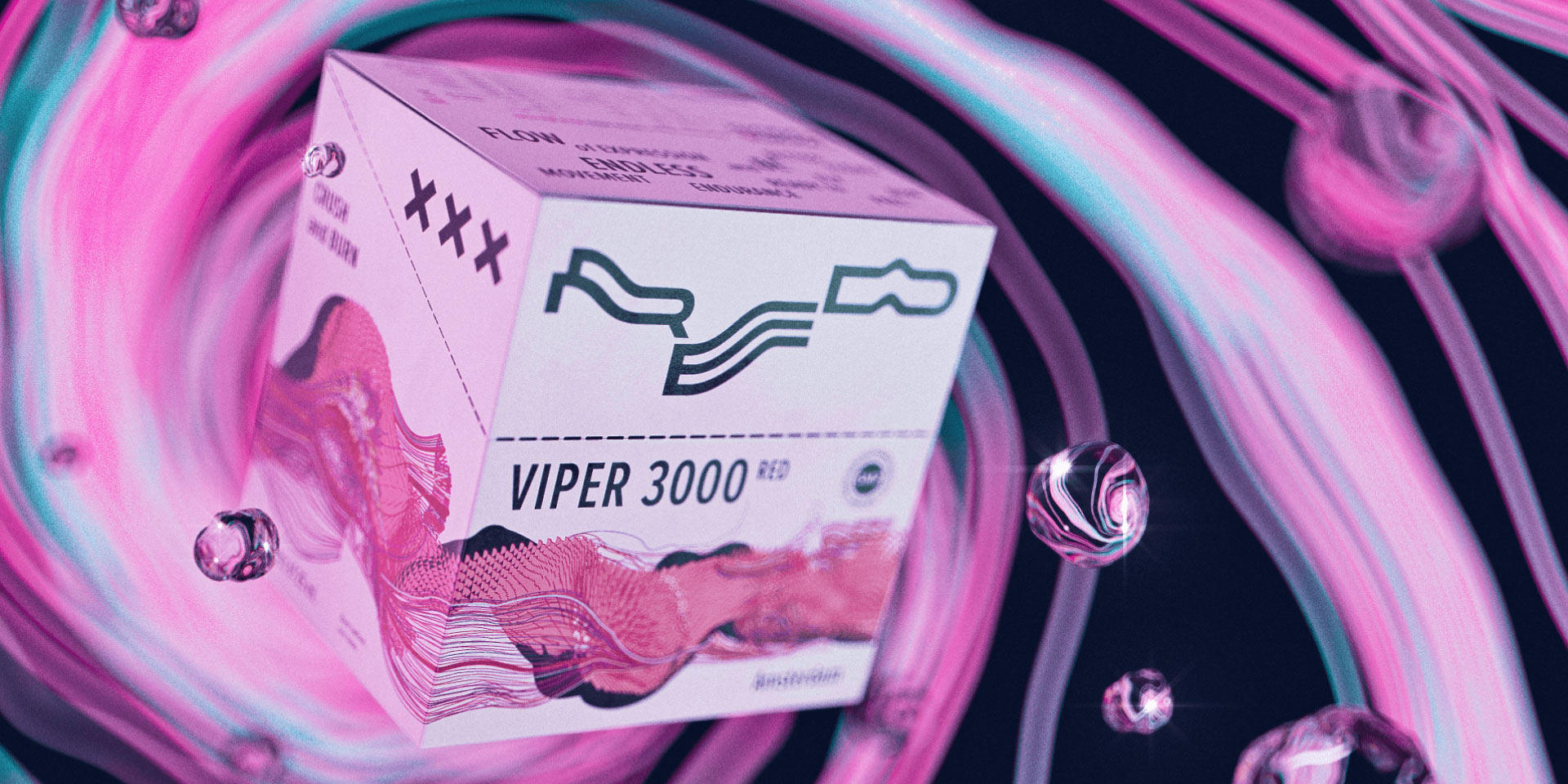
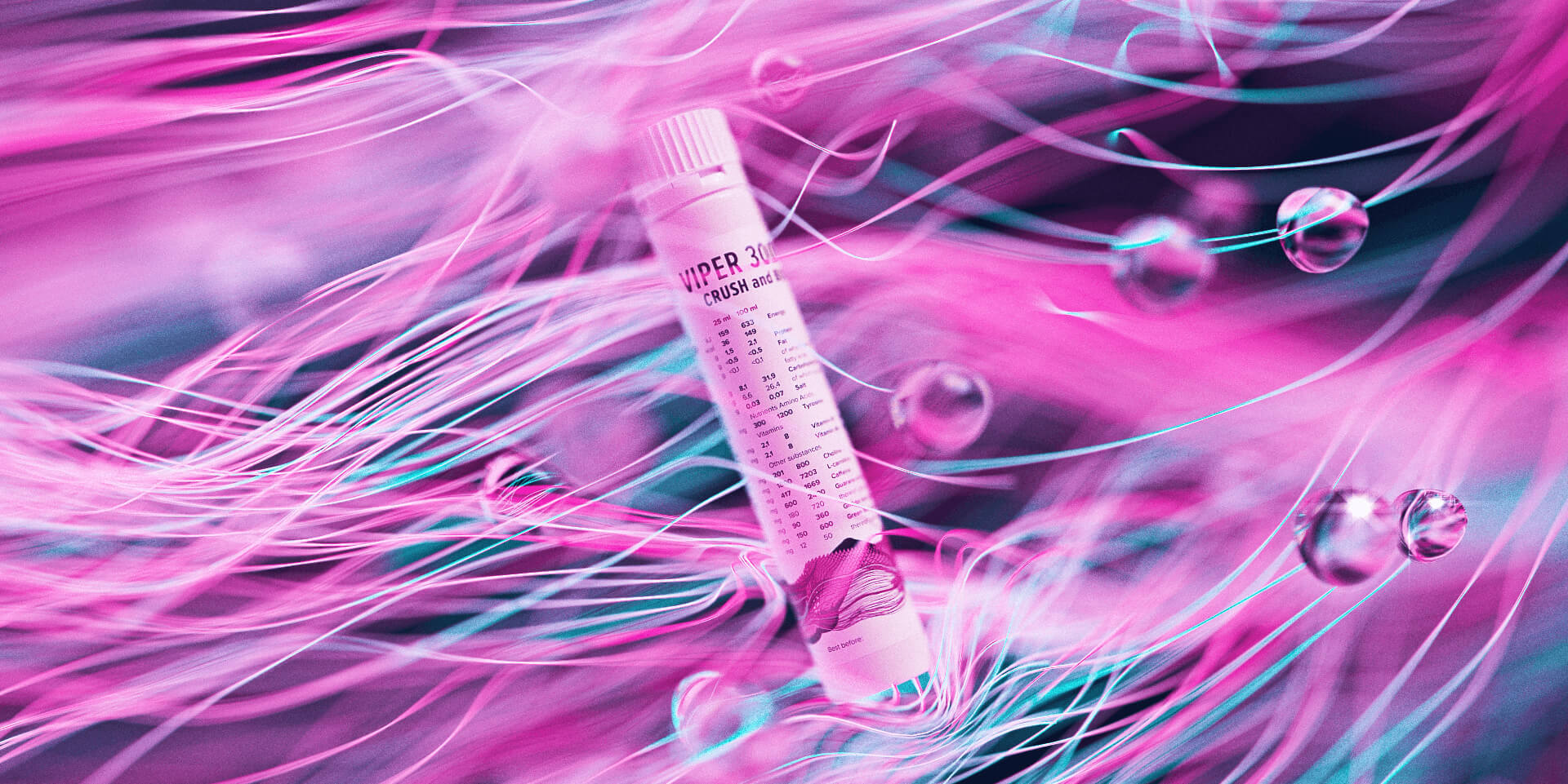
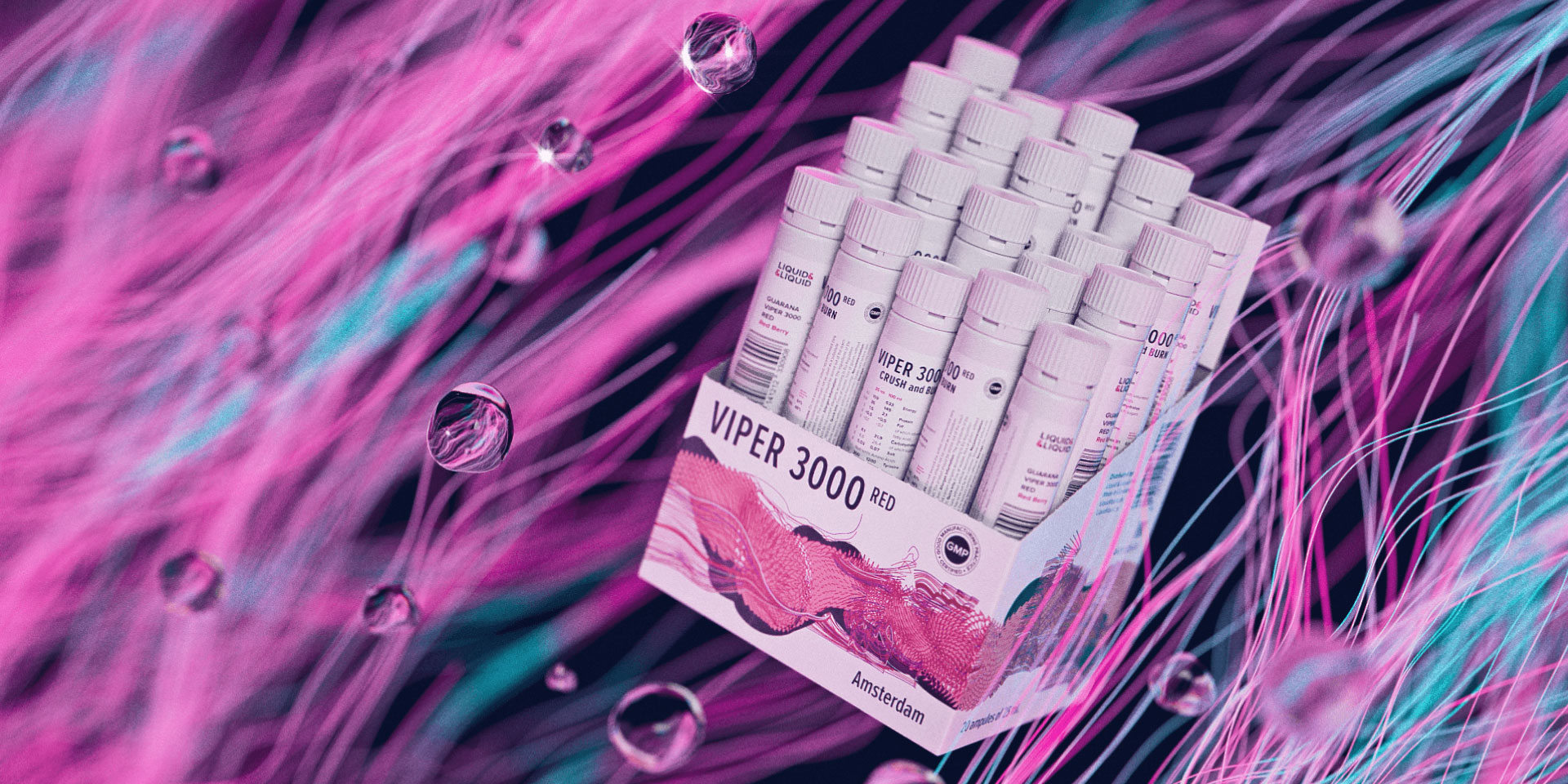
The third product in the limited line is viper red, amsterdam. It is targeted at a female audience and draws upon the image of amsterdam as one of the most plastic and flexible european cities, a city of pleasure. Its images are lightness, a state of flow, a feeling of flight. Tirelessness, energy, movement. Endless, unceasing, eternal pleasure.
The viper red graphics combine brutal forms and plasticity, fluidity, flexibility.
The symbol of amsterdam is three crosses, widely known and widely used in the public cultural space. The fact that the three crosses can be read as a symbol of saint andrew the apostle gives the additional depth to this image. At the same time, it can serve as a reference to ‘love, death and robots’, a philosophical epic. In short, this is an image of multiple meanings, in which everyone will see something of their own.
Graphics are born across all of the same messages: rough and gentle, abrupt and smooth, sharp and soft. Here we see the contours of the lines transit into each other in a very subtle way, and then they turn into sharp needles, pulse peaks, dragon scales. And in large forms of graphics, you can see the outlines of a female body shape.
Sports supplements under the liquid&liquid brand has been sold in russia for six years. During this time, the company managed to boldly detach itself from competitors, rebrand and release a limited line of high-class products. The brand is not just developing – it is running without slowing down, at the same pace as its customers.

CREDIT
- Agency/Creative: lovemedo branding agency
- Article Title: Packaging Design for New Flavors of Liquid & Liquid Sports Supplements
- Organisation/Entity: Agency, Published Commercial Design
- Project Type: Packaging
- Agency/Creative Country: Russia
- Market Region: Europe
- Project Deliverables: Packaging Design, Product Architecture
- Format: Bag, Bowl, Flow-Pack
- Substrate: Plastic, Pulp Carton


