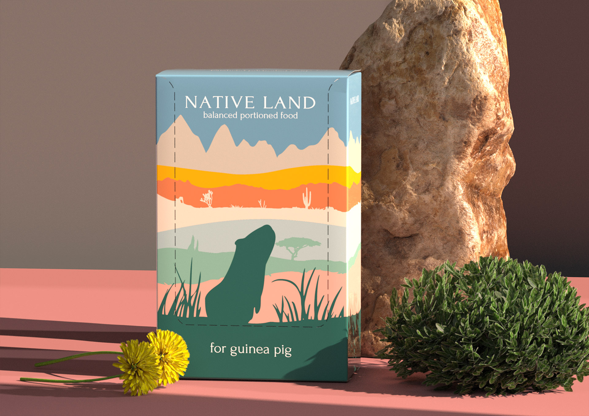
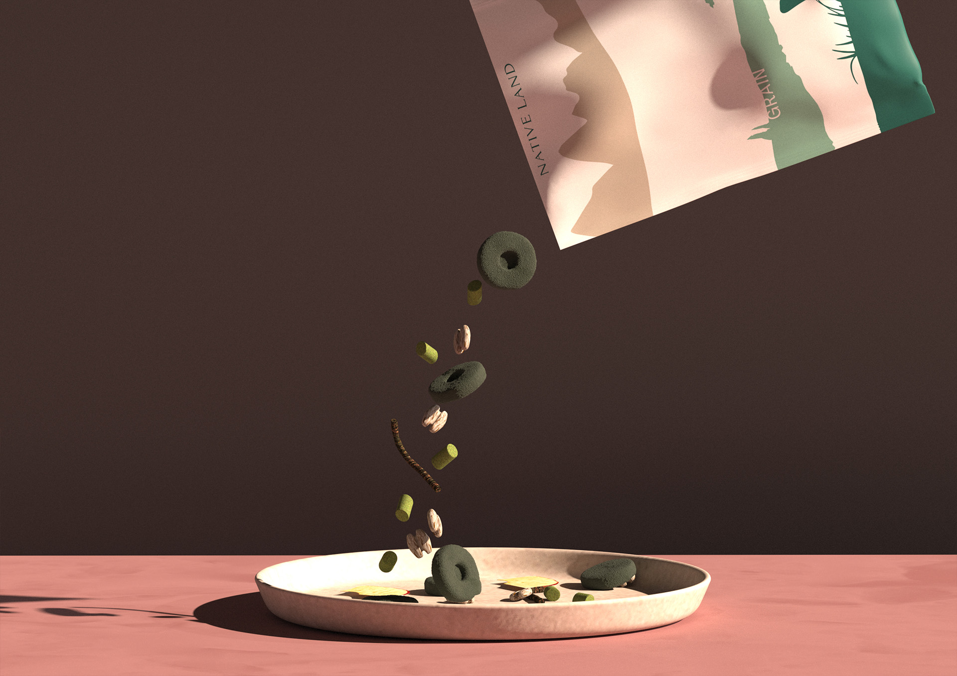
Native Land is a weekly portioned rodent food. This is the right, complete nutrition, close to natural.
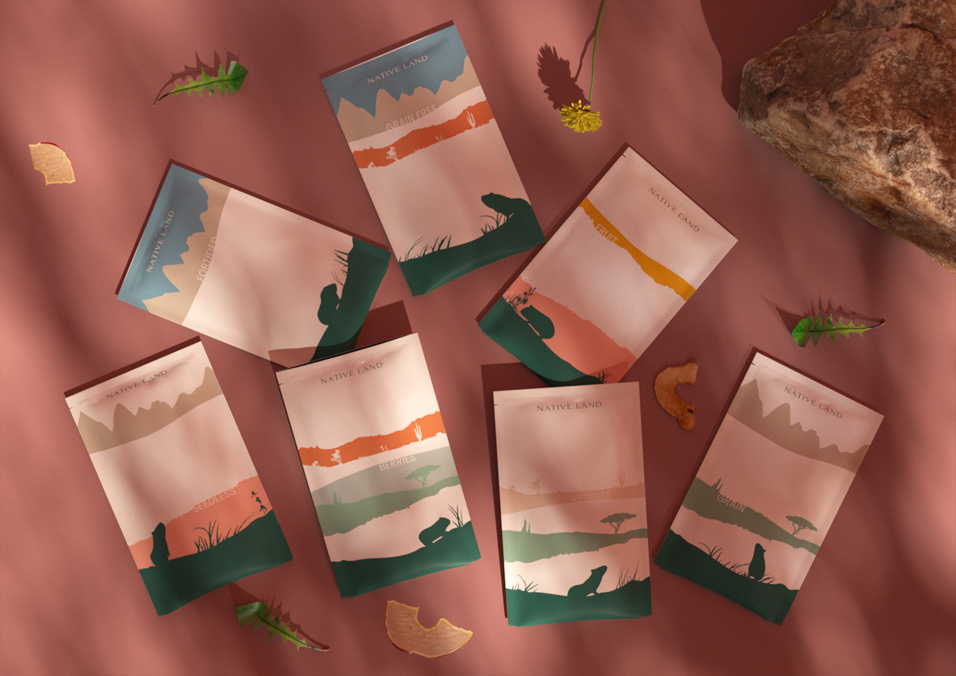
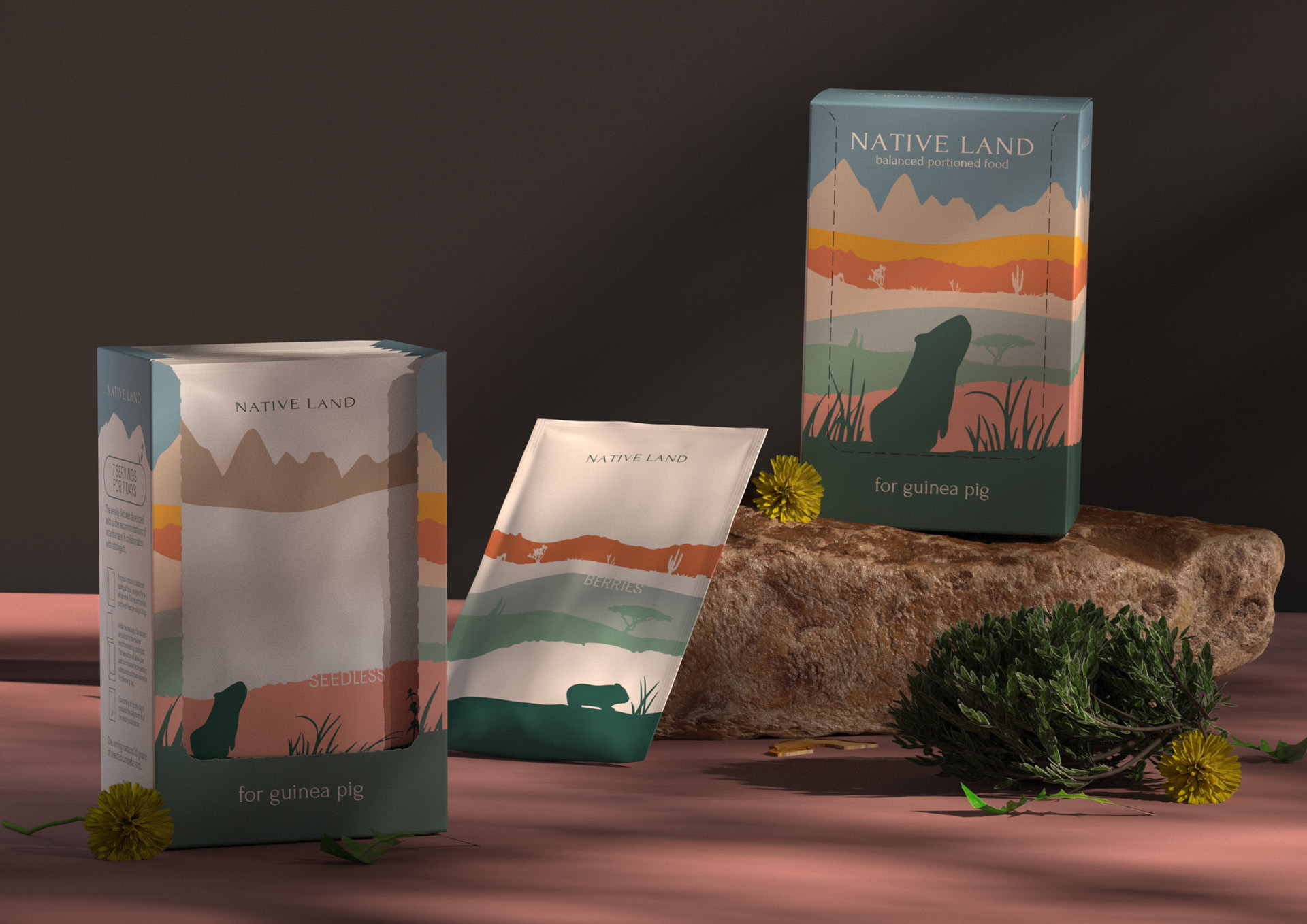
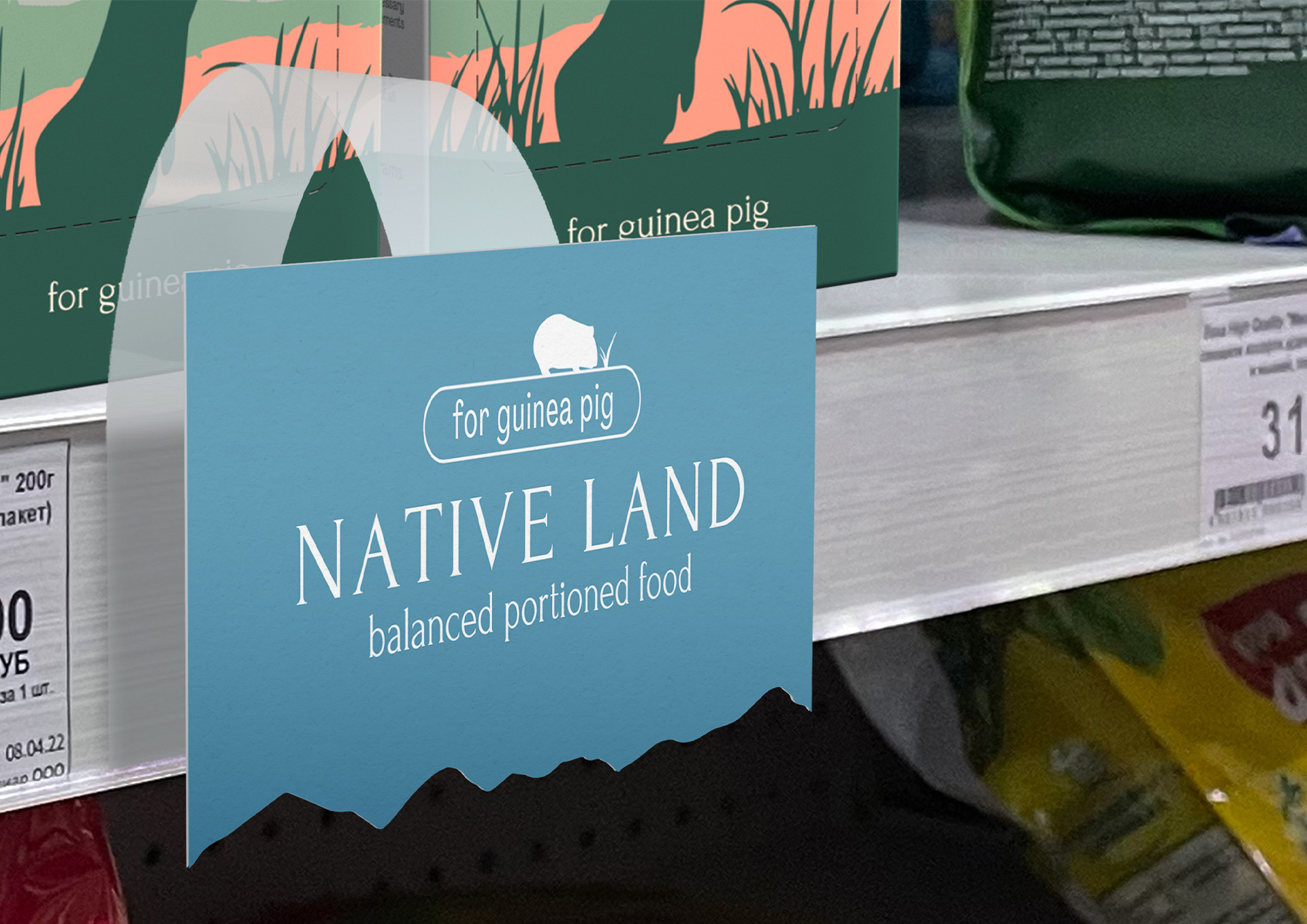
The habitat of a rodent was chosen as a visual metaphor for the main packaging. This graphic style of packaging directly refers to the natural habitat of the rodent and emphasizes the naturalness of the ingredients.
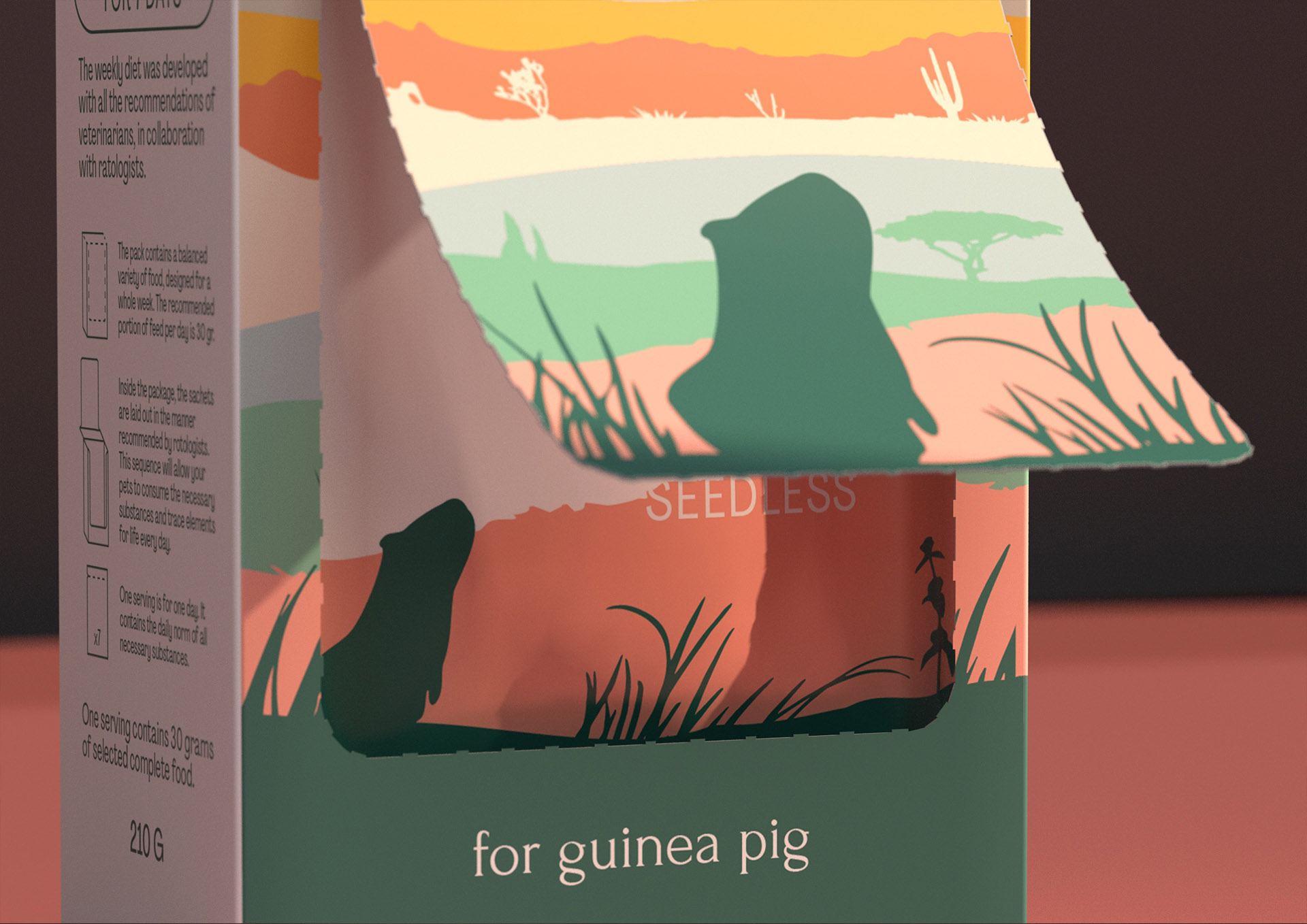
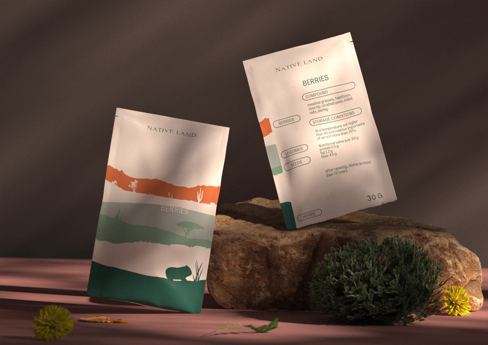
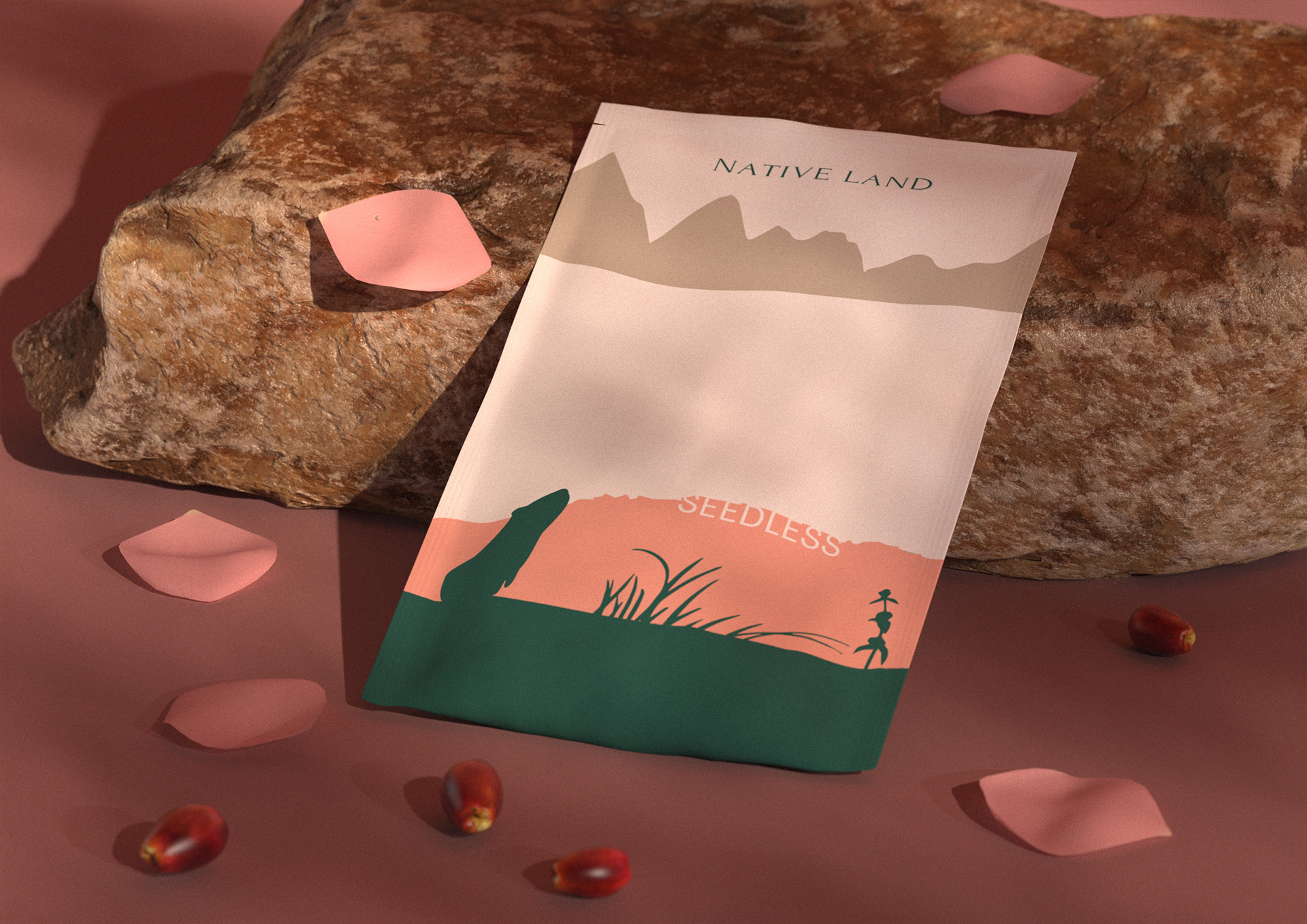
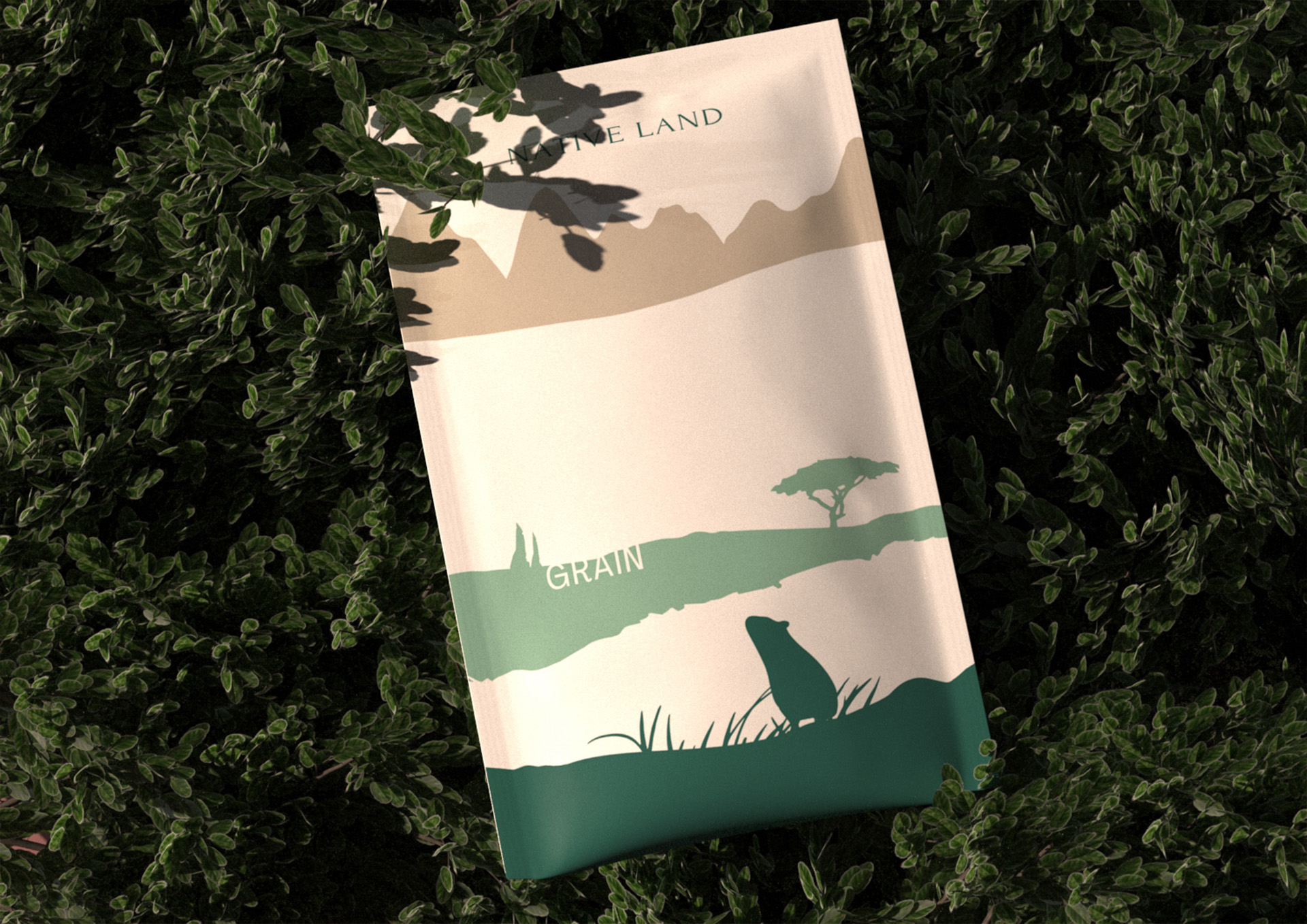
The food is based on 9 main components of the diet. This is reflected in the composite packaging landscape. Each sachet inside the pack has its own unique design and illustrates which food ingredients are in a particular sachet.
The color scheme of the packaging is designed in natural tones and helps the concept to emphasize the naturalness of the food.
The typography of the main package is made in a neutral, soft grotesque, so as not to contradict the metaphor. As for the typography of the bags, it fits into the landscape, thus not drawing much attention to itself and emphasizing the natural origin of the ingredients.
The Native Land brand name reinforces and supports the visual metaphor and promotes proper positioning among product buyers.
The brand logo is made in antique, which should emphasize the expertise and status of the product.
The relevance of this concept lies in the fact that at the moment there are no balanced portioned feeds on the rodent feed market. Pet owners always need to buy several 400g packs of a variety of food that is inconvenient to store. If the food disappears, then the rodents will not eat it.
Inside the main package are seven sachets laid out in the manner recommended by rotologists. This sequence will allow pets to consume substances and microelements necessary for life every day.
CREDIT
- Agency/Creative: Kseniia Ovchinnikova
- Article Title: Packaging Design for Native Land Food for Guinea Pigs
- Organisation/Entity: Student
- Project Type: Packaging
- Project Status: Non Published
- Agency/Creative Country: Russia
- Agency/Creative City: HSE Art and Design School
- Market Region: Europe
- Project Deliverables: 3D Design, Art Direction, Brand Naming, Packaging Design
- Format: Box, Pouch
- Substrate: Pulp Carton, Pulp Paper
- Industry: Food/Beverage
- Keywords: WBDS Student Design Awards 2022/23
- Keywords: feed, portion feed, rodents, guinea pigs
-
Credits:
Art director, graphic designer, motion designer: Kseniia Ovchinnikova
3D-artist: Andrew Polukhov
Curator: Leonid Slavin
Tutor: Yevgeniy Razumov


