


Project Overview:
The packaging design project for Narrow Gauge Orange Soda is an exploration of Maine’s rich heritage and vibrant flavors. Rooted in a profound connection to the heart of Maine, this project aims to create a visually compelling and locally resonant design for a sparkling beverage infused with THC.
Key Project Elements:
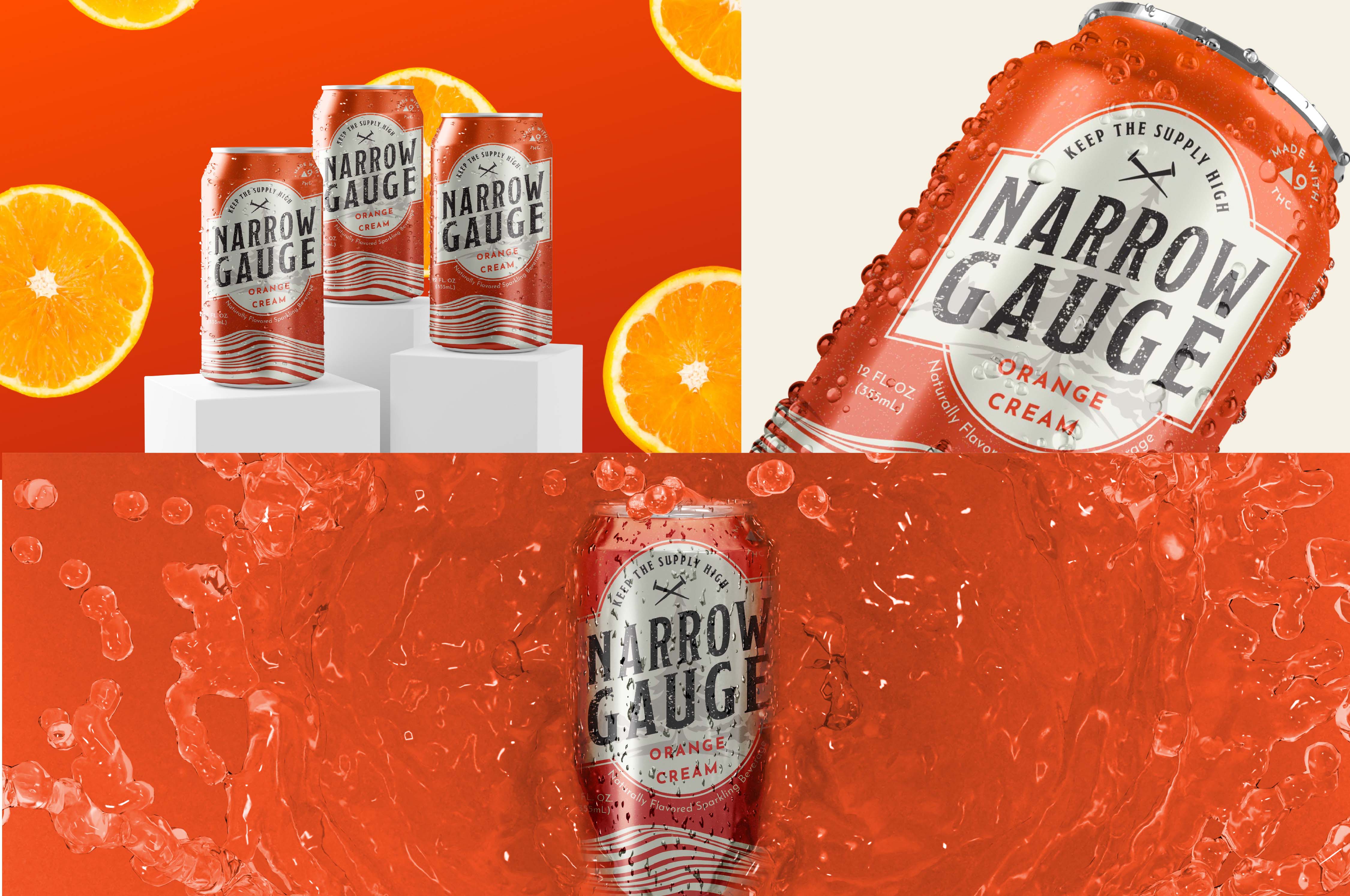
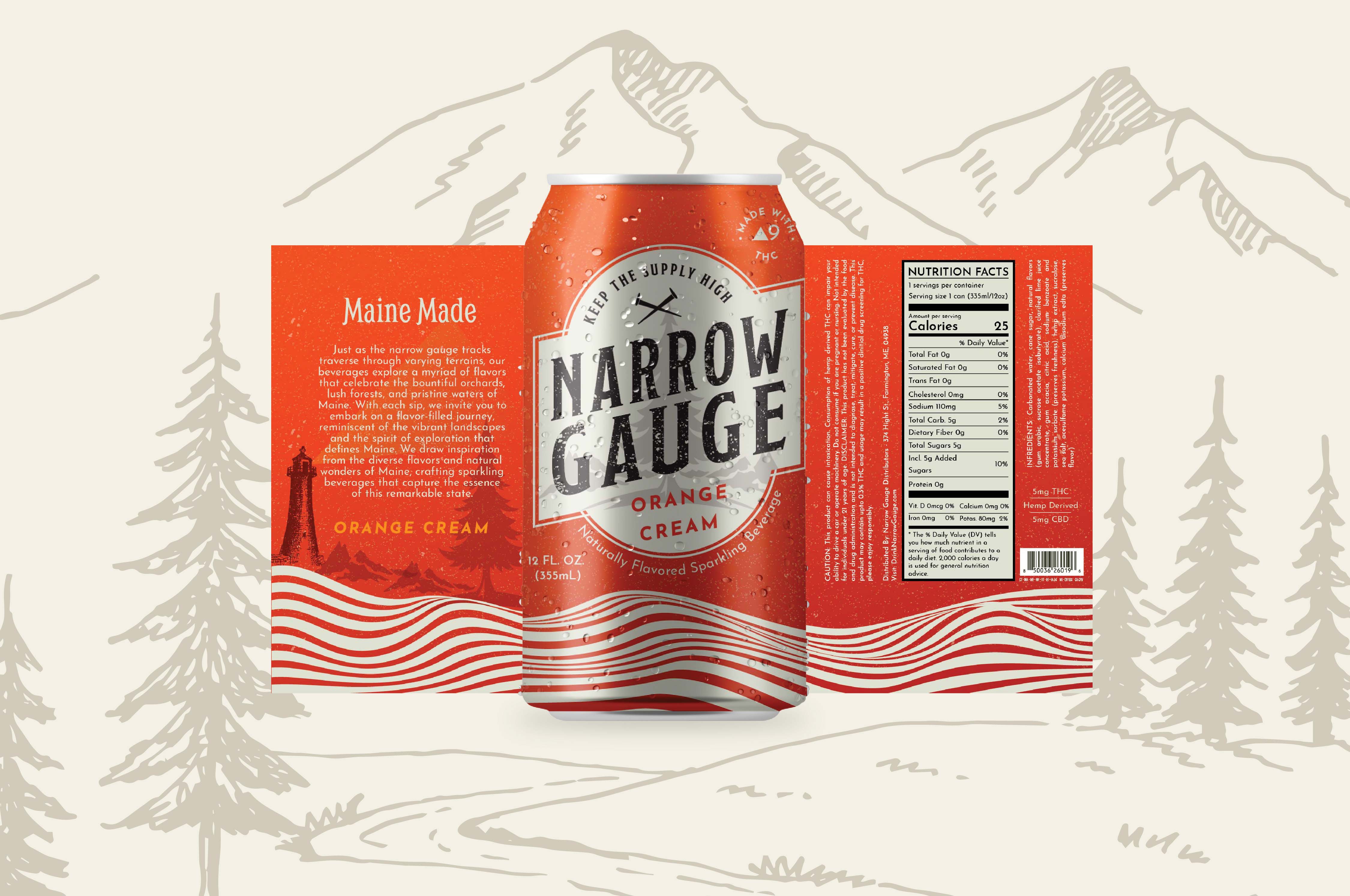
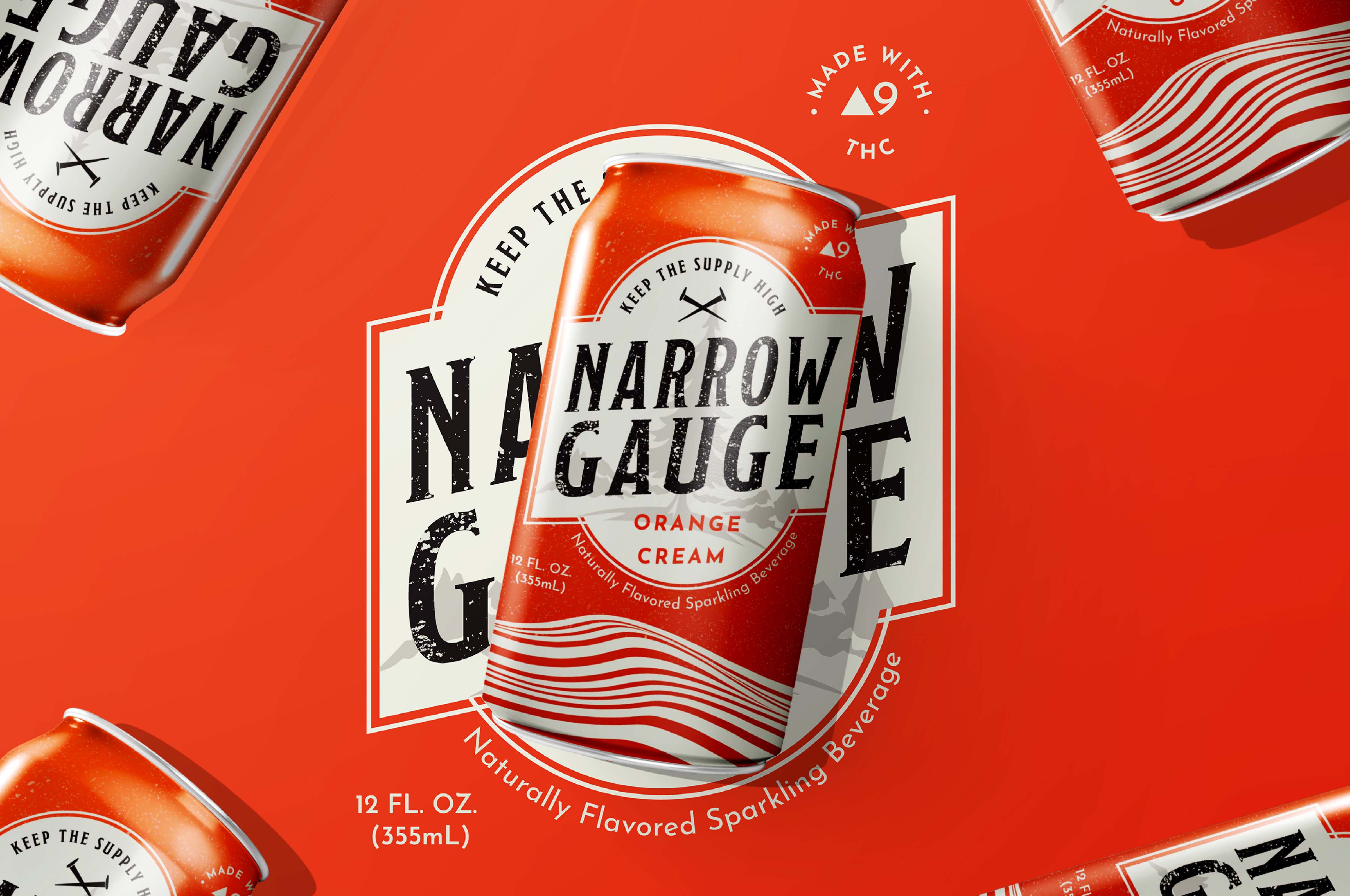
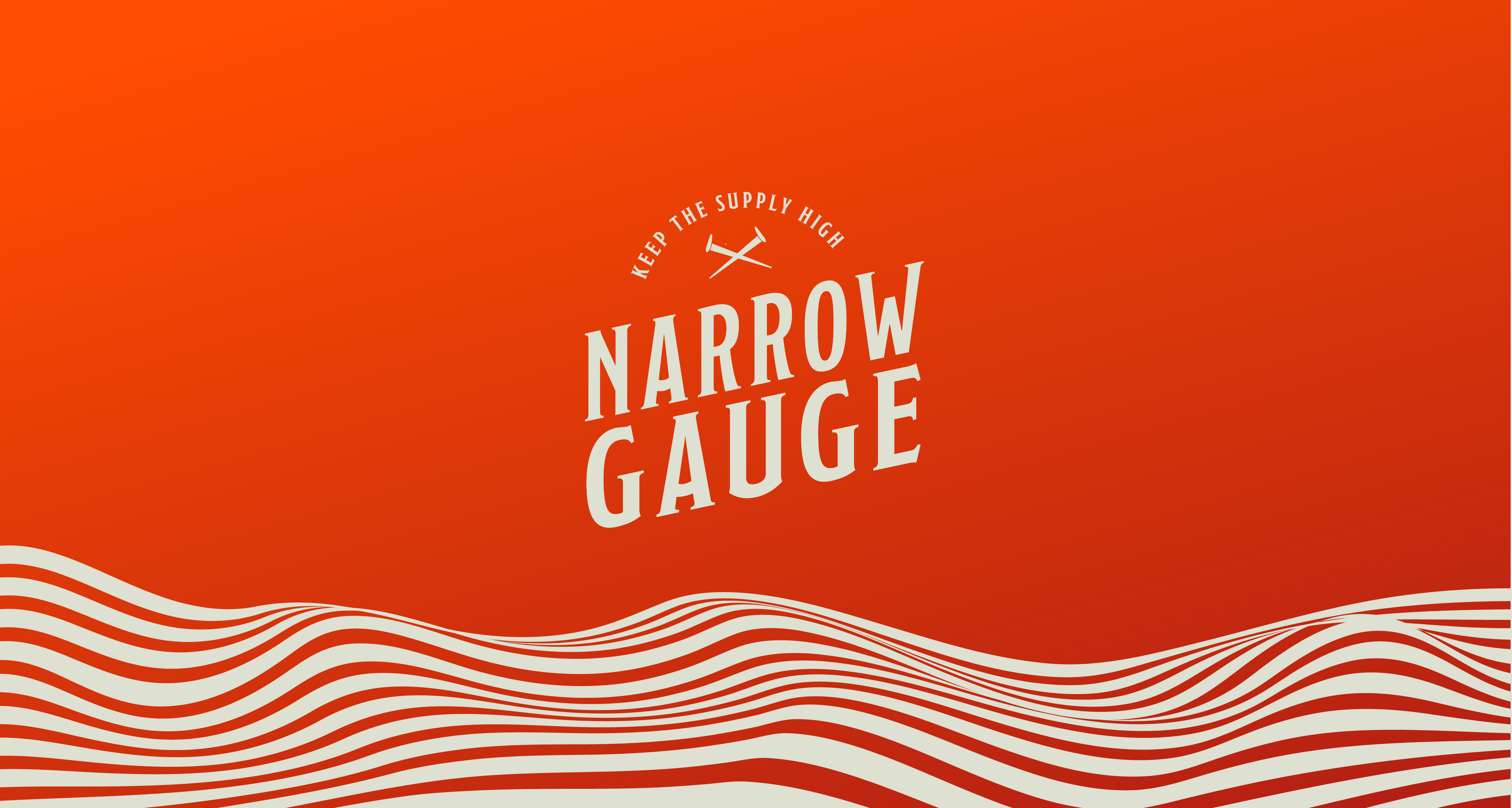
Historical Significance: The narrow gauge railroad, an emblem of Maine’s history, is prominently featured in the packaging. This historic symbol serves as a focal point to evoke the allure of uncharted paths, creating a narrative that connects consumers with the state’s pioneering spirit. Natural Beauty: The majestic mountains and iconic lighthouse that grace Maine’s landscape are woven into the sleeve artwork. These symbols represent the grandeur and maritime charm of the state, instilling a sense of nostalgia and an emotional connection to Maine. Colour Palette: The chosen color palette mirrors the zesty flavor of the beverage. High saturation of orange, combined with earthy tones inspired by Maine’s landscapes, is used to create an eye-catching design that captures the lively essence of the product. Typography: Clean, modern typography is carefully selected to ensure readability and appeal to a broad audience. Elements inspired by vintage railroad and maritime fonts are subtly integrated, preserving a local and relatable feel while maintaining a modern touch. Local Resonance: The packaging design is crafted to resonate with a diverse audience. It evokes nostalgia for locals, entices tourists to take home a piece of Maine’s essence, and attracts beverage enthusiasts with its contemporary appeal.
Project Goals:
Create packaging that tells a compelling visual story about Maine’s heritage and natural beauty. Emphasise the unique flavour profile of Narrow Gauge Orange Soda through the colour palette. Achieve a balance between modernity and tradition in the typography to maintain a local and relatable appeal. Ensure that the packaging design resonates with a wide-ranging audience, including locals, tourists, and beverage enthusiasts. Highlight the connection between the product and Maine’s history, making it more than just a beverage but a part of the state’s culture.
Project Deliverables:
Packaging Design: An eye-catching sleeve artwork that encapsulates Maine’s heritage and flavor. Design Concept Document: A comprehensive document outlining the rationale behind design choices and their significance. Mockups: Visual representations of the packaging design in various contexts, such as on shelves, in stores, and in digital marketing materials. Print-Ready Files: Final design files prepared for production and printing. Brand Guidelines: Guidelines to ensure consistent use of the design across various marketing materials.
CREDIT
- Agency/Creative: Project 1.6
- Article Title: Packaging Design for Narrow Gauge, Maine (Portland)
- Organisation/Entity: Agency
- Project Type: Identity
- Project Status: Published
- Agency/Creative Country: India
- Agency/Creative City: Bengaluru
- Market Region: Asia
- Project Deliverables: Brand Design, Brand Guidelines, Brand Identity, Packaging Design, Packaging Guidelines
- Industry: Food/Beverage
- Keywords: Brand Identity, Visual, Illustration, Brand guidelines
-
Credits:
Creative Director: Varsha Rao


