


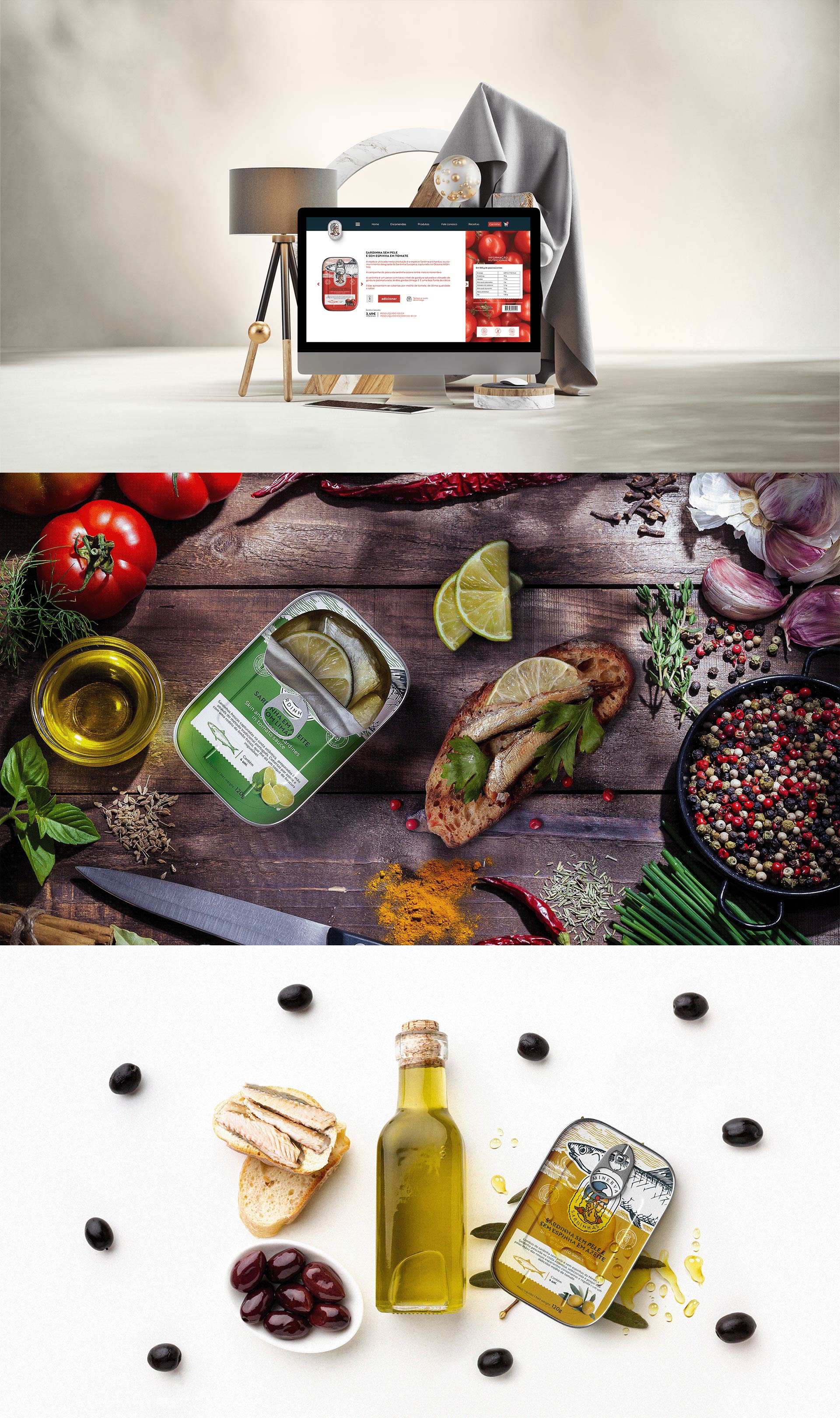
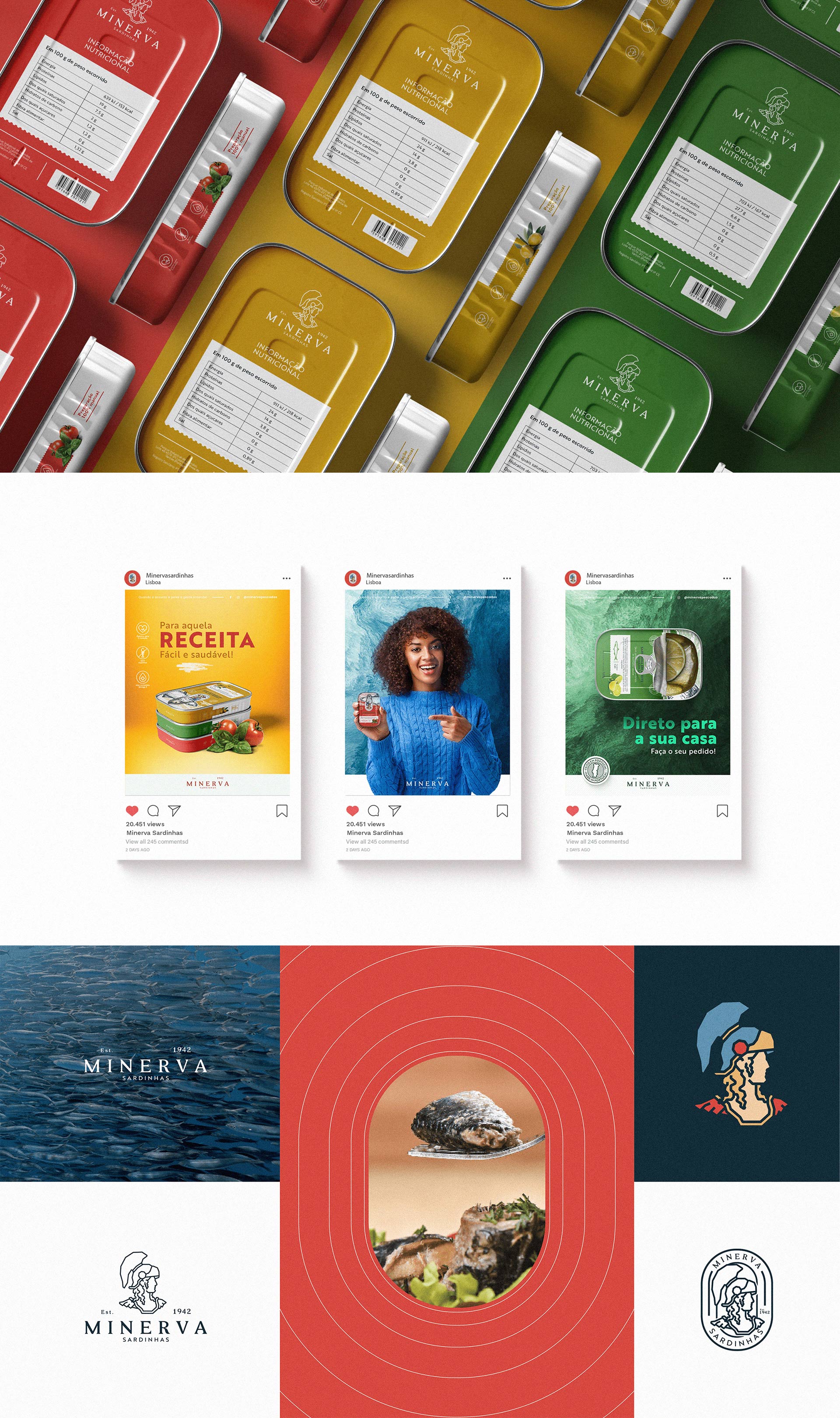
Conservas Minerva It’s about elegant, minimalist, ironic, vintage, innovative, romantic packaging and more. What they certainly have in common is their aesthetic beauty , a factor that cannot be underestimated considering the time we are living in.
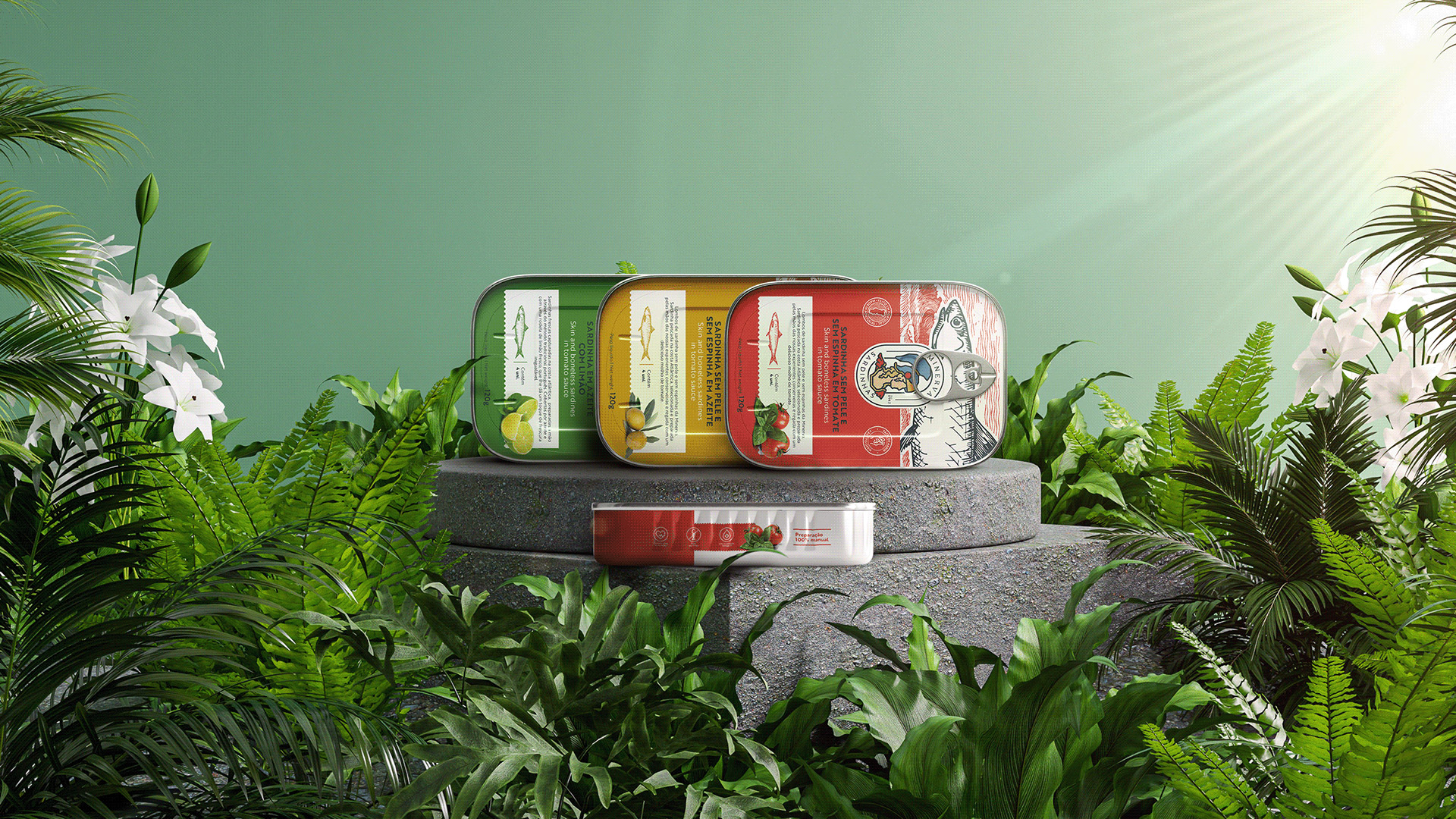
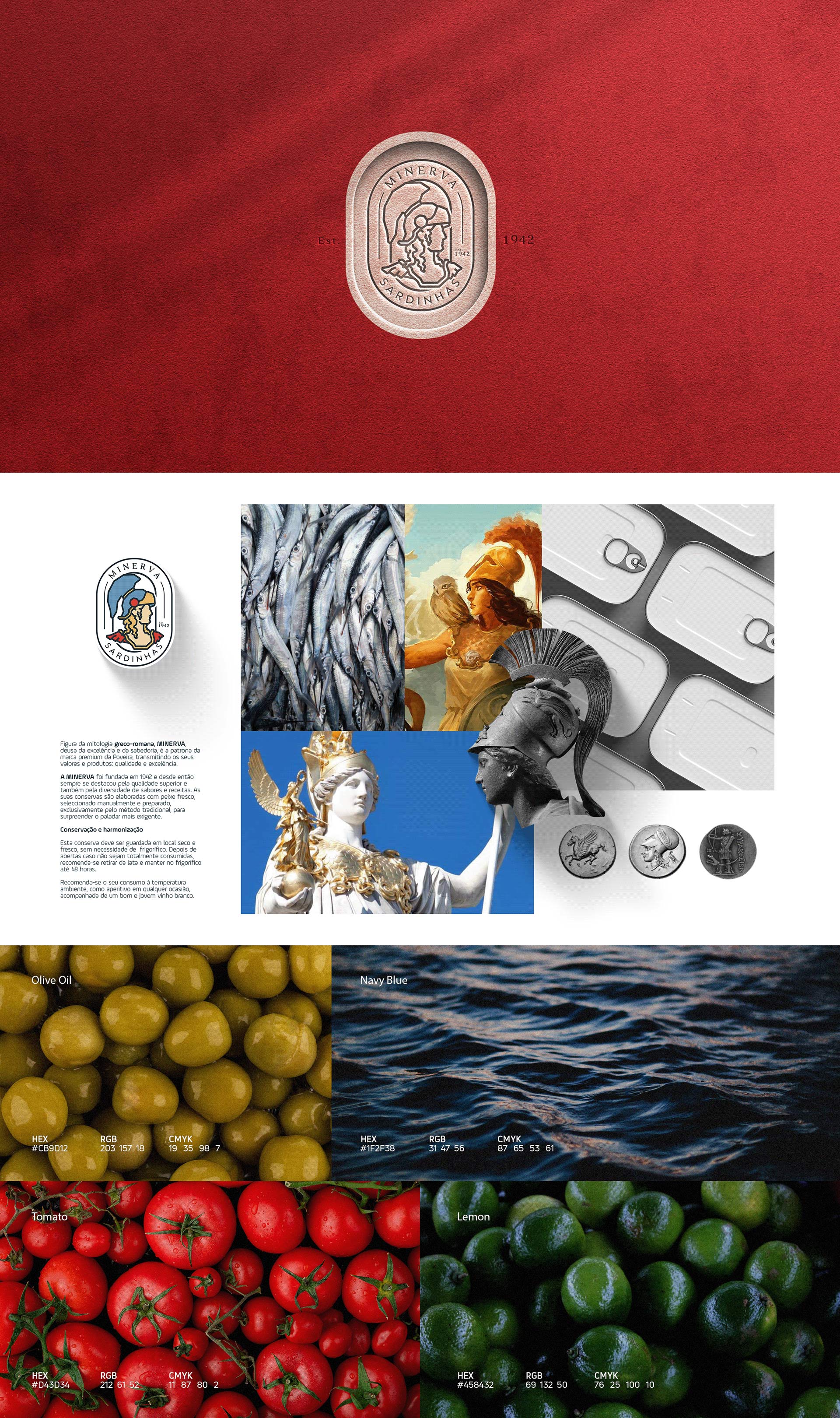
A figure from Greco-Roman mythology, Minerva, goddess of excellence and wisdom, is the patron of the premium brand of Poveira, transmitting its values and products: quality and excellence.
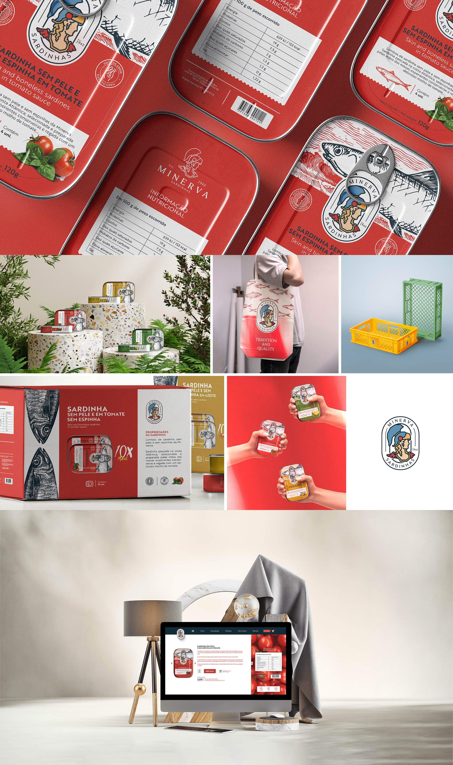
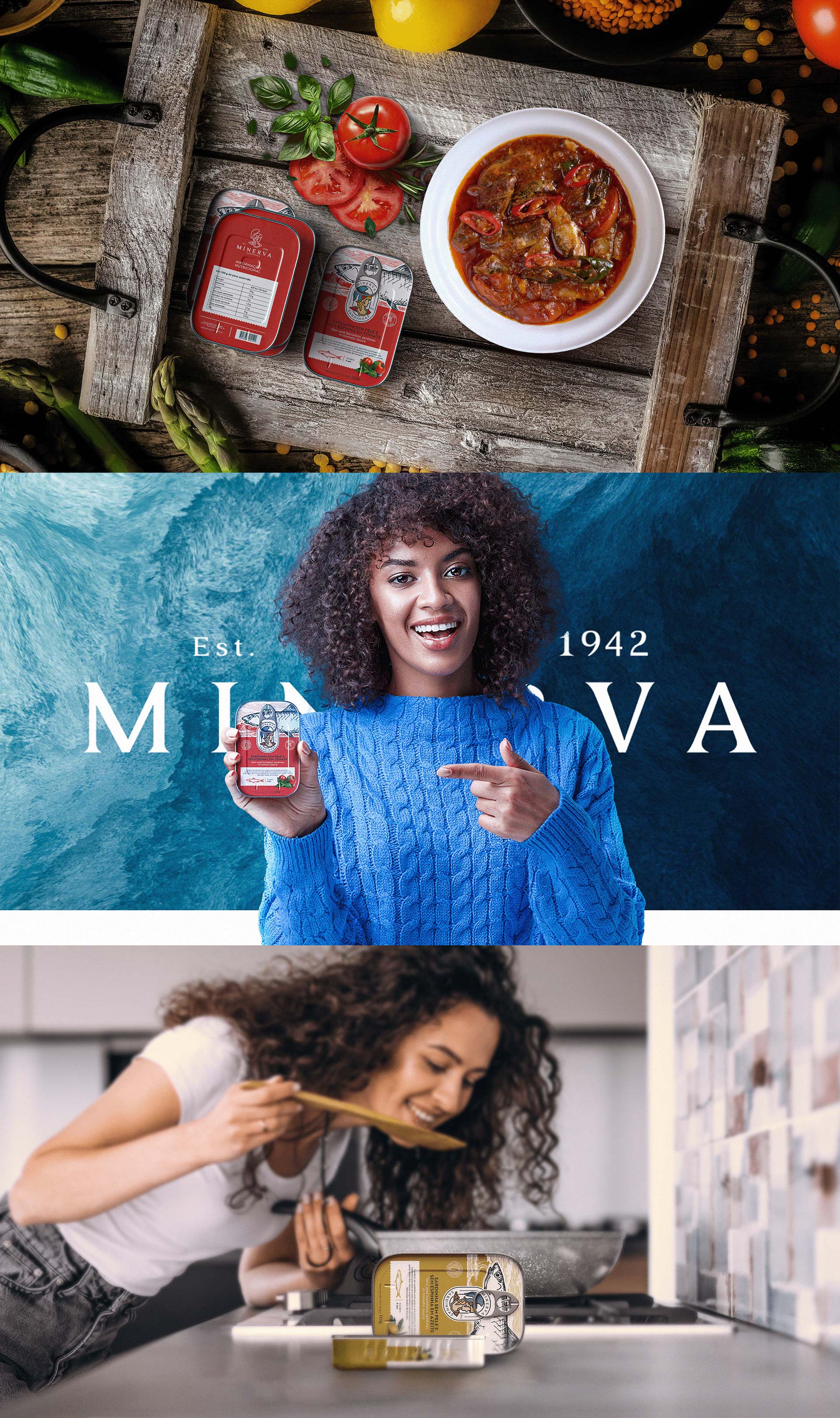
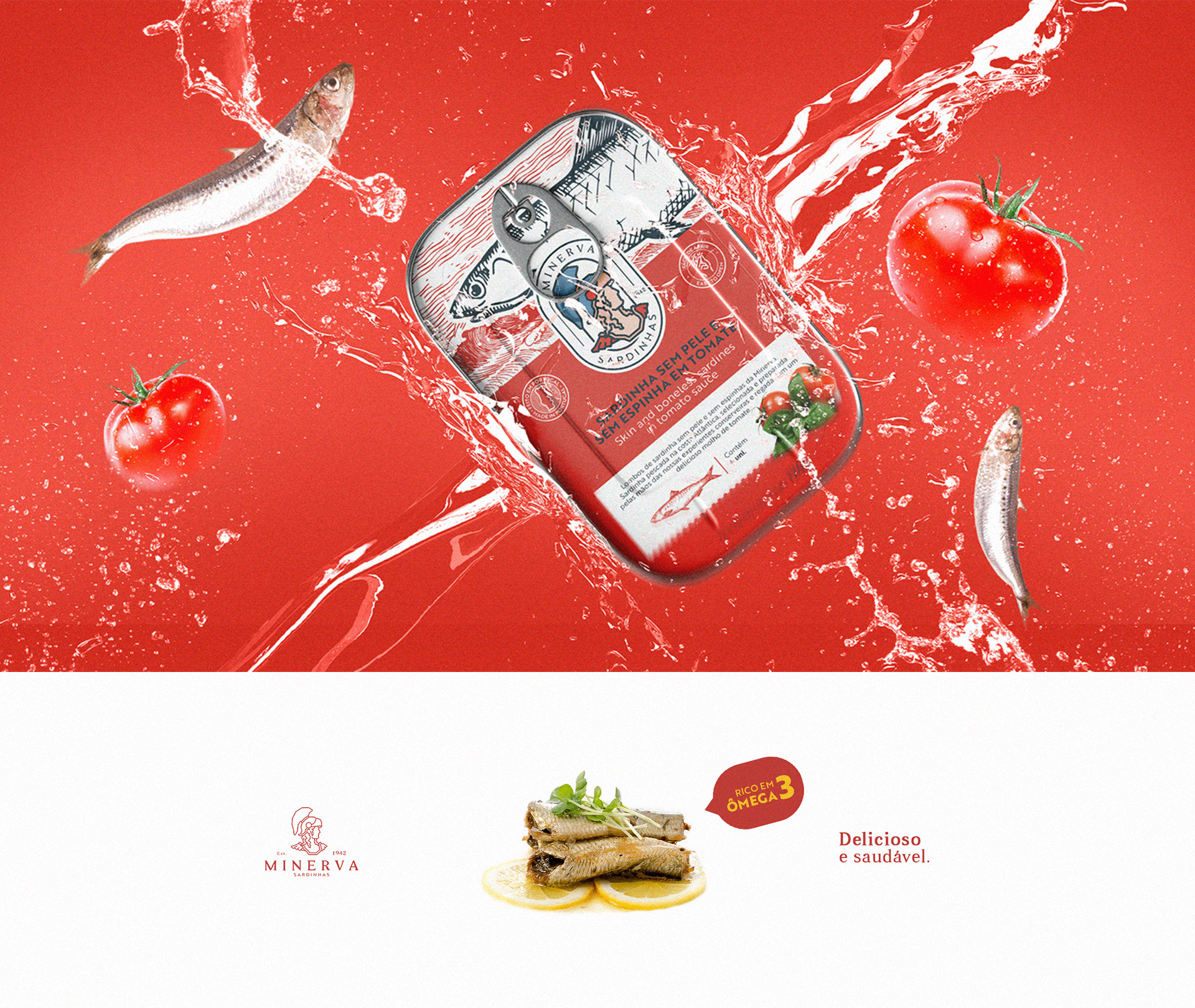
Minerva was founded in 1942 and since then has always stood out for its superior quality and also for the diversity of flavors and recipes. Its canned foods are made with fresh fish, selected manually and prepared, exclusively by the traditional method, to surprise the most demanding palate.
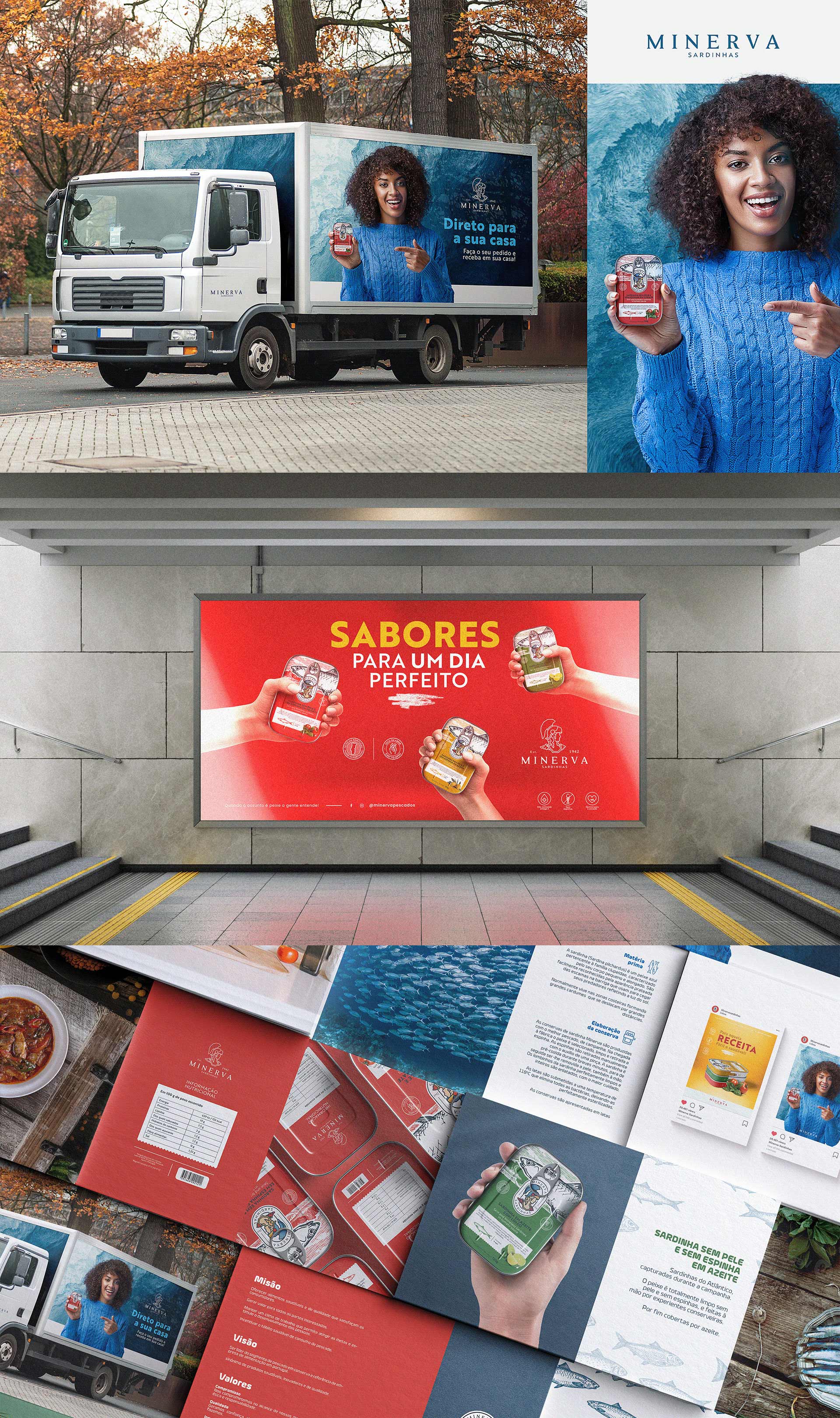
The company values a healthy eating option for everyday life that, in addition to doing you good, is very tasty, practical and versatile. At a Poveira we are fully committed to the responsible use of marine resources, with a view to protecting the sustainability of fisheries, as well as preserving nature
Mission
– Offer healthy and quality food that satisfies consumers.
– Generate value for all stakeholders.
– Maintain a work climate that allows the achievement of goals and encourages the development of people.
– Encouraging healthy eating habits.
Vision
– To be the leader in the canned fish segment and a reference for a food company in Portugal, synonymous with healthy, innovative and quality products.
Values
– Commitment: We are committed to achieving our goals by acting ethically and responsibly.
– Quality: We generate trust by achieving excellence in everything we do.
– Innovation: We anticipate applying new ideas to exceed expectations.
– Since 1942, elevating canned fish thanks to the excellence of the ingredients, which blend perfectly with the most demanding tastes.
CREDIT
- Agency/Creative: Studio cadmus
- Article Title: Packaging Design for Minerva Canned Food
- Organisation/Entity: Agency
- Project Type: Packaging
- Project Status: Published
- Agency/Creative Country: Brazil
- Agency/Creative City: Acaraú
- Market Region: Europe
- Project Deliverables: Art, Brand Design, Brand Mark, Brand Redesign, Graphic Design, Logo Design, Packaging Design
- Format: Box, Tin
- Substrate: Metal, Pulp Carton
- Industry: Food/Beverage
- Keywords: sardinha, sardine, PACKAGING, VISUAL IDENTITY, EMBALAGEM, BRAND DESIGN, BRAND IDENTITY
-
Credits:
Brand designer pleno: anderson carlos silveira


