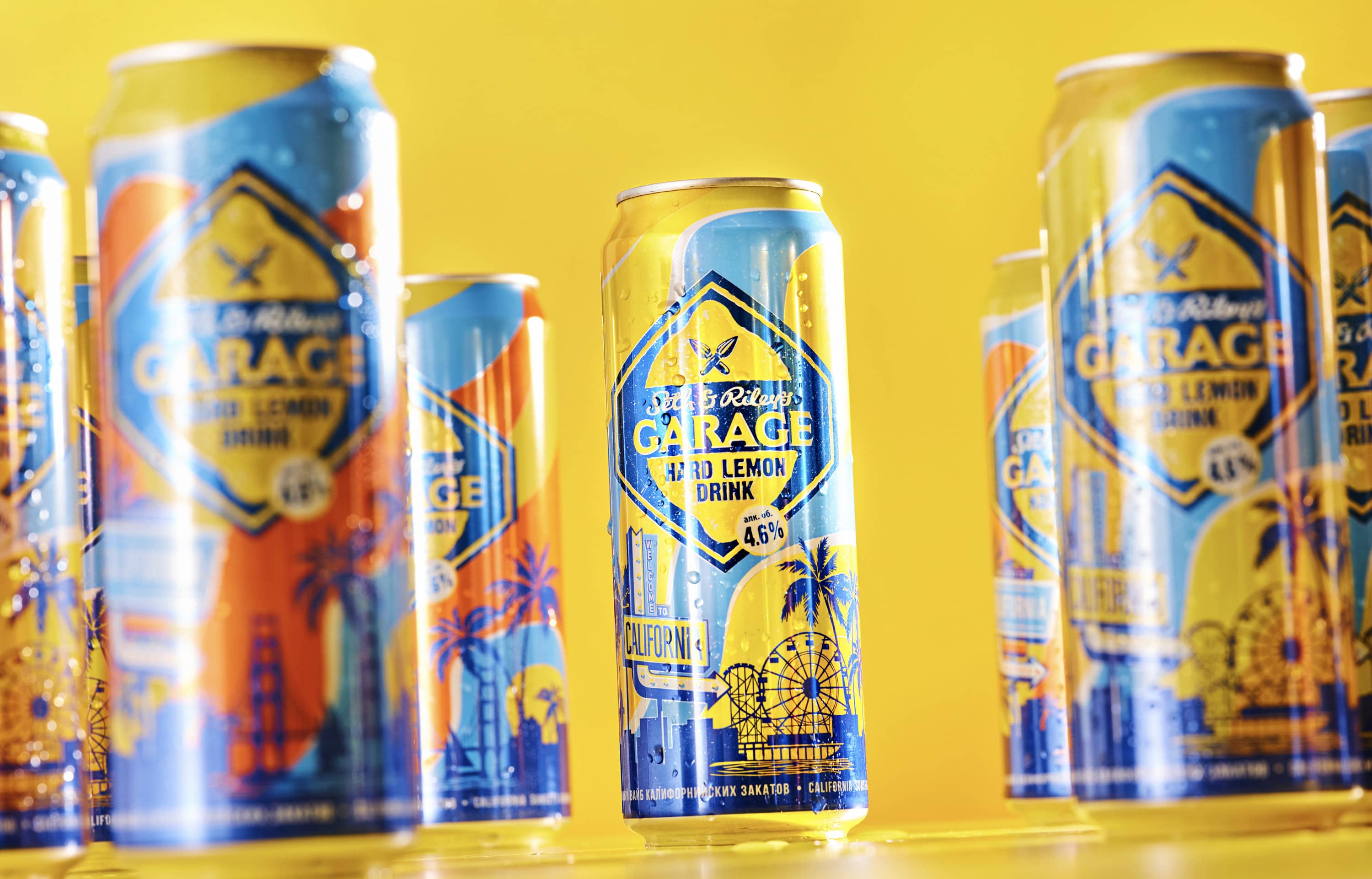
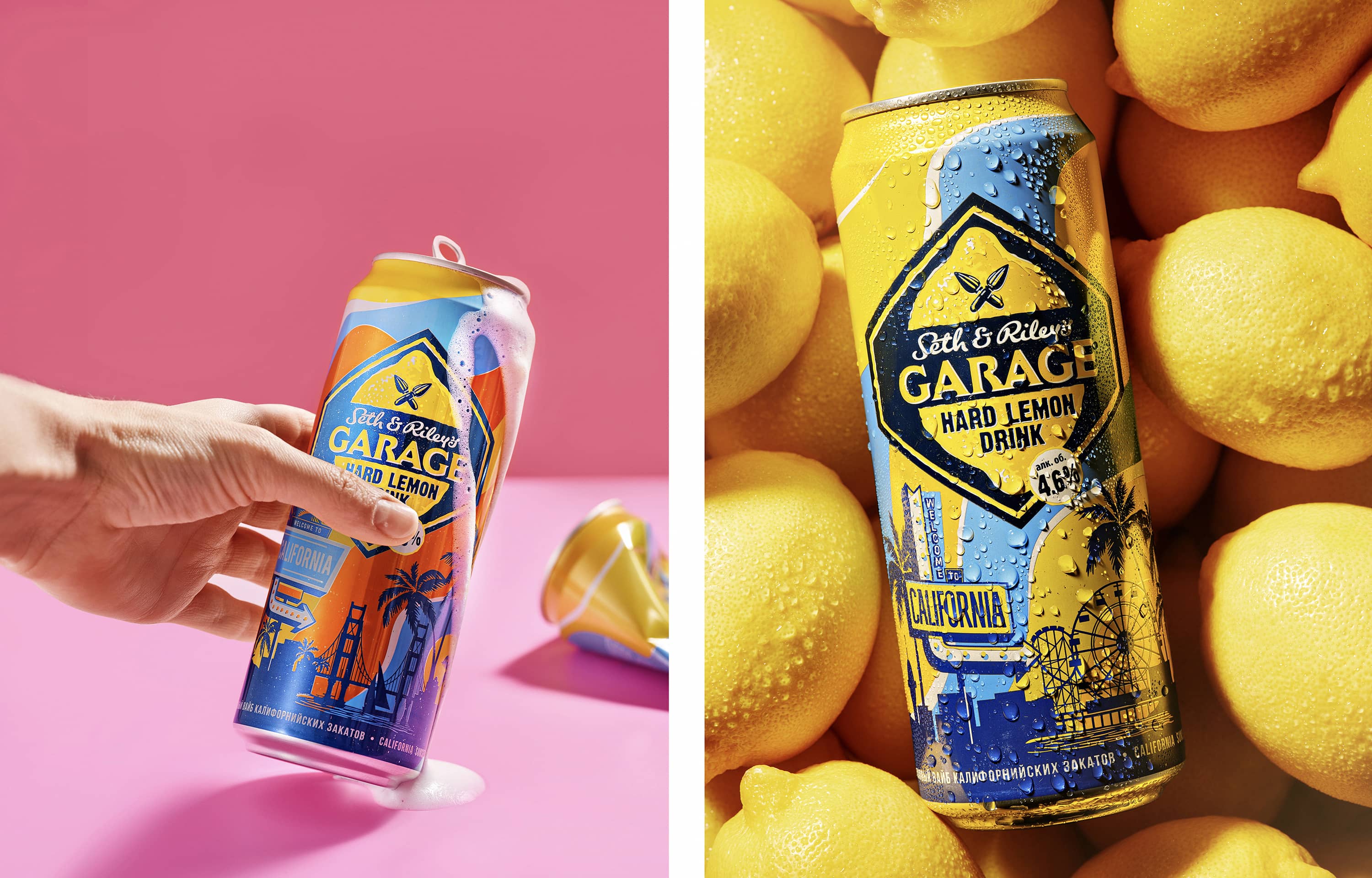
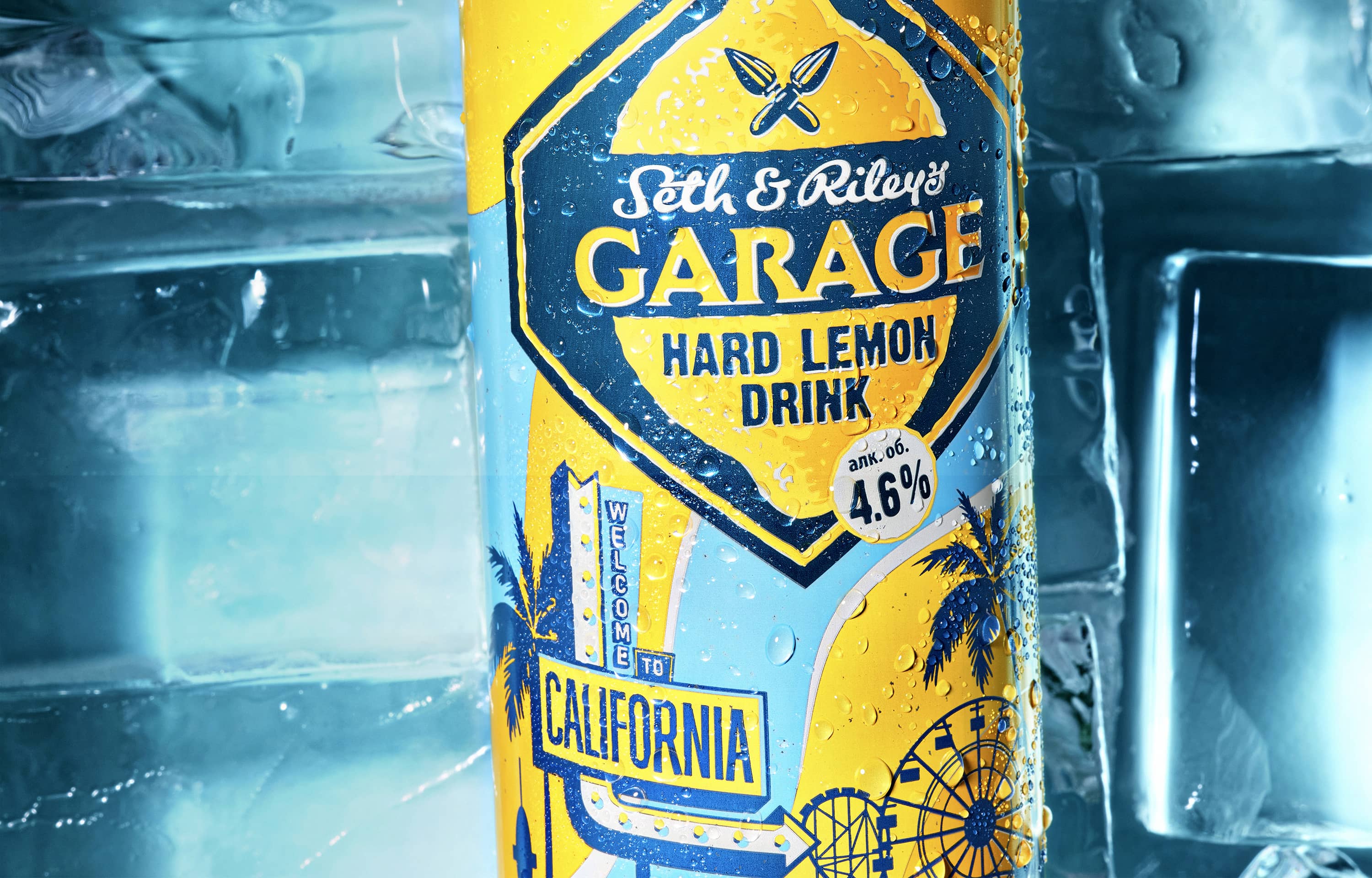
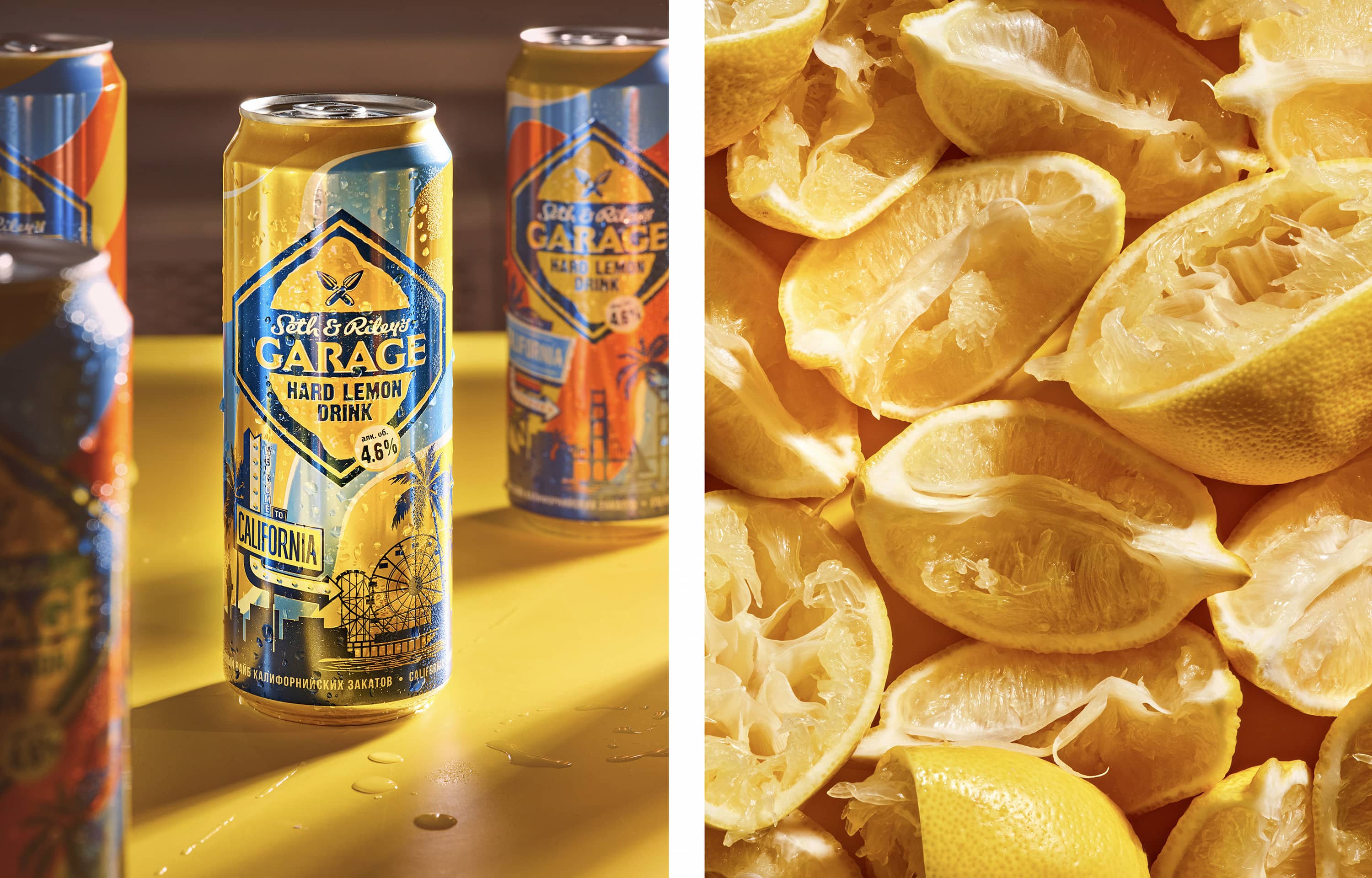
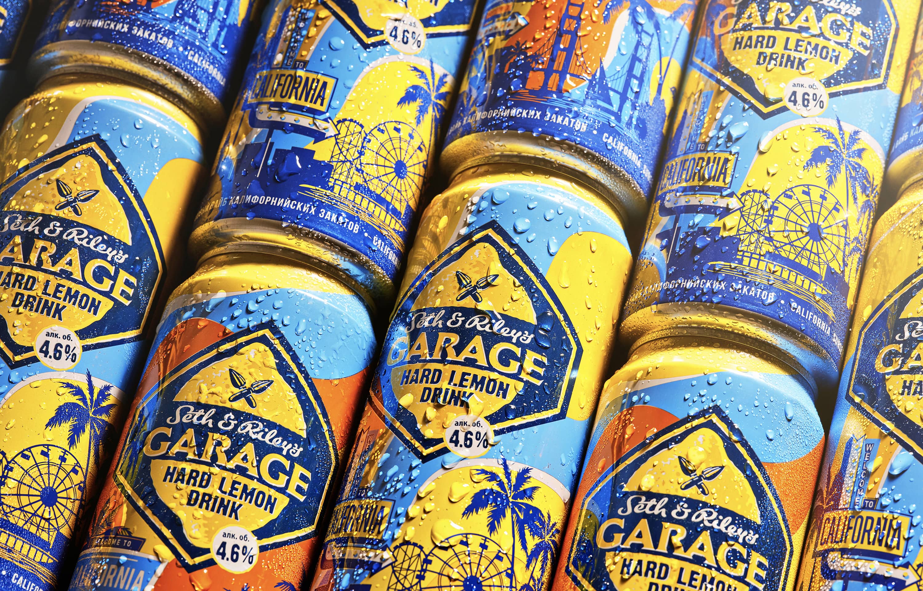
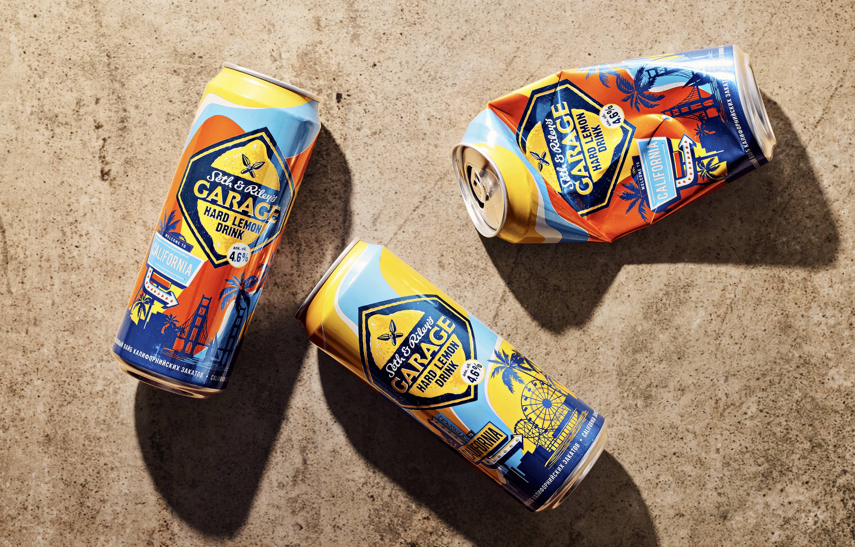
What do we know about California? Some will say that it is always sunny there, but we will tell you that California is very different. The limited edition series consists of two cans in which we tried to capture all the colours of the soft sunset, nevertheless, bright saturated colours accompany us on this 24/7 California trip. In the illustration, we have reflected the most recognizable tourist points of attraction: the Golden Gate Bridge, Santa Monica Piers, sandy beaches and a modern urban skyline that creates a beautiful contrast with the rich nature of national parks and the relaxed vintage mood of worn diners and neon signs. The packaging design turned out to be bright, but at the same time relaxed and natural. The design is filled with details and references to the real California.
The drink itself has nothing to do with California, it was invented in Europe and is also sold mainly in Europe. Meanwhile, it was necessary to create a recognizable image for the audience, and with tourist places like California, you have to work through a system of images and stereotypes. In addition, one of the limitations of the work on the project was the requirement that images of people or animals cannot be placed on the packaging. This complicated and limited the emotional component of the packaging, so I had to pay maximum attention to colour and geometry in the form of waves that carry the Californian mood, and tune in to the right vibe.
It is also worth paying attention to the colour scheme. The main colours of the Garage brand are yellow and blue. Despite the bright and full-colour illustration, we needed to keep the colour perception right so that the limited edition retains its continuity and is perceived as a continuation of the main line because there was nothing new in the taste of this drink.
CREDIT
- Agency/Creative: PG Branding
- Article Title: Packaging Design for Garage Limited Edition
- Organisation/Entity: Agency
- Project Type: Packaging
- Project Status: Published
- Agency/Creative Country: Poland
- Agency/Creative City: Warsaw
- Market Region: Europe
- Project Deliverables: Advertising Photography, Illustration, Packaging Design
- Format: Can
- Substrate: Metal
- Industry: Food/Beverage
- Keywords: packaging design illustration beer
-
Credits:
Creative Director: Dzianis Valianski


