Alfonso Paolini – Friscous by Petramarè
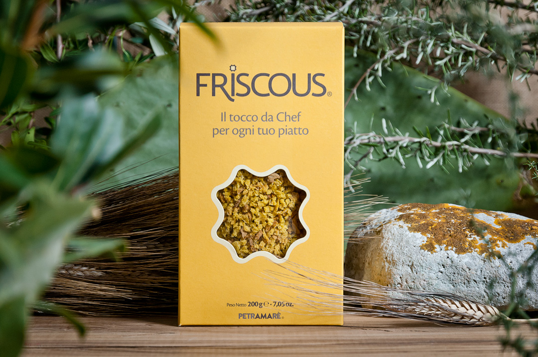
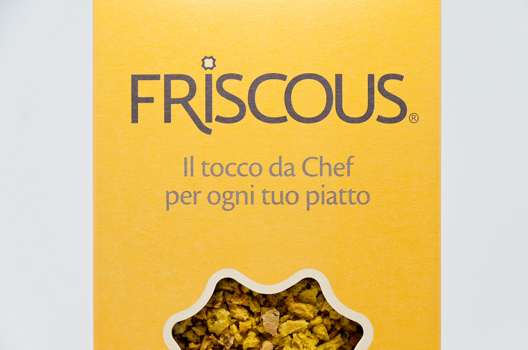
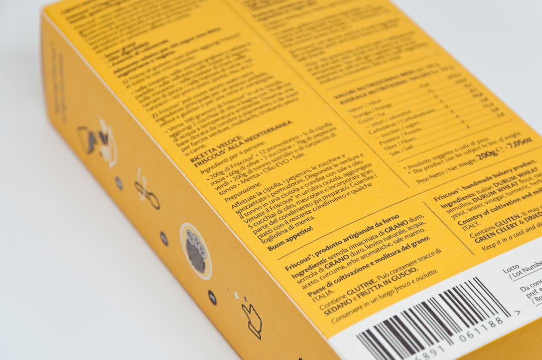
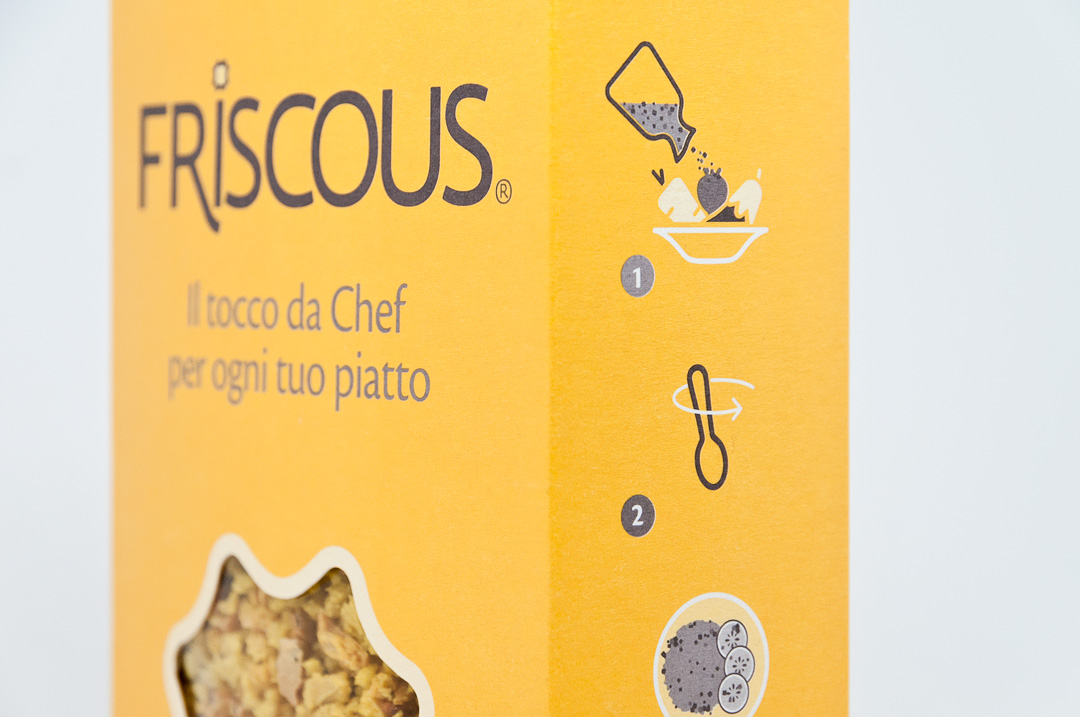
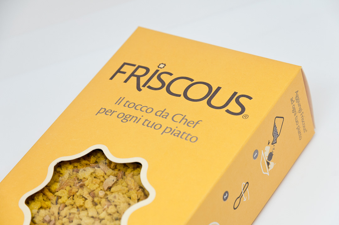
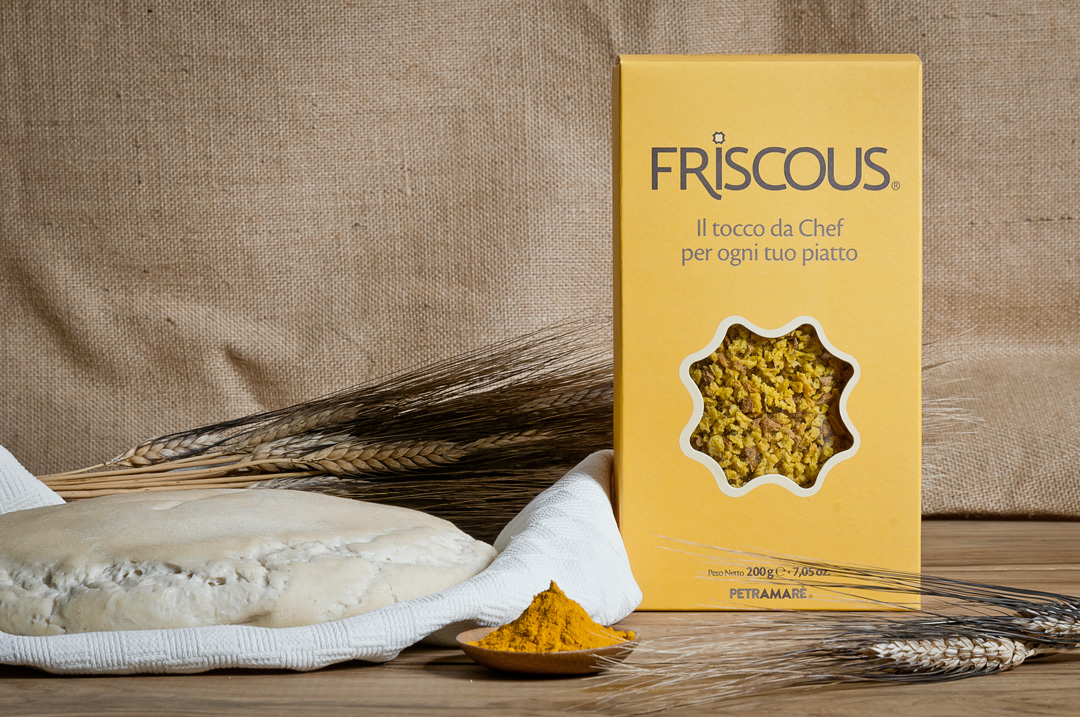
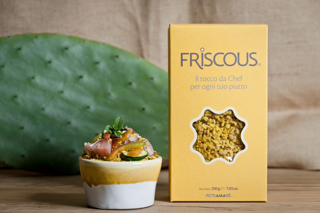
The project consisted in redesign the Friscous® brand, to break into the fine cuisine market with a professional image.The chromatic decision (yellow and tobacco brown colors) was studied based on the ingredients used to create the Friscous® products, such as wheat and turmeric, in order to reflect from the very first moment that it is a cereal and a culinary product.We are looking to activate intuitive language by association, using the least amount of elements in the composition and graphic organization: the yellow tone, besides reflecting the turmeric and the Friscous grains final color, it’s very recognisable by the human eye from afar.The window in the box is a graphic synthesis of the grain placed in the design of the Friscous logo, and on the side there is an infography that explains in very brief and simple steps how to use the product.Besides the cleanliness of the composition, another important consideration to be made is that for the final project it was decided to print with only two Pantone colors to help the customer to keep the box production costs down.
CREDIT
- Agency/Creative: Alfonso Paolini
- Article Title: Packaging Design For Friscous:Taste And Wellness From The Mother Yeast And Turmeric
- Organisation/Entity: Freelance, Published Commercial Design
- Project Type: Packaging
- Agency/Creative Country: Italy
- Market Region: Europe
- Format: Box
- Substrate: Pulp Carton


