Hired Guns Creative – Original Gravity Hazy IPA
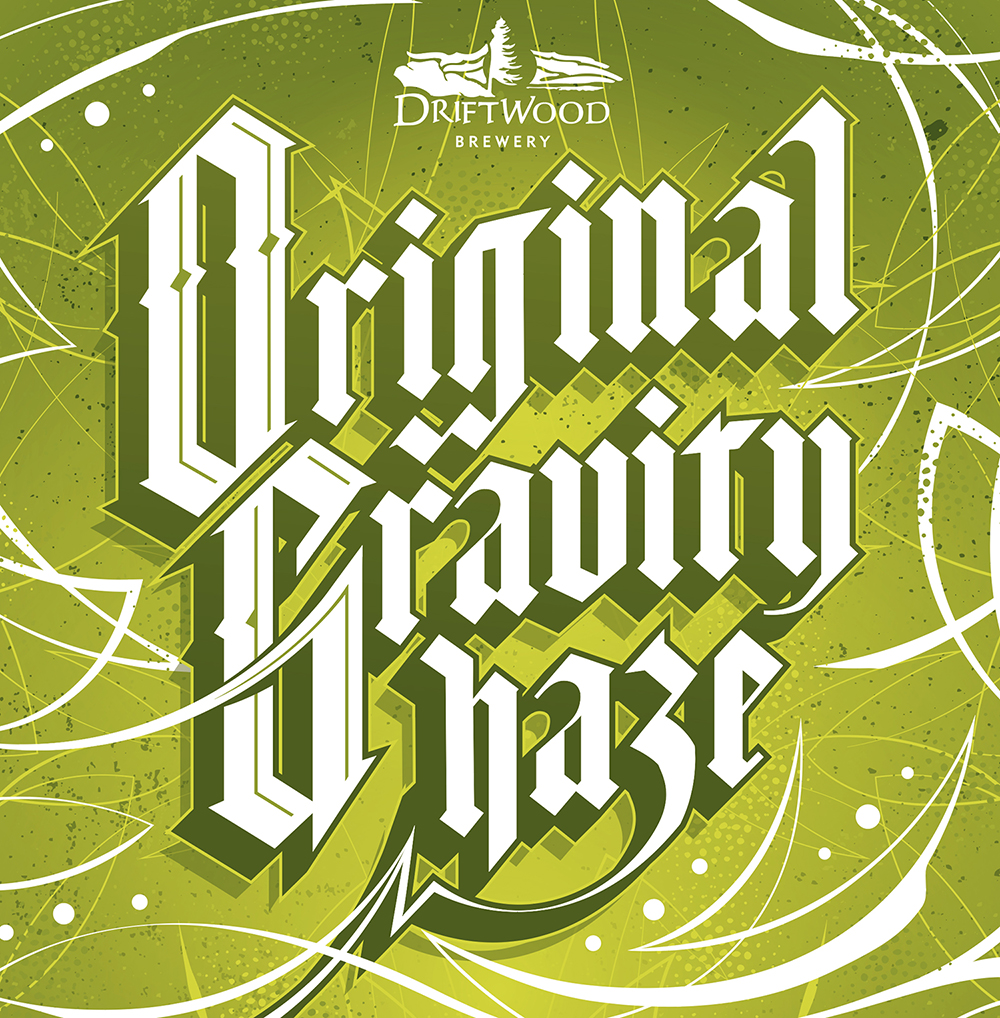
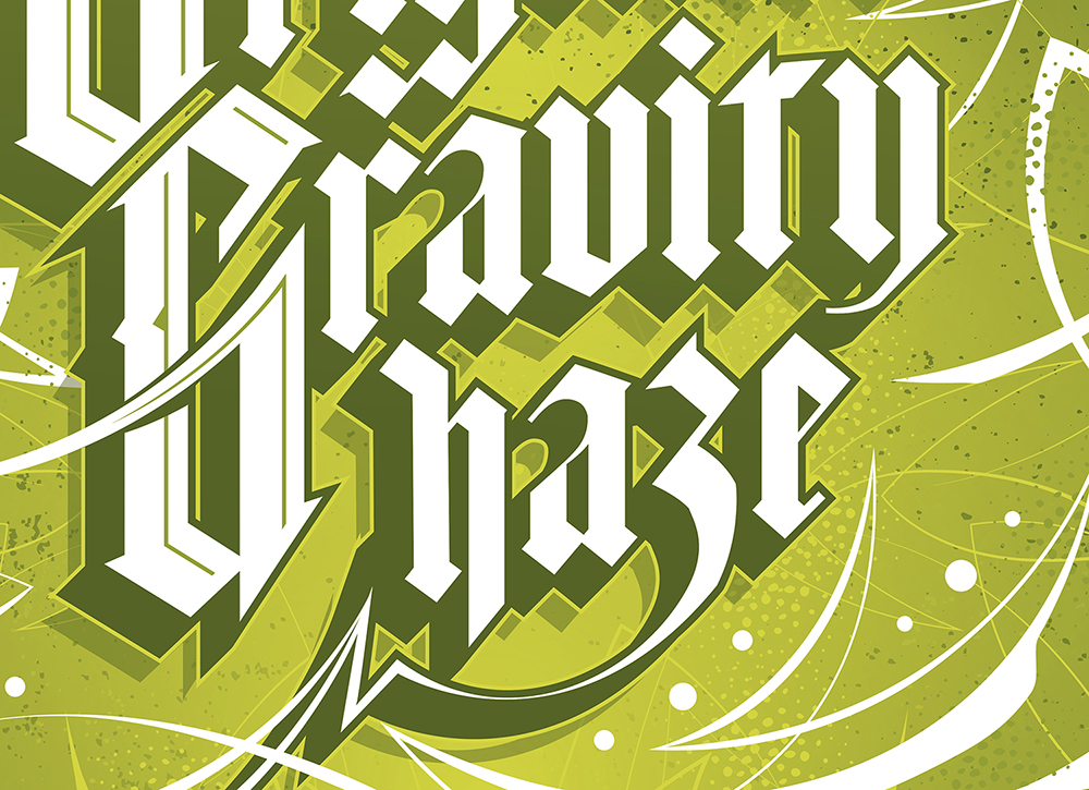
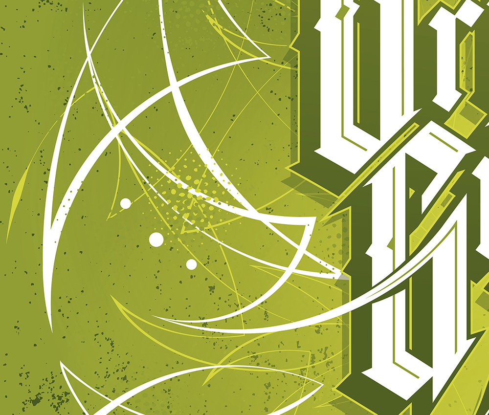
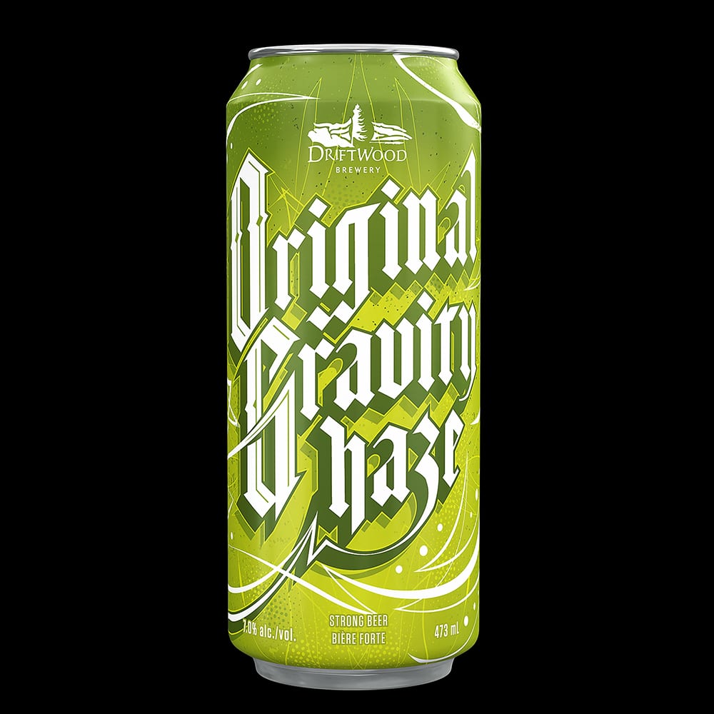
For Driftwood Brewery’s new Original Gravity Hazy IPA, we used hand-lettered calligraphy, the capital O and G inspired by the “Original Gangsta” graffiti of the late 80s and early 90s. For this design, we wanted to take a beer known for its northeast roots and tag it with west coast style, to create a connection to the infamous east-vs-west hip hop rivalries of the era.Original Gravity refers to a measurement taken during the brewing process, but the OG on this label has a deeper meaning—from Original Gangsta to Ocean Grown. The shorthand for this brew, “OG Haze,” is something most West Coasters will connect with. True to the style, Original Gravity comes on with citrusy brightness followed by a smooth, euphoric cloud of haze, just as the bright, stylized type treatment—the standout on this design—is set against a backdrop of cloudy green hues. With just three words, this design says everything it needs to—OG Haze is a true original, the last word in hazy IPAs.


CREDIT
- Agency/Creative: Hired Guns Creative
- Article Title: Packaging Design for Driftwood’s Original Gravity Hazy IPA
- Organisation/Entity: Agency, Published Commercial Design
- Project Type: Packaging
- Agency/Creative Country: Canada
- Market Region: North America
- Format: Can
- Substrate: Metal, Plastic


