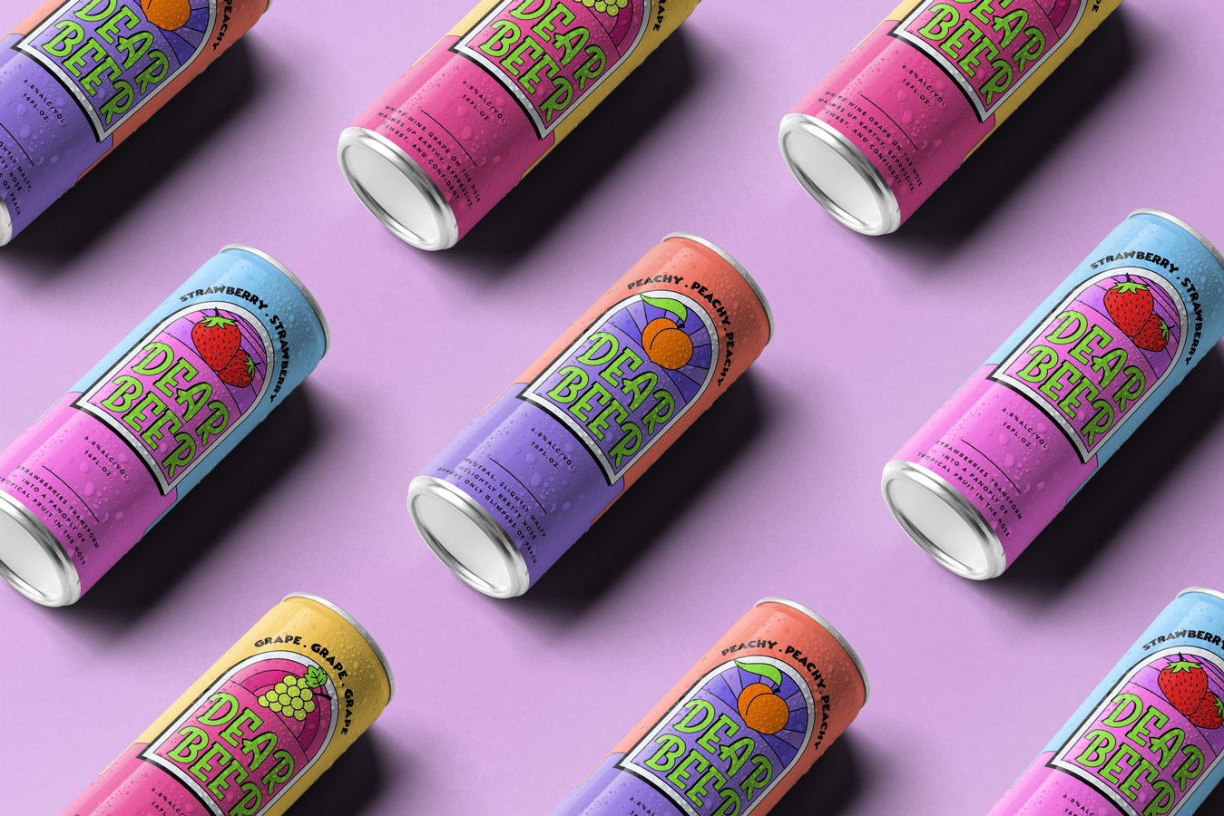
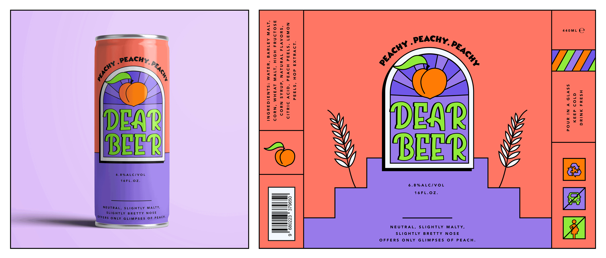
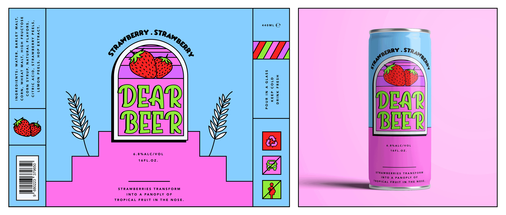
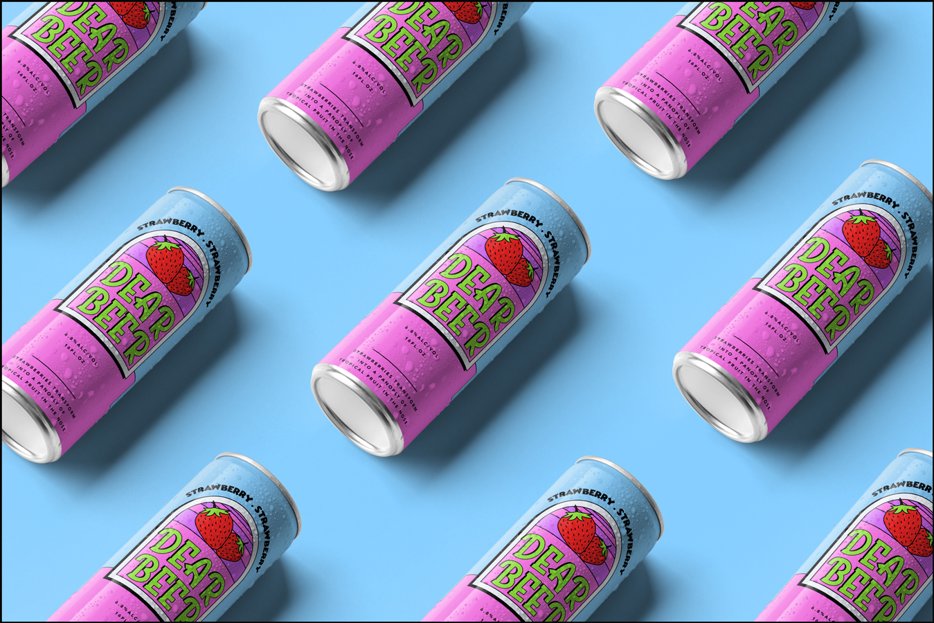
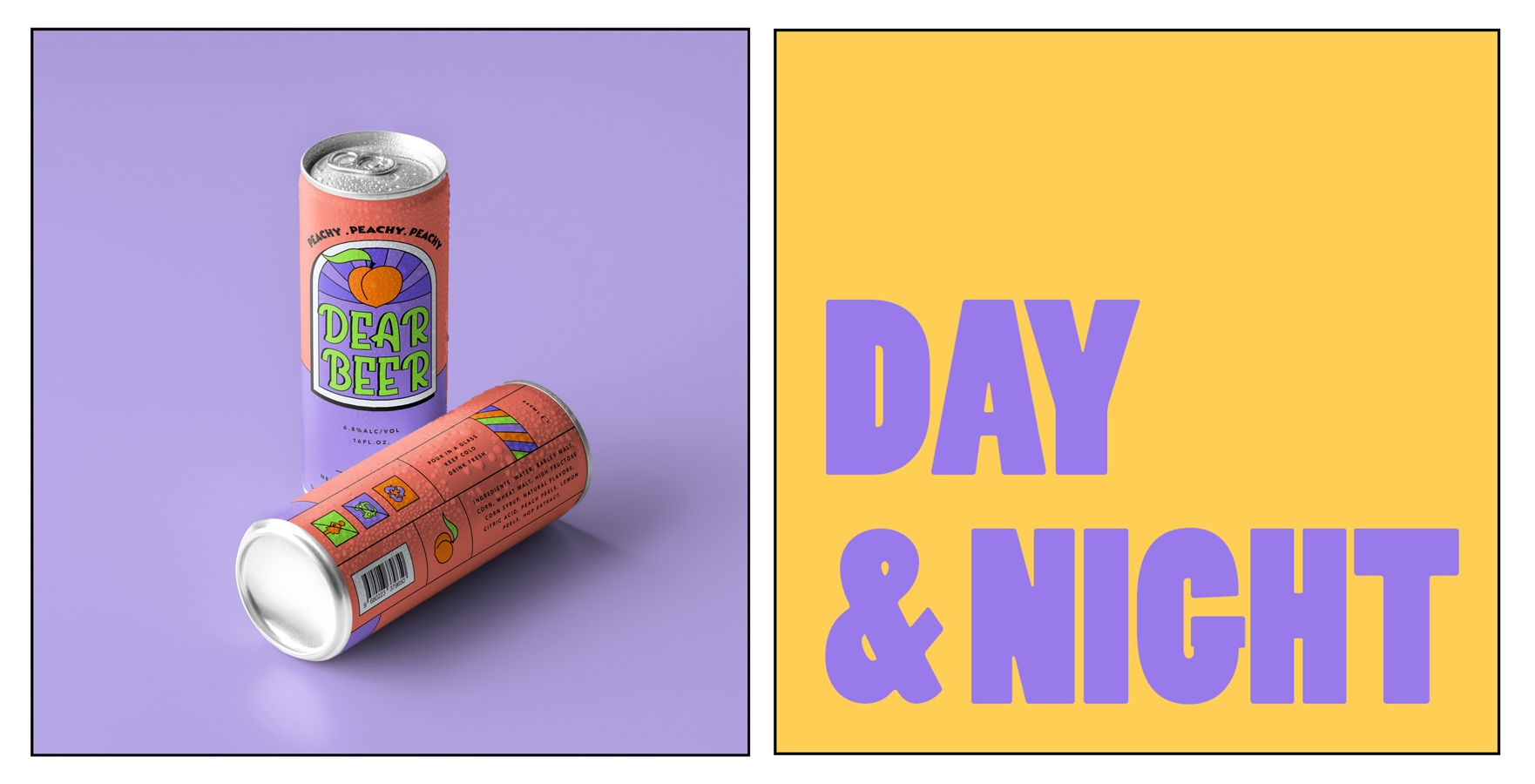
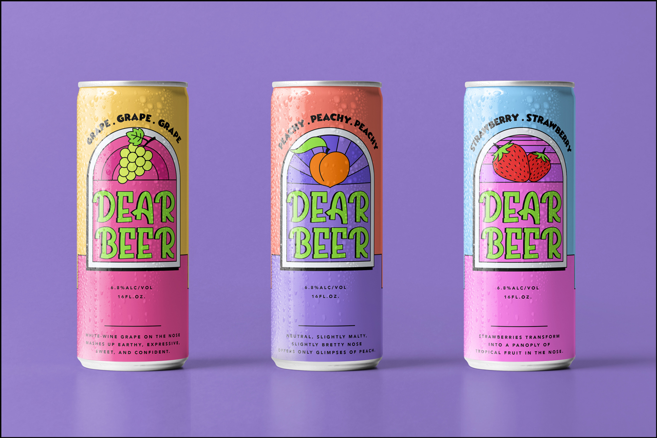
Dear Beer is a craft brewery brand mainly has three different fruit based beers: Peach, strawberry and grape. This brand and project is not published, it is a concept design work which we made in order to present our joyful approach to branding&packaging and take our designing skills to another level. What was so fun about this project is that we had no limitation other than our sense of design.
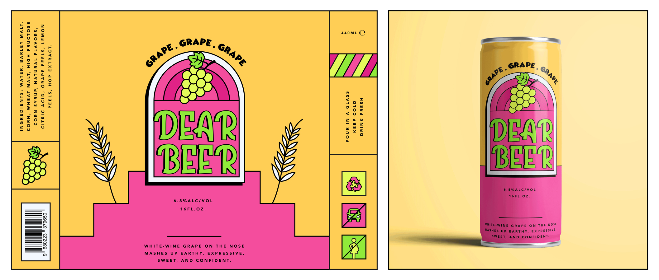
Inspired from retro style, we created a colourful identity mixed with bold and funny typography. Colour palette is composed of vibrant tones which works well with each other in different combinations. What makes the retro style stands out is mixing these colors with the bold shapes and lines. Our aim for the packagings was to be able to attract people even from far away. The graphical language of the brand enabled us to create clean packagings with straight lines and boxes. We also preferred a cartoony font with a small touch of 3d effect for the Dear Beer logo. It separated the logo from other elements on the designs. With this energetic identity we wanted to appeal all kinds of people no matter what their age is.
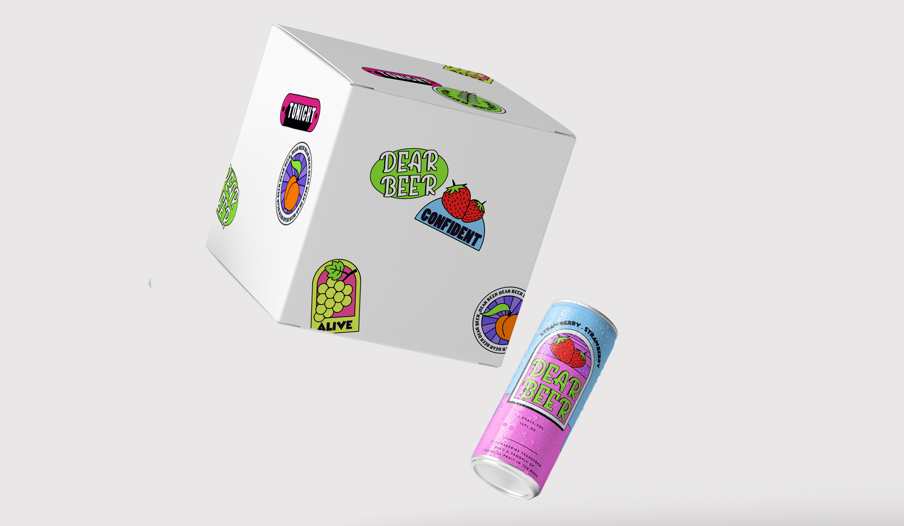
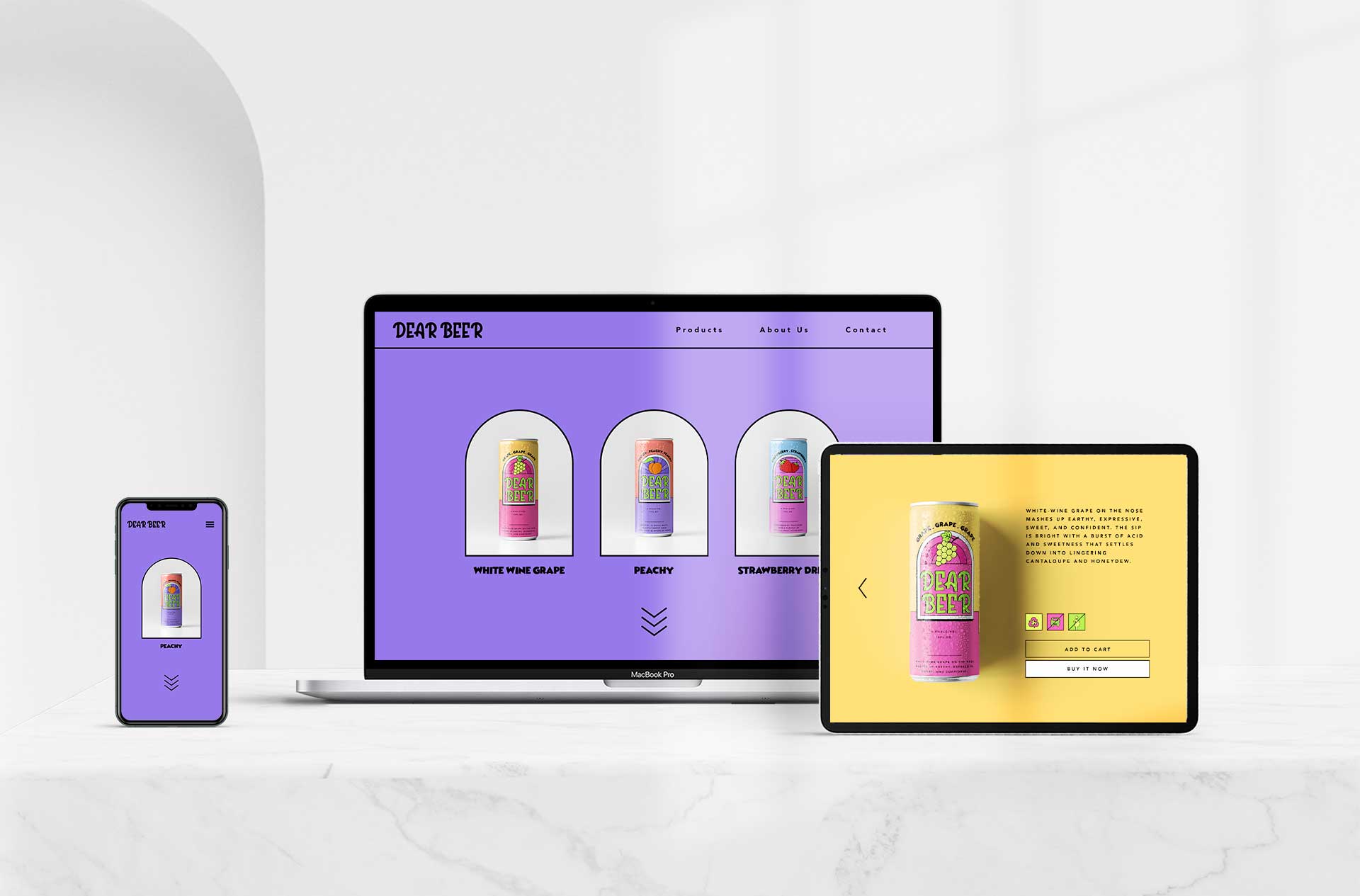
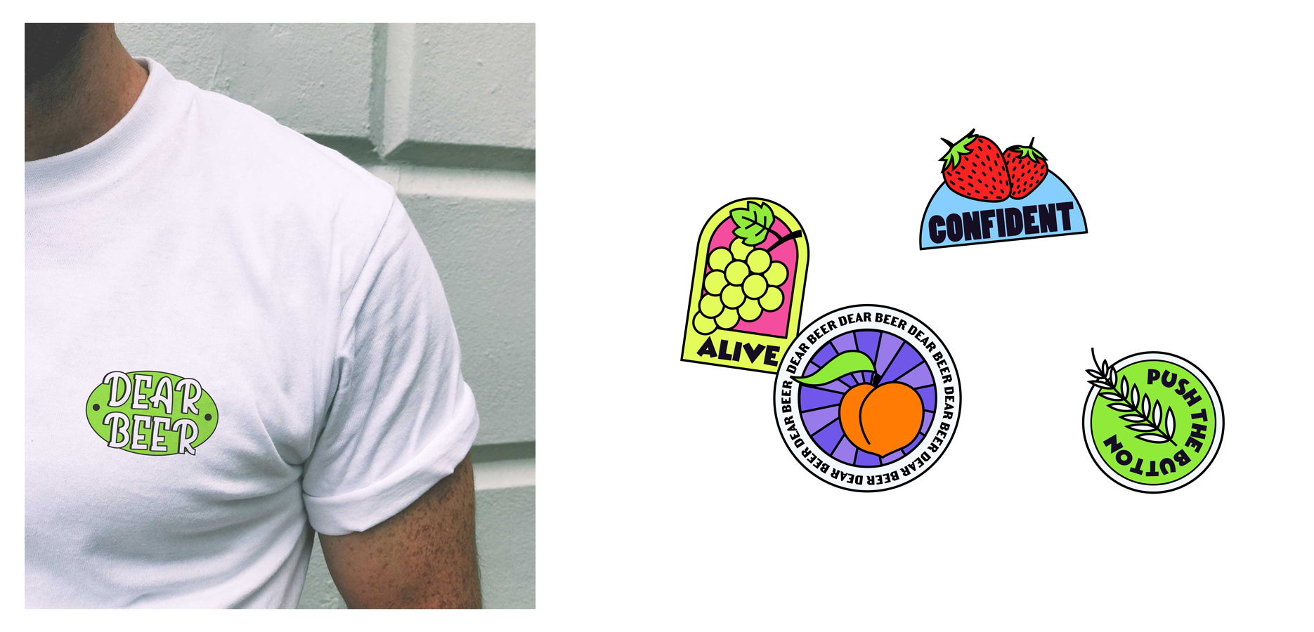
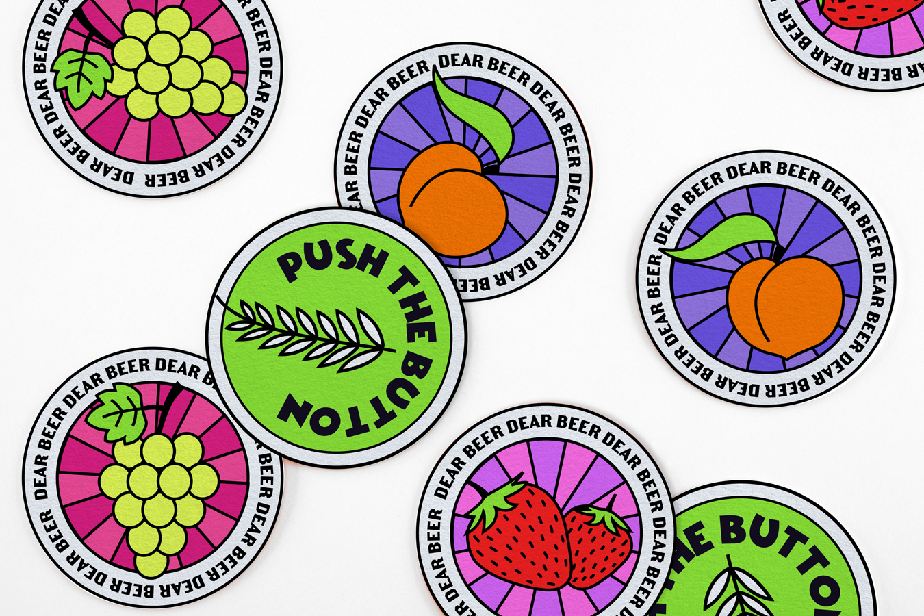
As a printed material of the branding, other than 3 main packagings we also designed a cardboard box, stickers, coasters and a t-shirt. We used graphical elements from the beer packagings and illustrations of fruits for the stickers and coasters. Also added them motivational words and sentences related with the brand’s language. For the digital identity of Dear Beer we designed a website layout which promotes and sells their products. Brand’s visual style is preserved on the web as well. We used the main shape on the packagings as frames on Dear Beer’s website. Other than website we made custom gifs for the brand’s social media and for any promotional digital platform.
Considering the overall process and the brief (written by us) we achieved what we were aiming for. This project represented our taste and design esthetic very well. It was completely full of freedom and joy. Hope you enjoy checking out this work as much as we do.
CREDIT
- Agency/Creative: Salt and Sugar Creative Studio
- Article Title: Packaging Design for Dear Beer Concept by Salt and Sugar Creative Studio
- Organisation/Entity: Agency, Non Published Concept Design
- Project Type: Packaging
- Agency/Creative Country: Turkey
- Market Region: Europe
- Project Deliverables: Brand Creation, Brand Design, Brand Identity, Brand Naming, Brand World, Branding, Graphic Design, Illustration, Packaging Design, Product Naming, Research, Tone of Voice
- Format: Can
- Substrate: Metal


