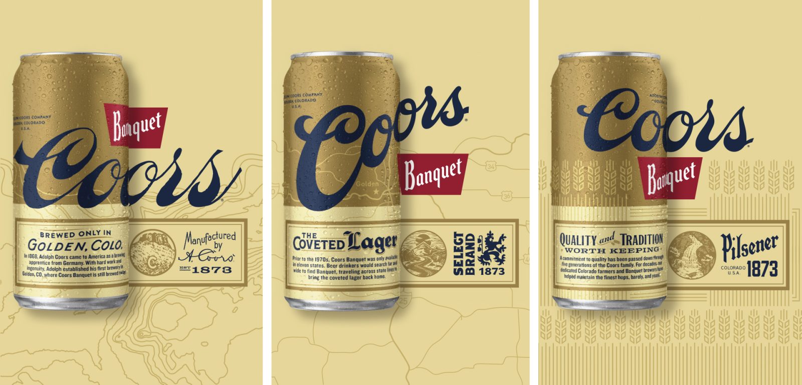
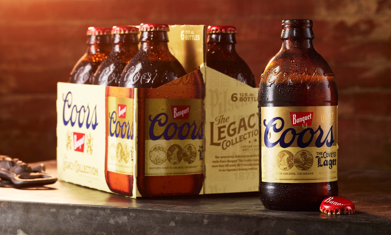
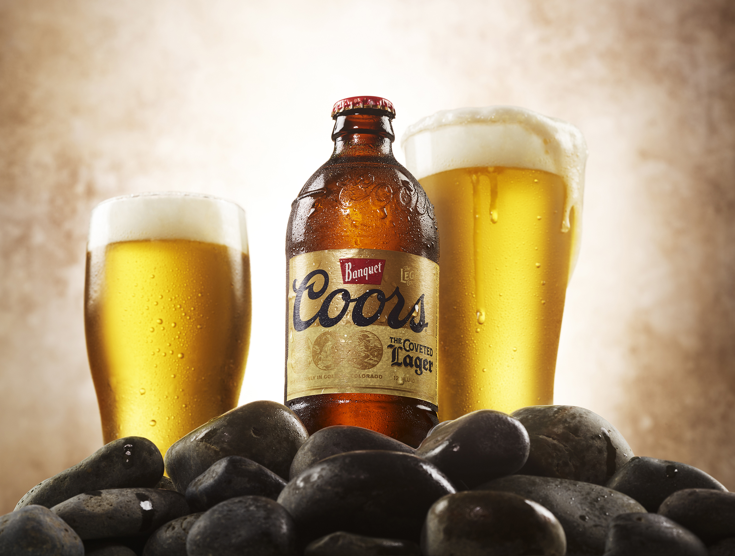
Molson Coors approached Equator to design the packaging for a limited-edition range of Coors Banquet ‘heritage cans’ to honor the brand’s 149-year history. The ‘Legacy Collection’ of cans and stubby bottles needed a design that nodded to the inspirational elements of the brand’s past, while simultaneously reasserting its current cultural relevance and appealing to the millennial consumer.
To ensure we targeted the new, millennial consumer most effectively, we conducted a category and cross-category audit, not only examining alcohol, but other areas such as clothing, vitamins, and supplements. Once this piece of the puzzle was in place, our internal strategy team gathered insights, combining internal data with information from Neilson and Mintel for an all-encompassing view of this consumer type.
To truly understand the brand and to map its place in the past, present, and future, we virtually explored the Coors archives, digging deep into the Banquet story and taking inspiration from past signage and logos. We also interviewed stakeholders to understand what the brand meant to them.
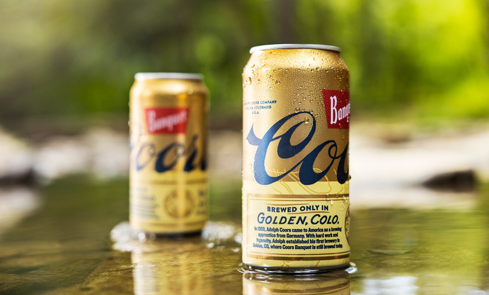
This intersection of brand and consumer informed our creative strategy, leading us towards the outdoors space and, specifically, the concept of the ‘golden hour’. As Coors Banquet is a well-balanced golden lager, and as the brand already had some golds and creams as part of its visual equity, there were strong synergies to build on. The idea of being outdoors, during the ‘golden hour’, enjoying the product and connecting with nature chimed with the Coors Banquet target audience and younger consumers looking for authentic brands with compelling stories.
We created a half-and-half aesthetic where half the can was metallic gold, and the other half was buff. This 50/50 color break made the package more impactful while also allowing for detail and discovery elements to be contained in the lower half of the pack, giving it a bold clean look without sacrificing brand credentials.
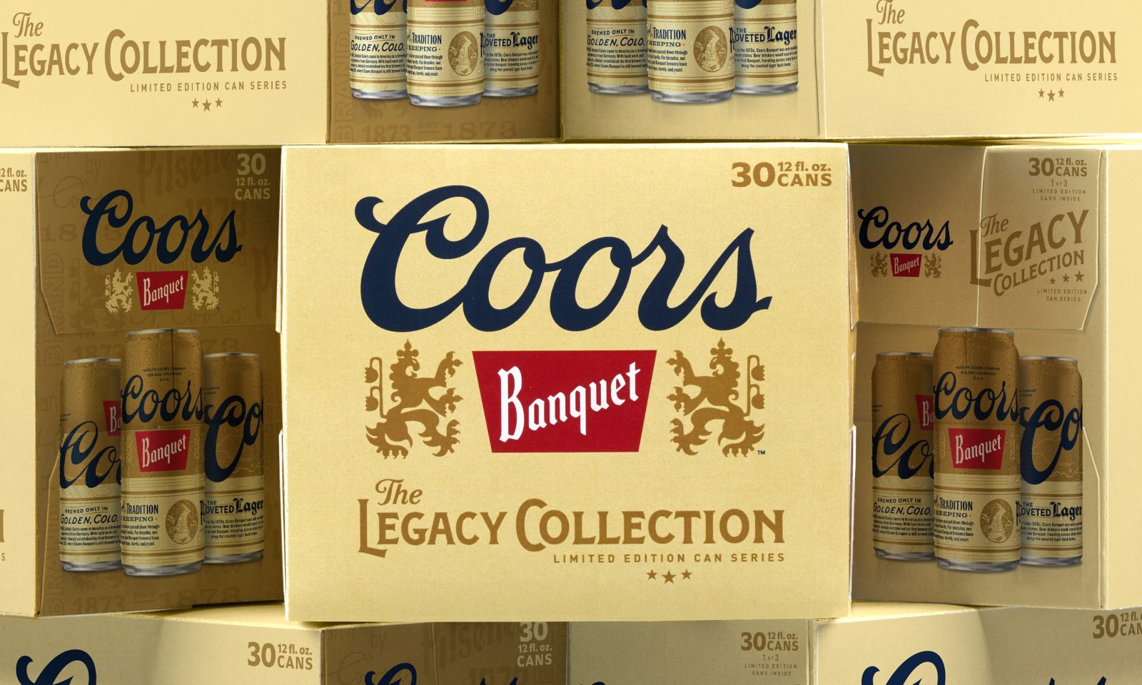
And, while the cans were the heart and soul of the scheme, we were also responsible for the in-store theme; designing the boxes and considering how they stacked together to create virtual theatre. Our goal was to increase stopping power when packs were placed next to each other, which we accomplished with a memorable mark for ‘Legacy Collection’, played up on pack, combined with the scale of can photography.
By looking to the inspirational elements of the brand’s past and connecting them to the lives and interests of its younger, target consumer, we were able to create a design that not only celebrated a 149-year legacy but carved out space for this relevant, popular brand to strengthen its position and grow its consumer base in the future.
CREDIT
- Agency/Creative: Equator Design
- Article Title: Packaging Design for Coors Banquet by Equator Design
- Organisation/Entity: Agency
- Project Type: Packaging
- Project Status: Published
- Agency/Creative Country: United States
- Agency/Creative City: Chicago
- Project Deliverables: Packaging Design
- Industry: Food/Beverage
- Keywords: WBDS Agency Design Awards 2022/23


